Staple

ARENA Staple rc1

  • This map is featured! Our best maps, all together in one place for your viewing pleasure.

Diva Dan

hello!
aa
Mar 20, 2016
1,035
1,954
Staple - 2 CP arena map where each team starts with a point

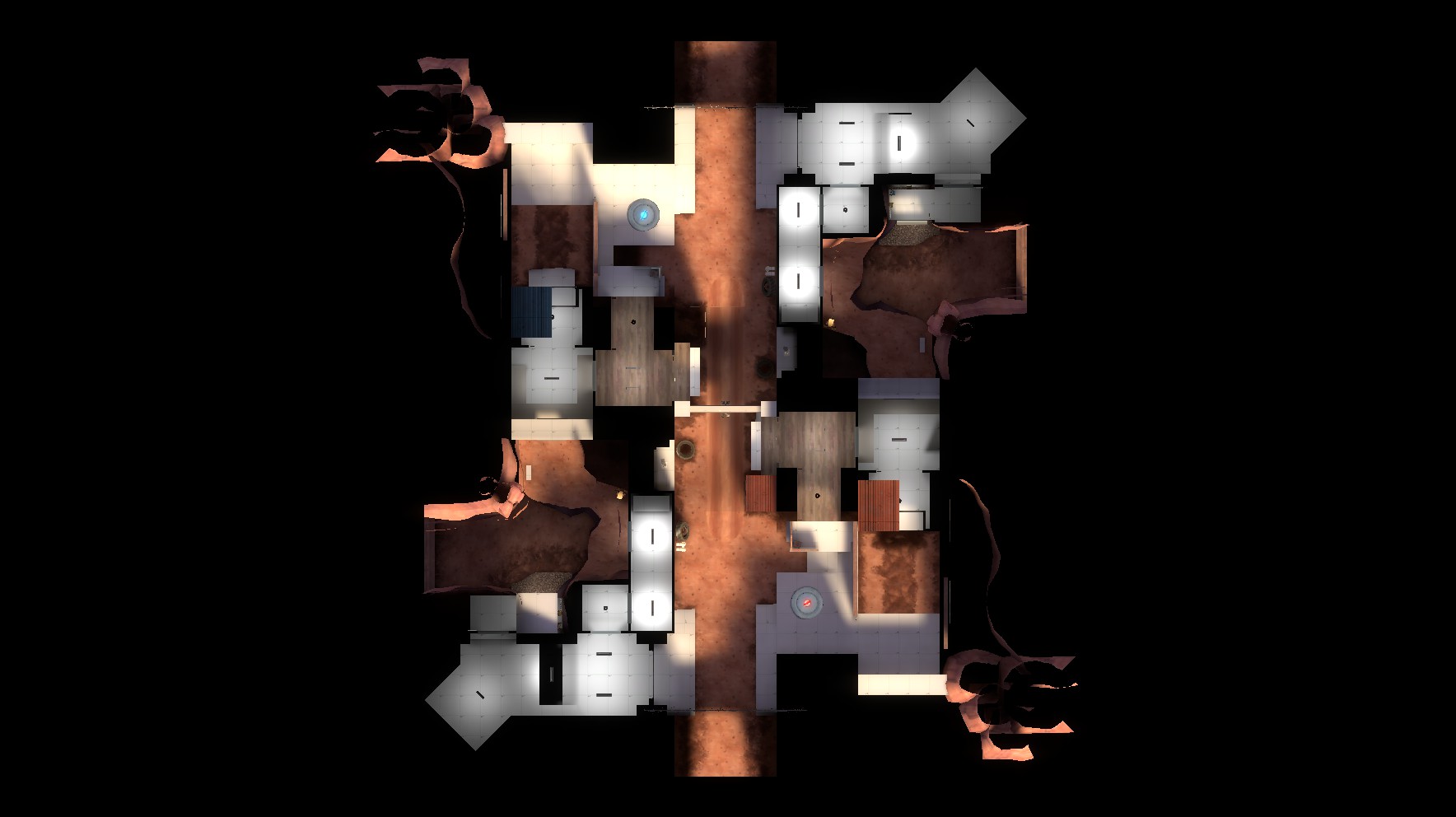
Staple is an arena map similar to byre, but with a twist. Instead of both control points starting neutral, both points begin being owned by their respective team.

The goal of this mechanic is to pair a strong team offense with a strong defense. While byre has the benefit of each team moving back and forth quickly to prevent camping, this map offers several very powerful attacking routes to each side. Alone this would feel unfair, but when each team owns their point right off the bat, I aim to create an interesting tug-of-war. that hopefully ends quickly. The only health kits are along attacking routes, and metal is relatively scarce.

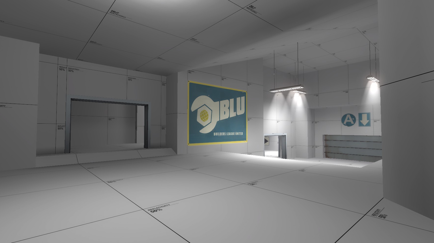
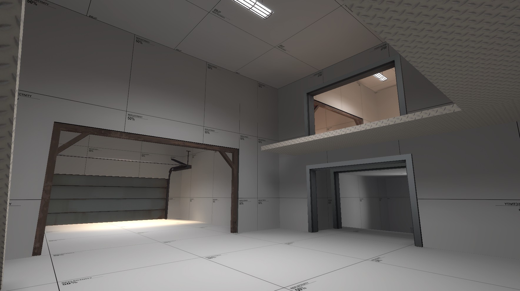
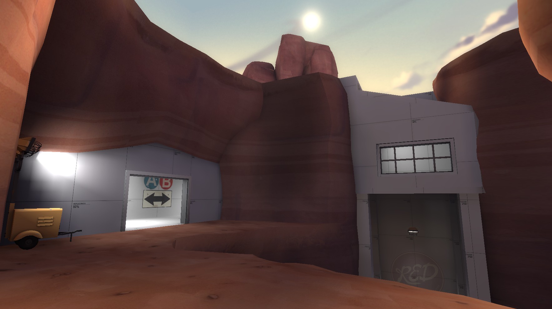
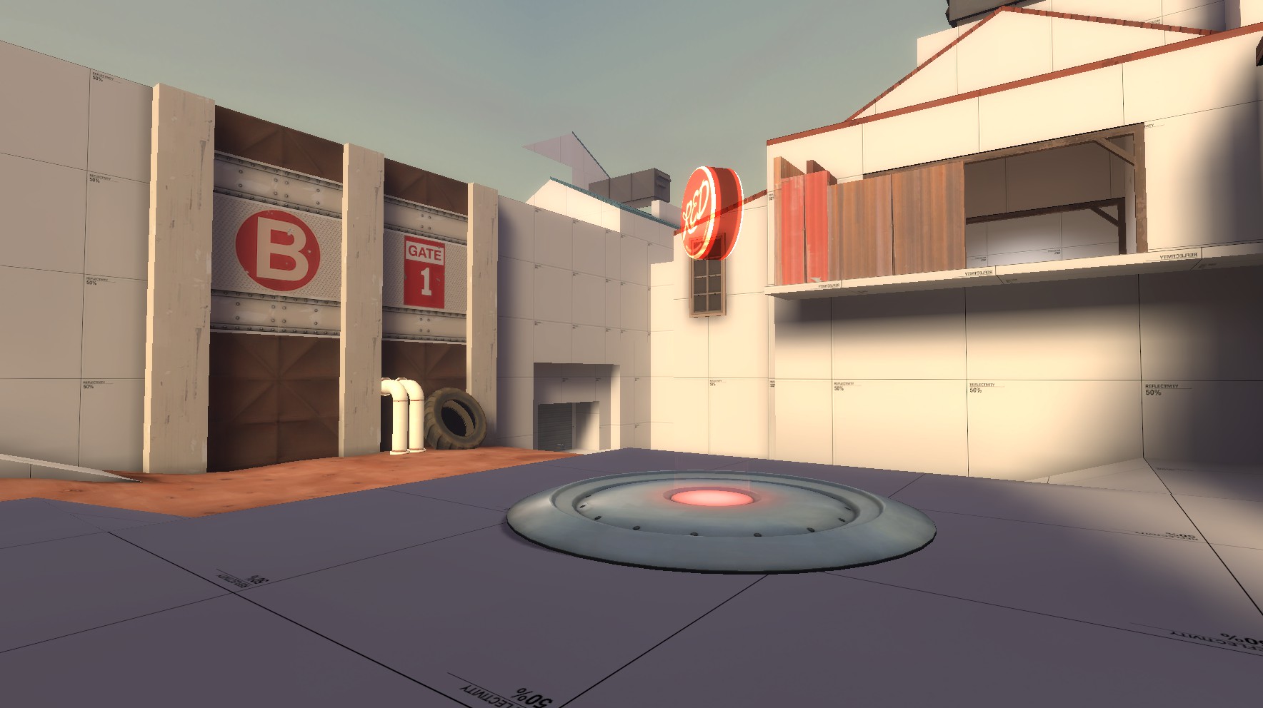
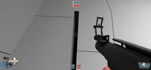
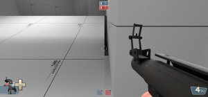
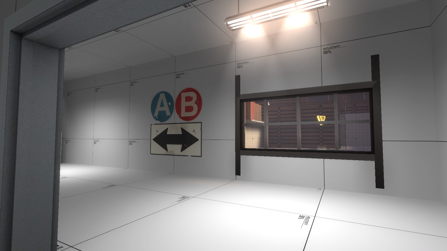
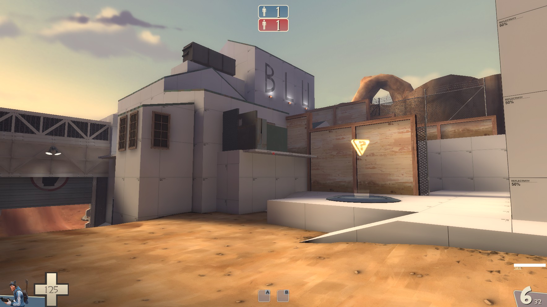
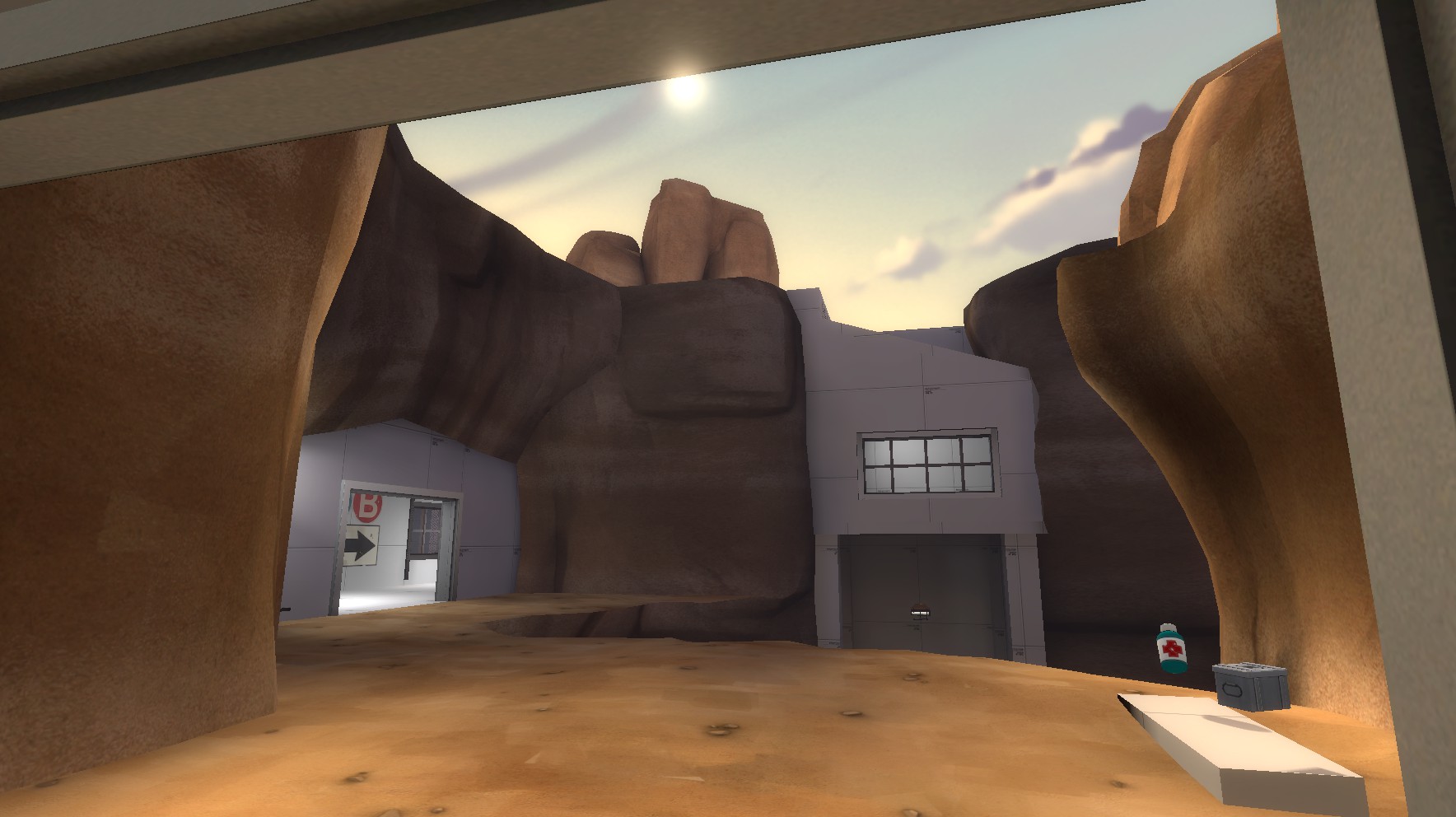
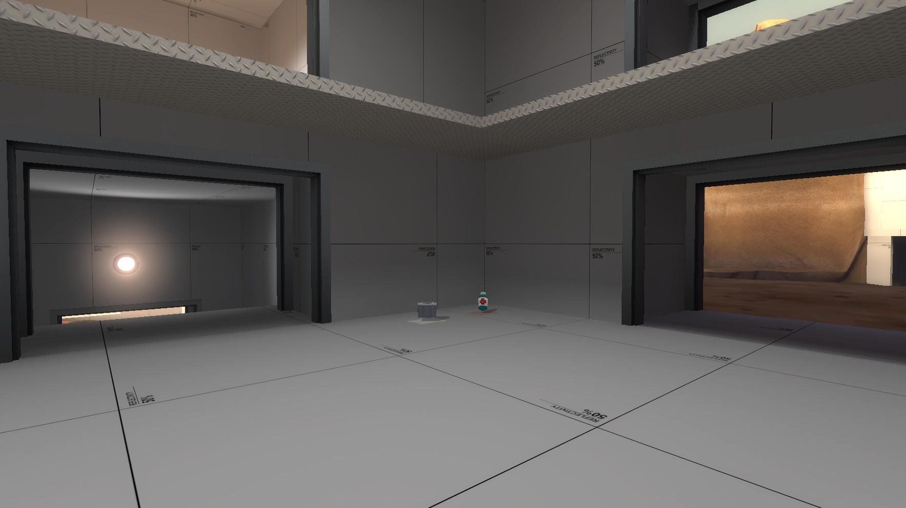
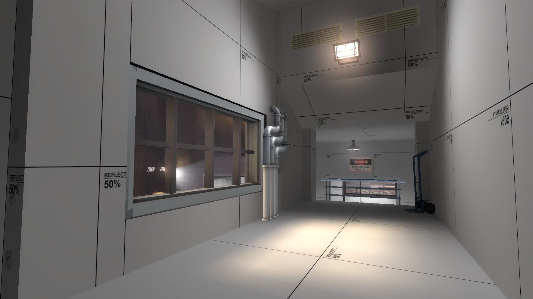
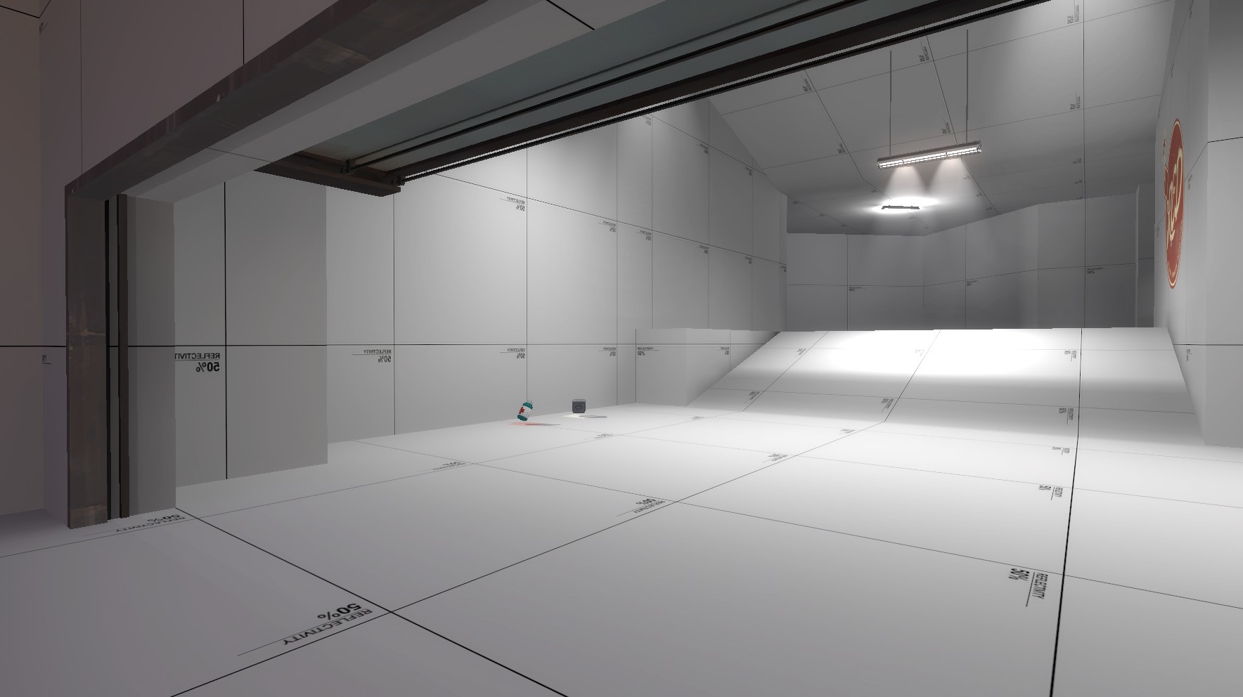
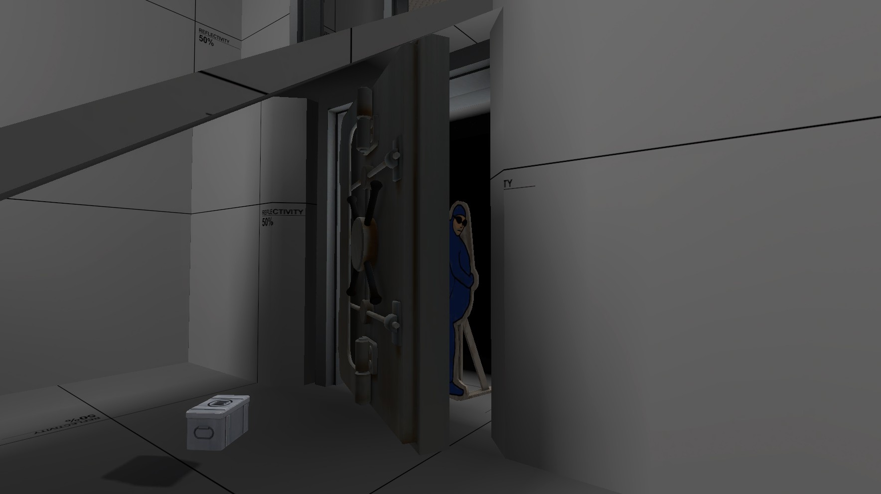
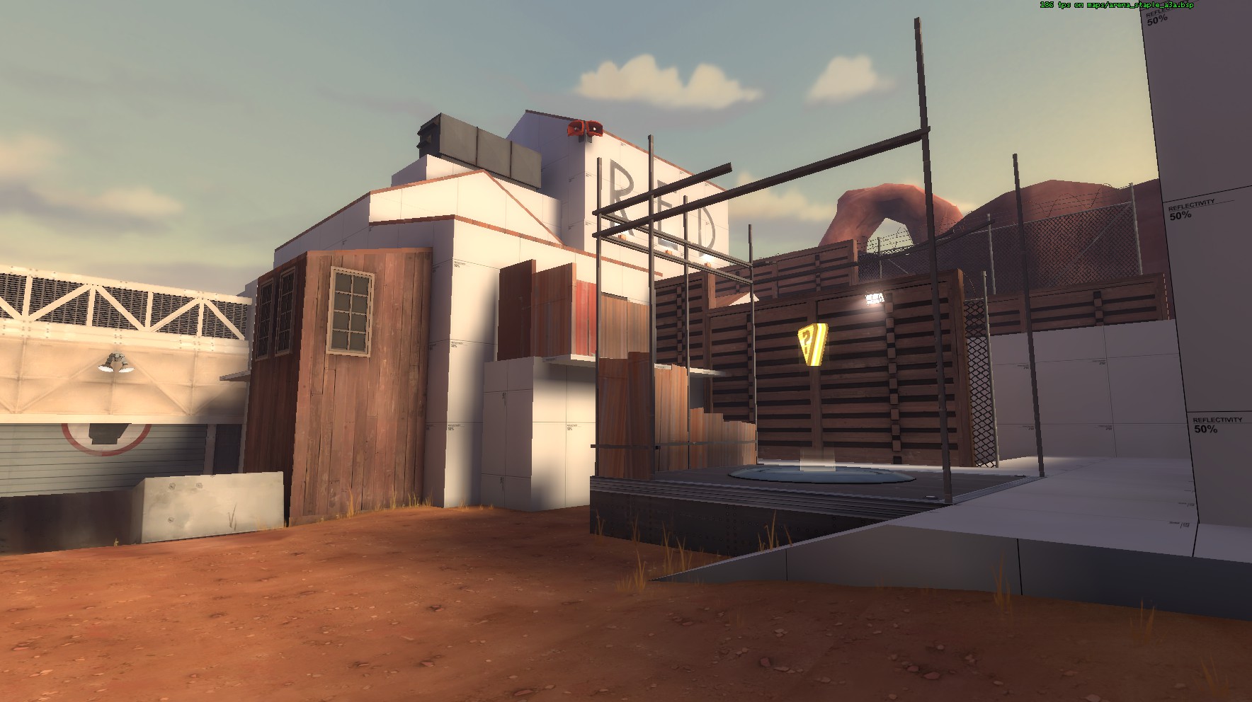
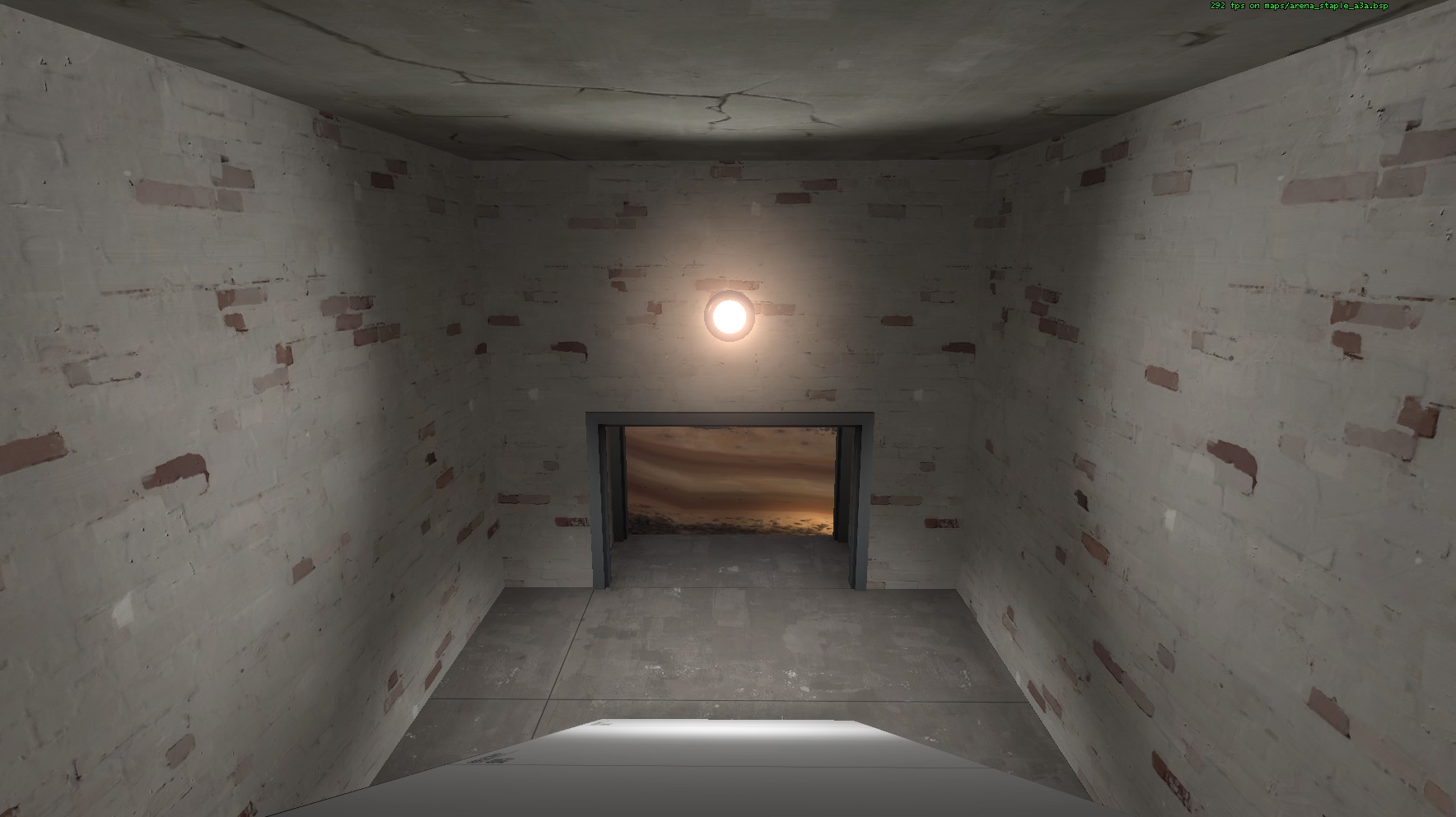
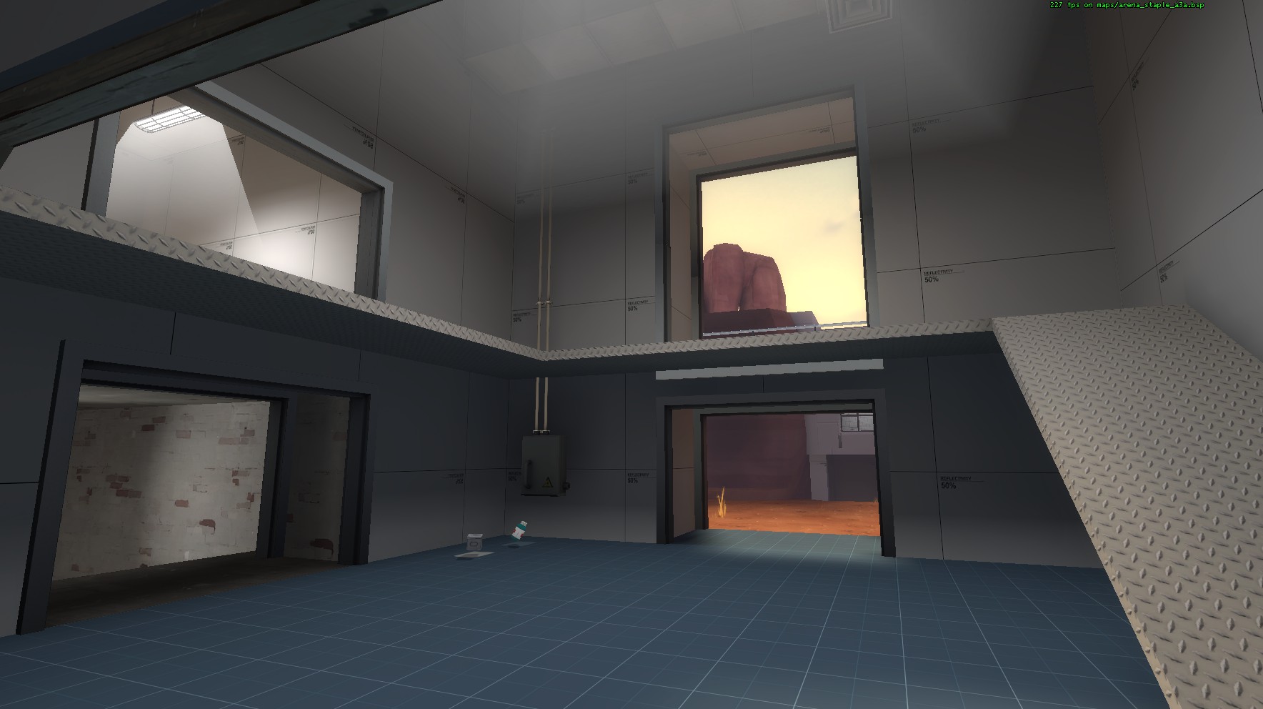
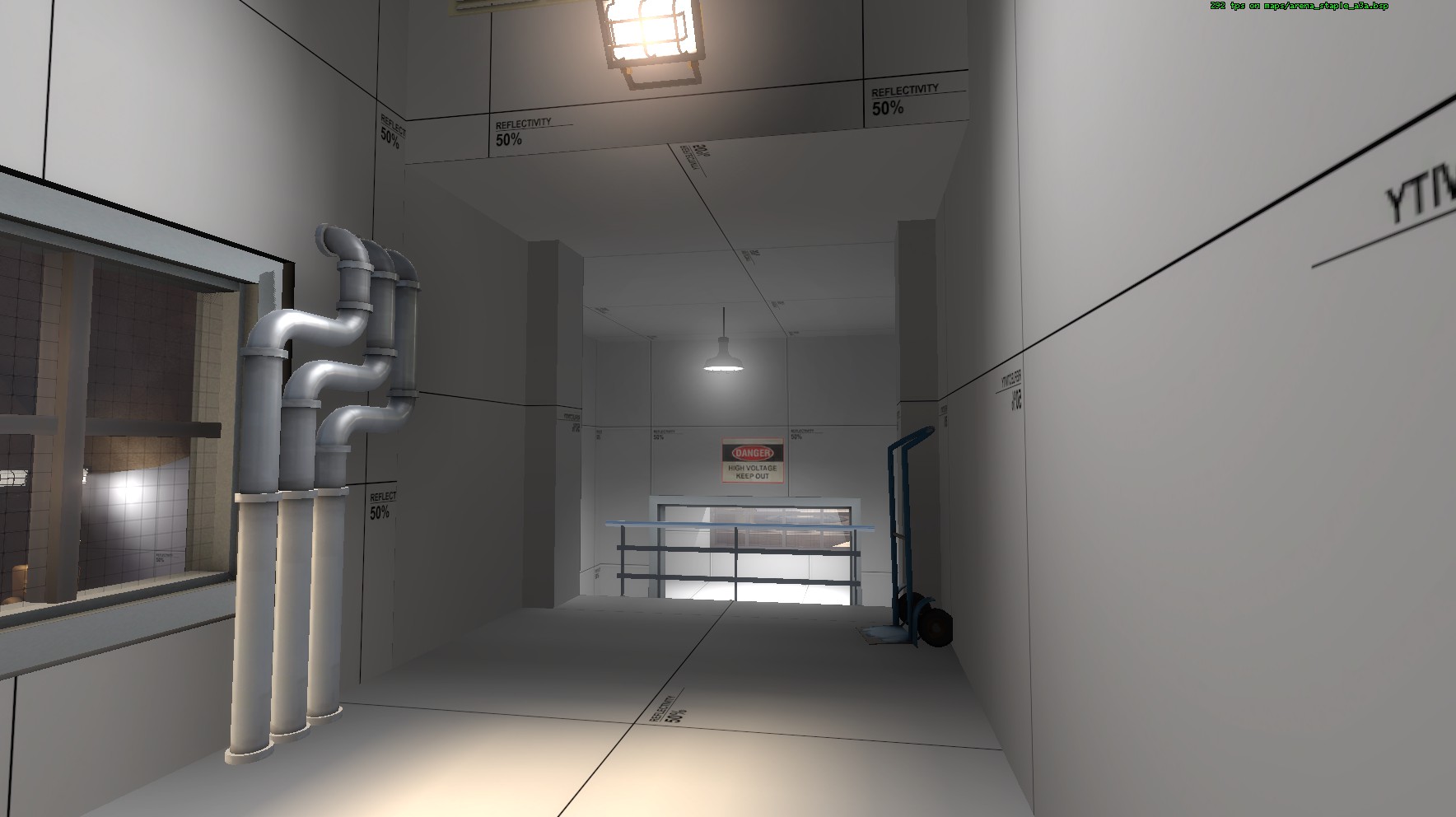
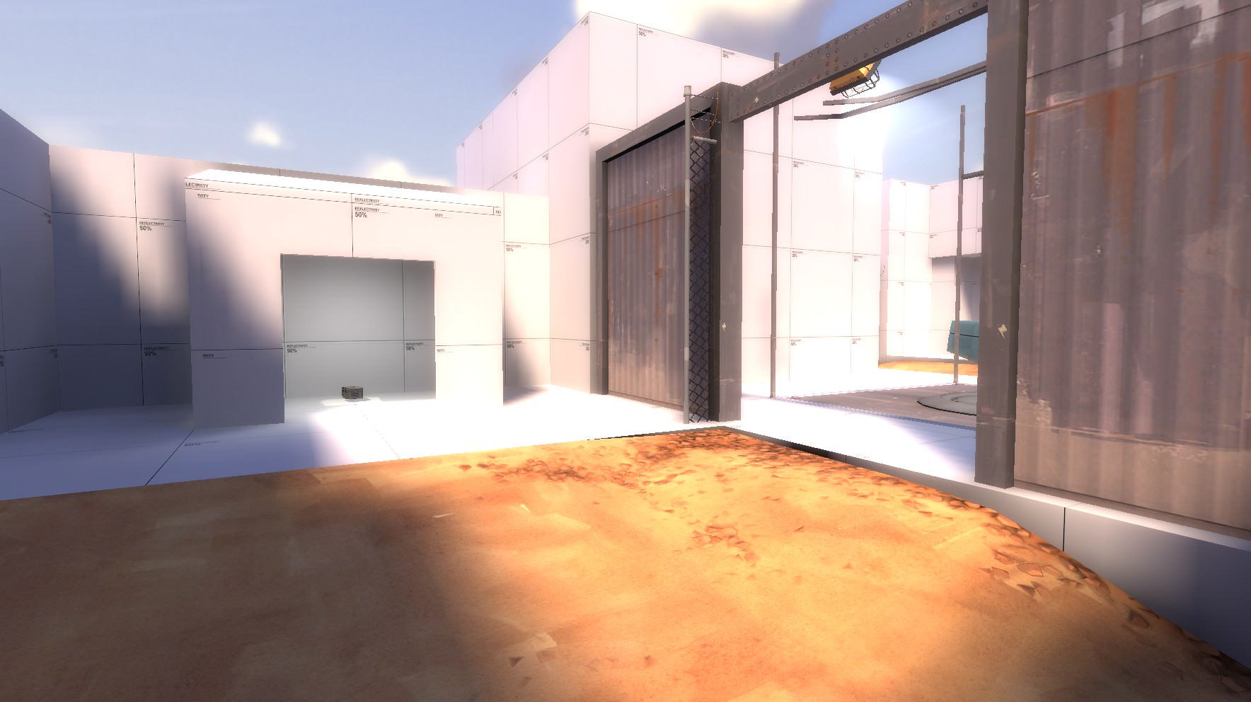
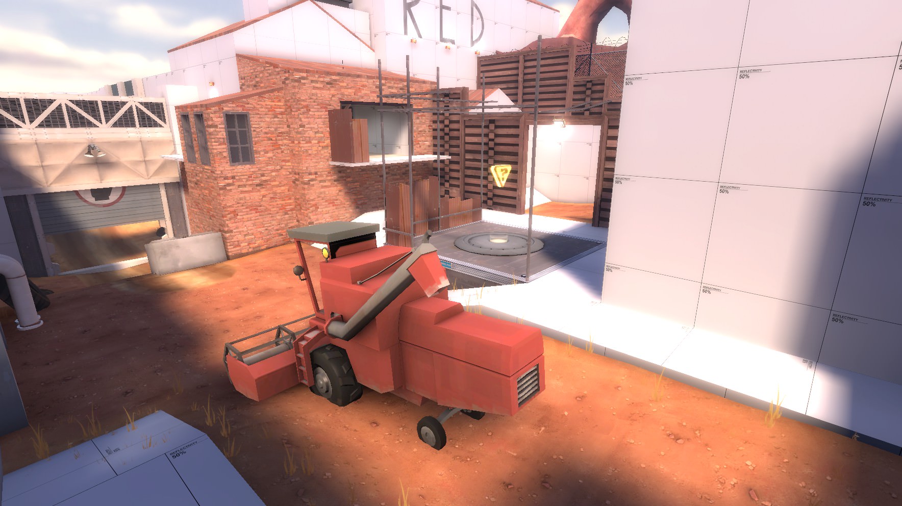
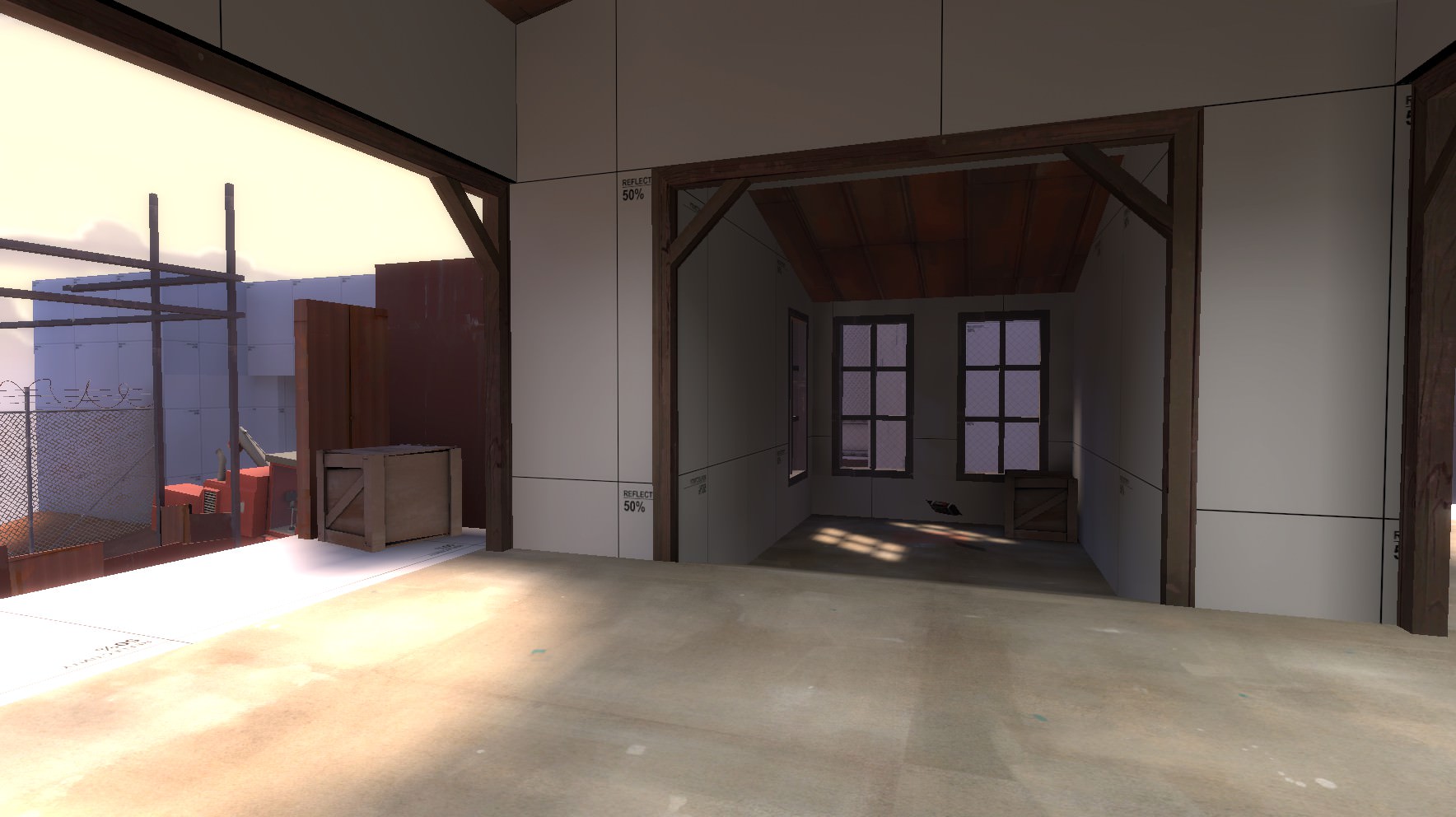
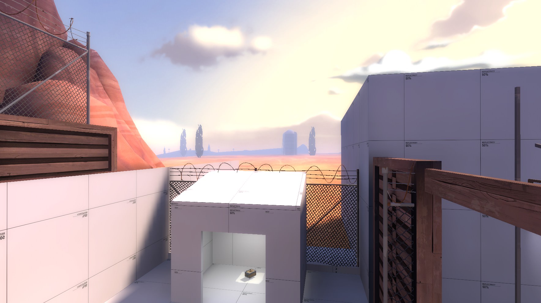
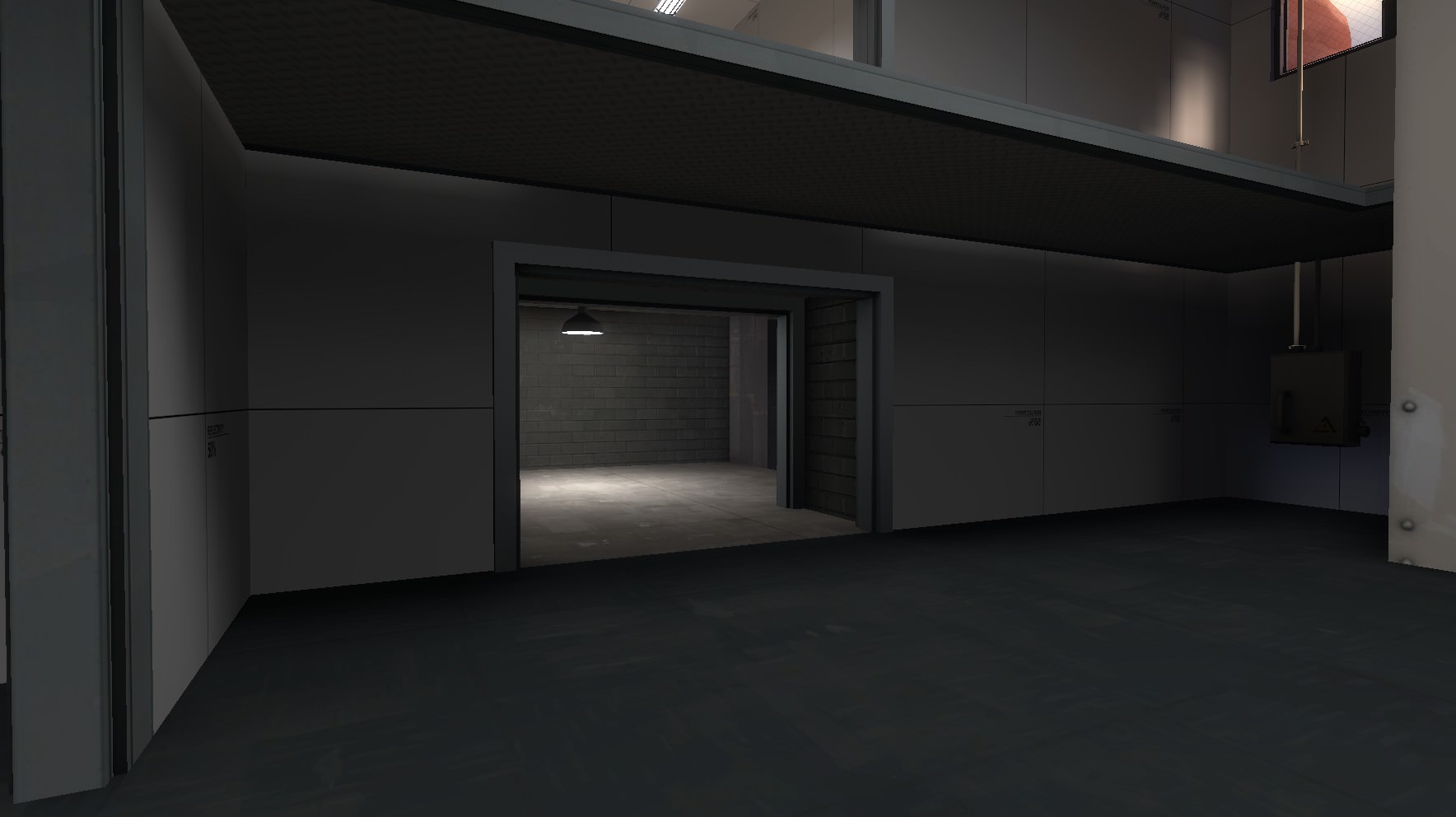
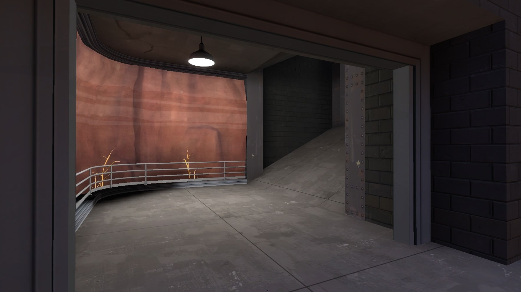
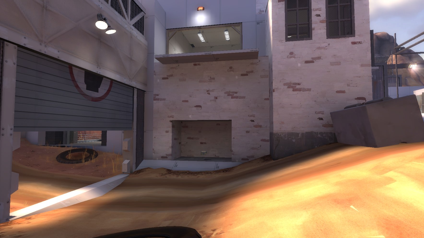
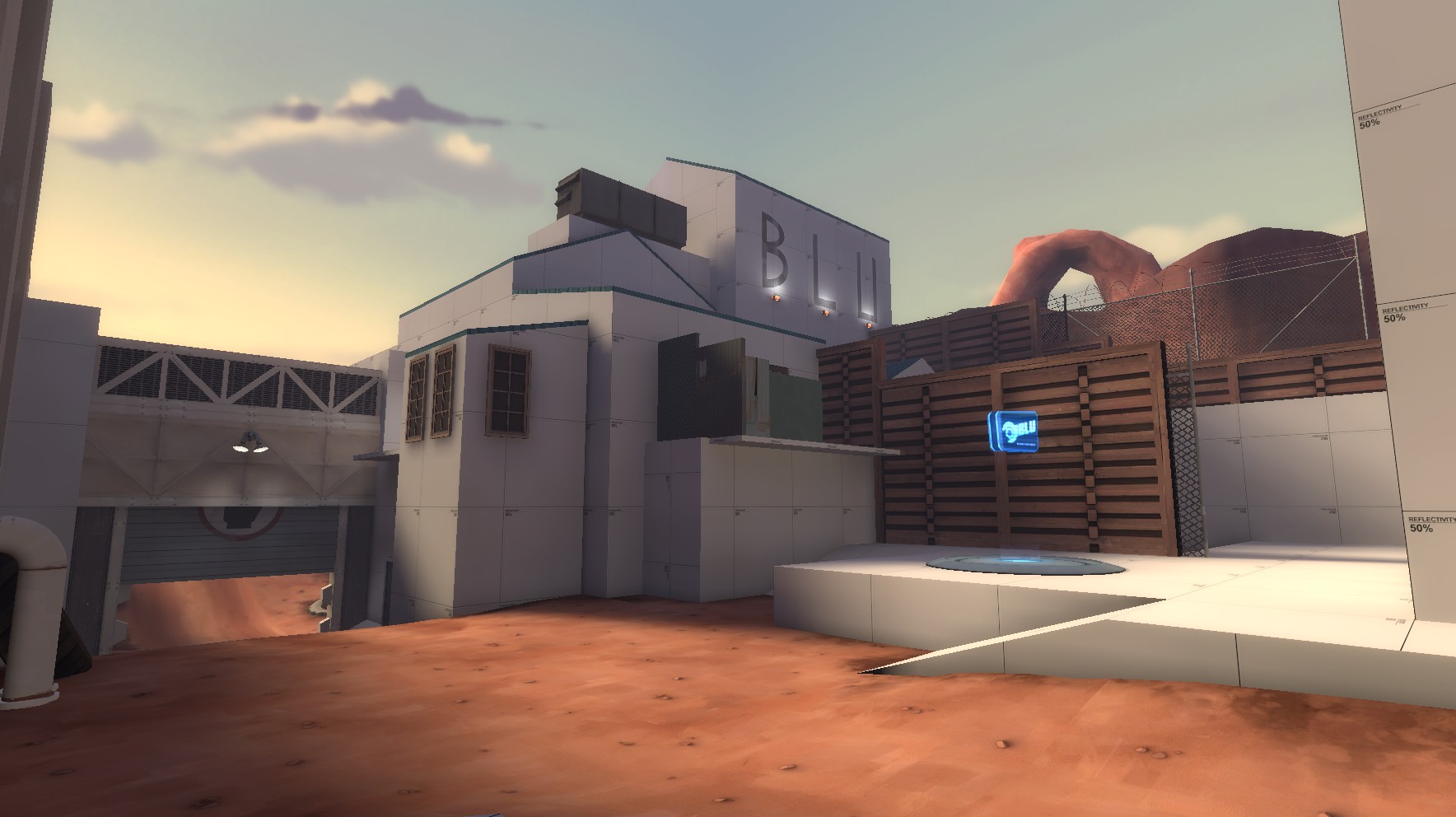
Below are some screenshots of the first version.

(and yes, I know the roofs are quite bad, it's temp optimization, or at least that's my excuse)
YgOY74l.jpg

UAAcd4Z.jpg

XdWeTg5.jpg

n2DpI70.jpg

gB12E2q.jpg

CZBlbjR.jpg


I hope that the gamemode comes out well and you have fun playing it!
 

YOYOYO

50 crashes and counting!
aa
Jul 10, 2017
620
556
This is a good map, so her is my feed back:
The A Is pointing at a wall, this shouldn't be too much of a problem, but its a bit confusing
arena_staple_a10000.jpg
Its kinda hard to see, but I'm on top of that, like, middle line wall. Once again, this is optional, but I'd suggest clipping itarena_staple_a10001.jpg
Shouldn't I win when I've captured both?
arena_staple_a10003.jpg
Is this supposed to be on the sides of the stairs
arena_staple_a10004.jpg arena_staple_a10005.jpg
And this is a detailing issue, but I can see through the rock things.
arena_staple_a10007.jpg

Hope this helps! :)
 

Idolon

they/them
aa
Feb 7, 2008
2,123
6,137
Assuming you're using the overtime system from Byre: Set the b_capped_a and b_capped_b branches to 1 instead of 0 to indicate that the points are already captured. You should also check that b_team_a and b_team_b are set appropriately (0 for red, 1 for blue). Haven't tested that it works but it should.
 

Diva Dan

hello!
aa
Mar 20, 2016
1,035
1,954
Thanks, I'll try that out! The source of the error was that I set each point to be owned by a certain team at the start, and I'm assuming it skipped some sort of step in the logic and didn't know how to react.
 

Diva Dan

hello!
aa
Mar 20, 2016
1,035
1,954
  • Added new cover to each side made of concrete that blocks a small sight
  • Made the capture area more obvious
  • Added speakers
85XLRhZ.jpg

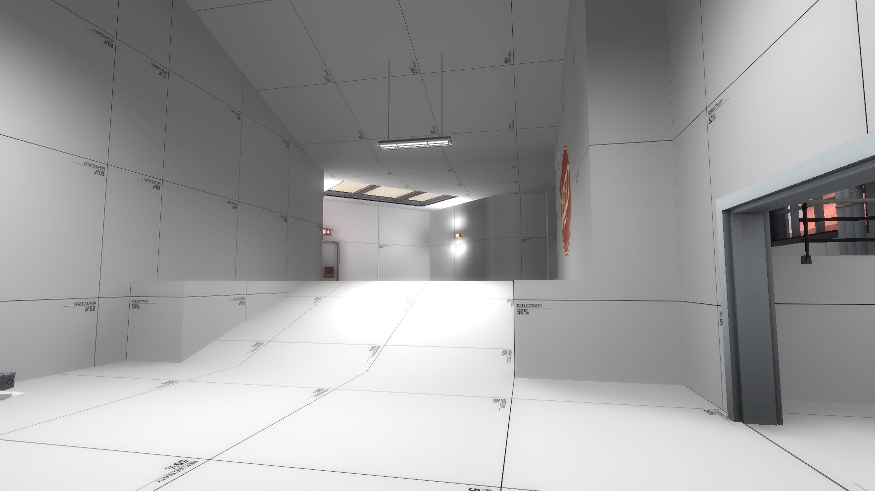
  • Redid the ramp to have less space on the edges
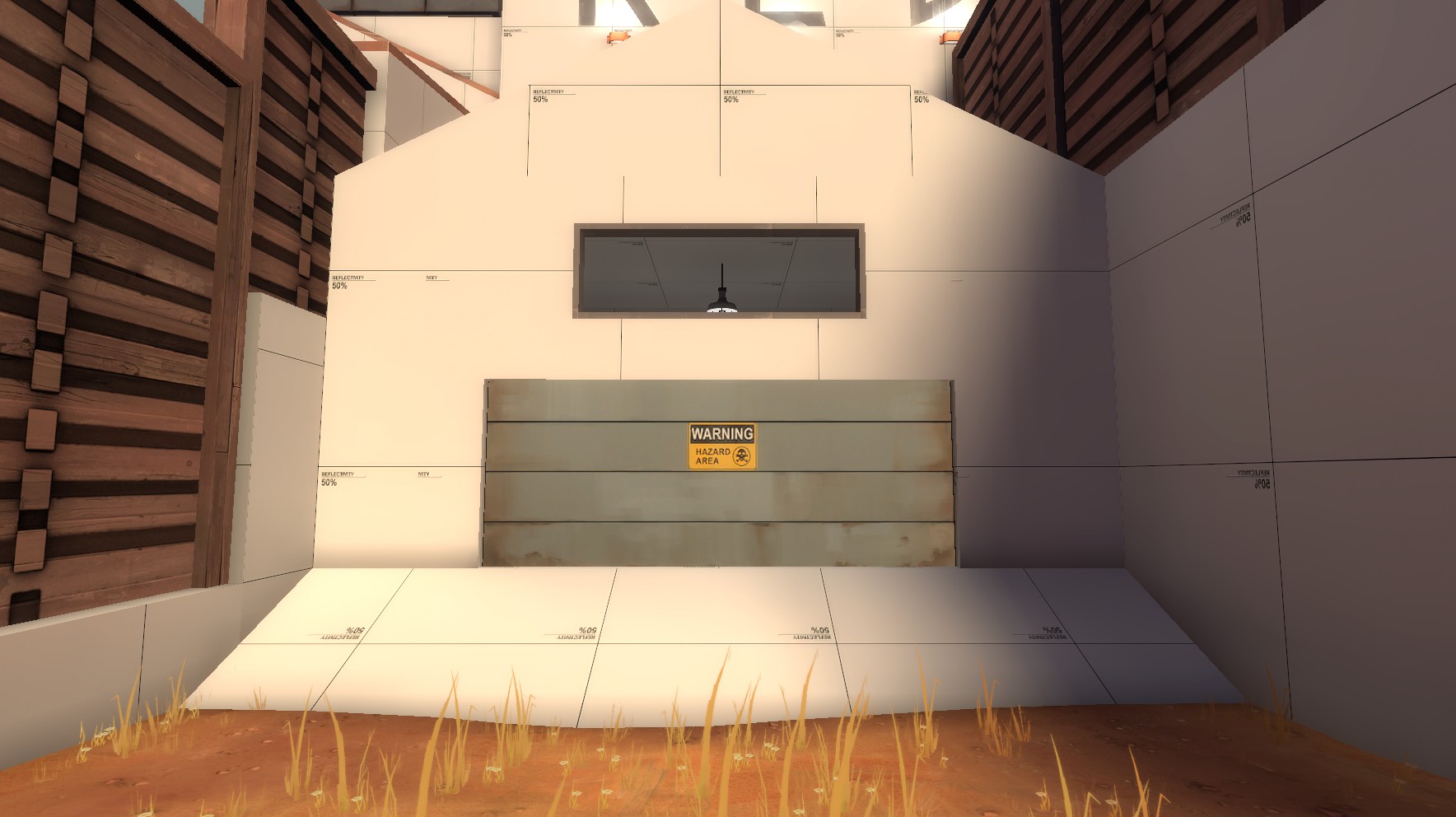
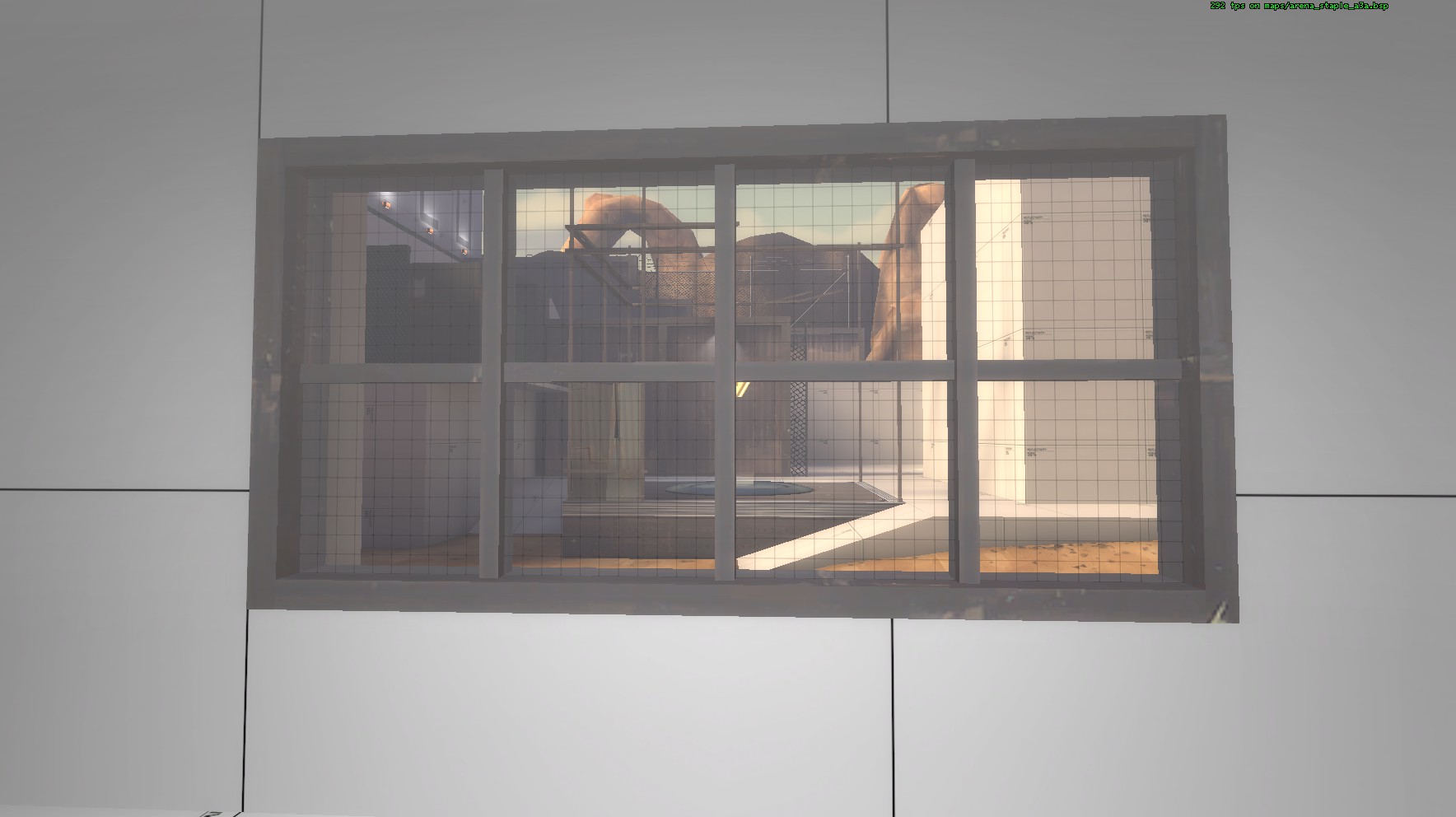
  • Added a window above the sliding door to spam pills or other things at people on the other side
tNsUvcQ.jpg

  • Moved the health and ammo to inside of the lobby to make holding the cliff sightly less powerful and the health more accessible for defenders
GW7rPxH.jpg

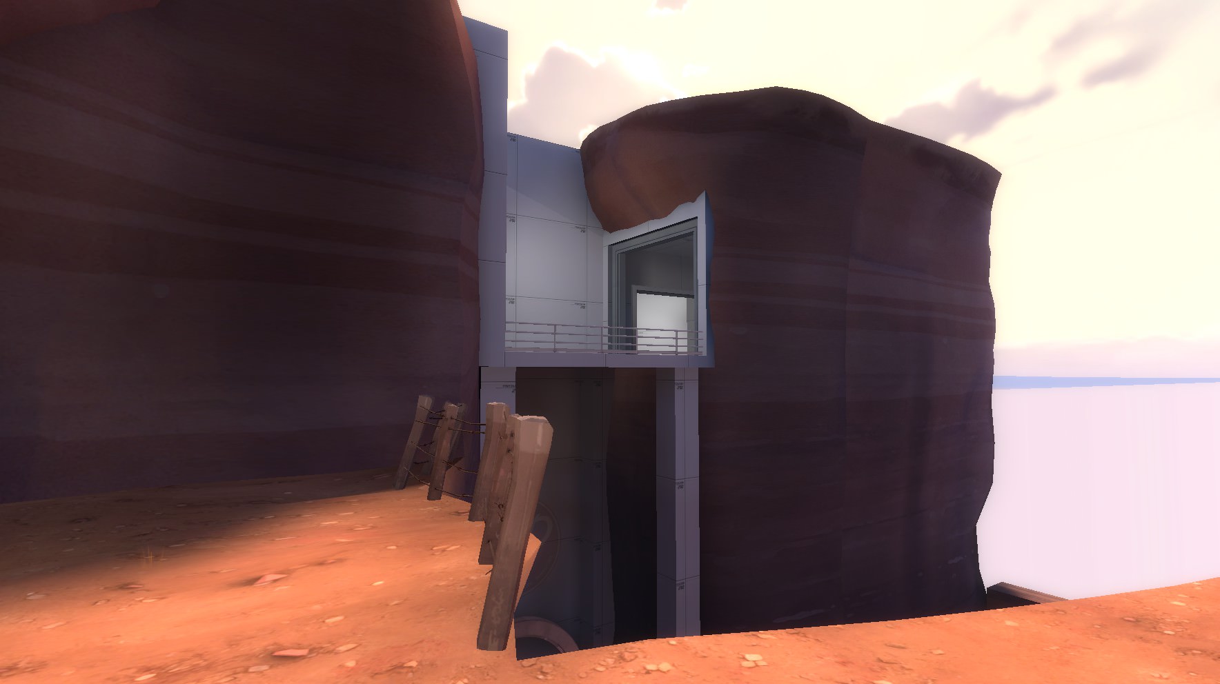
  • Rehauled the useless room to have a dropdown to the connector between spawn and the cliff. It has a sight to the window looking outdoors and should allow for some interesting plays
  • Window now has glass to prevent a sightline being abused
n383wss.jpg

  • Added health and ammo to the spawns sliding door
  • This should make the spawn room more appealing as a defense location
hSVKI4M.jpg

  • ???
oa5kmqi.jpg


Read the rest of this update entry...
 

Zed

Certified Most Crunk™
aa
Aug 7, 2014
1,241
1,025
Very attractive map with a very attractive man
 

Diva Dan

hello!
aa
Mar 20, 2016
1,035
1,954

  • Added cover around both capture zones
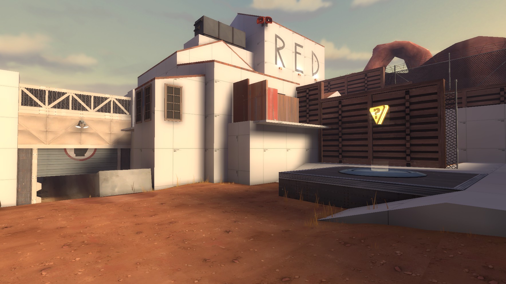
  • Added some themed textures to each side
SqPzW4u.jpg

ihxc16C.jpg

  • Added misc. props to each lobby
  • Raised the roof above the window overlooking each cliff
  • Fixed clipping around some of the doorways a little more
woxJgPk.jpg

  • Made it easier to jump over each side's railings in the window room
ld6rBQz.jpg

  • Removed the z-fighting window props (fiiiiiiine)
TQHpnvK.jpg

  • New light props courtesy of Tumbolisu
Now I'm going to respond to some feedback I got from the site.

  • "teams should own their own point when they game starts"
Originally the map had this idea, but I disagree with this decision for several reasons. Having each point start uncapped makes each team split up into two sides, most of the time. It gives choice between players to either hold more defensively and capture, or blitzkrieg the other team before they cap their own. It's like a rock paper scissors game and hopefully the map reflects that in the best way possible.
  • "capping is too soon"
I decided not to change the cap times in this version because I think that while they may be a little long, it makes the beginning of the game last much longer so players can make more decisions before they die and have to sit out. Generally it makes it feel like you're playing the map for longer, which is nice in arena.

That's about it, I hope you enjoy this version of the map!

Read the rest of this update entry...
 

YOYOYO

50 crashes and counting!
aa
Jul 10, 2017
620
556
When and if this map is finished, I would love to see it in-game! :)
 

Kube

Not the correct way to make lasagna
aa
Aug 31, 2014
1,342
1,850
This map came at the very end of the imp I held, so I've re-added it to VBot.

If you need the map to be deleted... you'll have to ask staff, sorry.
 

Diva Dan

hello!
aa
Mar 20, 2016
1,035
1,954
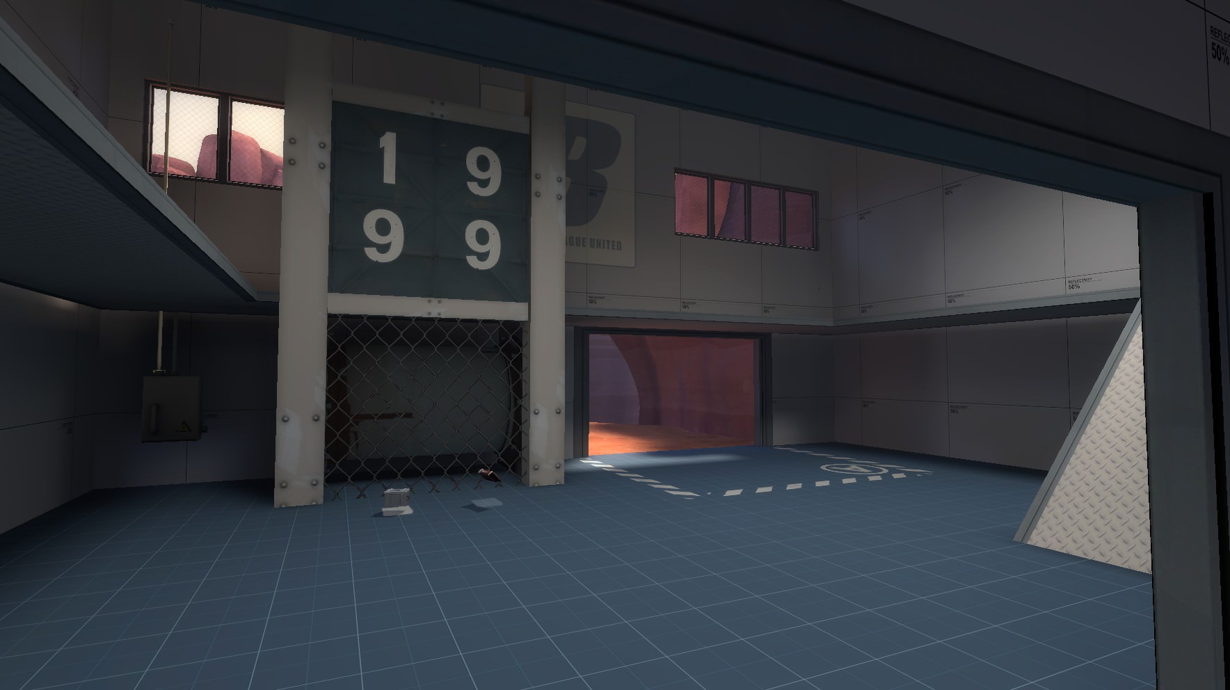
  • Redid some aspects of the spawnroom, including lighting
  • Sliding door has been replaced by a permanently open frame
80wsT9I.jpg

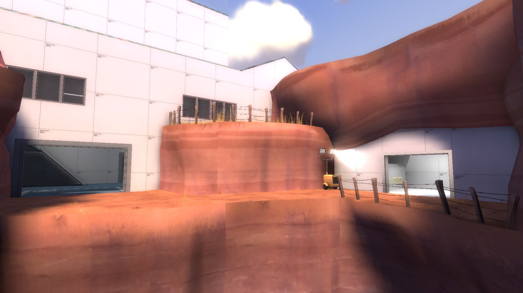
  • Redid the cliff, making it longer
  • New detail
sE6r1ns.jpg

  • Redid the entire lobby
  • It's now longer, has the pickups adjusted, and has cover
  • The window was removed from the second story
46eQ8I2.jpg

  • Gave the medium ammo a shed for cover
  • should make for more interesting decloak spots
  • fences were adjusted to change up how the point was approached
oWUVkW1.jpg

  • New cover added between the spawn and the control point
  • Balcony is short
  • Ramps to the point are easier to access
oEe7l9T.jpg

  • Added small health near the balconies to make it more favorable for attackers while also making it attractive for defenders to jump up to
ZcQxZDn.jpg


General Changes-
  • Improved clipping
  • Changed the lighting to match koth_highpass
  • Redone detail

Read the rest of this update entry...
 

YOYOYO

50 crashes and counting!
aa
Jul 10, 2017
620
556
this is cool, but have you updated the overview screenshots?
 

YOYOYO

50 crashes and counting!
aa
Jul 10, 2017
620
556
More Feedback! YAY!
First of all, this sign was blue at the "red" base, and when I capped it, it stayed the same. Maybe you could make it red at the start, and make both caps change skin when capped. Small detail but whatever
arena_staple_a40001.jpg

arena_staple_a40002.jpg

Next of all, I don't think I should be able to stand here:
arena_staple_a40003.jpg

Few more to go!
Ok, I know this is more of a detailing-ish kinda thing, but YIKES! the displacements need a top for the jumpers
arena_staple_a40004.jpg

arena_staple_a40005.jpg

I think that was the final one.
Overall its looking good and Original!
 

Diva Dan

hello!
aa
Mar 20, 2016
1,035
1,954
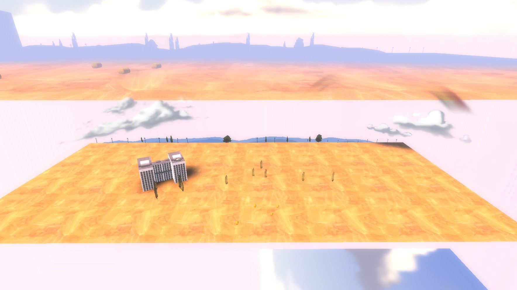
  • New 3D skybox (will obviously change)
4nv9KHG.jpg

p7z0X4a.jpg

  • Redid the bottom entrance into the lobby
  • It now connects to the enemy team's side
  • Metal placement was readjusted to compensate
0TNWiA3.jpg

cvrI8s5.jpg

xaS8ffa.jpg

  • Removed the window and instead made it open
  • This allows for faster rollouts into the enemy territory, meeting in the lobby more often, as a jumping class or scout
  • Also adds a risky skilljump for getting into enemy spawn
0gXlR4H.jpg

General Changes-
  • Fixed a few skins being incorrect
  • Fixed very little clipping
  • Fixed broken sliding door

Read the rest of this update entry...
 

YOYOYO

50 crashes and counting!
aa
Jul 10, 2017
620
556
YAY! a skybox (finally) congratz on 69 downloads.