You are using an out of date browser. It may not display this or other websites correctly.
You should upgrade or use an alternative browser.
You should upgrade or use an alternative browser.
Shoomonger
L4: Comfortable Member
- Jul 8, 2009
- 185
- 55
- Mar 2, 2009
- 986
- 605
Westerhound
L5: Dapper Member
- Feb 5, 2009
- 248
- 104
Near CP 4, on the left side (RED view)
http://dl.getdropbox.com/u/887468/mapscreenies/ctf_snowdrift_test10014.jpg
The wood planks around these doors arent clipped, so you can also stand on em
http://dl.getdropbox.com/u/887468/mapscreenies/ctf_snowdrift_test10004.jpg
http://dl.getdropbox.com/u/887468/mapscreenies/ctf_snowdrift_test10011.jpg
Windowframes that you get stuck on
http://dl.getdropbox.com/u/887468/mapscreenies/ctf_snowdrift_test10008.jpg
http://dl.getdropbox.com/u/887468/mapscreenies/ctf_snowdrift_test10000.jpg
http://dl.getdropbox.com/u/887468/mapscreenies/ctf_snowdrift_test10007.jpg
Standing on the lower frame, generally chillin like a villain
http://dl.getdropbox.com/u/887468/mapscreenies/ctf_snowdrift_test10010.jpg
And some props and brushes you might get stuck on
The sign
The plank a bit right from my aim
The electricity thingy
The metal brush
Healthkit would be good here
http://dl.getdropbox.com/u/887468/mapscreenies/ctf_snowdrift_test10013.jpg
Westerhound
L5: Dapper Member
- Feb 5, 2009
- 248
- 104
Garner
L4: Comfortable Member
- Aug 16, 2009
- 154
- 38
I really liked the gameplay and feel of this map when it was on during the playtest. The payload like progression with the intel was really nice / different and the general outlay was good.
However i do have some reservation over the amount of little rooms / corridors that are used, as there never really is a concentrated area of gameplay, everyone is taking different routes and it makes easy pickings for a well trained (cough cough me) spy
but 9/10 in my evaluation
However i do have some reservation over the amount of little rooms / corridors that are used, as there never really is a concentrated area of gameplay, everyone is taking different routes and it makes easy pickings for a well trained (cough cough me) spy
but 9/10 in my evaluation
Wacky Snoopy is
L1: Registered
- Mar 12, 2009
- 49
- 16
I really liked the gameplay and feel of this map when it was on during the playtest. The payload like progression with the intel was really nice / different and the general outlay was good.
However i do have some reservation over the amount of little rooms / corridors that are used, as there never really is a concentrated area of gameplay, everyone is taking different routes and it makes easy pickings for a well trained (cough cough me) spy
but 9/10 in my evaluation
Ah you.. Bloody fellow spy. Well I wasn't playing as spy.
But. When people learn a map, they learn how to move in the map. So random players like me - who have never played the map before - might be a bit lost, but the good thing in this map is it simpliness. Or how should I say it: the feeling that you constantly know where you should go, instead of wandering in the map.
Released snowdrift_test1, with many changes from b1. Download here. Note that this version is not b2.
Screens:


You might want to turn a couple of those window skins back to the original. It looks so weird with them all using the second skin. Even if it's just one or two, just to break the monotony.
Garner
L4: Comfortable Member
- Aug 16, 2009
- 154
- 38
Im sorry if some of these things have been said before or have been already noticed by you jonah, but incase they havent, ill post some screns  there 1440x900 screens so you may need to enlarge them to see what im on about in each screen.
1st one, looks like the door texture isnt aligned to the floor properly

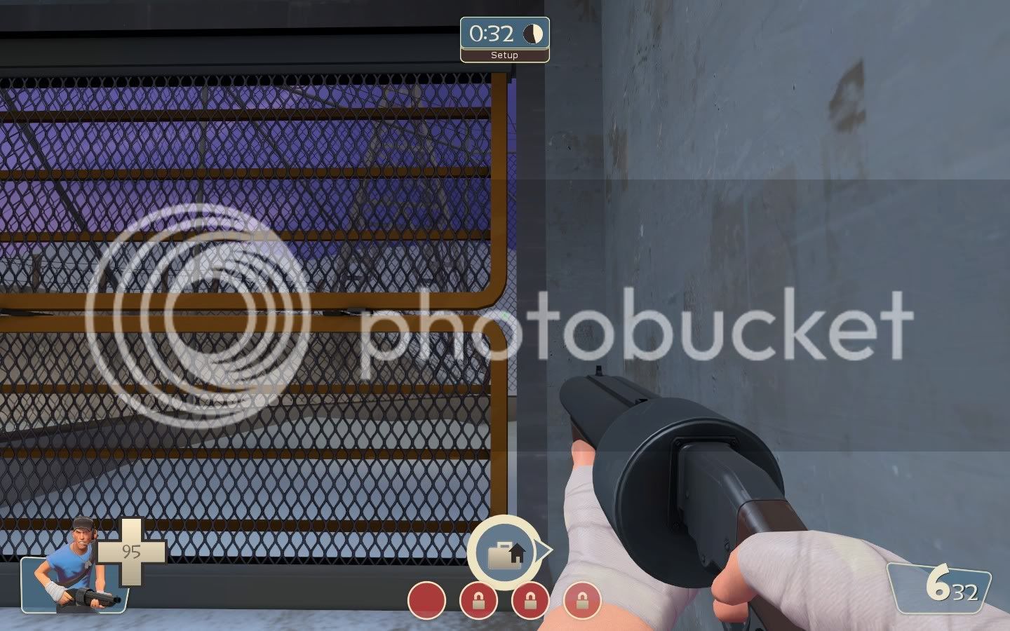
2nd one, setup gates seem to not be flush with the wall + the metal "feet" in the middle seem to not align.
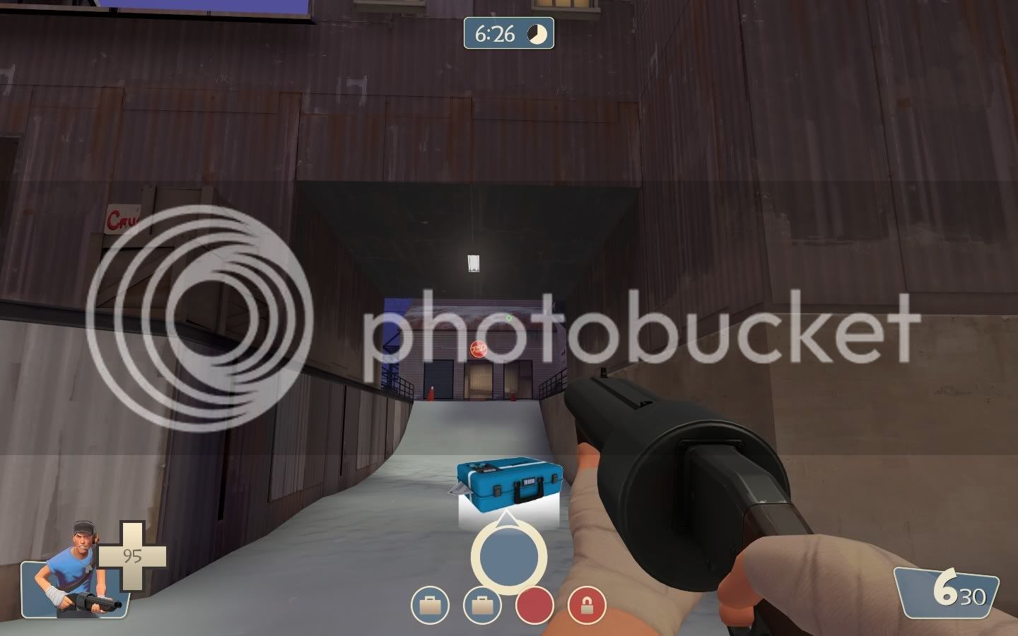
3rd one, this passageway seems to be a bit bare (understand its an alpha test but just informing you )
)
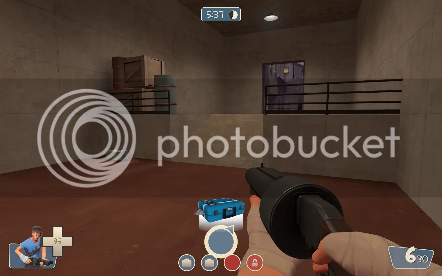
4th one, some ramps could be scrapped and steps used instead as it would look a bit better.
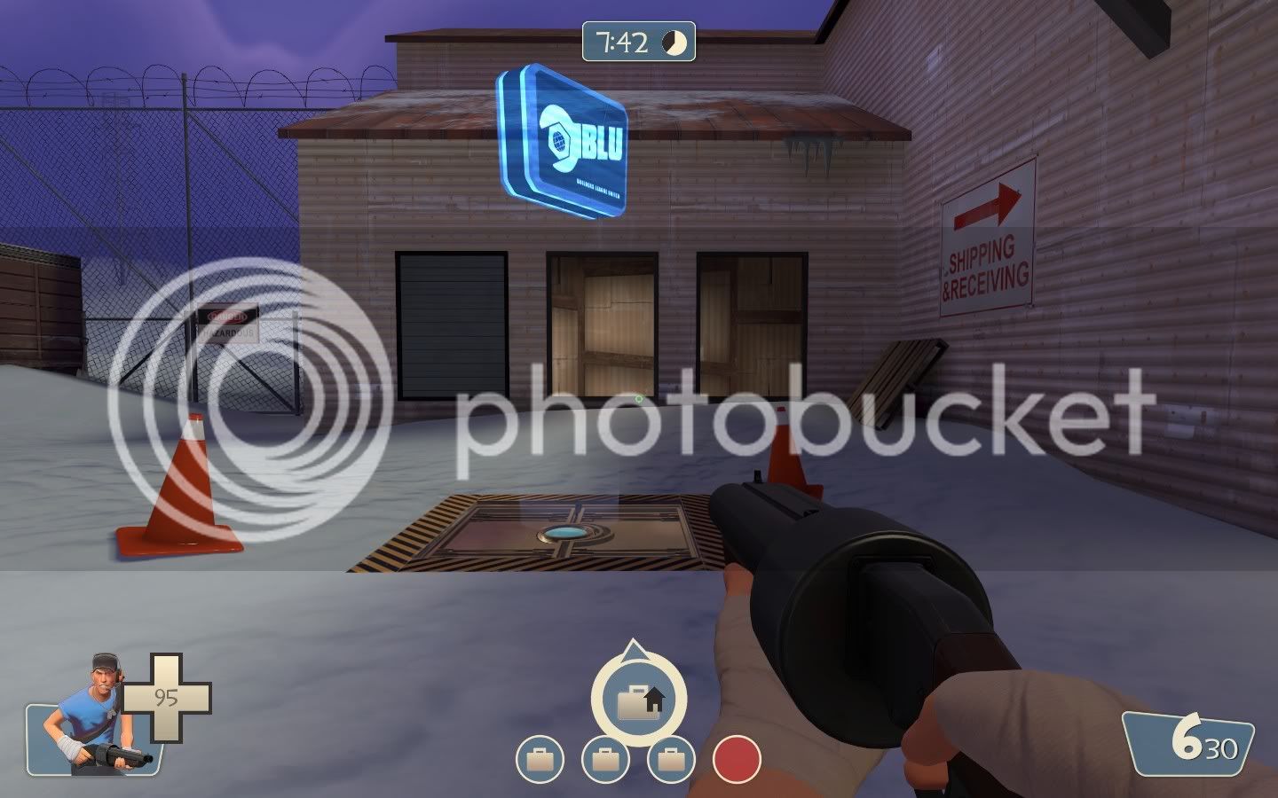
5th one, these two window in particular may need to have the support bars (however no glass) as people can just run through them which provides snipers and other classes no cover if they are in there. Having no glass in the windows still allows snipers/demos ect to shoot through them.
Those are my recommendations, usually i dont provide such indepth feedback for maps, but i thoroughly enjoyed this map, the gamemode and i believe with continued feedback and progression in developing the map it will be a fantastic map
Loved it on the gameday, will be watching this map
1st one, looks like the door texture isnt aligned to the floor properly

2nd one, setup gates seem to not be flush with the wall + the metal "feet" in the middle seem to not align.

3rd one, this passageway seems to be a bit bare (understand its an alpha test but just informing you

4th one, some ramps could be scrapped and steps used instead as it would look a bit better.

5th one, these two window in particular may need to have the support bars (however no glass) as people can just run through them which provides snipers and other classes no cover if they are in there. Having no glass in the windows still allows snipers/demos ect to shoot through them.

Those are my recommendations, usually i dont provide such indepth feedback for maps, but i thoroughly enjoyed this map, the gamemode and i believe with continued feedback and progression in developing the map it will be a fantastic map
Loved it on the gameday, will be watching this map
Wacky Snoopy is
L1: Registered
- Mar 12, 2009
- 49
- 16
Im sorry if some of these things have been said before or have been already noticed by you jonah, but incase they havent, ill post some scrensthere 1440x900 screens so you may need to enlarge them to see what im on about in each screen.
1st one, looks like the door texture isnt aligned to the floor properly

3rd one, this passageway seems to be a bit bare (understand its an alpha test but just informing you)

Those are my recommendations, usually i dont provide such indepth feedback for maps, but i thoroughly enjoyed this map, the gamemode and i believe with continued feedback and progression in developing the map it will be a fantastic map
Loved it on the gameday, will be watching this map
1st one, who cares? I think the door is an overlay as well.
The second pic, I have to disagree with you. Not EVERY damn wall should be detailed, not every area needs to be detailed. And if I have understood right, I don't know, it SEEMS that there could be a lot of action going on, and so I hardly think anyone would notice.
I have to agree on your later statements though
- Mar 2, 2009
- 986
- 605
http://dl.getdropbox.com/u/1490725/ctf_snowdrift_test20000.jpg
A BLU spawn, playerclip that wall.
http://dl.getdropbox.com/u/1490725/ctf_snowdrift_test20001.jpg
Somewhere, the rest of that wall is playerclipped, just not that one spot.
http://dl.getdropbox.com/u/1490725/ctf_snowdrift_test20003.jpg
Some of the brushes aren't being rendered?
http://dl.getdropbox.com/u/1490725/ctf_snowdrift_test20004.jpg
Oh, there appears one of them.
http://dl.getdropbox.com/u/1490725/ctf_snowdrift_test20005.jpg
Wait...it's gone again?
Oh, and Garner? I think the windows are supposed to be like that.
Garner
L4: Comfortable Member
- Aug 16, 2009
- 154
- 38
1st one, who cares? I think the door is an overlay as well.
The second pic, I have to disagree with you. Not EVERY damn wall should be detailed, not every area needs to be detailed. And if I have understood right, I don't know, it SEEMS that there could be a lot of action going on, and so I hardly think anyone would notice.
I have to agree on your later statements though
Yeah, i know the first one is a small thing, but it seems odd, better to just take 2 mins to fix than to leave it.
I agree that every wall doesnt need to be incredibly detailed, but the setup gate is one of the most looked at doors in TF2 and having that gap down the side looks, to me anyway, unnatural compared to most maps iv played.
Oh, and Garner? I think the windows are supposed to be like that.
Yeah, i know lol
But was just saying, since that one room/corridor with the windows can be accessed from both sides and another enterance, having the windows "open" and have the ability for players to walk through them, it gives very little cover to snipers (seems like a decent sniping spot) and other classes that are using that room.
Especially since its on a main corner where there will be alot of action (which would be the case on 24slot and 32slot servers)
So giving the windows some bars / supports (whatever the "+" is on a window) snipers and other classes can have some protection from stickies, grenades and people walking through the windows.
- Feb 1, 2009
- 1,094
- 1,085
Yeah, that's because there's a skybox brush there to prevent demos from shooting grenades to the last point from the other side of the building. I need to get rid of the tower completely to fix thathttp://dl.getdropbox.com/u/1490725/ctf_snowdrift_test20003.jpg
Some of the brushes aren't being rendered?
http://dl.getdropbox.com/u/1490725/ctf_snowdrift_test20004.jpg
Oh, there appears one of them.
http://dl.getdropbox.com/u/1490725/ctf_snowdrift_test20005.jpg
Wait...it's gone again?


