Sabotage

Sabotage b2e

Waif

L7: Fancy Member
Mar 22, 2009
412
125
hey grazr, notice you give other mappers ludicrous amounts of feedback, so I'm going to try and give some back :p

Can't say I have played the map properly, actually haven't done that at all for any ctf-contest maps, but I did have a fly around.

Therefore take this with a grain of salt: Gameplay impressions (this is all speculation): apart from the middle section it looks like there could be too many routes, spaced too far apart, in each teams base. Scooting around with my spec-cam, I was thinking: while this may prevent turtling/ chokepoiting to some degree, it may break the team apart- and there are bound to be routes that are hardly used. As I said, this is talking from my own mapping experiences (however small) and not actual testing.

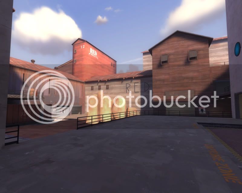
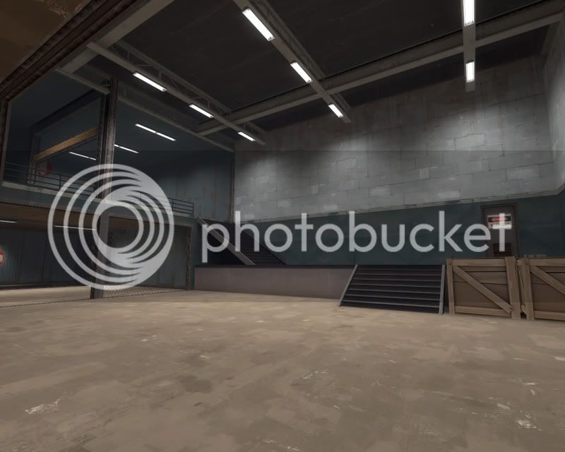
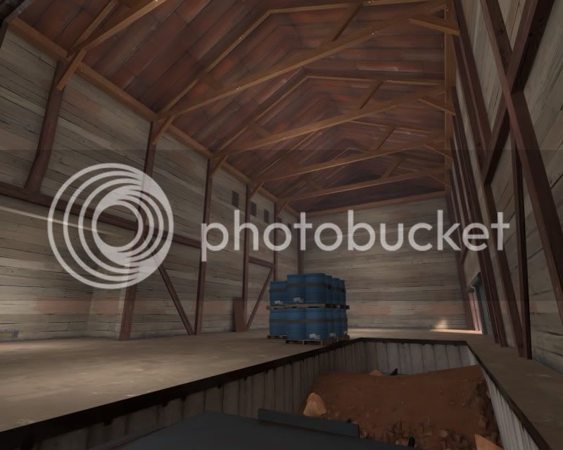
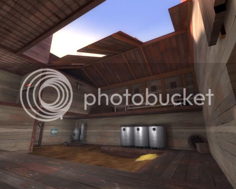
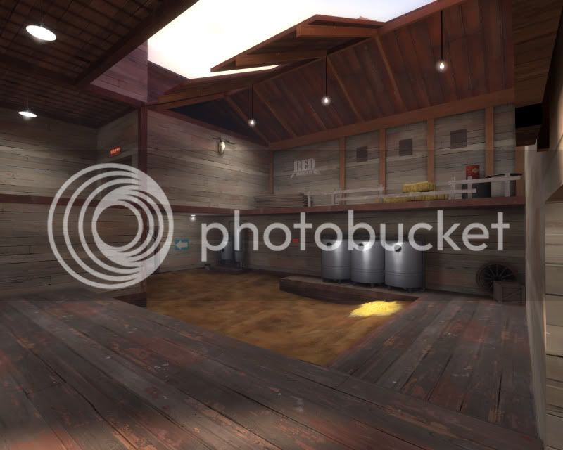
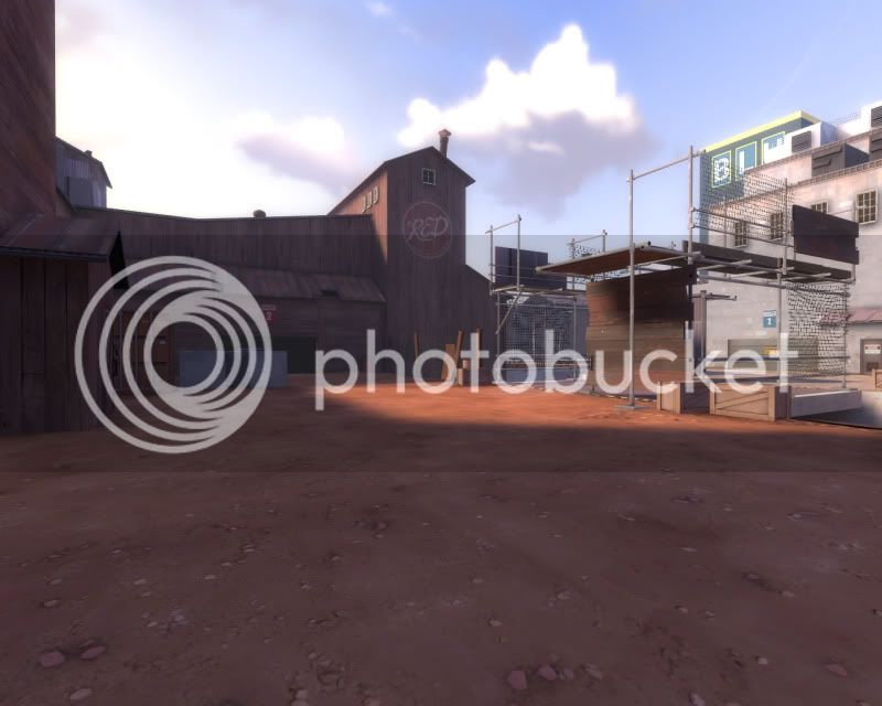
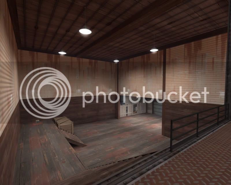
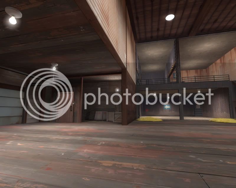
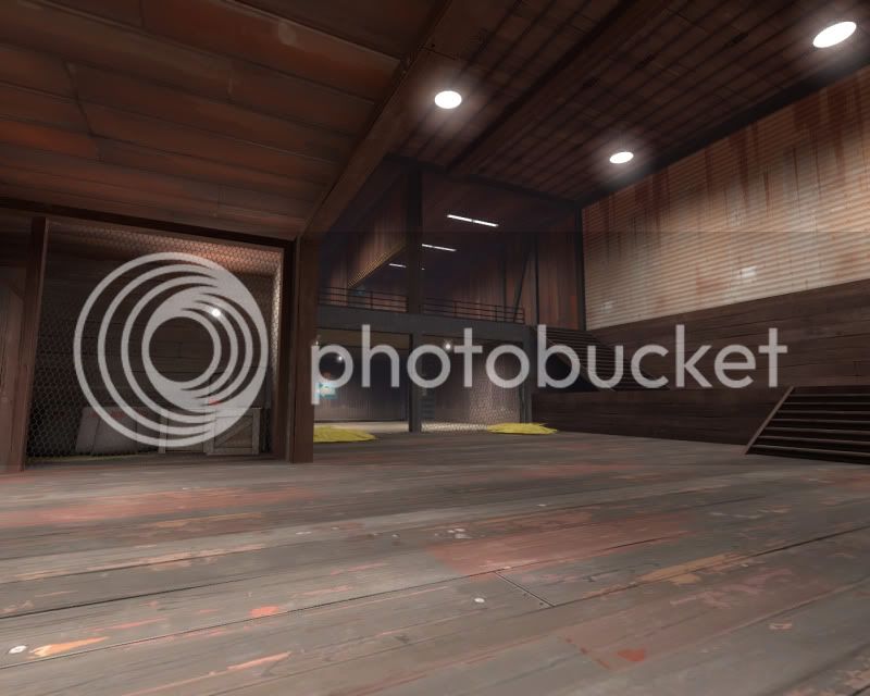
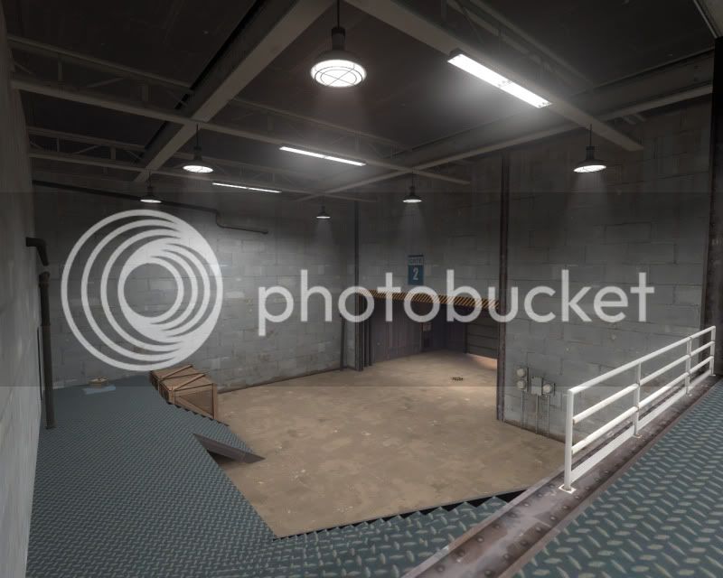
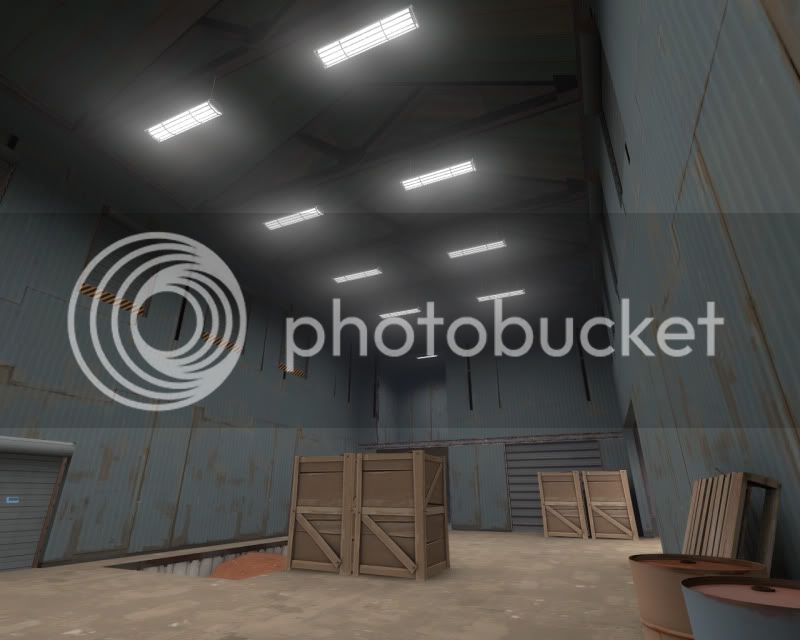
I also notice you have it named as beta, however in my eyes the detailing is not up to that level yet! There are simply too many plain old cube based geometry buildings. Why not spice them up with some unorthodox angles/ curves for interest? Add some more props, refine your theme and setting! Some screenies: (you probably know about the majority of these anyway)


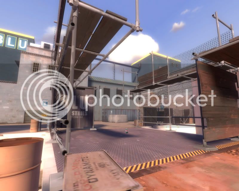
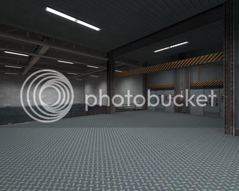
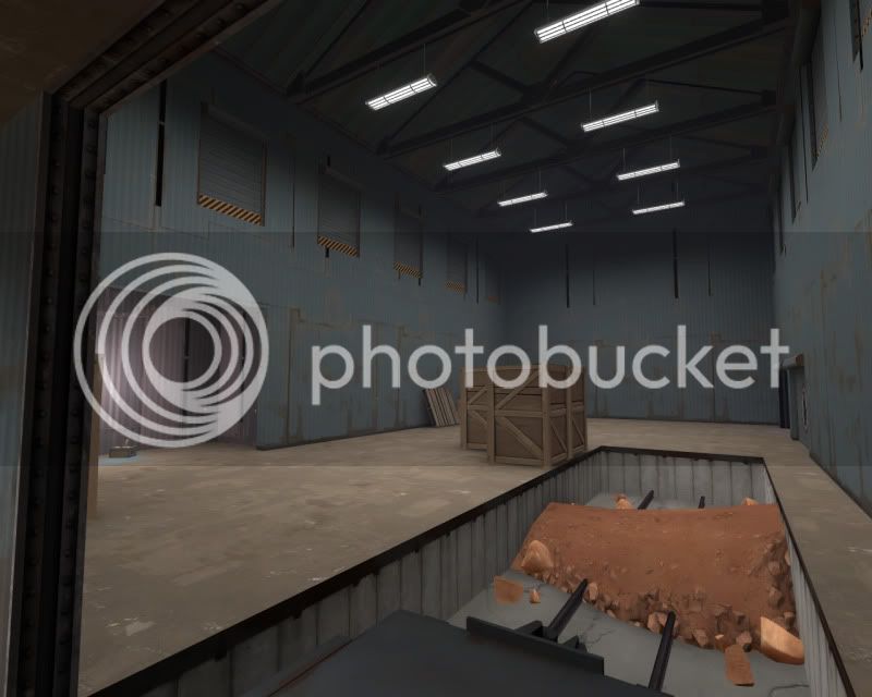
Is that the areaportal I can see...

From the inside..

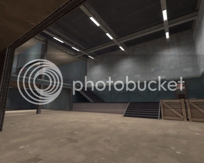
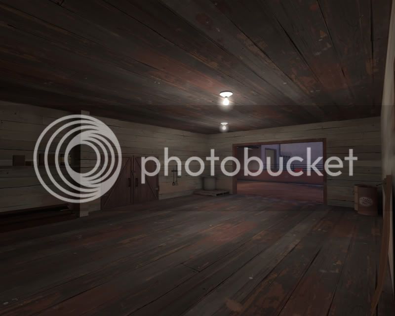
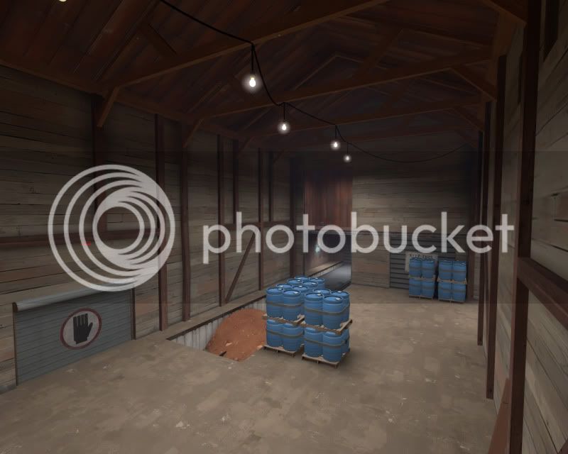
As I said, too basic geometry, over use of the one texture, just not enough detail ingeneral in this area!


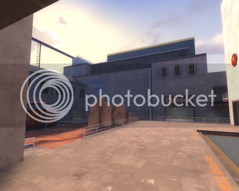
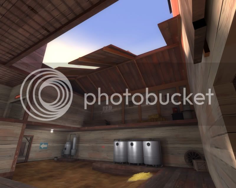
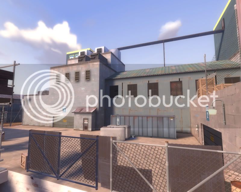
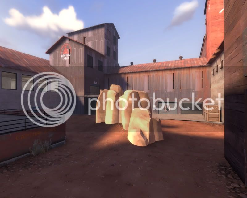
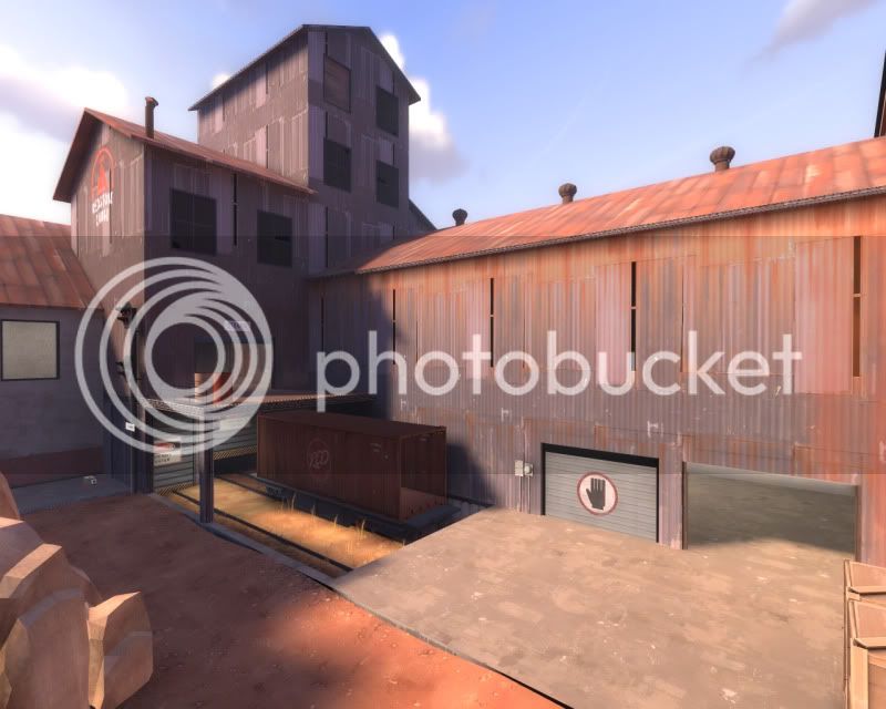
See the building above the creek? Too square, plain looking and it seems out of place with its surroundings. What is its purpose? The red/blue bases either side look quite nice btw!

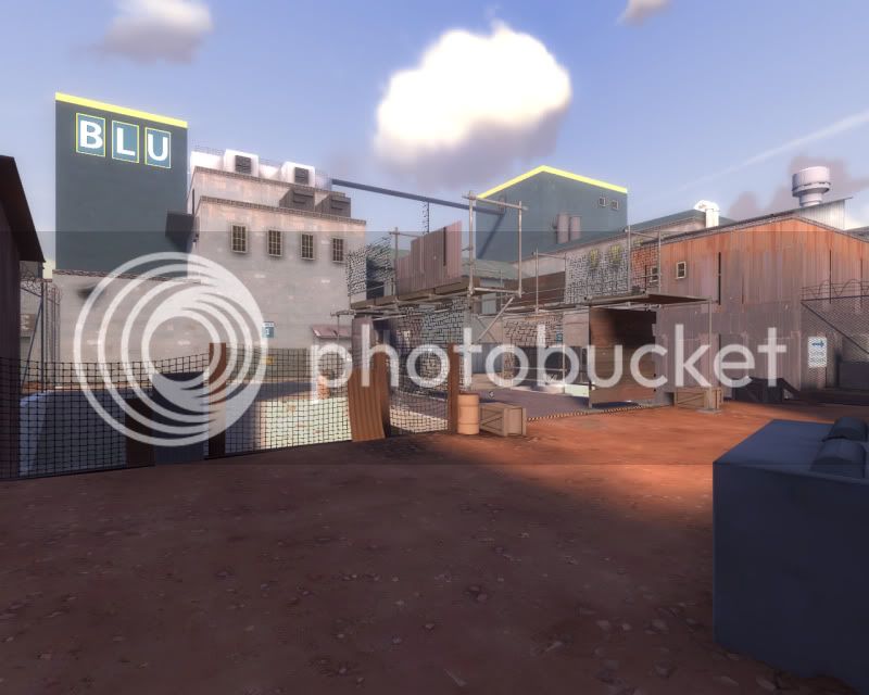
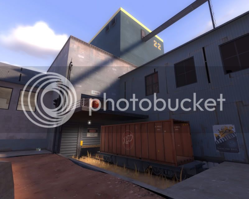
Immersion issue, that train track is ridiculous ! It burrows directly into concrete on oneside and wall on the other.

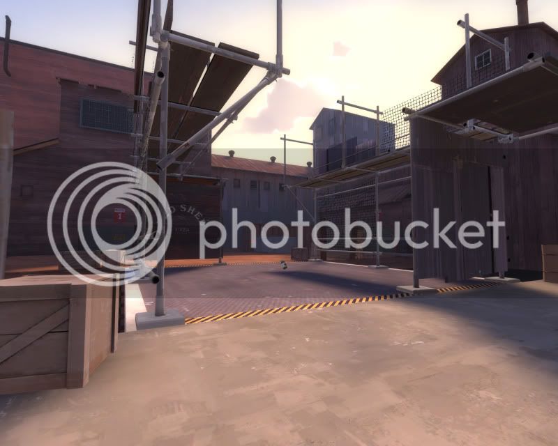
Odd shadows where displacement meets brush, nothing too major!

Nasty prop shadow!

Notice the dirt texture outside the fence and inside don't match at all?

Hope that helped, even a little bit. Cheers
 

A Boojum Snark

Toraipoddodezain Mazahabado
aa
Nov 2, 2007
4,775
7,670
Good areaportals that should keep rendering acceptable even when the map is fully detailed.
[01] This areaportal doesn't really serve a purpose.
[02] Nodraw

Overall the style of the map feels a little off. I think the heavy mixing of different types and shades of materials that changes abruptly plus the sparseness of detail leads to this.
[04] The flat colored stripes around the top of these buildings is a little ugly and out of place.
[05] These are on their way to being good but still need a fair amount of detailing/trimming. Texture repetition should be reduced. Also... window frames just slapped onto of metal?
[07] Quarter-scale sign overlays make me sad. They should be one-eighth.
[08] I'm assuming you are aware this is devtex. It does blend in a fair bit though. Also one in the room to the right and in the water.


[00] Why are these non-solid?
[03] You can climb up here on red's side but not blu's.
[06] Same here, because the dirt around the concrete block is a unit or two higher than blu's concrete. Both of these spots lend themselves to sentry lockdowns.
 

grazr

Old Man Mutant Ninja Turtle
aa
Mar 4, 2008
5,441
3,814
Thanks guys. I appreciate the effort.

Waif, you're probably right, i merely released it as beta for the contest when it was probably 1 more version away from being a proper beta release. I decided to go B1 because 99% of it was out of DEV textures with substantial minor details added. The map is still lacking a lot of detail as it is though, as you said, enough that the map's theme isn't explained very well. Hopefully B2 will address most of your concerns.

As for the paths being very split up, the layout was designed for 6vs6 where players would stick together and choose 1 of 3 potential routes to the capture zone. Path A) takes you past the enemy spawn with a high chance of interception but quicker chance to cap B) takes you through the middle of the base where you have more space to manouvre but are more easily spotted on approach and flanked, whilst C) is the furthest route to the cap zone but has more health/ammo, cover and less chance of direct interception.

In Public play however, the bases seperated routes might be considered extensive, especially when you equate static defenses (SG's). Hopefully it's not as bad as suggested because essentially there are 2 chokes at the entrances to the base and 1 choke at the objective. I'll be baring this in mind though as further releases will be for the public domain, where i can get more recognition and feedback.

@Booj: I'll address those minor imbalances in my next release, thanks for pointing them out. As for the windows, i think they just have a low fade distance i forgot to remedy. I'll address the aesthetics as well.
 
Last edited:

grazr

Old Man Mutant Ninja Turtle
aa
Mar 4, 2008
5,441
3,814
ctf_sabotage_b2a0000.jpg


New Sabotage soon.
 

grazr

Old Man Mutant Ninja Turtle
aa
Mar 4, 2008
5,441
3,814
ctf_sabotage_b2a0007.jpg


It's taken me a while longer to bring this map up to scratch beta wise, mostly because i was focusing on axle, but also because i actually lost the latest version. I've been working on seperating the areas via skybox brushes for optimisation purposes.

Currently i'm working on the lighting and then hopefully each following update can primarily be focusing on ground and out of bound details.

FYI the map has been turned into standard CTF. The map was initially balanced for invade mode, but i have a feeling it's balanced enough this way too (it's similar in design to ctf_turbine), i'll just need to test the faster than usaul spawn waves. which is either 6 vs the standard 20 or 12 vs standard 20; originally designed for 6vs6 comp play.

Not sure when i'll actually release this new version. If i say in 7 days it'll probably be more like 12.
 
Last edited:

tyler

aa
Sep 11, 2013
5,102
4,621
That roof in the last shot looks like it should be falling down any second. As in I'm not sure how half of it is supported.
 

grazr

Old Man Mutant Ninja Turtle
aa
Mar 4, 2008
5,441
3,814
Sheet/corrugated metal is pretty godamn light. It can easily be supported from a single side, let alone 3 of 4 sides. I'm guessing this is something you've neither researched nor studied, let alone took physics, geology or architecture in further education?

Traditional UK railway platforms frequently feature a corrugated metal roof supported by a single spine beam, on single file pillars, with supporting ribs.

http://www.trainspots.co.uk/200-299/fratton/0012004_0728_133538.jpg
 
Last edited:

Seba

DR. BIG FUCKER, PHD
aa
Jun 9, 2009
2,364
2,728
I'm less concerned about the sheetmetal than I am about the beams that support it; are they only attached in one place? Also, that wooden outcropping in the second from last pic looks very odd, I'd make it a vertical beam or something.
 

grazr

Old Man Mutant Ninja Turtle
aa
Mar 4, 2008
5,441
3,814
It has 2 ribs, but if it makes you feel any better, the thing is obviously in disrepair and falling apart. If its straightness is bothering you i could make it a displacement with warps in it's shape. But ultimately it's a ceiling detail and the amount of players that will see it may not justify the extra detail seen from both the inside, here, and the outside intel area. Maybe i'm being pedantic about performance... but, I've simply put it on display in a SS here; i guess i should understand that people will pick at it like that if i do that.

@ Seba: I guess you're right. I'll take a look at 2fort again for some reference on the downstairs area shelving details in both bases.

In the mean time:

ctf_sabotage_b2a0020.jpg

ctf_sabotage_b2a0017.jpg

ctf_sabotage_b2a0016.jpg

ctf_sabotage_b2a0018.jpg
 
Last edited:

grazr

Old Man Mutant Ninja Turtle
aa
Mar 4, 2008
5,441
3,814
ctf_sabotage_b2b0000.jpg

ctf_sabotage_b2b0001.jpg

ctf_sabotage_b2b0003.jpg

ctf_sabotage_b2b0002.jpg


The sand is left over from a previous detail, a shute from above which has since been removed. I'll have to figure out another detail that will allow players to exit the ditch that doesn't cause dissonance.
 
Last edited:

Pocket

Half a Lambert is better than one.
aa
Nov 14, 2009
4,696
2,580
I'm really liking the detail. I can't put my finger on why, but it just really sells its atmosphere.
 

grazr

Old Man Mutant Ninja Turtle
aa
Mar 4, 2008
5,441
3,814
ctf_sabotage_b2b0005.jpg


I might have made some of these lights too bright...

ctf_sabotage_b2b0006.jpg

ctf_sabotage_b2b0013.jpg

ctf_sabotage_b2b0008.jpg

ctf_sabotage_b2b0009.jpg


I also just realised there are no soundscapes in the version i saved :( that's gonna be a tedious task... unless i decompile my current version on the site, hm.
 

Seba

DR. BIG FUCKER, PHD
aa
Jun 9, 2009
2,364
2,728
The only sounds a map ever needs are the sounds of mercenaries dying.
 

grazr

Old Man Mutant Ninja Turtle
aa
Mar 4, 2008
5,441
3,814
ctf_sabotage_b2c0001.jpg

ctf_sabotage_b2c0002.jpg

ctf_sabotage_b2c0006.jpg

ctf_sabotage_b2c0003.jpg


Trying to figure out something to put on that big plain wall in RED's base that isn't windows, or maybe i should just put windows in after all, it'll probably look better on the inside that way too. Even if i have to work around a lot of wooden beams.

ctf_sabotage_b2c0007.jpg
 
Last edited:

grazr

Old Man Mutant Ninja Turtle
aa
Mar 4, 2008
5,441
3,814
ctf_sabotage_b2c0009.jpg


___________________________

Is this too much blurry white?

ctf_sabotage_b2c0012.jpg


I'm trying to find a good light balance. Ever since i reduced HDR so it was less intense on the white concrete walls outside, the inside has also gotten darker; most notably where i depended on high light bounces to illuminate the ceilings. It seems to look a little better in the screen shots than it does ingame, probably because it's a static image or what ever... the contrast appears to be less apparent. It's still kinda bugging me though.

Is there a way to set fade distances to sprites? Right now i'm using env_lightglow's but it's quite expensive when you have about 12 of them in a single room and controlling their attributes is tricky when the entity is seen from all 3 of the 3D perspectives. Sprites worked fine but with HDR enabled, any more than 3 lined up infront of the player and the bloom is piercing white where they overlap.

This room takes a hit of -80 to my FPS, from 300, because of the env_lightglow's; which may be within acceptable limits (220 FPS is more than reasonable), but this is without combat, i'm not done detailing it either and i know plenty of people run TF2 on much lower cards than my GTX 460.
 
Last edited: