Sabotage

Sabotage b2e

grazr

Old Man Mutant Ninja Turtle
aa
Mar 4, 2008
5,441
3,814
Huh, ok. I'm not sure about your comments on use of textures. The BLU base is primarily blue a.k.a. badwater's first 2 cp's and the RED base is red and white wood a.k.a. 2fort. The right flank's for both teams are mostly metal but half the doorways in the map have colour oriented arrows.

Could more people talk about the flow issues because i really don't get what trouble people are having (since i made the map and know where to go i don't get it). You take the left flank passing the enemy spawn and go forwards then right or you take the right flank away from the spawn and its "]" shape; entering the door, turning left and keep moving, then one more left and you're on the capture point.
 

grazr

Old Man Mutant Ninja Turtle
aa
Mar 4, 2008
5,441
3,814
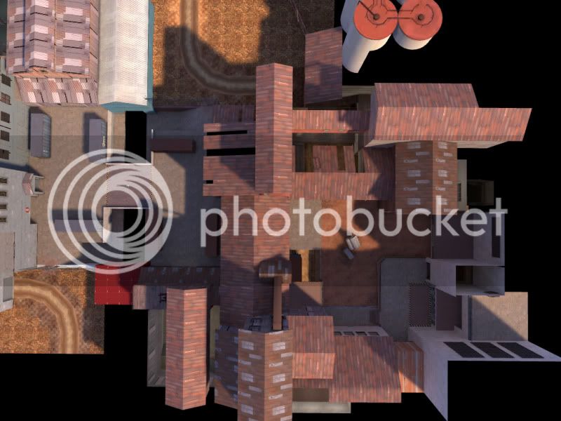
Hey grazr, is it possible to get a top down view? :D

I'm actually doing that right now! I was just checking to see if the gameday demo was up yet (which it's not) since a lot of comments were made in game. I was having trouble hearing people and reading all the text and playing at the same time.

Check back in 5 minutes and it should be here in this post.
 

Sel

Banned
Feb 18, 2009
1,239
2,570
Doors, fucking doors everywhere.

Doors that open, doors that stay shut, doors with holes in the top.

There's way too many. Today's test was comprised of people running into walls expecting them to open up for them. Replace them with something else please.
 
Jan 20, 2010
1,317
902
I'm actually doing that right now! I was just checking to see if the gameday demo was up yet (which it's not) since a lot of comments were made in game. I was having trouble hearing people and reading all the text and playing at the same time.

Check back in 5 minutes and it should be here in this post.

Coo, thanks grazr. :)
 

grazr

Old Man Mutant Ninja Turtle
aa
Mar 4, 2008
5,441
3,814
ctf_sabotage_a40019.jpg


ctf_sabotage_a40019b.jpg


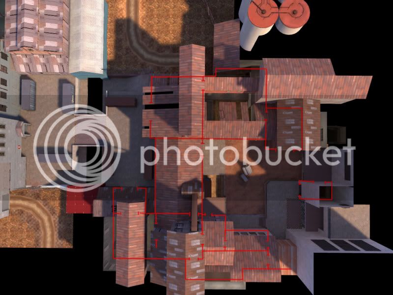
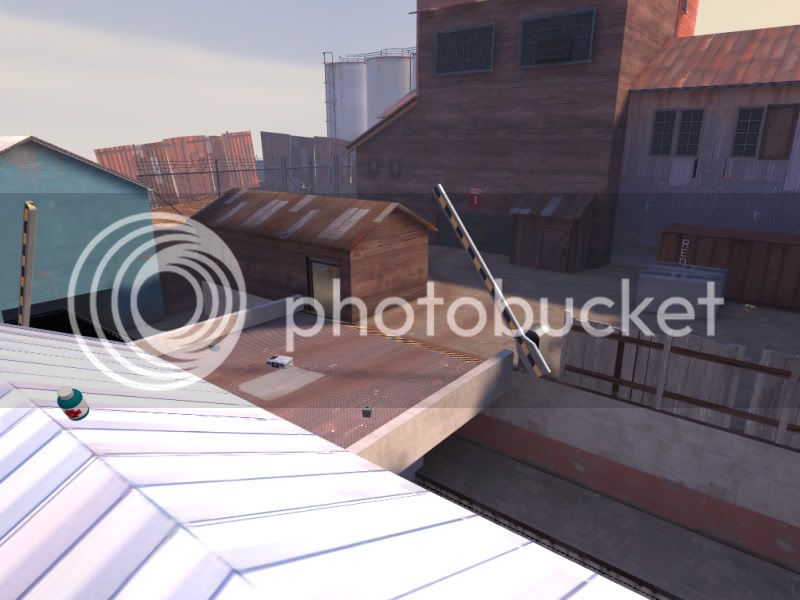
Sorry it's so zoomed in, i can't get a shot further out... But that's one base and the middle so that should suffice? They are completely symmetrical.

...Today's test was comprised of people running into walls expecting them to open up for them. Replace them with something else please.

There was one door on the front of both bases that wont open and there are arrows pointing to the doors you're supposed to take. I'll bare the door issue in mind, though. It's just that without doors there is a lack of optimisation possibilities, the alternative is corridors which isn't that much better. There are no more doors than what are in badwater so i'm surprised this was an issue.
 
Last edited:

grazr

Old Man Mutant Ninja Turtle
aa
Mar 4, 2008
5,441
3,814
After watching the demo, scores were 10-5 in Blue's favour, largely due to a 5 cap steam roll in the initial stage of players joining and learning the layout. Blue were quickest to learn the base routes and exploited the paths available.

There were several comments from RED regarding nobody using the left flank, despite the fact that that's exactly where BLU kept scoring captures from. After the 5 or so initial captures, RED went defencive and set up some sentries which balanced out the game to 5 more captures for both teams.

When i address the none respawnsive spawn times... hopefully the left flank will be more viable with enemies being chucked out the spawn room more frequently.

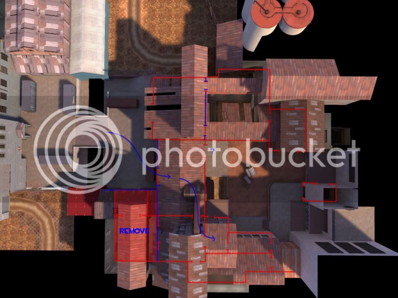
What about this?

ctf_sabotage_a40019e.jpg


Not sure whether to remove the doorway by the blue question mark though.

Travel time to that far flank is a little on the excessive side. You can reach it by the same time the enemy grab the intel. I was considering adding a secondary spawn like 2fort, but A) that would spawn players away from each other, i imagine that might be annoying in 6vs6? B) it may spawn players on the wrong side of the map to the role they intend to play (A/D).
 
Last edited:
Jan 20, 2010
1,317
902
Alright, here's my input with images:

First thing I noticed when I started up was this door:

ctf_sabotage_a40000.jpg


Like Selentic said so elquently, you seem to like this a lot. Random doors that have no clear indication that they won't work. Either remove them or give the the "closed door" skin. The red cross with the hand. Here's a couple more:

ctf_sabotage_a40003.jpg

ctf_sabotage_a40008.jpg


Right as I exit the spawn door labeled "intelligence" I run into a wall. I am okay with that, but add an arrow telling me to go right. Makes it less awkward:

ctf_sabotage_a40001.jpg


I think you could open up one or two of these windows:

ctf_sabotage_a40005.jpg


I like having an overlooking view of the CP like that but I feel like there's a missed opportunity there.

ctf_sabotage_a40004.jpg


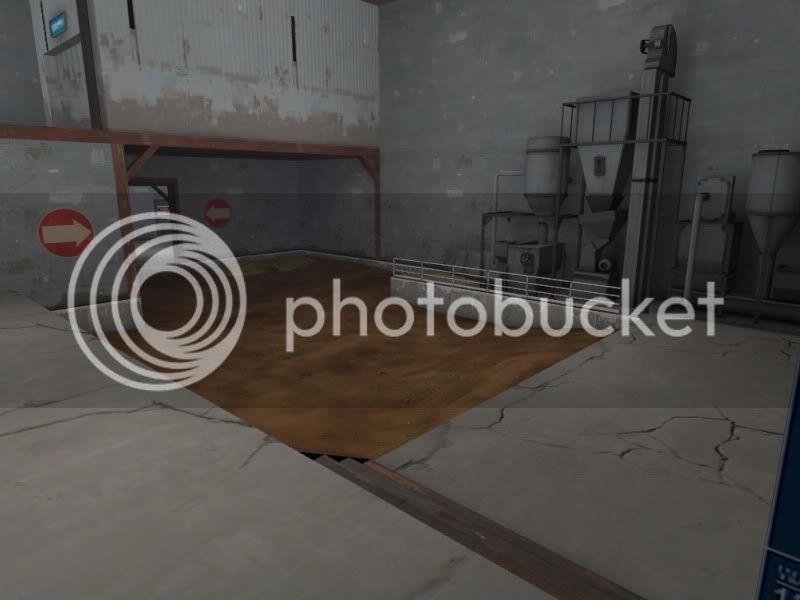
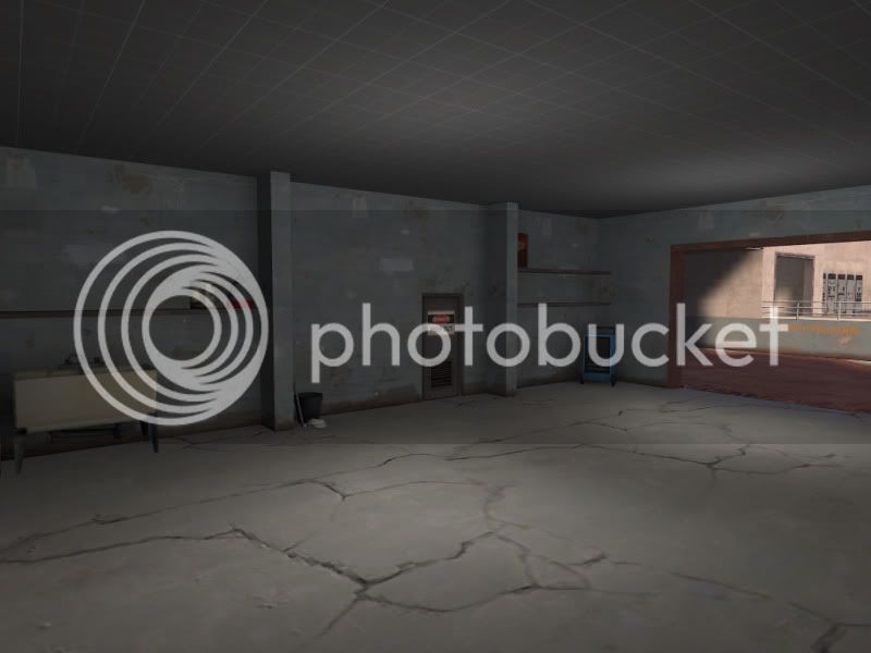
This room on both sides seems weird and empty. It might be the lack of detail, but it feels like it needs something.

ctf_sabotage_a40002.jpg


All four of these doors need to be fixed. The gap on top should be closed (unless that's a stylistic choice I am not getting) and their triggers need to be bigger. As a scout I would run into the door before it fully opened and be slowed down for a second or so.

ctf_sabotage_a40007.jpg


Need a sign that says this is the spawn room. Either on the wall to the left with an arrow pointing right (that'd be my choice) or above the doorway.

ctf_sabotage_a40009.jpg


Weird lightmaping going on here.

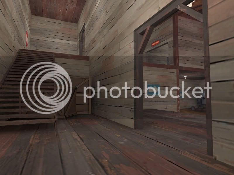
Final thing, I LOVE the look of the red side. Especially how bright it is. However, the blue side feels like a claustrophobic cave. Example. This room is pretty and bright on red side:

ctf_sabotage_a40010.jpg


On the blue side however it is dark (way too much so) and not very pretty at all.

ctf_sabotage_a40011.jpg


I'd say add a skylight of some sort in the same vain as the red side to let some light in. Really, the whole blue side kinda feels like this.

That's all, hope it helps. :D

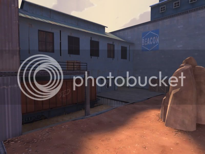
Edit: Oh yeah, on the blue side you have some red props sitting around. Like a red crate and red arrows pointing to the capture point.
 
Last edited:

grazr

Old Man Mutant Ninja Turtle
aa
Mar 4, 2008
5,441
3,814
The doors were the first thing i addressed after the test. The triggers are larger, the gap is gone and i just need to increase their speed a little for the scout.

Regarding details, i'm only in alpha, so existing details are minor or just for "solidizing" the theme. Because i'm in alpha my lights are temp and a little all over the place but thanks for pointing those out.

You should see more details on the spawn side of the map which should address these issues (for blue in particular) in the next release. Hopefully i can get it out before the deadline (I'll need to in order to pack the novint gear >.>).
 

grazr

Old Man Mutant Ninja Turtle
aa
Mar 4, 2008
5,441
3,814
Yup, It's the lack of a collision model that does that (chicken wire fences and rocks etc do the same), i've now turned the shadows off so it shouldn't be a problem now.

Just a small update:
sab-a5.jpg


Front left of base reduced by 25% in size, middle buildings length reduced by 10%, room outside spawn's width reduced by 20%, combined the 2 left flank corridors into 1 room to simplify layout. I just wanna add that one possible reason why areas seemed large in play testing was largely because i had no significant details, just massive walls. Other rooms have come to a more respectable size now that details are starting to fill them out and provide scale reference besides other players. Also, i've added cover between the 2 base entrances in the form of huts with a tiny sniper window.

I havn't changed the middle or capture zone sizes mostly so i can chuck out B1 for the contest. I could have delayed it significantly to reduce total map size but i'm hoping i can simply make the "large" size less noticable by use of ground cover (a'la the start of Badwater, which is huge but doesn't seem so massive because of rocks and ledges), since the map wasn't HUGE but it did seem large for ctf. All in an effort to submit it for the deadline.

I'll get a5 out before the deadline, see how the odd test goes, then release B1 (largely the same) for the contest submission, along with the Novint gear.
 
Last edited:

Penguin

Clinically Diagnosed with Small Mapper's Syndrome
aa
May 21, 2009
2,039
1,484
Looks like we've got a case of...

Sabotage.

YEEEEEEEEEEEEEEAAAAAAAAAAAAAAAAAAAAAAAAH!!!!!!!
 

grazr

Old Man Mutant Ninja Turtle
aa
Mar 4, 2008
5,441
3,814
a5 coming this weekend. Mostly i want to test the new spawn wave timers and the huts in the middle+fences before going beta and submit to the competition.

ctf_sabotage_a50001.jpg

ctf_sabotage_a50009.jpg

ctf_sabotage_a50010.jpg

ctf_sabotage_a50014.jpg

ctf_sabotage_a50017.jpg


Also, can someone point me in the direction of the capture block template? I guess i should add that in as well.

edit: other images

http://img.photobucket.com/albums/v213/grazr/ctf_sabotage_a50007.jpg
http://img.photobucket.com/albums/v213/grazr/ctf_sabotage_a50008.jpg
http://img.photobucket.com/albums/v213/grazr/ctf_sabotage_a50011.jpg
http://img.photobucket.com/albums/v213/grazr/ctf_sabotage_a50012.jpg
http://img.photobucket.com/albums/v213/grazr/ctf_sabotage_a50015.jpg
http://img.photobucket.com/albums/v213/grazr/ctf_sabotage_a50019.jpg

I'm also pretty stumped on alternative cover in the middle, i have 3 different variations of the huts, some with no back wall etc. The trouble is providing cover in the middle blocks sight of the intel, which really bothers me, and the huts themselves take up a fair bit of room (though they do fit fine). The only other cover i've implemented and tested were the hydro fences which are so boring, unimaginative and over used.
 
Last edited:

grazr

Old Man Mutant Ninja Turtle
aa
Mar 4, 2008
5,441
3,814
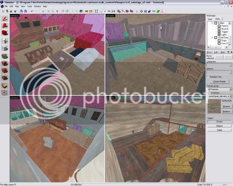
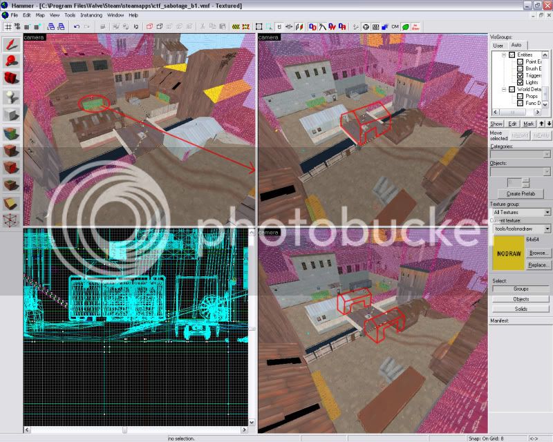
Before i release the beta, i'd like to get a little feedback on the middle of the map. Currently i have 2 huts on the side of the bridge that are intended to cut sight lines between both roller door exits:

sab-sight.jpg


The trouble with the existing 2 huts is that they block line of sight to the intel; which is awkward because the doors lie at opposite sides of the intel which makes it kind of unavoidable, but more importantly it blocks a large portion of view of the bridge too, so players are denied visibility of the most important location of the map. Coming out of the base exit (which is a closed door) and walking into a medium sized hut wall seemed to be kind of a flow breaker when i tested it by myself. I experimented with a single hut on the bridge itself but it looked pretty horrific, plus every other ctf map seems to have a central hut in this competition.

The bottom right Hammer camera shot was my third solution and would also allow for players to come from the side of the hut and shoot onto the bridge from there, but i wanted to get a few words of advice from people who've played this map and gotten different impressions about its gameplay. Previously containers covered the position the 2 huts have, but they were bulky and required moving over into the path to the bridge to properly cut sight lines between the base exits. I didn't want to obstruct access to the bridge that much and replaced them with the accessible huts which also provides a sniper position in one of the windows.
 
Last edited:

grazr

Old Man Mutant Ninja Turtle
aa
Mar 4, 2008
5,441
3,814
Which version of the 2 huts? The ones directly opposite the bridge ends or the one with the huts to either side of the bridge (as they are now).