Recreating a font, feedback appreciated

  • New users! Unable to confirm your account via email? Contact nesman on discord, there's an issue with the email server. *unrelated to the recent issue that we DM'd everyone about.

Tumby

aa
May 12, 2013
1,087
1,196
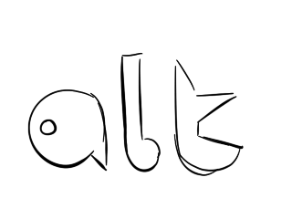
I'm trying to make a full font out of the vib-ribbon title. Only 6 letters are given, meaning I need to come up with 20 fitting designs. (Except for a bunch which can be just made by mirroring.)
Anyways, some letters are giving me trouble, like f, l and t. I'd really like some feedback and ideas.

Reference is located at the bottom of the image.

c10e342aaa.png

Only a sketch! Letters have so far been handdrawn and will be turned into an actual font-file once all letters are final.

You might be wondering why I'm even doing this. Well, there is no real answere. I'm just feeling like it.
I'm also not too sure what to do with capital letters. I gues lowercase and capital are just gonna be identical.
 

Pocket

Half a Lambert is better than one.
aa
Nov 14, 2009
4,711
2,587
I'd make the gaps in the U, and maybe even the S and Z, a little narrower. As for A, L, and T... maybe something like these?

Y4GPTxU.png
 

Tumby

aa
May 12, 2013
1,087
1,196
Updated letters:

261fa1321b.jpg


A: very nice
F + T: looks good
L: also very nice
S + Z: slightly smaller gaps, not sure
U: nice. randomly got an idea for another design, but I'm not sure about it
X: I need some opinions on that
Y: same as X

*looks at time* nearly 2 am already, grammar n wording is starting to suffer. bed time
 

LadyRaee

CHEERFULLY SUICIDAL
Sep 1, 2012
197
217
3rd "x" (it actually looks like x), upside-down "h" for "y". Also, j and u feel out of theme slightly, no idea how to improve them right now.
 

UKCS-Alias

Mann vs Machine... or... Mapper vs Meta?
aa
Sep 8, 2008
1,264
817
For the X i would try to get a more simplistic shape like:
x.png


There is no need for a sharp corner exactly in the middle. It just makes the character have too much lines compared to the other characters. To me the E you have already is quite busy in that part

EDIT: And a suggestion for a W aswel:
w.png
 
Last edited:

Lain

lobotomy success story
aa
Jan 8, 2015
723
757
Bionicle will always mean these to me:

4505786905_e867a2ec33_z.jpg
Holy fucking shit nostalgia overload.

I remember thinking the masks had deep power and when i built the combination bionicle (by collecting 3 of them and combining the parts) my brother and i would make our massive bionicles fight and i would always win because i picked the red mask, which was apparently the most powerful in my child mind.
 

Tumby

aa
May 12, 2013
1,087
1,196
26a1310dd6.jpg

Long time no see. Back again with a few more symbols as well as new ideas for a bunch of letters.
 

Tumby

aa
May 12, 2013
1,087
1,196
Could somebody say what they think about the new G J L and Y? As well as the extra symbols, and maybe also give ideas for other symbols like ? ! " # * \. They aren't needed but why not have as much as possible, as long as it "fits".
 

Izotope

Sourcerer
aa
May 13, 2013
698
764
Go with the second G, the third J(right one, as the left one looks like a G), second L because the first looks like a B.
I'd stick with the first X and Y.
 

Pocket

Half a Lambert is better than one.
aa
Nov 14, 2009
4,711
2,587
Maybe L should be, like, the bottom half of a Pac-Man at the bottom, with the same size curve you've been using. Can't be assed to draw it.
 

OctoBlitz

Sabotage related, and Tak approved!
aa
Jan 15, 2016
357
194
Bionicle will always mean these to me:

4505786905_e867a2ec33_z.jpg
I swear to god if I had the time and patience for modeling, there would be a Mata Nui resource pack made by now...
 

Tumby

aa
May 12, 2013
1,087
1,196
Ok now that I have time to do shit and am bored at once, it's time to do things. Question time (again): Which f g j and t look the most fitting? Are any letters strange compared to the reference at the top?

db6529ba0b.png