Original post at http://www.nodraw.net/2010/08/tf2-density-of-detailing/
When it comes time to detail a Team Fortress 2 level, the path most mappers take is one of trying to make everything look visually stunning, no matter how important or unimportant the area in question is. Even if detail is planned out beforehand, the initial reaction seems to be to make sure everything is a point of visual interest. Unfortunately, this is not the proper way to handle detailing: in TF2, gameplay and visual elements are closely tied together, and their relationship must be considered when detailing, because your points of visual interest are what the player should interpret as points of interest to the level’s gameplay.
This is why the TF2 world is static, with the exception of dynamic gameplay elements. There are only a couple animated props in the game used for detailing, and are not large or upfront in their presence. Smoke trail particle effects do not stand out, but silently add to the environment. Environment objects which do move or change are either direct gameplay elements (capture points, intelligence briefcases, payload carts, dynamic signs) or are environment hazards which affect gameplay (trains, saws) and have loud, clear sound effects to announce their presence. Any other dynamic elements are players, engineer buildings, or projectiles: things pertinent to playing the game.
However, detailing for TF2 does not just end at “keep the world static”. Detail is carefully distributed and allocated in the world for certain reasons, scaling the amount of it to where it is located. I’m going to call this the density of detail. This concept of density of detail can be found in any of Valve’s maps, but to demonstrate, I’m going to use a particular scene from Dustbowl that I think truly embodies it.
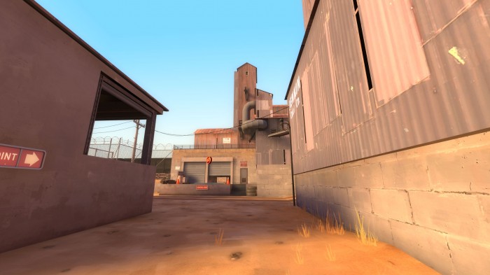
I’ll break it down into multiple parts. First is the obvious density of detail. What you should notice immediately is that your view is frame by two big, blank walls, with a relatively bland ground, and a blank sky. Already, you can see how detail is centering your view on the capture point, and that is what is key when detailing: drawing the player’s focus to what is important. The big metal wall on the right is not important. Community mappers have the tendency of seeing a big, blank wall like that in their map, and despite it being irrelevant to the player, adding as much detail as possible, using window models, overlays, conduits, and whatever else comes to mind in an effort to make that big blank wall not be a big blank wall, when it actually should be.
The walls have a low density of detail, and then we move on to the capture point area, which has a high density of detail. There’s obviously much more detail on the capture point than on the less important wall. There are doors, props, bright orange cones, and a bright red sign in addition to the capture point hologram, all which bring your attention to the area, which is where you want players to be looking (not distracted by unnecessary detail on the big wall to their right), as well as where you want players to go. The capture point here is not in the middle of the path players take, so they are not forced to walk onto it. But using smart detailing, you can bring players’ attention to it, since it is a high detail area in a low detail environment.
A second point to make here is how density of detail can build story for a map. An area with a high density of detail will look more important than something with less detail, which is in part what leads to attracting player attention. For a capture point, this can answer the question of why a team wants to capture it. If the entire map has a high density of detail, the question which arises is what is so important about the capture point at hand. Using the image from Dustbowl, if the walls on the right and left were as heavily detailed as the building by the capture point, it would make the smaller capture point building look unimportant, deconstructing the story behind it. However, Valve detailed the map wisely, making the capture point building more important than its surroundings. It is loading dock with a garage, with various supplies and boxes scattered around and inside it, with a tall, important looking structure built on top of it. It fills in the reason why the BLU team would want to capture it for itself: it’s an obviously important or strategic building to have. A loading dock with a garage full of supplies is far more important to capture than that big, blank, generic looking industrial building to the right! In addition, there’s a gate to the left of it, so controlling it means controlling traffic into the compound. A large story for the gameplay is built into the map through detail, and it’s all subtle, nothing is forced onto the player. You just need to look at the scene (and have your attention focused by the properly allocated detailing) to understand what is going on.
Now that we’ve covered the higher end of the density of detailing, I want to take a look at the lower end up the scale.
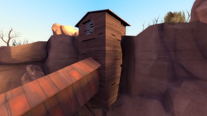
This screenshot (again of Dustbowl) is taken of a building high on a cliff face, far away from the player. What you should recognize is two things: first, it’s a very simple building can be made of 4 brushes, and second, proper use of textures that simulate depth on a flat surface. The two go together, you can create very simple structures in areas far from the player’s view, and then use textures like the ones shown to give it the appearance of being more complex than it truly is. Often the wood textures with holes are abused by community mappers by being used on surfaces close to the player’s eye, where the fact that they are faking holes is apparent. The wood texture with holes and the vent overlay shown are best used on structures far enough away to not attract the player’s attention, where their looks are not going to be studied and their attempt to look like they have additional depth is debunked. For buildings close to the player’s eye, a wood texture without holes and a vent model would be used instead. Additional detail, such as signs and ground-level props can be used to add more interest to the building, or, actual holes in the building can be made.
Summary:
Place detail where you want players to look
Do not feel required to make every surface a point of interest
Detail, if used properly, can bring story to a map
Only use textures to fake effects far enough away from the player
When it comes time to detail a Team Fortress 2 level, the path most mappers take is one of trying to make everything look visually stunning, no matter how important or unimportant the area in question is. Even if detail is planned out beforehand, the initial reaction seems to be to make sure everything is a point of visual interest. Unfortunately, this is not the proper way to handle detailing: in TF2, gameplay and visual elements are closely tied together, and their relationship must be considered when detailing, because your points of visual interest are what the player should interpret as points of interest to the level’s gameplay.
This is why the TF2 world is static, with the exception of dynamic gameplay elements. There are only a couple animated props in the game used for detailing, and are not large or upfront in their presence. Smoke trail particle effects do not stand out, but silently add to the environment. Environment objects which do move or change are either direct gameplay elements (capture points, intelligence briefcases, payload carts, dynamic signs) or are environment hazards which affect gameplay (trains, saws) and have loud, clear sound effects to announce their presence. Any other dynamic elements are players, engineer buildings, or projectiles: things pertinent to playing the game.
However, detailing for TF2 does not just end at “keep the world static”. Detail is carefully distributed and allocated in the world for certain reasons, scaling the amount of it to where it is located. I’m going to call this the density of detail. This concept of density of detail can be found in any of Valve’s maps, but to demonstrate, I’m going to use a particular scene from Dustbowl that I think truly embodies it.

I’ll break it down into multiple parts. First is the obvious density of detail. What you should notice immediately is that your view is frame by two big, blank walls, with a relatively bland ground, and a blank sky. Already, you can see how detail is centering your view on the capture point, and that is what is key when detailing: drawing the player’s focus to what is important. The big metal wall on the right is not important. Community mappers have the tendency of seeing a big, blank wall like that in their map, and despite it being irrelevant to the player, adding as much detail as possible, using window models, overlays, conduits, and whatever else comes to mind in an effort to make that big blank wall not be a big blank wall, when it actually should be.
The walls have a low density of detail, and then we move on to the capture point area, which has a high density of detail. There’s obviously much more detail on the capture point than on the less important wall. There are doors, props, bright orange cones, and a bright red sign in addition to the capture point hologram, all which bring your attention to the area, which is where you want players to be looking (not distracted by unnecessary detail on the big wall to their right), as well as where you want players to go. The capture point here is not in the middle of the path players take, so they are not forced to walk onto it. But using smart detailing, you can bring players’ attention to it, since it is a high detail area in a low detail environment.
A second point to make here is how density of detail can build story for a map. An area with a high density of detail will look more important than something with less detail, which is in part what leads to attracting player attention. For a capture point, this can answer the question of why a team wants to capture it. If the entire map has a high density of detail, the question which arises is what is so important about the capture point at hand. Using the image from Dustbowl, if the walls on the right and left were as heavily detailed as the building by the capture point, it would make the smaller capture point building look unimportant, deconstructing the story behind it. However, Valve detailed the map wisely, making the capture point building more important than its surroundings. It is loading dock with a garage, with various supplies and boxes scattered around and inside it, with a tall, important looking structure built on top of it. It fills in the reason why the BLU team would want to capture it for itself: it’s an obviously important or strategic building to have. A loading dock with a garage full of supplies is far more important to capture than that big, blank, generic looking industrial building to the right! In addition, there’s a gate to the left of it, so controlling it means controlling traffic into the compound. A large story for the gameplay is built into the map through detail, and it’s all subtle, nothing is forced onto the player. You just need to look at the scene (and have your attention focused by the properly allocated detailing) to understand what is going on.
Now that we’ve covered the higher end of the density of detailing, I want to take a look at the lower end up the scale.

This screenshot (again of Dustbowl) is taken of a building high on a cliff face, far away from the player. What you should recognize is two things: first, it’s a very simple building can be made of 4 brushes, and second, proper use of textures that simulate depth on a flat surface. The two go together, you can create very simple structures in areas far from the player’s view, and then use textures like the ones shown to give it the appearance of being more complex than it truly is. Often the wood textures with holes are abused by community mappers by being used on surfaces close to the player’s eye, where the fact that they are faking holes is apparent. The wood texture with holes and the vent overlay shown are best used on structures far enough away to not attract the player’s attention, where their looks are not going to be studied and their attempt to look like they have additional depth is debunked. For buildings close to the player’s eye, a wood texture without holes and a vent model would be used instead. Additional detail, such as signs and ground-level props can be used to add more interest to the building, or, actual holes in the building can be made.

Summary:
Place detail where you want players to look
Do not feel required to make every surface a point of interest
Detail, if used properly, can bring story to a map
Only use textures to fake effects far enough away from the player


