Radaka
L420: High Member
- May 24, 2009
- 491
- 244

By radaka at 2009-06-26
The grass texture on the rock sticking out of the water on the left doesn't match up with those on land, and looks a bit odd.

By radaka at 2009-06-26
Unsewn

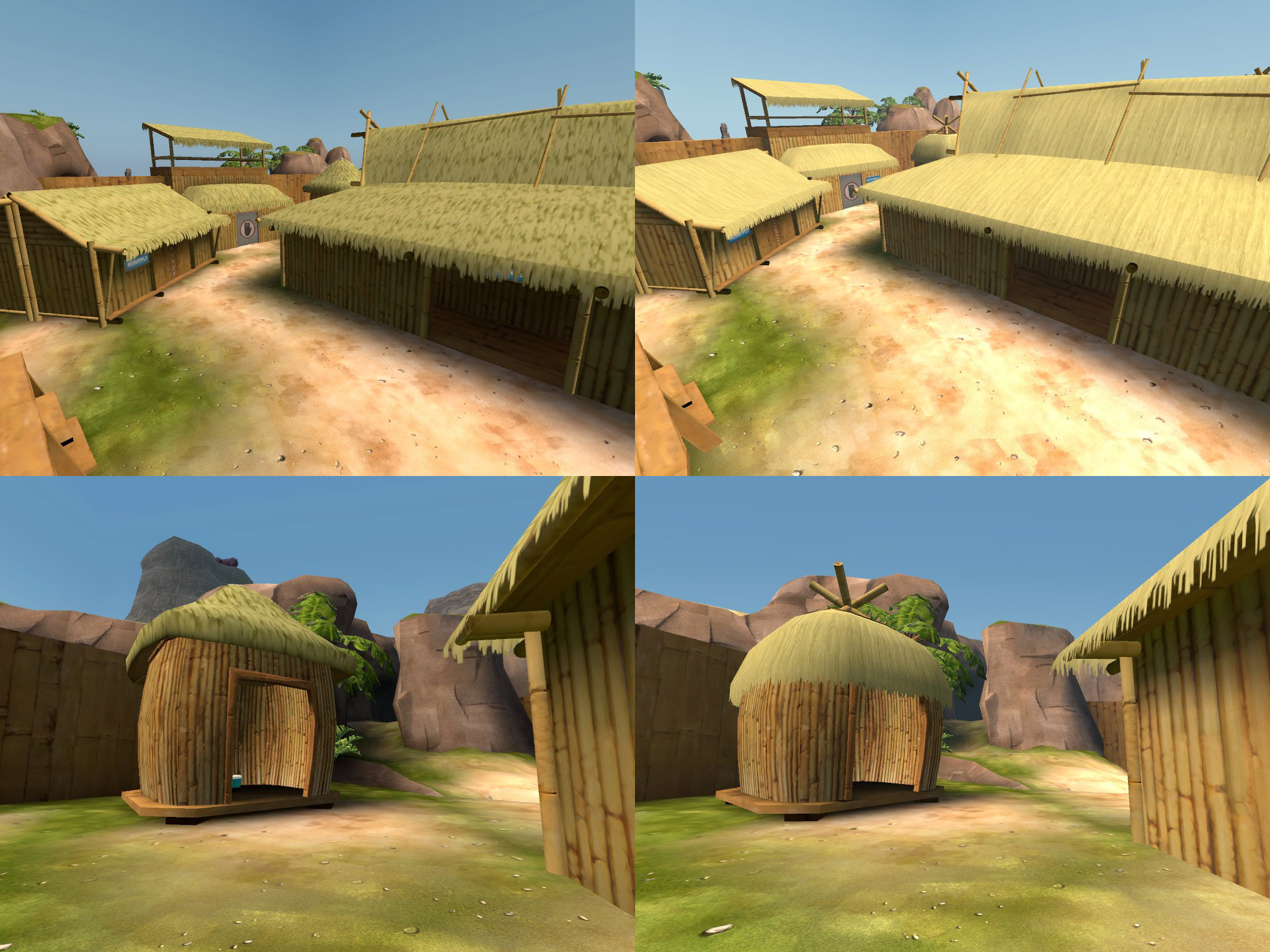
By radaka at 2009-06-26
Unsewn

By radaka at 2009-06-26
From a gameplay perspective, I think you should widen this grate so as to be able to see at least most of the hologram upon entering. This would be a good helper to lost souls
")

By radaka at 2009-06-26
Possibly playerclip this, it's a bit annoying to have your view duck down then go up again.

By radaka at 2009-06-26
The health has an overlay, but the ammo doesn't. (I would recommend going through the whole map and putting overlays under every health and ammo)

By radaka at 2009-06-26
Unsewn

By radaka at 2009-06-26
This sudden change in textures on the back of the BLU boat looks unnatural.