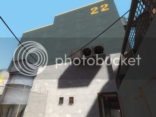
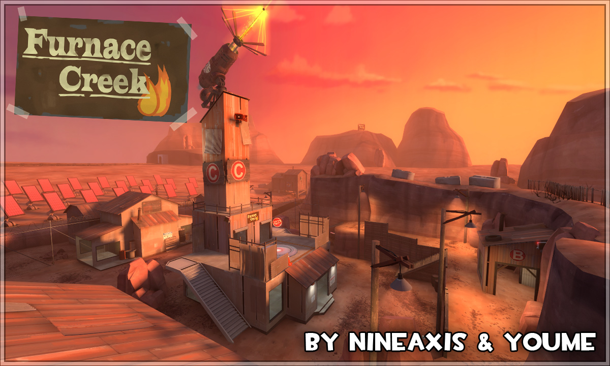
For example, it is alpine, but also sports urban brick buildings, which makes no sense.
*cough* SWAMP *cough*
It is a marsh afterall.
Mtn Lab had it.
A lot of swamp maps have it.
This has it.
Last edited:
For example, it is alpine, but also sports urban brick buildings, which makes no sense.
everyone likes it differently. I personally think it's great that the map is so narrow paths. this guarantees fast and hard action.
my opinion
the splash thing was just fyi, wasnt sure if you wanted to change it, should have mentioned that i kind of liked it. guess i'll see if i can play it with real people if i have time and reevaluate my opinion.
The blue spawn pretty boring to be stuck in. Maybe could you add some one way windows on the main door or on the walls?
Weird shadows.
Mirrored writing on the hot air balloon.
Z-fighting.
You may or may not want players here.
The cliff face isn't solid. You will die when falling, but it looks bad while doing it. It may be possible to get past the hurt triggers though with some tricky jumping, perhaps as scout.
TF2 usually doesn't make you jump to enter vents, even less duck jump. If you didn't want that for some reason just being able to walk in might be preferable, or at least being able to simply jump to enter on both ends.
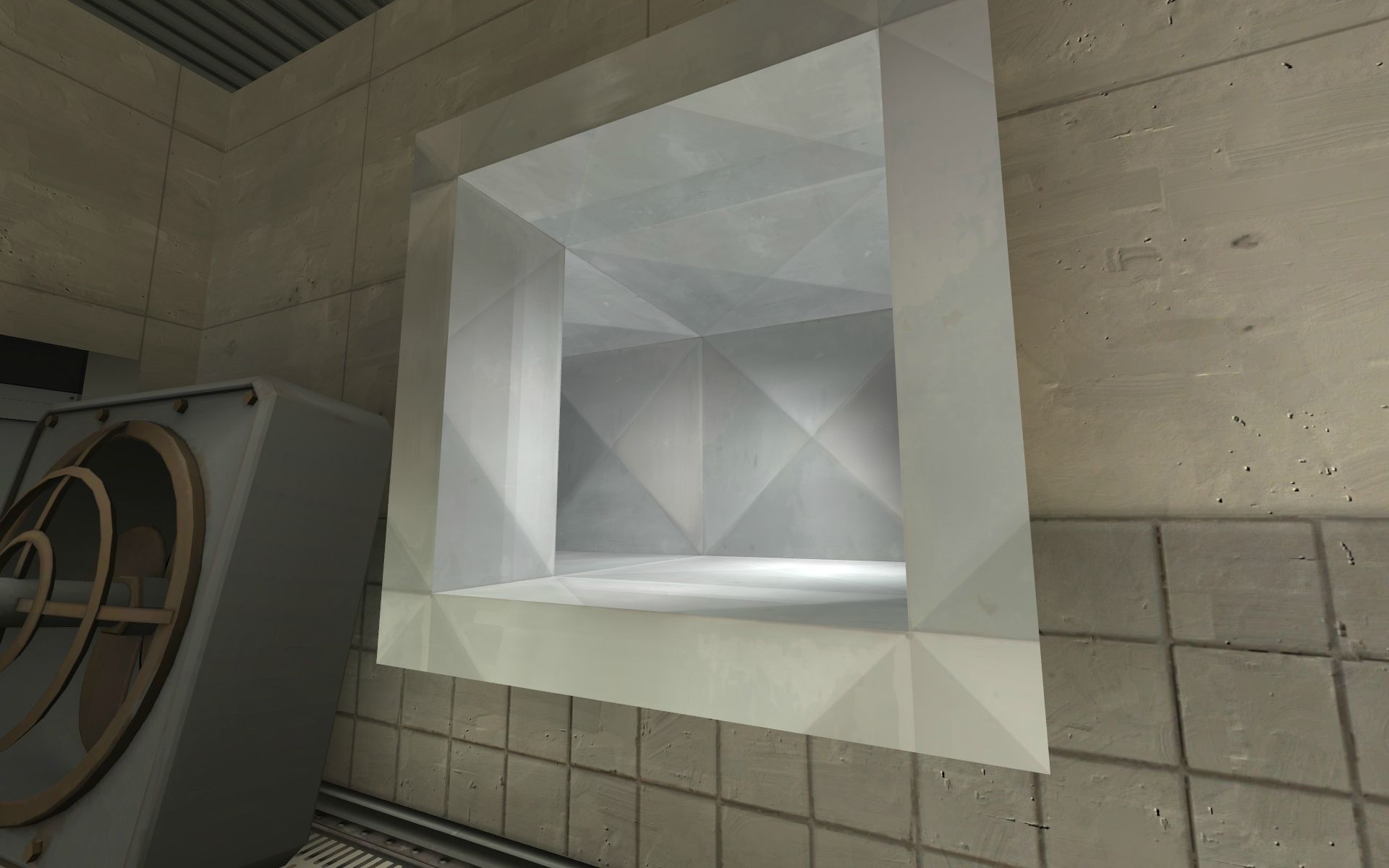
The buildings outside this window appears and disappears as you move in this area. If it's going to be buggy it might as well be removed, showing only the sky.
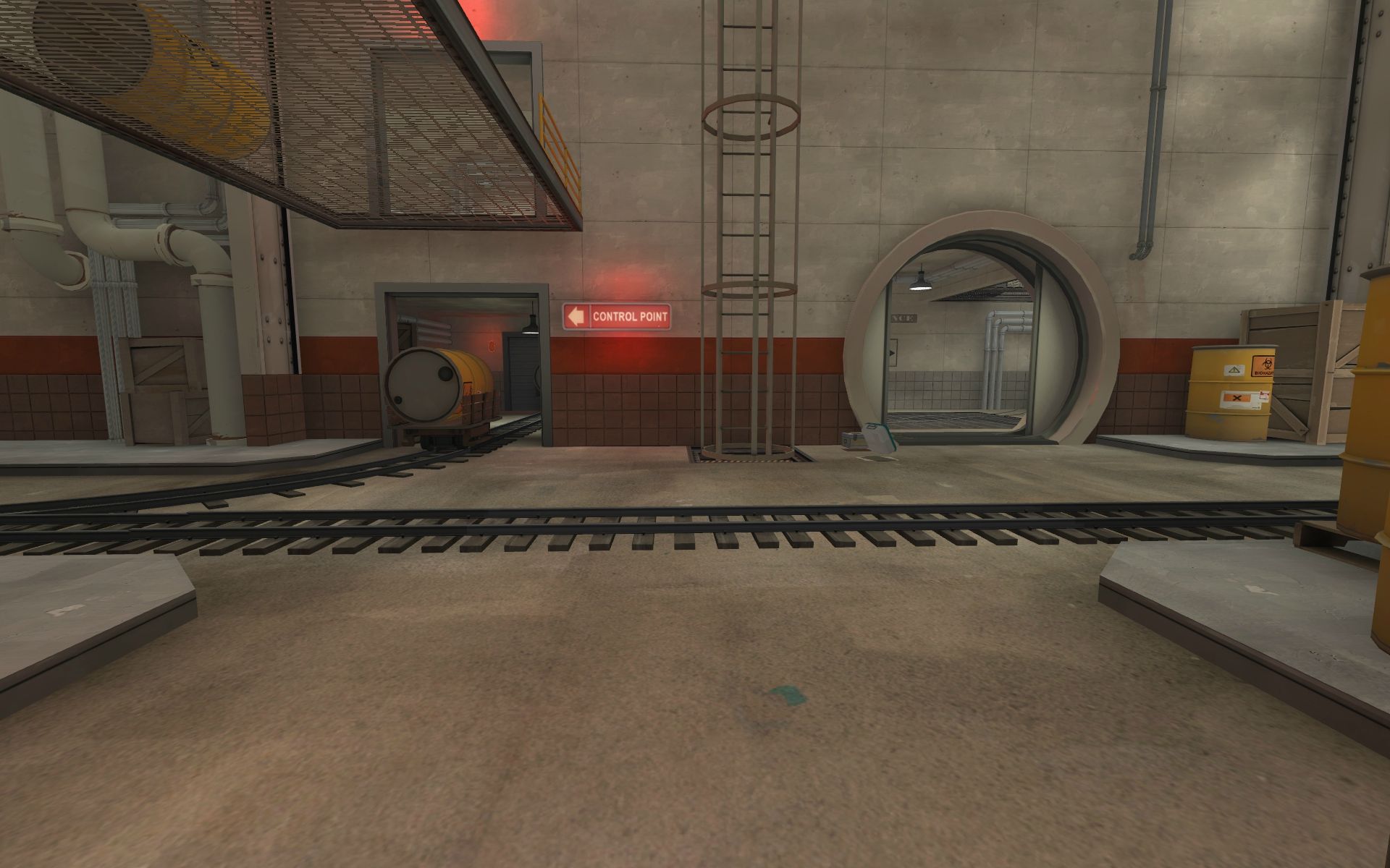
You'd think one standard "CONTROL POINT" sign when exiting the spawn would be enough, but it isn't.
No, the problem is in too many conflicting themes all going on in the same tiny area. For example, it is alpine, but also sports urban brick buildings, which makes no sense.
*cough* SWAMP *cough*
It is a marsh afterall.
Mtn Lab had it.
A lot of swamp maps have it.
This has it.
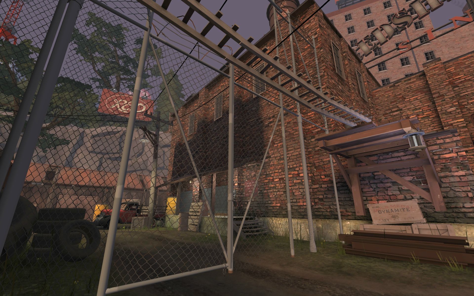
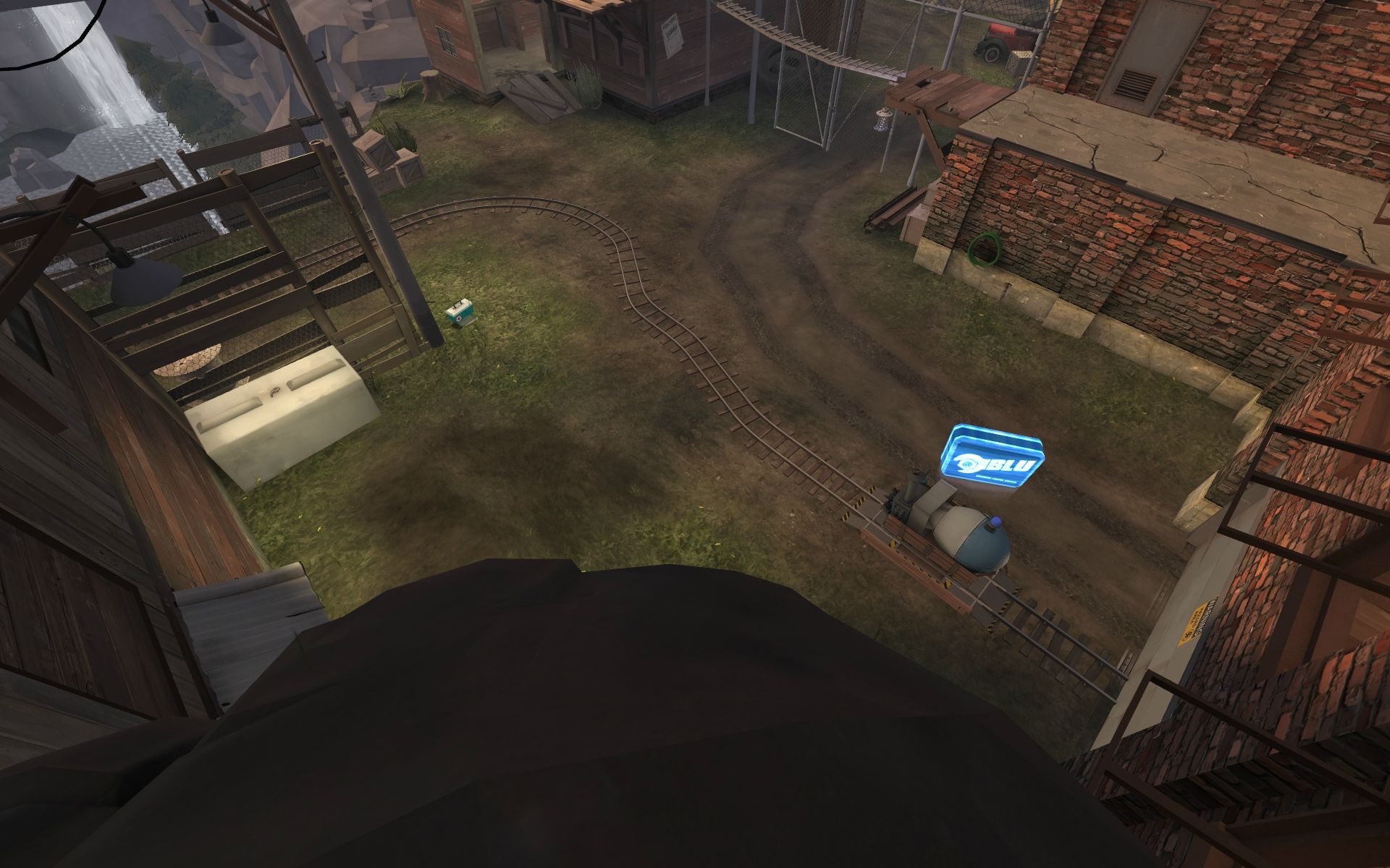
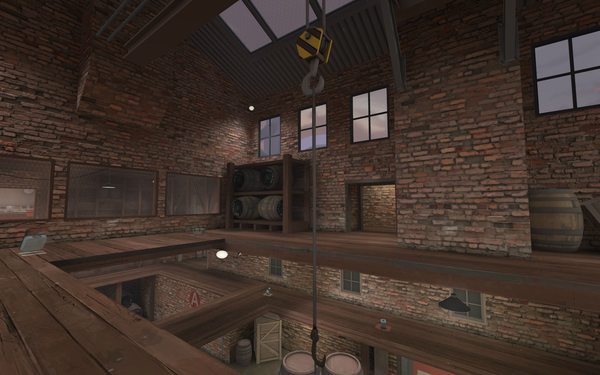
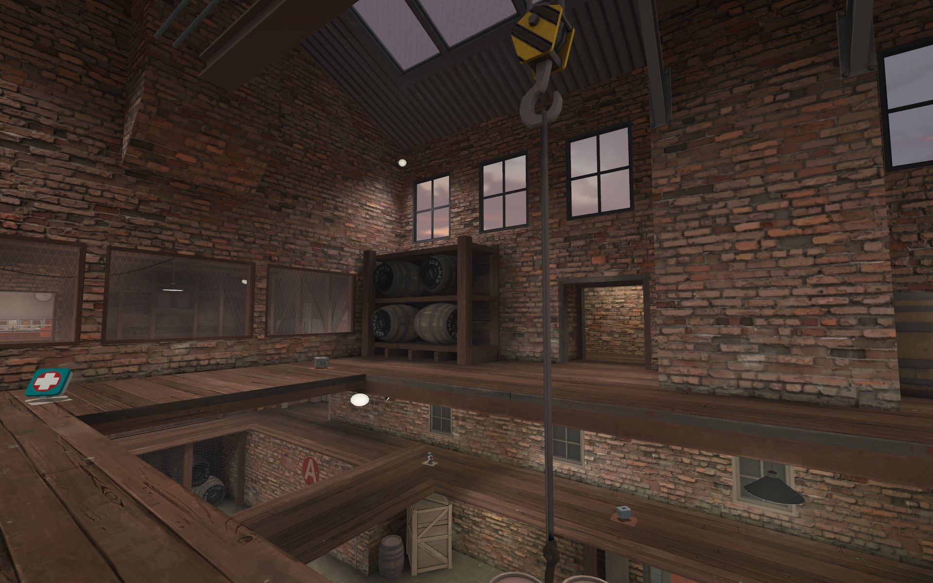
My issue with the detailing outside is that the big brick buildings in skybox don't really fit rest of the theme. (That is really well made, by the way) You should make something more fitting with some brushwork, right now, those buildings just don't fit into rest of the theme.

I like your map (with the screen) I hope I will have my computer back to test it ^^'
-and-The lighting inside is FAR too bright and has practically zero focus! It would be far better if you reduced the number of lights and utilised only a handful to focus the player towards the most important areas such as doorways, staircases, etc. I also think you need to up the shadow darkness for the light_env because it looks a little wishy-washy outside.
If you'd like, when I get a chance, I'll run through the map again and get screenshots of where the lighting could be better...
Hey! I wanted to note one thing that I think is important and I guess lots of people don't realise it.
Empty space is also a part of composition.
Everywhere. In painting, photography, music, everywhere.
Take a look:
The whole right side of this place is empty. Do you feel like it's missing something? Anything interesting on the far left? The mapper's goal was probably to focus player's eye on the cart and area around it, so he doesn't need much detail on the walls that are not important.
Take a look at this, what immediately gets your attention? The CP building. Take a look how detailed is it and how the lightning highlights it. And what about the rest? Bare cliff wall on the left. Does it need anything more?
One more. Can you see any detail on the rocks around the point? No. Because they are not important. Do you know what I mean?
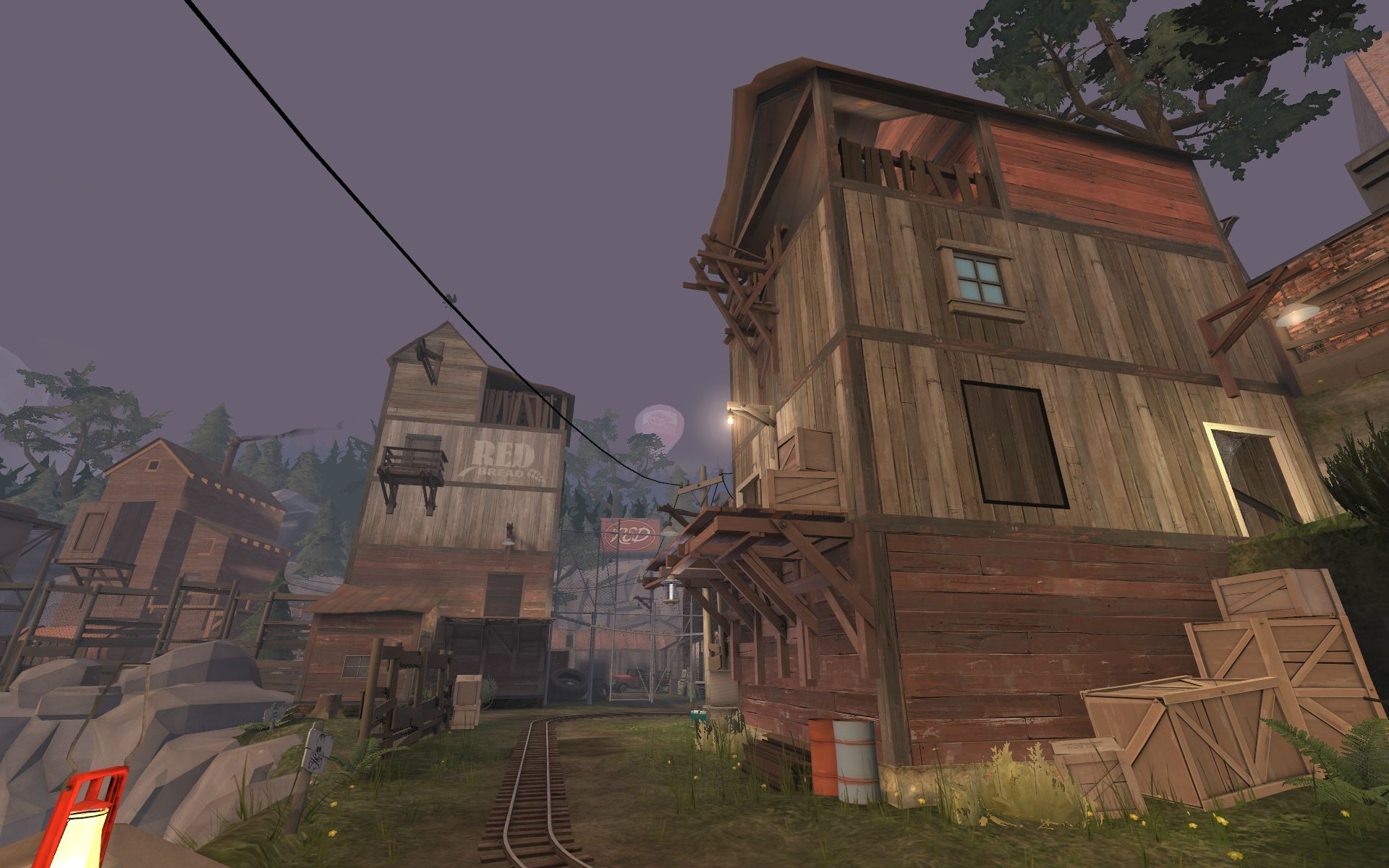
I am writing this not to tell you that your detailing is wrong. Just tone it down. You don't need crates and barrels everywhere or windows in every wall and 150913 different textures. Your map is gonna look great if you'll make your detailing a bit more clear and simple, cause you know how to do it. You just do it too much.
I am not sure what you are trying to tell us with your examples, the problem people are having is going overboard with detail and having large amount of it everywhere, even maps you show us as example, know where to stop. I personally don't have a problem with it as i haven't played the map yet, (so that opinion might change very quickly) but i can see where they are coming from and you really should think again before you shoot down all this feedback ton overdetailing.
I am not sure what you are trying to tell us with your examples, the problem people are having is going overboard with detail and having large amount of it everywhere, even maps you show us as example, know where to stop. I personally don't have a problem with it as i haven't played the map yet, (so that opinion might change very quickly) but i can see where they are coming from and you really should think again before you shoot down all this feedback ton overdetailing.
What if they have had personal playtest on it, or it was tested as extra on TF2M gameday.
You shouldn't split forum feedback into "Less important" category, it is quite bad idea, considering you can't be on every playtest this map will have and some people come tell their opinion here.
Thanks I'm currently addressing this. Any thoughts/comments on specific areas where the lighting/detail could be improved would be nice of course.
")
I havent really played the map, but last night I was messing around in rc4 with a friend
We really liked the map, but ran into a few small things that i thought id post here (most things arent very important, but well)
The third round or so we ran into this error
A floating chimney in the spawndoor:
http://steamcommunity.com/id/WanderG/screenshot/559795187002078765
http://steamcommunity.com/id/WanderG/screenshot/559795187002079456
It wasnt just in my client, my friend saw the same thing, it was only for 1 round, the next round it was gone
Also, we managed 3 times to survive the explosion at the end, by standing crouched on the front of the payload when it falls down
The water looks a bit broken for me:
http://steamcommunity.com/id/WanderG/screenshot/559795187007283135
My graphics are set quite low, so perhaps theres nothing to fix there
Also have some z-fighting (thats what its called right? when 2 textures cant decide which ones above the other) going on here:
http://steamcommunity.com/id/WanderG/screenshot/559795187007282091
And as you can see a brush that sticks through the window frame
I also saw the bottom of some fence between B and C having a z-fight with the floor, but i cant remember where exactly
Something else I found slightly annoying: if blue manages to get to the payload that is still standing on B just before the time ends, overtime starts, but then theres that rotating ground part that makes the payload unpushable for more than 5 seconds, which makes the overtime win. This way blue loses, even though they managed to defend and push the card just in time
Perhaps to fix it, instead of making the card unpushable, set the speed to 0?
In red spawn when turning around: http://steamcommunity.com/id/WanderG/screenshot/559795187007573945
The payload is visible that way, theres stairs there, and 2 door entrances, I thought it looked like it was possible to walk that way
Walking up the stairs works, but then even though theres nothing blocking it, ya cant walk any further
Perhaps have some stop-sign or something above those stairs?
Then the last thing I found a bit odd was the clipping at the rocks above the water, sometimes we were standing with our feet inside some rocks, and stickies would sometimes just fall through them
I think thats about it, i look forward to really playing the map with more ppl
Thanks sir! I really liked your work on mountainlab. Would love to hear your feedback.
-and-
Thanks I'm currently addressing this. Any thoughts/comments on specific areas where the lighting/detail could be improved would be nice of course.
Thanks for your feedback! I certainly appreciate your comments. I am looking at certain areas where I can adjust the level of detail and focus the lighting to help guide players.
As far as the open feeling that's really not what i was going for with the map.
I guess some things that are important to point out in my opinion are that its not necessarily bad to have a high level of detail provided that the higher level if detail is consistent throughout. Just make sure you that your don't find themselves lost in a sea of details. Perhaps its better to say it this way... if you're going to increase the mean average in one area of the map you need to do so throughout the map. You should attempt to guide your players with light and by setting the important areas in your map as the outliers on the positive side of detail and your unimportant areas as the outliers with the least amount of detail. I hope this makes sense but...
Some screens to prove my point a little bit better:
ctf_doublecross has a very high mean average of detail. Valve did a great job creating a high amount of detail and then guiding the players to the important areas through a strong dichotomy of light/shadow:


pl_barnblitz has a high average of detail... how do players find their way around? Good signange and the track guides both blu and red players (in opposite directions) to each other.


plr_nightfall works the same way. It has a high average of detail, but the fact that the cart glows and paths lead players to the most important areas is important to note.


cp_mountainlab looks great and after playing the map a couple times (combined with good signage) players are able to find their way around quite easily.


Some areas on cp_gravilpit and cp_dustbowl work the same way:


I want you to understand that I'm certainly not trying to create a massive upheaval in how everyone looks at mapping or their own artpasses. I think peoples perception of density of detail here is overall pretty correct. I just think that people sometimes go a little overboard on detailing only certain areas instead of trying to make a pretty map that is not distracting.
In other words... I'm watching people play this map repeatedly. I've been recording demos/getting feedback/asking players/etc and VERY importantly (watching peoples crosshairs when they play the map). If players eyes consistently stray from the objectives then I'm doing it wrong, however if players enter the map and say "That's pretty!" or their 20'th time (or 100'th for that matter) playing the map say, "I never noticed that before, that's cool!" then I'm doing my job. Also please note: The map is not final yet.
Thanks again for all of your feedback!