FYI, final releases aren't the only place for good lighting. I'm guessing from what you've said here so far that you have a decent rig. If that's the case you ought to be compiling with at least -staticproplighting. I do that and -staticproppolys even in alpha.
Consider it done. Its part of the next release. Thanks.
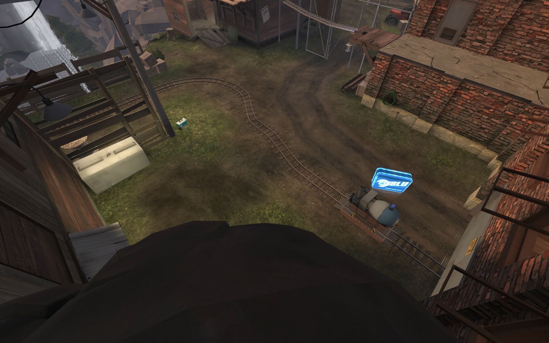
looked around rc3 a little. displacements had some pretty bad stretching. didn't notice lowfps until loading up 13 bots, and it was pretty minor. not sure about the spawngates, i like seeing what's out there as blu, especially when i have to wait 90 seconds :O.
there was a lot..A LOT of props. always feel like im running into something.
http://cloud.steampowered.com/ugc/540654438386868144/D4CFD73A98E0792BBD8188BDEC95DA88A0AC39C2/ was splashing a heavy through there
http://cloud.steampowered.com/ugc/540654438386863860/0850EB7257F2FF8A968C2E769BE86B849064FF57/ got stuck at the end there, barrels seem frozen (guess you were going for that "stuck" thing)
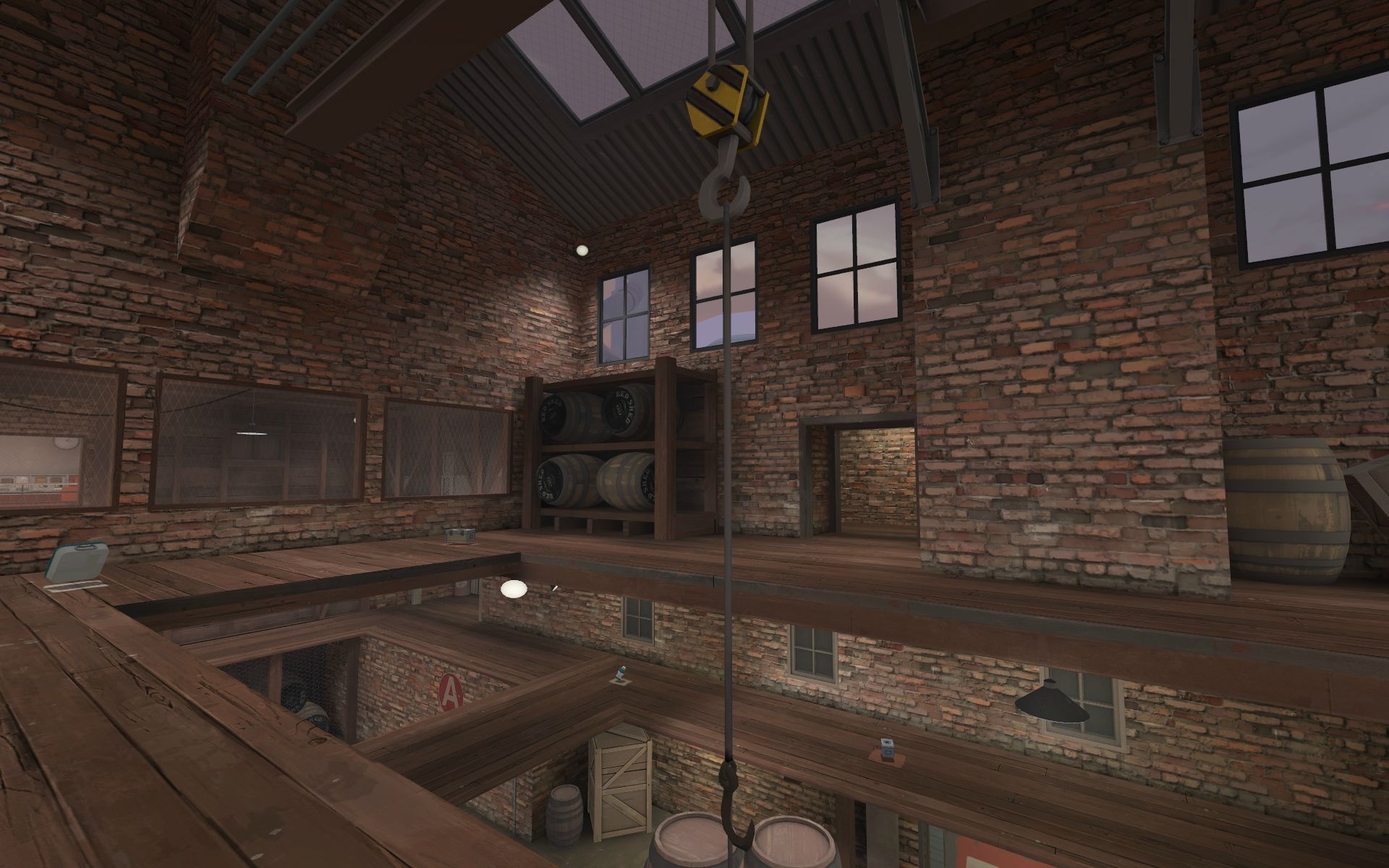
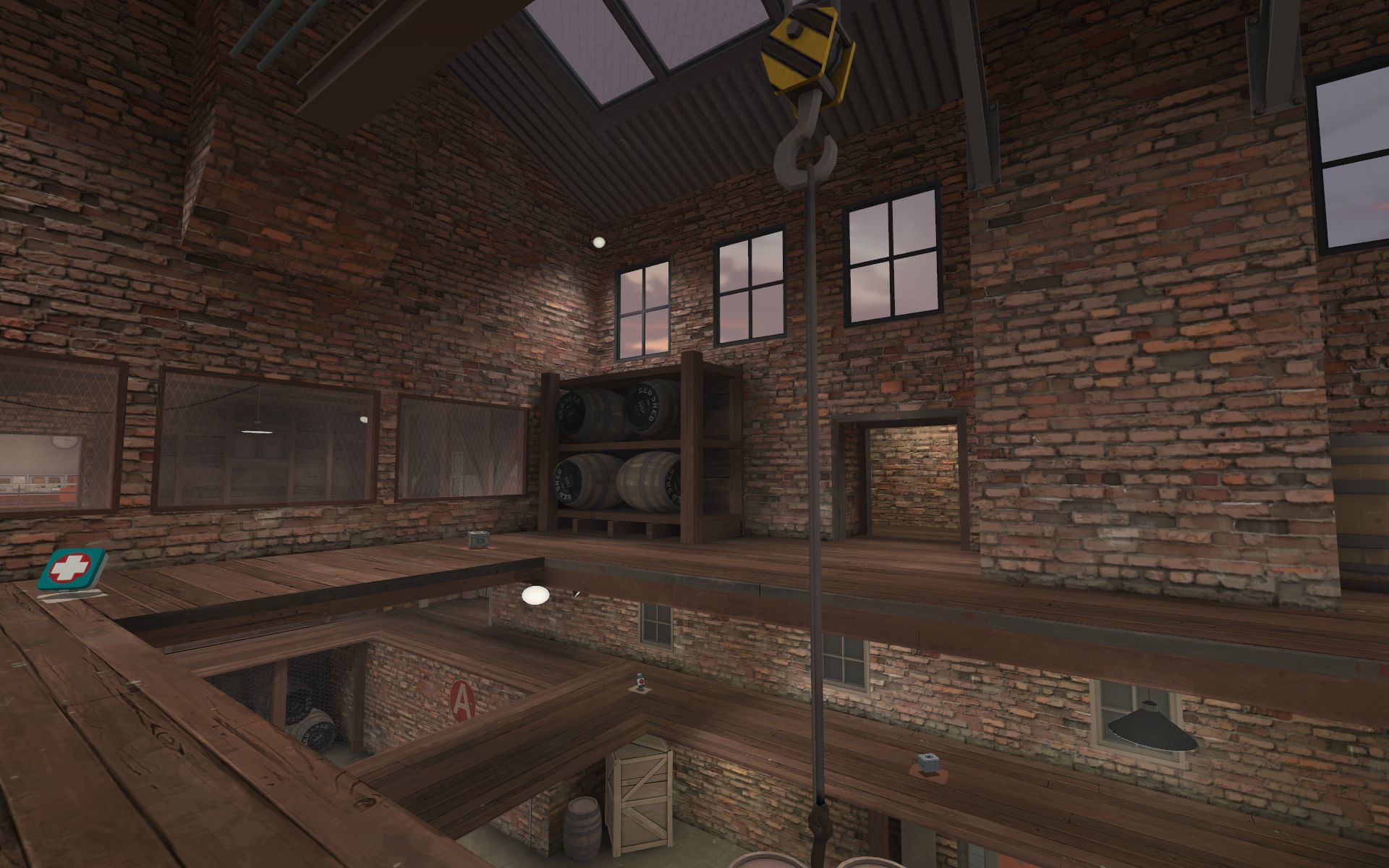
http://cloud.steampowered.com/ugc/540654438386867068/BA8C6842D574A5497D9C174711D77470514FCCC1/i really like this
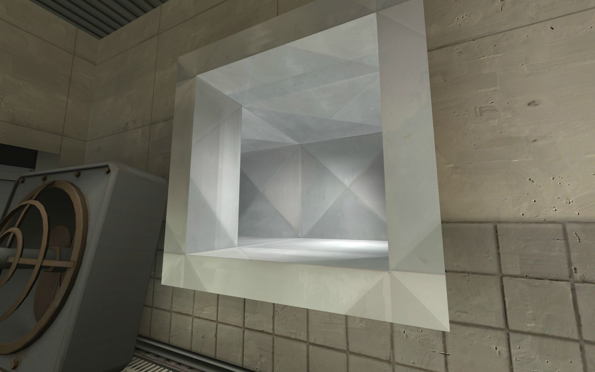
http://cloud.steampowered.com/ugc/540654438386870822/E8248884931C9259CE20EB514D43E8C127387D31/ looks like misaligned water texture?
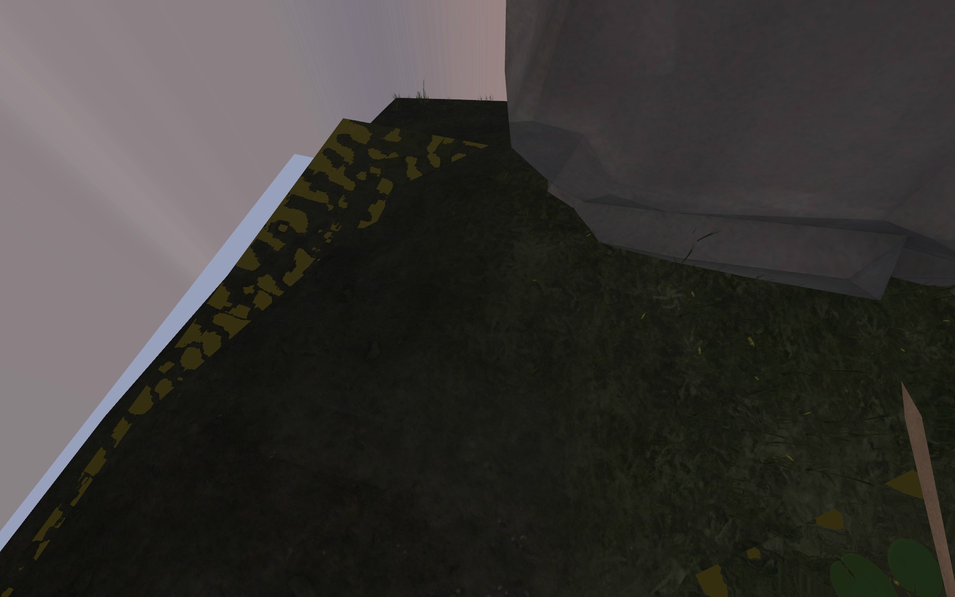
http://cloud.steampowered.com/ugc/540654438386866131/5FB9515E69604232BB718E17C8958CB4B30992A1/ stretched texture, in a few places actually
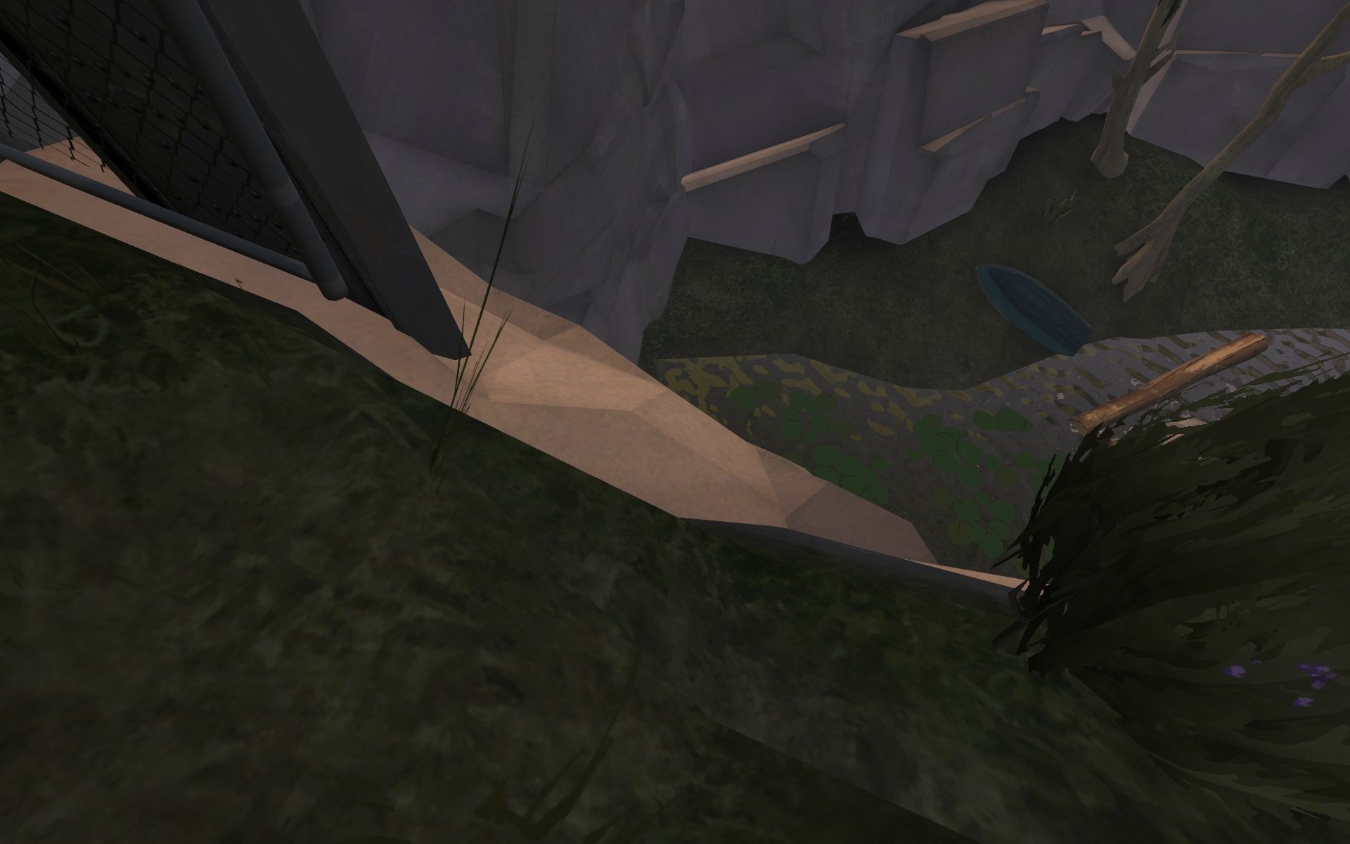
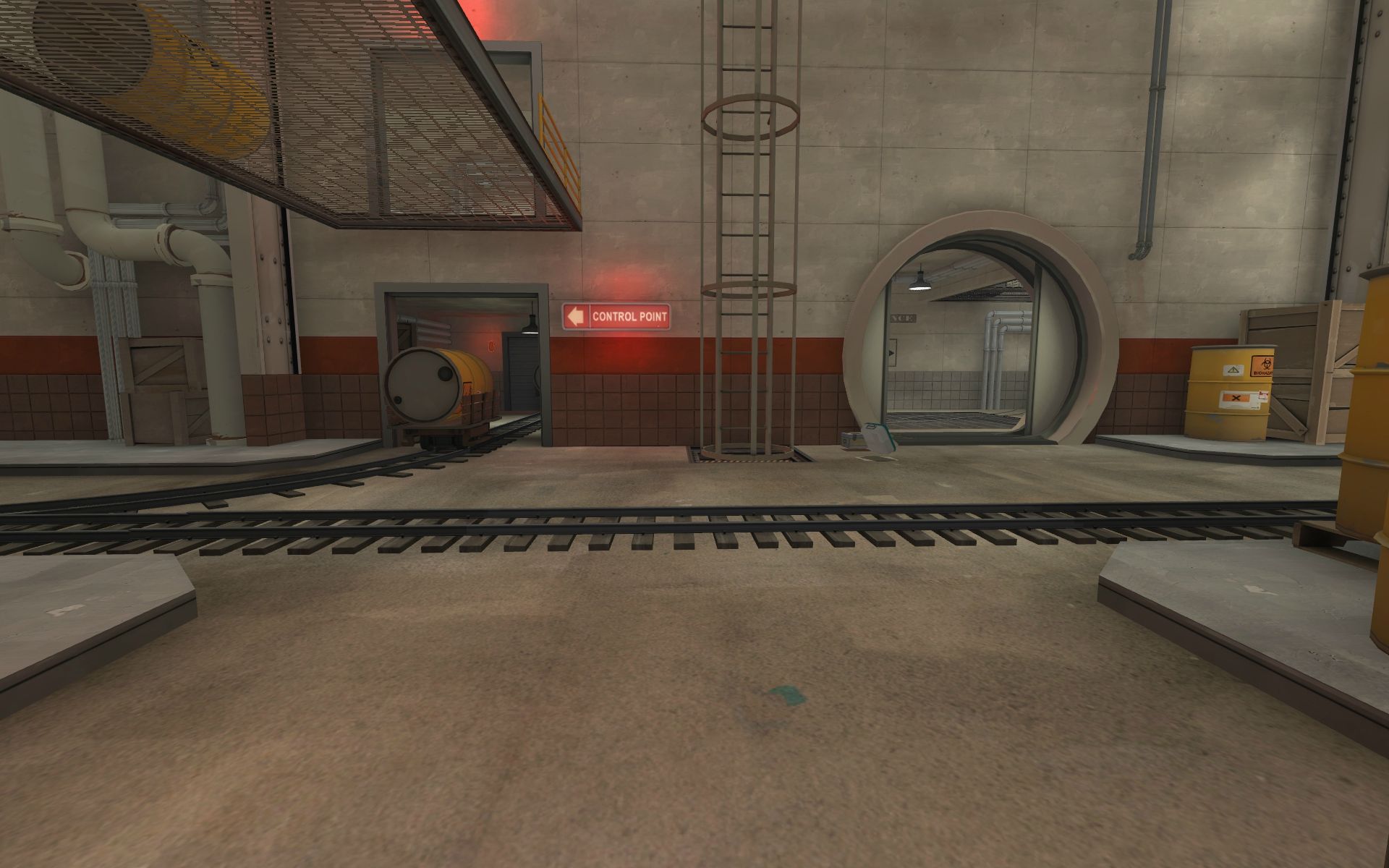
http://cloud.steampowered.com/ugc/540654438387204021/0BAFC39A1473E1B0056F6EB55A5E0B4DF407314E/ got stuck here trying to go up the stairs
http://cloud.steampowered.com/ugc/540654438387203086/BA17DEF6E54BCAE1EA6D9864A7ED9CE5FC8D63BF/ looks out of place, caught my attention pretty quickly
on the topic of gameplay, it is definitely NOT the most balanced payload map (goes to badwater). way too narrow. it feels like dustbowl/goldrush for the last half. well for the middle, and the first part is a pretty fun opening. just from playing with bots though, but i doubt it's will play much differently.
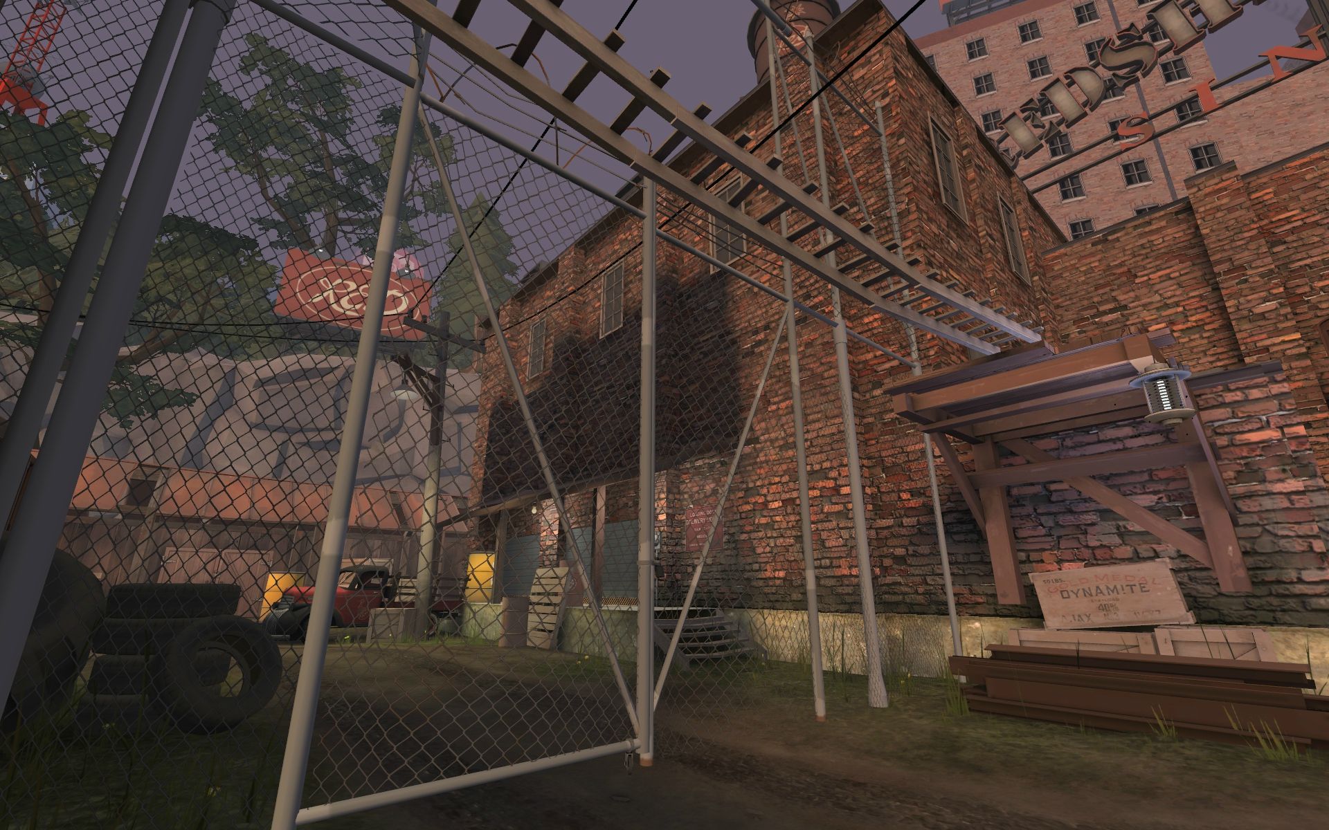
Yeah there are some displacements that stretched pretty badly when I subdivided. I'll be doing what I can to fix it. I actually really like the gates closing and opening fully. It allows the blu team to open gates when they want and close them when they don't want them open. I had considered allowing blu to see out either with a window or using the transparent yellow gates, but opted for the gates that are currently there. As far as blu being stuck inside for 90 seconds I had considered adding some more scenery behind them to help ease the pain of the wait. I will have more player clipping in my next release. No one likes to backup into a prop that has a tiny edge when a pyro is w+m1'ing at them.
Pic1: Im ok with that. If a skilled player can splash by hitting a prop that opens to a target instead of shooting at them and missing its fine. Also im pretty sure you could hit the wall behind the fat heavy for the same effect.
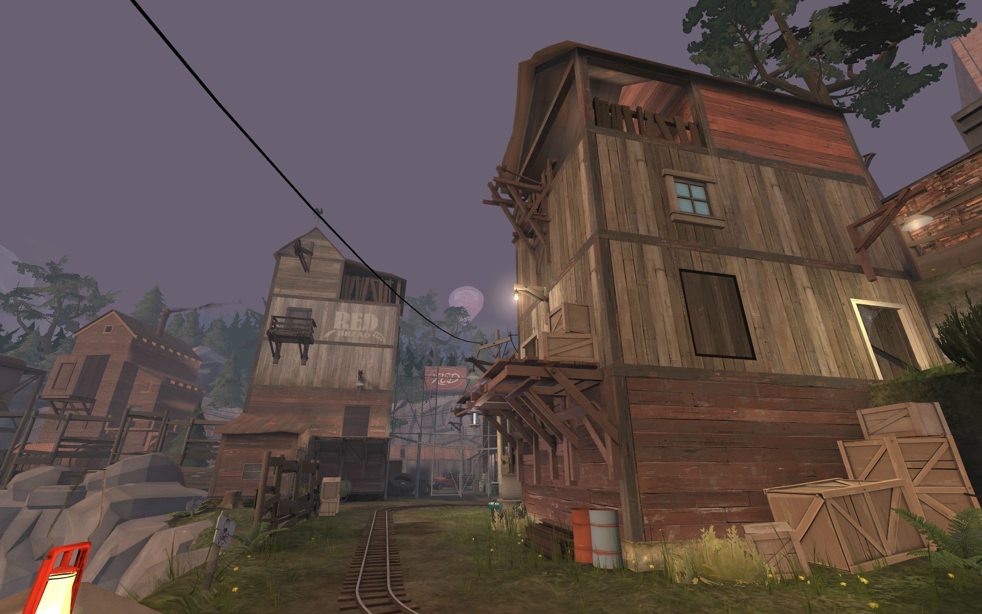
Pic2: The barrels actually explode from the railing above red at last and fall down there. The barrels that were down there disappear.
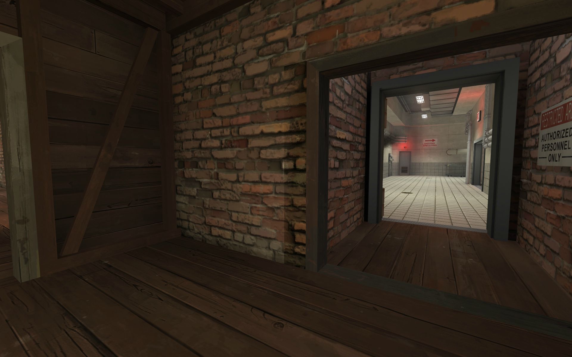
Pic3: Thanks you can actually cross the bridge or walk on some player clipping I added to the cliff model. Although you can easily fall through the ~100 unit space between them... I had thought about adding a little bit of push where the water was, but it seemed hard enough to cross backwards as is, so I left it alone.
Pic4: Fixed. Thanks.
Pic5: Working on fixing it. Thanks.
Pic 6: Ya there is really no need for that prop to catch you. Ill move it, clip it. or make it not solid. Thanks.
Pic7: You can only really see those if you are in the deathpit, but either way I'll consider it. Thanks.
As far as balance I've actually found it to be pretty well balanced. After watching a ton of demos/sourcetv's/playing myself, and hearing other players feedback the one place that might need a little addition is immediately after the entrance beyond A. If a red team stacks the mirrored house towards the entrance and makes solid pushes towards the battlements periodically it can be hard for the blu team to overcome without the support of a good engi/medic. Although the Blu team tends to win when they make a solid push upstairs, so perhaps this just needs more arrows/guidance. Although, as defense tends to improve more over time than offense I could see that being a potential problem... I'll be keeping my eyes on it. I really like the close fights that take place in the hallway before point C and the finale. Especially when a semi-experienced team is facing an equally skilled team the catwalks/hallways change hands often and dictate how the cart moves below. Quite fun to see/play. The opening is alot of fun (and does play quite a bit differently with real players as opposed to bots. (Bots get stuck near the cap at B, so the fight at A is pretty short if you're playing with bots. I'll be fixing that soon.
Thanks for your feedback sir. Really appreciate you taking the time to post pics too.
You have too many things going on at once. It is over detailed to the point of being eclectic on the outside, IMO. Which is the same problem with Mountainlab.
I like mountainlab. I think 3dnj did a great job. Its certainly one of the prettiest maps in tf2 right now.
When I run throughout this map for the first time, the first point seemed very dizorganiated at the level of detail.
The detail is present at all level of the map, In any case, this can be something very good, but you need a lot of more work on this, the brushwork is very squared and unimaginative, the giants rocks just looks unnatural, there is not transition between the displacement and the model, the part with the water is just copy/pasted from mountainlab. The skybox seems very odd for me because I feel crushed under a pile of building and smoke, whitout any blank zones.
For the second point, it's just the layout of well man, three levels, an hole at the middle with a distillery on the top, please, be more imaginative. Further, the gameplay based on a main corridor with somes small corridors at the sides can be very fade, you are just playing on a choke all the time !
At the third point, you have once again changed the theme, with another main corridor with some others corridors, okay it looks good (less the tracks on the floor and the mono-level).
for the last point, I saw the last point of dustbowl, the same floor level and the same size.
Thanks for having feedback this time. Ill take some time to respond to each paragraph with one of my own. The first point may at first seem disorganized due to its level of detail, but when you really look at the playable area you'll find it to be pretty simple. Three tiers of ground sloping 128 units downward each towards a deathpit. Three buildings set across the path of the track. The main fight happens between the first and second fight and the point is typically lost when the Red team loses the second building. Although, I have seen good red teams win by holding the third building and pushing from it to prevent the blu team from controlling the overexposed large health pack. Most of the detail comes from the vista of the death pit. This was intentional. I don't know how many times I have been in a pl_thundermountain pub as the blu team gets to 3-2 and heard someone say, "I've played this map a hundred times and never seen that view." I wanted to make sure that players have an exciting and memorable experience on my map. Providing a vista on stage one that is fun, looks great, and rewards skilled play does exactly what I was trying to achieve. Though I would love to see (with pictures) exactly what you mean when you say, "...the giants rocks just looks unnatural, there is not transition between the displacement and the model, the part with the water is just copy/pasted from mountainlab." The rocks are found in many official tf2 maps used exactly the same way. Please give me an example of how they transition from the displacement to the model any differently/better. Even in Rexy's new map (which also looks great btw) when you see the model rocks next to the displacement you can clearly see which is which and his models/textures are even custom. That's just how its going to look, and I don't think it looks bad.
It really isn't just the layout of well. There are two houses and stairs that lead to each. In most fights those houses are the primary central points during that fight. I added the third tier to be able to trump the houses. If you play the map with humans it actually plays more like badwater point 2 more than anything where the team that controls the roof that overlooks point 2 wins. Also when you see a big sign on the outside of the red building that says "Redshed Distillery" don't you think you should see a distillery inside? Regardless its part of red's facade that is created as you push from the marshland outside to the distillery inside. Its not so much a change of theme as a progression. In my opinion it adds depth to the story as well as providing a feeling of progress for the blu players as they transition from one area to the next. It's one of the main reasons that traditional cp maps are so fun (in my opinion).
What do you expect exactly? Aren't all maps essentially corridors that connect to larger areas? If you really look at it most maps are comprised of those two things. You can make the hallway snake, bend, curve, flex, gain height, drop, flank, or even teleport I guess... but in the end the hallway is going to lead to another hallway or an open area. The fun and beauty is when you see the corridor change hands as a skilled player masterfully subjugates his/her foes and takes control of the hallway by overpowering or outmaneuvering (or both) his opponent.
As far as the last point. I can see how it looks very similar to dustbowl, but i assure you it plays very differently. I posted this before, but perhaps you overlooked it:
Its pretty equally influenced by both dustbowl and goldrush. I know it actually does look a lot like dustbowl 3-2 but it plays massively different for a few reasons that shouldn't be overlooked:
1. The drop to the pit is one way. If you go down... you're down.
2. The sewer system that is down there connects to both the left and right side houses. (in dustbowl it only connects near the center bridge and in goldrush it connects to the center area as well as having a house that flanks the back right)
3. Manngrove has bridges (in the form of pipe systems) that connects both ways. (In goldrush you have to drop and climb to reach the flank area on the right and the left house has drop that requires rocket/sticky jumping to climb. In dustbowl you can only push on the left and not the right.)
4. The left house in dustbowl requires one to go into the alley or rocket/sticky jump to the otherside. in Manngrove its actually pretty easy for the blue team to pass unscathed across the bridge at the back of the choke. I did this to encourage blu to build/attack from the back of the right house.
I think I'm going to need pictures to illustrate my point better. I'll try to get these to you when I can, or you can feel free to play the map and see how the sewer system that connects the pit, left, and right houses as well as the two way connecting bridges to the left and right house add a positive and new twist on a fight that is familiar.
Thanks for responding with the feedback in any case.