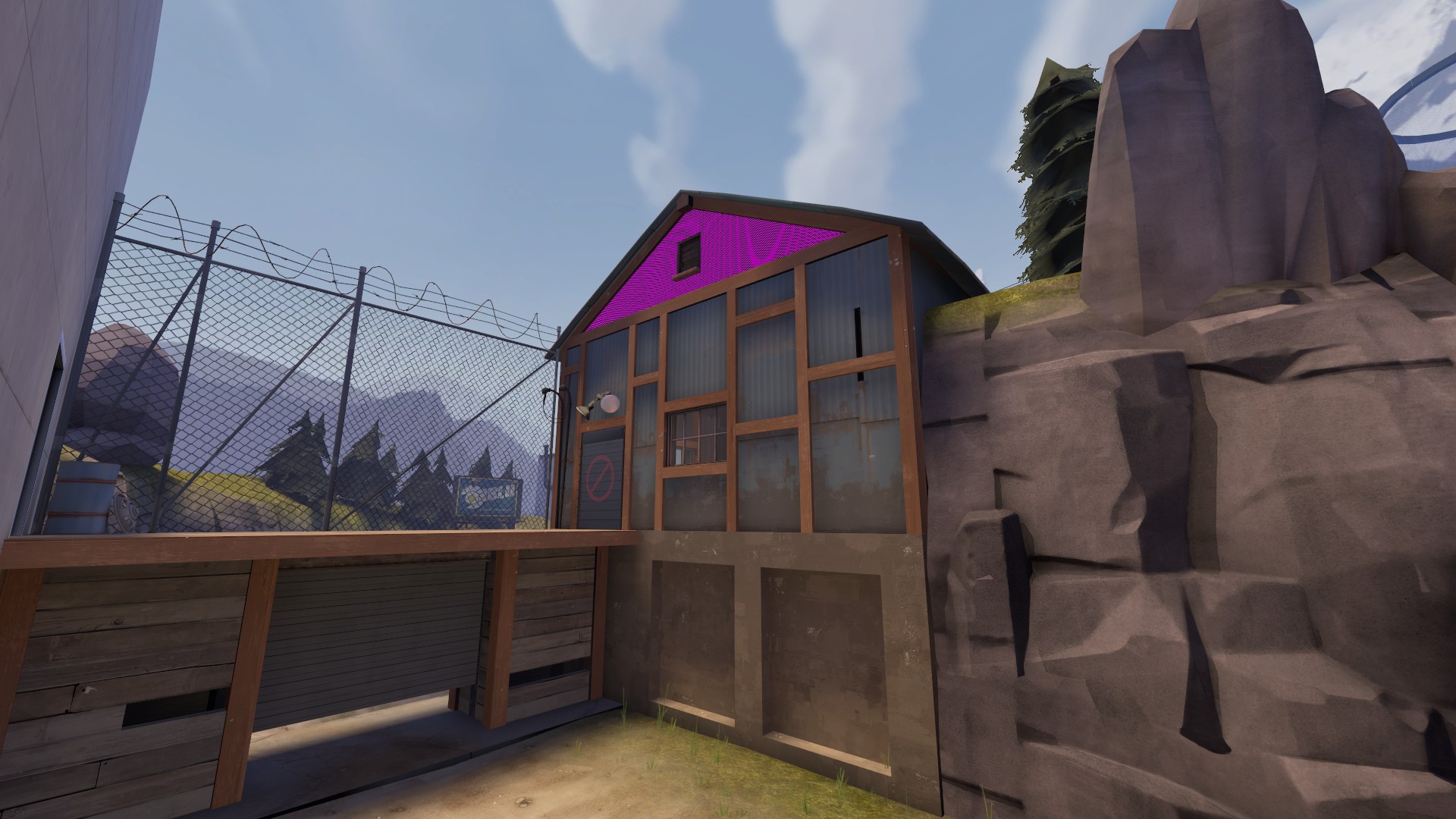
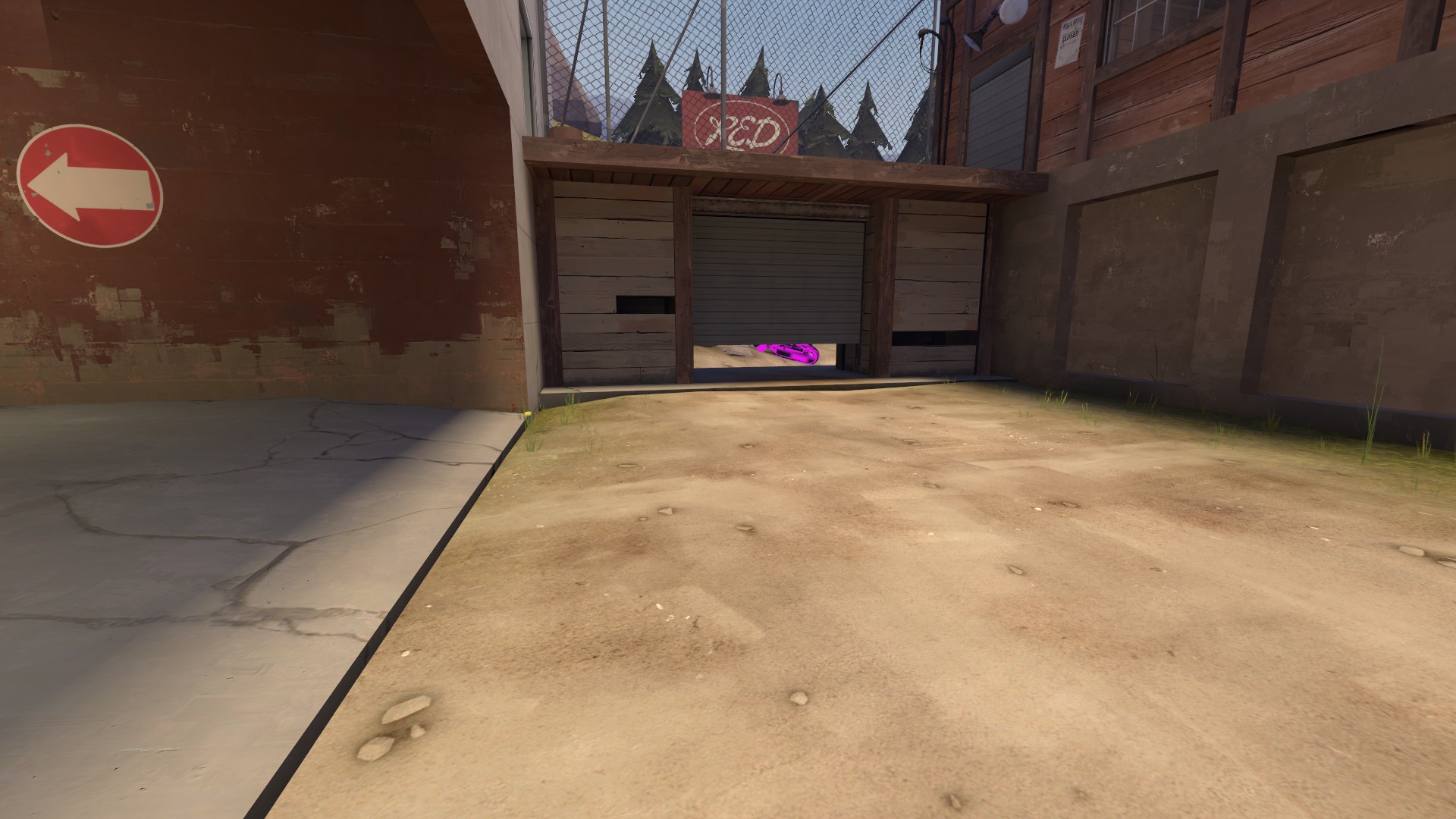
Glassworks

CP Glassworks RC7a

  • This map is featured! Our best maps, all together in one place for your viewing pleasure.

xzzy

aa
Jan 30, 2010
815
531
-0.5 fps, hate it.

I like the color around the center CP, but I'm not sure if a flowerbox in that little room fits thematically. I guess I don't know what theme you're going for, but if it's an industrial site like most TF2 maps are, any flowers that sprout are going to be in random spots that doesn't get a lot of foot traffic, they're basically weeds that aren't ugly.

Also doesn't that room open to the sky? Why do you have a light entity in there? :D
 

Crash

func_nerd
aa
Mar 1, 2010
3,349
5,524
Lighting needs work still, but:
FBD9D8BA02DFB9C3F8C5D9DB9A65300C2AF997BB
 

xzzy

aa
Jan 30, 2010
815
531
Check out what I did on Stoneyridge on that ledge over the death pit next to A. Basically make a light with the same color as the skybox and point it at whatever is too dark. Players will never notice you're tricking them.

It also means you don't have to try and cram a lightbulb in there.

If you actually want to draw attention to that detailing, another option would be cp_foundry, check out the spotlights they set up around the middle point where the BLU letters are.
 

Crash

func_nerd
aa
Mar 1, 2010
3,349
5,524
Yeah I was thinking some kind of spot light beam coming from the structure above pointing down to the point would be really cool.

I've already been stealing your lighting from Stoneyridge for quite a few places on the map now. So uh... Thanks! :)
 

Crash

func_nerd
aa
Mar 1, 2010
3,349
5,524
Beta 4 dropped, downloads in OP

Beta 4-
Tons more detailing (FLOWERS), final/ second especially
Adjusted spawn times so attackers have more reward for captures
Added a Facepunch Emporium Vehicle Prop Contest prop
Added some proper lighting in a few places
Remade tunnel going into basement from second courtyard
Changed steep ramp route into building between second and final into platform + stairs
Improved optimization

This should be the version I run for the Marathon Test.
 

Crash

func_nerd
aa
Mar 1, 2010
3,349
5,524
If anyone has a spare moment and wouldn't mind running around the map a bit, I'd appreciate it. Just a quick look over/ capture and all that. Trying to see if I overlooked anything glaringly obvious before the Marathon test.
 

MAkzu

L1: Registered
Jun 5, 2014
7
4
The map does look good indeed. But one thing tough.

Why is there a giant class thingys on the final buildings? That makes no sense.
 

Bereth

L4: Comfortable Member
Dec 13, 2011
170
197
I saw a couple of minor clipping bugs (dropdown in lobby especially), and some minor detail criticisms, but the only thing worth a picture are these:

l6rACHL.jpg


CIELNVm.jpg
 

Crash

func_nerd
aa
Mar 1, 2010
3,349
5,524
Updated screenshots in OP

Known bugs from this version:
There is a seam in both final spawns for some reason.
There are a few dark lighting issues, primarily on Red side
A couple engineer building bugs that I'm not going to point out until after the test tonight, heh.
Might be too much health near final now, we'll see.

Get hyped for the 3hr test, do it!
 

puxorb

L69: Emoticon
aa
Dec 15, 2013
533
802
This map is really really fun, so thanks for hosting this event! I hope the heatmap results help you make the map even better.

One complaint:
When you go around the building at mid, you can fall off the rock formation because of its steepness. If I were you I would add a wooden beam submerged into the rock or even just make the edge a little more square-ish. Does this make any sense? I can post a screenshot if it doesn't.
 

xzzy

aa
Jan 30, 2010
815
531
The map played well, it was good to see it in a pub environment when people have learned the layout.


As you heard many times, just fix the sign situation on the forward spawn because I think everyone fucked it up and ran the wrong way at least once.

I'm not sure what the geometry in that area allows but turning the door 90 degrees so you exit the spawn room facing the correct direction might help. 45 degrees might work too.
 

xzzy

aa
Jan 30, 2010
815
531
Also, that pipe that goes along the ceiling in the final point rooms gets in the way of epic rocket jumps from the raised platform to the CP.

And the "battlements" sign above the door that leads from last to CP2 is solid, not sure if it's a problem to let people stand up there but I thought I'd mention it.
 

MAkzu

L1: Registered
Jun 5, 2014
7
4
Downloaded it and roamed a bit. Detailing is quite good for a map that is in this state. Or well, i have not played many maps within beta, but still, impressive.

Anyway, I was kinda disappointed at this part

50snVT8.jpg


It is very empty and boring. So do you know what i did? I made this to express my opinions.

ye0tVkI.jpg


(I hope the images show correctly as i am new here.)