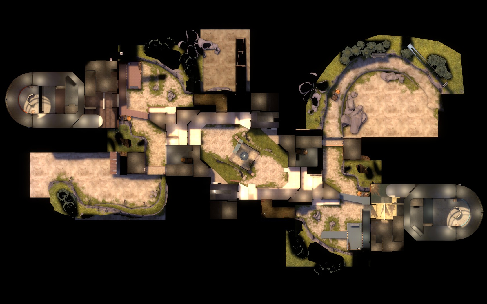
-
This map is featured! Our best maps, all together in one place for your viewing pleasure.
You are using an out of date browser. It may not display this or other websites correctly.
You should upgrade or use an alternative browser.
You should upgrade or use an alternative browser.
Maybe have a payload bomb over the final point?
Only some kind of nerd would put a bomb over the final capture point.
(xzzy, how do we not have a good video of your explosion up yet?)
RubbishyUser
L7: Fancy Member
- Feb 17, 2013
- 414
- 488
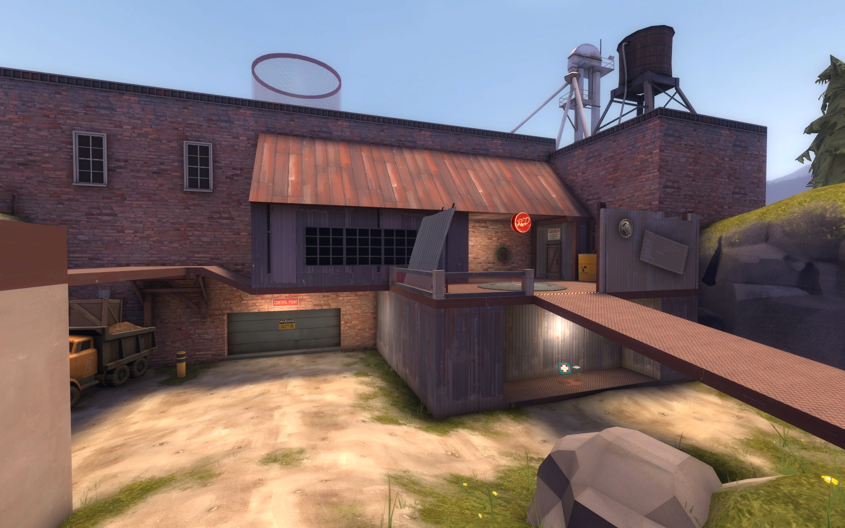
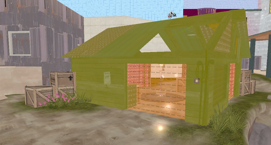
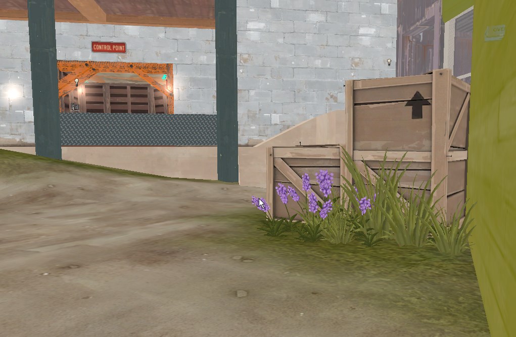
I never actually understood what that corrugated iron prop is that you have on point 2. It's awfully helpful for blocking sightlines and all, but what on earth is it? Oh, and that wood in screenshot 3 is a weird colour.
Just a metal barrier. Something they threw together for cover. Doesn't have a "purpose" the same way the sniper walls on 2fort don't.
Patch panels.
paaaaaatcccccchhh paannnneellls
https://www.youtube.com/watch?v=jPb4oryoRMw
I resisted using them a few times on seconds new walls, but I'm thinking I'm going to have to use at least one over there. It just works too well. Hopefully the daylight will help.
And yeah I'll move that rock back. Definitely too far forward.
And yeah I'll move that rock back. Definitely too far forward.
Last edited:
Updated, download in OP
I'll take some new screenshots tomorrow or something.
5-20-14
Beta 3-
Shrank doorways on mid building to reduce sniper sightlines.
Reduced a few other sightlines around mid.
Stretched final area back 256hu.
Adjusted on-capture spawn time adjustments, spawn times should not suck so hard now, especially when fighting is at final
TON of detailing. 99% of dev textures are now gone.
Big optimization pass.
Added experimental dead-end room at final.
Made roof above second steeper as an experiment.
Changed a window on mid to glass from wood.
Added lip to open window at mid
Adjusted displacement alpha painting.
Fixed mid air bullet strike green particles bug (lol)
I'll take some new screenshots tomorrow or something.
Last edited:
CRITICAL ERROR, sign of noob mapper:
SOLID_VPHYSICS static prop with no vphysics model! (models/props_foliage/tree_pine01.mdl)
Looks pretty good, there's some problems with the reflective floor in both of the bases where the reflections abruptly cut off. Pretty sure this is caused by misaligned lightmaps, something to double check down the road. The reflections look kind of bad anyways, maybe just pick a floor texture that doesn't shine.
I really don't like the cave that goes underground into the bases, it feels like too much of a run to do that little u-turn. Nothing wrong with it thematically, it just feels like an arbitrary mapper decision. I don't know how much leeway you have for adjusting that in terms of map balance but making it shorter would probably help.
CP 2 looks better with it centered on the control point.
Yeah I definitely plan on overhauling that tunnel. Plan on giving it the same treatment as the tunnels towards mid. I'll streamline them a bit when I do. I just haven't worked up the willpower to remake them yet.
And yeah that texture will get axed for B4.
And yeah that texture will get axed for B4.
takabuschik
aa
- Apr 14, 2013
- 662
- 344
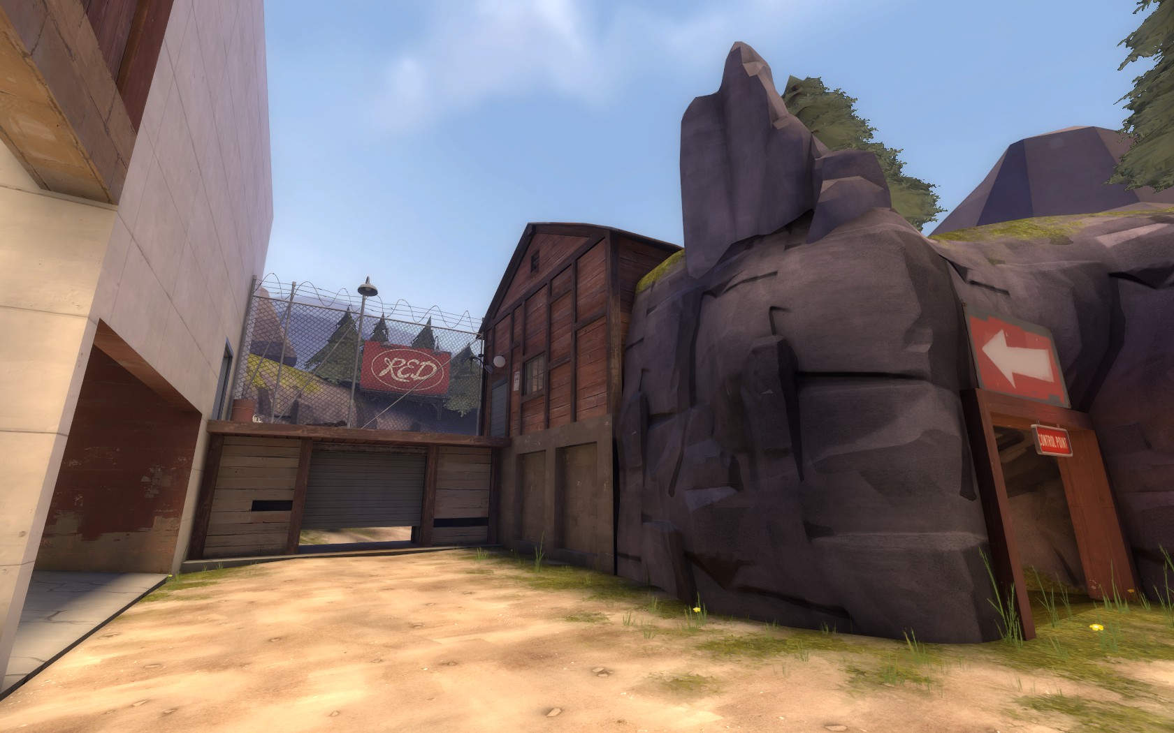
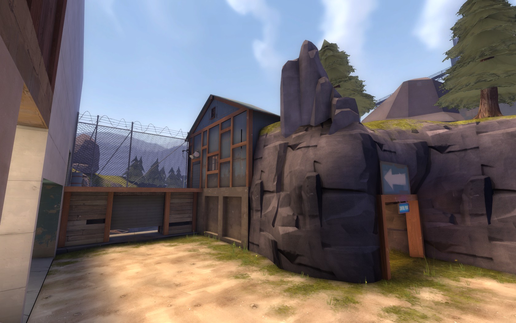
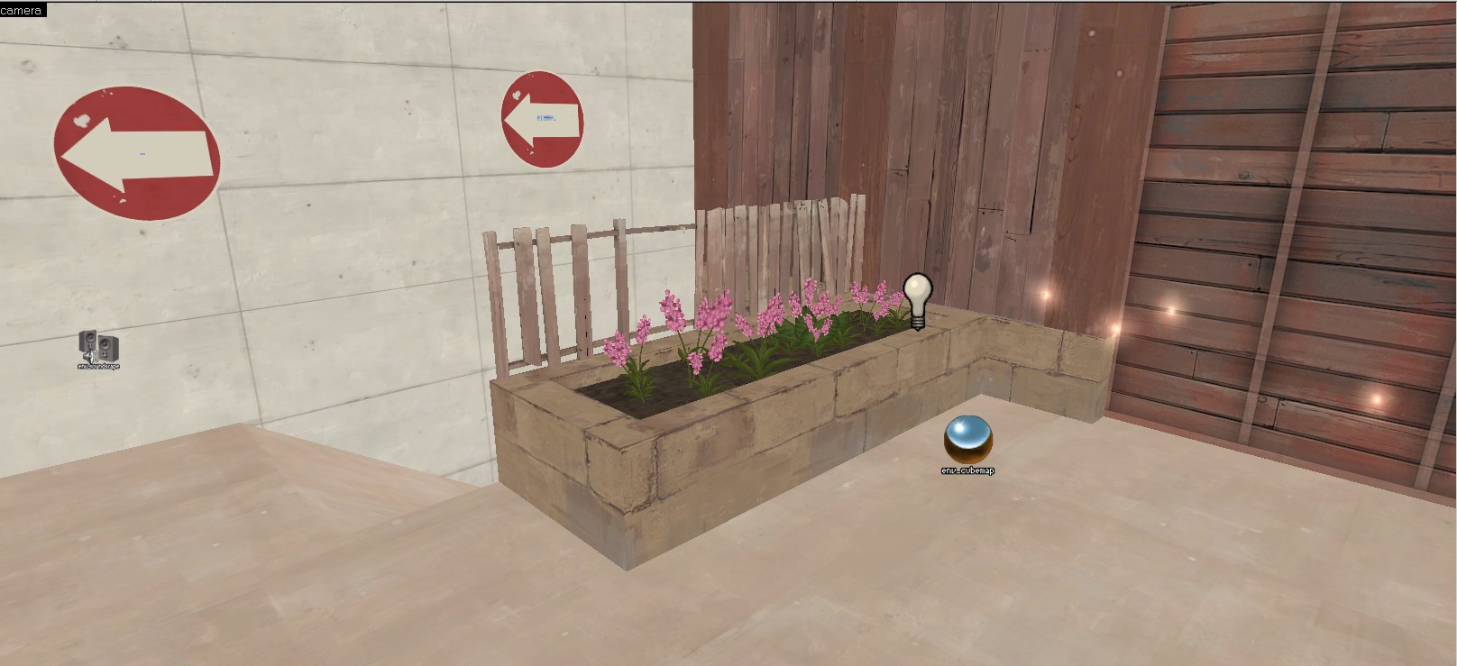
The arrow over the tunnel in the second to last screenshot just doesn't make sense to me. I know blu team should go left, but still it looks wierd, as if they shouldn't enter the tunnel at all. Maybe put the sign somewhere else? maybe on the rocks above the tunnel or on the building behind it?
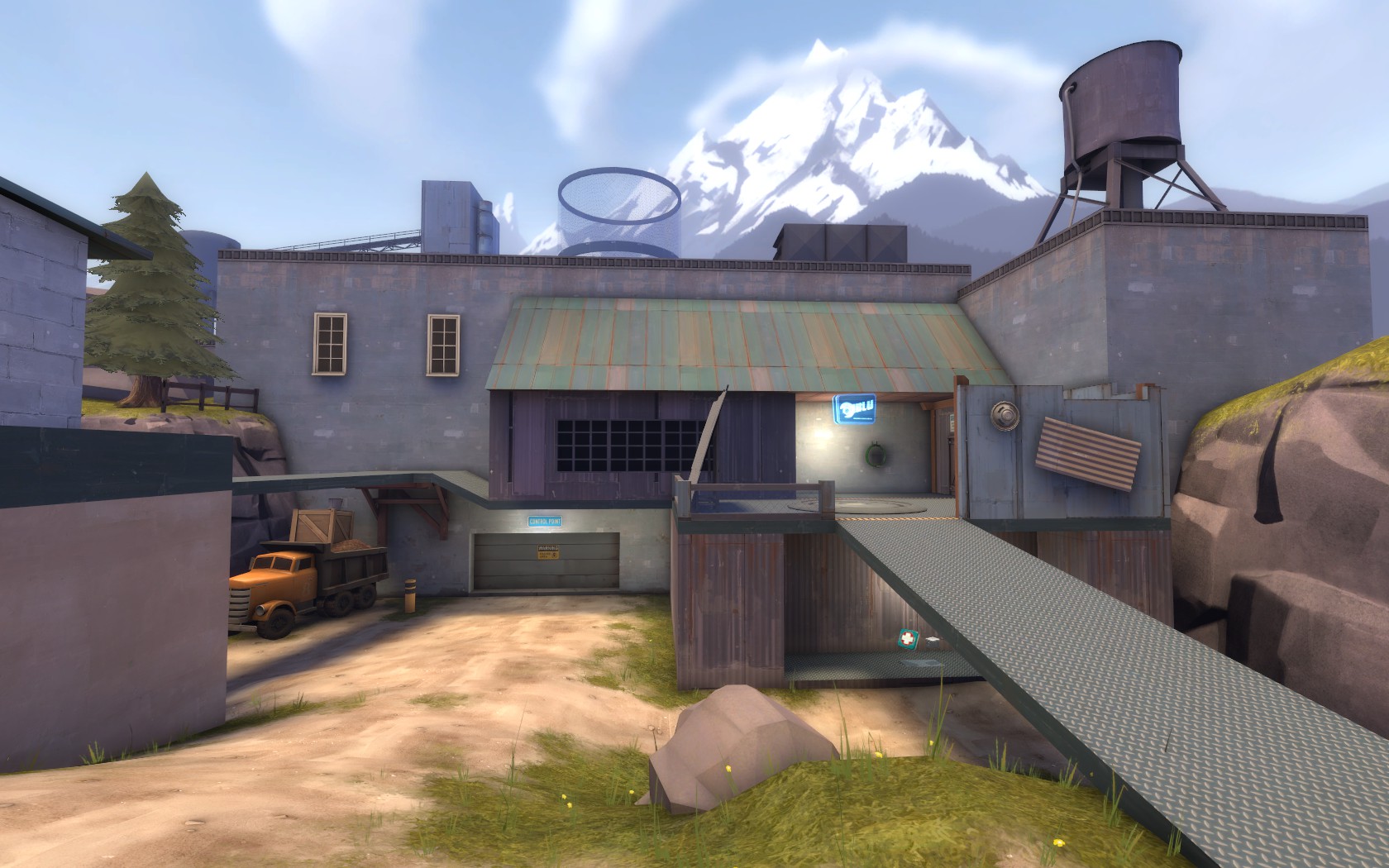
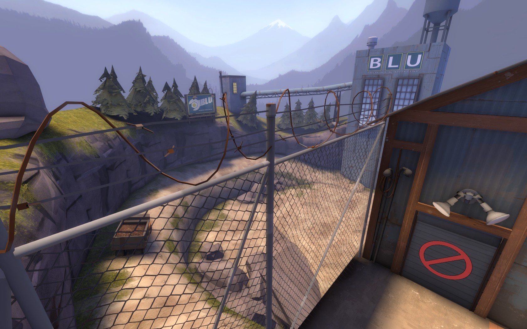
Another thing that looks wrong to me, is the texture on the blue building inside the quarry in the last screenshot: I think it should have some concrete on it instead of corragated metal.
Other than that, from what I can tell by the screenshots, it looks good. I hope I'll find some time to play it soon.


