Dusk

CP Dusk rc

osiem

L2: Junior Member
Jan 25, 2011
89
137
Cp_dusk is a two round attack/defence map set in alpine environment after the sunset.

Thank you to:
Everyone who gave feedback and/or playtested this map
LeSwordfish for map's name
The Construction Pack team for models made by them that I used
YM for his paint patch textures

Please do not decompile and modify the map without my permission.

More screenshots
Full changelog
 
Last edited:

Nacimota

L1: Registered
Jan 18, 2011
29
18
Howdy!

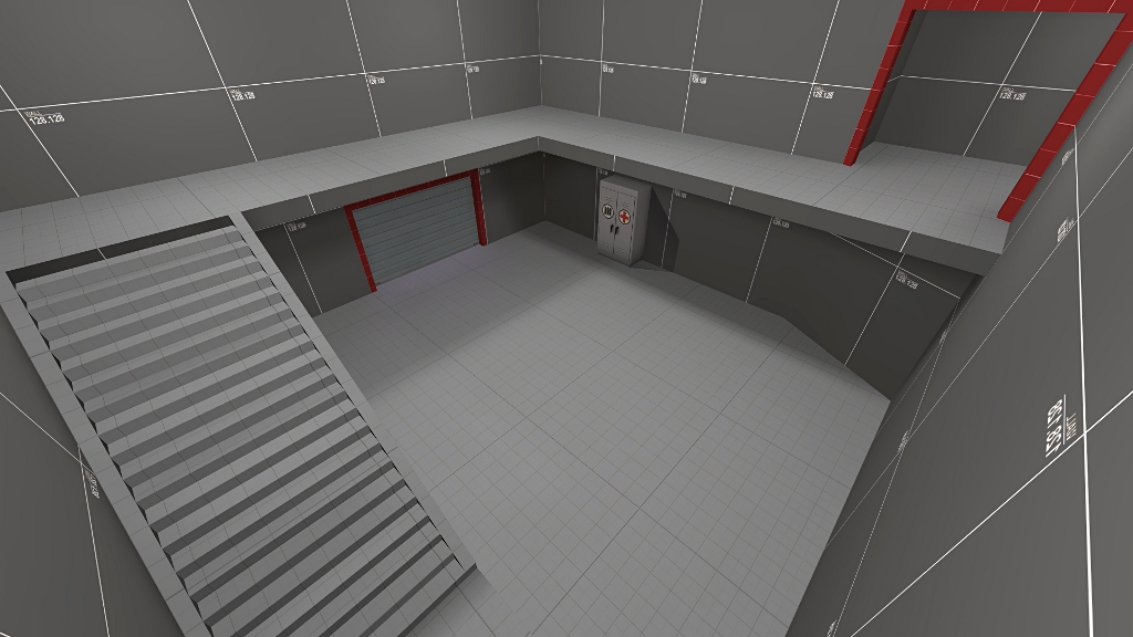
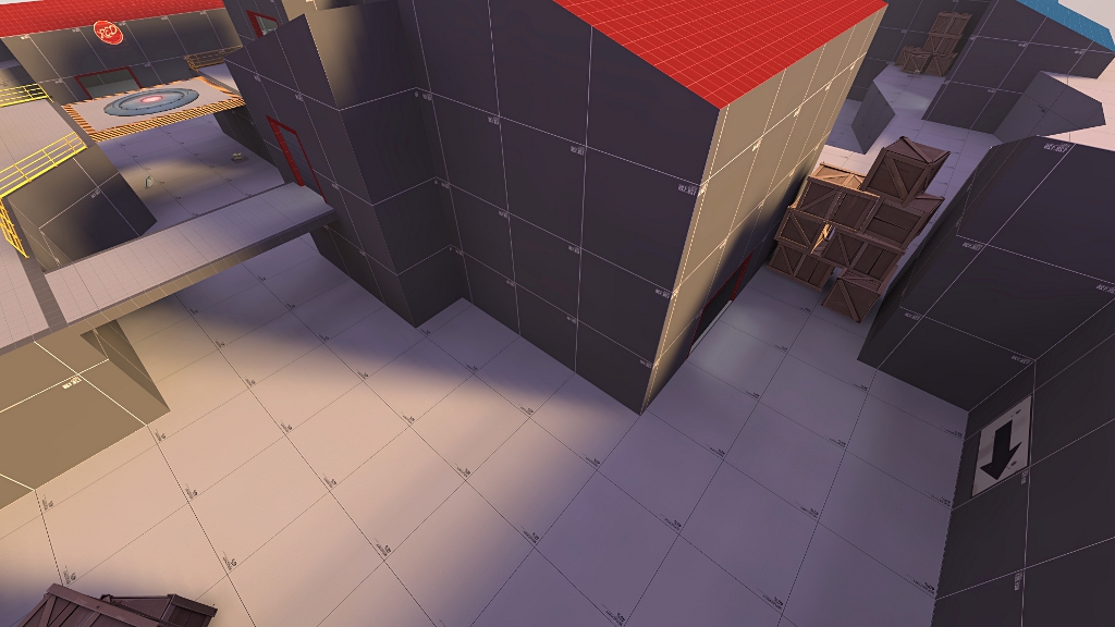
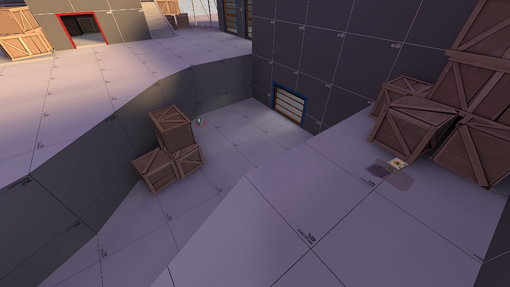
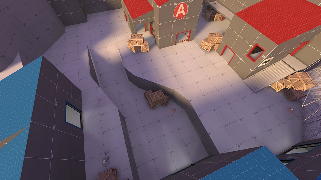
Let me just say that your visleafs are not particularly terrible, I see you've used func_detail in number of places and maybe even hints but I'm not sure; anyway, forgive me for nitpicking.

The highlighted brushes should be func_detail'd in my opinion:

osiem_vis1.jpg

osiem_vis2.jpg

osiem_vis3.jpg

osiem_vis4.jpg

osiem_vis5.jpg

osiem_vis6.jpg
 

Nacimota

L1: Registered
Jan 18, 2011
29
18
Unless you stuck hints all around it so the visleaves on the top and bottom cant see eachother there's no point splitting them like that
 

LeSwordfish

semi-trained quasi-professional
aa
Aug 8, 2010
4,101
6,597
The first point should be a bit more enclosed. My suggestion is to put walls around it, with a door on either side. in this picture, put a wall along the side of it, a large-ish door on the bottom (from the picture's view) and a small door on the top.
thumb_cp_osiem_a1_6.jpg


The point cant be contested without leaving spawn, the main route still sees it easily, and the secondary route has a less obvious entrance!

If you dont want to do that, or intend to keep this a 2cp map, you need a larger space to fight in before it- buildings like before the point in dustbowl's third stage, or at the start of artpass or gorge.
 

osiem

L2: Junior Member
Jan 25, 2011
89
137
Thanks for your feedback, guys. i'm probably gonna put some more cover around A, but first i'd like to test this map a little, because it hasn't been played even once yet. Also, i set A's capture time for 7 second (3 sec on dustbowl's 1st point) and blu respawn time 3 sec longer than red, so maybe it wont be so hard for red to defend, huh?

Nacimota - yes, i've used some hints, but i'm quite new to mapping and i don't know much about optimisation, i've only read one tutorial about hints and i still need to learn about areaportals.

Anyway, gonna make those brushes you've marked func_detail, decide what to do with A and upload new version tomorrow.
 

osiem

L2: Junior Member
Jan 25, 2011
89
137


Okay, so i've made some changes to A and a2 is up.
LeSwordfish, i've made A a bit like you've said, but i've put bigger entrance on the top and smaller on bottom. Also, i've added a small entrance on the side. Hope it's good like that.
I've added new screenshots of A so you guys can check out the changes.
I'm really looking foward to more feedback, and gonna start working on 2nd stage soon.

Changelog:
- reworked A capture point building to provide more cover and make defending easier
- added spectator cameras
- made some small solids func_detail to improve optimisation
- fixed some lamps which weren't attached to the ceiling
 
Last edited:

Sgt Frag

L14: Epic Member
May 20, 2008
1,443
710
I don't think those overhead paths should be func_detailed, maybe I'm wrong (if i am, then I'll do it on my map :p)

Also, Swordfish has a good point, Maybe adding a small building or something in between?

The areas below them are so small, that not rendering anything in there probably wouldn't be worth the trade off of the extra vis-splits that leaving them world spawn would create.

Even hints probably wouldn't help, you'd actually have to area portal them to seal them off.

I'd only leave them there if it actually creates a useful split that you'd have to use a hint for anyway (and still, they'd cause 2 splits when func_detailing and using a hint would only cause 1)
 

Sgt Frag

L14: Epic Member
May 20, 2008
1,443
710
Thanks for your feedback, guys. i'm probably gonna put some more cover around A, but first i'd like to test this map a little, because it hasn't been played even once yet. Also, i set A's capture time for 7 second (3 sec on dustbowl's 1st point) and blu respawn time 3 sec longer than red, so maybe it wont be so hard for red to defend, huh?

Nacimota - yes, i've used some hints, but i'm quite new to mapping and i don't know much about optimisation, i've only read one tutorial about hints and i still need to learn about areaportals.

Anyway, gonna make those brushes you've marked func_detail, decide what to do with A and upload new version tomorrow.

I'd suggest cover too, all you really need is a few props, or 'walls' here and there where you think a player could take cover. You're going to hear that in testing anyway, so might as well throw a few pieces of cover in, then you can get feedback if the cover is in a good spot, or should be moved. Instead of just waiting to hear that you do in fact need cover ;)

At this stage you shouldn't even mess with hints. The map is so basic that it should render decent anyway, and the need for hints hasn't yet been determined by scene complexity, vis splits. You'll just have to move, delete, redo them later when they are needed anyway. Having them in early just complicates things and can actually make it worse.
 

osiem

L2: Junior Member
Jan 25, 2011
89
137
Thanks for your feedback, Sgt Frag.
I've already made that walkway with B control point func_detail. Gonna make it world geometry back for a3 then.
I've added some cover to A, now i need to test it a bit to say if it's still too easy for blu to capture.
Finally, do you think i should delete those hints i've already made?
 

osiem

L2: Junior Member
Jan 25, 2011
89
137


Okay, a3 is up, i think 1st stage's layout is rather finished and i'm starting to work on 2nd one, but if you think something should be improved or changed, please let me know. :)

Changelog:
- rebuilt red spawn to make red's way to B a bit longer
- added some crates and a medium healthkit in the lower path from blu spawn
- made flanking route to point B longer
- made right (looking from point A) exit from blu spawn wider at the end
- added missing func_respawnroom in one part of blu spawn
- changed some healthkits and ammopacks location
- made func_detail with point B world geometry

here's some screenshots of changes

red spawn:
cp_osiem_a3%20ch1.jpg

cp_osiem_a3%20ch2.jpg


lower path from blu spawn:
cp_osiem_a3%20ch3.jpg
 
Last edited:

osiem

L2: Junior Member
Jan 25, 2011
89
137


I've finished 2nd stage and I'm updating the map to a4.
I would love to get some feedback.

Changelog:
- added second stage
- changed AddTime outputs for AddTeamTime
- some minor changes on first stage
 
Last edited:

grazr

Old Man Mutant Ninja Turtle
aa
Mar 4, 2008
5,441
3,814
This map played a lot better with 6-8 players a side. A full server saw a lot of tough defences. Partly as a result of numerous medium-large health and ammo spots.
 

Moose

L6: Sharp Member
Nov 4, 2009
312
616
Haven't had a chance to test yet, but I like what you have. Height variation looks good, and I don't see any huge issues with the layout from the pics.

My only concern is that you seem to have a few outdoor areas that might feel like a boring, flat corridor. Specifically the left side of this pic on the lower level:
cp_osiem_a3%20ch2.jpg


Other than that though, looks really fun.
 

osiem

L2: Junior Member
Jan 25, 2011
89
137
Thanks for your tips, guys. :)

grazr - I'll try to reduce the number of medium/large pickups near B and C. I'm also rebuilding the area between A and B to make it a bit larger.

Moose - Thanks, I'm rebuilding area near B and I'll try to make outdoror areas a bit more interesting there.
 

osiem

L2: Junior Member
Jan 25, 2011
89
137


I've made some important changes (mainly near B) and i'm updating the map to a5.
As usual, i'd love to get some feedback. :)

Changelog:
- fixed broken red respawn doors
- moved blu spawn back from A (was 1024 units from A, now it's 1152 units)
- made main route from A to B wider (was 256, is 320)
- rebuilt area between A and B, it's bigger now, also added a balcony for blu and rebuilt a flanking route to B
- rebuilt blu entrances to a building with setup gates for 2nd round to prevent red from spamming blu spawn
- deleted some crates near C and D
- added a new entrance to building next to D to make a trench under D more useful
- changed location and reduced number of pickups (mainly near B and C)
- disabled shadows on all yellow handrails
- added/removed some playerclips
- other minor changes

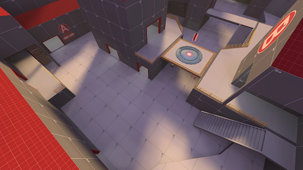
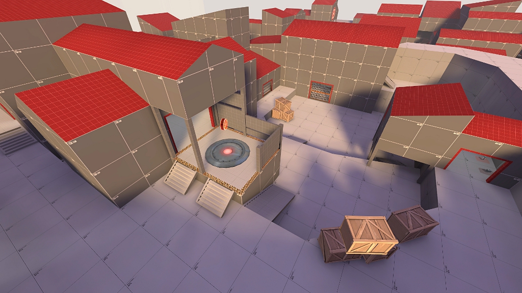
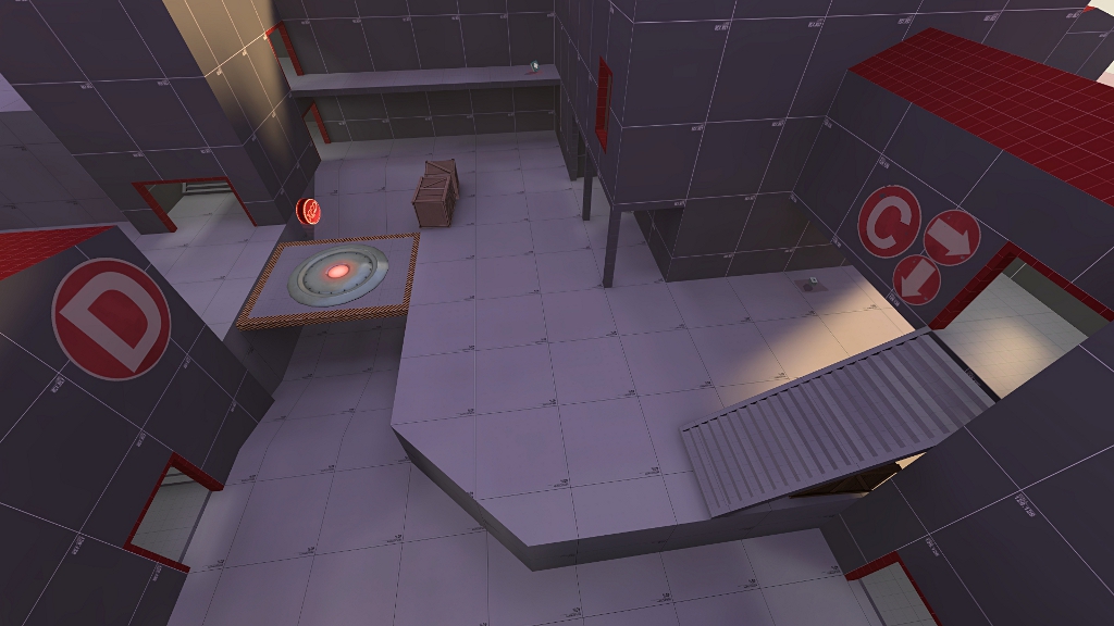
I'm also adding some overview pictures of each point, hope it will help to imagine how the map layout looks like before downloading:

A
cp_osiem_a5%20A%20overview.jpg


B
cp_osiem_a5%20B%20overview.jpg


C
cp_osiem_a5%20C%20overview.jpg


D
cp_osiem_a5%20D%20overview.jpg
 
Last edited:

osiem

L2: Junior Member
Jan 25, 2011
89
137
Frozen - I'll think of adding something there, but this area really felt too cramped with 18-24 players on server, I've made it a bit bigger (only 128 wider and 128 longer) and I'll test it like that first. If it'll seem too large and open, I'll add something there.

Anyway, thanks for a tip. :)