Yo, as one of the few remaining people on this site willing to play 3-CP maps, I got some feedback for this map, mostly pertaining to its overabundance of routes and width.
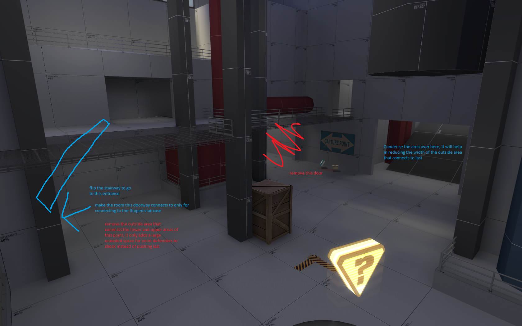
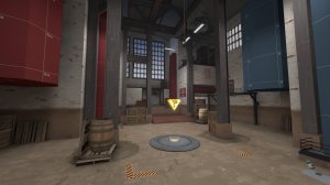
This screenshot is at mid, and suggest a lot of changes to streamline the traversal and defense of the point.
Starting with the staircase that connects the balcony and the area by the health and ammo kit. I recommend removing the doorway to the right on the screenshot, and flip the staircase to the door on the left, the one hidden by the wall in that screenshot.
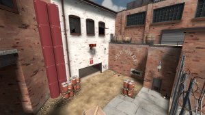
In doing that is the second part of my recommendations, removing the outside area that serves to connect the balcony and the lower area together. It's big, fairly empty, and only really serves a purpose of attacking engineers building annoying nests that defenders have to clear out before they push to Last. Reduce the size of the room that the flipped staircase goes to so it only serves to connect to the staircase to compensate.
Finally, for the big ramp room, reduce it's width. Reducing it's width can help in reducing the space of the outside area between mid and last, which is my next point.
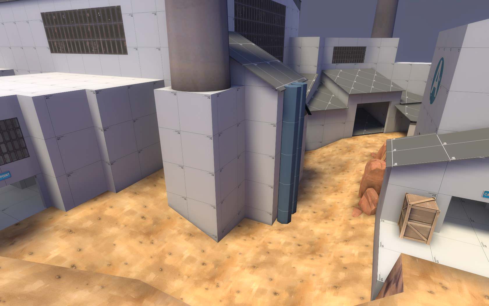
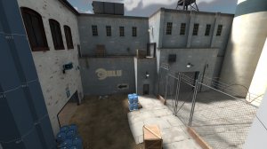
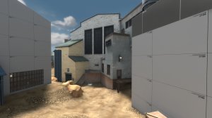
This area is HUGE width wise, and not very interesting to travel in. I'd say increase it's length, and decrease it's width. Now how you do this is up to you, as I don't have any concrete ideas on how to do this with your current layout, other than squishing the distance between mid entrances.


