Daenam

KotH Daenam b12

hondjo

L2: Junior Member
Feb 20, 2016
84
39
b5!

thanks to feedback from
TF2M
lucrative's stream
gaeta discord

Removed some deadspace in the lobby/spawn area
hopefully fixed cubemaps
added shutters on either side of the garden-exit of lobby to break up sightlines

flipped the windows on the catwalk
splitted the battlements, requiring people to walk from one to the other all the way. (jumping classes can still go over)

some other stuff idk

Read the rest of this update entry...
 

G.bo

L4: Comfortable Member
Sep 24, 2017
179
195
Oh my gosh, yes. This map looks fantastic. I love the direction this is going.
 

Jack5

L4: Comfortable Member
Apr 6, 2018
189
37
Y'know, I think I liked the old name Viridii better. Rolled off the tongue easier.
 

Asd417

Sample Text
aa
Mar 20, 2016
1,461
1,035
oh Now I see. I did think the name of this map is particularly Korean.
btw you want to keep 지하실 as a single word without spacing
 

hondjo

L2: Junior Member
Feb 20, 2016
84
39
- revamped far left side of lobby
- removed small greenhouse and replaced it with a more versatile shack
- moved and removed a bunch of pickups
- pickups have patches after being asked enough for them
- changed left flank to be more one-way and to favour the tunnel more
- improved clipping around common jumping spots and the point
- stop hiding in the ceiling
- improved korean translations ( thanks @Asd417 )

Read the rest of this update entry...
 

ElkTF2

L1: Registered
Nov 15, 2019
1
2
whats with all of the clipping that kills rollouts (and really confuses me on where I can go)?

any plans to change it up in the future to where there arent invisible walls on places it looks like should be strategic?
 

Melons

L1: Registered
Nov 15, 2019
1
2
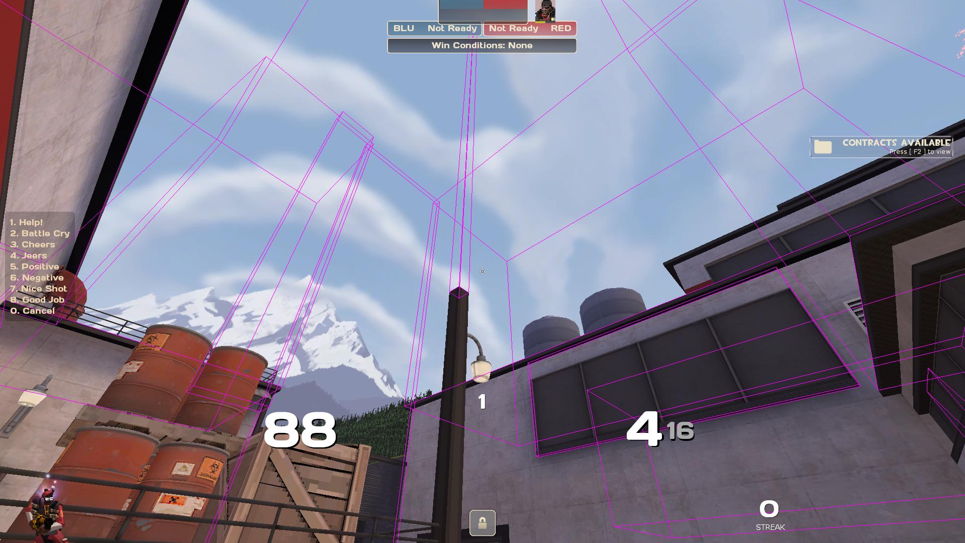
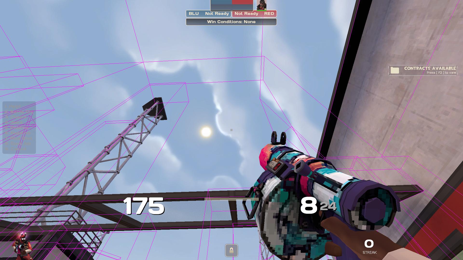
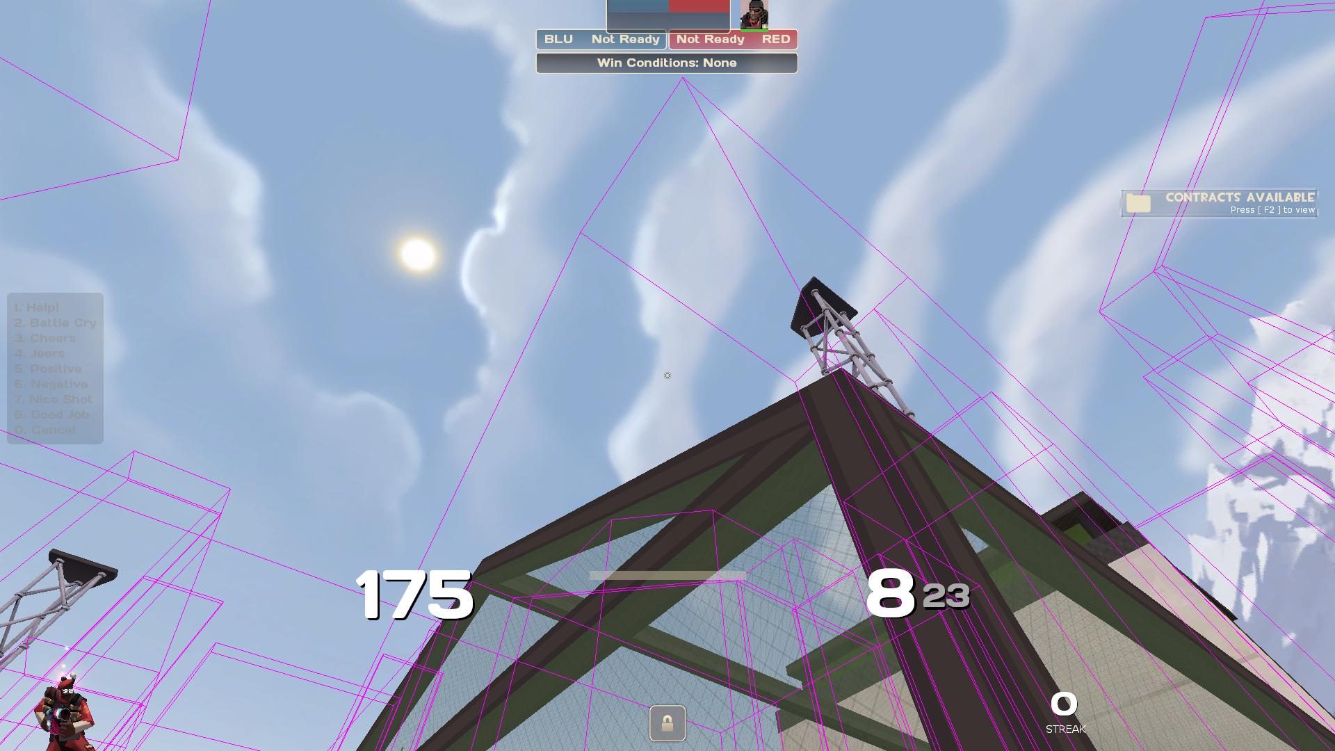
Theres a lot of invisible walls that I just don't understand. These don't need to be here IMO. Kinda kills any interesting soldier movement.
Exhibit A (Outside spawn door).
cFspNNP.jpg

This first one was a good laugh, but it shouldnt exist for such a small brush.

Exhibit B (On way to mid from outside spawn door).
cVLm9oi.jpg

This one I don't understand at all. Forcing people to thread the needle under this glass ceiling doesn't make much sense, there's no reason why people shouldnt be able to go over this catwalk.

Exhibit C (Mid)
EkH0EDq.jpg

This one you can at least argue you dont want this highground to exist for gameplay purposes, but if thats the case make it look like you shouldnt be able to stand on it, i.e. make a tower thats a lot higher or something.
 

hondjo

L2: Junior Member
Feb 20, 2016
84
39
after a long downtime it's finally back.

GAMEPLAY
-adjusted some sightlines spanning from lobby spawn to battlements
-reworked the dropdown room to have a stairway instead
-overpass above the flank fence is now accessible and can be splashed through the grates.
-changed the shape of the point in order to combat "ninja capping"
-added a small ammo pack behind point under battlements
-staircase outside of right spawn made w i d e r

VISUAL
-added and removed various barrelcrate props to represent their teams' colour better
-(hopefully) made some inaccessible roofs obvious
-rethemed the capture point
-a team coloured spotlight emits from the point when captured

next up are 3d skybox, new skybox (currently budget tatooine) and edits to the korean signs, these have been sent to me already but im too lazy.

Read the rest of this update entry...
 

hondjo

L2: Junior Member
Feb 20, 2016
84
39
b9

-fixed shit cubemaps/packing from b8
-shuffled around some props to make them look nicer and changed their colour
-added 3d skybox
-long overdue update of the korean sign for battlements from 교전지점 to 교점지역, and in the process accidentaly messed up one other sign which i will change later i suppose (제한구역 (restricted area) instead of 지하실 (basement) in the old dropdown room)

and last but not least,

개구리

Read the rest of this update entry...
 

hondjo

L2: Junior Member
Feb 20, 2016
84
39
- raised the ceiling in tunnel and added splashable grates leading to point.
- removed fence dividing battlements
- opened fence dividing flanks
- added small health packs to tunnel and the back of point and replaced small healthpack on the left side with medium
-fixed overlays near red spawn not lining up nicely

- optimized the map in general, since i have a toaster config i personally can not tell the difference but i am curious as to how much it impacts different configs (fade distances, hints, occluders)

frog

Read the rest of this update entry...
 

Katsu! :3

Veteran Cat
aa
Jul 30, 2021
813
511

hondjo

L2: Junior Member
Feb 20, 2016
84
39
Heyo, b10 of your map had Missing Cubemaps so I made some for it! No decompiling of the map done, I just generated them inside tf2 using this (https://tf2maps.net/threads/tutorial-building-cubemaps.16452/) handy guide. The filename is koth_daenam_b11. Credit isn't required but it'd be appreciated :)

Download link for the .bsp:
thanks for making this, i hope to get back to updating this soon with fixed cubemaps this time :chord:
 

otherside

L1: Registered
Mar 10, 2024
1
0
It's a great and very fun map, but it still needs some major changes to be perfect for competitive. I've no clue if the map was made for competitive, and if it's for 4v4, 6v6 or 9v9, but I moderate a Highlander PUG and we tested the map this weekend, people's impressions were:

- The spawn is too close to the point, demoman's rollout has only one jump - maybe centering the spawn room in the map (and forcing people rollout through lobby) could fix it.

- Think the point capture area should be squared, making possible to edge-cap from ramp.

- The main shutter also needs to be worked in a way of nerfing the sightline in case of someone opening it for his Sniper to peek, you can see the whole lobby with that shutter open.

- And of course, there's a ridiculous Sniper sight line from the point to the respawn door, and it needs to be removed (so broken).

Changing the spawn room (or removing the door to the yard) would fix the 1 jump rollout and remove the broken Sniper sightline, but it would make the whole yard/catwalk/stairs area very unused, it already feels very dead since the combo's optimal push is from lobby, so IDK.
The catwalk is kind of boring, since it's not connected to lobby and you're far from your team - the whole catwalk and its house feels like a playground for Spies to get easy picks, but I don't know if I'd change anything lol.

The headglitch in the point feels ok, not too overpowered since the rail blocks a Heavy from shooting on people's feet.

I don't know if I like or not the underpasses but they're kinda cool tbh.

Screenshots: View: https://imgur.com/a/LI6EceY


Anyways, I'm just leaving our feedback here...
Tysm! We loved the map! :)
 
Last edited: