-
This map is featured! Our best maps, all together in one place for your viewing pleasure.
You are using an out of date browser. It may not display this or other websites correctly.
You should upgrade or use an alternative browser.
You should upgrade or use an alternative browser.
a2 changelog:
- introduced amphoras
-- similar to pumpkin bombs, but apply various status effects instead
- intel rooms are actually interesting
- moved intel entrance to block sightline from intel to battlements
- added medium health near intel entrance to support pushes in
- adjusted deep water damage triggers
- added visualisation for deep water damage triggers
- ubercharged couriers (that would ignore the scare effect) are now forced to drop the flag
- flag timers now operate on shotclock mode
- flags have a temporary visualisation to convey scare mechanic
- adjusted water (ty toop!) and sky
spawnrooms will be improved later.
amphoras have no stuck prevention so are temporarily clipped.
Read the rest of this update entry...
a3 changelog:
- added a structure to lobby, that should provide more opportunities for both defending and forward holding during a push
- added a tunnel into lower intel
- increased amount of ammo pickups
- remade lazy placeholder displacements by the water
- changed crits amphora to mincrits
- added stuck prevention to amphoras, replacing placeholder clipping around them
- reworked spawns
- reworked mid
- increased water hazard opacity
Read the rest of this update entry...
a4 changelog:
- (hopefully) fixed amphoras sometimes being invisible on respawn
- improved geometry around water
- geo changes around mid, connectors, and lobby
- more cover overall
- landmarking
- significantly reduced water hurt zone damage
- added patches for amphora spawn locations
- enabled halloween mode
- new water. very murky. damage zone indicator should stick out way more against this
Read the rest of this update entry...
a5 changelog
- fixed an asymmetry (oops)
- geo adjustments to connector
- (hopefully) fixed invisible amphoras (for real this time)
- the nearest-to-mid route out of intel now requires a jump, meaning couriers will have to take a longer path before escaping the enemy base
- carrying the intel provides a dispenser-like effect for you and your nearby allies
- updated a few amphora particles
- added amphora spawn particle
- skeletons!
- flag now resets when dropped (not held!) in the water
Read the rest of this update entry...
a6 changelog:
- less skeletons!
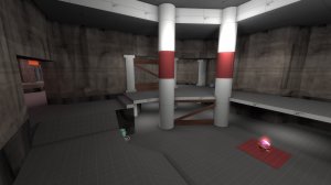
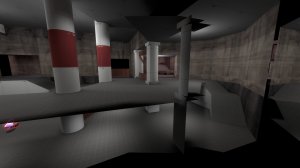
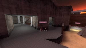
- large geo changes to intel room
returning the quickest way out and adding extra space to push, as well as adjusting angles when pushing in, should improve both sides of an intel room fight.
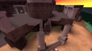
- traversing across the mid high ground requires jumping
couriers will now have to take the low ground, allowing teams more opportunities of running into eachother during flag runs.
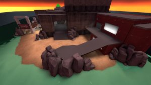
- geo changes to spawn lobby
no more cheeky teleporter spots and some extra visibility out of the spawn building
- amphoras now take activator team into consideration
shooting positive amphoras (health, minicrits, cloak) affects everyone. shooting negative ones (jarate, fire, blast) affects you and the enemy team. no more accidentally immolating friendly scouts.
- added bespoke amphora appear particle
Read the rest of this update entry...
- less skeletons!


- large geo changes to intel room
returning the quickest way out and adding extra space to push, as well as adjusting angles when pushing in, should improve both sides of an intel room fight.

- traversing across the mid high ground requires jumping
couriers will now have to take the low ground, allowing teams more opportunities of running into eachother during flag runs.

- geo changes to spawn lobby
no more cheeky teleporter spots and some extra visibility out of the spawn building
- amphoras now take activator team into consideration
shooting positive amphoras (health, minicrits, cloak) affects everyone. shooting negative ones (jarate, fire, blast) affects you and the enemy team. no more accidentally immolating friendly scouts.
- added bespoke amphora appear particle
Read the rest of this update entry...
a7 changelog:
- removed single-capture win
- significantly improved flag logic
-- fixed extreme flag pickup range in most cases
due to how flags work when 'passing' it to another player, the extreme pickup range still happens on the same tick a flag is dropped.
-- implemented a much better method of acquiring the courier
flagdetectionzone passes !activator, which is by huge measures a much cleaner method than the mess i'd cooked up a year ago.
-- now uses 100% less sweeping triggers!
- added more team colouration around mid and connectors
- reduced skeleton health
- revised parts of amphora logic
- fixed water damage triggers not giving damage indicators
- improved outdoor lighting
- added medium ammo to intel room, to aid defending engineers and pushes
- added soundscapes
Read the rest of this update entry...
b1 changelog:
- artpass! welcome to the styx!
- each amphora now has a unique model and sounds!
- killing the losing team during humiliation time makes their soul pop out, trapping them in the underworld forever!
optimisation passes and other improvements to follow.
Read the rest of this update entry...
Feedback Time! Prepare Yourselves:
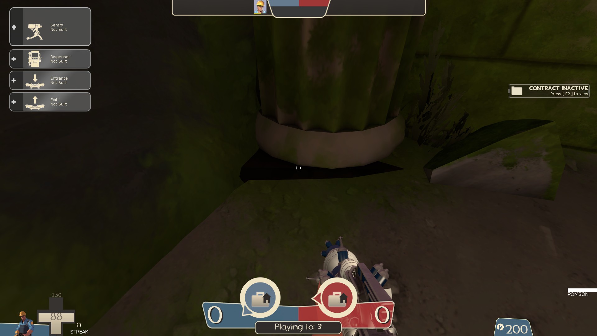
-this prop is fully black
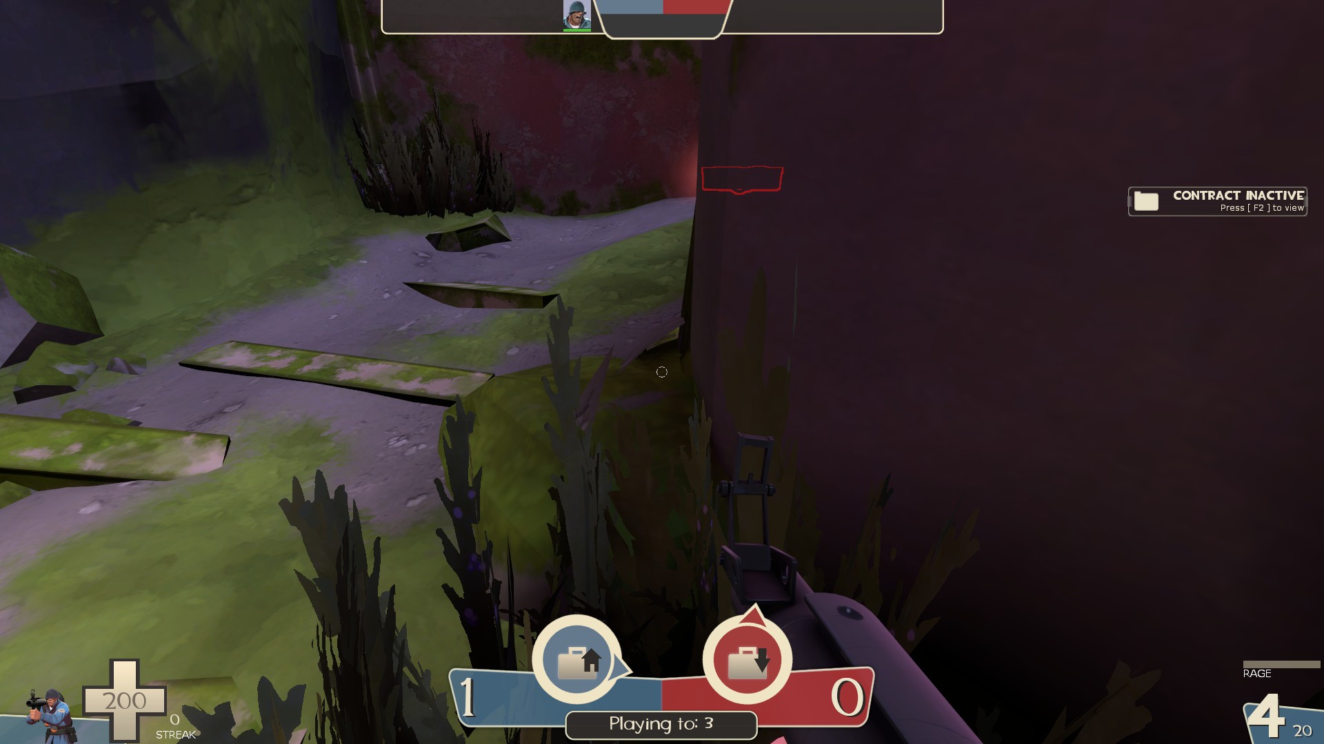
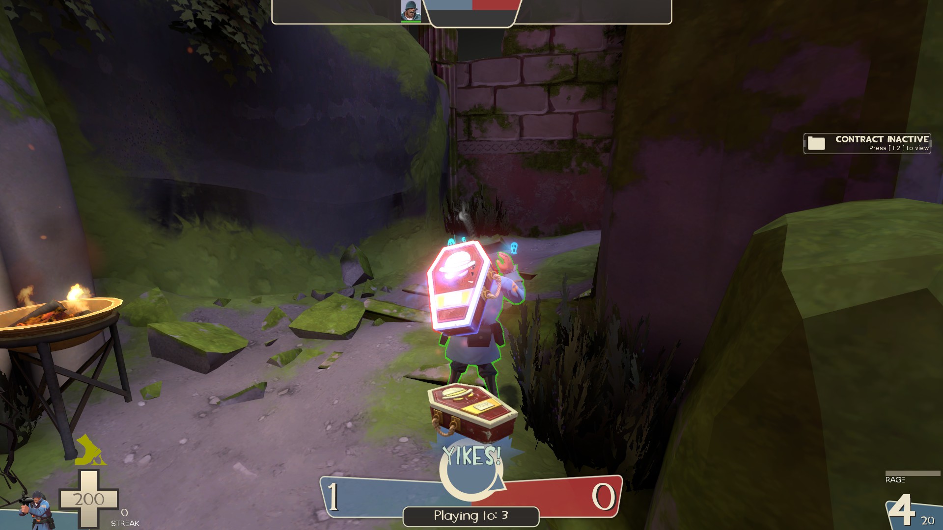
-displacement seam
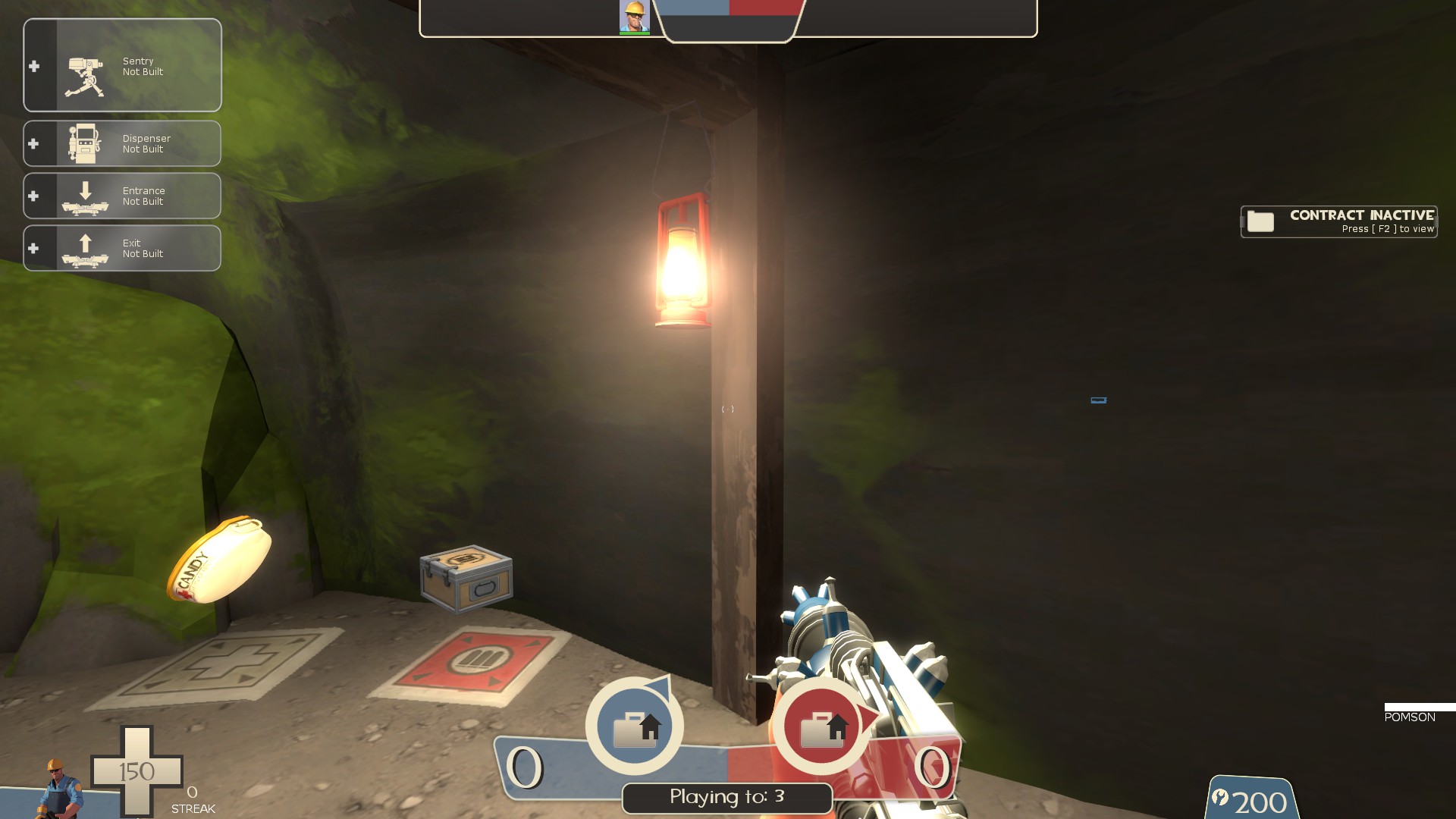
-none of the supports in these caves seem to have any clipping, add some to smooth em out
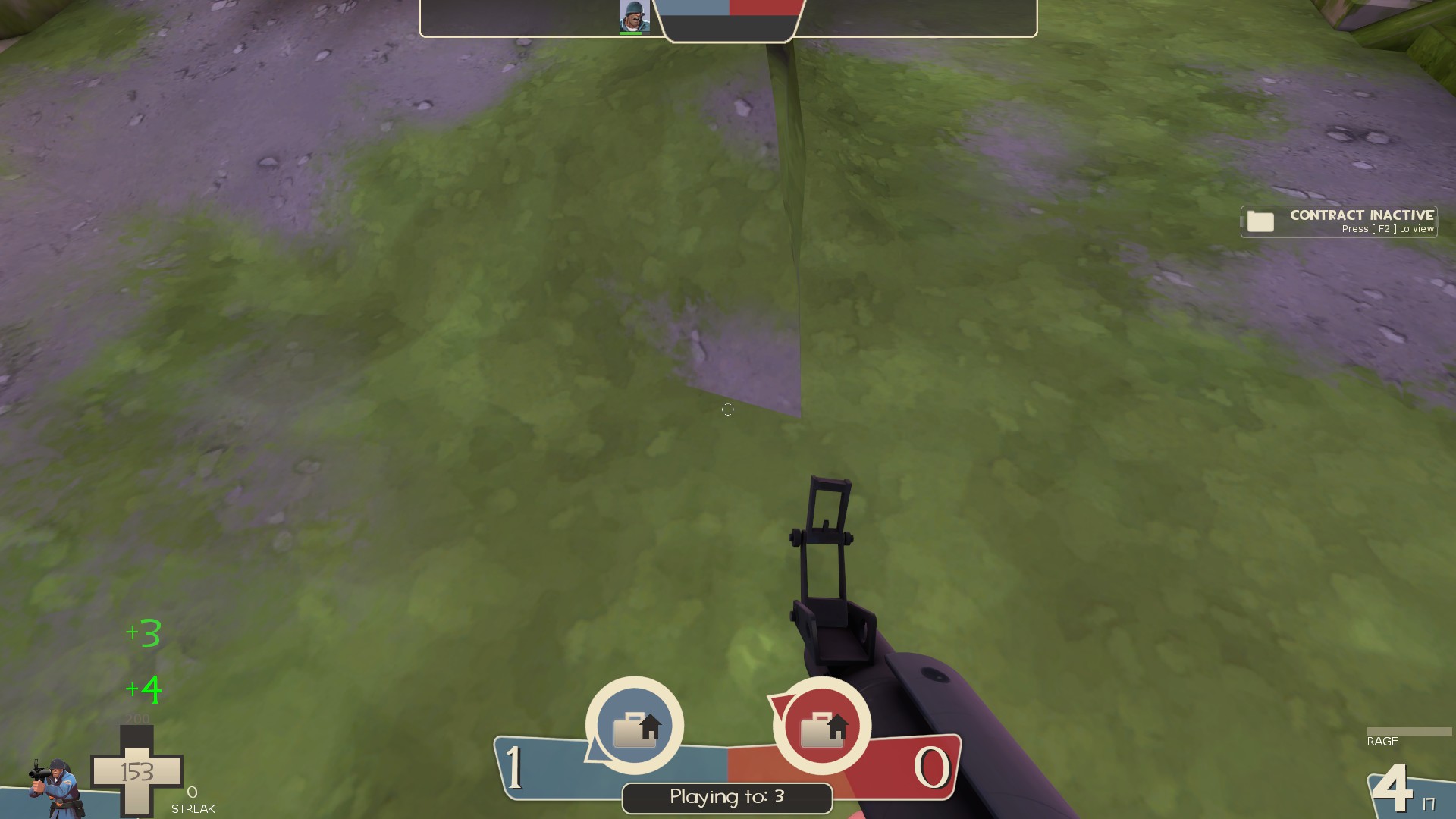
-the dirt on the ramp doesn't mesh with the grass around it
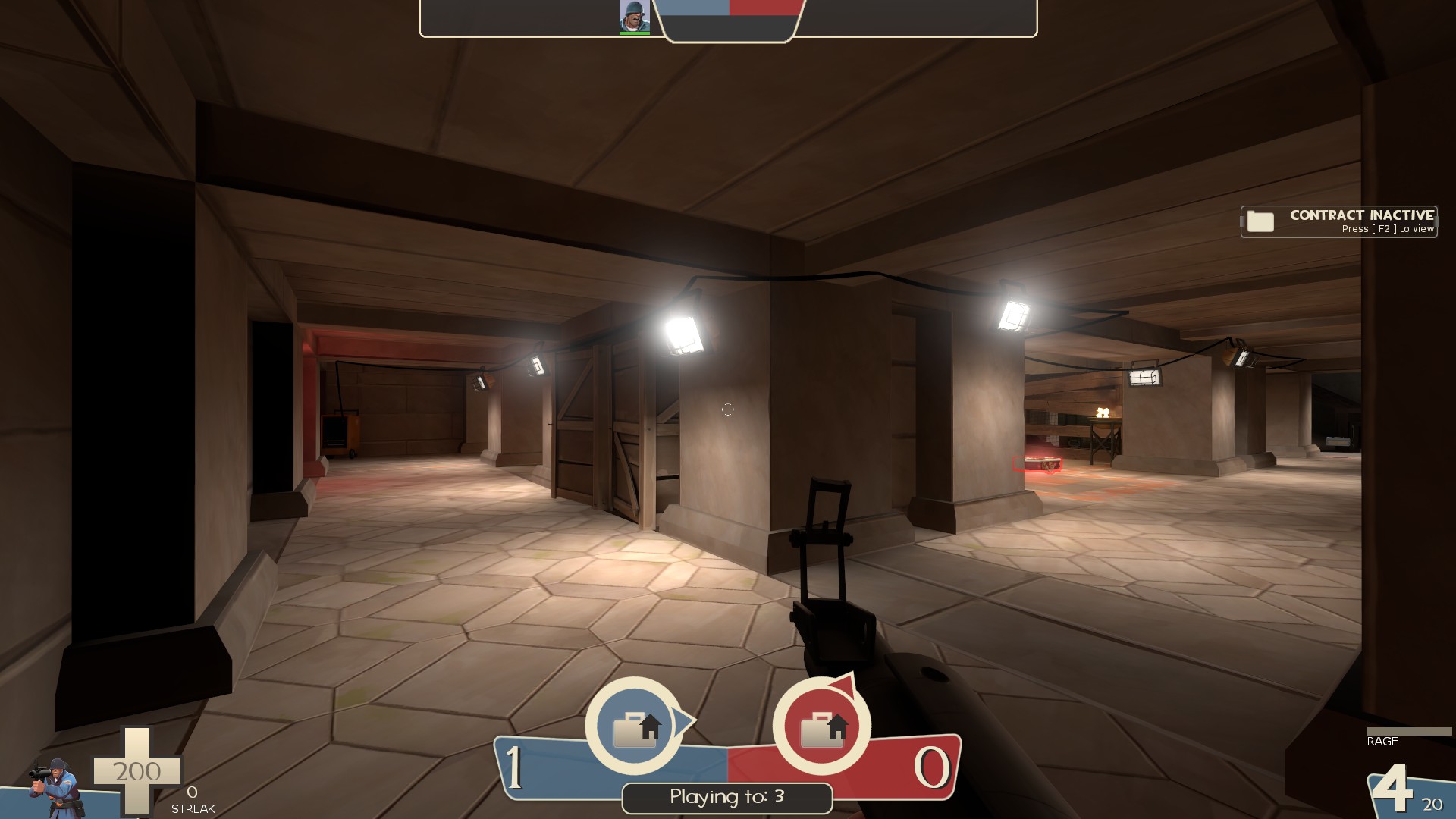
-ceiling is really low here
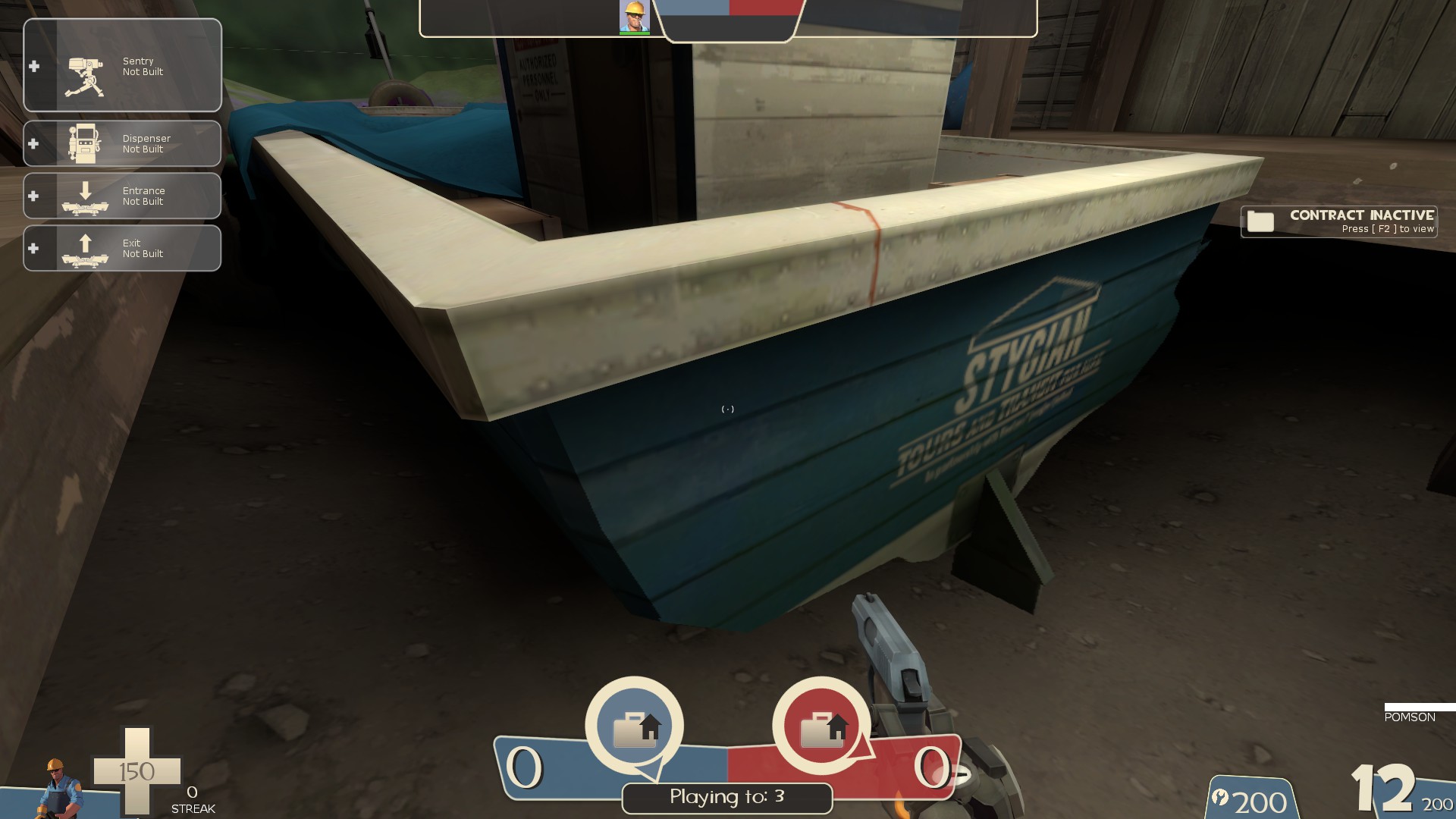
-with how low the water is/how high the platforms are, it's difficult to get out of this lil area behind the boat in spawn. Easy to get into it though with how little space there is to move around the nearby platforms
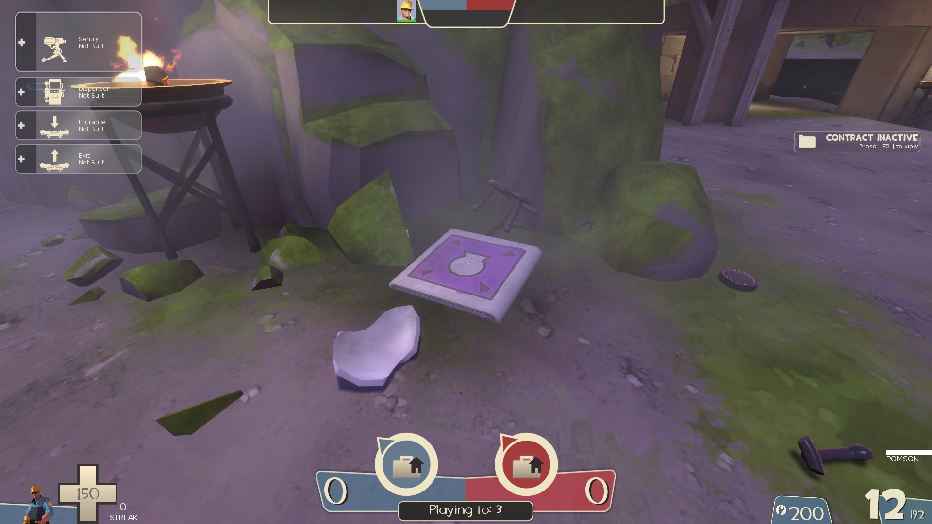
-the pots could use some kind of sound effect when they break and give a player an effect
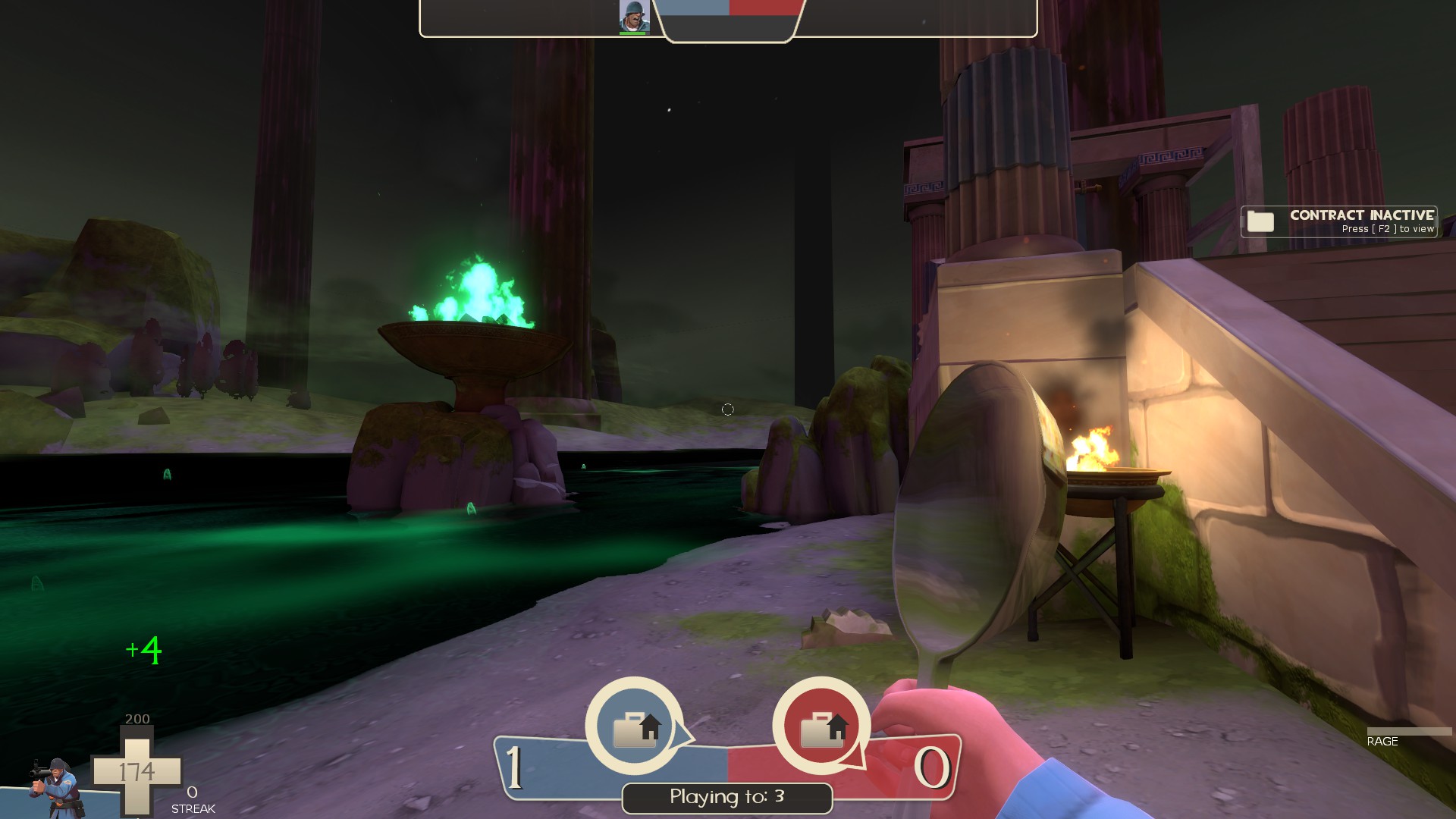
-dunno what could be done about this but for some classes, like solider, only the weapons go invisable player side, no idea if this happens for other players looking at them
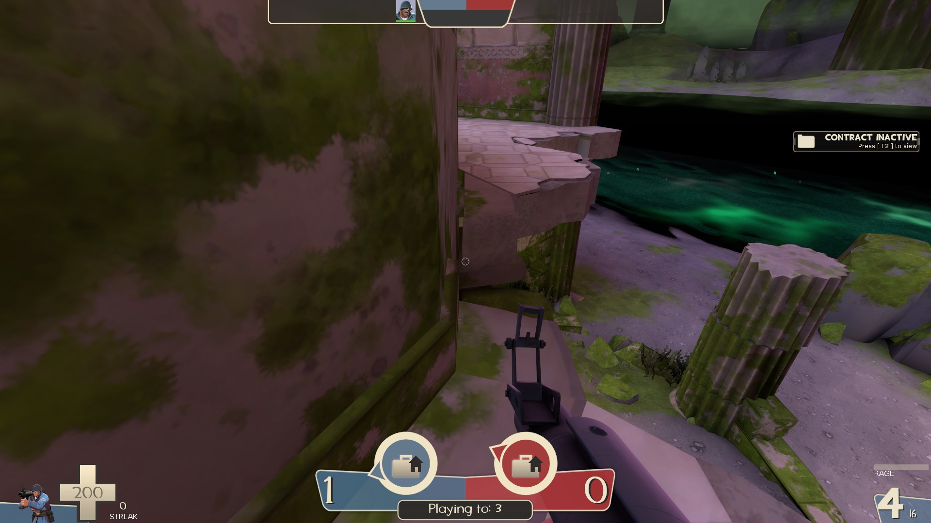
-lil seam here
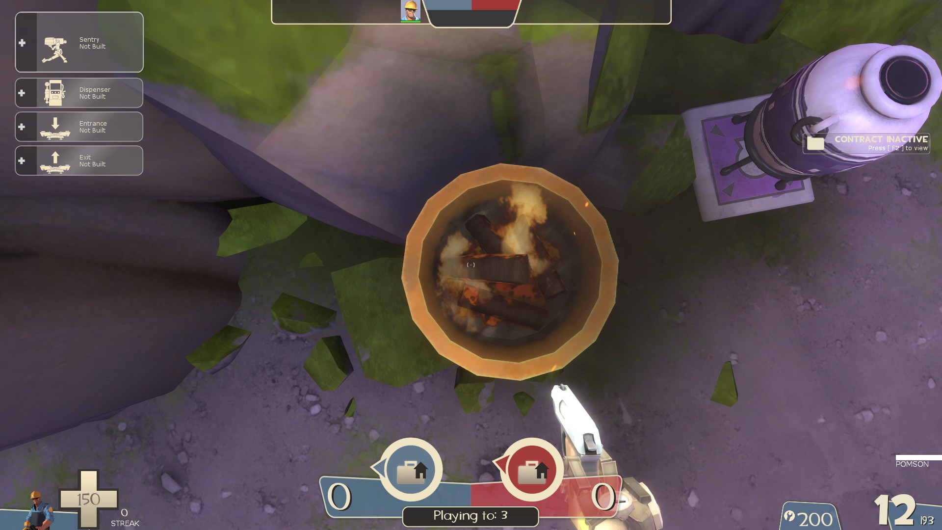
-fire from these braziers doesn't hurt players, while the green fire from the big ones does. Bit inconsistant
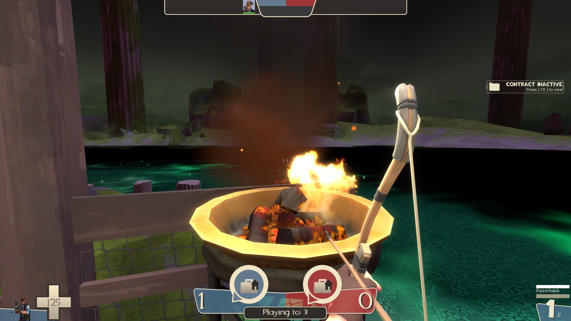
-fire from these also doesn't light huntsmen arrows which it probably should
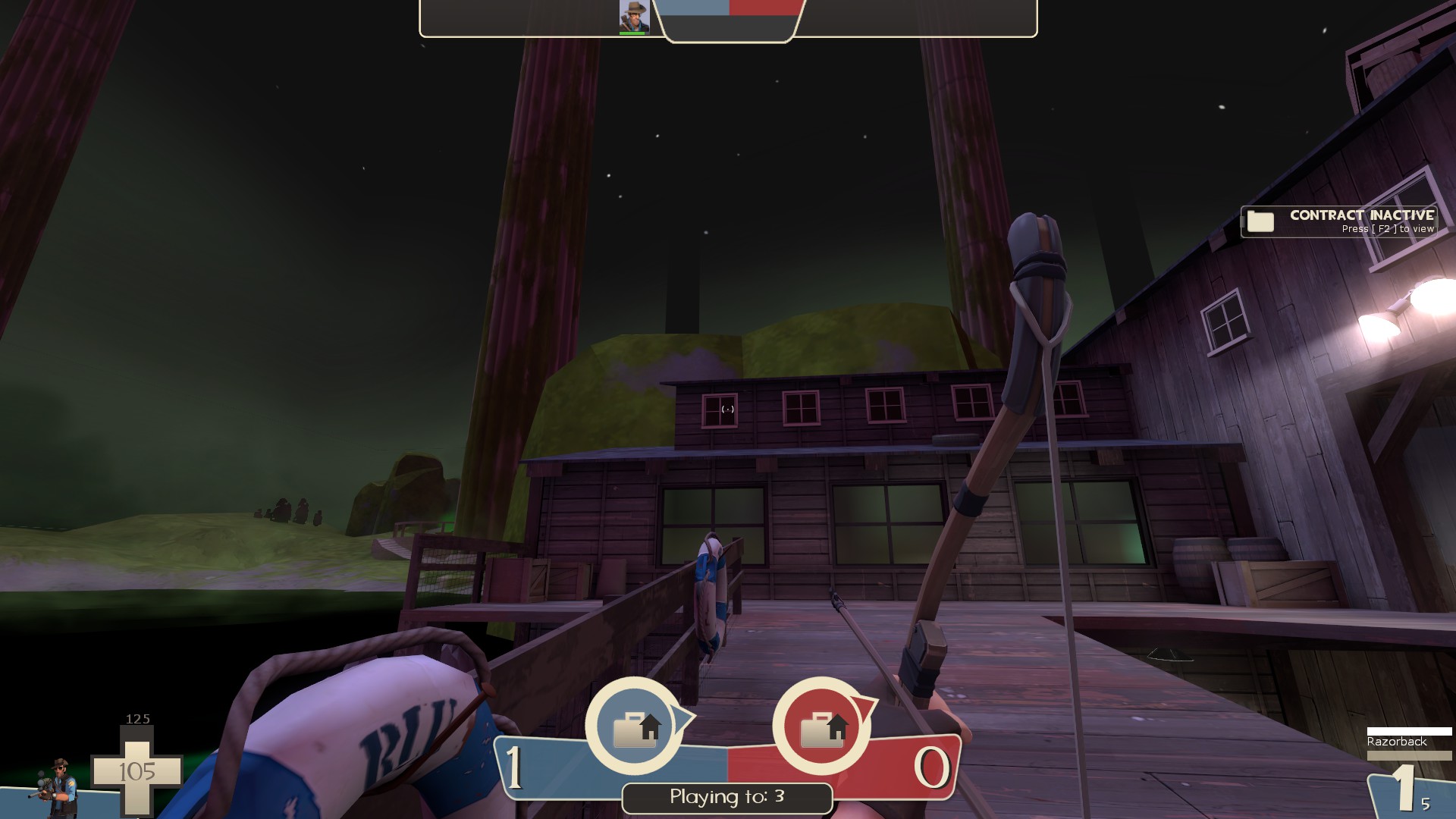
-that rock in the background is rather obviously in the 3d skybox. Could use some basic geometry in the main map to help it transition better
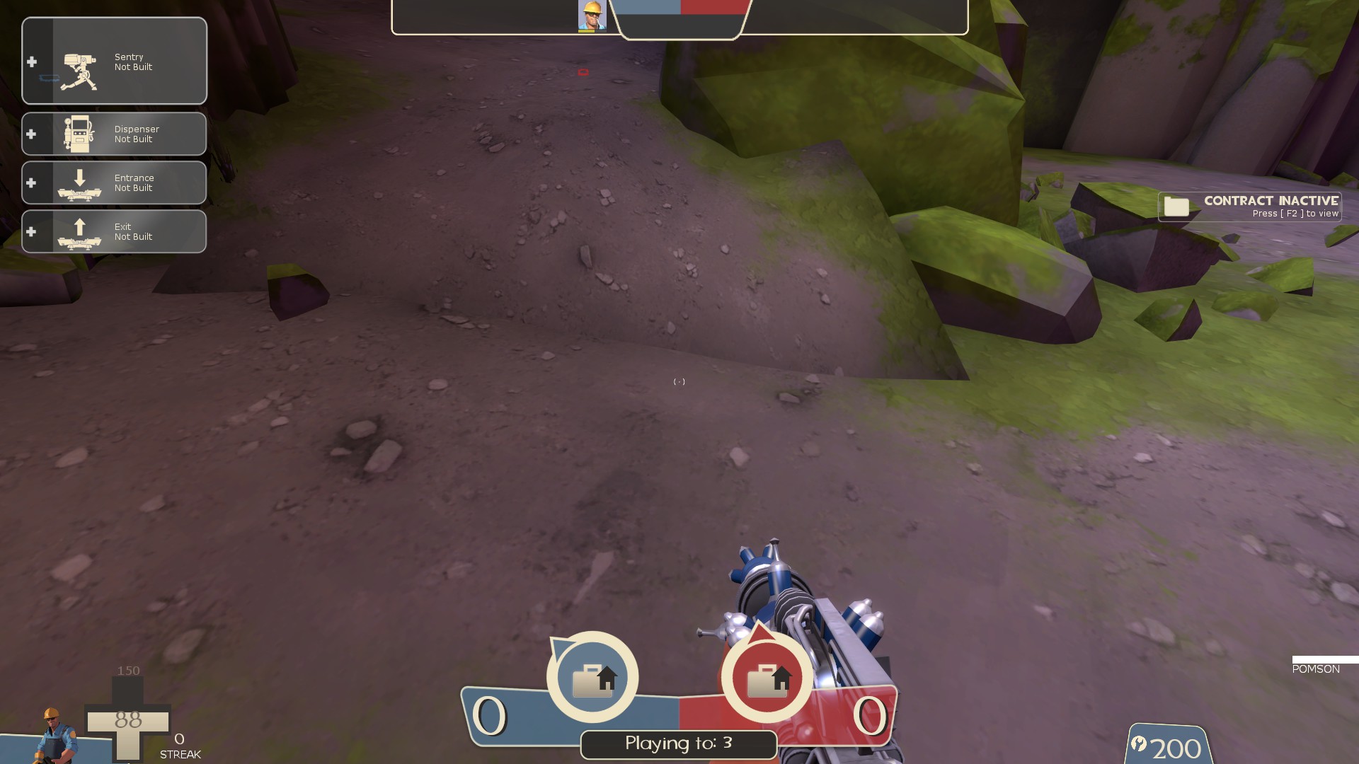
-could use some better sewing on these displacments to help the texture flow better
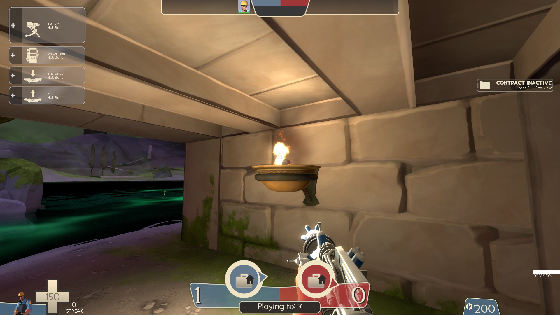
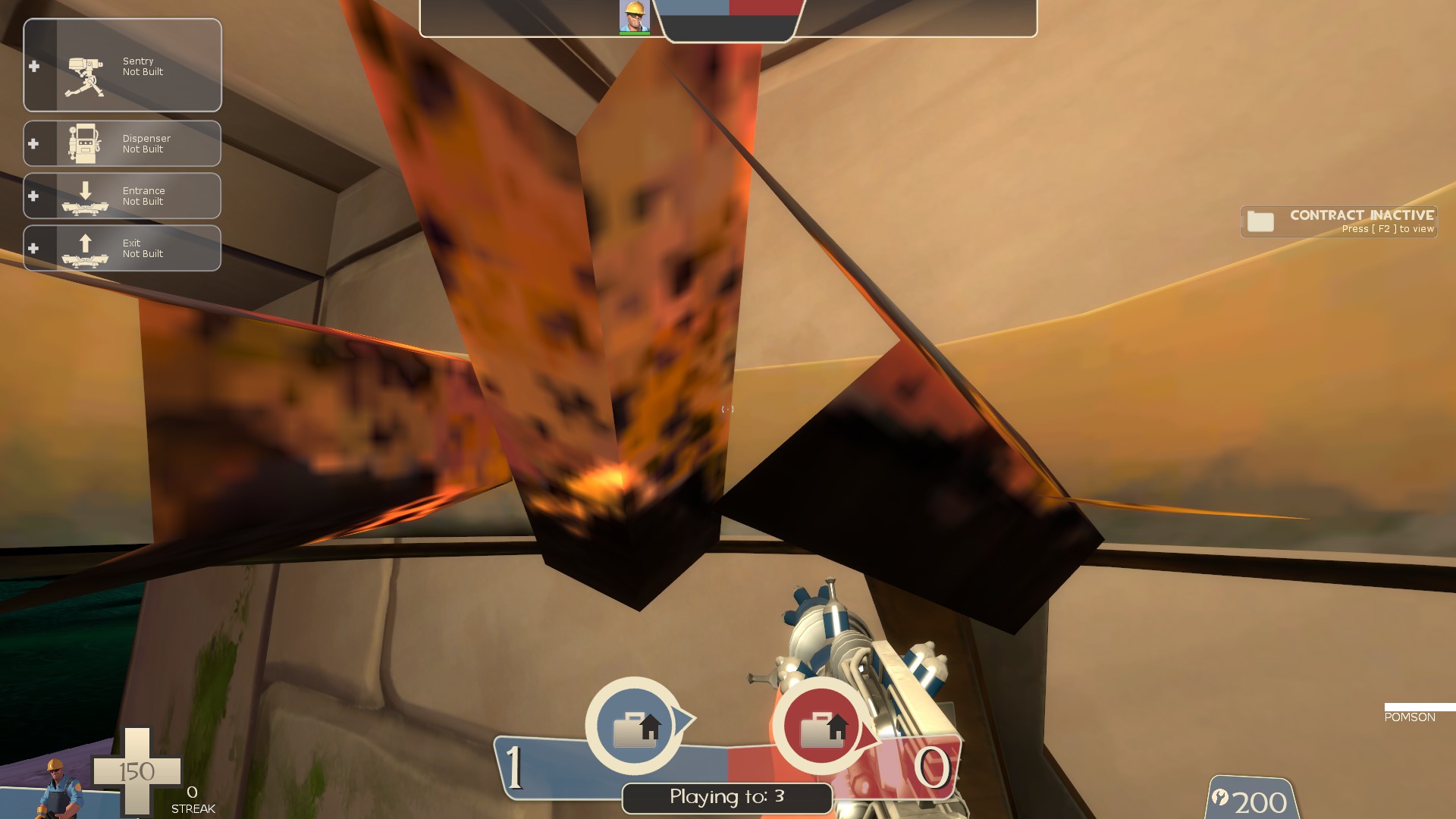
-this is a rather sizable prop to lack collision in play space I get why it doesn't have collision but it's way too big to not be noticed
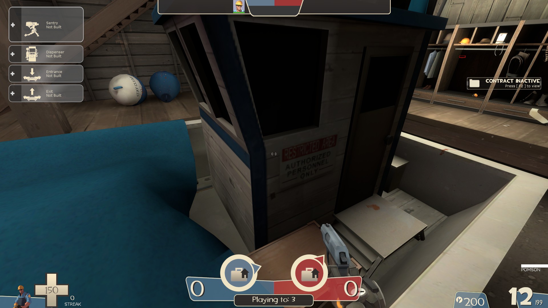
-shouldn't the sign on the boat be blu as well?
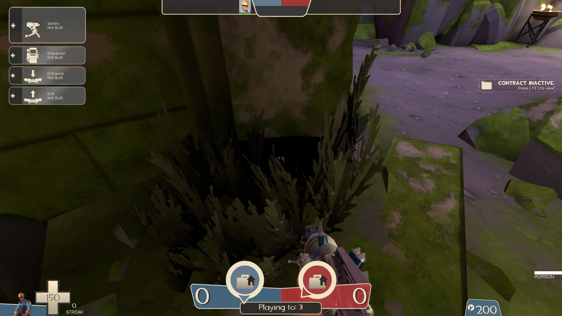
-black prop in this bush
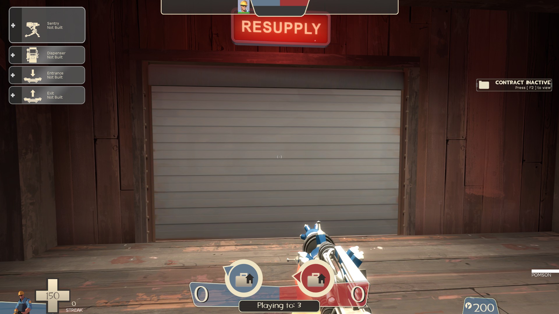
-no visualizer on this door
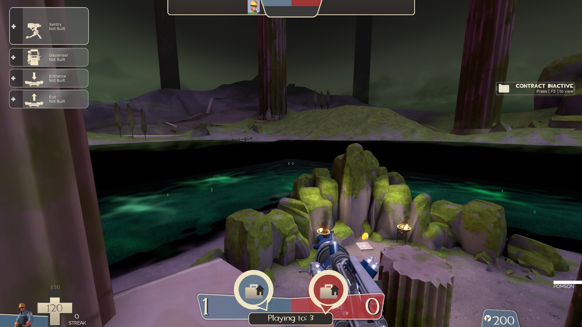 -the water needs a better transition to the skybox. It's very easy to see where one stops and the other starts
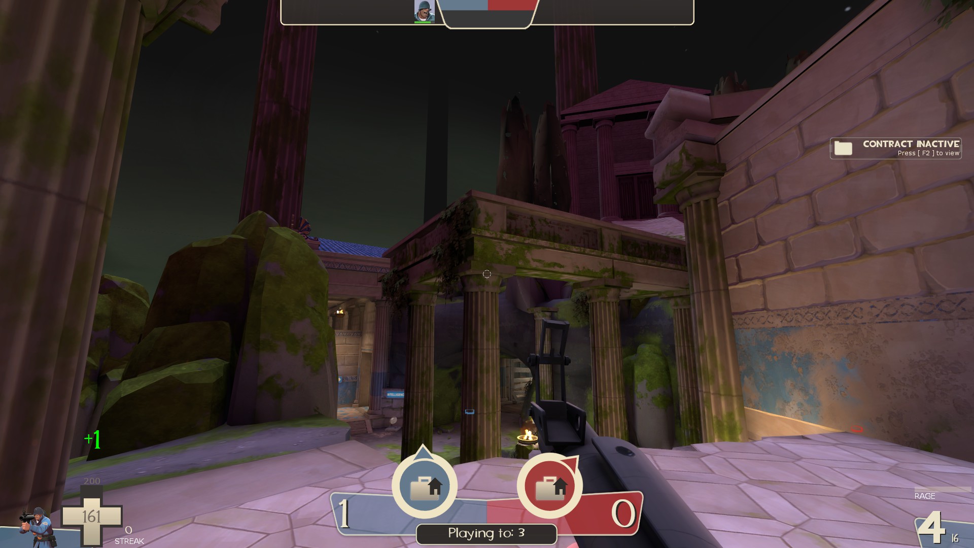
-with how low the top of these columns are, it looks like I can explosive jump onto them, but I can't. It's a bit awkward.
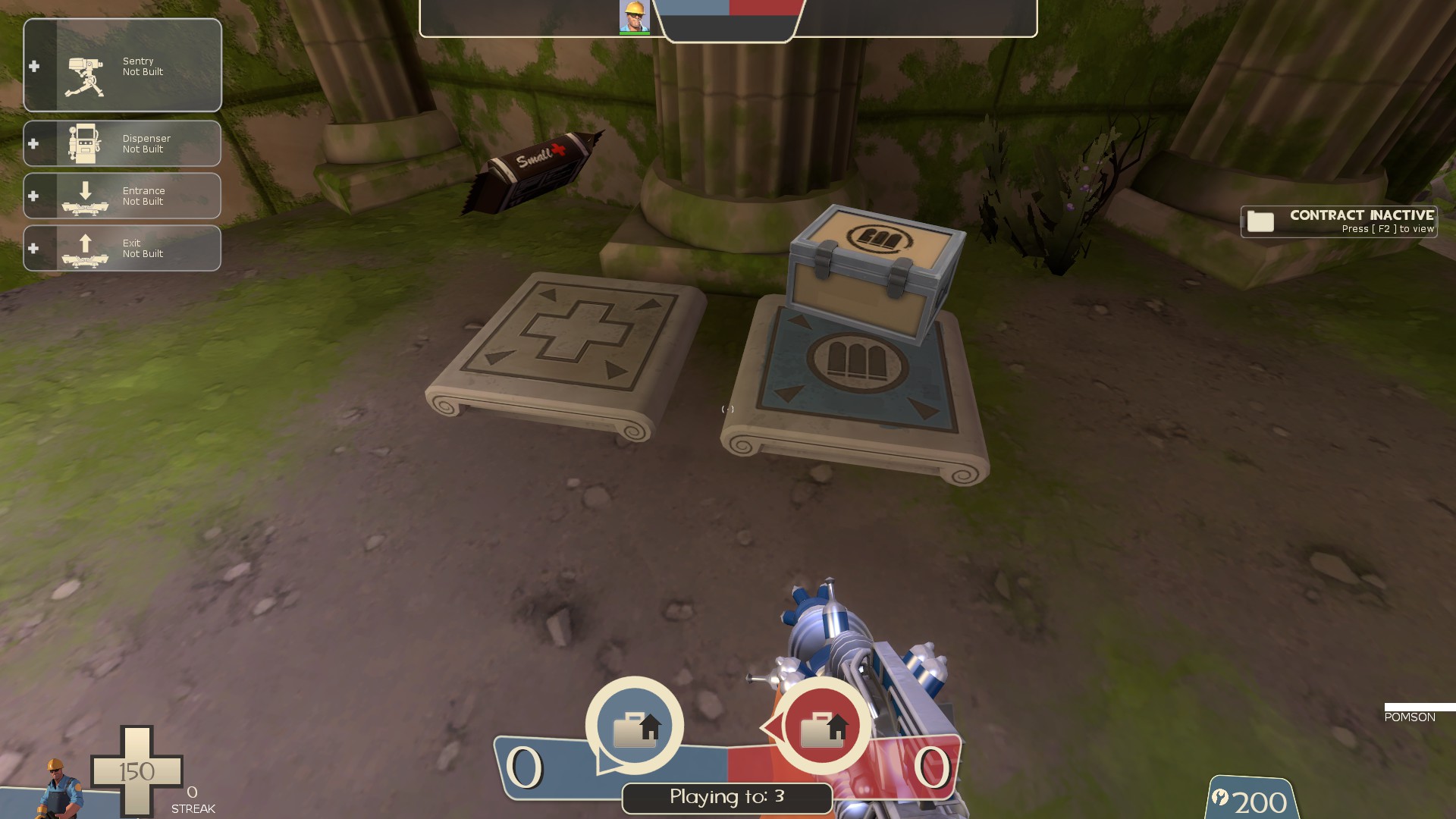
-remove collision or clip the ammo/health indicator props
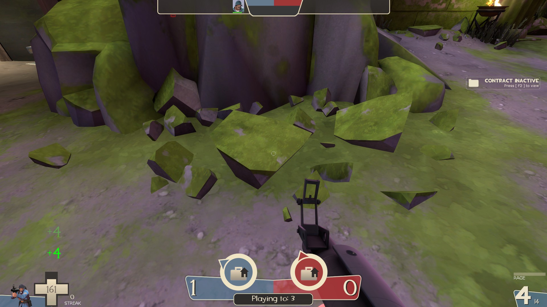
-these rocks are used alot and without collision. They are easy places to hide stickies which could be problematic
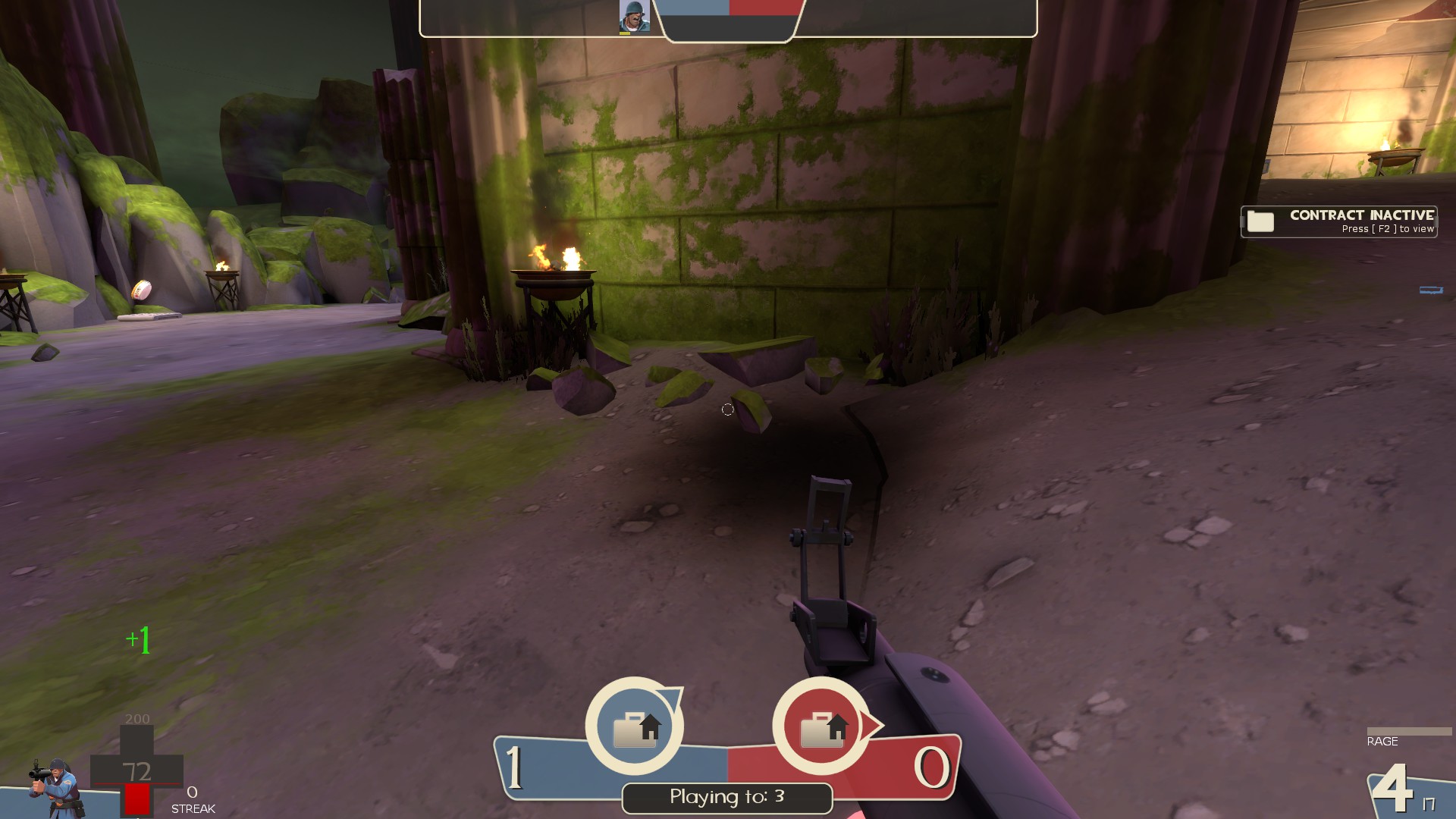
-floatin rock
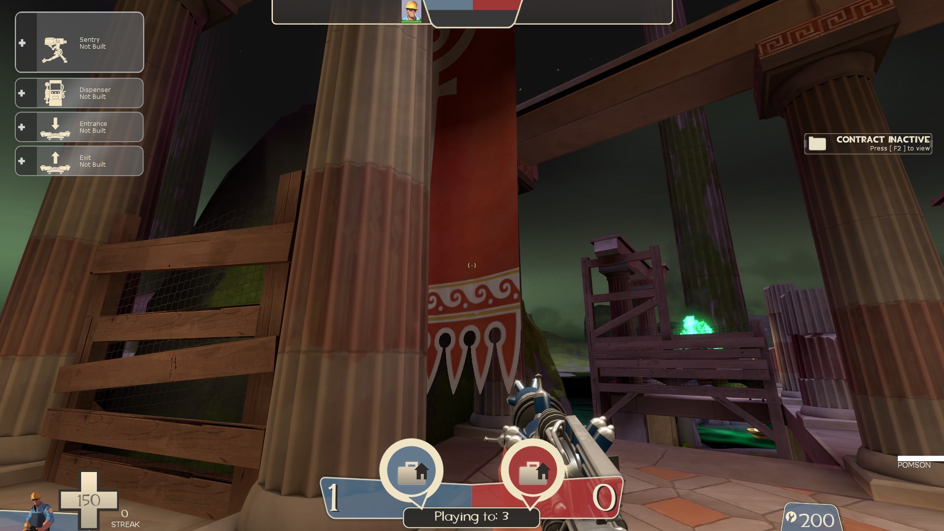
-kinda odd how this banner is fully solid and doesn't let players walk under it. I know you can't do the real life thing of it being pushed out of the way as someone goes under but it still feels strange. Maybe disable collision for it or have the bottom part that's in play space ripped off so it doesn't get in the way
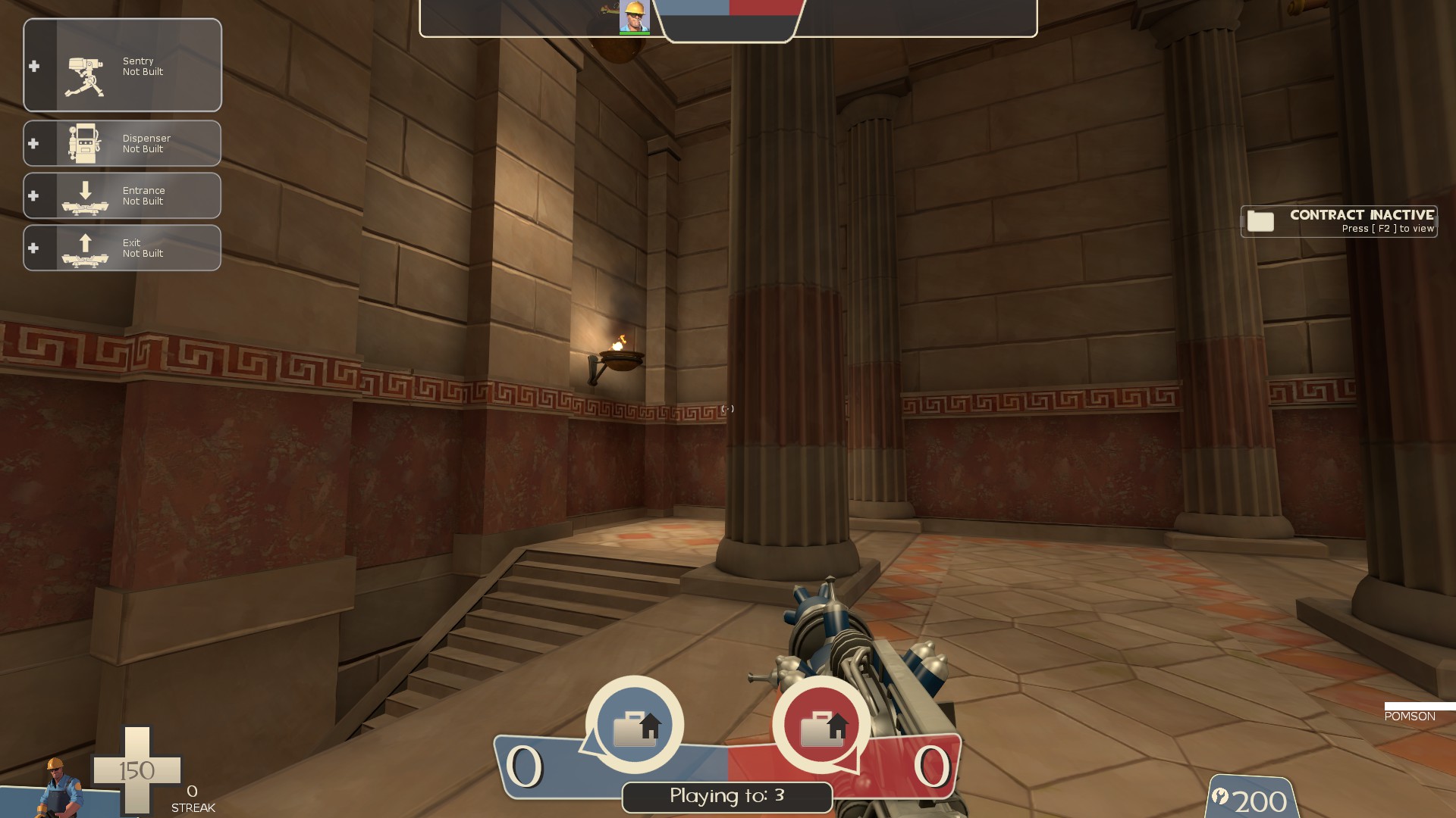
-all of these things sticking out of the walls could use a good clipping. Easy to get caught on em
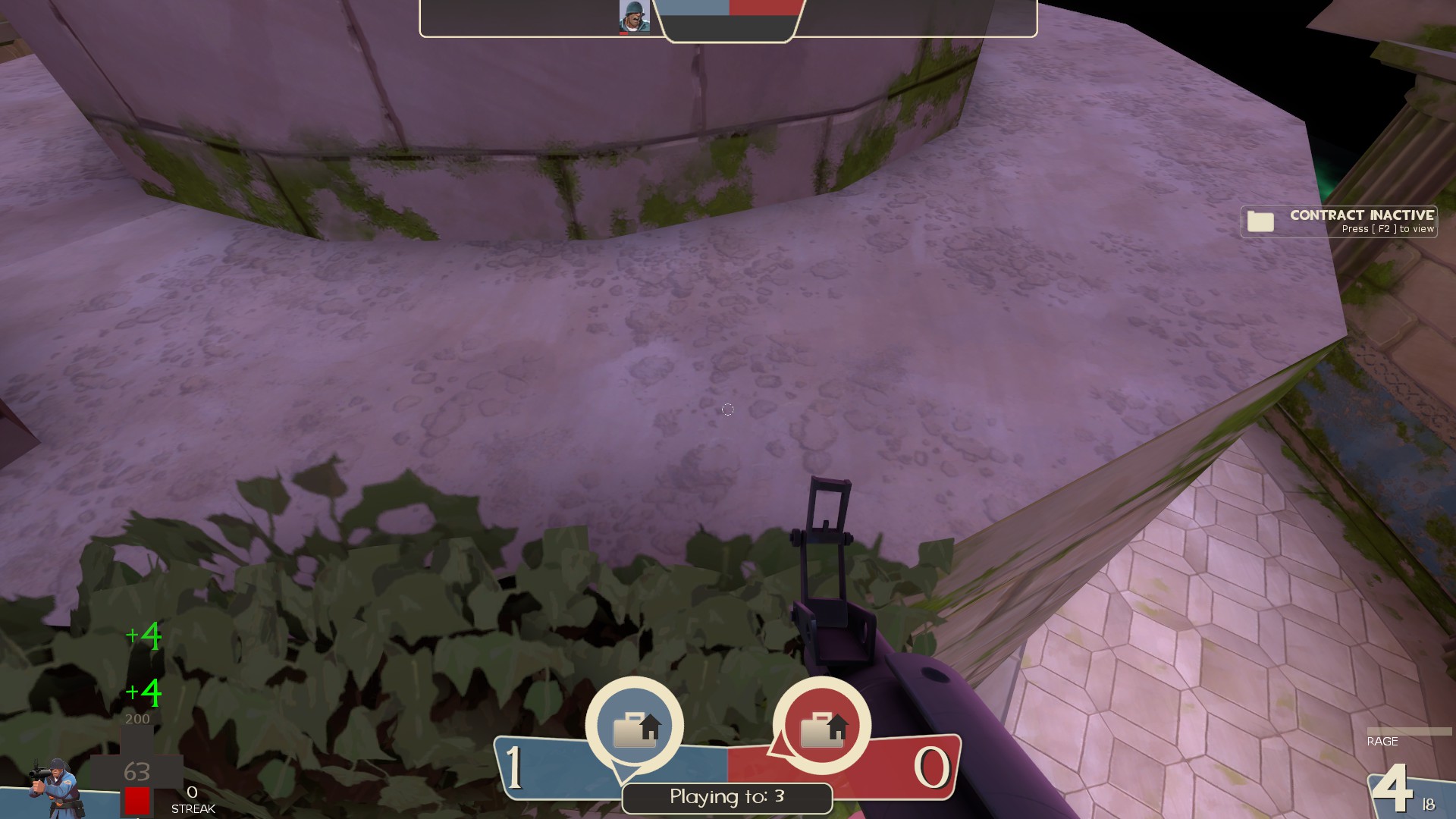
-I can stand on a tiny ledge here
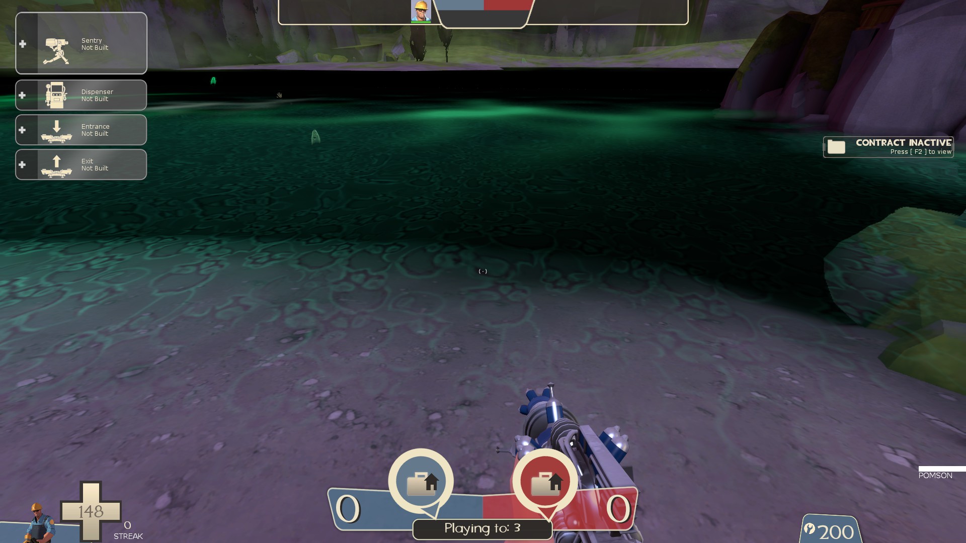
-the skull water is super metal, and that's awesome
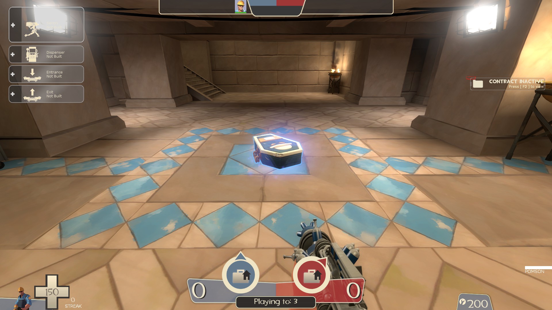
-I'm not sure how well this model for the intel fits the theme of the map. While it's a great looking model, it doesn't exactly say "greek" to me
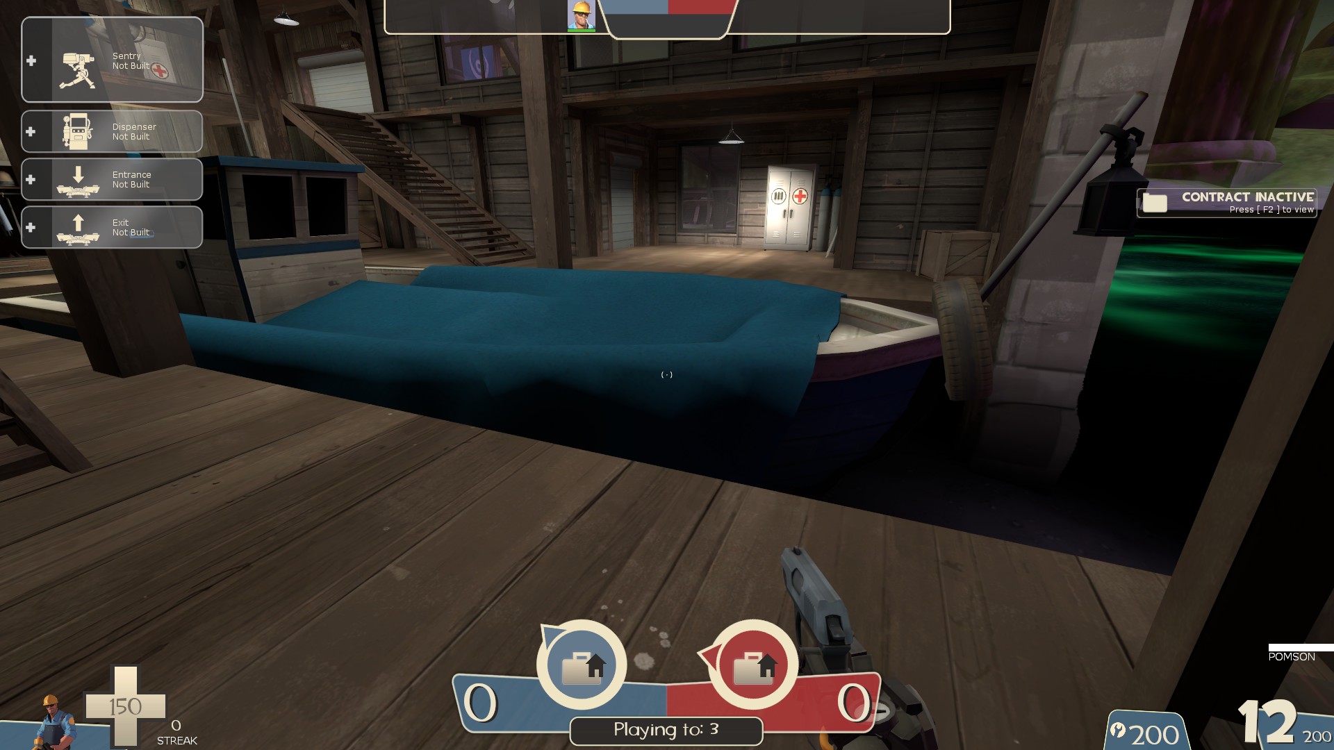
-the area in front of the boat has some of the same issues as the areas behind it, but now with a hurt trigger. Easy to fall in, difficult to get out. I also managed to get stuck under the wooden platform where I wasn't fully in the water enough to drown, but far enough in that I couldn't get out without dying
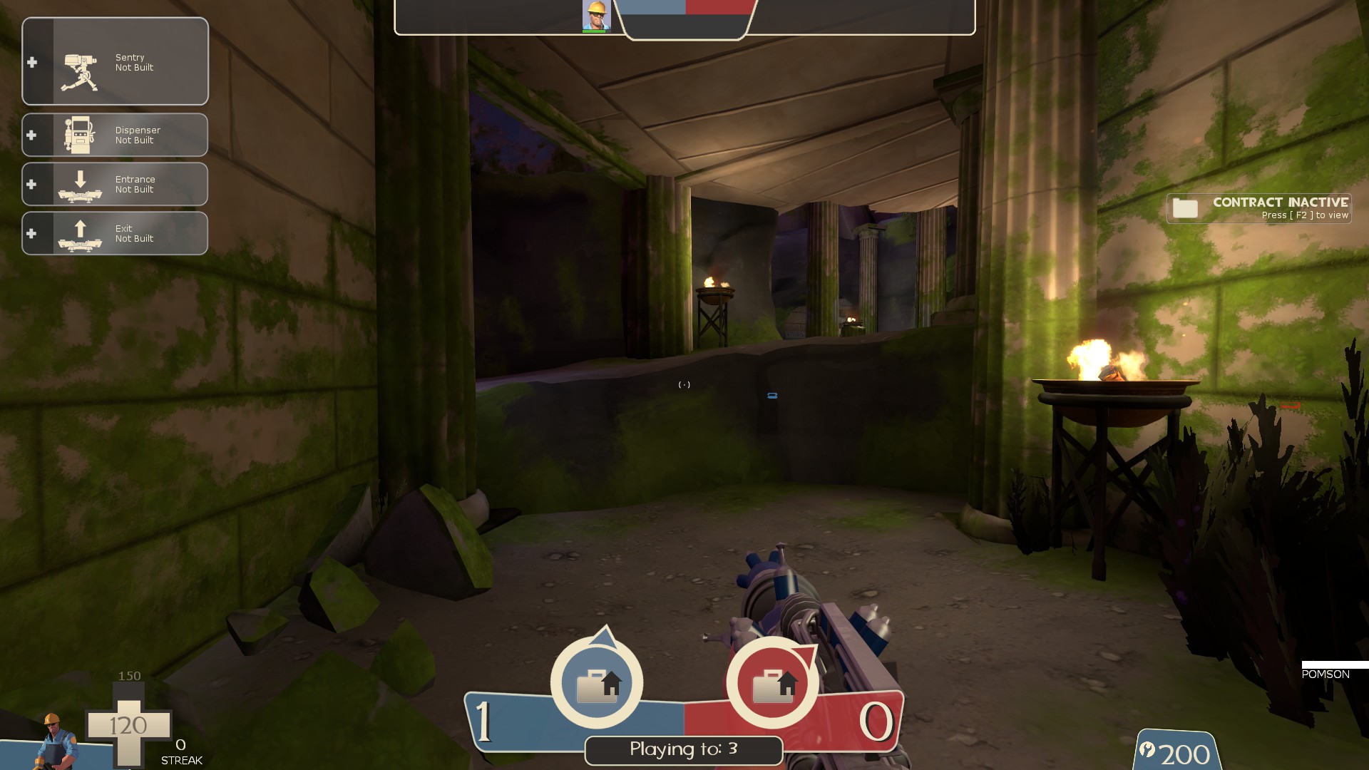
-this route could use a way to get up it when someone has the intel. Just a lil board ramp or something since you can't jump while in the "scared mode" the intel puts you in. As it is, only the outer path past mid lets players get around while in that state
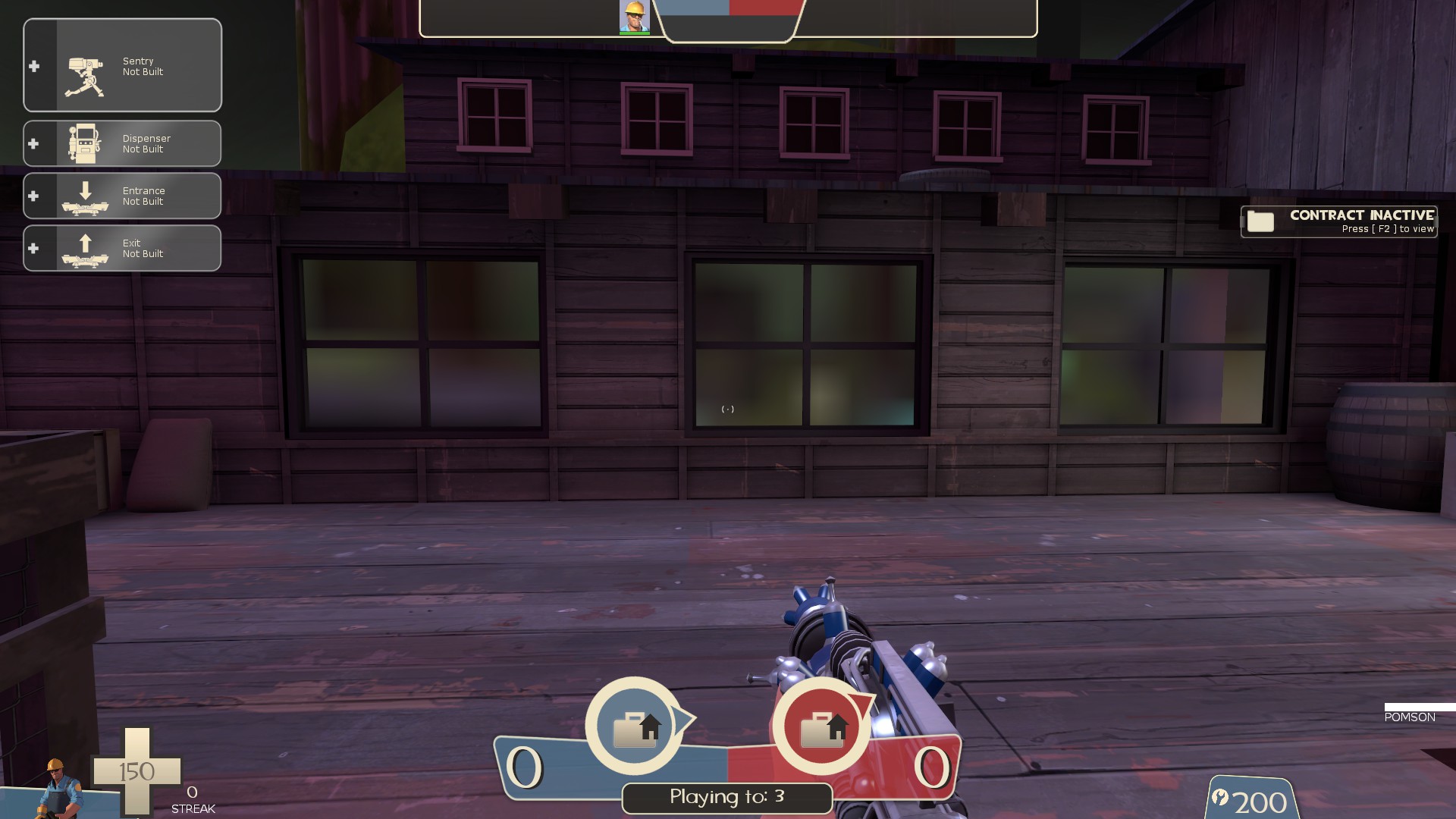
-With how large these windows are, they could use some higher quality cubemaps for reflections or even just replaced with a non reflective window texture. It doesn't look great as it is atm
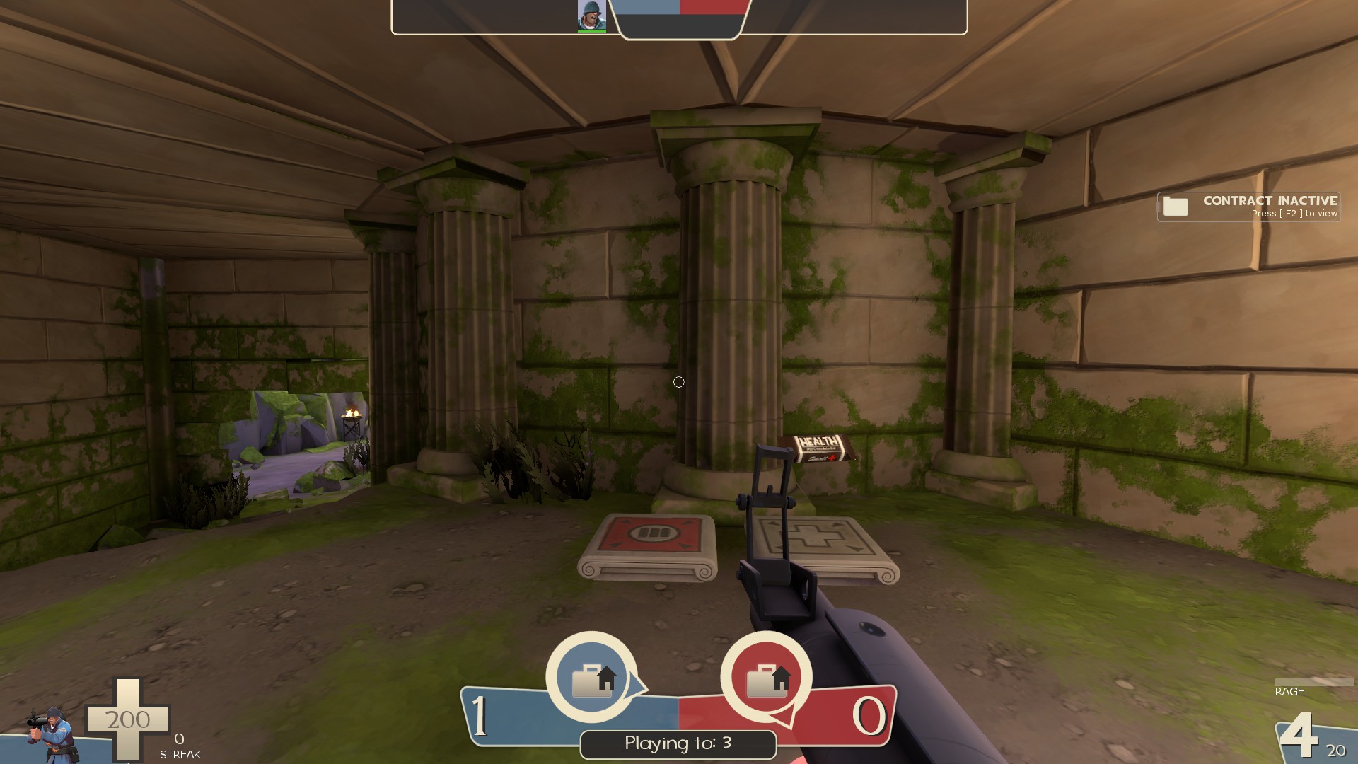
-these columns could use some clipping
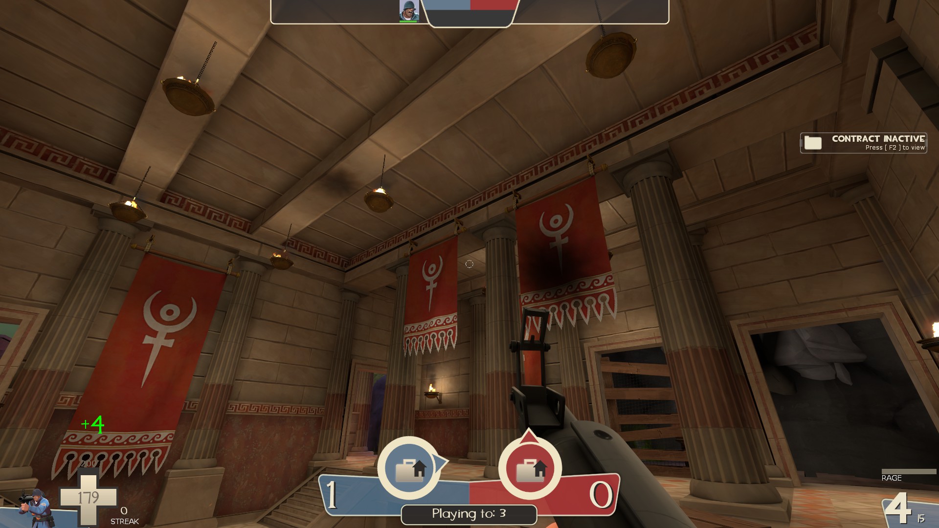
-odd how the hanging lights don't have collisions while the banners in here do
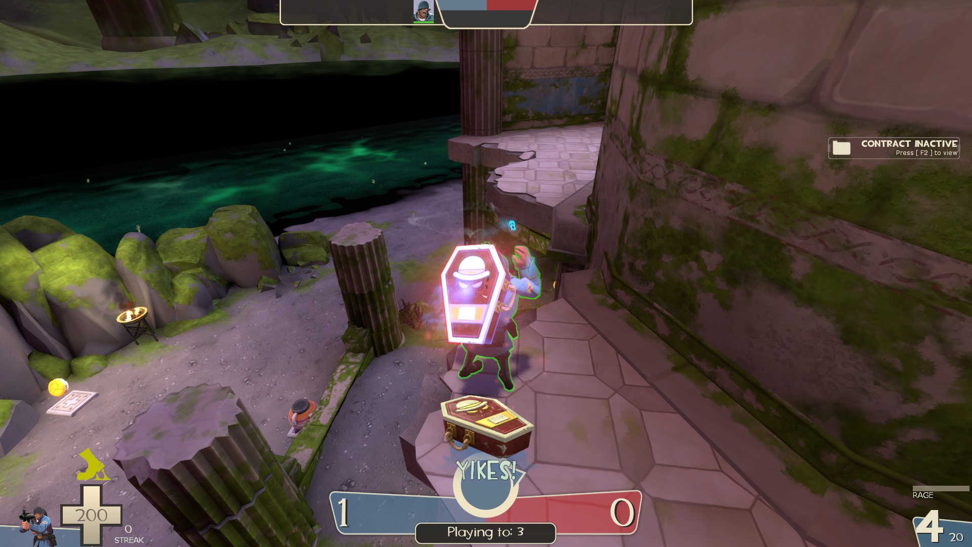
-would be nice to have a lil board across this gap for getting across while scared with the intel. This is the shortest route between both bases and what players will want to use to cap
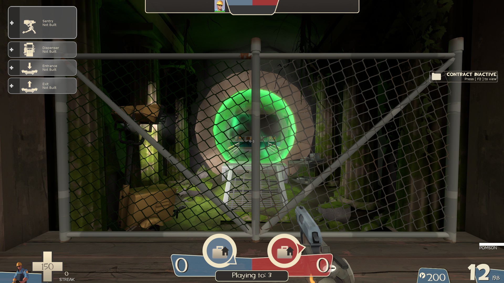
-this portal thing is really freakin' cool
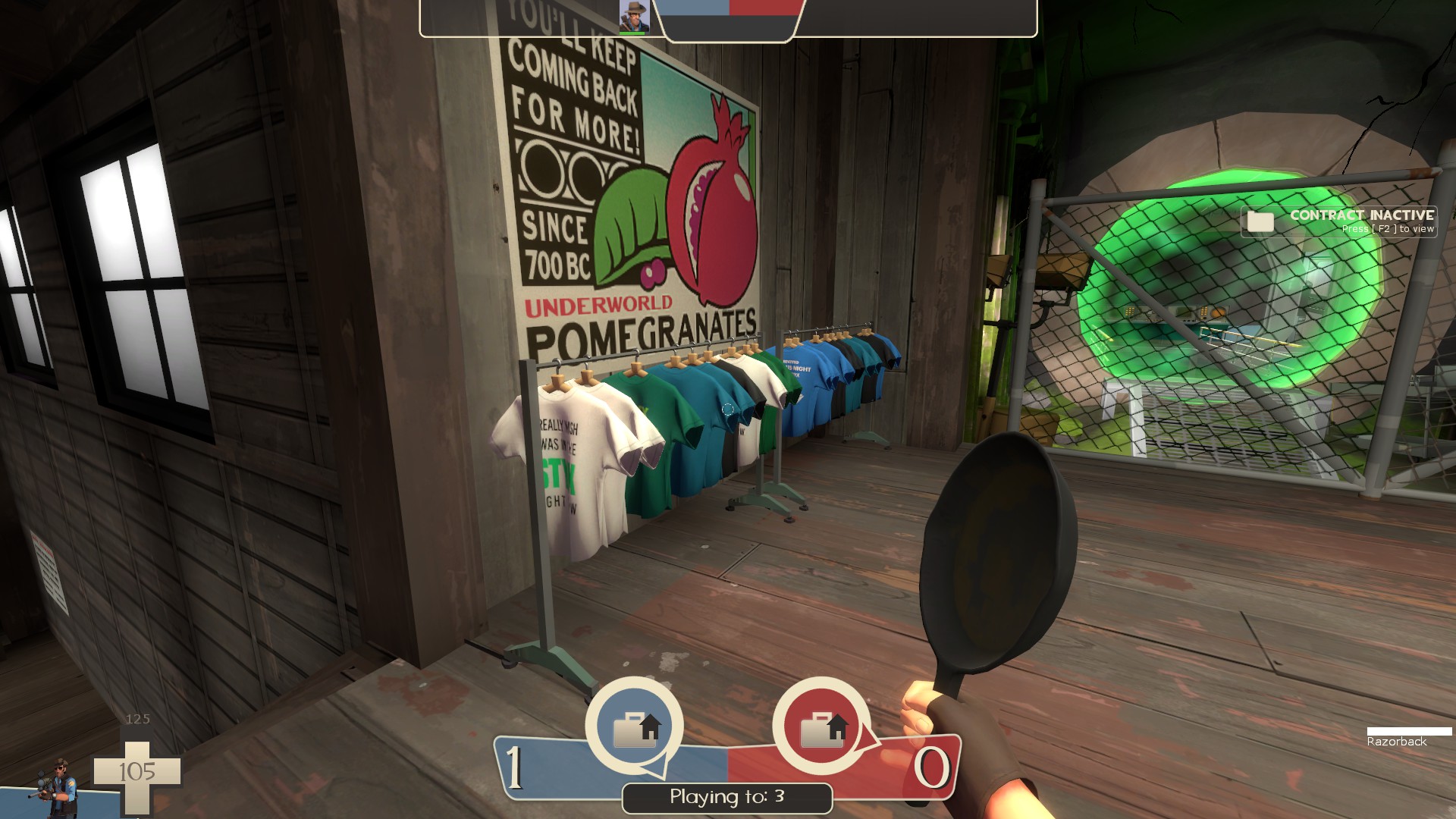
-I like the tourism angle of the spawn rooms (that sign is hilarious) but the shirts leave a lot to be desired. The basic font of the text gives off the vibe of something quickly made in MS paint and just doesn't feel very TF2
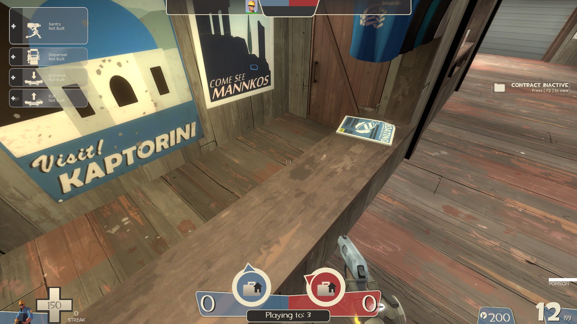
-push out the clip brush so I can't stand on the edge of the counter
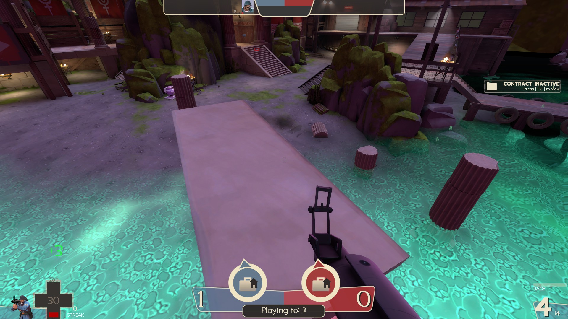
-I can get up on top of the platform on these columns but not on any of the others in the map. It's a bit inconsistent due to their height compared to playable space height
Lastly, I'm not huge on the green/purple lighting. I get why it's there and isn't as bad in game as it is in screenshots but I feel like it could be toned down a bit and still give off that otherworldly feel
That's all for now. While I can't say how the map plays yet and not sure about the lack of a timer, visually, it's pretty flipping awesome. The team for this project did a great job and should be proud of what they accomplished
-this prop is fully black
-displacement seam
-none of the supports in these caves seem to have any clipping, add some to smooth em out
-the dirt on the ramp doesn't mesh with the grass around it
-ceiling is really low here
-with how low the water is/how high the platforms are, it's difficult to get out of this lil area behind the boat in spawn. Easy to get into it though with how little space there is to move around the nearby platforms
-the pots could use some kind of sound effect when they break and give a player an effect
-dunno what could be done about this but for some classes, like solider, only the weapons go invisable player side, no idea if this happens for other players looking at them
-lil seam here
-fire from these braziers doesn't hurt players, while the green fire from the big ones does. Bit inconsistant
-fire from these also doesn't light huntsmen arrows which it probably should
-that rock in the background is rather obviously in the 3d skybox. Could use some basic geometry in the main map to help it transition better
-could use some better sewing on these displacments to help the texture flow better
-this is a rather sizable prop to lack collision in play space I get why it doesn't have collision but it's way too big to not be noticed
-shouldn't the sign on the boat be blu as well?
-black prop in this bush
-no visualizer on this door
-with how low the top of these columns are, it looks like I can explosive jump onto them, but I can't. It's a bit awkward.
-remove collision or clip the ammo/health indicator props
-these rocks are used alot and without collision. They are easy places to hide stickies which could be problematic
-floatin rock
-kinda odd how this banner is fully solid and doesn't let players walk under it. I know you can't do the real life thing of it being pushed out of the way as someone goes under but it still feels strange. Maybe disable collision for it or have the bottom part that's in play space ripped off so it doesn't get in the way
-all of these things sticking out of the walls could use a good clipping. Easy to get caught on em
-I can stand on a tiny ledge here
-the skull water is super metal, and that's awesome
-I'm not sure how well this model for the intel fits the theme of the map. While it's a great looking model, it doesn't exactly say "greek" to me
-the area in front of the boat has some of the same issues as the areas behind it, but now with a hurt trigger. Easy to fall in, difficult to get out. I also managed to get stuck under the wooden platform where I wasn't fully in the water enough to drown, but far enough in that I couldn't get out without dying
-this route could use a way to get up it when someone has the intel. Just a lil board ramp or something since you can't jump while in the "scared mode" the intel puts you in. As it is, only the outer path past mid lets players get around while in that state
-With how large these windows are, they could use some higher quality cubemaps for reflections or even just replaced with a non reflective window texture. It doesn't look great as it is atm
-these columns could use some clipping
-odd how the hanging lights don't have collisions while the banners in here do
-would be nice to have a lil board across this gap for getting across while scared with the intel. This is the shortest route between both bases and what players will want to use to cap
-this portal thing is really freakin' cool
-I like the tourism angle of the spawn rooms (that sign is hilarious) but the shirts leave a lot to be desired. The basic font of the text gives off the vibe of something quickly made in MS paint and just doesn't feel very TF2
-push out the clip brush so I can't stand on the edge of the counter
-I can get up on top of the platform on these columns but not on any of the others in the map. It's a bit inconsistent due to their height compared to playable space height
Lastly, I'm not huge on the green/purple lighting. I get why it's there and isn't as bad in game as it is in screenshots but I feel like it could be toned down a bit and still give off that otherworldly feel
That's all for now. While I can't say how the map plays yet and not sure about the lack of a timer, visually, it's pretty flipping awesome. The team for this project did a great job and should be proud of what they accomplished
Attachments
Clipping pass is coming! Thanks for highlighting areas anyway tho-none of the supports in these caves seem to have any clipping, add some to smooth em out
-with how low the water is/how high the platforms are, it's difficult to get out of this lil area behind the boat in spawn. Easy to get into it though with how little space there is to move around the nearby platforms
-remove collision or clip the ammo/health indicator props
-all of these things sticking out of the walls could use a good clipping. Easy to get caught on em
-I can stand on a tiny ledge here
-the area in front of the boat has some of the same issues as the areas behind it, but now with a hurt trigger. Easy to fall in, difficult to get out. I also managed to get stuck under the wooden platform where I wasn't fully in the water enough to drown, but far enough in that I couldn't get out without dying
-these columns could use some clipping
-push out the clip brush so I can't stand on the edge of the counter
These are intended-ceiling is really low here
-this route could use a way to get up it when someone has the intel. Just a lil board ramp or something since you can't jump while in the "scared mode" the intel puts you in. As it is, only the outer path past mid lets players get around while in that state
-would be nice to have a lil board across this gap for getting across while scared with the intel. This is the shortest route between both bases and what players will want to use to cap
They do we just forgot to pack them in b1-the pots could use some kind of sound effect when they break and give a player an effect
Known bug, it's only the viewmodel and happens any time the cloak effect is used on non-spies, I believe its intended to be fixed soon.-dunno what could be done about this but for some classes, like solider, only the weapons go invisable player side, no idea if this happens for other players looking at them
no-shouldn't the sign on the boat be blu as well?
The original design was slightly more greek but was made more coffin-like to read more clearly to players what it is.-I'm not sure how well this model for the intel fits the theme of the map. While it's a great looking model, it doesn't exactly say "greek" to me
tbf thats just what touristy shirts look like-I like the tourism angle of the spawn rooms (that sign is hilarious) but the shirts leave a lot to be desired. The basic font of the text gives off the vibe of something quickly made in MS paint and just doesn't feel very TF2
Stock CTF does not have a timernot sure about the lack of a timer
b2 changelog:
- optimisation pass
did you know we had no occluding geometry beneath the displacements at mid and connectors, and no areaportals? i'm shocked it ran as okay as it did.
- fixed amphora at mid coastline being partially clipped into rocks
- added missing soundscapes to boathouses
- nobuilt large braziers
it WAS funny, but trigger_ignite doesn't damage buildings and trigger_hurt would nobuild the area anyway. sorry
- improved clipping around ferries
oops! players couldn't climb out of the water.
- added hazard tape to flag capture zones
- added bubbling particles when skeletons spawn
- added particles for killing the losing team during humiliation
version control hiccup meant we actually didn't have these for b1. oops!
- added fluff particles to flag teleporting
- replaced clips over lobby structures with short push triggers
- improved team side recognition at mid
- added some nonsolid clutter physics props
- fixed missing sound files
- fixed missing albedotint and smoothing on flags
- fixed sorting issues on respawnroomvisualisers
- fixed issue with water damage triggers at symmetry line
- fixed issue with water damage triggers not being present near boathouses
- fixed water damage triggers slightly poking through the ground beneath battlements
- fixed issue with deep water flag return triggers on blu side
- fixed issue with deep water flag return triggers near boathouses
- fixed issues with skeletons spawning on blu side
- fixed flags being slightly misaligned
- fixed some displacement seams
- fixed seam at mid
- adjusted lighting across the whole map
- slightly brightened environment direct and ambient light
- improved clipping
- improved lighting on a few props
- fixed a few prop misalignments
- fixed some small z-fighting
- fixed some brazier particles going through thin floors
- improved displacement cost of water caustics
- added some funny guys
Read the rest of this update entry...
Some things I found in B2:
I think you should keep this, it's funny
Guessing you found this already and decided a sentry can be outranged easily, but I included it in case
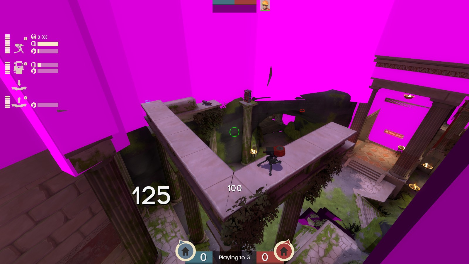
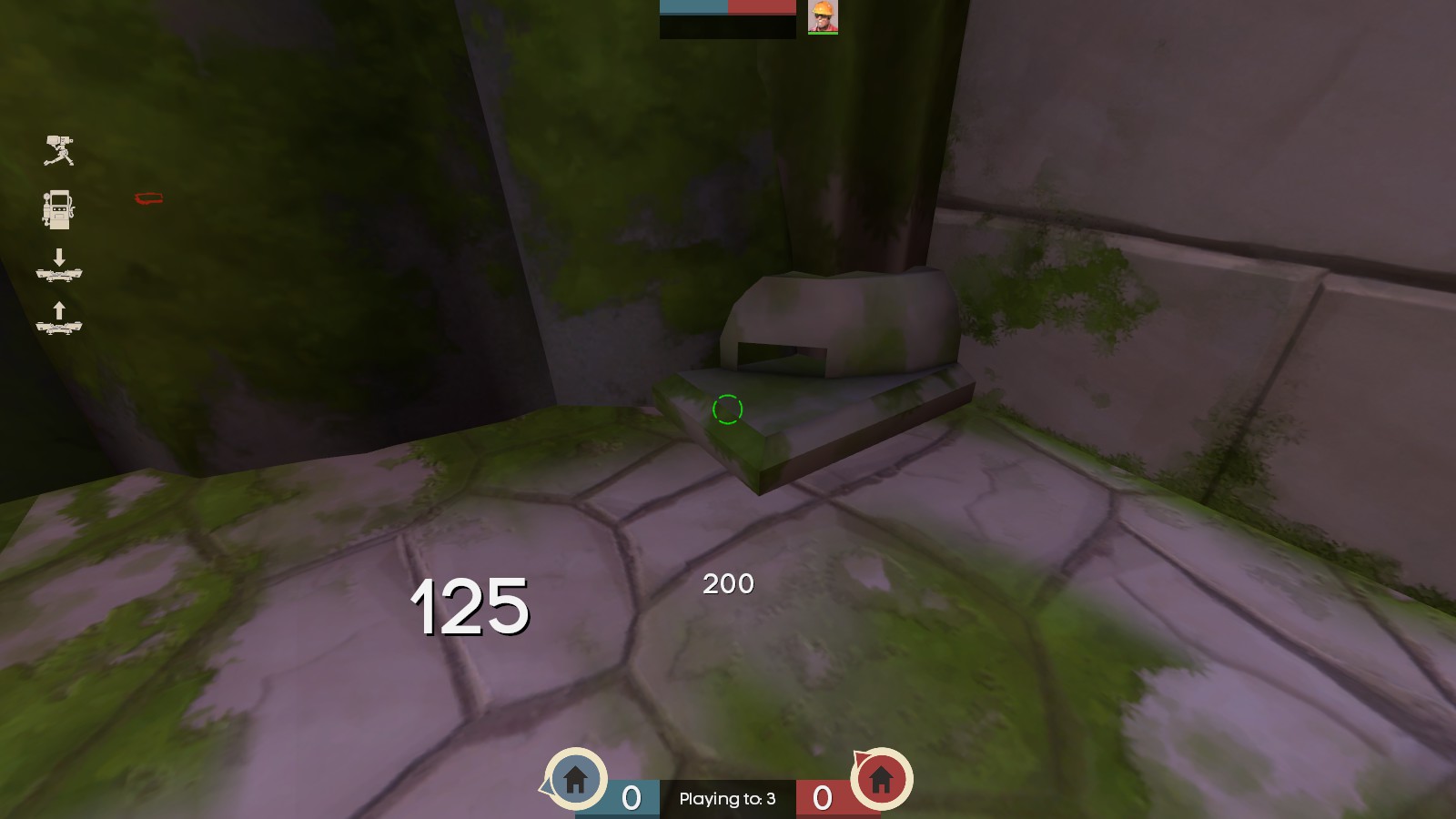
A single quad of this model is missing.
Parts of the spooky water disappear for me at certain positions. Tested with mat_phong on both 0 and 1
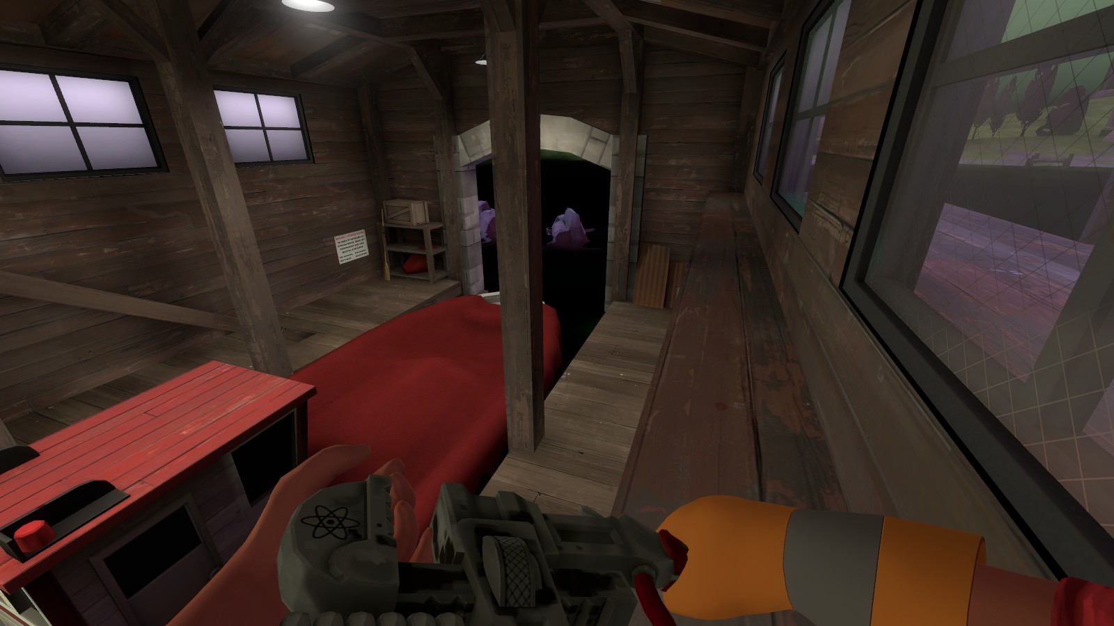
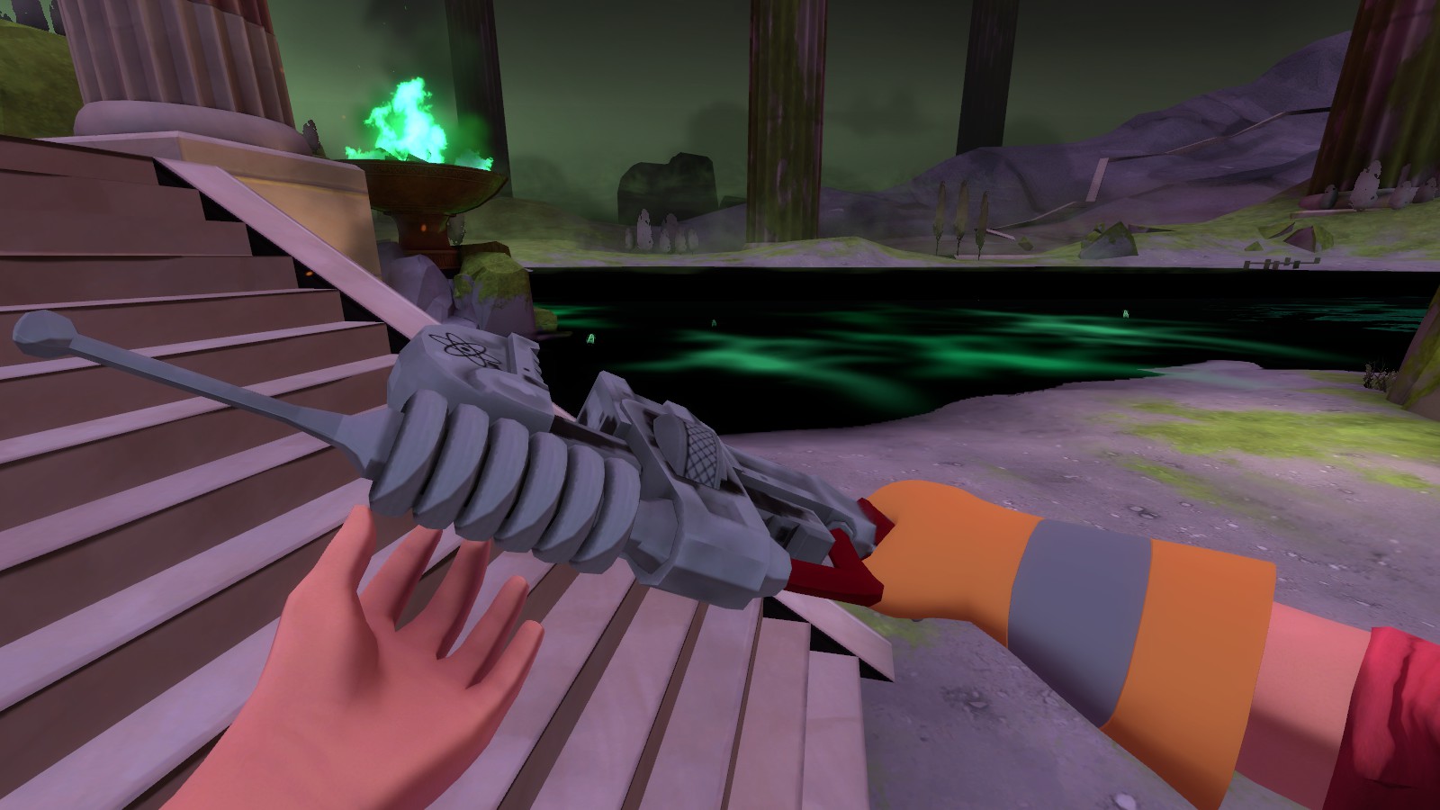
The flags are quite an annoyance for jumpers. If you don't want to make them non-solid, maybe you should put some clearly solid overhang behind them between the pillars or something
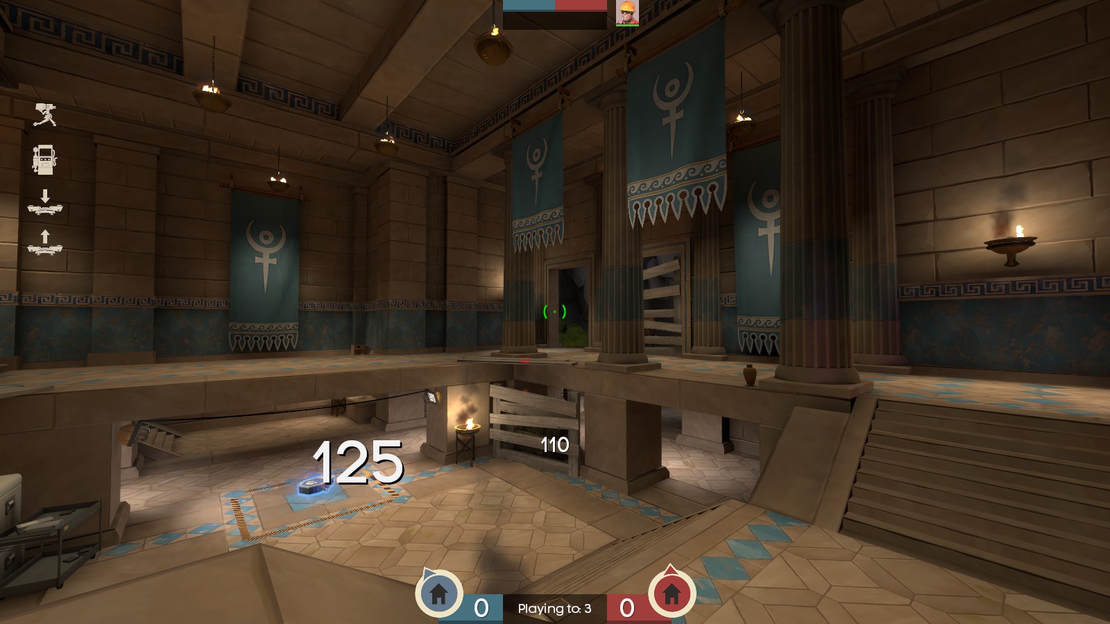
Questionable texture alignment
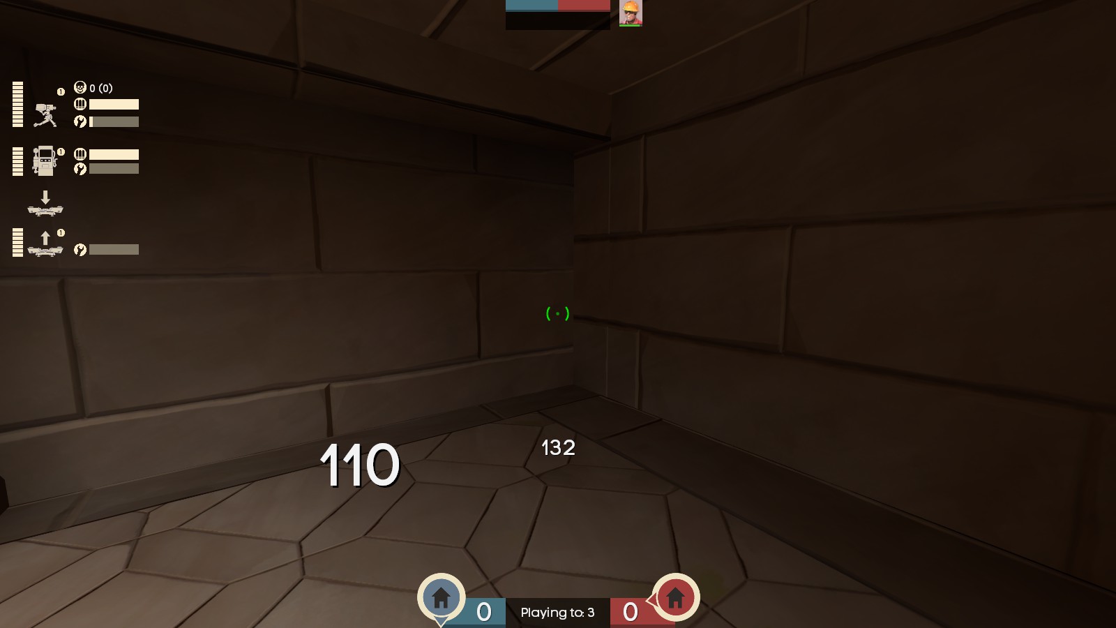
I know you said before that the clipping had yet to be finalized, so I don't know how much clipping I should report before it gets annoying - I've put it all in a spoiler. mostly progressing in terms of how minute and ignorable they are
I think you should keep this, it's funny
Guessing you found this already and decided a sentry can be outranged easily, but I included it in case
A single quad of this model is missing.
Parts of the spooky water disappear for me at certain positions. Tested with mat_phong on both 0 and 1
The flags are quite an annoyance for jumpers. If you don't want to make them non-solid, maybe you should put some clearly solid overhang behind them between the pillars or something
Questionable texture alignment
I know you said before that the clipping had yet to be finalized, so I don't know how much clipping I should report before it gets annoying - I've put it all in a spoiler. mostly progressing in terms of how minute and ignorable they are
A general summary - None of the beams in the direction of the main spawndoors are clipped, and around the flagrooms, a majority of the pillars still need smoothing clipping for some reason, their curve sometimes isn't enough to ensure you don't get caught on them.
Most of the time when running at this corner you'll step up onto the raised floor - but inconsistently, sometimes you get stuck. If someone retreated here while health had been taken, they could get stuck and die for it
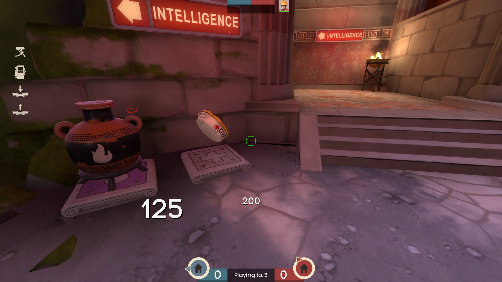
You can jump up on the base trims of all these pillars. Also, you get stuck against this one (and the rest, which makes it easy to get stuck retreating - but I get that they maybe protrude too far to justify a clipping slant)
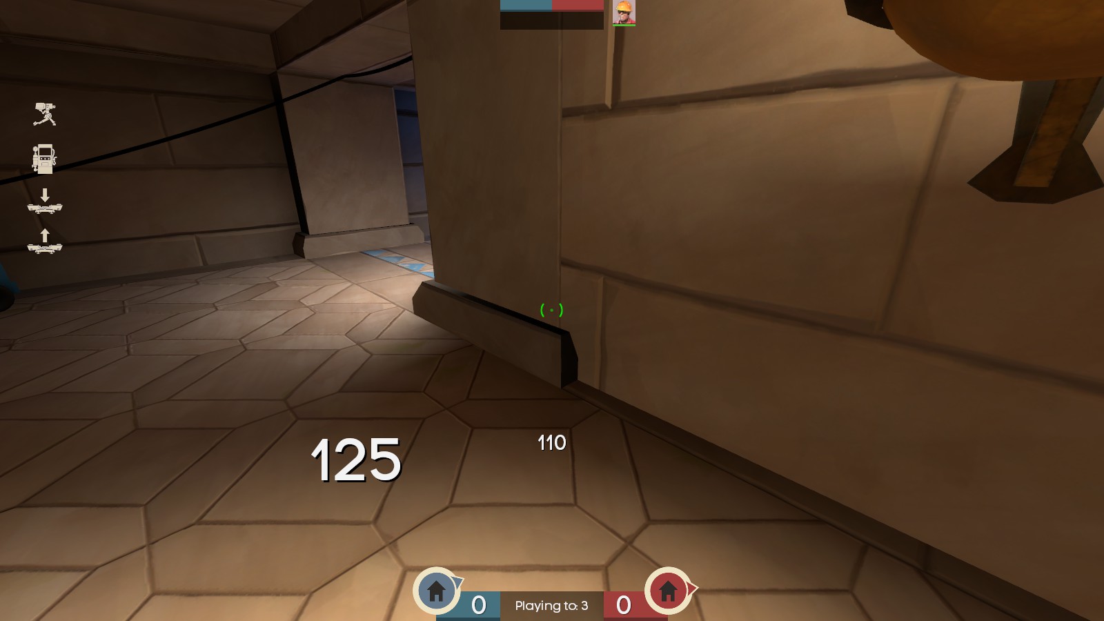
Making a beeline for this staircase can get you caught
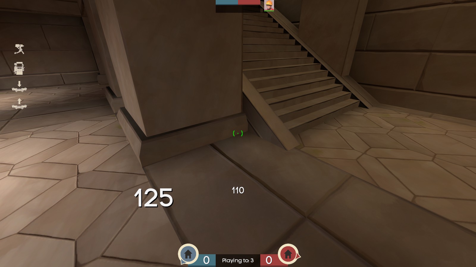
Even though this is at an angle so it's more slippery than usual, you can still get stuck against the beams.
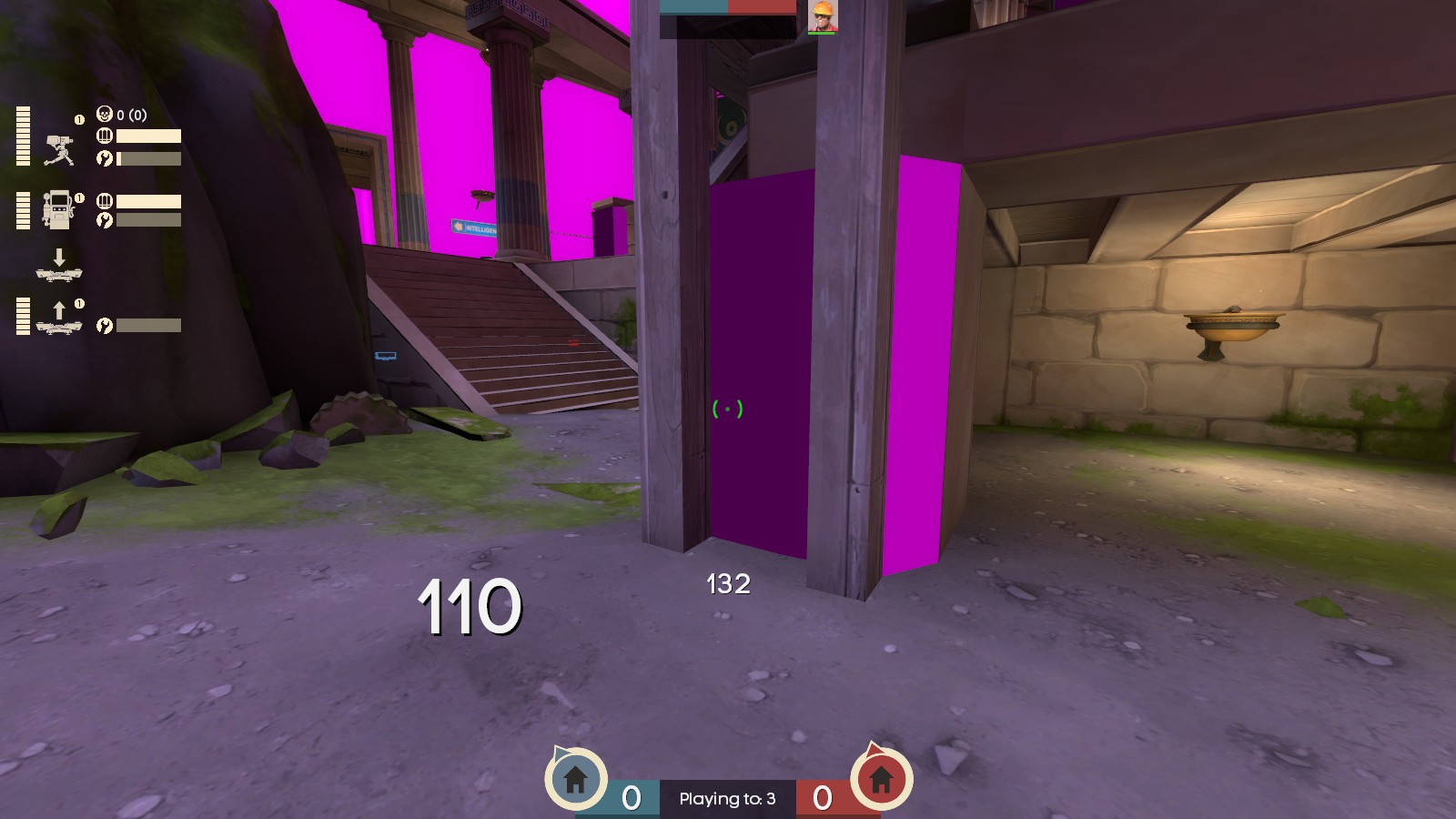
If you run into the bush, you get caught in the corner. Also, if you crouch against this wall under the tiny trim (as C&D Spies are likely to do), you can't stand up.
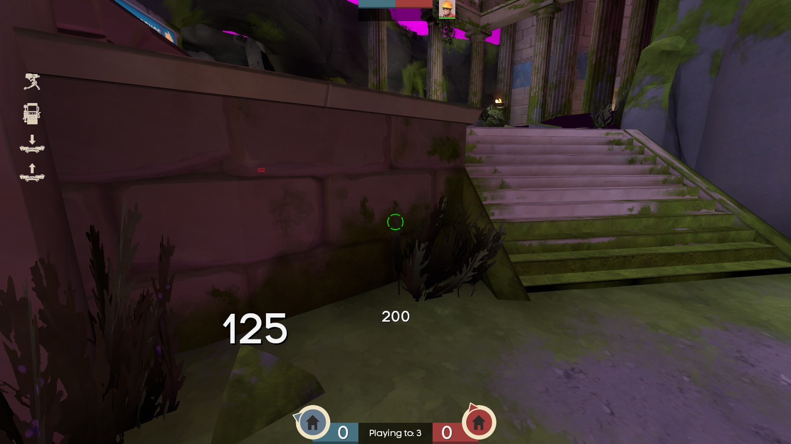
Same deal here, if you try to tuck yourself out of the way as a Spy here you can't stand up
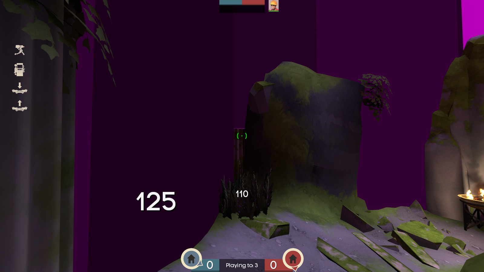
Thank you for smoothing this corner off! unfortunately there's a tiny bit sticking out
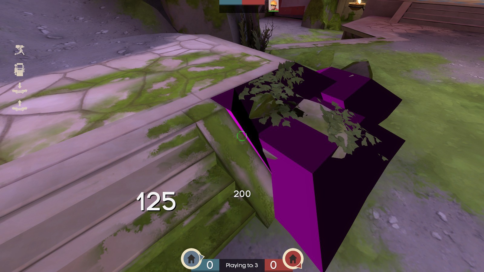
people trying to cut corners or backpedaling towards the staircase can walk over most of this debris, but get caught on the column. if it was moved closer to the stairs it could even justify extending the clip ramp for that corner
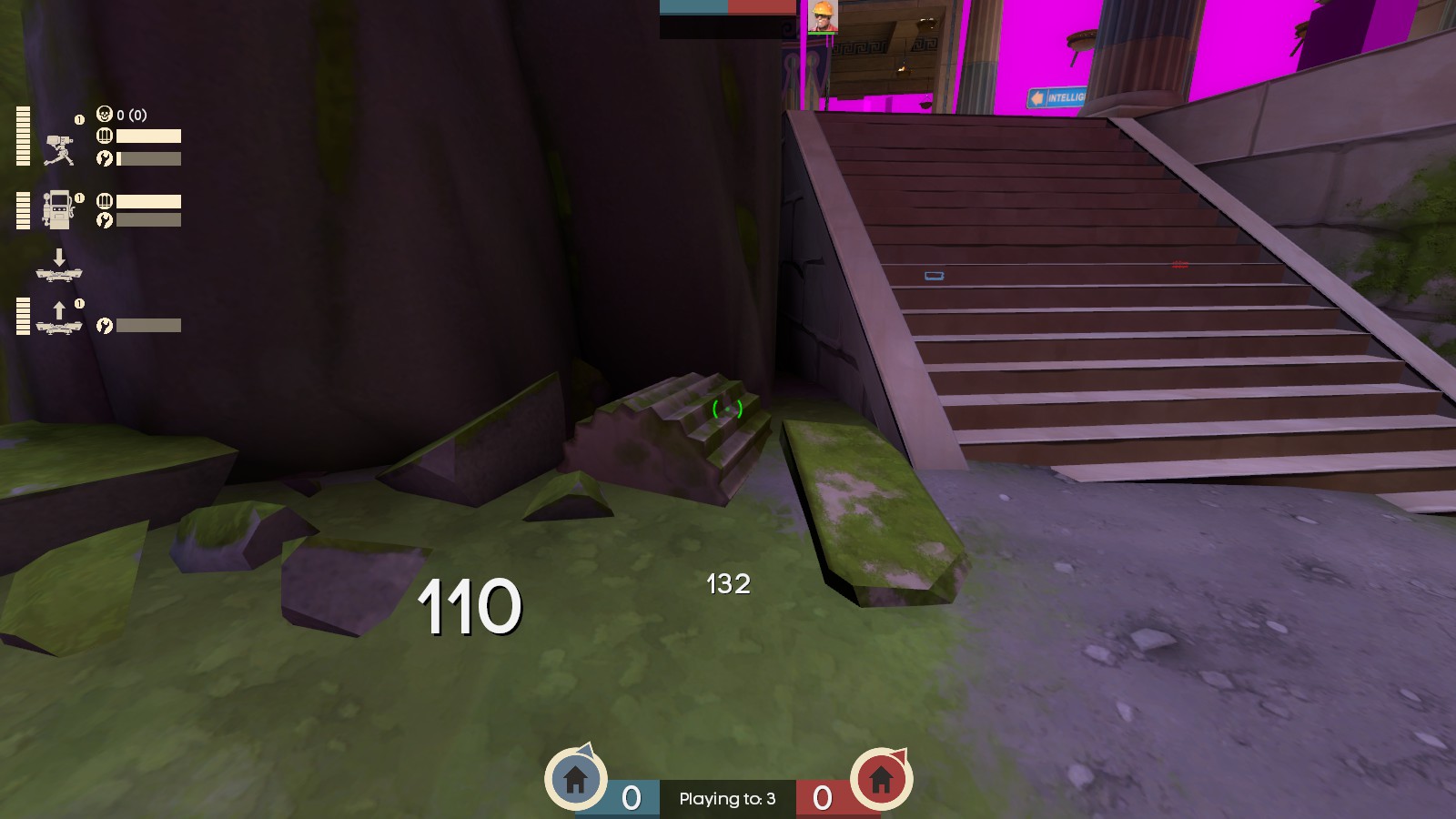
Most of the time when running at this corner you'll step up onto the raised floor - but inconsistently, sometimes you get stuck. If someone retreated here while health had been taken, they could get stuck and die for it
You can jump up on the base trims of all these pillars. Also, you get stuck against this one (and the rest, which makes it easy to get stuck retreating - but I get that they maybe protrude too far to justify a clipping slant)
Making a beeline for this staircase can get you caught
Even though this is at an angle so it's more slippery than usual, you can still get stuck against the beams.
If you run into the bush, you get caught in the corner. Also, if you crouch against this wall under the tiny trim (as C&D Spies are likely to do), you can't stand up.
Same deal here, if you try to tuck yourself out of the way as a Spy here you can't stand up
Thank you for smoothing this corner off!
people trying to cut corners or backpedaling towards the staircase can walk over most of this debris, but get caught on the column. if it was moved closer to the stairs it could even justify extending the clip ramp for that corner
Last edited:
thanks for the feedback! we're sorting out rendering issues with the water and are aware of the missing quad. that structure shouldn't be buildable - thanks for pointing it out!
unfortunately for the clipping we're extremely close to the brushsides limit (no exact numbers but it's likely only a few dozen!). will do what we can to smooth everything out, but no promises for the really small stuff.
unfortunately for the clipping we're extremely close to the brushsides limit (no exact numbers but it's likely only a few dozen!). will do what we can to smooth everything out, but no promises for the really small stuff.
b3 changelog:
- added amphoras to the far sides of mid beach
- added mann brothers lines on capture
- added muffled mann brothers lines from flags on pickup and drop
you're stealing their souls back, after all. go read the promotional material.
- added asphodel plants
- added menu photos
- added mission briefing text (en)
- updated goal strings
- greatly improved soundscapes
- adjusted props at back of intel to direct players better around an area they could get caught
- added resupply signs over ground level spawn door
- fixed culling (flickering) issies on water caustics
- replaced brushwork stairs with bespoke meshes
- replaced brushwork debris with bespoke meshes
- replaced brushwork portal brackets with bespoke meshes
- improved clipping
- fixed an exploit where the courier could cross mid high route
- fixed an exploit where players could build in areas of RED spawn
- further optimisation
- added prop fades
- fixed attenuation on amphora break sounds
- converted amphora break sounds from stereo wav to mono mp3
- fixed soundscapes on blu side
- fixed tall structure around lobby/connectors being buildable
- fixed skeletons not spawning after each flag's first capture
- fixed misaligned capture particles
- increased height on capture particles
- added nodecal to misc pot props
- fixed missing quad on pillar base mesh
- fixed some texture alignments
- fixed a small displacement issue in shore tunnels
- fixed 3d skybox transition issues
- fixed area portal seams around some shutter doors
- small detail adjustments across the map
- fixed funny guys
Read the rest of this update entry...
absolutnonevahno
L1: Registered
- May 23, 2021
- 1
- 0
Cool map, man. Sometime when player are making stickyjumps the untextured areas of the temple become visible from above, hope it can be textured without making optimisation sick. I like your work.
b4 changelog:
a new tf2 patch has released! within it are several bugfixes we contacted valve about.
this patch fixed:
- heavy being able to crouch and jump while scared with his primary weapon out. this fixes a major exploit with heavy couriers being able to take the top route.
- tf_generic_bomb now has options to pass !activator. this means we no longer need to use func_breakable, so grenades, fire, and other projectiles will now break amphoras.
- the dragon's fury's projectiles now interact properly with tf_generic_bomb.
thanks, eric!
- added intel signs in tunnel route
- updated ivy props
- buffed fire amphora effects
-- fire amphoras deal far more fire damage for a longer duration
-- fire amphoras deal some damage immediately on detonation
- fixed amphoras not respawning if broken on the first tick after spawn
- added soundscape triggers to water
we have enough brushsides for this now! woo
- further optimisation
- fixed an issue where the flag could be dropped in the boathouse water exit behind the respawnroomvisualiser and not hit the deep water flag reset trigger
- fixed a broken ssbump
- fixed a perch on blu battlements
- fixed a logic error with the blu flag spawning skeletons
- added ambient sounds to generators in temple tunnel routes
- adjusted amphora break sound attenuation
- fixed mann brothers muffled flag lines being global
- added anti-spam delay to mann brothers muffled flag lines
- fixed wrong mann brother muffled flag lines
- fixed spectator cameras
- fixed some z-fighting
- fixed a sign in blu intel pointing the wrong way
- fixed a bunch of gravity-defying pebbles
Read the rest of this update entry...
b5 changelog:
- measures to try and fix, or at least better diagnose, an uncommon and locally-unreproducable bug where players aren't being spooked when picking up the flag
- delayed stun trigger enable by 0.01s, in case some weird asynchronous behaviour was leading to this trigger linking to the player before they get marked as courier
- delayed stun immunity trigger enable by 0.04s to account for this (this trigger forces a flag drop if you escape the stun, eg quickfix uber)
- fixed a small displacement seam on red side of mid
- fixed some outdated ivy props
- fixed some z-fighting
Read the rest of this update entry...


