cp_tomo

CP cp_tomo A4

I dinne ken

Has currently had enough
aa
Apr 16, 2016
324
433
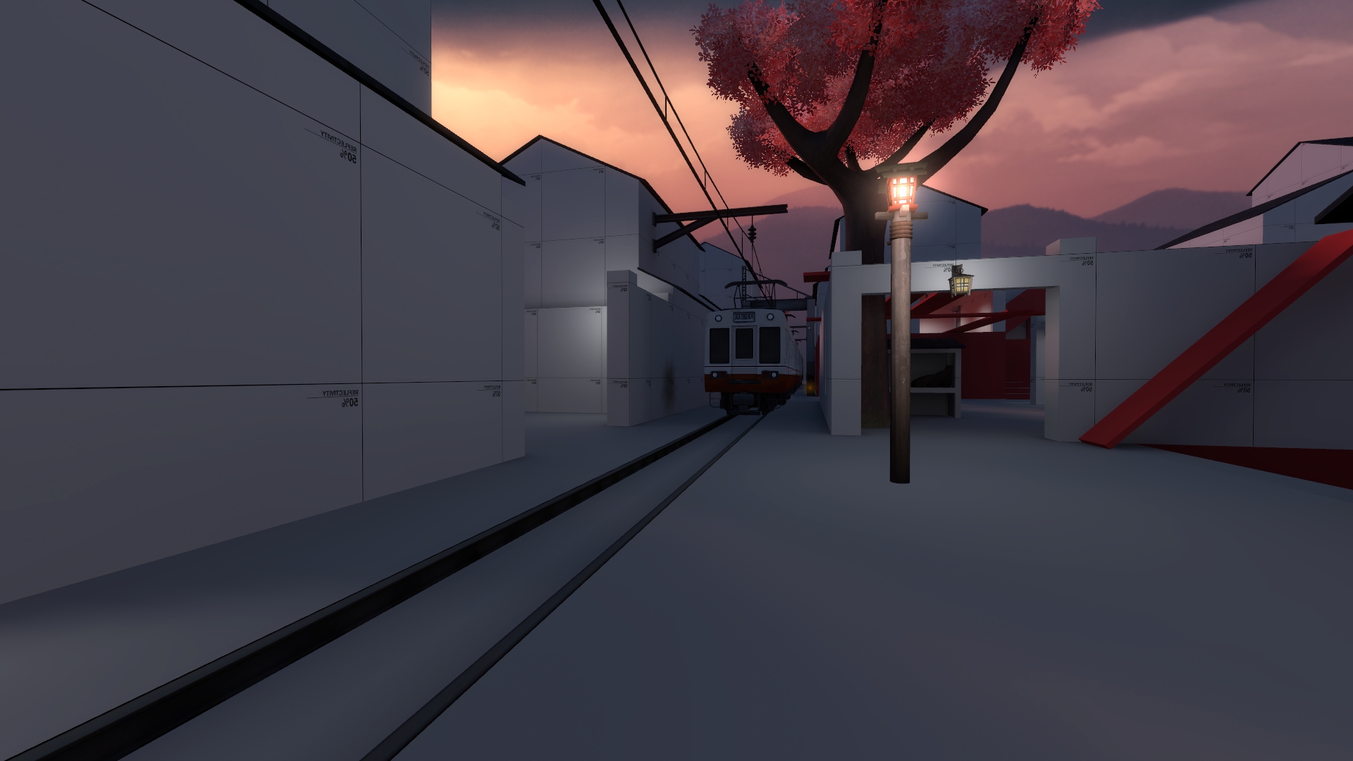
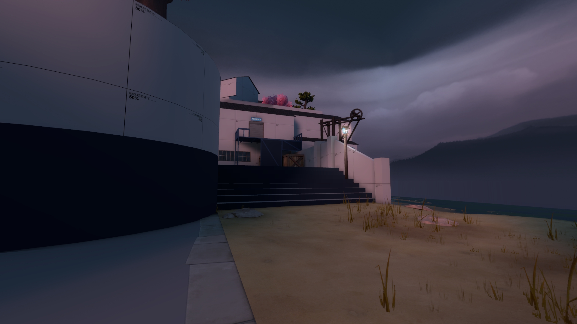
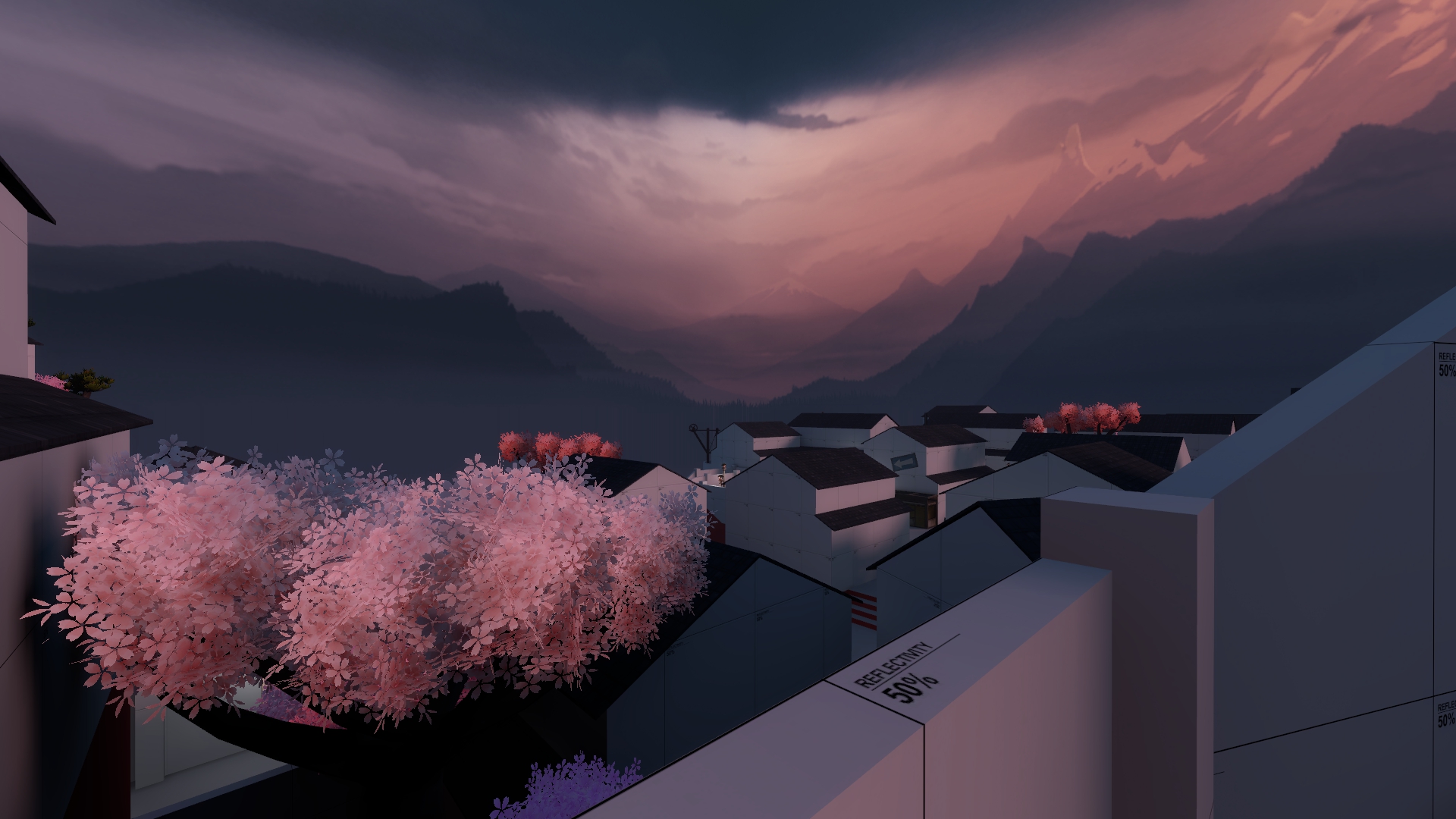
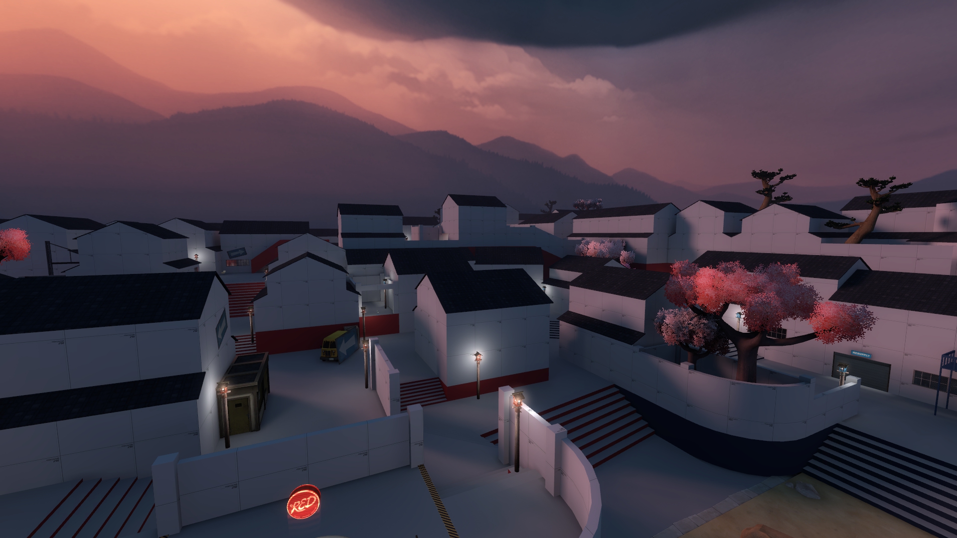
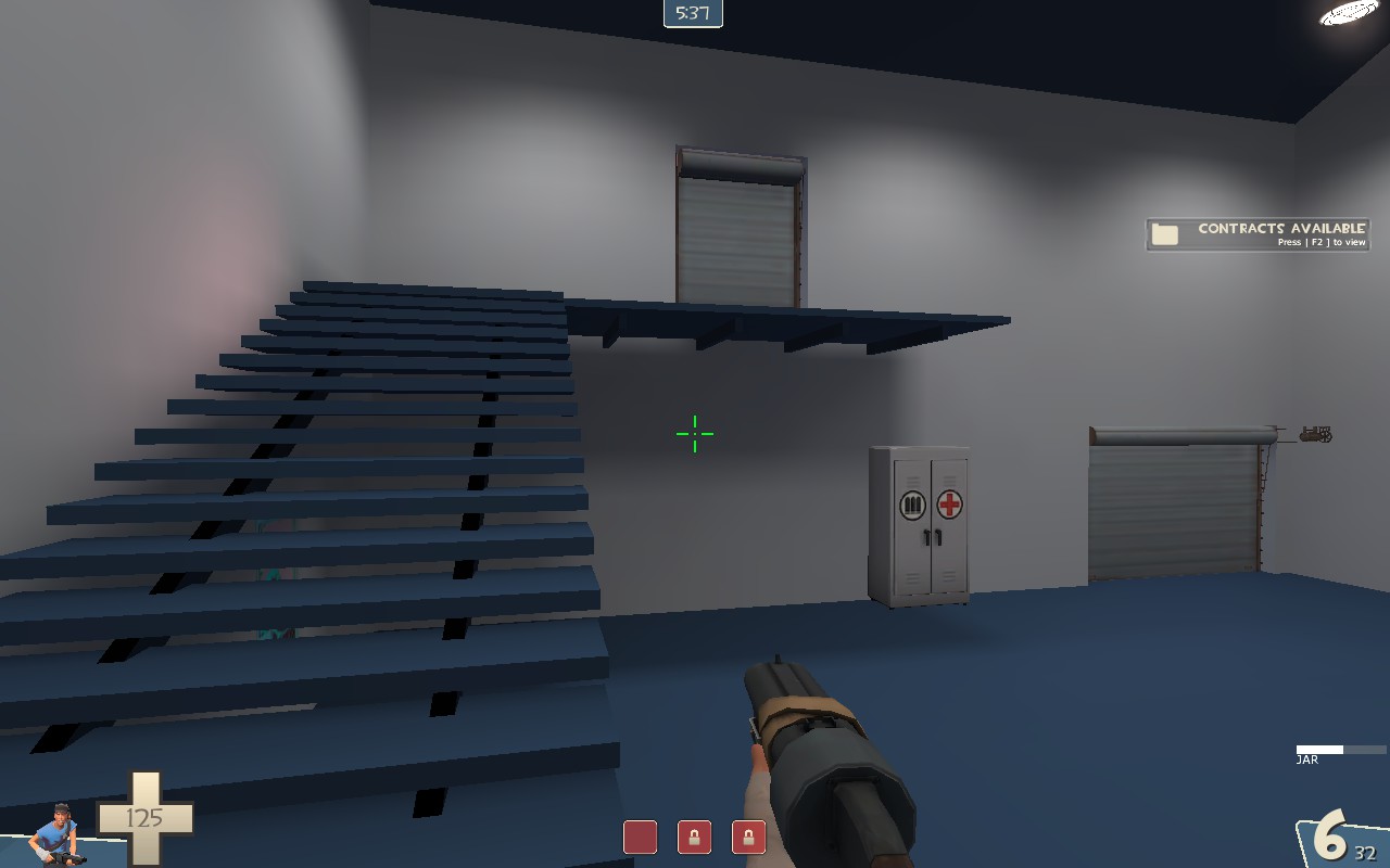
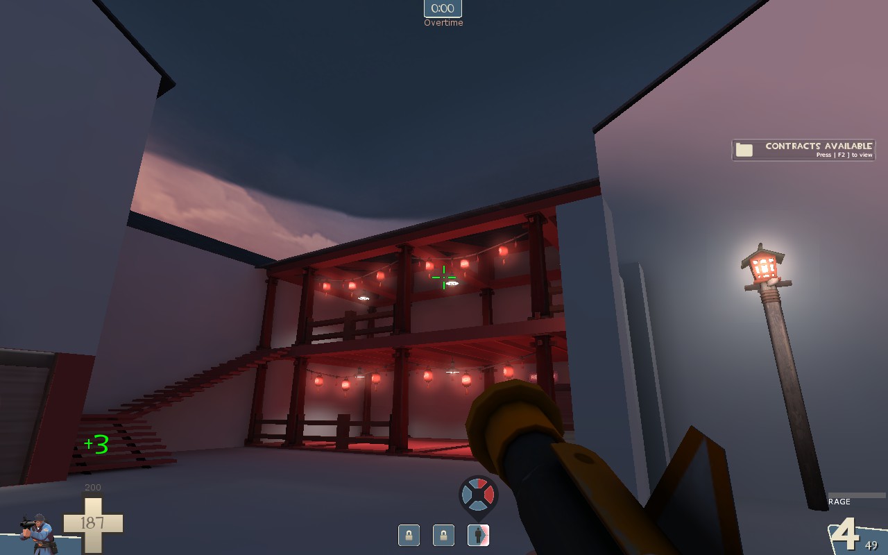
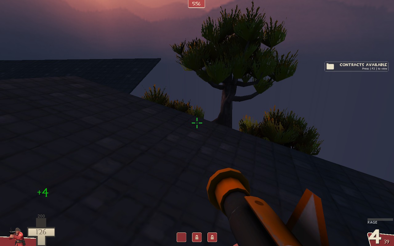
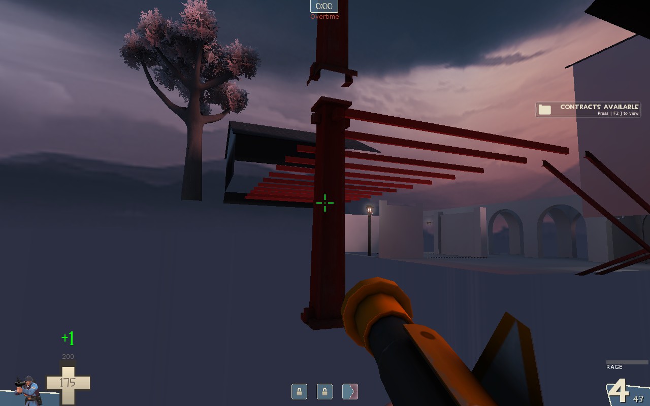
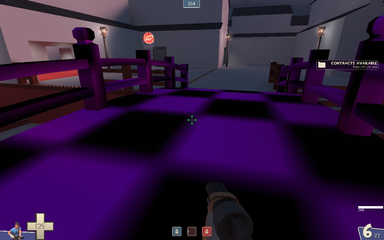
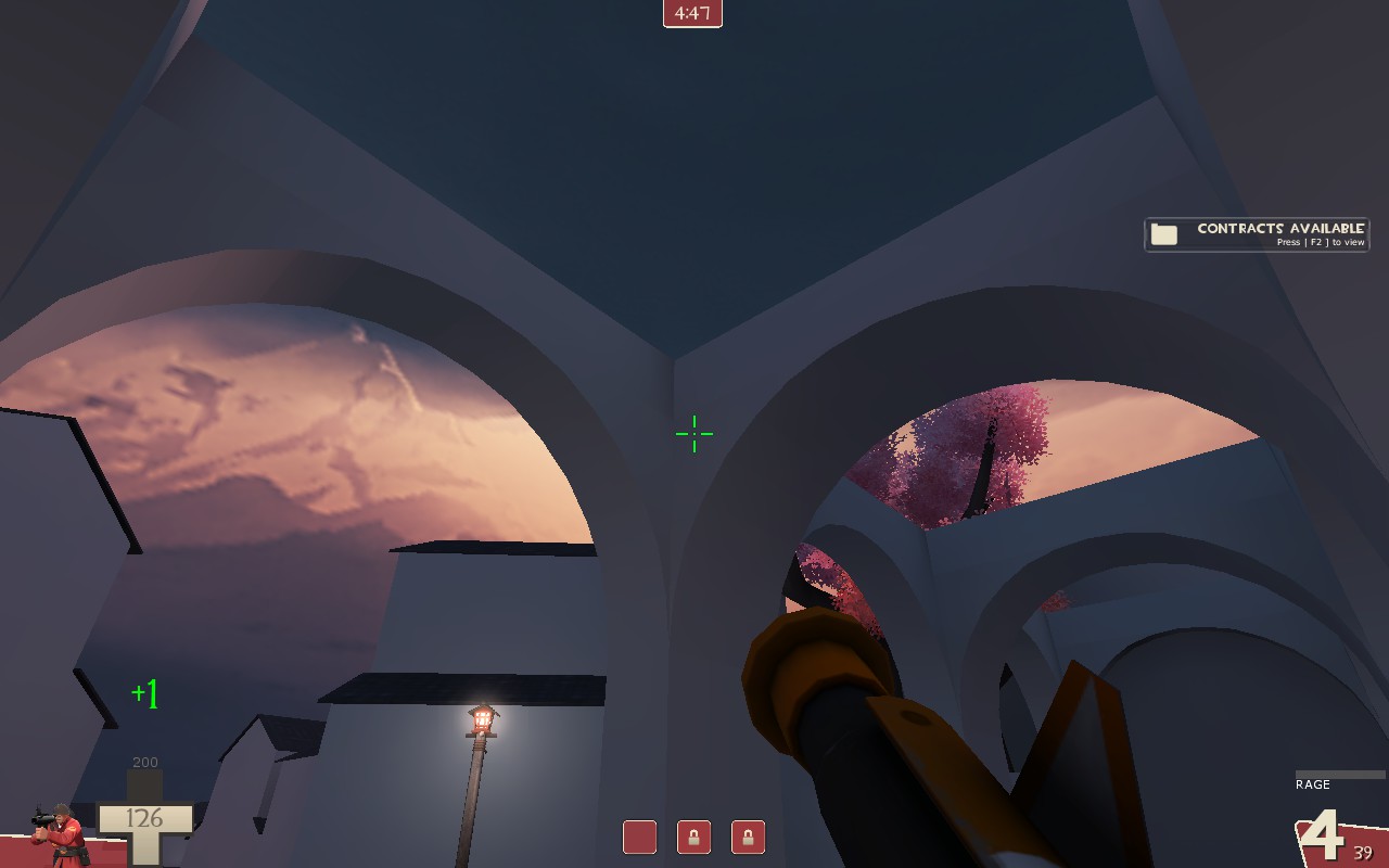
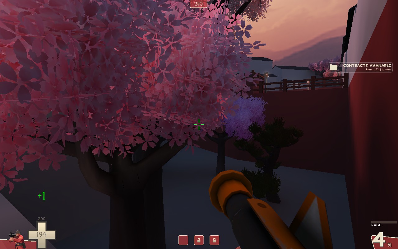
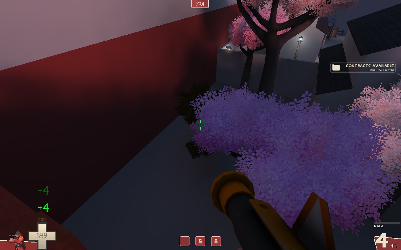
cp_tomo - A vividly coloured single stage Attack/Defend CP map set in a rural Japanese port town

Sitting down to a large bottle of saké, hearing the sound of the waves lapping against the shoreline, and watching the evening sun while it gently warms the air.

Nothing could break this enchanting evening.

Nothing, except two gangs of mercenaries savagely battling it out to control this idyllic and historical town!
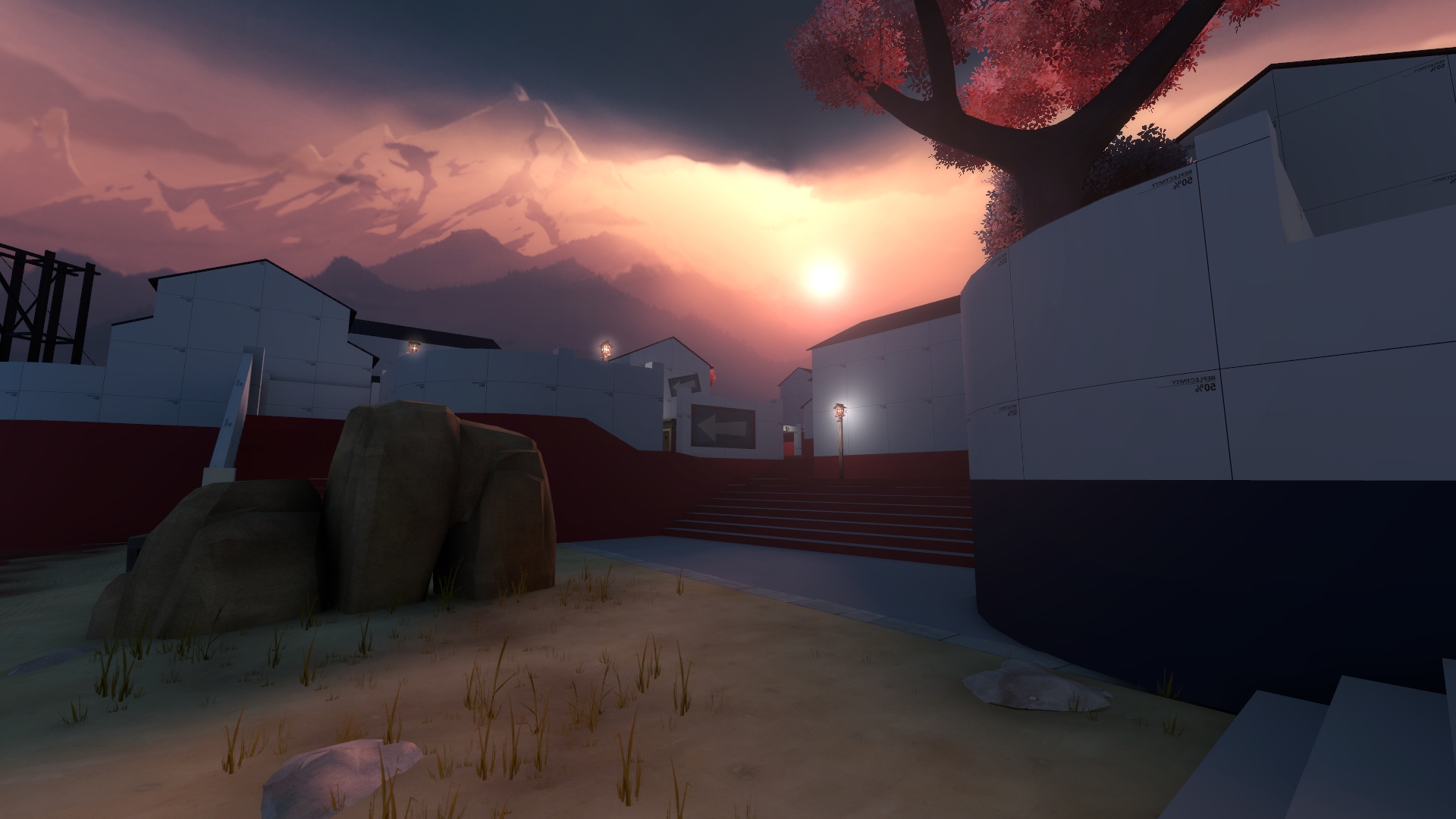
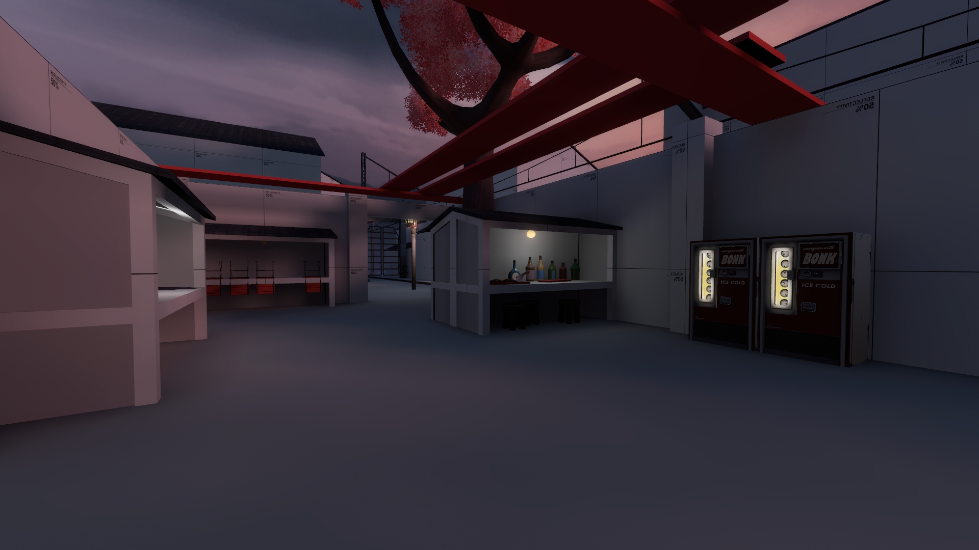
20180225184838_1.jpg
20180225185009_1.jpg
20180225184946_1.jpg
20180225184829_1.jpg
20180225185248_1.jpg
20180225185122_1.jpg


This map is my entry to the Connect 5 contest.

I used the vertical "Seaside - Asia - 1 moving train - Day - Asymmetrical" line.

I based it off of a port town in Japan called Tomonoura, which is also where I got the name.

I have been told that as long as the primary source of light is the light_env and not the secondary lights such as the lampposts, then it can be considered a "Day" map.

Assets used:

The Swamp Pack
The Frontline Pack
The Overgrown Pack
The Japan Pack
The Extended Japan Pack

The better Sakura trees - EArkham
Sky_yuki - Void
Water_powerup - Tumbolisu
The Devbucket Collection - Beef Bucket

And a special thank you to Freyja!
For the Japanese Electric Train + Overhead Wires models
And, for specially releasing the mvm_teien assets to the public at my request
 
Last edited:

YOYOYO

50 crashes and counting!
aa
Jul 10, 2017
620
556
Even though its really pretty, I have some problems I wanna talk about.
First of all, is this door supposed to be used? It opens and close, but has some kinda clipping thing.
cp_tomo_a10000.jpg


Also, Even though there are some signs, I still got lost pretty easily. This could be fixed many ways, and I'll let you choose.

Some more stuff (I'm practically doing this while I play): Its probably not the best Idea to have a working train right in front of the red bases door. Even though its hella funny to see players destroyed by it. I'm saying this because we all know what happened with snowplow.
cp_tomo_a10002.jpg

Also, Dev texture:
cp_tomo_a10001.jpg
 

I dinne ken

Has currently had enough
aa
Apr 16, 2016
324
433
  • I've fixed the door for next version: it didn't have a move direction.
  • For the door that goes directly onto the train tracks problem; I've actually put train signal lights on the inside of that spawn room. They light up when a train passes. So if you get flattened by the train coming out of that door it's your own fault. If it is actually a problem in playtesting I will fix it by moving the spawn to another location.
  • That texture bug is a problem with compilepal not packing it, I'll have a look into that.
May I ask you how the performance is on the map?
 

I dinne ken

Has currently had enough
aa
Apr 16, 2016
324
433
pardon? I'm not sure I know exactly what you mean, apology.
How many fps are you achieving. You can check this with net_graph 1 enabled.

And if you could give me your pc specs to base this off of that would be great.
 

YOYOYO

50 crashes and counting!
aa
Jul 10, 2017
620
556
Ok, I don't usually do this, but I'll try:
fps: 90
and (please don't laugh)
processor: Intel(R) Core(TM) i7-4600U CPU @ 2.10GHz, 2701 Mhz, 2 C...
System Type: x64-based PC
 

I dinne ken

Has currently had enough
aa
Apr 16, 2016
324
433
That's good, I was worried it wouldn't be too great optimisation wise. Don't worry about your specs tho.
 

Bunker Junker

L3: Member
Jul 28, 2017
141
38
Looks like a very good looking map, will give it a shot, and get some inspiration out of this one.
 

Bunker Junker

L3: Member
Jul 28, 2017
141
38
Alright, I tried it out for a while, and here's my review:

- This door up here doesn't let me go though it, I believe you put a player clip there by mistake.

91C83D76AE0E4178E0DC6D208381CBA48D74AE35


------------------------------------------
- I believe this roof should be clipped, as it honestly don't really have a purpose if you ask me.
A16D5F5A3D77B2222957EB10B889FE89EB2D23BA


I've also discovered that while on the roof, and in a certain location, I can actually get out of the map.

(Location)
7FF27E9ADE9982A00FE0E9647525E3F0A1462DA5

(Result)
D641CA3075CFBAF0D8239F16ADAB0CCCE06E94EC


------------------------------------
- Missing texture bridge.
DAD6429CEEB9E337DEE89F420353D3061EEE67AF


--------------------------------
- I think a roof should be added so players don't get confused on how their head bumped the air.

63627FE4EEB06B686AE47BFF0B9AB9C230A7D7C2


Plus I don't think a player clip should be there at all, as I kind of wanna jump over it.
-------------------------------
- Nice deathpit, but I don't think you should just open off one side, and clip off the other. As it kind of makes players believe that there's a flank route, only to end up getting mad because there was a player clip blocking them, resulting in their deaths.

I think you should either clip off both ends, or open them, which will make a new risky flank route.

7ECD78DD826C9926F1F6105099EA1E09822A38EA

8FEC7149C85256F494AA6F1323B26FA08CB71216


And yeah, I don't think a train at spawn is a good idea, at least in terms of "seriousness" it can get in the way and be a hassle.
---------------------------------------------------------------------------------------------------------------------------------------------------------------------

Anyways, I really did like the design of this map, looked very beautiful despite being in it's early stages. Though I wonder on how it'll play out.

I wish you the best.
 

I dinne ken

Has currently had enough
aa
Apr 16, 2016
324
433
Alright, I tried it out for a while, and here's my review:

- This door up here doesn't let me go though it, I believe you put a player clip there by mistake.

- Missing texture bridge.

- And yeah, I don't think a train at spawn is a good idea, at least in terms of "seriousness" it can get in the way and be a hassle.

I've already addressed these issues in post 5 ¯\_(ツ)_/¯, but thanks anyway.
Also, I've recently found out that the bridge's distinct lack of textures is due to the said model's weird file name which compilepal didn't like. I have a workaround for this which I will do.

- I believe this roof should be clipped, as it honestly don't really have a purpose if you ask me.

-I've also discovered that while on the roof, and in a certain location, I can actually get out of the map.

- I think a roof should be added so players don't get confused on how their head bumped the air.
Plus I don't think a player clip should be there at all, as I kind of wanna jump over it.

- Nice deathpit, but I don't think you should just open off one side, and clip off the other. As it kind of makes players believe that there's a flank route, only to end up getting mad because there was a player clip blocking them, resulting in their deaths.
I think you should either clip off both ends, or open them, which will make a new risky flank route.

Anyways, I really did like the design of this map, looked very beautiful despite being in it's early stages. Though I wonder on how it'll play out.

I wish you the best.

  • The roof isn't meant to be nonclipped, thanks for finding that out. I will fix it for next version.
  • The roof Idea on the arches is a good one, thanks for that. I should hopefully add that for next version although it isn't critical.
  • I have decided to make that deathpit just a clipped off area now, with a higher wall on the cliff side of the deathpit to discourage the idea that it is one.
  • Thankyou for the compliment about cp_tomo's looks, although it may look less pretty for next version as the solid coloured textures were considered a problem during playtesting. This was because it removed some visual depth from the scenes making it hard to see distance.
Thanks for having a pootle around in cp_tomo.
 

Bunker Junker

L3: Member
Jul 28, 2017
141
38
I've already addressed these issues in post 5 ¯\_(ツ)_/¯, but thanks anyway.
Also, I've recently found out that the bridge's distinct lack of textures is due to the said model's weird file name which compilepal didn't like. I have a workaround for this which I will do.


  • The roof isn't meant to be nonclipped, thanks for finding that out. I will fix it for next version.
  • The roof Idea on the arches is a good one, thanks for that. I should hopefully add that for next version although it isn't critical.
  • I have decided to make that deathpit just a clipped off area now, with a higher wall on the cliff side of the deathpit to discourage the idea that it is one.
  • Thankyou for the compliment about cp_tomo's looks, although it may look less pretty for next version as the solid coloured textures were considered a problem during playtesting. This was because it removed some visual depth from the scenes making it hard to see distance.
Thanks for having a pootle around in cp_tomo.

Gotta make sure man. :^)

And glad to help, look forward for the next version.
 

I dinne ken

Has currently had enough
aa
Apr 16, 2016
324
433
A2

Hopefully, I got the logic working this time.

Additions
  • Added windows to the first blue spawn
  • Added a new route to A
  • Added some new stairs near A where a drop-down used to be, might change in future
  • Added more signs that hopefully better direct people to the points
  • Added a van for cover and break up sightlines to Red's first spawn
  • Added cranes around the pier
  • Added vending machines around the market
  • Added hint and skip textures, it should now be better for optimisation
  • Added a new side route/flank to B
  • Added a new side route onto C's point, the entrance of which is on the flank
Changes
  • Resized the map so that it is leaner and more compact in in-game size, should be less of a walking simulator now
  • Changed the location of Red's first spawn so its easier to tell where red is supposed to go and also make defending A easier
  • Changed B completely, its now set inside a building site
  • Changed the lampposts so that they emit more light
  • Changed the route to the high ground nearish A that used to be a lantern-lit stairway to a building
  • Changed the dev textures on the buildings to not be solid white, this was done to help depth perception
Removals
  • The dev texture bridge
  • The boring B point, now a hipper cooler B point
  • The drop-down onto the beach from Blue's spawn
  • The "tree pit" (the death pit during the route from B-C)
Fixes
  • fixed all the logic (hopefully), I tested it much more vigorously than last time so it should be fine
  • fixed red spawn's roof's lack of solidity
  • DOOR STUCK
Plans
  • Make B-C shorter, I currently think its too long by about 512 units (although I haven't tested this)
  • Add gutters
Things to test for
  • Spawn timings
  • Point capture timings

Read the rest of this update entry...
 
Last edited:

Skittelz

L6: Sharp Member
Mar 17, 2016
399
281
Also, I've recently found out that the bridge's distinct lack of textures is due to the said model's weird file name which compilepal didn't like. I have a workaround for this which I will do.

Oh. I had the same problem with the bridges. Here are the fix vmt's Freyja gave me:

Small bridge
Big bridge

Override this in japan/materials/models/props_japan
 

I dinne ken

Has currently had enough
aa
Apr 16, 2016
324
433
A3

A3 babyee!

Additions
  • Added gutters
  • Added more signs directing people to the points, they are now all in the style of cp_onsen (apart from one, which has to be a prop)
  • Added 2 more side routes to C, as it seemed hard to flank around
  • Added an interior to a building next to A so engies can have more cover for their sentries in return for it being shot at easier from certain angles
  • Added a full ammo pack to that building
  • Added More cover to the scaffolding around B
  • Added some pretty lanterns to the route to the Flanks around C, will add more around the map
Changes
  • Resized the map so B-C is 256 units shorter
  • Changed the capture time of B from 5 seconds to 10, as I felt it was too short
  • Changed the scaffolding around B point, so now the route around the back of B has 2 entrances and it's prettier.
  • Changed the textures of the spawns so they can be more easily identifiable, and also make navigating the map a bit easier
  • Changed the layout of the connecting routes between Blue spawn and A so more of it could tactically be used
  • Made the map 50 lighter, should help with the darkness problem
  • Made A-B 256 units shorter
  • Made the stairs from the beach to the higher ground closer
Removals
  • Removed an unused flank from A-B
  • Removed an unused flank near B (both so unused that you won't even know they've gone
  • Removed some unused planks from B's scaffolding to an area before C point
Fixes
  • Removed an annoying sightline from Blue's forward spawn to very close to C
Plans
  • I could possibly make B-C 256 units shorter again if need be
  • Add telephone Poles and air conditioning units
  • After the connect5 contest is done I may ask for the firework assets to be released from pl_effigy

Read the rest of this update entry...
 

I dinne ken

Has currently had enough
aa
Apr 16, 2016
324
433
A4

It's so tiny!

Additions
  • Added struts to the ceilings of the buildings with interiors
  • Hopefully added spawn times that were good for the spawns they were in. If they even work at all, they are hard to know if they are there.
  • Added some more cover around A point for both teams to use
Changes
  • Changed Blue spawn - A so its 256 units shorter
  • Changed A-B so its 256 units shorter
  • Changed B-C so its 256 units shorter
  • Changed the long flank from blue spawn to A / the path to B so that there is less of a sightline and it's also simpler
Removals
  • Removed the unused flank/high ground around the long flank from blue spawn to A
  • Removed the unused planks on top of the market (I liked those ); )
  • Removed an op sniper spot on the planks
  • Removed some unused space near the edge of the map that doesn't effect gameplay
  • Removed an unused flank/high ground that the planks led to near B
Plans
  • I could possibly make A-B shorter still, though I don't know if I could make any other part of the map shorter.
  • Add AC units only, telephone poles and their wires look cluttered and also fuck with the engine if there are too many of them
  • I could move back red's first spawn if it's too close to A

Read the rest of this update entry...
 

YOYOYO

50 crashes and counting!
aa
Jul 10, 2017
620
556
It got prettier! Is that the default sky box, or did you do something to it!?

But flattery aside, I wanna notify you on some things that I thought were necessary
1. On B, there no capping tape which show you where the capping trigger box is, This can be a bit confusing for players:
cp_tomo_a40000.jpg
Also, In my opinion, Cap C is kinda anti climactic, especially for a final cap point. I know its not very final, so you might have something planned, but It would be cool if it wasn't just a box with a point in the middle.