[Contest Entry] pl_ghost_town

bob+M|M+

L6: Sharp Member
Mar 31, 2008
346
394
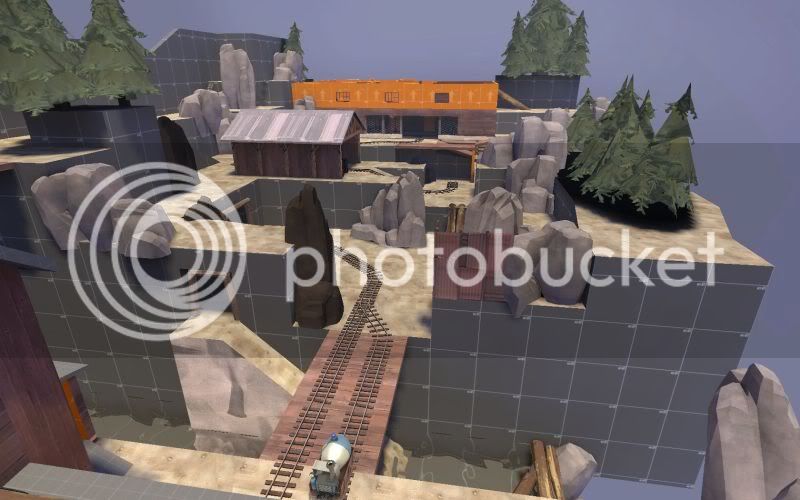
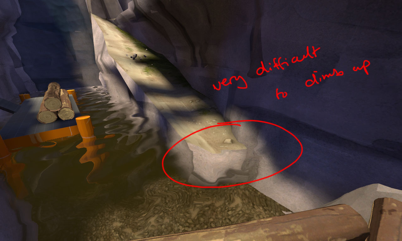
This map has great integration among all the different pathways, but like others have said I think there are too many alternative routes, which cause the player density to be spread like butter.


Some things to think about...
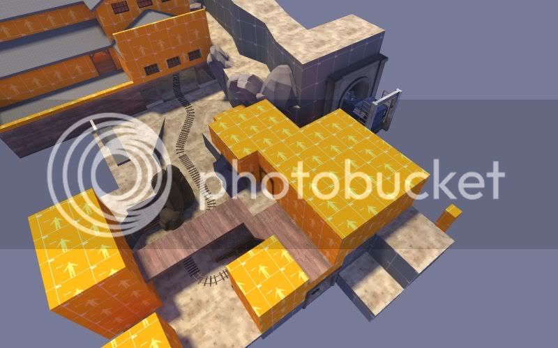
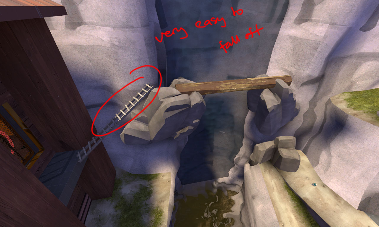
long routes
pros: access to unexpected areas of offense
cons: time consuming, detract from gameplay

ex:
plghosttowna40010nd8.jpg

plghosttowna40011jy5.jpg


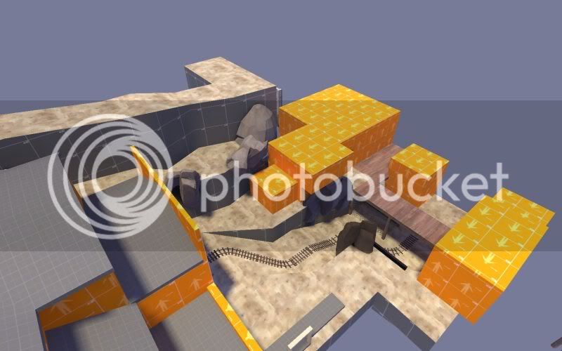
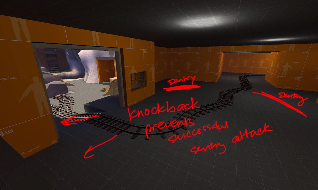
Field of view, and expecting where players will come from
pros: gives attackers versatile methods of attack
cons: Players seem to appear out of no where all the time in this map, which can make it very difficult for defenders to know what direction to face.


64410043tn1.jpg

84359052ka1.jpg

endqc0.jpg


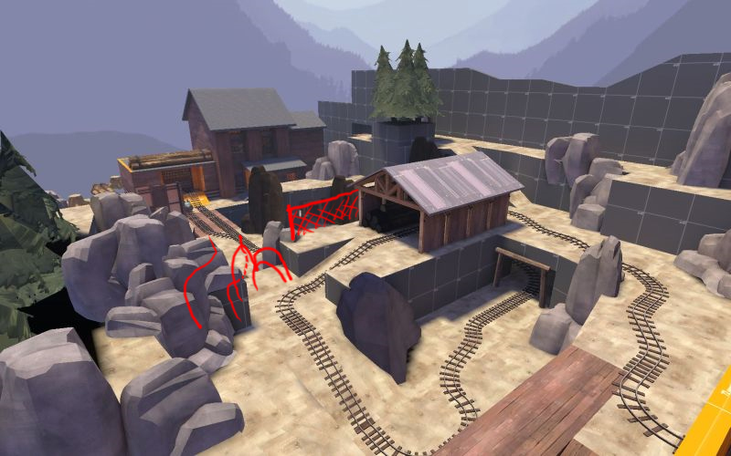
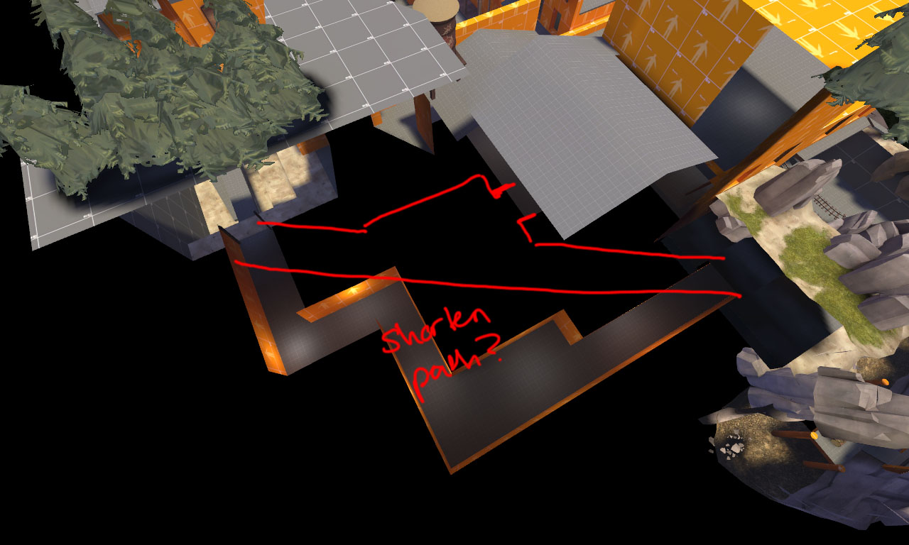
It seems like some alternative paths allow for blue to infiltrate too far into red territory.


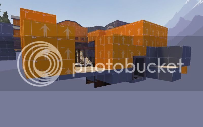
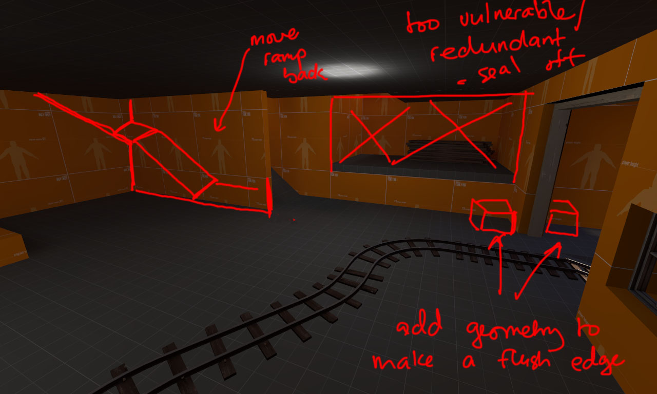
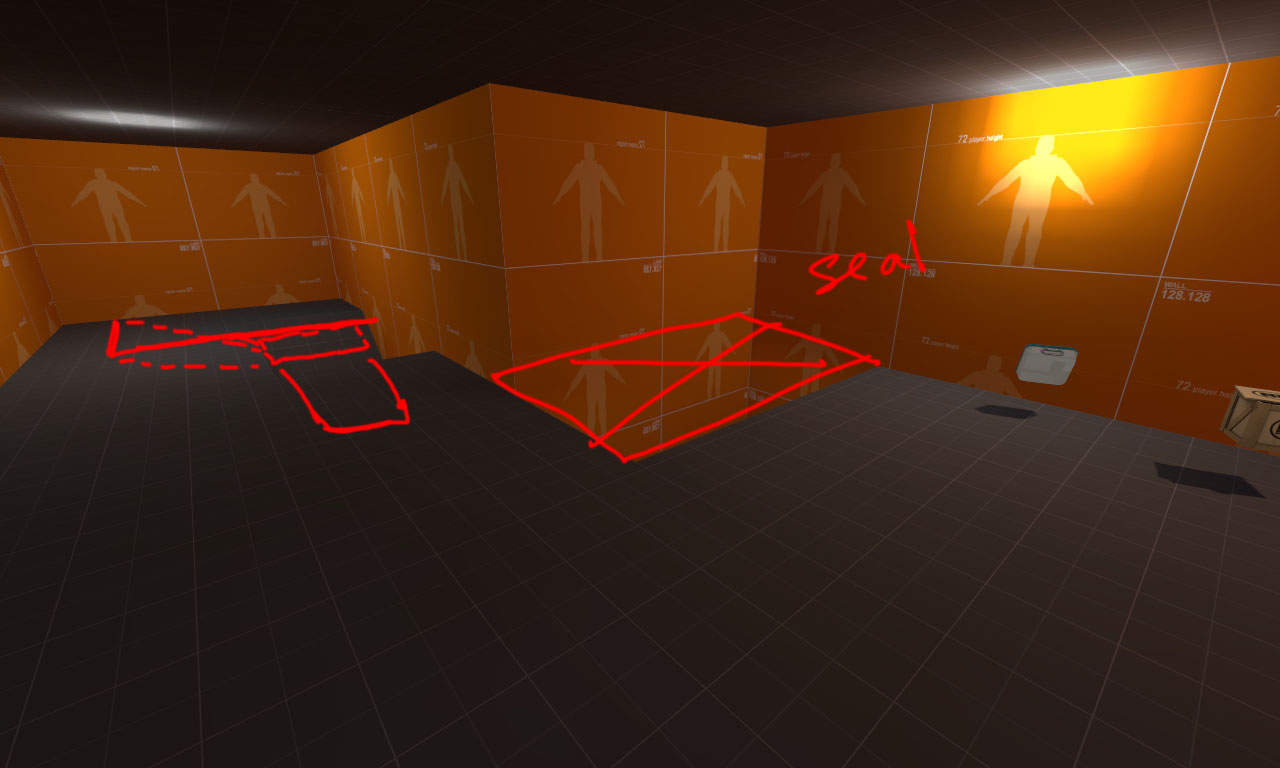
One thing you can do to help confusion is to reduce the amount of open spaces through windows and doors.

Can shoot through all these areas:
window1sr1.jpg

'

You could add glass to almost ALL these windows
window2py0.jpg


Hope that can give you some ideas.

bob+M|M+
 
Last edited:

FLOOR_MASTER

L3: Member
Mar 10, 2008
118
140
A4 feedback:

Major issues with this area, it's very difficult to jump up:
ghosttown21.jpg


Likewise, it's very easy to fall off this ladder:
ghosttown22.jpg


There's no incentive to use this path. It's simply too long and better alternatives exist. Either remove it entirely or perhaps change it to something like:
ghosttown23.jpg


This area is problematic:
ghosttown25.jpg


...sentry knockback will either force you inside (where you die) or force you outside (where you can forget about successfully taking down sentry). I think a flush edge is needed or more cover in front of the left sentry position. For the flush edge, this suggestion applies:
ghosttown24.jpg

A flush edge allows you to pop in and out of the room, regardless of knockback, to attack the sentries.

Also shown in the above image - the rear drop-down is way too vulnerable to sentry fire and is redundant considering the path to the left exists. It's best sealed off. I also recommend changing the geometry of the left path as shown (move the lower part of the ramp back a bit to facilitate sentry attacks - but keep the edge of the wall where it is). I forgot to draw a window on the wall, but I'd recommend adding one as well for visibility (place it where the arrowhead for the "move ramp back" text is -- the window should NOT be shootable).

The same idea, viewed from upstairs:
ghosttown27.jpg


I disagree with the addition of the wall here. It funnels RED into the bottom area around CP2 and encourages RED to camp up in the buildings further forward. In effect, it hurts BLU even though it may appear otherwise on the surface. I'd also recommend removing the planks in the church entrance:
ghosttown28.jpg


It'd be helpful for BLU if these windows were see-through. I'd also recommend greatly simplifying the church interior - pile up the pews around the edges of the church interior or remove most of them/all of them:
ghosttown29.jpg


I'll refrain from commenting on CP3/4, as I'd rather see these issues resolved before proceeding with the rest of the map.

I hope we can see an update soon!
 

TheDarkerSideofYourShadow

L10: Glamorous Member
Apr 12, 2008
792
286
Thank you for the feedback Floor, bob, and Muffin.

Next week is my week off (possibly this week too, depending on how much class I want to skip). I'm planning on making another pass through the map to fix several issues, and I already have some layout changes planned to make things better (or at least I hope). I know some of the concerns you've voiced are things I was already planning on addressing, but you've provided valuable feedback for areas which I wasn't considering, and do need to address.

Once again, thank you. Without the feedback you guys provide, I wouldn't be working on this map right now :)
 

Blindfate

L1: Registered
Nov 2, 2008
43
6
I really like the new third area and the new final point -looks- a lot better.

Where people are saying to add windows, I either agree or say just make the whole thing able to be shot through, it seems like some of them allow it, others dont without any real way of knowing. I also agree that some of the alternate paths dump you too far into red territory. I also liked the addition of the third blue spawn point.
 

Memento Mori

L2: Junior Member
Mar 25, 2008
61
11
Looked pretty good overall.
Firstly, I think the small stream of water near the end should be a bit deeper because I hate pyros and it couldn't be used to douse their evil flames of hate. The church interior seemed a little redundant because 1 - the attackers have no real reason to go in there, 2 - the defenders can SORT OF shoot through the boarded door which makes for a good flank but isn't really that effective. It would probably be good to open the door up either fully or so you have to crouch, and possibly open some windows.
 

S3BB0_L1C1OUS

L3: Member
Nov 2, 2008
118
13
I played this map only about 10 minutes and I'd felt and looked very good.

Nice work!
 

TheDarkerSideofYourShadow

L10: Glamorous Member
Apr 12, 2008
792
286
Silly me, thought I would be able to release a5 over thanksgiving break. Well, I did get some work done, but still have plenty to go. I'm currently redoing the entire map (though there will be less to do with the final two points). Might have gotten a bit more done if I didn't have to spend a whole day rebuilding again because everything was suddenly off grid :-/ Anyways, I've been sharing pictures in steam chat, so I thought I'd post a few here, just to prove this project isn't dead.

pl_ghost_town_a5b0004.jpg

pl_ghost_town_a5b0005.jpg

pl_ghost_town_a5b0006.jpg
 

Chilly

L6: Sharp Member
May 3, 2008
326
127
I think it's a good improvement over the original. I really like the height variations you have... it should make for more interesting gameplay. I would suggest avoiding making that area too symmetrical front to back. Your second picture looks very similar left-to-right right now. Also, you'll want to make your non-functional tracks look obviously different than the functional ones, perhaps with some broken track sections or stationary carts/trains on them? Otherwise you'll get people setting up their defense for one section when the cart won't even run past them. :)
 

TheDarkerSideofYourShadow

L10: Glamorous Member
Apr 12, 2008
792
286
So far I've only got two dud tracks in the map. One can be seen in the first and third shots, the track next to the cart, but those two merge together. The other can be seen in the middle shot, off to the bottomish right. That one is actually behind the point, and dead ends into a wall. As far as it being a bit symmetrical...I guess you're right on that count. I hadn't planned that, thats just how it turned out.
 

FLOOR_MASTER

L3: Member
Mar 10, 2008
118
140
I also echo Chilly's praise for the emphasis on the z-axis in the track layout and the move away from indoor/concealed combat. I know making recommendations based on screenshots is premature, but I think you might want to add a fence or cover of some sort to the left of the structure in the middle of the first screenshot (in order to break up the map a bit and lessen the impact of snipers). Likewise, you could break up the long sightline in the second screenshot:
ghosttown30.jpg
 

TheDarkerSideofYourShadow

L10: Glamorous Member
Apr 12, 2008
792
286
H'okay, finals are done with, and I've got until Sunday to try and get something out before I got off the air for about 2 weeks. That being said...

I added some rocks where you indicated Floor. The plan had been to put something there, but I completely forgot until your pictures reminded me. Thank you :)

First area is finished, moving onto the second one. Hoping I can finish up this area, and then release the first half of the map for a bit of testing. Here are some shots of the obviously in progress area. Lots of big blocks to be replaced by buildings and whatnot.

pl_ghost_town_a5c0000.jpg

pl_ghost_town_a5c0001.jpg

pl_ghost_town_a5c0002.jpg
 

TheDarkerSideofYourShadow

L10: Glamorous Member
Apr 12, 2008
792
286
Alpha 5a is now out

Download here:
http://forums.tf2maps.net/downloads.php?do=file&id=710


Change Log/Pictures in the first post.


As a note, I'll be out of town for 2+ weeks, so if you could please leave feedback here, or hang onto it until I get back, that would be greatly appreciated.
 
Last edited:

TheDarkerSideofYourShadow

L10: Glamorous Member
Apr 12, 2008
792
286
Nah, I uploaded only a 2 point map because that was all I could get done before I left on vacation (currently still on it, just got temp access to the internet). I figured it was better to test something than nothing.
 

TheDarkerSideofYourShadow

L10: Glamorous Member
Apr 12, 2008
792
286
Alright, bump from page five. I'd rather not take an extended break from TF2 without finishing this. So....if you have any feedback on a5a, please let me know. Want to get a full version out sometime soon, just need to think of what I want to do with the third area of the map. Again, and feedback/suggestions so I can address those as I brainstorm would be greatly appreciated.
 

Blindfate

L1: Registered
Nov 2, 2008
43
6
last time I played the final area (I dont remember if thats the "third" area or not..) I remember feeling like it was a little too open, as far as how much player exploration is possible, instead of funneling people towards the last point. That may or may not be a good thing.