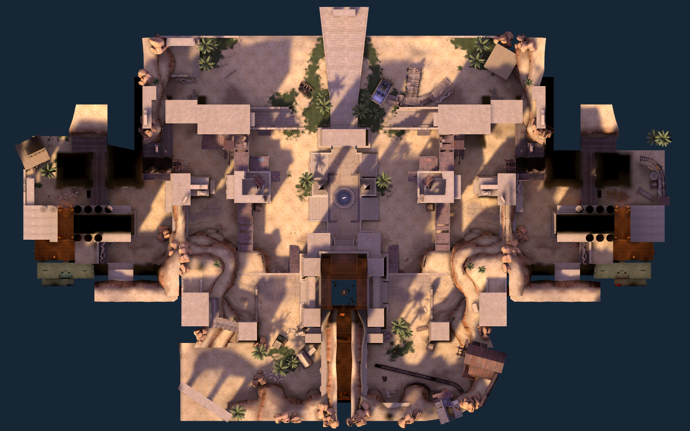
- Feb 26, 2016
- 27
- 6
I posted on here a while ago about a map I had started as my first "get back into it" map (named koth_subplatform), and after some discussion and research, I figured out it was way more of a pain to deal with just one piece to this map. So instead, I split the ideas up into two different maps.
However, within the last few days of working on each map separately, I had begun to put together ideas for other maps with different game modes as well. Each of these is in different parts of production, but there's no way I'd be able to work on more than one at a time. So, I'd like a little bit of opinion!
I'll post information and blueprints to the maps I came up with, as well as a SOP (state of production) so that you can get a feel for how far along I am with them. Once you've gone through them, give me your opinion on which map I should work on first, or at all!
Name: koth_seabed / arena_seabed
SOP: Blueprints made, basic map layout complete, no functioning game rules
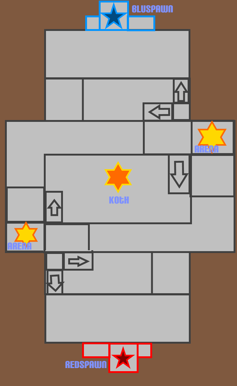
Description: This is the first half of the abandoned koth_subplatform map I started: an underwater research facility. Here, I would make a giant, warehouse-like facility with multiple glass walls and windows to peer out into the ocean depths. Instead of building water around a near-floating structure, I would instead put the facility on the seabed so that it's easier to put water around. Being a koth map, there would be a central large room with a control point in the middle and multiple entrances. There would also be an underwater segment where you can enter a dive room on the side and proceed to either the other team's dive room, or a route that leads right to the control point. The rooms around this central large room would be small enough that I could get rid of them and transform this map into an arena map as well, provided I adjust prop locations and certain height changes.
Name: koth_platform / ctf_platform
SOP: Blueprints made, basic map layout complete, no functioning gamerules
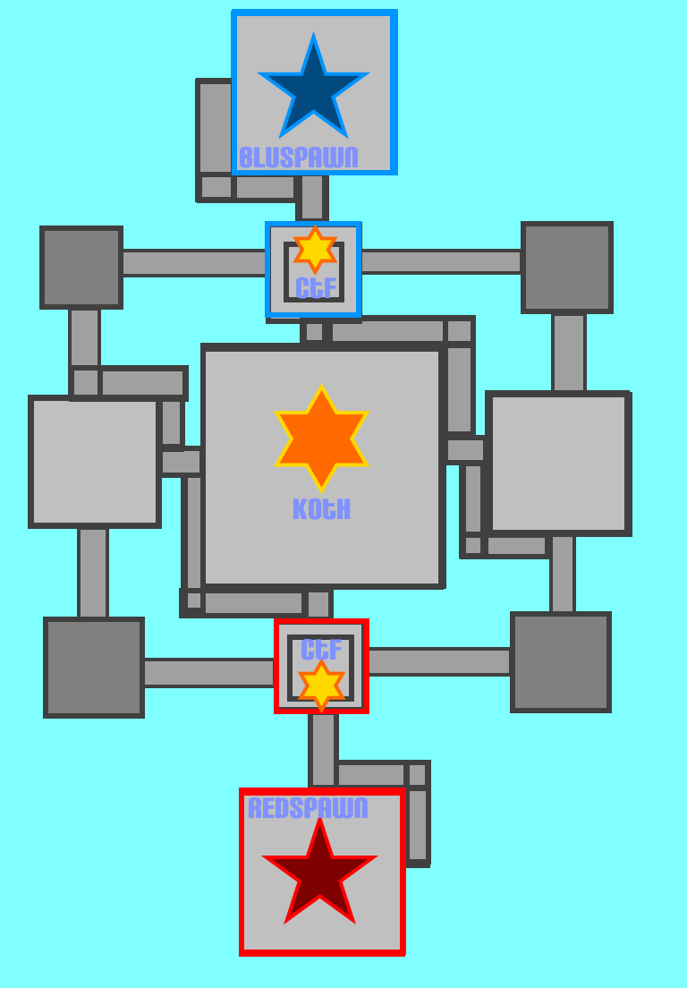
Description: This is the second half of koth_subplatform that came to be. I took the Big Shell (Metal Gear Solid 2)-like structure and brought it to the surface. Without having to worry about enclosing in bridges, I made them longer and wider, as well as four total floors for height advantage. However, to prevent snipers and other long range attackers from dominating the map, certain bridges will be built with covered areas, walls that break up the railings, and other prop emplacements, along with the most direct route to the capture point being multiple walls thick. There are quite a few options in terms of getting around, with large enclosures on either side of the bridges, multiple staircases, pipe-bridges, etc. I made the map large and diverse enough that I'm confident enough I could turn the gamerules into a capture the flag type as well.
Name: koth_academy
SOP: Blueprints done, no map files started whatsoever.
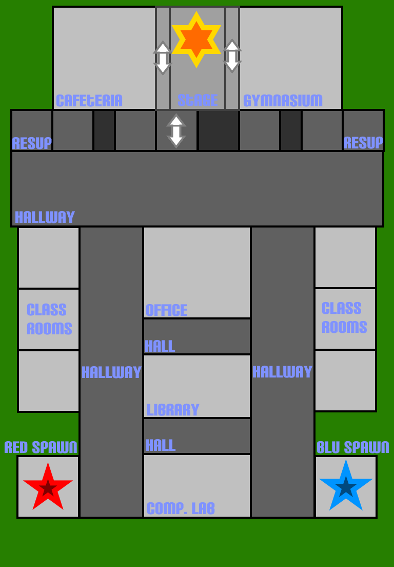
Description: When I was in high school, I took classes for computer science. Programming, web design, flash animation. I even attended a technical school for two years alongside high school so I could broaden those horizons. I think now, what would be the ultimate tribute to those years than building my school inside a game engine for others to experience, too? This map is a very small, very simple map to build: two hallways, exactly the same in size and detail, that lead up to a larger connecting hallway, a second-floor stage, and two larger rooms on either side of that stage. Aside from the connecting hallways, most of the smaller classrooms and such would be able to connect to the other parts of the map. The only ones that wouldn't be able to are direct routes to the spawn rooms. This map would be totally indoors, but with windows that would peer outside to the rest of the schoolgrounds. Again, there is nothing aside from the blueprints to this map.
Name: cp_smalltown
SOP: Blueprints done, very basic road/travel path, little to no environment.
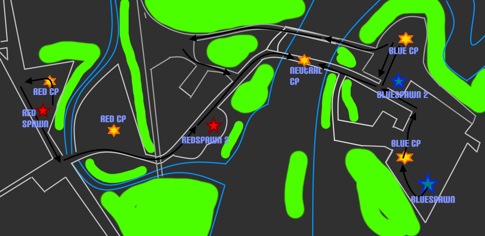
Description: This is a bit of a personal undertaking, but it's probably the one I'm most excited about. I took a map of the town I live in (Wells River, VT) off Google Maps, traced over it in an image editor, and designed a capture point map on that map. I'll be making this in a somewhat realistic way, with businesses, scale road sizes, even environment detail like trees and the Connecticut River. There is very little done with this map right now. Only landmarks, dev texture roads, and capture point props for marking. This'll probably be the map that will have to have the most detail put into it, making it a huge undertaking. I'm also still pretty new to mapping, so I may just even shelve this idea for later.
Name: cp_supercenter
SOP: Blueprints done, no mapping done
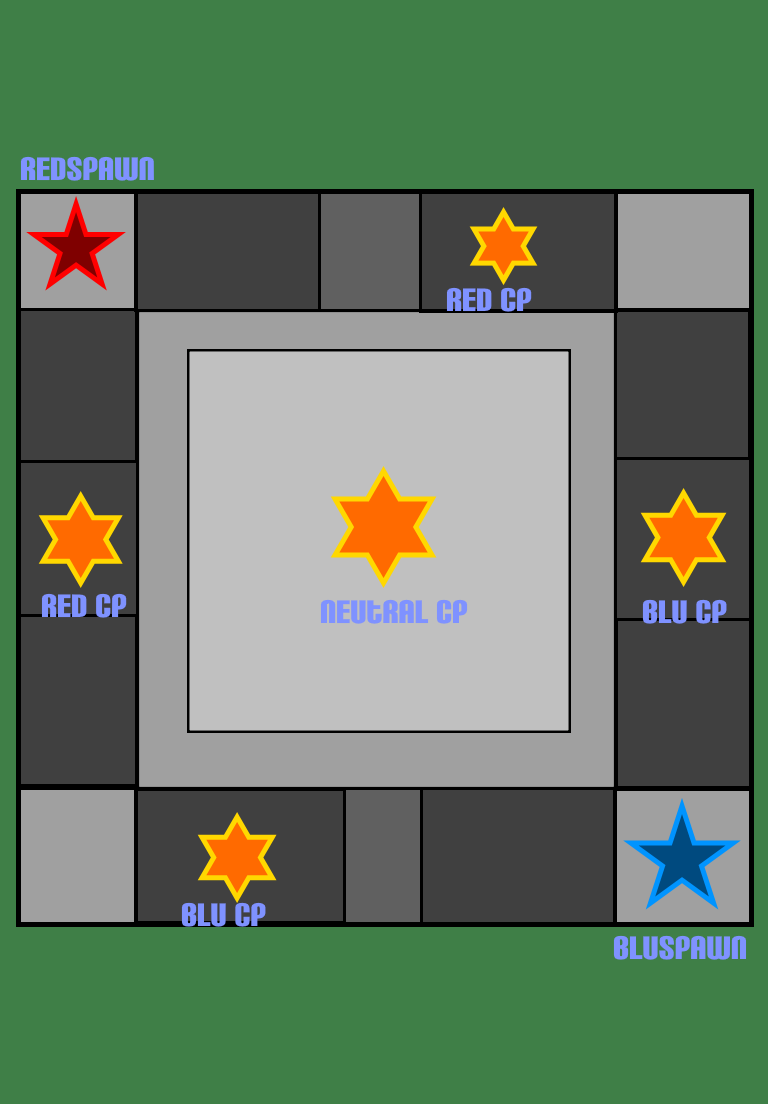
Description: Again, this one is another that just sorta popped into my head recently. A few weeks ago I journeyed to Concord, NH, where I went into one of their enormous stretches of malls. The structure's architecture stuck with me, and I've wanted to build digitally what I see in my mind. The only way I know how is with Source, so I figured, why not turn it into a fancy shmancy multiplayer game arena, too? The mall I entered was very square, or rectangular, with a large food court in the middle. The place I would build would be a large, indoor mall with arches and glass roofs along the hallways. In the center that divides the teams, a neutral control point in the middle of a grocery store. The control points would be fairly close together in terms of spawn room distance, however in order to capture the next point in the sequence, the players would have to trek across either the middle point, or around the halls to make it to the newly opened one. This would prevent players from being able to simply walk along the hallway to the next door shop to get the next capture point. Plus, pushing players along hallways forces them to play as a team, making sure that teamplay is essential to this map. Again, this map has nothing other than blueprints, so I can shelve it and play around with the idea some more before committing to it.
And that's it! That concludes my mapset that I've been thinking about.
I look forward to feedback, as well as opinion. Any help and thought would be greatly appreciated!
However, within the last few days of working on each map separately, I had begun to put together ideas for other maps with different game modes as well. Each of these is in different parts of production, but there's no way I'd be able to work on more than one at a time. So, I'd like a little bit of opinion!
I'll post information and blueprints to the maps I came up with, as well as a SOP (state of production) so that you can get a feel for how far along I am with them. Once you've gone through them, give me your opinion on which map I should work on first, or at all!
Name: koth_seabed / arena_seabed
SOP: Blueprints made, basic map layout complete, no functioning game rules
Description: This is the first half of the abandoned koth_subplatform map I started: an underwater research facility. Here, I would make a giant, warehouse-like facility with multiple glass walls and windows to peer out into the ocean depths. Instead of building water around a near-floating structure, I would instead put the facility on the seabed so that it's easier to put water around. Being a koth map, there would be a central large room with a control point in the middle and multiple entrances. There would also be an underwater segment where you can enter a dive room on the side and proceed to either the other team's dive room, or a route that leads right to the control point. The rooms around this central large room would be small enough that I could get rid of them and transform this map into an arena map as well, provided I adjust prop locations and certain height changes.
Name: koth_platform / ctf_platform
SOP: Blueprints made, basic map layout complete, no functioning gamerules
Description: This is the second half of koth_subplatform that came to be. I took the Big Shell (Metal Gear Solid 2)-like structure and brought it to the surface. Without having to worry about enclosing in bridges, I made them longer and wider, as well as four total floors for height advantage. However, to prevent snipers and other long range attackers from dominating the map, certain bridges will be built with covered areas, walls that break up the railings, and other prop emplacements, along with the most direct route to the capture point being multiple walls thick. There are quite a few options in terms of getting around, with large enclosures on either side of the bridges, multiple staircases, pipe-bridges, etc. I made the map large and diverse enough that I'm confident enough I could turn the gamerules into a capture the flag type as well.
Name: koth_academy
SOP: Blueprints done, no map files started whatsoever.
Description: When I was in high school, I took classes for computer science. Programming, web design, flash animation. I even attended a technical school for two years alongside high school so I could broaden those horizons. I think now, what would be the ultimate tribute to those years than building my school inside a game engine for others to experience, too? This map is a very small, very simple map to build: two hallways, exactly the same in size and detail, that lead up to a larger connecting hallway, a second-floor stage, and two larger rooms on either side of that stage. Aside from the connecting hallways, most of the smaller classrooms and such would be able to connect to the other parts of the map. The only ones that wouldn't be able to are direct routes to the spawn rooms. This map would be totally indoors, but with windows that would peer outside to the rest of the schoolgrounds. Again, there is nothing aside from the blueprints to this map.
Name: cp_smalltown
SOP: Blueprints done, very basic road/travel path, little to no environment.
Description: This is a bit of a personal undertaking, but it's probably the one I'm most excited about. I took a map of the town I live in (Wells River, VT) off Google Maps, traced over it in an image editor, and designed a capture point map on that map. I'll be making this in a somewhat realistic way, with businesses, scale road sizes, even environment detail like trees and the Connecticut River. There is very little done with this map right now. Only landmarks, dev texture roads, and capture point props for marking. This'll probably be the map that will have to have the most detail put into it, making it a huge undertaking. I'm also still pretty new to mapping, so I may just even shelve this idea for later.
Name: cp_supercenter
SOP: Blueprints done, no mapping done
Description: Again, this one is another that just sorta popped into my head recently. A few weeks ago I journeyed to Concord, NH, where I went into one of their enormous stretches of malls. The structure's architecture stuck with me, and I've wanted to build digitally what I see in my mind. The only way I know how is with Source, so I figured, why not turn it into a fancy shmancy multiplayer game arena, too? The mall I entered was very square, or rectangular, with a large food court in the middle. The place I would build would be a large, indoor mall with arches and glass roofs along the hallways. In the center that divides the teams, a neutral control point in the middle of a grocery store. The control points would be fairly close together in terms of spawn room distance, however in order to capture the next point in the sequence, the players would have to trek across either the middle point, or around the halls to make it to the newly opened one. This would prevent players from being able to simply walk along the hallway to the next door shop to get the next capture point. Plus, pushing players along hallways forces them to play as a team, making sure that teamplay is essential to this map. Again, this map has nothing other than blueprints, so I can shelve it and play around with the idea some more before committing to it.
And that's it! That concludes my mapset that I've been thinking about.
I look forward to feedback, as well as opinion. Any help and thought would be greatly appreciated!


