You are using an out of date browser. It may not display this or other websites correctly.
You should upgrade or use an alternative browser.
You should upgrade or use an alternative browser.
- Status
- Not open for further replies.
Passerby
L2: Junior Member
- Mar 27, 2010
- 99
- 15
Wow... took me a full minute to notice that, just looking at the screenshots.
ya i should of circled it
i also noticed some of the rails have a concreat lip on the bottom that you can step on. the rail and lip should be player clipped
strangemodule
L5: Dapper Member
- Sep 10, 2009
- 223
- 59
Oh btw SWATY, I think I only see the "water seams" on my end because I'm using a skin that makes the water ripples smaller. If you don't see them then don't worry about it.
No, their are definitely water seams.
fixed. just trolling bro
- Apr 9, 2008
- 1,706
- 1,491
maybe it 's just me but i dont like to see elemeant fade in and out when they are that visable and that close
But you should be paying attention to the baddies trying to shoot you. Not the props fading in and out.
Download
http://forums.tf2maps.net/showthread.php?t=12609
RC1 Changelog:
-Added another spawn due to being too easy to spawn camp before.
-Fixed the fade distance to a couple of props.
-Fixed some nodraw textures.
-Fixed some issues with clipping.
-Fixed an issue with the 3d sky.
-Improved fps.
http://forums.tf2maps.net/showthread.php?t=12609
RC1 Changelog:
-Added another spawn due to being too easy to spawn camp before.
-Fixed the fade distance to a couple of props.
-Fixed some nodraw textures.
-Fixed some issues with clipping.
-Fixed an issue with the 3d sky.
-Improved fps.
Oh btw SWATY, I think I only see the "water seams" on my end because I'm using a skin that makes the water ripples smaller. If you don't see them then don't worry about it.
Yeah, I dont see them.
Ya bro, I carved it.
lul
Anyway, moving on.
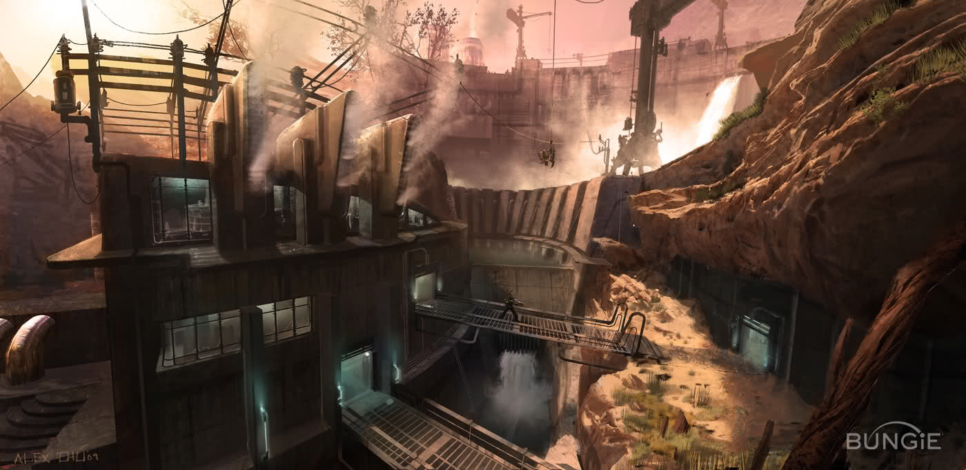
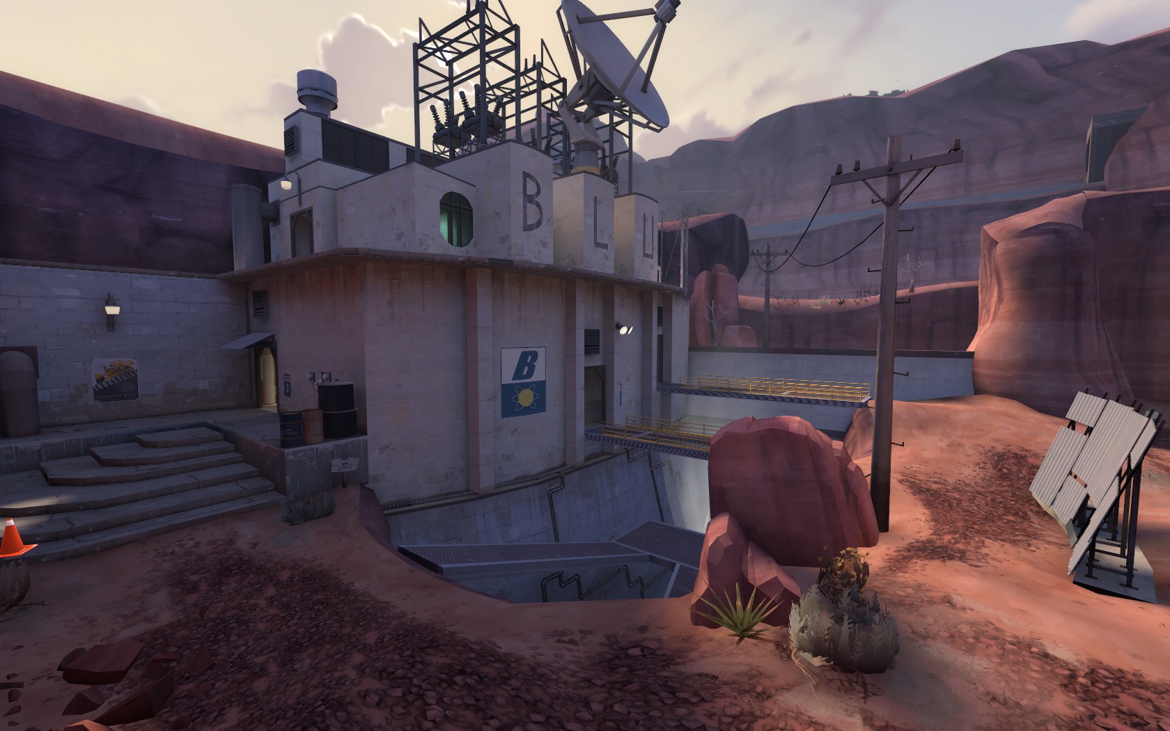
Well, since ctf_biomass is finished now I have decided to show you guys where I got the inspiration for this map. So I got the inspiration from this concept art that Bungie released for halo reach beta, not that I like halo or anything, I randomly found it online googling for concept arts because thats how I get my inspiration for every map I make.
This is the concept art
This is my map.
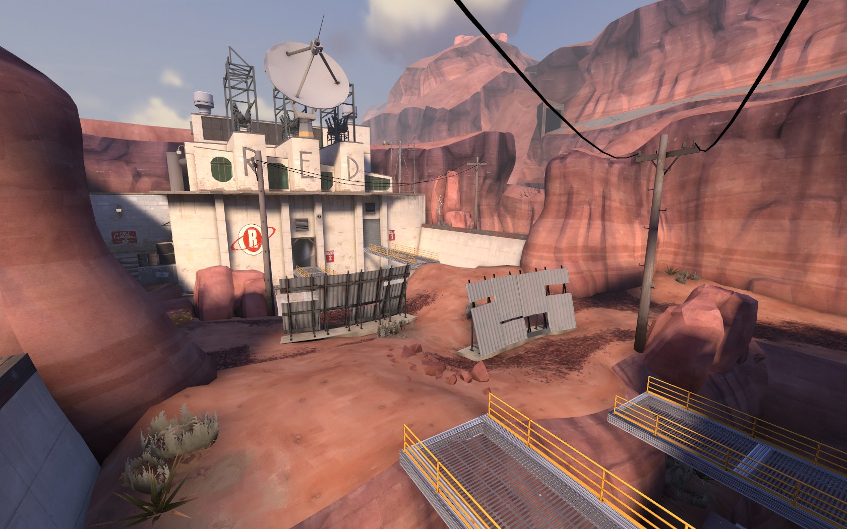
This is where I first found the concept art.
http://www.shacknews.com/featuredarticle.x?id=1278
Well, since ctf_biomass is finished now I have decided to show you guys where I got the inspiration for this map. So I got the inspiration from this concept art that Bungie released for halo reach beta, not that I like halo or anything, I randomly found it online googling for concept arts because thats how I get my inspiration for every map I make.
This is the concept art

This is my map.


This is where I first found the concept art.
http://www.shacknews.com/featuredarticle.x?id=1278
Wow, good resemblance to the concept art there
Thanks
still havnt tried ths one out, looks great though!
Thanks
One might say you followed the concept art too closely. The result of which being poor gameplay and an inconsistant art style. If it wasn't for the standardised TF2 props i probably wouldn't guess this was a TF2 map.
There's using outside sources for inspiration and reference and then there's out right ripping it off (with little thought as to the consequences in terms of both gameplay and art style). Fortunately for you, the average player jizzes their pants at any map that has X amount of props thrown in them rather than the accuracy of the art style or theme achieved.
questionable rant:
I don't mean to be rude but you seem to be oblivious as to the actual process that is design. Whipping out copies and replica's of everything else with little to no originality. Even going as far as to copy and paste work from other vmf's (in the past) rather than attempt to create it yourself and maybe learn something about the deeper intricacies of Hammer.
I can only hope you realise sooner rather than later what it is you're actually doing right now, compared to other people and their maps. I'm not saying this just because i've found out you've used something as reference and am able to use it as an excuse to be rude and abusive but because you've copied something so closely it resulted in a negative impact on your environment and you wern't even able to anticipate this; and this isn't the first time you've taken from something else without modifying it to a reasonable degree that at least you might fool people into thinking the map adds a fresh character to custom TF2.
Level Design 101: environments produced for differing games and game mechanics (concept art or otherwise) inevitably play more poorly than original content designed for the game in mind without strict modification and compromise. Just look at 2fort and dustbowl as prime examples. Both considered aweful despite their apparent popularity, but still achieving that popularity due to heavy modifications to the layout and drop placement. Even in this example we're dealing with incredibly similar but still dissimilar game mechanics (TFC>TF2) and the result is a sub par map. You've gone the full mile with a Halo design. I was wondering how you produced a map that strayed from TF2 game mechanics so horrifically and now we know why. You based your design incredibly closely off a non-TF2 design.
Dan Gilbert, although only reiterating known facts, tells us that the human brain is an amazing device. As self aware sentient beings we have the capability to simulate experiences before we physically encounter them. I have never seen this capacity from you in your maps and you continue to run into the most basic and avoidable mapping mistakes (despite the fact that you manage to get your maps into late beta; probably because of the general ignoring of feedback you like to do in regards to feedback you don't like to hear)./end questionable rant.
edit: Either way, you've worked hard and well done on getting the map this far.
Last edited:
- Status
- Not open for further replies.


