all it takes is a nice rock to make a good map with you people. :/
:crying:
But prestige....
all it takes is a nice rock to make a good map with you people. :/
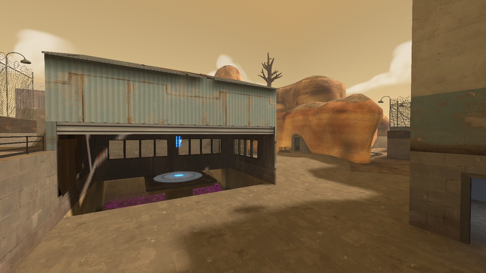
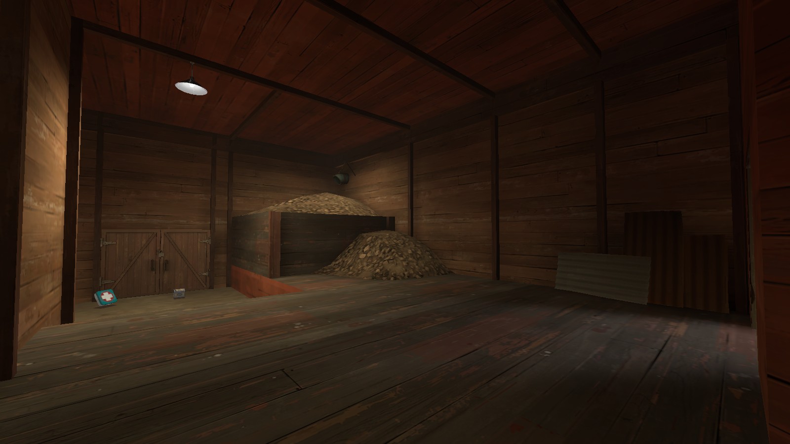
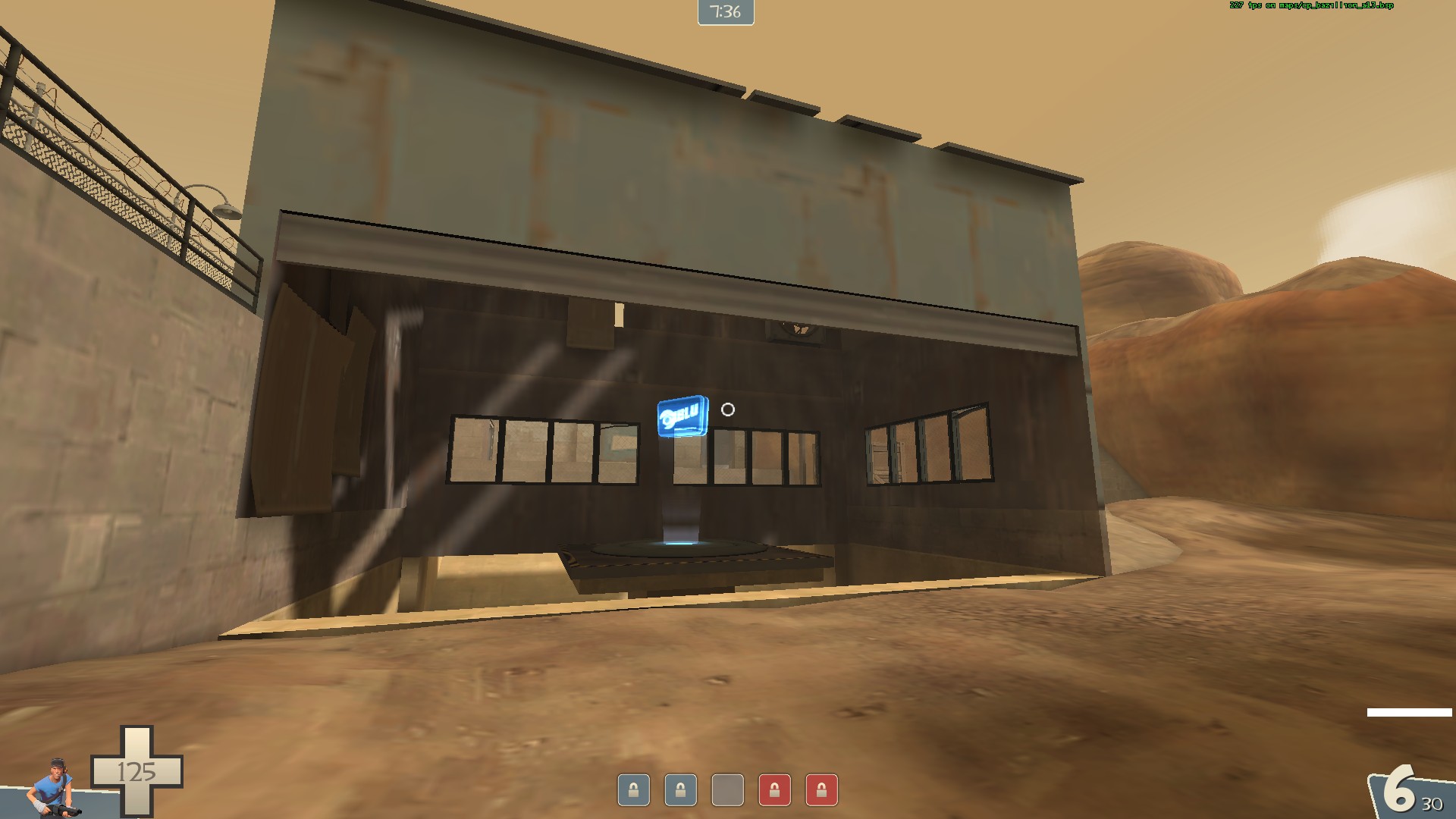
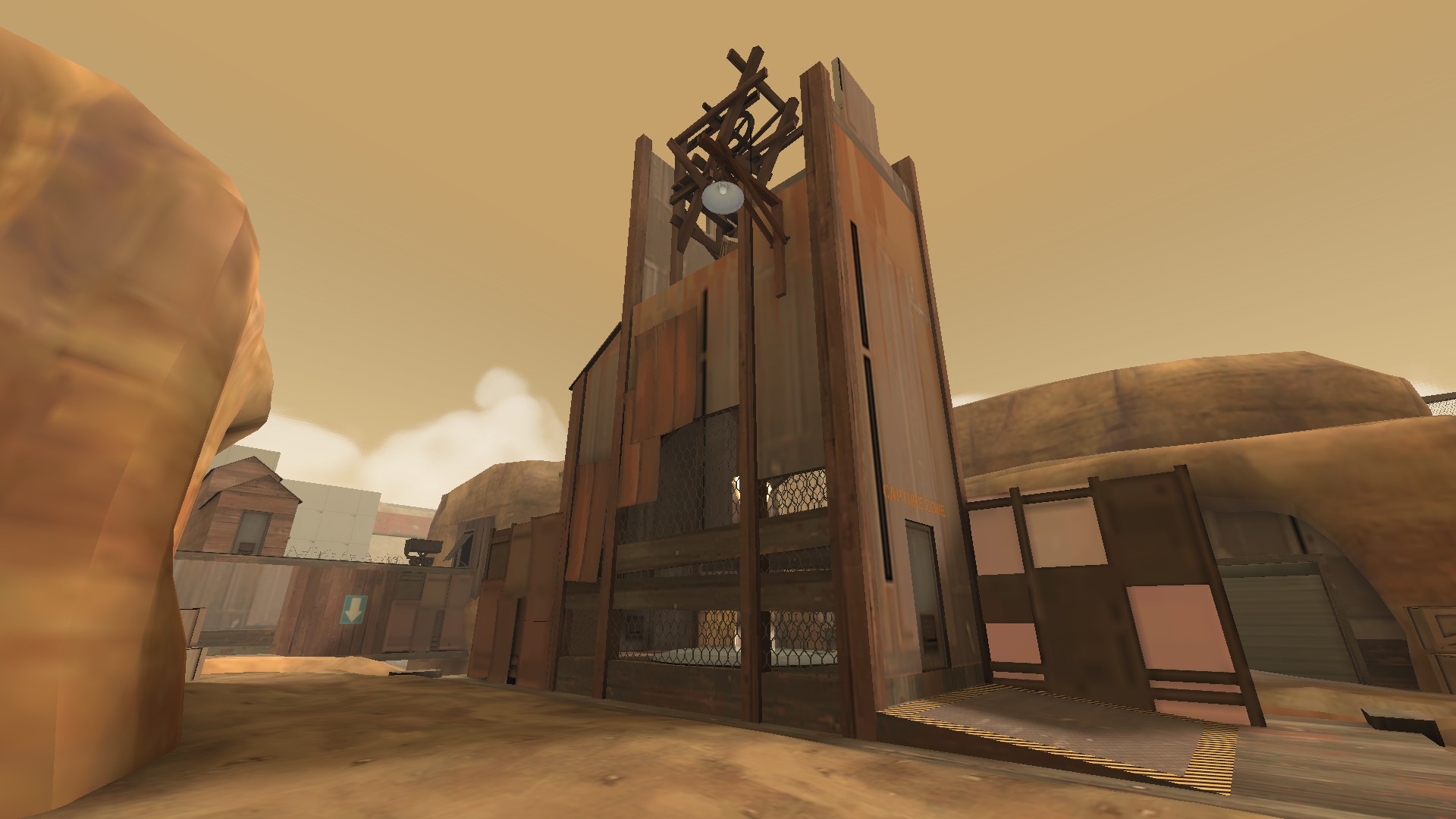
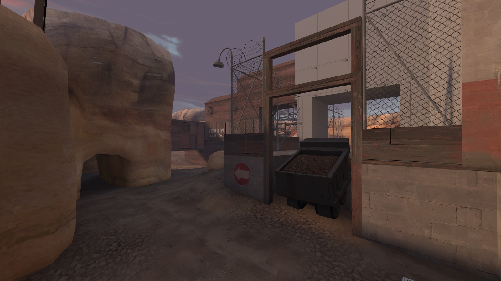
Normally Bazillion has such a good layout. Take a route, and you can be pretty sure you'll end up where yu expected to, which is about as good as you can ask for. That door strikes a bit of a bum note though, three times i went through it expecting to get a good flank or height advantage, and it always went to the same place. Also, its over-complex to reach the upper levels on defense. Simplifying the final point slightly, to give attack fewer routes might be a positive thing.In the first one, why is that door there?
Map had a lot of unchecked sightlines. Particularly problematic at mid where you can block a cap from the opposite side of the tower. This just delayed progress through the map. I actually tried this design in a CP map last year and it kinda worked, but it didn't have such huge sightlines where a sniper could cover left and right. A team that won combat were heald up by a scout on the point and a sniper further back. As i already stated, it just holds up the maps potentially faster gameplay and just has people standing around waiting for someone else to make the first suicidal move.
You've made the points incredibly difficult to capture. Even with what i've said about the middle, CP2 being on that platform where attackers have to throw their backs to the defenders whom also have the advantage of focusing splash damage against the wall behind...
Concerns:
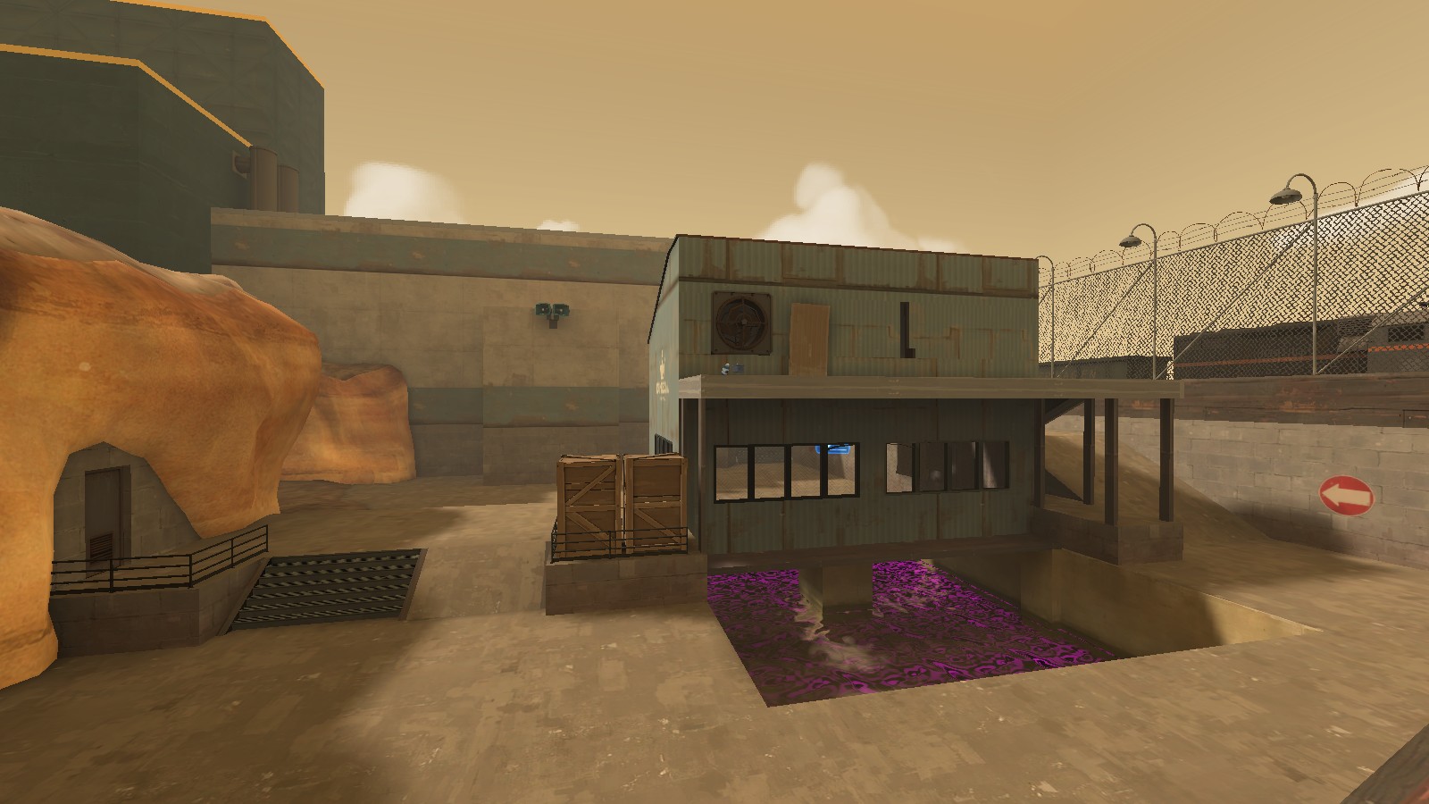
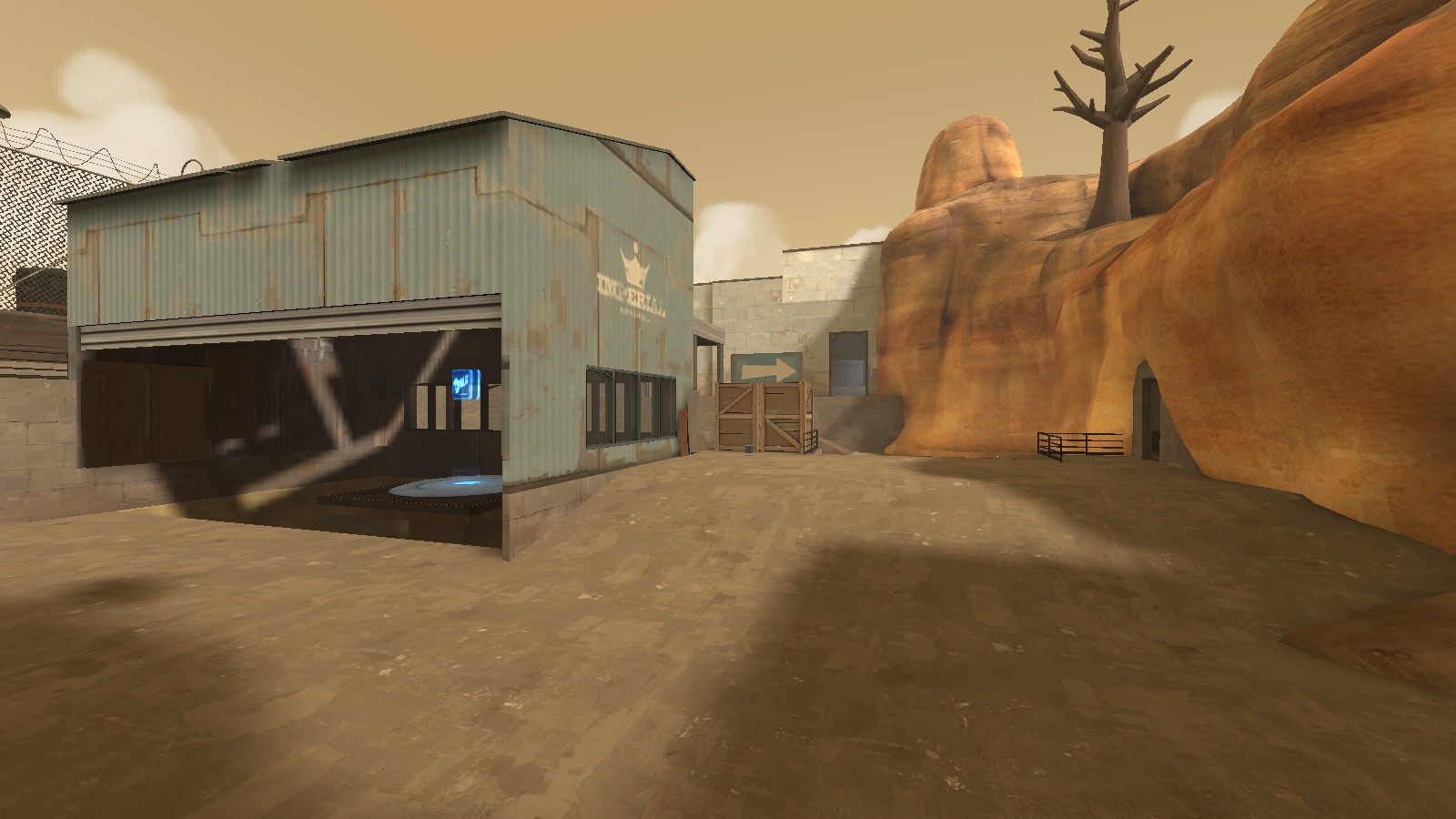
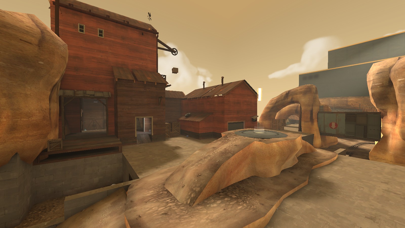
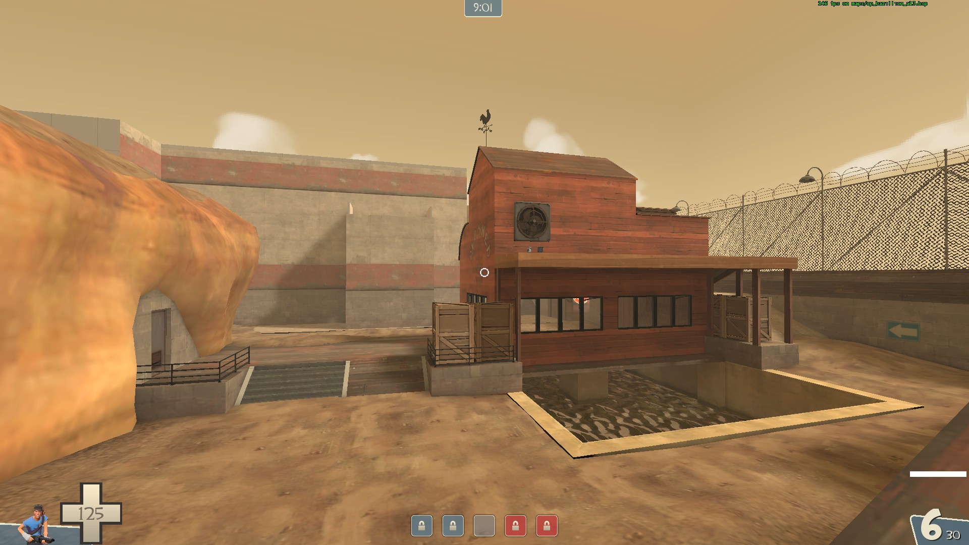
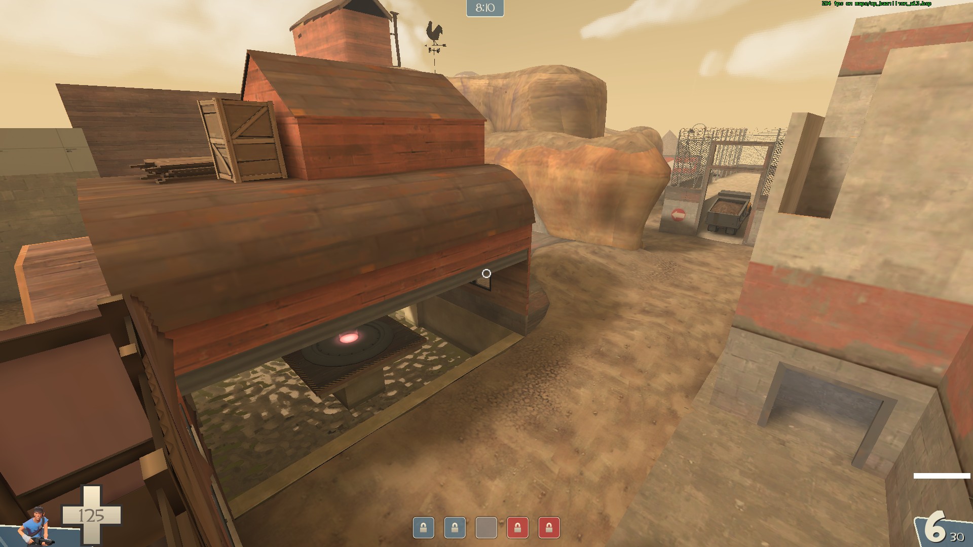
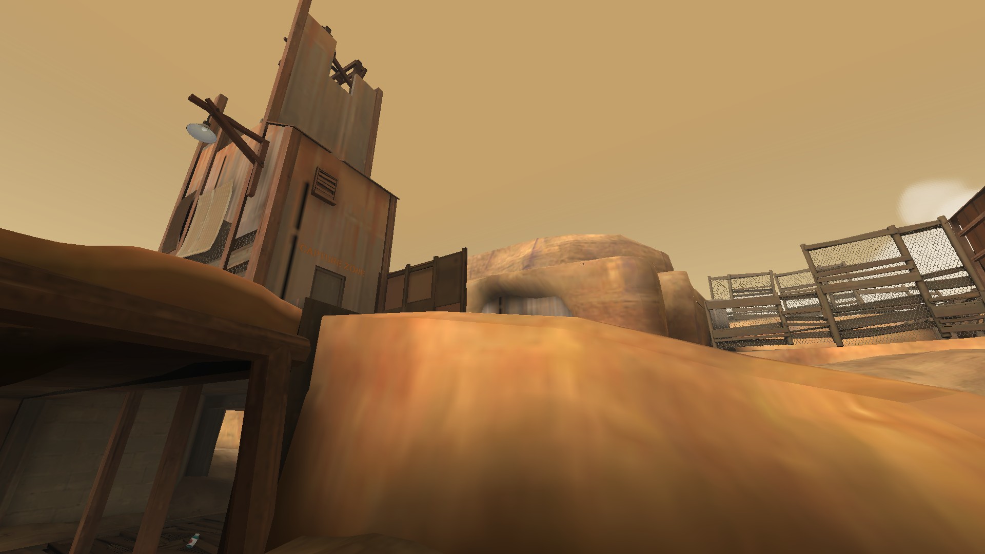
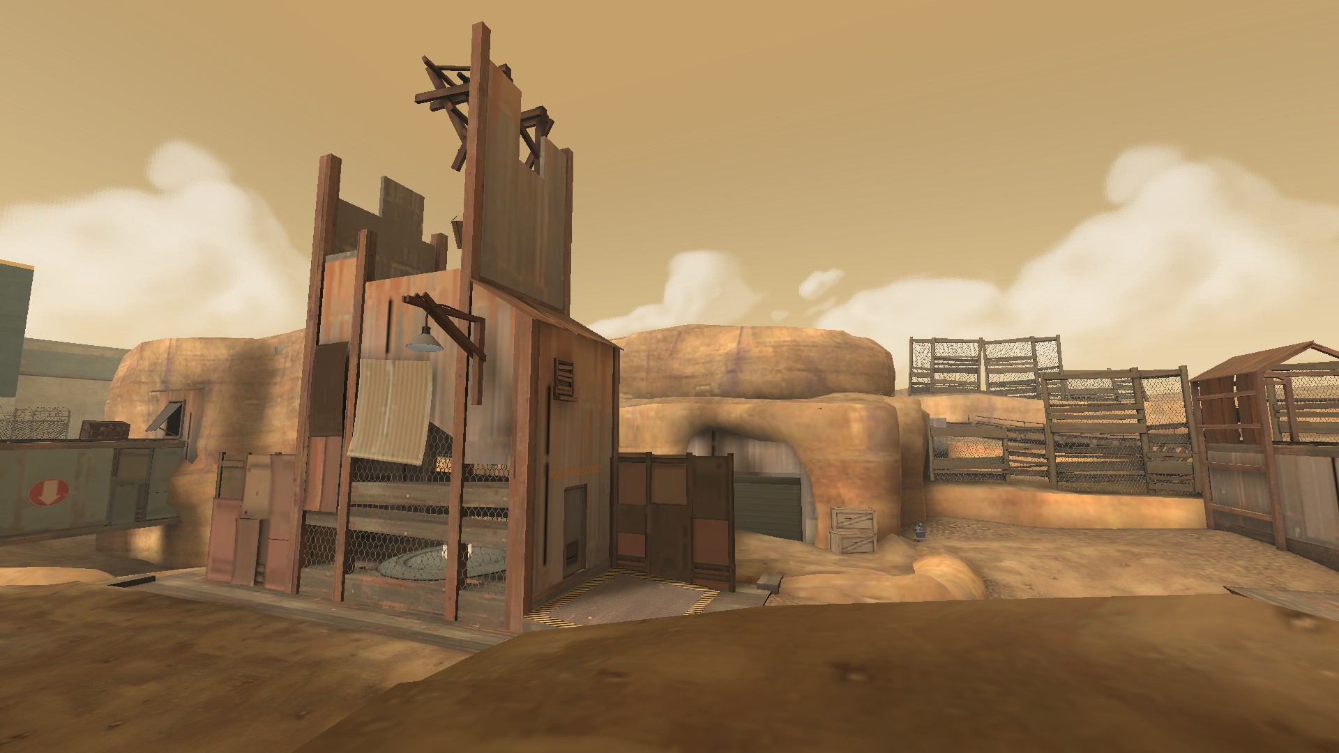
- The map has a lot of unused space
- The map has almost no cover besides varying corners and walls
- The map feels slightly larger than it should be. Shrinking it by 10% would feel right when you come to also include some details and cover. It doesn't sound like much but when i did it to my 5cp map is was exactly what was needed to make it feel more "comfortable".
- Ammo drops? i didn't see much of this. We only had 14 out of 24 players at this point so a lot of combat was 1on1/2on2 and people picking up weapons drops from players. But in larger teams you can't garauntee a player can grab a weapon from a fallen enemy.
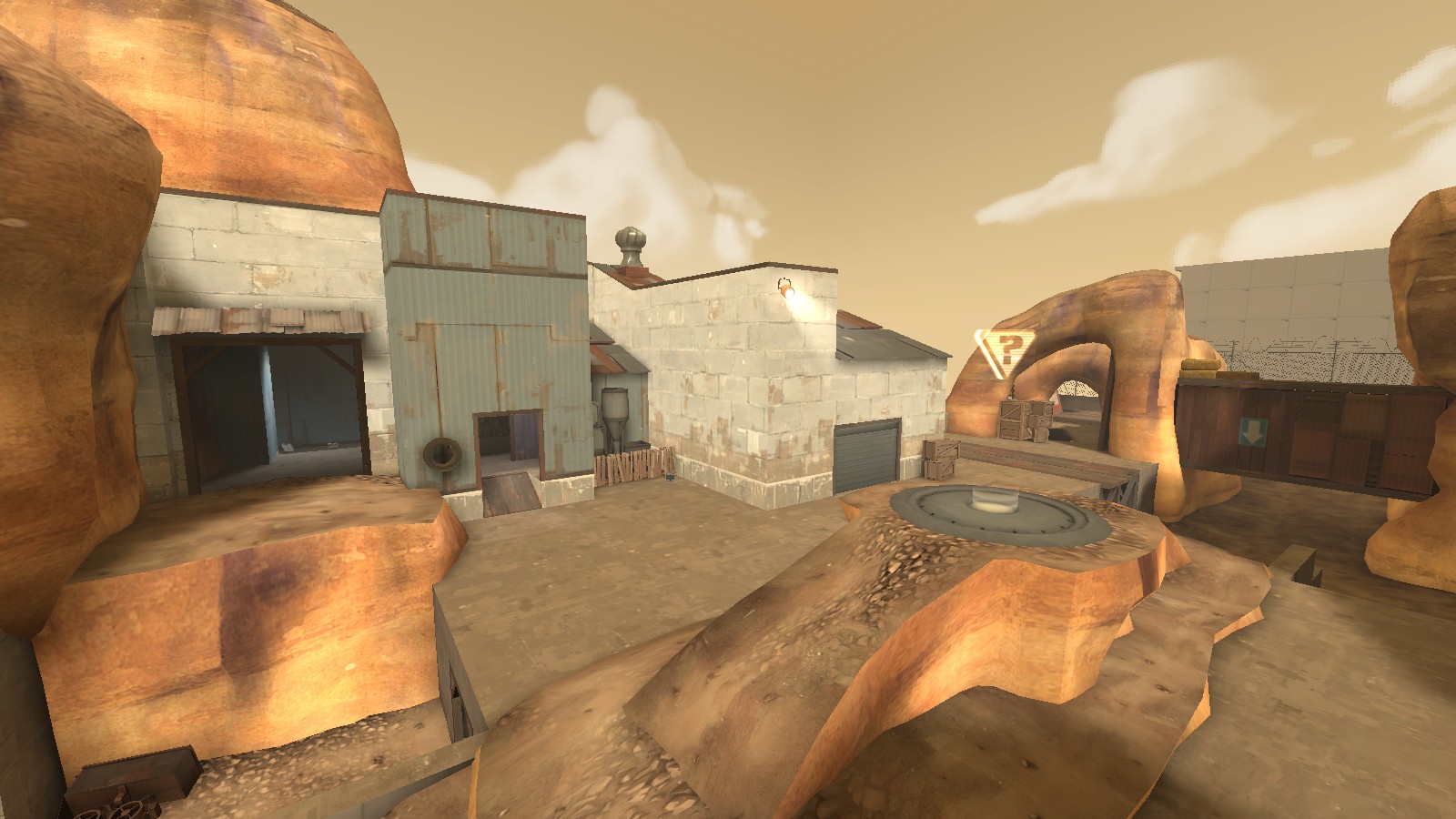
- Walk to mid is loooong.