Axle

CP axle rc

grazr

Old Man Mutant Ninja Turtle
aa
Mar 4, 2008
5,441
3,814
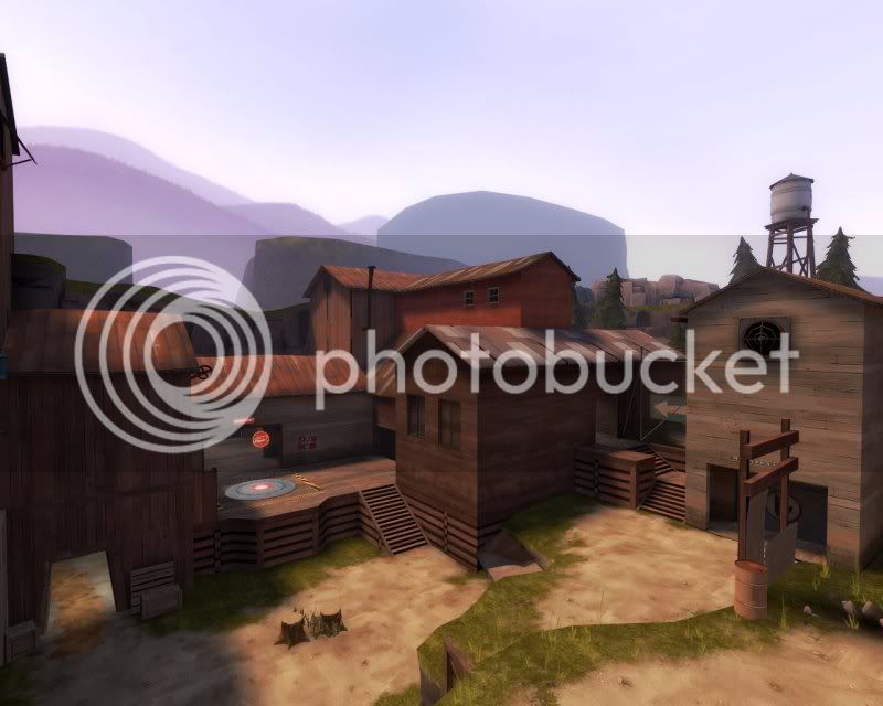
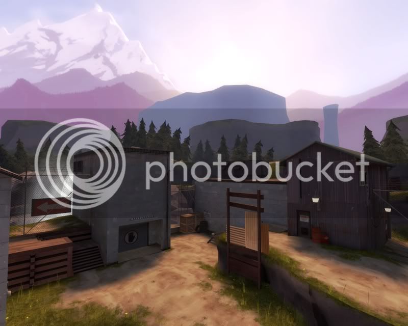
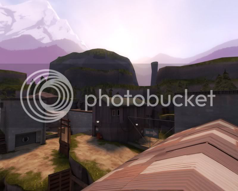
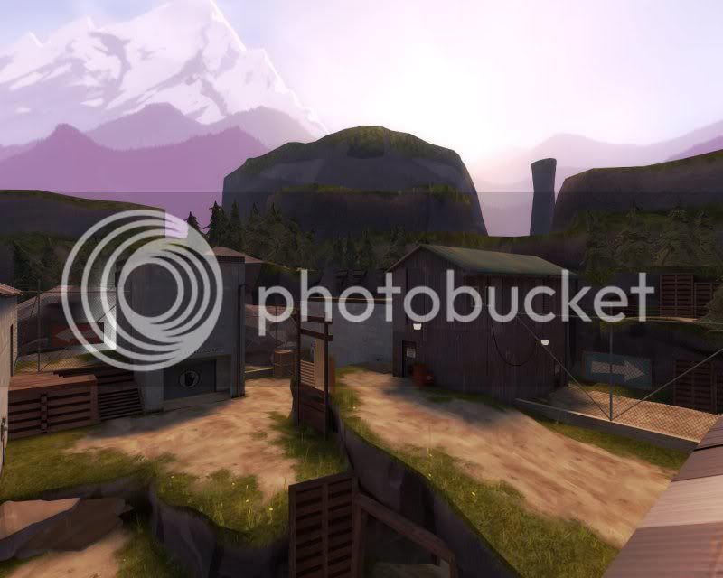
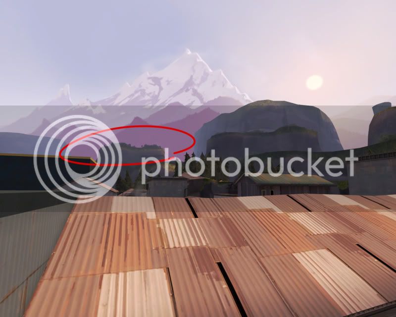
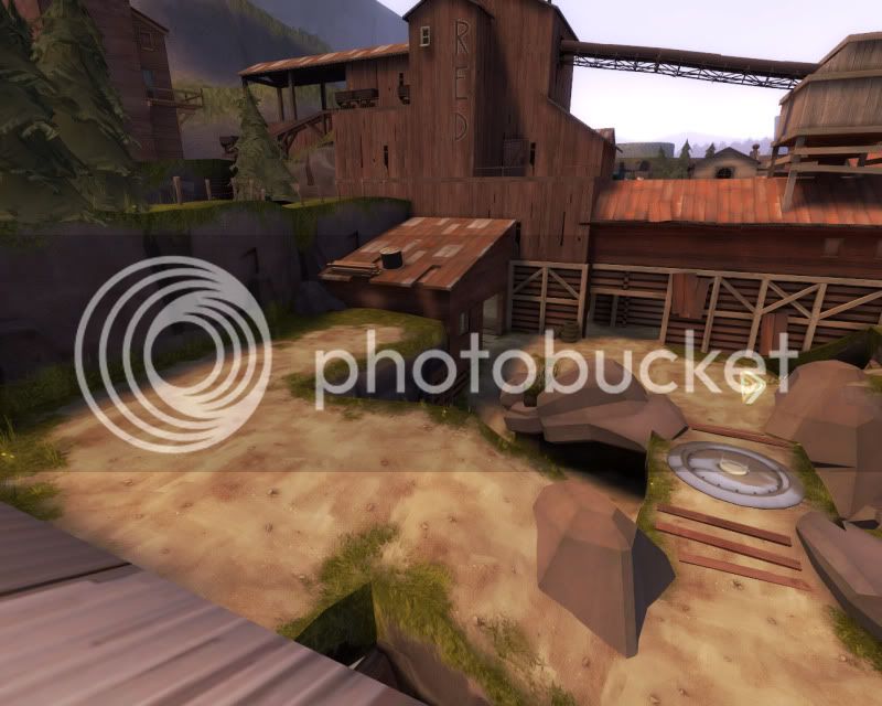
I synced the fog settings for a more accurate representation of the map when it gets released: 1024 - 7168

cp_axle_a6b0002.jpg

cp_axle_a6b0001.jpg

cp_axle_a6b0000.jpg


If i do increase the 3dskybox scale, i'm gonna have to increase the fog settings too. The batholiths appear as just white monoliths on the opposite side of the map.
 

grazr

Old Man Mutant Ninja Turtle
aa
Mar 4, 2008
5,441
3,814
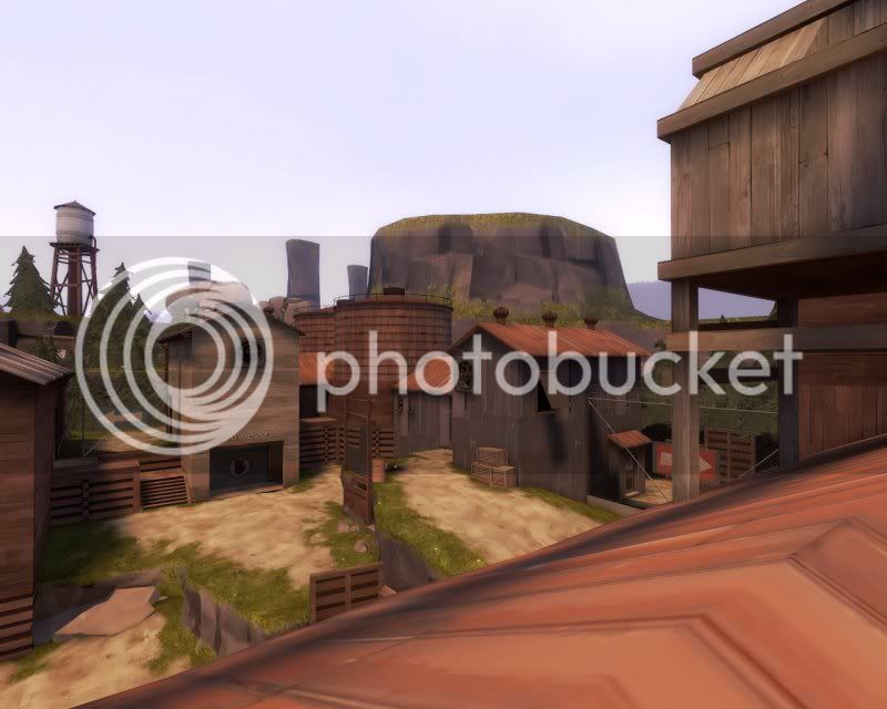
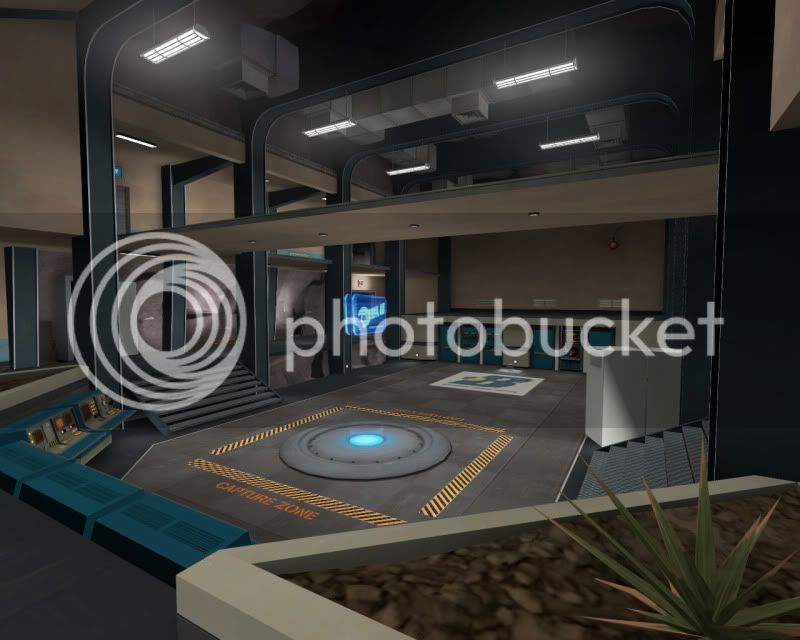
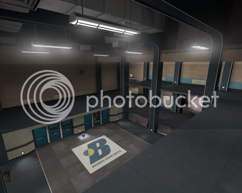
cp_axle_b10001.jpg

cp_axle_b10005.jpg


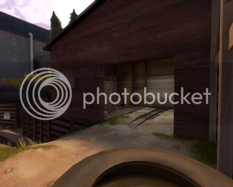
There seems to be some weird bug that wont allow aligning of textures either on brushes too small, displacement too small or stuff in the 3dskybox. Even though in Hammer the texture on the batholiths have been alt-clicked to alignment in game they do not render aligned.

I'm gonna have to create some foliage or something to put on the tops of the plateau's. They're looking rather flat and bare.
 

grazr

Old Man Mutant Ninja Turtle
aa
Mar 4, 2008
5,441
3,814

honeymustard

L9: Fashionable Member
Oct 26, 2009
698
575
I'm getting that same texture alignment problem. Did you manage to fix it?

Anyway, it's looking good. Have you thought about using the skybox texture that Boojum (or Mangy?) used in the art pass contest? Might work.
 

grazr

Old Man Mutant Ninja Turtle
aa
Mar 4, 2008
5,441
3,814
I'll consider it. Wasn't it just Dustbowl's skybox? It's one of the few clear ones that lets you customise it how you feel with clouds etc.

I havn't been able to resolve the alignment issue. I might email someone at Valve about it...
 

grazr

Old Man Mutant Ninja Turtle
aa
Mar 4, 2008
5,441
3,814
Well i should probably inform you of changes the i intend to make so people can stop repeating each other.

  • Enlarge play area at mid, most likely expanding higher ground to existing surrounding cliff area.
  • Potentially re-orientate spawn to face "forwards" on this higher ground.
  • Increase cap time on CP1 by minimal amount.
  • Fix HUD to show the right way around.
  • Adjust some health and ammo to recommendations

Comp players have been complaining about a lack of space around CP1. Whilst i understand how claustrophobic it feels fighting here, it's no smaller than Badlands CP1 and i'm disinclined to make any major changes here given current existing acceptable comparisons.

I think what makes it feel that way are the numerous pillars that can block sight to the point and the bridge up top that stops people freely and aggressively jumping into the central area. I have to admit that it has made combat around CP1 rather direct and difficult to execute due to geometry and i am considering lesser dramatic solutions to the area in general.
 
Last edited:

honeymustard

L9: Fashionable Member
Oct 26, 2009
698
575
Hey Grazr, I figured out the problem with the textures not aligning. It's actually a bug with the Ultimate mapping resource pack. Specifically, the blend textures. When replacing the vmts (for custom thumbnails), something is bugged, which causes them to appear aligned in Hammer, but not in game. If you delete the problematic vmt in sourcesdk/bin/orangebox/tf/materials then it'll work. I'm pretty sure I flagged this up with Boojum ages ago in the thread, but I can't remember.
 

grazr

Old Man Mutant Ninja Turtle
aa
Mar 4, 2008
5,441
3,814
Ah, yes, you were right. Thanks.

A small update with B2:

Moved CP1 bridge over the point so it is not so intrusive to gameplay:

cp_axle_b20003.jpg

cp_axle_b20002.jpg


Moving 3rd spawn back a bit. Although i didn't want to move it back, it still shaves 2000 hammer units off the travel distance from 2nd spawn:

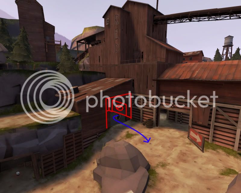
cp_axle_b20005.jpg


Ignore the sign... hopefully i wont be needing it with the re-orientated spawn position. You can also probably see how i'm opening up the cliff top for extra space around mid.

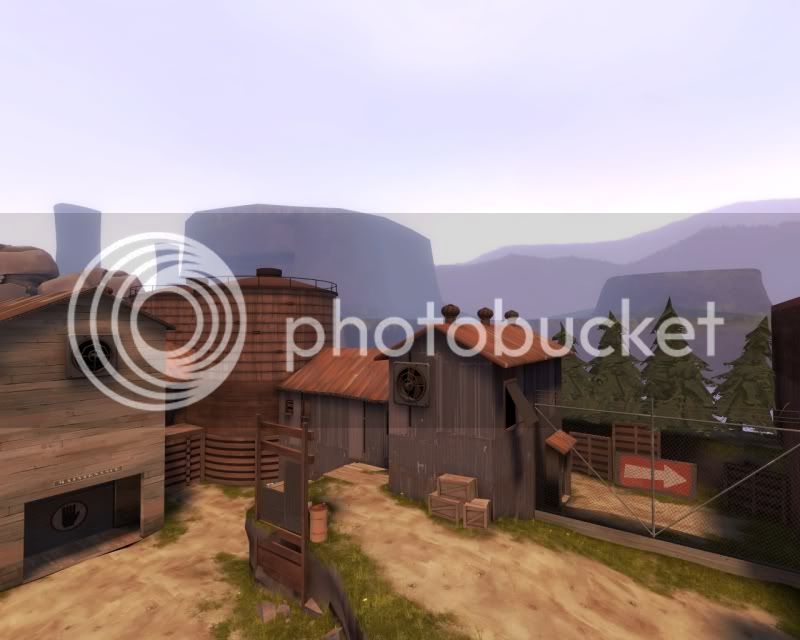
Doubled the 3dskybox again. Also started working on some foliage on the buttes. Although it looked pants in Hammer it actually looked alright in game:

cp_axle_b20004.jpg


Will update hopefully at some point during the new week with the release version.
 

grazr

Old Man Mutant Ninja Turtle
aa
Mar 4, 2008
5,441
3,814
As posted over on Playstuff.net, i really need your help here guys as you've played this map since alpha.

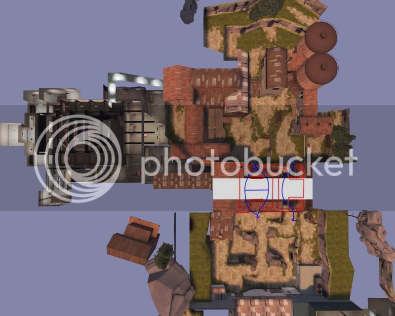
I've had this map tested by the comp community a couple times, just to get their opinion and gauge how it plays out 6vs6. Now they hate how CP2 is so easy to cap after mid, which i suppose is fair play when in a higher level of team play you can send players forwards to get a free second cap in. Now i'm not opposed to increasing the distance between CP 2 and 3, it would be in keeping with traditional 5cp layout design. But the dilema is it takes away something of axle's character.

Since you guys have been with me since alpha testing i really want to get your opinion on whether such a modification as this:
cp_axle_b20009.jpg

would be better or worse.

It would make swings from one team to the other less dramatic, but what my intentions were with axle were to allow a team who got pushed back and successfully defend their last CP fight back and properly counter-attack the enemies base. Which was always something that pissed me off about 5cp maps in public play, the steam rolling and how being pushed back to last was just an inevitable grind for 10-12 minutes to a loss.

I don't mind adjusting my aims with this project slightly, for the sake of more coverage and popularity, getting it more popular isn't exactly a sell out factor if more people are enjoying it then that's a plus either way.
 
Last edited:

grazr

Old Man Mutant Ninja Turtle
aa
Mar 4, 2008
5,441
3,814
cp_axle_b20013.jpg

cp_axle_b20015.jpg

cp_axle_b20017.jpg

cp_axle_b20019.jpg


As per my last post, i'm just gonna go with some cap rate changes in case i over shoot by changing too many things at once with the layout. CP2 caps 33% slower, CP1 caps 50% slower. This also makes CP2 harder to cap and will probably see less volatile back capping.

If the lack of a combat area between CP2 nad 3 is still posing problems i'll go ahead and make the changes. The main route will be improved, without a doubt, but my concern lies with the far route becoming even more redundant with such an increase in travel distance.

There's also something else in the 3dskybox i really wanna show you guys. It's not a secret but i wanna get it looking proper before i show previews.
 
Last edited:

tyler

aa
Sep 11, 2013
5,100
4,621
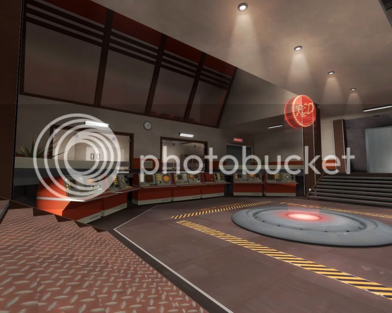
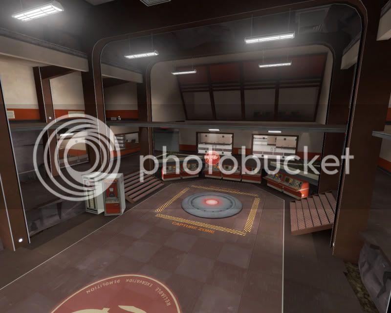
Looks gorgeous, but I'm starting to get weird feelings about the wall_cabinets on the final point just kinda hangin out, a little crooked, like "yeah whatever we're just computing, get outta here". May just be me though.
 

EArkham

Necromancer
aa
Aug 14, 2009
1,625
2,774
Stick a handtruck under one of them. Then their odd position would make perfect sense.

Kep