You are using an out of date browser. It may not display this or other websites correctly.
You should upgrade or use an alternative browser.
You should upgrade or use an alternative browser.
B2 and Gameday bump, even though there weren't many regulars left by the end.
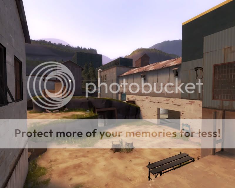
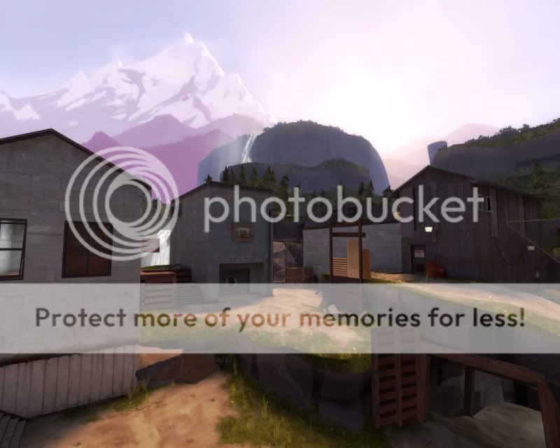
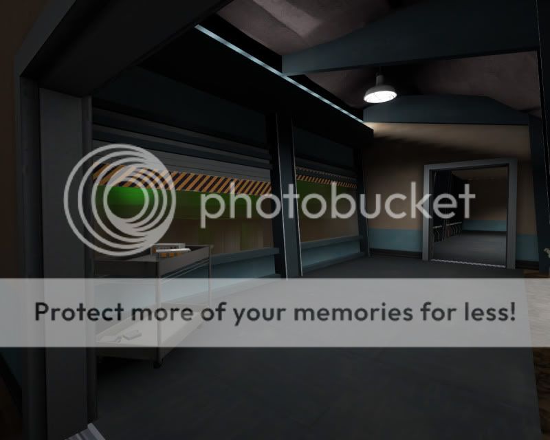
I don't really wanna leave it on this version for several weeks as there is a ammo imbalance and a few tweaks so please throw in your feedback asap so i can get b2 replacement out in shapely form.
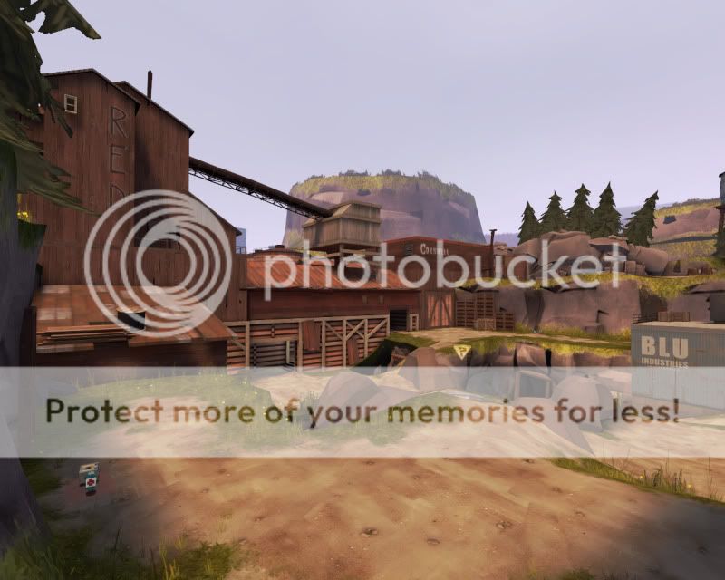
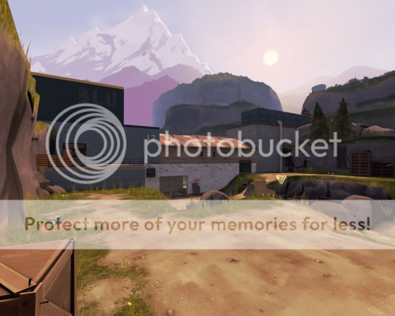
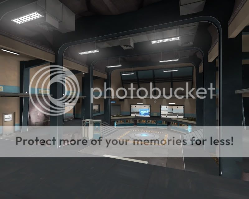
I don't really wanna leave it on this version for several weeks as there is a ammo imbalance and a few tweaks so please throw in your feedback asap so i can get b2 replacement out in shapely form.


Here's cp_axle_b2d: TF2maps.net 23.4MB bz2
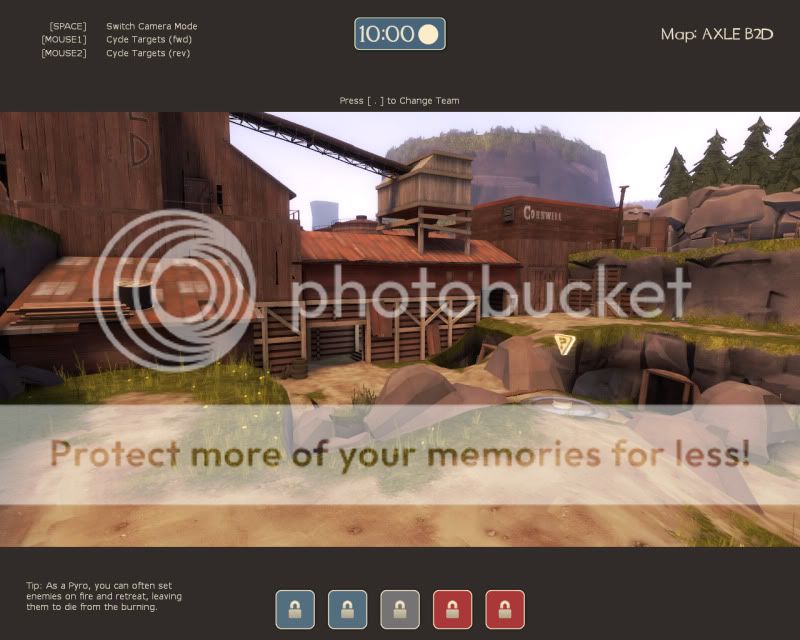
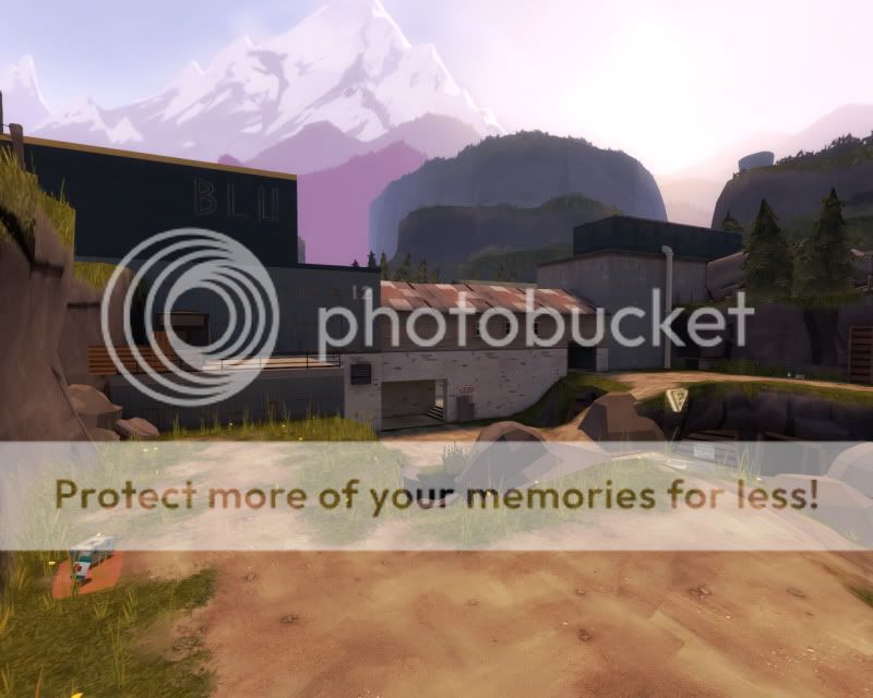
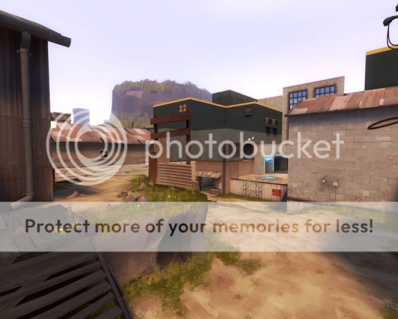
cp_axle_b2 changes:
CP1 caps 50% slower
CP2 caps 33% slower
Moved CP1 bridge over capture area making it easier to attack
Removed accessible ventilation duct at CP1
Increased width of middle area
Re-orientated 3rd spawn more appropriately
Added minor detail to CP's 2, 3 and 4
Added detail to 3dskybox
Added small health to middle's high ground
Fixed some clipping issues
cp_axle_b2d changes:
Fixed ammo imbalance at CP2
Fixed some lighting conditions
Fixed some too-short fade distances
Added minor optimisation through appropriate model fade distances
Added optimisation through hints at CP2/4 and 3
Final words:
Pretty much all of B2's changes were met with "success" in the initial test. CP1 was easier to attack but was defended on the point a lot more whilst CP2 captures were easier to interrupt by either team. Whether or not this affect is prefered remains to be seen but the changes did what they were supposed to do.
TF2maps.net discussion thread
Last edited:
Since there is a lot more higher ground the middle has become something of a spam trap, along with second. To cut some sight lines and provide some higher ground in the center i'm considering going with a cliché tower setup:
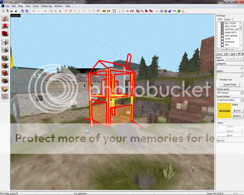
Thoughts, y/n?

Thoughts, y/n?
honeymustard
L9: Fashionable Member
- Oct 26, 2009
- 698
- 575
- Mar 2, 2009
- 986
- 605
I dunno if a shack over the point would work. Go ahead and try it. Make a couple variations of mid and release them as _test versions with Fast Vis and such.
Why don't you think it'd work?
Right now people are complaining that the middle battle is too straight forward. Spam rockets/nades across the centre, run up the cliff and drop down to flank the enemy... which never really works that well because the enemy has usually done the same.
I have no other ideas on how to evolve the combat at mid and each time i think about it the obvious answer is to throw up some central high ground; otherwise there's no emphasis on the centre of the map besides the medium health under the arc.
-
People have only ever really made minor complaints about certain parts of the map; besides the terrible soldier/demo rollout which really needs to be resolved. I'm just trying to gauge what people want improved upon but people don't seem to know where they stand. Half the people don't make comments because they think they don't know what they're talking about (which isn't even the point about feedback) and the other half are lazy or un-interested.
People have made indirect dislikes about space but never really "this is bothersome, could you allow me to do this please?", which is something i can respond to by either letting them, disagreeing or comprimising... Like Blob did when he said fighting as sniper at CP2 sucks, let me have better access to the high ground.
Is all i have to work on at the moment is "CP1 could maybe use a flank", "it's hard to push out" and "better health placement for rollout" which is really ambiguous advice on what is actually bothering people. I just don't know where to put my attention. Watching demo's only gets you so far, at some point you need someone to tell you what they enjoy about the map and what they hate about the map, because you can't assume a player is enjoying an experience at any one point in time.
Last edited:
- Mar 2, 2009
- 986
- 605
Go make that building over mid. Release _test. Try a second alteration if you can think of one. Release _test2. See whether either fixes any problems. Succeed or Fail, and move on or try again.
At the moment, mid is the one that feels most... standard.
It's another bridge, really. Two flanking narrow routes, mirrored height advantage, and a point over health. It's solid enough, but... formulaic. Like you're reading off a list.
The shack is a nice idea, though give an all-class route to the upper levels, since soldiers and demomen dont need more of an advantage. Maybe sawmill-style narrow routes from the side high ground? and balanced cover on the upper layer of the shack? You then have three levels- the upper shack, for defending the point, or covering an attack, (maybe with no LOS to the point itself?), the middle bridge with the point, and the lower level with health?
The problem i see with this is making mid harder to re-cap. But, with the ramps, it shouldnt be too hard to clear out a soldier or sentry. Plus, the three levels thing is (comparitively?) unique?
There you go. Enjoy, with a pinch of salt, of course.
It's another bridge, really. Two flanking narrow routes, mirrored height advantage, and a point over health. It's solid enough, but... formulaic. Like you're reading off a list.
The shack is a nice idea, though give an all-class route to the upper levels, since soldiers and demomen dont need more of an advantage. Maybe sawmill-style narrow routes from the side high ground? and balanced cover on the upper layer of the shack? You then have three levels- the upper shack, for defending the point, or covering an attack, (maybe with no LOS to the point itself?), the middle bridge with the point, and the lower level with health?
The problem i see with this is making mid harder to re-cap. But, with the ramps, it shouldnt be too hard to clear out a soldier or sentry. Plus, the three levels thing is (comparitively?) unique?
Half the people don't make comments because they think they don't know what they're talking about (which isn't even the point about feedback)
There you go. Enjoy, with a pinch of salt, of course.
Last edited:
Just a little update, here are some choices i've gone with for B3:
http://img.photobucket.com/albums/v213/grazr/cp_axle/axle-hammer-1.jpg
http://img.photobucket.com/albums/v213/grazr/cp_axle/axle-hammer-2.jpg
http://img.photobucket.com/albums/v213/grazr/cp_axle/axle-hammer-3.jpg
http://img.photobucket.com/albums/v213/grazr/cp_axle/axle-hammer-4.jpg
http://img.photobucket.com/albums/v213/grazr/cp_axle/axle-hammer-5.jpg
I'm happy about changes to CP1, it also gives me more space to take the radiation/nuclear theme further whilst addressing the flanking issues.
CP2 is completely experimental, as much as i didn't want to move it for aesthetic reasons it may just be the best course of action. It increases the travel time for attackers and is hopefully less of a spam trap in general, behaving more like dustbowl CP1. I've increased space behind the stairs on the far right flank for attackers to manouver.
I'm raising the building height of the buildings at mid to stop roof spam and FPS issues for rocket jumpers (Done on RED but not BLU yet).
Only other thing i'm really fiddling with that isn't shown is the base vestibules, which have had a number of walls knocked through. Will show that and ingame shots later... just trying to keep a little interest up and let you know where i'm taking axle.
EDIT: Oh, and if you're a fan, check out: http://forums.tf2maps.net/showthread.php?t=15839 and drop a vote for your favourite (axle) map for feature.
Last edited:
honeymustard
L9: Fashionable Member
- Oct 26, 2009
- 698
- 575
These changes look nice - mid looks a lot better now, and not too similar to Fastlane thankfully. CP2 will be interesting, looks like a sentry could lock it down quite well, but will have to test that.
honeymustard
L9: Fashionable Member
- Oct 26, 2009
- 698
- 575
Sure, i should throw in some of those wooden hole decals at red's too for the release version.
I'm having trouble getting some decent light at RED CP2 so i might dispense with the double layered, metal roof/wooden under layer and go for the 2fort style metal roof with gaps in. At least that would also break the monotonous appearence of the wooden ceiling.
I'm having trouble getting some decent light at RED CP2 so i might dispense with the double layered, metal roof/wooden under layer and go for the 2fort style metal roof with gaps in. At least that would also break the monotonous appearence of the wooden ceiling.
@ Peng: You mean the foliage on top? There's a foliage "card" in the texture list.
skybox/foliage_card01
@ Seba: As for making the green more subtle, it's only in the detail area and doesn't bleed into the gameplay area, that corridor is saturated with BLU stuff, blue walls, blue pillars, blue window frames etc. I think players will get the hint that they're in the BLU base.
Trying to make Rexy's cooling towers not go to waste by putting them in more visible locations:
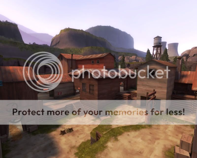
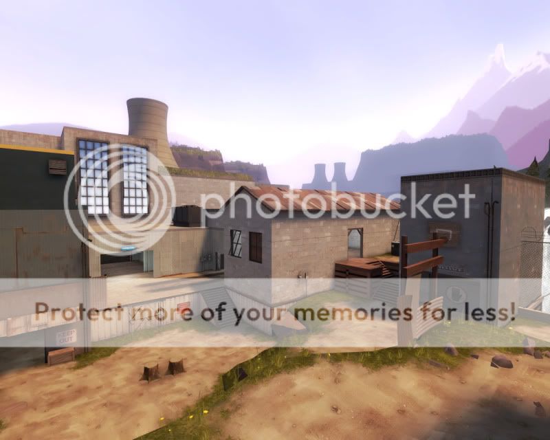
I might have to nudge around some of these batholiths to get them into more highlighted positions.
So far i havn't had any luck creating a steam particle effect for the cooling towers. The steam and smoke entities don't translate well at 1/16th and using the particle editor none of my particle seem to show despite updating my particle manifest.
skybox/foliage_card01
@ Seba: As for making the green more subtle, it's only in the detail area and doesn't bleed into the gameplay area, that corridor is saturated with BLU stuff, blue walls, blue pillars, blue window frames etc. I think players will get the hint that they're in the BLU base.
Trying to make Rexy's cooling towers not go to waste by putting them in more visible locations:


I might have to nudge around some of these batholiths to get them into more highlighted positions.
So far i havn't had any luck creating a steam particle effect for the cooling towers. The steam and smoke entities don't translate well at 1/16th and using the particle editor none of my particle seem to show despite updating my particle manifest.
Last edited:
cp_axle_b3b out now:
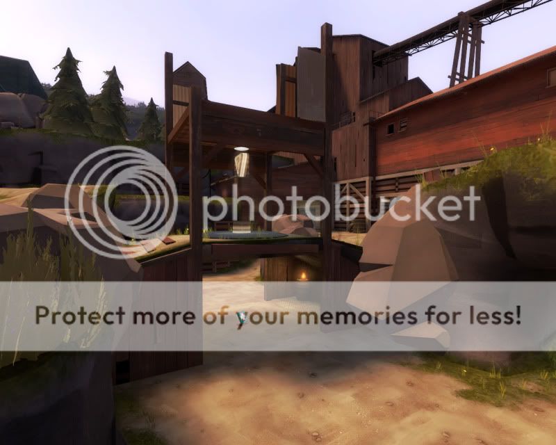
Change log:
layout:
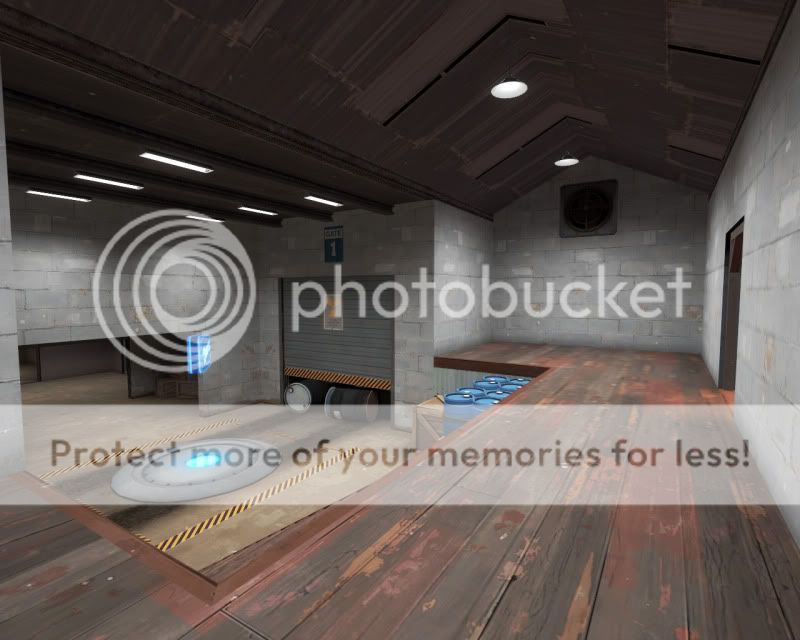
Added flanking route to CP1
Re-worked base vestibule
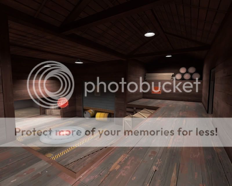
Moved CP2 into left flank building (defenders perspective)
Created more space around CP2
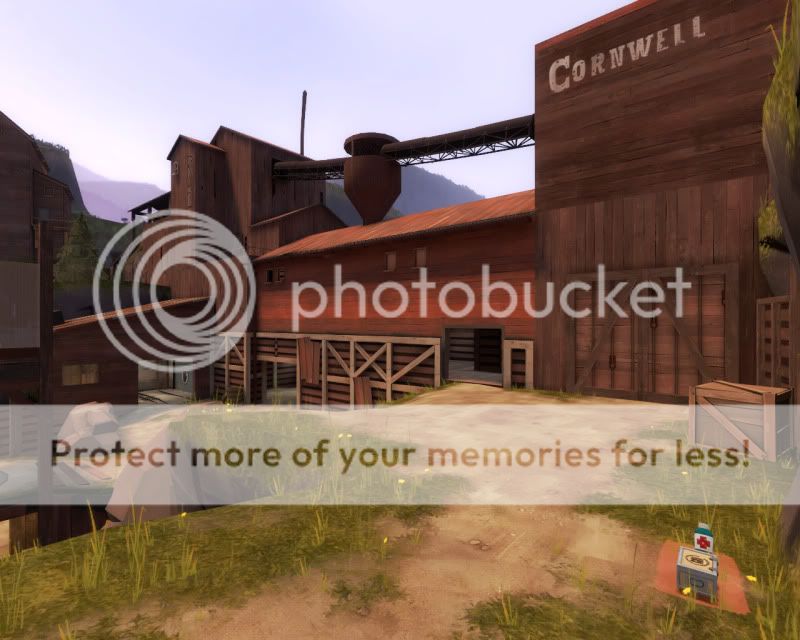
Added a structure over CP3
Item drops:
Reduced small ammo count
Increased some small ammo to medium
Added and moved health for better "rollout" capacity
Aesthetics:
Added cooling towers by Rexy to the 3dskybox
Added foliage and waterfall to 3dskybox
Added further prop detail to play area
Worked in nuclear theme at CP1 and 2
Performance:
Changed majority of prop fade distances from default
Seperated the skybox areas between cp2, 3 and 4.
Images:
CP1
CP1
CP2
CP2
CP2
Base entrance
Base entrance
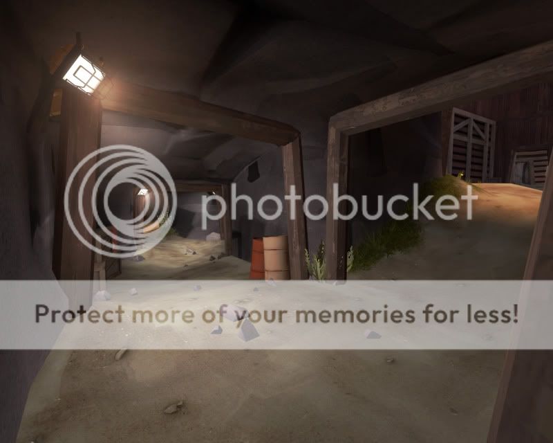
Tunnel
CP3
CP3

Last edited:


