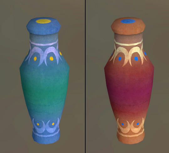
artpass_whark

What gametype should Whark's new map be?

  • CP

    Votes: 14 33.3%
  • CTF

    Votes: 9 21.4%
  • PL

    Votes: 19 45.2%

  • Total voters
    42

Whark

L3: Member
Jul 26, 2010
112
39
Maybe somewhere in the middle between these two posts? Like, just one or two diagonally leaning bricks might be all it needs to break it up. Having lots of loose bricks might make sense if there was like, a crane constructing a building/wall, but I am not suggesting that AT ALL, lol.

Yea that wouldn't cut it.

I do prefer this approach though - take feedback and go insane with it. Then scale back when needed.
 

Whark

L3: Member
Jul 26, 2010
112
39
Those stacked blocks look kind of ridiculous. The line didn't seem like an issue. Not every point of the map needs to be visually interesting.

Maybe somewhere in the middle between these two posts? Like, just one or two diagonally leaning bricks might be all it needs to break it up. Having lots of loose bricks might make sense if there was like, a crane constructing a building/wall, but I am not suggesting that AT ALL, lol.

Better?

market00015.jpg


And more forward progess

market0066b.jpg


market00041.jpg


market00026.jpg
 

Jetti

L5: Dapper Member
May 2, 2010
226
111
Those logs which stick out in the ingame render seem too thick but too stubby. Try to make it like the one in the concept art.
 

Keonyn

L2: Junior Member
Mar 27, 2010
56
17
Don't forget the genie lamp to go with it. (would be a good prop for a CTF using this theme actually)
 

grazr

Old Man Mutant Ninja Turtle
aa
Mar 4, 2008
5,441
3,814
A lot of that white is just too clean...

Also, make that white fencing at the top of the building infront of the BLU spawn red wood, to contrast with all that white, like you have on the building on the right.

You really should be out of DEV textures by now, there's less than a week to go and most people will want to get their final compiles done before then, incase of unforseen obstacles.
 
Last edited:

Keonyn

L2: Junior Member
Mar 27, 2010
56
17
I think he does a good job of breaking up the flat geometry. I think his biggest obstacle at this point is getting it done in time. Still seems to be quite a bit left to do and there's very little time to do it at this point.
 

Chemical Alia

L2: Junior Member
Jul 22, 2010
98
52
I think his biggest obstacle at this point is getting it done in time. Still seems to be quite a bit left to do and there's very little time to do it at this point.

sounds like every Guildhall assignment ever, amirite whark?
 

Whark

L3: Member
Jul 26, 2010
112
39
sounds like every Guildhall assignment ever, amirite whark?

It'll be another grind. Should have something done. It won't be ideal but it will be done!

This theme is a tricky one because reference shows that in Egypt there are flat surfaces and right angles everywhere. I think the stereotype that jumps to mind when you deal with a Near Eastern theme is Aladdin. And not reference from real the actual architecture but from movies and Disney World. Which is an important consideration when you do a theme. Live and learn.

83927.jpg


agrabah.jpg
 

FreeLance_FoX

L6: Sharp Member
Sep 6, 2008
353
173
Whark if you need eyes on what you have so far to check for visual glitches and stuff... all you have to do is ask us (the followers of your thread, that is). I would be more than happy to scan for errors and maybe suggest some spots that could use overlays, supports, etc.

In that last batch of screenshots especially, the undersides of all the overhanging roofs looked extremely bare. Some wooden supports or light fixtures or anything to cut down on the stark look of those buildings would be great. I would also suggest you find a paint overlay you like and make at least a few of the walls kinda graffiti/painted looking--just to add interest.

Good luck finishing Whark!