artpass_whark

What gametype should Whark's new map be?

  • CP

    Votes: 14 33.3%
  • CTF

    Votes: 9 21.4%
  • PL

    Votes: 19 45.2%

  • Total voters
    42

Chemical Alia

L2: Junior Member
Jul 22, 2010
98
52
Well, what if you made the shack a larger market stall type of thing? A square layout of tables, poles holding up some cloth, and various stuff to block bullets into the shack? You'd have the same functionality without it looking like a weird little house. Whark might have some ideas about this that could help you, I dunno how much of a team design effort this is.

Yeah, that's cool. I hope whark is getting this. I'm not a level designer, so I don't know how long that would take or exactly what his remaining time budget is (though I think he's got overtime for the next several days at work), but I'd be happy to help out with something like that. Man, if we had started the project on time we'd have another 2 weeks to make stuff v:
 

Whark

L3: Member
Jul 26, 2010
112
39
Yeah, that's cool. I hope whark is getting this. I'm not a level designer, so I don't know how long that would take or exactly what his remaining time budget is (though I think he's got overtime for the next several days at work), but I'd be happy to help out with something like that. Man, if we had started the project on time we'd have another 2 weeks to make stuff v:

Yea. I've been watching the conversation here and there. Not much time to comment as things are getting crunchy at work. Its sounds like that may be doable. I can toss stuff around and try to come up with something.
 
Last edited:

johndo

L1: Registered
Aug 9, 2010
10
2
Hola, the other artist helping on this game. YES! There's another artist on this! heh

Anyway, here is a cart that I made that uses the wagon wheel already in tf2. Its' size is about the size of the truck and it will replace it in the map.

cart1.jpg

cart2.jpg
 

Whark

L3: Member
Jul 26, 2010
112
39
Working around B. I'm conflicted on aesthetics vs gameplay here. I do feel that the shape of the roof is extremely gameplay important here. The point of a whitebox is have gameplay finished. Changing that because it looks cool just goes against my instincts here. Though I do agree that it needs to change to look correct.

market0077.jpg


market0071.jpg
 

Chemical Alia

L2: Junior Member
Jul 22, 2010
98
52
I'm almost done with the diffuse map for the first skin of this, I want to have a neutral plus red/blue tinted version for versatility with future use. Just too tired to finish it tonight, but I'll post it in the model viewer when it's done.

7f5d39cb17f8e7e19a8c49e41af94c686g.jpg
 

Acumen

Annoyer
aa
Jun 11, 2009
704
630
make it more round please :eek:
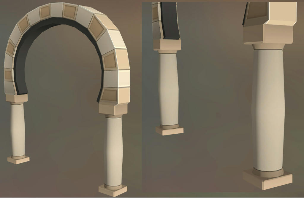
such a huge object (the arch) needs more roundness (32 sides) ! it'll look really edgy ingame as it is right now and tf2 is one thing - ROUND :D
hope you can somehow add the sides and still use the texture for it :/
 

Chemical Alia

L2: Junior Member
Jul 22, 2010
98
52
make it more round please :eek:
such a huge object (the arch) needs more roundness (32 sides) ! it'll look really edgy ingame as it is right now and tf2 is one thing - ROUND :D
hope you can somehow add the sides and still use the texture for it :/

I haven't started with details yet and the textures is still mostly just solid colors, so changes are easy until it's close to finished. I exported a WIP so maybe whark can bring it in and take some shots of it at the player's height, since I'm not 100% sure of the scale other than that it's big.

But I think it could go up to 18-24 sides if necessary, but 32 sounds like massive unnecessary overkill for a static mesh that doesn't move around in the lighting. It looks quite acceptable to me so far with smoothing, even in the HLMV when I shine the light around it.

Here's a test shot of how it looks in the model viewer (ignore the messed up smoothing groups):

70466ce4f8655e62ed308d26bdf7d62f6g.jpg


Only at the base/top are hard edges visible, and they're not in the player's normal line of sight. There will also be noise like grime and texture in these areas.

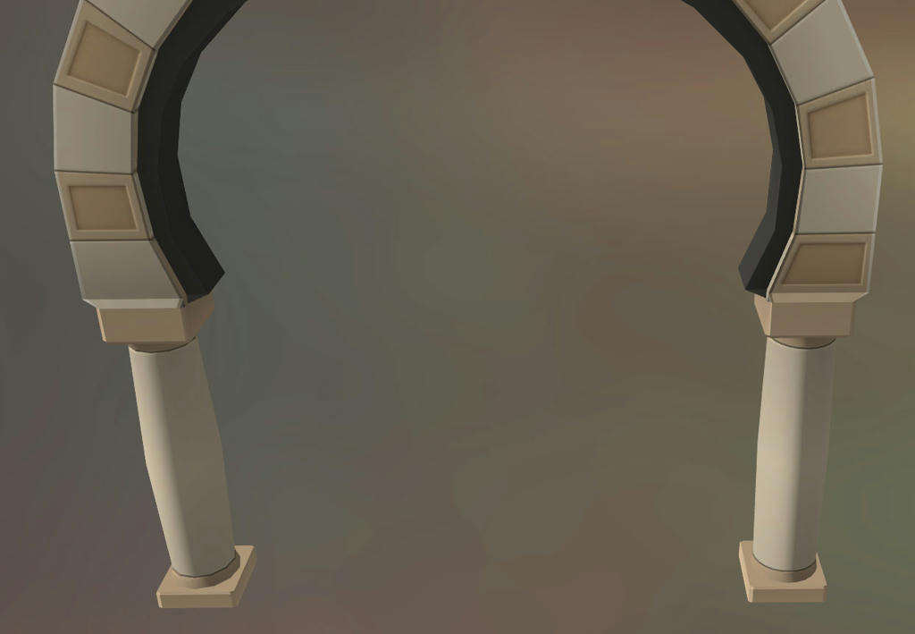
Here's another shot with the left column at 12 sides, and the right column at 24, so you can compare the differences.

af19a46e03d163c0d0068f4fa073313a6g.jpg


I'd be more than happy to make any changes necessary, but it's really whark's decision in the end on what's best for performance/optimization. He knows how many times it'll appear in the map, so I'll leave it to his judgment.
 

Acumen

Annoyer
aa
Jun 11, 2009
704
630
it's not about improving light casting on the model but more making the round shape believable.

some examples from the game:
vault_door has ~32 sides
even the tiny wallclock model has 32 sides..

it's neither "massive unnecessary overkill" nor unoptimized work by valve. polygons are cheap today. but i'll stop here. tried to fight this fight too often in here :)
you know what looks good in your map !
 

Whark

L3: Member
Jul 26, 2010
112
39
finished a first pass over this area. After alot of feedback and 10 iterations maybe it will come together.

market00013.jpg


market00006.jpg
 

Chemical Alia

L2: Junior Member
Jul 22, 2010
98
52
it's not about improving light casting on the model but more making the round shape believable.

some examples from the game:
vault_door has ~32 sides
even the tiny wallclock model has 32 sides..

it's neither "massive unnecessary overkill" nor unoptimized work by valve. polygons are cheap today. but i'll stop here. tried to fight this fight too often in here :)
you know what looks good in your map !

I'm up for making any changes if there's a good reason. :) I looked up the models you mentioned, and maybe we're talking about different parts of the arch? That vault door needs to have at least 32 sides because the round shape of the arch is viewed from the front. Same with the clock, wagon wheel, etc., normal maps/smoothing groups are useless in this case so more geometry is the only way. I assumed you were talking about the columns, but are you actually referring to the archway? If so, the only reason mine is lower poly is because it's built from bricks and not intended to be a rounded surface. I just want to clarify that we're on the same page so I can understand you better.

Increasing the sides of the columns to 24 is still well in my reasonable budget for this model. So if you guys think it's a noticeable improvement, I'd be happy to go with that.

I would still dispute the argument that "polygons are cheap", though. It's really bad practice to think in these terms as a modeler, even with next gen games. I overhear the art lead bitching/joking about people who don't optimize enough all the time at work, and applications from talented artists are thrown out for this reason all the time.


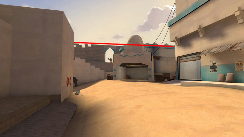
I'm thinking wood trim somewhere on the blue building on the right would be a big help for visual interest. Also is that building in the background the second shed thing that we were all talking about changes before, or am I just retarded?

Edit:

Oh, and I'm not too crazy about this straight line that forms across the top here. Maybe it's only from this angle, but it creates a sense of stasis. This is a nitpick.

2ed362e25fcf721a998d2ce4993ef1a26g.jpg
 
Last edited:

Mr. Happy

L6: Sharp Member
Jul 16, 2008
320
158
is that camel's silhouette based on the camel cigarettes camel? Looks exactly like it.

I love this.
 

Whark

L3: Member
Jul 26, 2010
112
39
Oh, and I'm not too crazy about this straight line that forms across the top here. Maybe it's only from this angle, but it creates a sense of stasis. This is a nitpick.

2ed362e25fcf721a998d2ce4993ef1a26g.jpg

market00025.jpg


Added dome trim and piled some more blocks on the wall.
 
Nov 14, 2009
1,257
378
I'm not sure what you mean by that.

The rules of the contest say no collaborations, and this map is quite close, if not one.


Whark, I like what your doing to A. Its funny, since both your and my theme are hard in the same way (too many flat walls), and we are at about the same level of completion (your a bit ahead of me).
Can't wait to see what you will do with the alloted week!
 

tyler

aa
Sep 11, 2013
5,100
4,621
Those stacked blocks look kind of ridiculous. The line didn't seem like an issue. Not every point of the map needs to be visually interesting.
 

Chemical Alia

L2: Junior Member
Jul 22, 2010
98
52
market00025.jpg


Added dome trim and piled some more blocks on the wall.

Those stacked blocks look kind of ridiculous. The line didn't seem like an issue. Not every point of the map needs to be visually interesting.

Maybe somewhere in the middle between these two posts? Like, just one or two diagonally leaning bricks might be all it needs to break it up. Having lots of loose bricks might make sense if there was like, a crane constructing a building/wall, but I am not suggesting that AT ALL, lol.
 

Whark

L3: Member
Jul 26, 2010
112
39
The rules of the contest say no collaborations, and this map is quite close, if not one.

Not sure how to answer that. Other than: if an artist makes a bunch of assets, then another artist makes one, and I take alot of feedback and ideas from people in the interest of making my level better, how is that a collaboration? I am the one executing on the thing.


But yea, you and I are plagued by those damned walls. I'll be hard pressed to get something in at the deadline but with some long hours this week I will have something to submit.:)