artpass_whark

What gametype should Whark's new map be?

  • CP

    Votes: 14 33.3%
  • CTF

    Votes: 9 21.4%
  • PL

    Votes: 19 45.2%

  • Total voters
    42

Simski

L2: Junior Member
May 17, 2010
57
11
Perhaps the pit of death can be a poisoned spring?

Fill it with water, add some stuff that implies that it was used as a water source, add a tipped over bottle dripping poison into the spring.
Perhaps add a stranger color to the water.
Put the death line a little bit below the water line so you won't die instantly when you fall into it, but high enough that you can't escape hitting it when falling into the water.
 
Last edited:

MangyCarface

Mapper
aa
Feb 26, 2008
1,626
1,325
Perhaps the pit of death can be a poisoned spring?

Fill it with water, add some stuff that implies that it was used as a water source, add a tipped over bottle dripping poison into the spring.
Perhaps add a stranger color to the water.
Put the death line a little bit below the water line so you won't die instantly when you fall into it, but high enough that you can't escape hitting it when falling into the water.

too much narrative!... story should be 90% composed in the minds of those playing your map. Confine them too much to an idea and I believe you lose some of the magic in the art of implication
 

Simski

L2: Junior Member
May 17, 2010
57
11
too much narrative!... story should be 90% composed in the minds of those playing your map. Confine them too much to an idea and I believe you lose some of the magic in the art of implication

Darn :(

I just liked the idea of having a little more unique death pit, but having it make sense that water kills you is hard unless you involve an explanation... or if you're playing GTA.
 

Goombac

L4: Comfortable Member
Mar 27, 2010
172
84
My big problem with the areas outside of C is that they have kind of awkward geometry. It may just be WIP,. Even around A and around BLU spawn the walls just look out of place, although I'm guessing it's just placeholder. I'm with Mangy on destroying the displacements and creating your own and really making this map your own little creation.
 

J4CK8

L11: Posh Member
Mar 4, 2009
820
243
I don't know if people are going to want to hang around a CP hovering over a pit of poisonous smoke, lol.

But you're happy to go stand under a huge rocket and capture a point? Or push a very explosive cart into a very explosive pit? :p

Anyway, I'm loving this theme, hope it gets put to good use when you release the 'pack' :)
 

Whark

L3: Member
Jul 26, 2010
112
39
My big problem with the areas outside of C is that they have kind of awkward geometry. It may just be WIP,. Even around A and around BLU spawn the walls just look out of place, although I'm guessing it's just placeholder. I'm with Mangy on destroying the displacements and creating your own and really making this map your own little creation.

Yea. Its the challenge of artiing out someone else's level without too many gameplay alterations. I find working in this theme in this level, which clearly feels like it would be at peace with a mining or industrial theme, extremely painful. Every change, every shape brings out a plethora of other problems. If I had my own whitebox that had this theme in mind this would be a much easier task. I knew what I was getting into but didn't anticipate the difficulty properly. It seems that TF2's art style would be freeing, but in fact, its very, very, very restricting. More restricting then any other game I've mapped for in fact. I'm not finding that very enjoyable at the moment.
 

Goombac

L4: Comfortable Member
Mar 27, 2010
172
84
Well worst case scenario you make your own map or detail someone else's with this theme! Really hope you finish, I'm loving the theme.

You could also look at de_dust and dust2 (if you haven't already) and use that architecture for inspiration.
 

EArkham

Necromancer
aa
Aug 14, 2009
1,625
2,774
I knew what I was getting into but didn't anticipate the difficulty properly. It seems that TF2's art style would be freeing, but in fact, its very, very, very restricting. More restricting then any other game I've mapped for in fact. I'm not finding that very enjoyable at the moment.

Me, too. I'm finding it very tough to get my theme to work well within the TF2 universe. So far I've changed my plans for A & B about three times each now. The only plans staying consistent have been for C, but that's been more or less standard spytech.

So yeah, I feel your pain.

Kep
 

Chemical Alia

L2: Junior Member
Jul 22, 2010
98
52
But you're happy to go stand under a huge rocket and capture a point? Or push a very explosive cart into a very explosive pit? :p

Anyway, I'm loving this theme, hope it gets put to good use when you release the 'pack' :)

Oh, no. I thought Whark mentioned that he abandoned that idea already because it doesn't make sense.

But uh, I did some paintovers for the area around B that I was hoping to get some thoughts on this afternoon, but totally forgot to upload them so I could post them at work. Oops!
 
Last edited:

Chemical Alia

L2: Junior Member
Jul 22, 2010
98
52
Not because it doesn't make sense but because I like Pulp Fiction.:)

IS THAT WHAT I THINK IT IS

I'm trying to think of some names for business, events, etc. that I can make signs and posters out of in a bit. So far I have come up with these:

The Screaming Monkey Antiques and Consignment
Oasis Plumbing

lol so if anyone has a raging desire to suggest something, I'd love to hear it.
 

Goombac

L4: Comfortable Member
Mar 27, 2010
172
84
Raiders of the Lost Ark style? Have an ark under the point and when BLU captures the point it opens and C falls apart?
 

Gerbil

aa
Feb 6, 2009
573
846
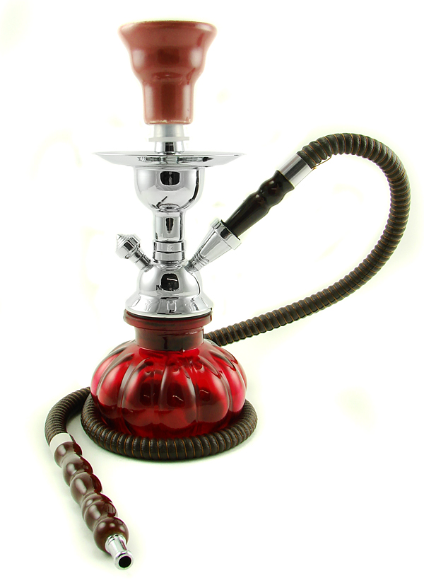
Couldn't think of a name, but maybe something with/about hookahs?

hookah.jpg
 

Draco18s

L9: Fashionable Member
Sep 19, 2009
622
136
Put the death line a little bit below the water line so you won't die instantly when you fall into it, but high enough that you can't escape hitting it when falling into the water.

I've actually done this in my map. So far only a scout (yay double jump) can "survive" the jump (I suppose that means I need to move the deathbrush up some) but I don't feel that it's a real issue. You HAVE to keep moving or you'll sink and die.

But I'll be putting in a roaming gator which I can also give a "train-like" deathbrush as well.

In any case, the placement of the deathbrush (height of the water level or not) I figure is one of those things that doesn't disqualify a map. I figure that the winning map will likely get a few cosmetic changes by Valve before it goes live anyway (the location of the deathbrush--if its deemed an issue--would take seconds to move back up).
 

Pocket

Half a Lambert is better than one.
aa
Nov 14, 2009
4,701
2,583
I propose that the death pit be filled with poisonous snakes.