Chemical Alia
L2: Junior Member
- Jul 22, 2010
- 98
- 52
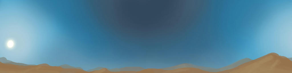
This is still a gigantic WIP, but I've started on a new skybox texture. Once he gets it set up and I can see how the scale looks, I want to do more with some hills/dunes and a few cirrus clouds. I want to paint some cards with ruins and other structures for out in the distance, too.
Yeah, I was really liking the slanted windows, for the way it contrasts with the arabic influence. It's like a low tech spin on spytech, but still very recognizable as such, and that's pretty unique.
The location is appropriately spytech in design, if not in texture. It looks fine to me. I don't mind the lack of spytech textures, because the area is still spytech (it's just very arabtech). I mean, they're pulling a giant explosive out of the ground. You don't need computers to be spytech.
Yeah, I was really liking the slanted windows, for the way it contrasts with the arabic influence. It's like a low tech spin on spytech, but still very recognizable as such, and that's pretty unique.
Last edited: