artpass_whark
- Thread starter Whark
- Start date
You are using an out of date browser. It may not display this or other websites correctly.
You should upgrade or use an alternative browser.
You should upgrade or use an alternative browser.
Mr. P. Kiwi
L5: Dapper Member
- Nov 22, 2009
- 244
- 95
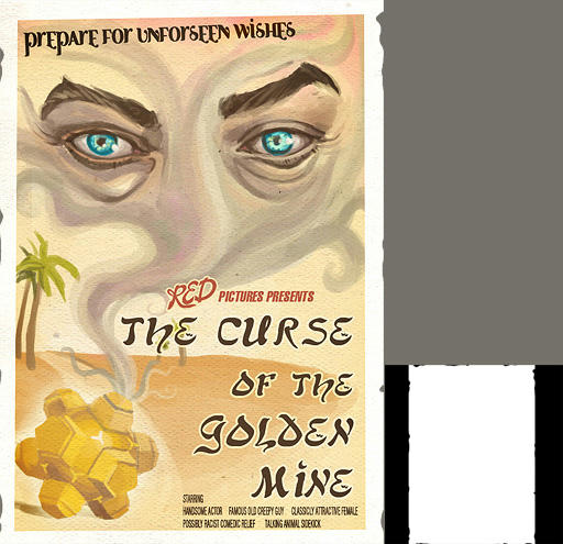
Personally, I wouldn't want to see a poster like that in-game… And not because I think it's ugly, I think it's rather nice. I think it just doesn't fit well the TF2 theme - you could, however, add it as an easter-egg somewhere in the level.
Keonyn
L2: Junior Member
- Mar 27, 2010
- 56
- 17
I like the poster, and don't see a problem with it clashing with the TF2 art style. It has the right look, just lacks the wear and tear often seen in other poster overlays. In this case it's not a big deal since movie posters usually have a very short display period and are made of much tougher stuff, some in the early 60's and earlier were actually more a canvas or cloth than paper.
just lacks the wear and tear often seen in other poster overlays.
The smaller black and white image against the first post of the poster is the alpha channel.. it will look worn and torn when used in game..
Chemical Alia
L2: Junior Member
- Jul 22, 2010
- 98
- 52
Oh yeah, I should probably have mentioned, the actual size of TF2 posters a 512x512, so the text won't really the focal point or anything, especially when you're just running around.
And yeah, it's torn, you can see how in the black and white alpha channel. I saw one screenshot of it in game and might want to rip it a little more, but I want it to be about on par with the wear and tear of the existing TF2 posters and any of the other ones I make.

And yeah, it's torn, you can see how in the black and white alpha channel. I saw one screenshot of it in game and might want to rip it a little more, but I want it to be about on par with the wear and tear of the existing TF2 posters and any of the other ones I make.

FreeLance_FoX
L6: Sharp Member
- Sep 6, 2008
- 353
- 173
Wooden posts with barbed wire between them more appropriate instead of that chain link fence? (I hate to say it, but: like egypt)
Look at a rope texture for the wires holding up C, a much thicker rope would be better imho. Staying with wires, the wires between the telegraph poles should have a few more between them.
Look at a rope texture for the wires holding up C, a much thicker rope would be better imho. Staying with wires, the wires between the telegraph poles should have a few more between them.
- Jul 26, 2010
- 112
- 39
Wooden posts with barbed wire between them more appropriate instead of that chain link fence? (I hate to say it, but: like egypt)
Look at a rope texture for the wires holding up C, a much thicker rope would be better imho. Staying with wires, the wires between the telegraph poles should have a few more between them.
No shame in saying "like Egypt!"
- Jul 26, 2010
- 112
- 39
What exactly is beneath point C?
I couldn't tell very well from the screenshots.
Exactly! I think its working. At first it was explosives but Alia, myself, and some other friends are taken by the idea of (fill in the blank).
- Jul 26, 2010
- 112
- 39
Hmm... I'm not too fond of the idea of having it filled with explosives, I don't see how that would make a lot of sense when you fall into it and die...
I might suggesting something later if something would come to mind.
I'm finding explosives to be, quite honestly, racist.
- Feb 26, 2008
- 1,626
- 1,325


