Arcadia

KotH Arcadia A7b

Kataiser

L1: Registered
Aug 3, 2015
47
2
Arcadia - KoTH map with unique(ish) layout

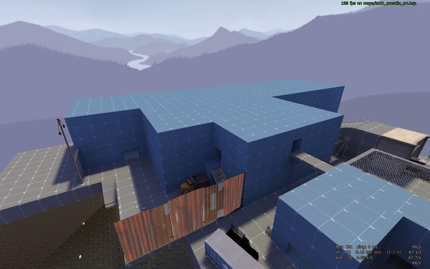
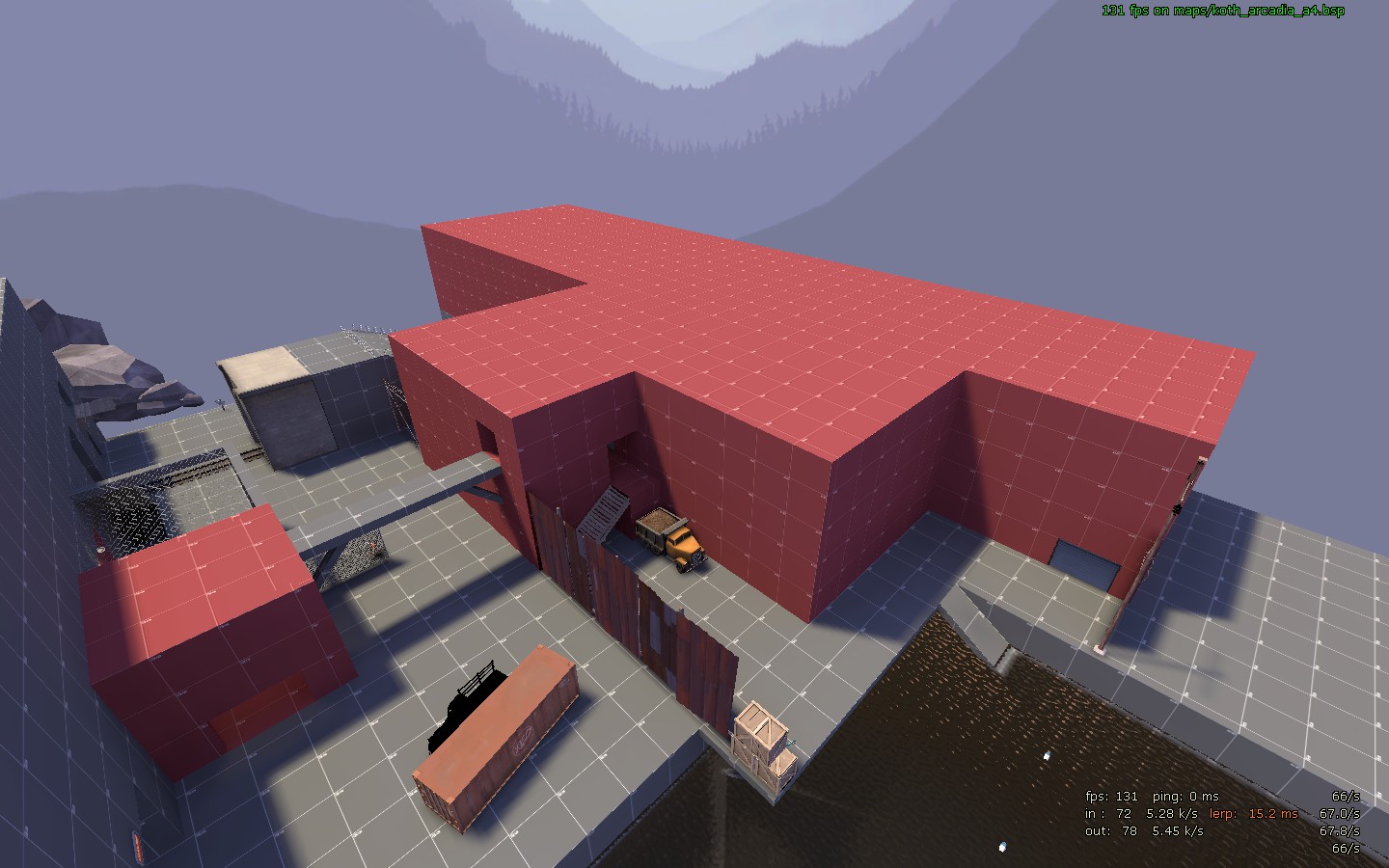
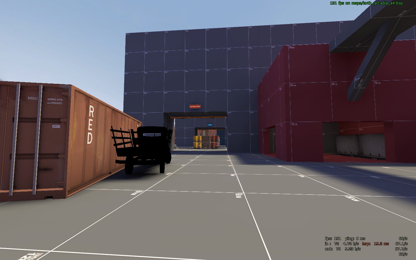
Arcadia is a King of the Hill map, with a somewhat unique layout: the backs of both spawn rooms are facing each other, and the point is placed on top of the building they form. The main area is surrounded by the ocean (use your imagination), the RED/BLU facilities, and a waterfall, and a train runs near the point every now and then. Since it's in alpha, I'm mostly focused on locking down gameplay, but I have some ideas for detailing. Testing has only been done by me and bots, no other players yet.

I am aware that it is asymmetrical. That is because I'm not sure what layout is better (leaning towards red side, though). That is one of the things I need feedback on. Note that this is my first TF2 map and first experience with Hammer, so expect some of the problems associated with that. For example, I have no idea how to do optimization. Thanks to Crash for his tutorials, by the way.
 

JMaxchill

L5: Dapper Member
Jan 21, 2015
215
69
Sounds neat! I'll DL and have a runaround :D Have you considered keeping it asymmetrical, though?
e: Did you use bsp_repack? If so, you don't need to bzip it as well. If not, do (it keeps it compressed all the time, not just when downloaded)
e: Incoming feedback dump!
  • Do you have any spectator cams? If not, plug them in :p
  • No signs. Anywhere. I genuinely couldn't find the point until going noclip. Shove a massive arrow outside your spawnrooms (Red had a small one that didn't really help, but Blu was a mess)
  • The point yard could be a little wider
  • If you fall in the water, there's no easy way out - both the doors under the point were locked
  • Why do you have such a massive structure opposite your spawnrooms? It feels like either the point should be there, or players should spawn there
    WVZg44j.jpg
  • I don't feel like I should walk out of spawn then turn and go back round it. You either need signs on where people should go, or to put the spawns in the massive buildings (which I feel would solve most things
    oqt7PLP.jpg
  • Sightline
    Zv4B61Q.jpg
 
Last edited:

Yrr

An Actual Deer
aa
Sep 20, 2015
1,317
2,759
I would suggest that you test the two side layouts as symmetrical maps because testing both at once will taint your results
 

Kataiser

L1: Registered
Aug 3, 2015
47
2
Okay, thanks for the feedback! I'll work on signs and spectator cams. The doors in the tunnel open after the point is first capped. And I can't see your images.

I am aware that red currently seems to have a huge advantage over blu right now. It definitely does affect results.
 

killohurtz

Distinction in Applied Carving
aa
Feb 22, 2014
1,016
1,277
Nothing is wrong with the trucks, don't worry. Some props just appear black with phong shading disabled.
 

Kataiser

L1: Registered
Aug 3, 2015
47
2
What appears to be another side effect of your config: it definitely does have signs. I put more when I saw your post, but now that you have images, I see a few places where there are arrows on the walls. Anyway, A5 is coming soon.
 

JMaxchill

L5: Dapper Member
Jan 21, 2015
215
69
What appears to be another side effect of your config: it definitely does have signs. I put more when I saw your post, but now that you have images, I see a few places where there are arrows on the walls. Anyway, A5 is coming soon.
I didn't know that. Thanks!
 

Kataiser

L1: Registered
Aug 3, 2015
47
2
Changelog:
  • Added spectator cam
  • More signs
  • Wall near point changed to chicken wire
  • Increased capture zone size
  • Widened ramps out of water
  • Sniper windows enlarged
  • Removed hole at balcony
  • Temporarily disabled train*
  • Brightened spytech room
  • Clipping improvements
  • Some lightmap optimization
*Was unbalanced, especially against Blu.

There are still some things I don't know how to do, like shadow control and the lighting compile options for example. NOTE: this is still not suitable for player testing, because of the asymmetry. Looking at you, feedback.tf2maps.net.

Read the rest of this update entry...
 
Last edited:

Kataiser

L1: Registered
Aug 3, 2015
47
2
A7 changelog:
  • TREES! Only one affects gameplay, though
  • Added identical rooms under the point/spawns, connecting the tunnel to the backside of the point
  • Made doors in tunnel team only and always unlocked
  • Lowered the height of the building outside spawn
  • Fixed dynamic shadow angles again (for good this time)
  • Modified capture/respawn times
  • Moved/added some signs
  • Func_detailed a bunch
  • Improved lightmap quality in places
  • Improved spectator camera
  • Improved clipping
  • Slightly improved lighting
  • Fixed a sticky hiding spot

Read the rest of this update entry...