Angkor

PL Angkor RC2

squintik

L2: Junior Member
Sep 9, 2009
57
35
PL_Angkor is a 3 stages payload map (goldrush like) with some CP in stage 2 and 3 to allow the cart to continue moving on its path.

After BLU's plane crashed in the cambodian jungle, they encountered RED team wandering around a khmer temple, so they quickly decided to just blow up everything ...
They'll need to bring their explosive-filled cart from their plane, to the temple entrance up to the top of the temple and drop it into the sacrifice pit !
 
Last edited:

nik

L12: Fabulous Member
Aug 14, 2009
987
564
THIS LOOKS BRILLIANT

I love this theme! the tree roots really kick ass
 

Penguin

Clinically Diagnosed with Small Mapper's Syndrome
aa
May 21, 2009
2,039
1,484
Oh deng.

This looks fantabulous!~
 

Fireman

L4: Comfortable Member
Mar 21, 2008
150
59
Throw this up on a gameday? Those screens have me itching to give it a try!
 

Retroid

L5: Dapper Member
Aug 25, 2009
206
22
It looks amazing! I love the style.

...

A few detailing problems I can see though, like the tracks squashed up a bit going up the hill. Also you may want to look at the corners of buildings and align the textures so you don't get those L shaped bricks. Also perhaps a few more roots.

But for an Alpha it looks all kinds of amaze!
 

J4CK8

L11: Posh Member
Mar 4, 2009
820
243
Well that is definatly a nice looking map however I feel that it's just too grey. I know it's the theme but maybe add a red stripe along some walls or something to add some variety in the walls. Other than that it looks fantastic and I can't wait to paly it :)
 

squintik

L2: Junior Member
Sep 9, 2009
57
35
Yeah, it lacks some details adding some contrast and color ... I've planned to add more vegetation on walls/ground (moss, more tree roots, etc...) and some colored props (plane seats here and there that had fallen during the crash for example, some strange statues perhaps painted by REDs, etc...).
But it will probably wait until the beta (having the gameplay ok on every stages) :)

Anyway, I added some screens of stage B and C (just to have a look at the CP thing and the general idea for these areas), and also added the map for tomorrow gameday.
 

EArkham

Necromancer
aa
Aug 14, 2009
1,625
2,774
Ouch. I just spent a week creating assets for an Angkor themed entry for the artpass contest, with at least another week to go before I was ready to show anything. :\

Looks like you're off to a promising start on the theme.

Kep
 

squintik

L2: Junior Member
Sep 9, 2009
57
35
Yay, there's a lot of cool things to do with this theme, so I'm waiting to see what you'll do with it ! (don't really see how it will fit with the contest map layout, but I'm sure you can do something cool !)
I can give you the few custom assets I have if you need, but they're not final, quite specific, and there's nearly nothing actually ... (just 3-4 not so good textures and some tree models).
I guess it'll be even easier for you to just do your own, fitting with what you want to do ... (and then release a models/textures pack ? :p)
Good luck anyway !
 

Harribo

aa
Nov 1, 2009
871
851
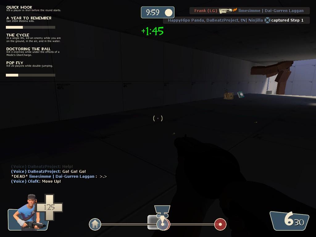
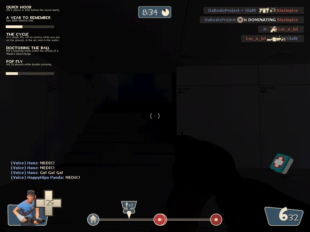
Loved your map in gameday, the unique theme is really interesting. I do think the blocks in the wall texture are a bit big, you do feel like an ant walking through the 1st stage. The 2nd and 3rd stage but more-so the 2nd stage feel pretty short. The little touches like the button pressed door in red's 1st stage spawn and the hollow logs are great. There was basically no light in the left building coming from blue's side in the 2nd stage:
gaonmaacb.jpg

and aswell in the downstairs area right of the cart (coming form blue's side) in the 3rd stage:
gaonnaacb.jpg
,
I get that its only alpha get but red can take real advantage of this dark to ambush blue. The door/opening before the final straight in stage 3 is really spammy too. I'm hoping for great things from this map, look forward to seeing this progress :)
 
Last edited:

squintik

L2: Junior Member
Sep 9, 2009
57
35
Yeah, there's some really dark room at the moment, because I would like to avoid having artificial lights (like fire torches), so I need to tweak the geometry (with some ceiling parts collapsed, etc...) to have areas correctly lit. I'll add some temp spotlights for next alpha, to correctly test gameplay in these areas :)

For the stone blocks size in stage A, you're right. But I like the feeling of being small in a huge temple, so I'll try to keep them kind of big (and I like to have some big holes in walls with just 2 or 3 blocks removed). I'll see what I can do about this.

And yeah, for the door in last stage, there's still a lot of work to do on the layout there :) (the whole stage C is quite placeholder in fact, it was just to give the basic idea/setting of the stage, with not so much vegetation, a lot of verticality, the final sacrifice pit, etc...)

For stage B and C being too short, it's probably because there was no strong defense, so I should better look at this first I guess (perhaps I can add more lenght to the last part of stage B, but I think the distances and gameplay areas size are pretty much ok)

Thanks for the feedbacks !

I guess my list of main things to fix (after seeing the playtest) is :
- too hard to defend in general ? (at least when not knowing the map, so perhaps add some obvious sentry spots, or close some small alternative paths ?)
- some big sightlines for snipers here and there (will be hard to fix in some places, but I'll try to block some)
- some performance issues in some areas (didn't see them, but it's not so much optimized so I'll watch the demo to find where people had issues)
- some obvious stuff I was too lazy to do like dark areas, too small func_respawnroom or missing resupply cabinets in C that I should fix for next playtest :)

(and then a lot of details I heard or saw, but I'll need to watch the demo again :p and it's still in alpha state anyway, so a lot of these are already known)

For others who participated in the playtest, do not hesitate to post your feedbacks :) (like general things you didn't say or write during the game perhaps, like the map scale, too linear, too many flank possibilities, if you found the map too easy or hard for a specific class, etc...)

Thanks a lot for the playtest anyway !
 
Apr 13, 2009
728
309
Well, I think it may help to split up the map in stages to be tested individually and focus on one at a time, though that is your call to make. 30 minutes doesn't leave a lot of time to play the map several times and scramble teams if necessary.

Out of all stages, I rather liked stage 3, the final uphill push being pretty memorable (at least it was when we were attacking because we struggled a good bit there, after teamswitch it was more or less a steamroll :p).
One possible problem is that your stages may be a little too long. At least it felt that way, when compared to goldrush. Maybe that's just unfamiliarity with the layout, but I felt like as red, we spent the better part of setup getting to blu's spawn. Some signs for shortcuts would help, because backtracking the track doesn't work when there is a giant door blocking the passage :)
 

gastrop0d

L3: Member
Apr 22, 2009
110
33
Yeah I think the stages were pretty big in comparison to Goldrush. Some areas were just massive; the area around the final point comes to mind.

There were some great memorable areas, though. The first and last stages in particular. Work on bringing the scale down a little.

As for your position on lighting; gameplay takes priority over theme, hands down. There's numerous dark areas in the map that are almost unplayable. TF2 is all about visual priority and gameplay readability. Add lights, it will make the map so, so much better.

Besides, if Red really is set up in the temple, they would have erected some lights and equipment.

The fog colour didn't really match the sky colour from what I remember. The fog was green and the sky blue.

I agree with Loc_n_lol, you should focus on each stage individually in testing to really refine them.

Overall I think the map is really promising, though.
 

squintik

L2: Junior Member
Sep 9, 2009
57
35
Thanks for the feedbacks guys, I'll try to fix these issues (path not always clear when setting up the defense as red, mostly the door in stage B, fog color, size, lighting, etC...).
And yeah, I'll test only one stage for next playtests (mostly A & B as stage C is too much WIP) but I wanted to see first if playing the whole map was not too long and if every stage is different enough, etc...
 

Harribo

aa
Nov 1, 2009
871
851
I would like to avoid having artificial lights (like fire torches), so I need to tweak the geometry (with some ceiling parts collapsed, etc...) to have areas correctly lit. I'll add some temp spotlights for next alpha, to correctly test gameplay in these areas :)
gastrop0d said:
Besides, if Red really is set up in the temple, they would have erected some lights and equipment.
I think gastrop is dead right, some builders floodlights or something would be put up in the dark areas by red, i mean messing with destruction of the building will probably do/look just as well but you could maybe do something visually interesting with artificial lights.

I think your right unfamiliarity with the maps layout is what probably led to poor defence and a short round time in stage 2 and 3. Try getting your map played a couple more times with impromptus and see if the defence holds together better. Some navigation/signs would help people get an idea of the place much quicker too, you've got to remember being a custom map maker people dont necessarily have to persevere in learning your map layout like people will with official maps, if its still not fun to defend after a couple of rounds people may not bother. The problem I would say you will have it trying to incorporate them with your theme