Angkor

PL Angkor RC2

squintik

L2: Junior Member
Sep 9, 2009
57
35
Thanks for the test and the feedbacks ! (I couldn't manage to be on time for the playtest, so I'll have to wait for the server demo)

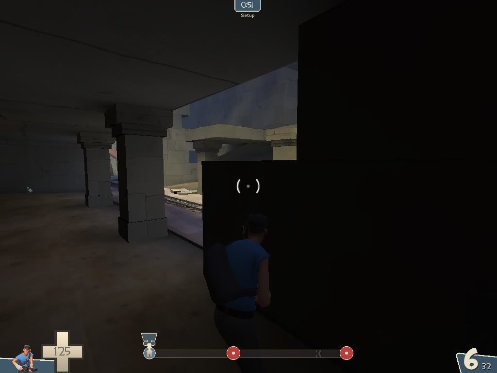
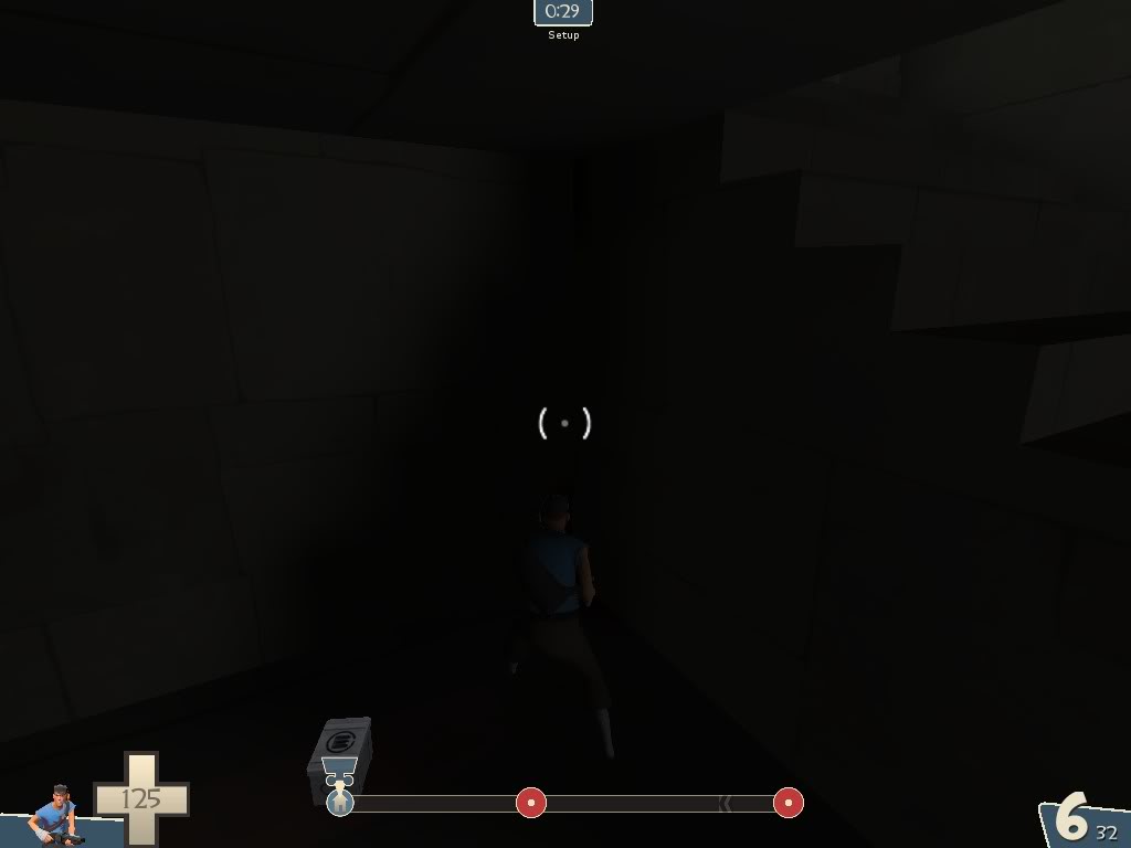
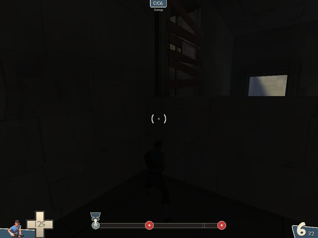
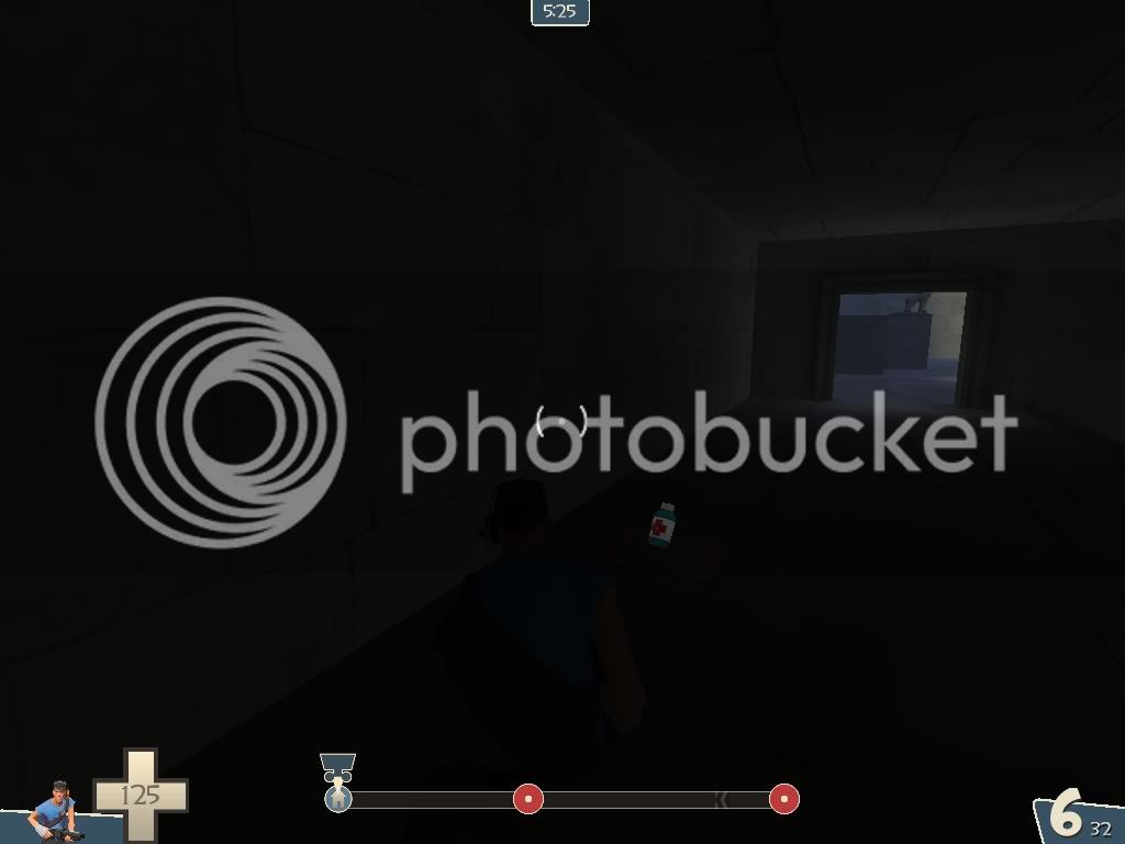
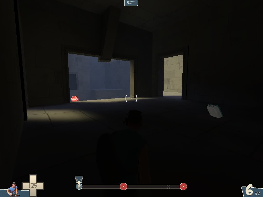
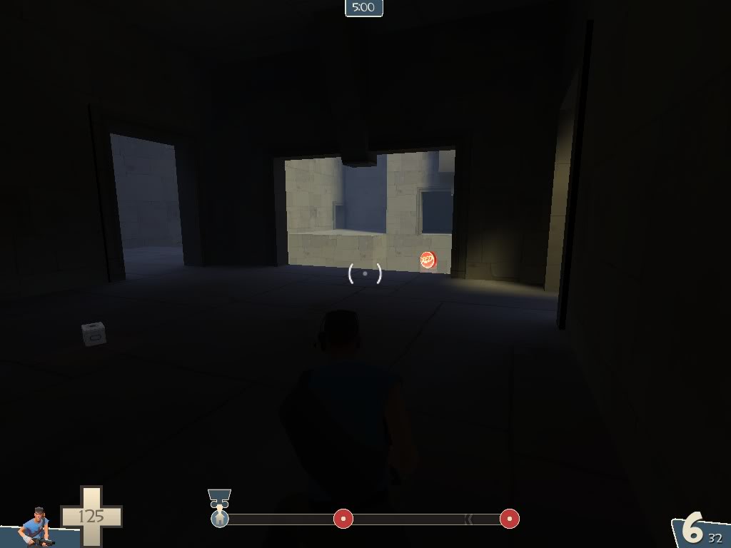
For the lighting, I'm surprised it's so dark for a lot of people ... the ambient is at 600 iirc, and there's some fake lights to boost the diffuse lighting for some interiors, and I never got any complaint about this on other playtests ... but I guess I'll boost the fake lights for some interiors. (and no, I don't want to add torches)
 

Sergis

L666: ])oo]v[
aa
Jul 22, 2009
1,874
1,258
For the lighting, I'm surprised it's so dark for a lot of people
pl_angkor_b10000.jpg

pl_angkor_b10001.jpg

pl_angkor_b10002.jpg

pl_angkor_b10003.jpg

pl_angkor_b10004.jpg

pl_angkor_b10005.jpg


I'm surprised you're surprised.
 

squintik

L2: Junior Member
Sep 9, 2009
57
35
New version (b2) released :

- updated layout in last section of the map to have more possibilities
- updated lighting to avoid having too dark areas
- fixed collision bug with the plane
- art updates on temple buildings and structure
- tweaked ammo and health pickups (less pickups now, transformed some big into medium pickups, ...)
- some clipping work around doors and windows
- updated 3d skybox
- more optimization

See first page for link, screens, ...
 

Blade x64

Logical insanity
aa
Sep 3, 2009
252
639
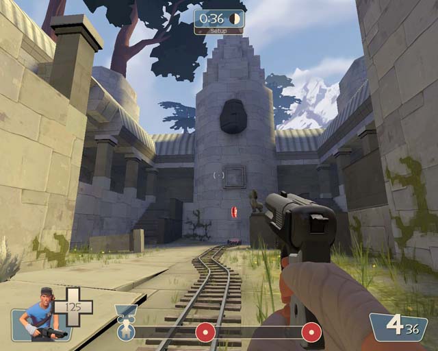
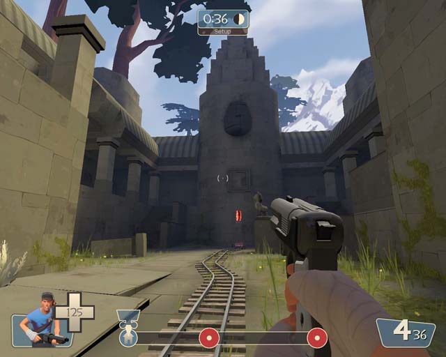
Figured out why you saw adequate lighting while others could barely see. Not exactly sure why, but when $ssbump is enabled the textures increase in brightness. Disabling $ssbump allowed the textures to have their normal map without the highlighting.

See:
mat_bumpmap 1
taMoK.jpg


mat_bumpmap 0
KoXSz.jpg


Good models and textures, by the way. Good enough that I want to use them (and I did, which is how I found this out). My only complaint is that the tree models seem to have somewhat awkward collision models.

Edit: After learning a little more about ssbump and normal maps, it looks like you're using a normal bump map for ssbump.
 
Last edited:

squintik

L2: Junior Member
Sep 9, 2009
57
35
Indeed, I'll have to look at these programs to generate real ssbump maps to fix this ... thanks for the info ! (hopefully that will help fixing the bad lighting on the face statues too)

And I'll have a look at the tree collisions, I didn't modify them since quite a long time so I can probably make some better ones.
By the way, if you need some files for the textures or models used in the map, don't hesitate to ask. (but I guess you already extracted everything from the bsp :) )
 

Username

L2: Junior Member
Aug 26, 2008
96
61
I'm loving the layout and gameplay, but this map seriously needs some detailing in the rooms. Torches, doorways, niches, explosions... Anything but the boxy rooms there are now.
 
Oct 6, 2008
1,965
450

I'm a little confuse like always:p

Where are they changing those values exactly?

Say... if you're still working on this, can you remove the invisible wall on stage 1? I'm loving the sticky jumper on this map to fly from the plane right into red spawn it's SUPER fun but I'd like to be able to get over that 2nd back wall but can't because of the player clip. I'm finding that it reall helps red from becoming entrenched at the point causing stalemates

Ahhhhhhhhh.... just saw the date on the thread - sorry for the bump
 
Last edited:

GPuzzle

L9: Fashionable Member
Feb 27, 2012
638
414
Dude, your map is so preety is not even fair.

And sorry for the necro-bump
 

squintik

L2: Junior Member
Sep 9, 2009
57
35
Thanks !

While I'm here, I guess I should give some news about the map ...
So, I have been working on this one from time to time, trying to improve the gameplay and visuals.
In short, rounds A and B are nearly finished, but round C still need some work (mostly for visuals), so the next version is still not ready :p

Oh and for Kill_the_Bug, the end of round A will be slightly different, which is supposed to help BLU and offer more interesting gameplay.

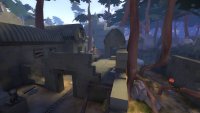
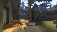
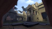
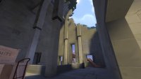
I guess it's time for some WIP screenshots then :

Round A:
-

Round B:
- - -
 
Mar 20, 2012
391
806
One note of criticism, which you could take or leave -

The architecture style of your interiors resemble more of a gothic cathedral than a khmer temple. The tripartite nave with parallel arcades that lend their weight to pointed arches is a very gothic thing. The khmer people were not capable of such verticality or building techniques.

Still a beautiful map, but I thought I'd mention it.
 

Tarry H Sruman

Large Orphanage Proprietor
aa
Jul 31, 2011
872
1,021
The architecture style of your interiors resemble more of a gothic cathedral than a khmer temple. The tripartite nave with parallel arcades that lend their weight to pointed arches is a very gothic thing. The khmer people were not capable of such verticality or building techniques.

I'm proud of the fact that I completely understood all of this.
 

squintik

L2: Junior Member
Sep 9, 2009
57
35
Hehe :)
It's a good point (it's different from khmer architecture) but I think I'll keep it.
I need some big rooms and I like to have more variety in the architecture, so that it's easier to differenciate each rooms and have better space for gameplay.
When navigating through the map, these gothic-style rooms don't seem out of place (in my opinion at least :p) ... so yeah I'm ok with them, but thanks for the feedback !

Trotim said:
If you're resuming working on this remember to check this out again: http://www.youtube.com/watch?v=MJXg6fcUpGY
Thanks for the link, I already watched this before, and although I don't agree with several points he said, some are valids and have been adressed. (some are just a matter of taste I guess)

- rollback stairs : personally, I like them. I think they can create some "unique" moments (BLU rushing on the payload to prevent it from going down, RED team better working together because they focus more on the payload going up the stairs, etc...)
I tweaked some stuff so that they're slighly less punishing for the attackers though (cart speed slighly higher on the slope, cart not being able to go down the slope if it reached the top once, and some rollback slopes are shorter in rounc C).

- high ground near the end of round A: I don't think the area is so bad (there's nothing wrong with high grounds, on the contrary !) so I just removed the overpowered sentry position, and there's a new interior near this area (which should create new possibilities for both BLU and RED).
There are some other changes (most of them can be seen on the first screenshot I posted) but I think it should be ok.

There are a lot of other changes (intermediate spawn in round C, timers have been tweaked too, some tweaks about distances and heights in round C, fixed known bugs, etc...) but I'll wait for the next version before giving all the details.