pl_halfacre
- Thread starter YM
- Start date
You are using an out of date browser. It may not display this or other websites correctly.
You should upgrade or use an alternative browser.
You should upgrade or use an alternative browser.


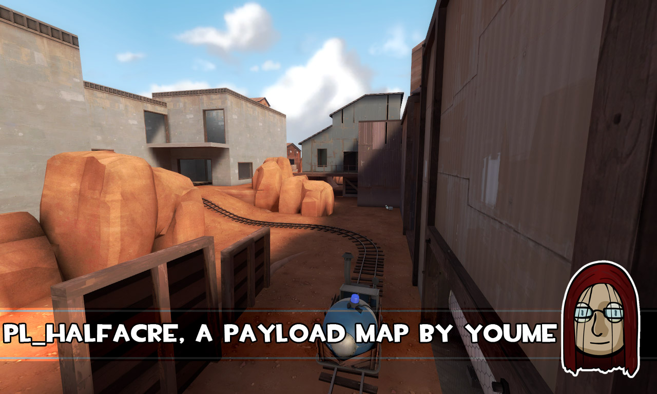
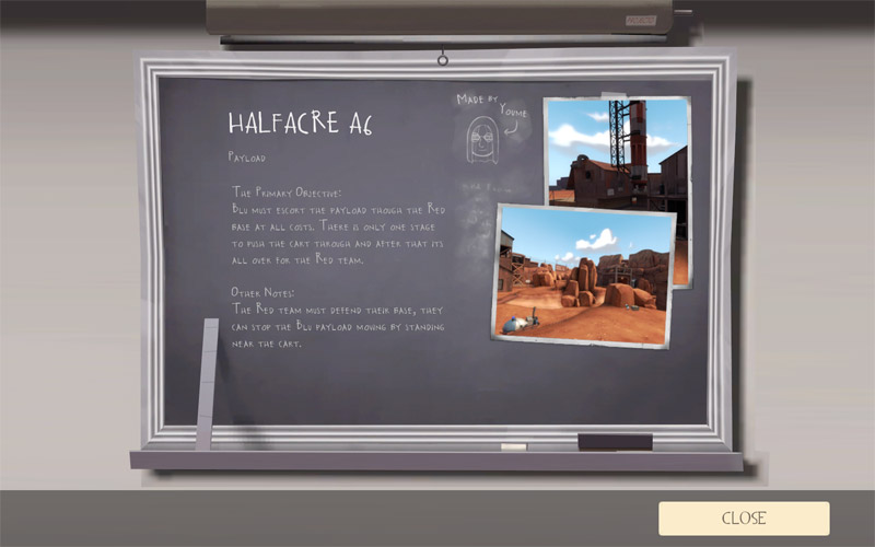
OK, a6 is up for gameday, its at 20mb Zipped amazingly. This is the final alpha before it goes beta. I've worked on the displacements and clipping a lot since I took the above screenshots, theres far more displacement work now and its all (I think) displaced nicely.
I'm genuinely pleased with how this is going now. :thumbup1:
If you wish to download it prior to gameday: (bear in mind that _b1 will be out before monday)
http://forums.tf2maps.net/downloads.php?do=file&id=803
Edit:
I'm genuinely pleased with how this is going now. :thumbup1:
If you wish to download it prior to gameday: (bear in mind that _b1 will be out before monday)
http://forums.tf2maps.net/downloads.php?do=file&id=803
Edit:
YesIs the massive bar at the bottom of the screenshots really necessary?
I guess some folks need to validate themselves with obnoxious banners when their work cant speak for itself.
I think everyone here would agree that youme lets his work speak for itself, but that the banners are a nice touch for promoting the map. Regardless, if you don't like the banners there's no need to make passive-aggressive comments about them.
I think everyone here would agree that youme lets his work speak for itself, but that the banners are a nice touch for promoting the map. Regardless, if you don't like the banners there's no need to make passive-aggressive comments about them.
Im afraid you're mistaken.. not only would I disagree very strongly, I would go so far as to say that the 'cute' little banners betray a truly sad degree of narcissism, with a hint of arrogance thrown in. The bile thrown out against other mappers is equaly disgusting. but returning to the topic at hand-- maps.. honestly, I won't even go there because I might shatter someone's fragile existence should i attempt to provide criticism-- we've seen most of it brushed aside or ignored in deference to one's supposed midas touch. in any case it's likely that the powers that be here welcome no such blasphemy, and it's unfortunate that these cliques exist. So don't let me interrupt everyone's e-fellatio session and have a wonderful thanksgiving.
honestly, I won't even go there because I might shatter someone's fragile existence should i attempt to provide criticism
No single user here exists on this imaginary fragile egde of egoism of yours and are remarkably sober about recieving jibes. You can give your advice in the knowlegde that the designer will or will not heed your words, and that you have tried to help regardless. Anything else is simply immature. People may on the odd occasion conflict with another's opinion but when it comes to raw criticism no one's as insecure as you choose to believe. Look at all the post's Youme's thanked in reply to all that was bugged with his map; is he really that arragont?
Also try the other W.I.P. threads. People have ultimately scrapped projects in the pursuit of higher quality authorship after learning heaps from harsh critisms. The trend being the harsher the critique the more the user learns and improves.
This has been the most fluid, quick-learning and respectable community i have ever settled in over the 8 years i have had in level design. These guys really do listen to what you have to say.
I say again. Try them.
But don't expect a whole load of respect in return, with an attitude like that.
Im afraid you're mistaken.. not only would I disagree very strongly, I would go so far as to say that the 'cute' little banners betray a truly sad degree of narcissism, with a hint of arrogance thrown in. The bile thrown out against other mappers is equaly disgusting. but returning to the topic at hand-- maps.. honestly, I won't even go there because I might shatter someone's fragile existence should i attempt to provide criticism-- we've seen most of it brushed aside or ignored in deference to one's supposed midas touch. in any case it's likely that the powers that be here welcome no such blasphemy, and it's unfortunate that these cliques exist. So don't let me interrupt everyone's e-fellatio session and have a wonderful thanksgiving.
Huh? What bile against other mappers? Youme is one of the nicer and more helpful mappers on here. Actually, I think almost all the mappers are helpful and friendly.
As for cliques, while I'm a fan of some of the mappers on here, it still doesn't change the fact that the banners are really not that big of a deal. They're definitely not as big of a deal as you're making them out to be.
Finally, either you're trolling, or just a complete prick in general. Either way it's unfortunate since these forums tend to be very friendly and useful for the people that need them (mappers + map testers + server admins). Get over yourself and try being helpful instead of being a jerk.
I guess some folks need to validate themselves with obnoxious banners when their work cant speak for itself.
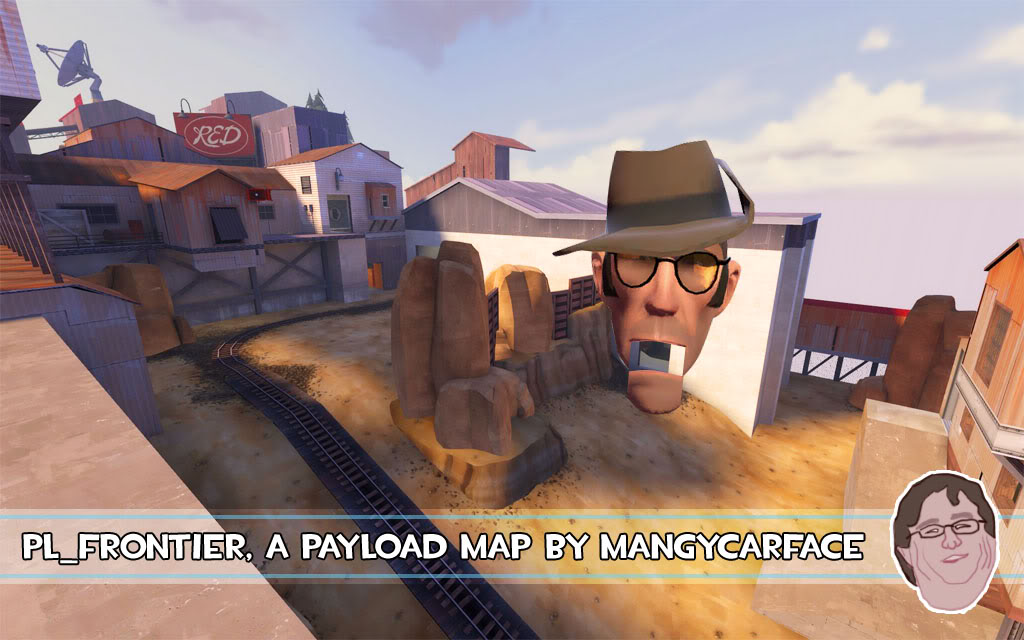
I fail to see how they are obnoxious; it doesn't obstruct much of the image, since it’s see-though you can still see what is behind it. It contains three key pieces of information that you might need to know, the name of the map (very important if you then want to go search and download it), the game mode (which lets you judge how likely you are to like it, I for example wouldn’t be inspired by a CTF map but might be more inclined to try out an A/D map) and who made it, which admittedly is the least important bit of information on the banner but still it is helpful if you're searching for more maps by me, or that map itself.
so all in all its to the point and informative, the rest of the screenshot can do all the talking, the banner is just the stuff a screenshot won’t provide. Hardly obnoxious, and I suspect that most people who have played either hoodoo or halfacre will tell you that the map would still stand up without any kind of banner on the screenshot.
I'm open to suggestion that perhaps the banner is too large or the style isn't quite right but any screenshot I publicise (and those I have) has to have three pieces of information on it: map name, gamemode, my name+avatar.
Your very second (or first?) post in this forum is a direct attack at a mod, not a good start. I'm fully capable of taking a joke, I'm of the firm belief that if you can't laugh at yourself your life is being wasted. This would have just slipped by if you hadn't followed it up here with heated comments.yo Mangy I think I've got what your map is missing:
Firstly the banners like I said above are simply to convey information, I know not everyone reads the nitty gritty of posts so when I publicise my map (that’s basic marketing, I really hope you're not against publicity..) even if someone just looks at the pictures they still see all the important information.Im afraid you're mistaken.. not only would I disagree very strongly, I would go so far as to say that the 'cute' little banners betray a truly sad degree of narcissism, with a hint of arrogance thrown in. The bile thrown out against other mappers is equaly disgusting. but returning to the topic at hand-- maps.. honestly, I won't even go there because I might shatter someone's fragile existence should i attempt to provide criticism-- we've seen most of it brushed aside or ignored in deference to one's supposed midas touch. in any case it's likely that the powers that be here welcome no such blasphemy, and it's unfortunate that these cliques exist. So don't let me interrupt everyone's e-fellatio session and have a wonderful thanksgiving.
Secondly, The only time there is bile thrown out at other mappers is when we play L4D together. I think this is in DJive's signature and its very very true: "If I tear your map to pieces its not because I don't like it, it's because I do" I and most others here really want to see everyone’s mapping skills improve, after all the more quality mappers there are the more quality maps there will be. However, you do have to be honest with people, if their maps sucks and they believe it’s amazing they need to know that it bites, so that they can see what is wrong with it and improve. I don't want to get into a discussion about this again I've gone though it here before and basically it comes down to this: If everyone sugar coats their opinions too much no one can improve because no one will tell you what is bad.
If you're holding back in criticism because you're afraid you're going to upset someone you really need to see that as mappers we want critique, without it we struggle to improve our maps so by holding back you're being less than unhelpful, if you have criticism say it, but say it without being nasty - be matter of fact, and then don't forget to add that its just your opinion and you shouldn’t upset anyone.
The 'powers that be' here tolerate anything that comes in a friendly manner, however harsh your critique or opinion might be, as long as you're not a jerk about it, it’s all good.
This pretty much sums up my opinions now. As of this post I'd like you to conduct yourself in a more friendly and respectful way, you're entitled to your opinions about things that people do, and you're even entitled to express them (amazingly enough that is a large feature of a forum), but they've got to come over in a nice way.Finally, either you're trolling, or just a complete prick in general. Either way it's unfortunate since these forums tend to be very friendly and useful for the people that need them (mappers + map testers + server admins). Get over yourself and try being helpful instead of being a jerk.
I just love people saying "bah, it´s BS, i hate it with my full heart"...
i´m not saying people aren´t allowed to have such opinion, but:
A: Either you tell why it´s BS, or your opinion isn´t worth a penny
B: You need to backup your right for criticism by showing some of your work
C: I don´t know where that quote is from, but it kinda fits
"the louder someone shouts, the more you know he is wrong"
I´ve been in an arts forum for some years and really got sick of it, everyone took a handfull of honey and coated every piece of immature, unprofessional work with a thick crust of "WOW, thats unique and great". It was a horror.
As soon as i came in and layed down some profound critique, they all grouped together and got all defensive.
Point is, this forum is great and can handle criticism.
Point is, the banner might be smaller and concentrated to a single corner, but why do you bother with such a minimal matter
Point is, why not brand something you made when it´s a quality product. When i see a Youme map, i know what i´m getting. Why should it be an anonymous map?
That´s that")
______________
to the map:
I love the displacement work and the flow
but honey is pretty much useless for a mapper, so:
the flow of the map is great (for blu), but unfortunately thats due to the lack of real chokepoints, which bring the neccessary climax up and downs to a payload map.
The turns are imho too wide, too much room around it to make it complicated for blu
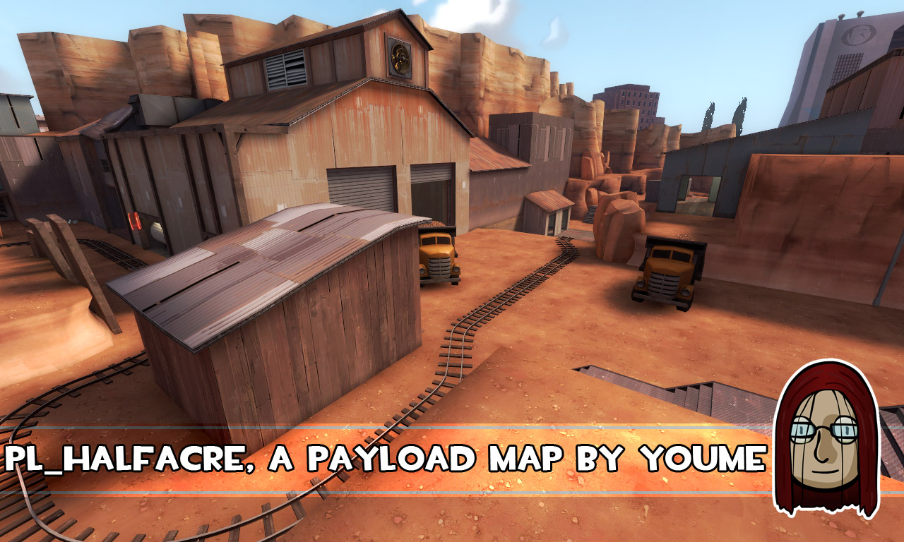
e.g. first cp, there is this looong big building at the right side, giving blu too much cover, too much space to setup a base if neccessary, its only a minor halt before the bomb moves on. I´d seal that off, although as red spy, i liked this building, because it was easy to get behind blu, way too easy.
make some passages tighter and slim down the road to give red a chance

the last point makes defending hard, because there is only a few good spots for sentries,
and those can be easily dismanteled by a good demo or far away soldier

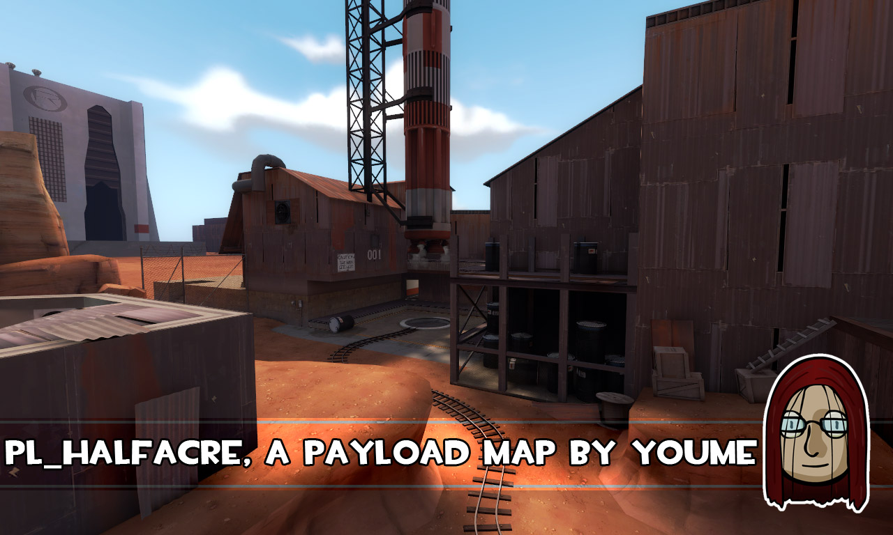
i believe that a more massive building here would make another good shelter for reds sentries.. the broken control room can be too easily taken a only servers blu as cover

i´m not saying people aren´t allowed to have such opinion, but:
A: Either you tell why it´s BS, or your opinion isn´t worth a penny
B: You need to backup your right for criticism by showing some of your work
C: I don´t know where that quote is from, but it kinda fits
"the louder someone shouts, the more you know he is wrong"
I´ve been in an arts forum for some years and really got sick of it, everyone took a handfull of honey and coated every piece of immature, unprofessional work with a thick crust of "WOW, thats unique and great". It was a horror.
As soon as i came in and layed down some profound critique, they all grouped together and got all defensive.
Point is, this forum is great and can handle criticism.
Point is, the banner might be smaller and concentrated to a single corner, but why do you bother with such a minimal matter
Point is, why not brand something you made when it´s a quality product. When i see a Youme map, i know what i´m getting. Why should it be an anonymous map?
That´s that
______________
to the map:
I love the displacement work and the flow
but honey is pretty much useless for a mapper, so:
the flow of the map is great (for blu), but unfortunately thats due to the lack of real chokepoints, which bring the neccessary climax up and downs to a payload map.
The turns are imho too wide, too much room around it to make it complicated for blu
e.g. first cp, there is this looong big building at the right side, giving blu too much cover, too much space to setup a base if neccessary, its only a minor halt before the bomb moves on. I´d seal that off, although as red spy, i liked this building, because it was easy to get behind blu, way too easy.
make some passages tighter and slim down the road to give red a chance
the last point makes defending hard, because there is only a few good spots for sentries,
and those can be easily dismanteled by a good demo or far away soldier
i believe that a more massive building here would make another good shelter for reds sentries.. the broken control room can be too easily taken a only servers blu as cover
Well I've pretty much turned _a6 into _b1 with some modifications based on gameplay tonight and some other additions.
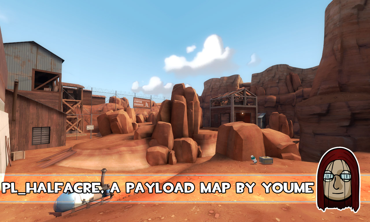
I've added more rocks in around the track, those hopefully should narrow things in a little and cut down some of the long sightlines.
I've also added in two new overlays which I'm about to upload for everyone to use
link to _b1 - http://forums.tf2maps.net/downloads.php?do=file&id=803
FPSB link coming once they fix their broken site - lol :lol:
I think eerieone's comments are pretty accurate. I do think you have a good choke point early in the map (right before the first turn), but there really aren't any through the rest of the map. On a map this size you'd probably want a decent choke point every 1/3rd of the map, so the first one is good but you might want to consider one more in the second half of the map.
I do like eerieone's first sketch, since that's one area I think is too wide open and redundant (if you want to run up, just follow the tracks). However, instead of blocking it completely like eerieone's sketch, you might want to consider making doors/windows or something in there so it's not completely split into two areas. I have another idea that I'll sketch right after dinner.
I also like the final sketch, but think you could also make use of the rock ledge across from the rocket. If you make ramps up there and block access a bit, you can add additional good sentry locations without otherwise modifying the area. It also partially addresses my complaint about the map not being vertical enough.
Most of the map is pretty good for sentry locations, which is a good improvement over hoodoo. I think creating some good locations in the last part of the map is key, however, since you want to make it very hard for the attackers to win. Adding some additional protected areas near the "control room" would definitely help.
edit: I need to stop typing so slow. You beat me by 7 minutes.
FPSB have fixed their map upload (but not the edit...) so here it is http://www.fpsbanana.com/maps/72535
cornontheCoD
L420: High Member
- Mar 25, 2008
- 437
- 70
I played it for the first time on gameday, and I thought it was pretty good. I liked it better than Hoodoo, but I only got to play hoodoo one time. I pretty much agree with the previous comments from gameday.
and to anyone complaining about the banners: while Youme's taking that extra time to put his banner on each screenshot, you can use that time to try and make your own map better
and to anyone complaining about the banners: while Youme's taking that extra time to put his banner on each screenshot, you can use that time to try and make your own map better