WiP in WiP, post your screenshots!
- Thread starter Arhurt
- Start date
You are using an out of date browser. It may not display this or other websites correctly.
You should upgrade or use an alternative browser.
You should upgrade or use an alternative browser.


Nitpicking, but, you can edit your posts.Little update


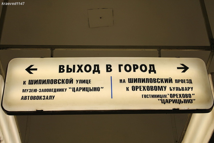
Whoa, that custom texture doesn't fit the TF2 style very well, bruh. You should add some scratches, wear, and tear, and use colors other than straight black and white, mah dude. I'm also not sure about those arrows, browski. You should give them more visual weight, try making them heavier, like the style on the left, homeslice.

Well, I was going for the look of real world subway signsWhoa, that custom texture doesn't fit the TF2 style very well, bruh. You should add some scratches, wear, and tear, and use colors other than straight black and white, mah dude. I'm also not sure about those arrows, browski. You should give them more visual weight, try making them heavier, like the style on the left, homeslice.


Empyre
L6: Sharp Member
- Feb 8, 2011
- 309
- 187
The sign in the photograph is kind of creamy yellow instead of stark white, with darker areas around the edges. There is also evidence of wear around the edges. If you duplicate that and change the arrows like Beef Bucket suggested, it would look a lot like the real sign in the photo, but also fit better in TF2's style.Well, I was going for the look of real world subway signs

By the way, if you're looking for a font that's more like these signs, I recommend DIN Bold.It looks too... neat. I'd have gone for something like this:

Chunkier text, sharper angles on the sign, maybe some wear and tear as well.

is this going to be 2cp koth?I think this is the prettiest WIP I've done before! I'm really happy with it so far.
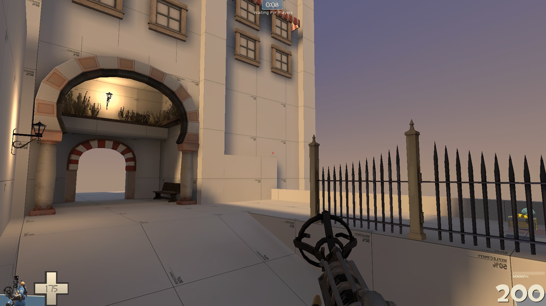
Also, does anybody else do this when planning out a map? I find it pretty useful because I can have poor memory.
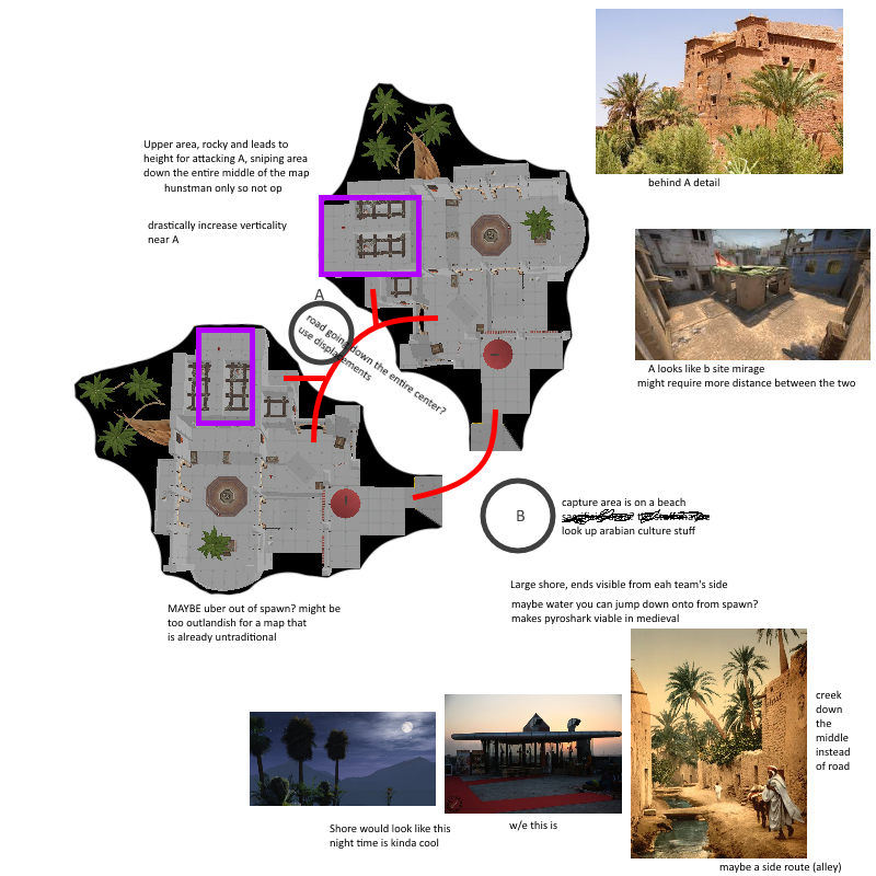
less windows and its good to goI think this is the prettiest WIP I've done before! I'm really happy with it so far.
Also, does anybody else do this when planning out a map? I find it pretty useful because I can have poor memory.
Quite unique, I wonder how it will develop!It's going to be player destruction with 2 capture zones, but a shelter styled cp maps sounds really cool
Edit: You should totally consider putting a lake that connects two cps and flows to the sea!
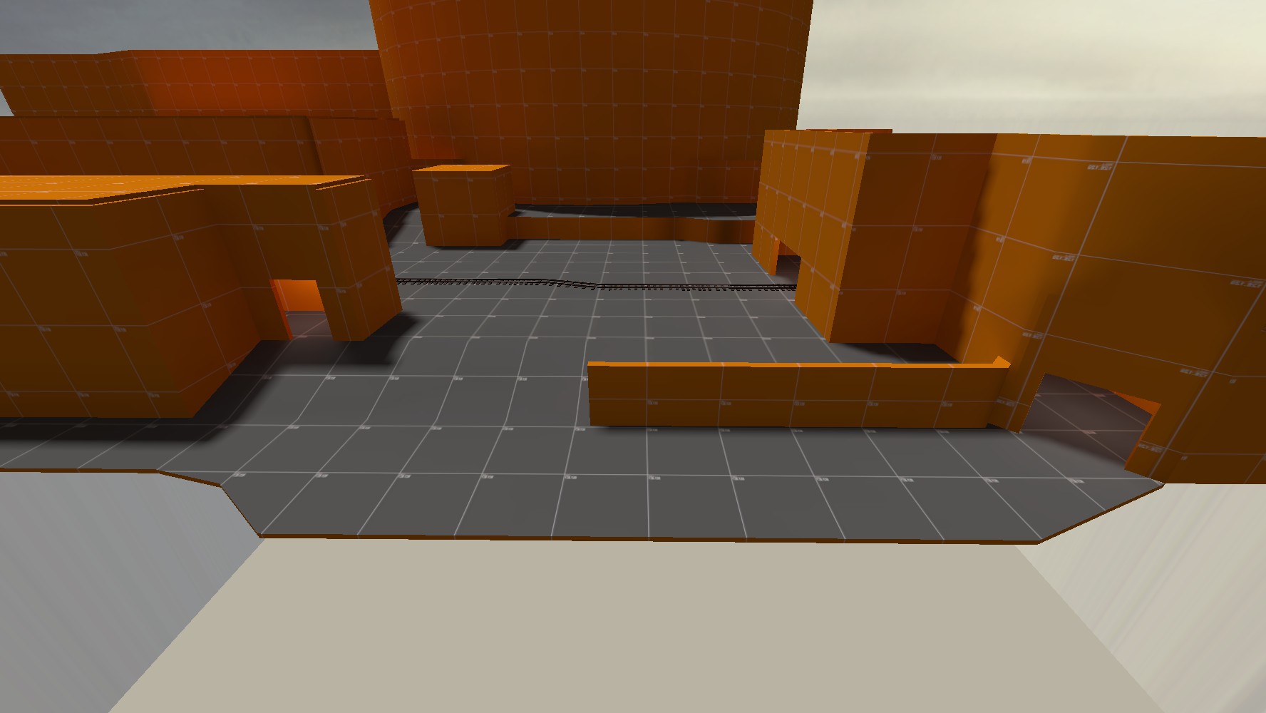
Discount Dustbowl
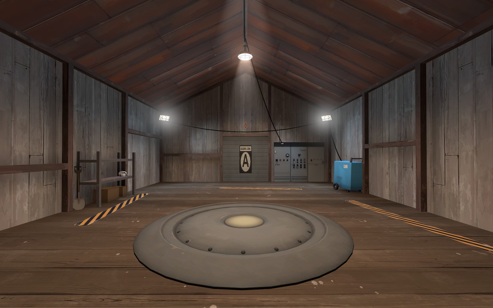
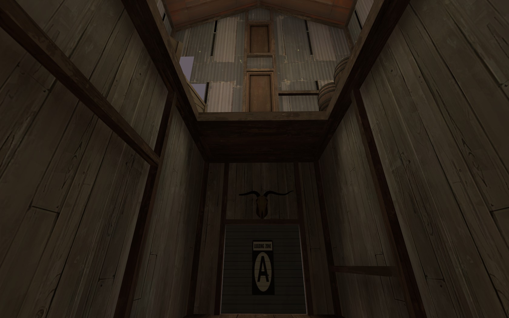
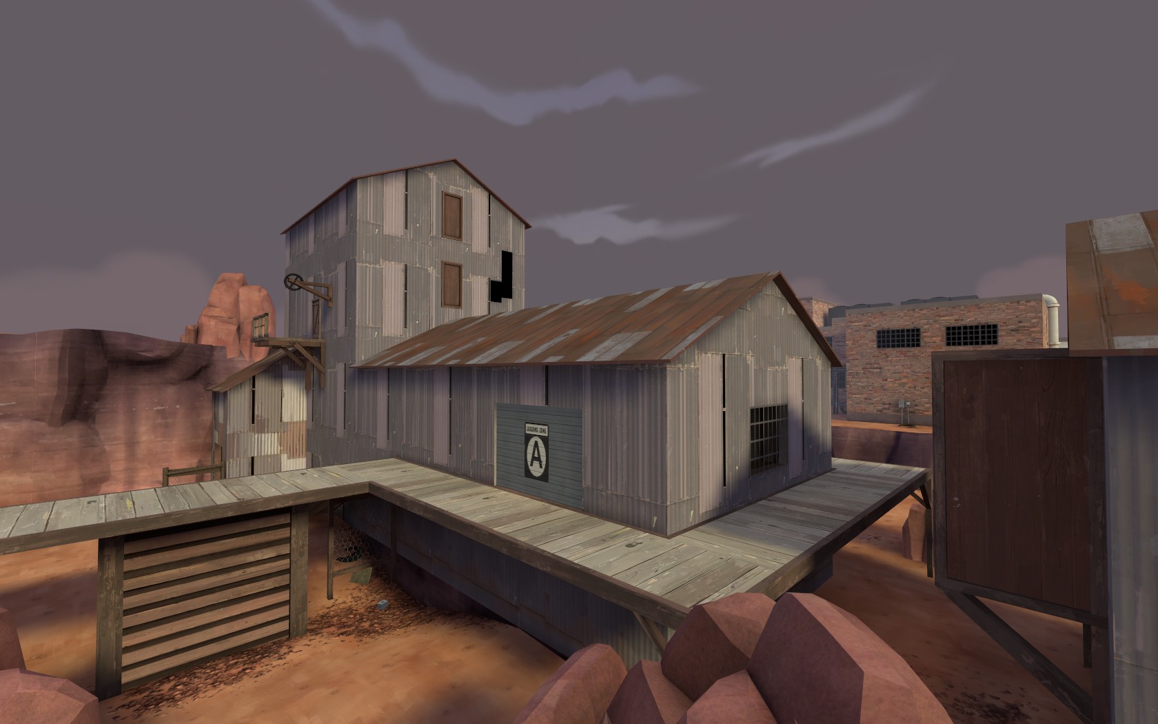
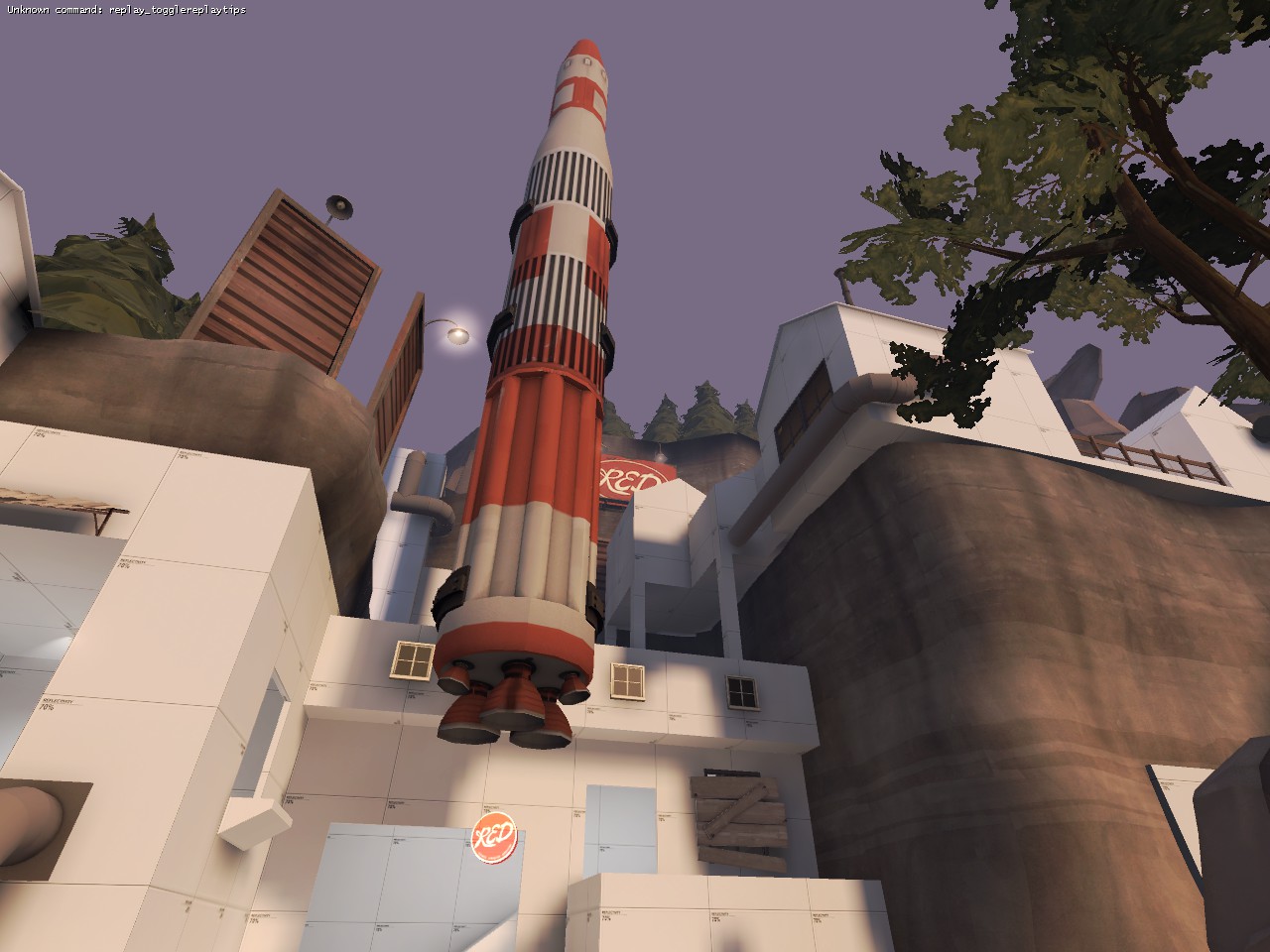
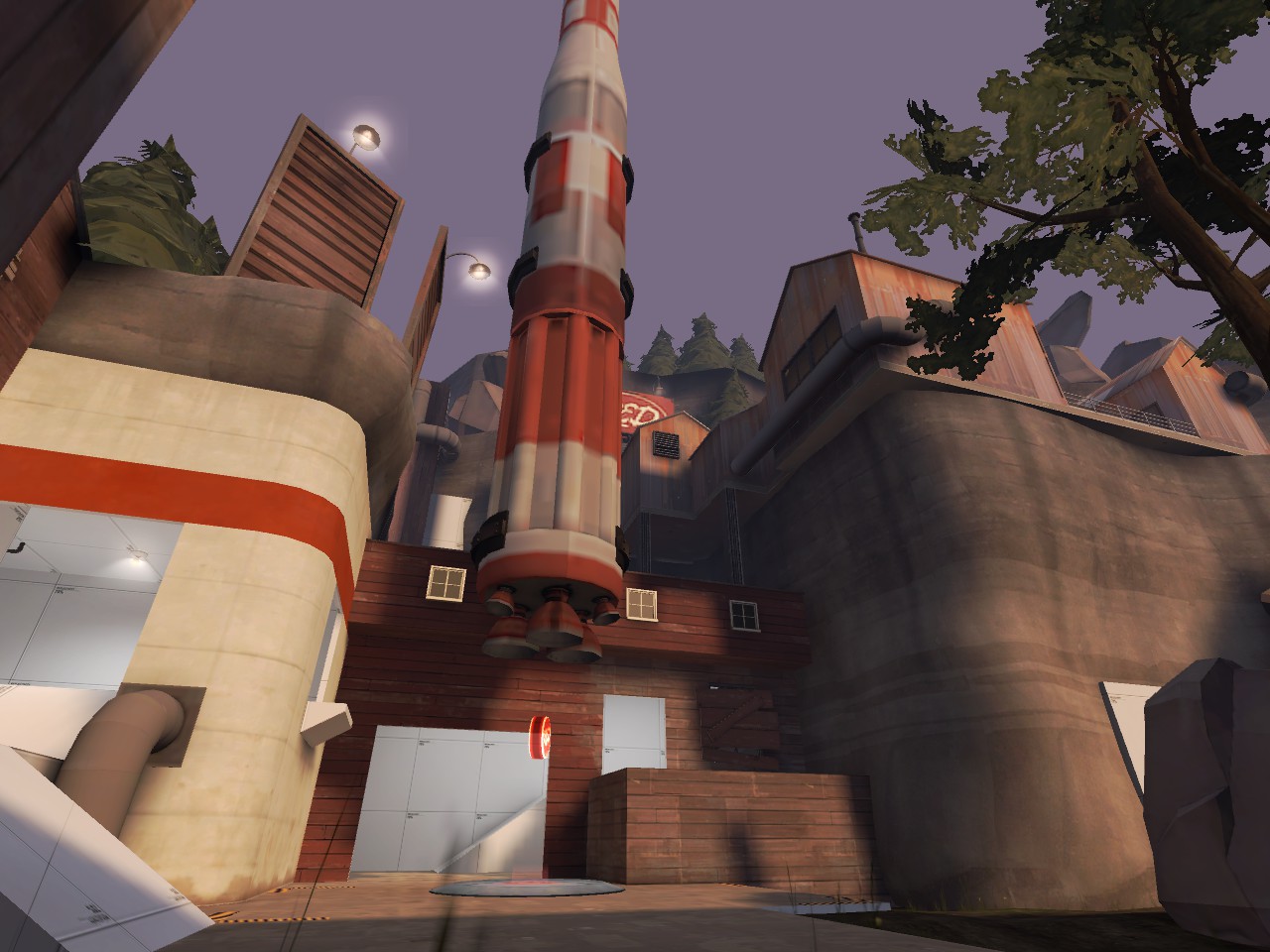
I might not place a wooden building next to the engine of a rocket... but I otherwise love the detailing, great work!
Wood doesn't look good there, I'd stick to the concrete pattern you've got going on the left
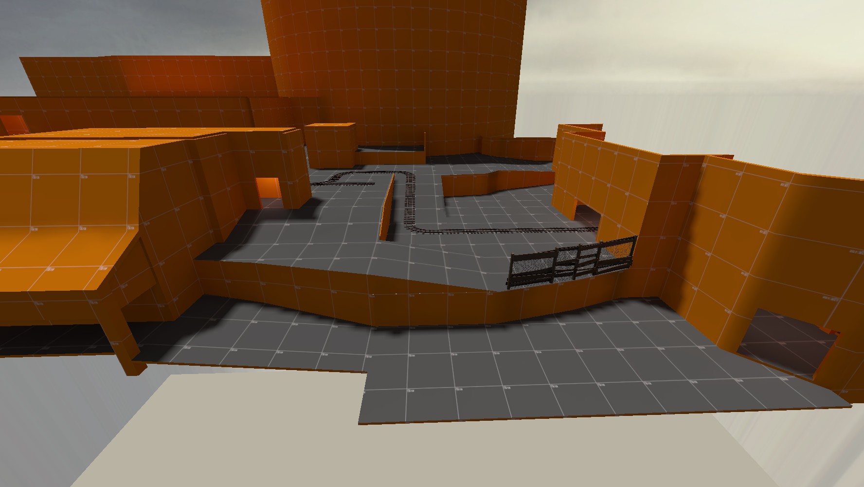
Discount Dustbowl