Clearbridge A1
Small experimental map with Badlands spires, prominent water, and dynamic one-way windows.
I've occasionally dabbled in mapping on-and-off for the past few years, and a few days ago started "doodling" a small KotH map while brushing up on some tutorials. It started with a couple of Badlands spires facing each other diagonally before things started to take shape, which inspired the use of a lot of angled geometry in the map after rebuilding the initial sketch.
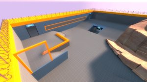
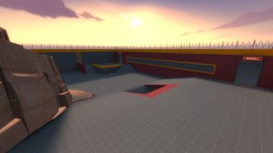
Granted, the map right now is still somewhat in the "stuff in a box" stage and it's rather small even for a KotH map, having no real intermediate area between the zone outside spawn and the point section. That said, there's a lot of cover and an attempt to keep long sightlines limited.
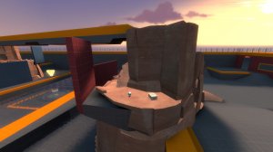
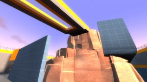
Highlights of the map are the two spires, which connect to each other at the top via a bridge with a windowed floor (the eponymous "clear bridge") and a small medkit. Below that, is the point, which - along with the surrounding area - is partially flooded, with deeper pockets out near the edges. Each side also has a little "house" with pick-ups inside and a perch with some cover on its roof.
The most unusual feature, I'd say, is the prominence of windows, especially one-way ones. While those are nothing new in TF2, they're usually relegated to letting players peek out of spawnrooms. While that's still the case here, there are also a couple more in areas of cover that are meant to let you safely look out into wider spaces without even being seen. But the big twist is that the one-sidedness of everything but the spawn windows is tied to ownership of the point, allowing each side's hidden information to change depending on who is attacking and defending; the attackers have an easier time sneaking to the point while the defenders' movements are more exposed. So while the map is small, I think I managed to give it a decent amount of nooks and crannies without being overly complex or too cramped. Of course, it's highly experimental.
Overview
Additional Images
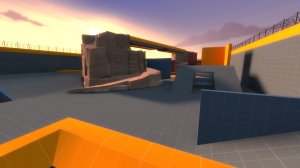
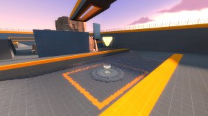
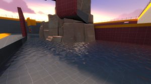
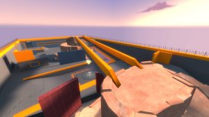
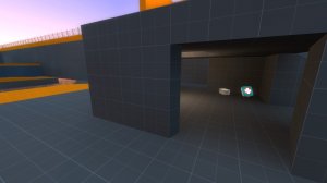
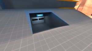
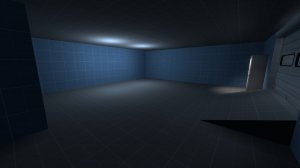
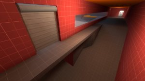
I hope it's enjoyable. Past three days were spent making it, but I think I've got something interesting.
One last note: I'm aware that the bloom can be a little overbearing if you're using HDR, especially on the orange meshes if you're looking away from the sun. All the lighting was set up before I turned on HDR, so the numbers are a little out of whack. It's still totally playable, though.
