KotH Eros RC2a
- Thread starter Bakscratch
- Start date
You are using an out of date browser. It may not display this or other websites correctly.
You should upgrade or use an alternative browser.
You should upgrade or use an alternative browser.


https://en.wikipedia.org/wiki/SantoriniHmm, remebers me a little bit of Ilios.")
Santorini? TF2 is really becoming more like CS:GO every day
In all seriousness, your hyping was justified. Can't wait to play rounds on this.
Edit: Wait... I just recognized the map. I seriously hope you've removed that screaming.\
Edit 2: BIRDS, BAK. YOU'VE OFFICIALLY OUTDONE YOURSELF.
In all seriousness, your hyping was justified. Can't wait to play rounds on this.
Edit: Wait... I just recognized the map. I seriously hope you've removed that screaming.\
Edit 2: BIRDS, BAK. YOU'VE OFFICIALLY OUTDONE YOURSELF.
Last edited:

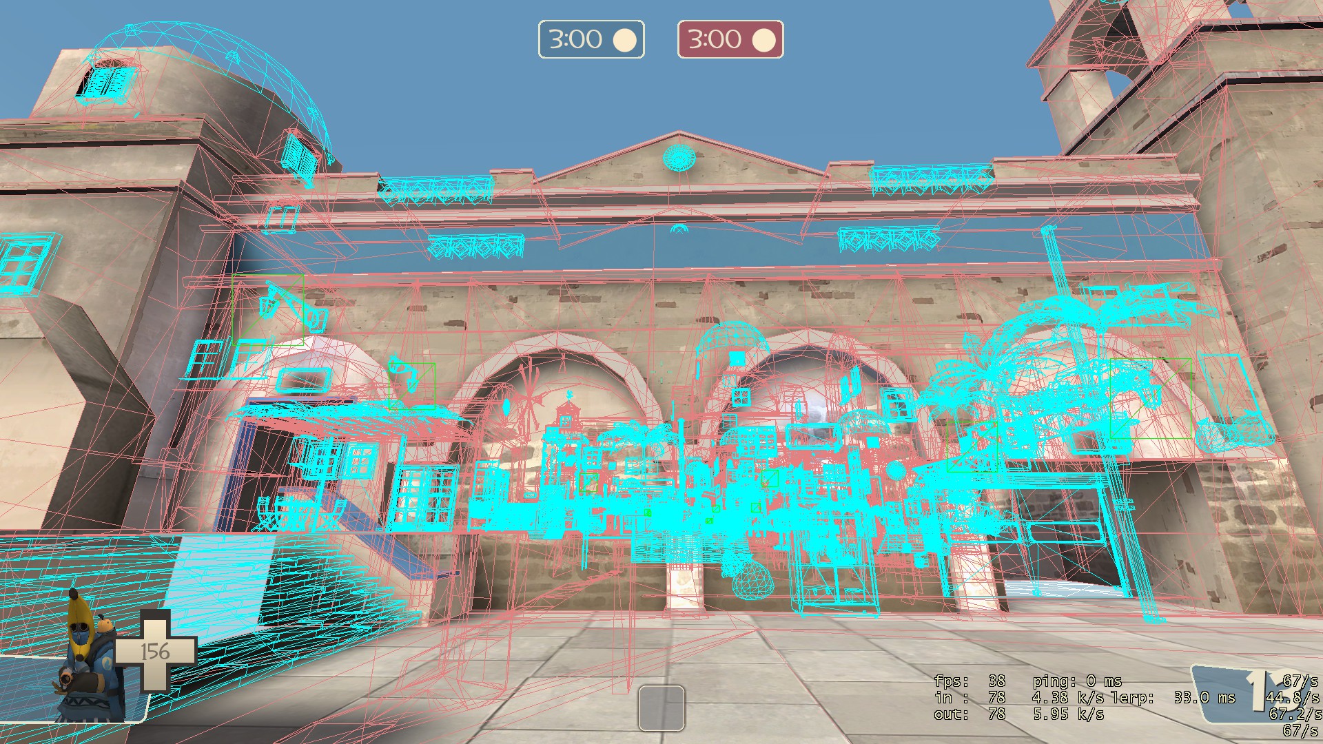
map looks and plays great, but when I put it on a server I got a lot of people saying that their fps was dropping badly. So yeah this definitely needs optimization work
I haven't walked the map yet, but if the cliff and cliff buildings are in the skybox, you should be able to put skybox brushes over the top of any building that can't be jumped on. Combined with good use of hint brushes + areaportals, should be able to cordon off at least some areas for optimization.
The building in Zed's screenshot looks like a prime candidate for this treatment.
The building in Zed's screenshot looks like a prime candidate for this treatment.
I haven't walked the map yet, but if the cliff and cliff buildings are in the skybox, you should be able to put skybox brushes over the top of any building that can't be jumped on. Combined with good use of hint brushes + areaportals, should be able to cordon off at least some areas for optimization.
The building in Zed's screenshot looks like a prime candidate for this treatment.
There is indeed a skybox brush on top of that building, I was investigating it on the server. In fact, from a certain angle, you can slightly see where the skybox brush occludes a non-func_detailed brush, even though it's pretty non-obvious.
Optimization is not my strong point, but I'd imagine you could extend a huge areaportal through the ocean, as well as put some in the doorways? If that's possible, and if you're not doing that already.
Last edited:
- Oct 11, 2013
- 273
- 413
RataDeOrdenador
L5: Dapper Member
- Oct 12, 2015
- 230
- 105
I was like "why does this map have the same layout as koth_ripntearmidi?" Now I know why... jesus. :V
I really love DEM BIRDS! They're so good and gives you that "coasty" atmosphere. But there's something I (at least) would change:
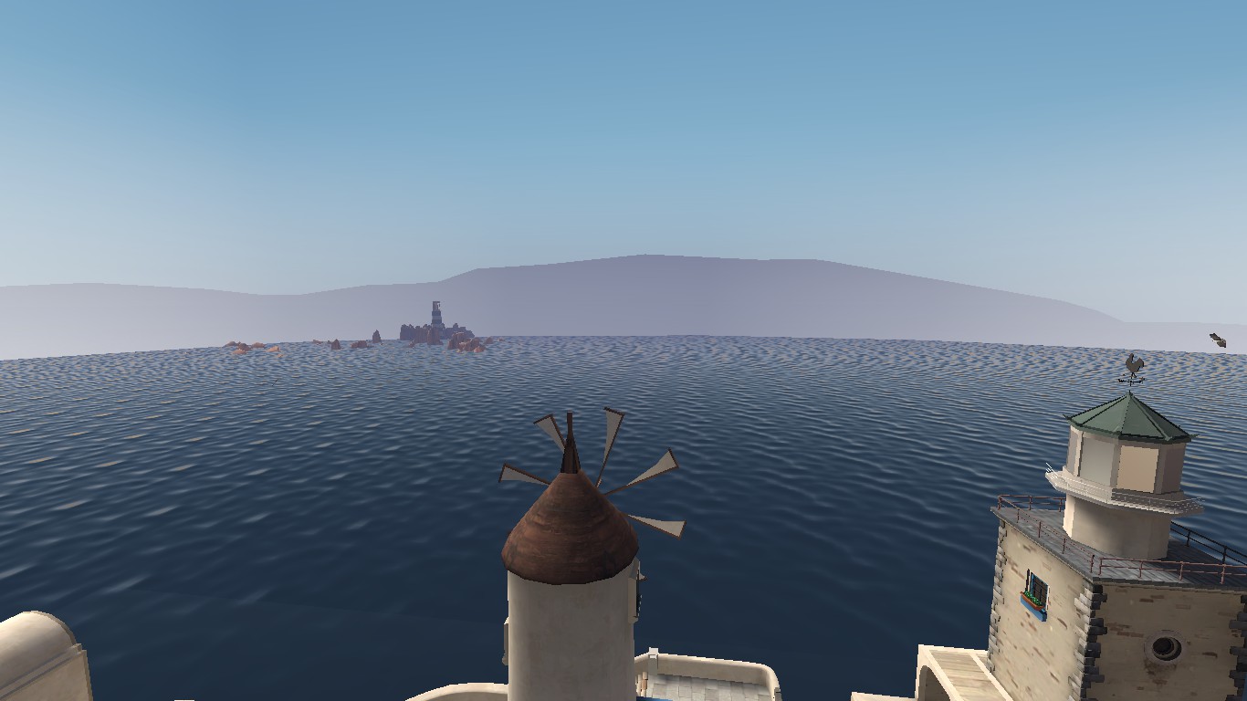
Those mountains at the BG. They look odd,and well. They basically don't fit at all with the map. It's like this "island" is just in the middle of the biggest lake in the world. And since the seagulls (they're seagulls,right? Or maybe SEAGALS?) are more into the coast/beach/ocean,removing that bg might be the best idea IMO.

And these pictures were made on the limit of the skybox. There's a TON of nodraws that ruins the beauty of this map. Since it's a symmetrical map,both sides have the same problems.
Other than that (and that "optimization" part),I think it looks really awesome. My body is ready to test this map. ò3ó
I really love DEM BIRDS! They're so good and gives you that "coasty" atmosphere. But there's something I (at least) would change:
Those mountains at the BG. They look odd,and well. They basically don't fit at all with the map. It's like this "island" is just in the middle of the biggest lake in the world. And since the seagulls (they're seagulls,right? Or maybe SEAGALS?) are more into the coast/beach/ocean,removing that bg might be the best idea IMO.
And these pictures were made on the limit of the skybox. There's a TON of nodraws that ruins the beauty of this map. Since it's a symmetrical map,both sides have the same problems.
Other than that (and that "optimization" part),I think it looks really awesome. My body is ready to test this map. ò3ó

Generally this looks kinda nice but there's a lot of room for improvement, so harsh words follow:
The overall lighting is blaaaaaaaaaaaaand as fuck everythings so uniformly lit. Make the ambient darker and the direct light brighter, or maybe just fiddle with tonemap and bloom values?
Change these to point lighting, it oughtn't affect the overall lighting much but it'll get rid of the blotchy shadows:

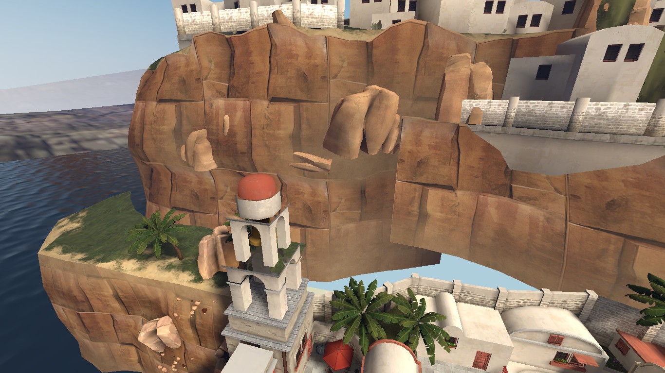
This looks like garbage:

It's super blocky which doesn't really mesh with the rest, the stones down the side are way too dark, the contrast is eeeeeeeehhhhhhh then the top bit looks sort of plonked on and doesn't really look like it belongs at all
The cliff texture is naaaasty, iirc it's meant to be a filler material for some modelled rocks that were cut from the game before launch. but it may have been in dustbowl or 2fort? either way, nasty lookin
Where are all da boats?
The overall lighting is blaaaaaaaaaaaaand as fuck everythings so uniformly lit. Make the ambient darker and the direct light brighter, or maybe just fiddle with tonemap and bloom values?
Change these to point lighting, it oughtn't affect the overall lighting much but it'll get rid of the blotchy shadows:
This looks like garbage:
It's super blocky which doesn't really mesh with the rest, the stones down the side are way too dark, the contrast is eeeeeeeehhhhhhh then the top bit looks sort of plonked on and doesn't really look like it belongs at all
The cliff texture is naaaasty, iirc it's meant to be a filler material for some modelled rocks that were cut from the game before launch. but it may have been in dustbowl or 2fort? either way, nasty lookin
Where are all da boats?
Or just disable self-shadowing.Change these to point lighting, it oughtn't affect the overall lighting much but it'll get rid of the blotchy shadows: