Got bored, had a run around. Some layout feedback for a map I haven't played:
Routing immediately out of blue spawn is pretty messy. What I assume is the main route uses a respawn door frame for sizing, which I generally consider a "medium" size door. A large door feels more appropriate if that's where the bulk of blue team is expected to push. I recommend a head clearance of 160 units minimum so players can't bonk their head while jumping. A large billboard arrow sign and a lighting cue pointing blue this way would also help signpost it as the main route.
The secondary route is
really complicated. It reminds me of Gorge, which has a very similar path out of blue spawn into the flank on the left. The difference here is that, when a player on Gorge sees that exit they want to use, they can easily trace the path back to the stair they need to use to get there. Here, the path is considerably more complex and the exit is a bit hidden. I would recommend widening the building on the left to encompass both halves of the stair, making the doorway into the building more visible and making the gameplay space inside the building more interesting.
A blue player will not see this doorway.
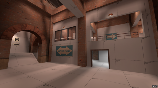
When heading out of the main route, these two options seem equally important, but the one on the right leads directly to the point while the one on the left is a cramped flank of sorts. I would recommend making the left door smaller so it reads as a flank.
This exit feels like a more appropriate place for the main blue push, assuming the road and the silos are intended to be the main paths to the point. The current exit puts the road quite far away. Also...
Consider simplifying the geometry here so that blue has a single large elevated platform. This, with the health and ammo, will signal to blue team that this is a good place to hold before pushing into the point.
Consider simplifying this stair to a 90 degree angle instead of a 180.
First, I think the routing in this building is a bit of a mess. The main route is not very intuitive and could stand to be simplified. The cramped flank route is directly in front of players and I would not be surprised if a lot of players take it without thinking. In addition, the flank is a considerably shorter path forward than the main path, which feels... off? I don't know how to articulate why this is a problem, and it might not be one.
Secondly, a lot of the geometry in this building is pretty confusing. I feel like the basic layout makes sense, but having archways everywhere subdivides a single contiguous gameplay space into several smaller ones, making it harder to understand at a glance or hold in memory. Consider removing arches in locations that are not really dividing two distinct gameplay spaces so that the space reads more like one large room with columns in it. For instance...
This area is an good example of what I think more spaces in this building should feel like.
Here's a suggestion of what a more intuitive main route / flank setup might look like:
The high ground is accessed directly forwards from the main route rather than requiring several turns. The flank route is lowered into the ground to fit underneath the ramp.
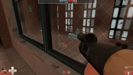
I don't have much to say about B, there's nothing obviously wrong with it.
Overall the map looks pretty slick and I think there's a good overall structure to work with - certainly better than a lot of the maps I've seen in playtests. Have fun iterating!