WiP in WiP, post your screenshots!
- Thread starter Arhurt
- Start date
You are using an out of date browser. It may not display this or other websites correctly.
You should upgrade or use an alternative browser.
You should upgrade or use an alternative browser.
Kill_the_Bug
aa
- Oct 6, 2008
- 1,969
- 451
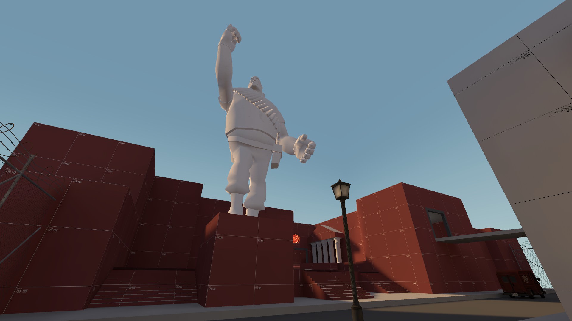
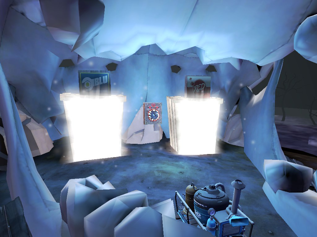
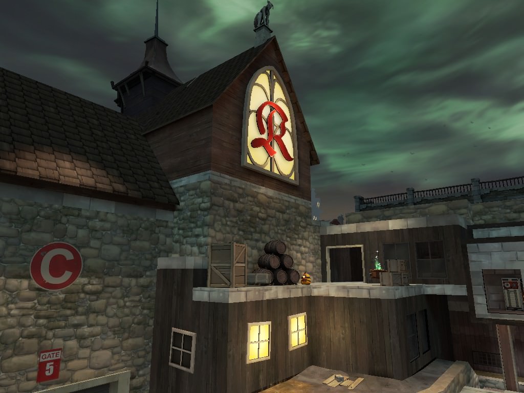
My first bit of creativity in months - looking at doing another space themed map - any ideas on how to incorporate these into it? I really like the feel of these two images.


Empyre
L6: Sharp Member
- Feb 8, 2011
- 309
- 187
Kill_the_Bug
aa
- Oct 6, 2008
- 1,969
- 451
Yep I realize that for the game play, how do you think I can incorporate it as a visual someplace? Maybe a lab that players can't get to?
marshmallie
L2: Junior Member
- Oct 4, 2014
- 51
- 155
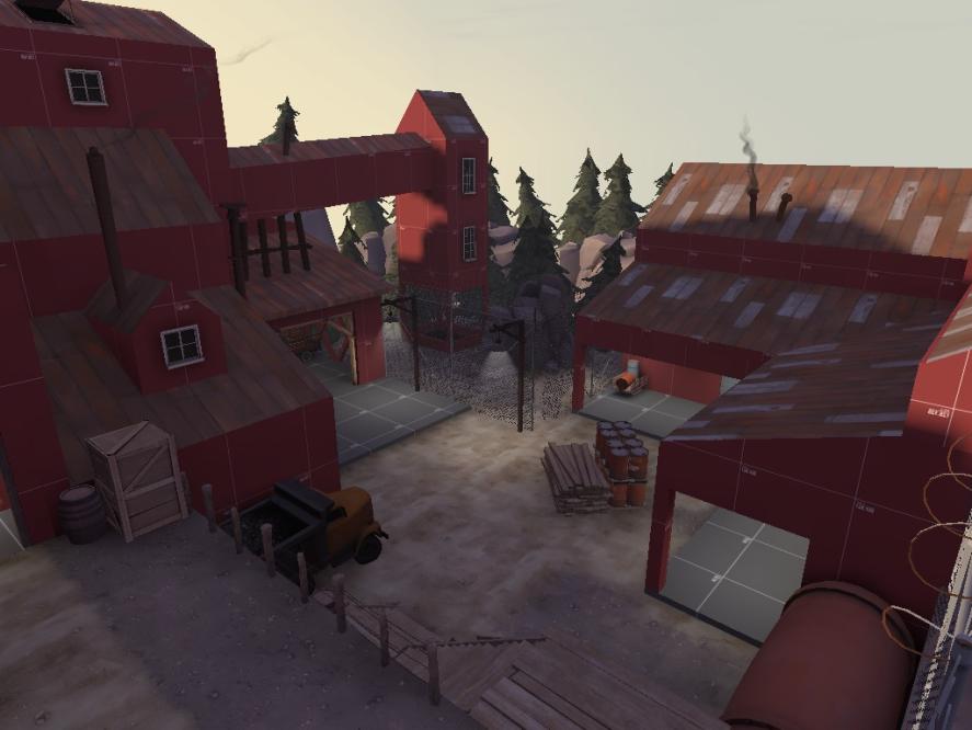
Wow, that looks amazing, minor issue is that some grass sprites, particularly on the right side, are clipping through stairs. Also, the pine tree, next to the hp/ap looks a little weird, why is a tree growing in such an enclosed space? and why would the people who own the place let it keep growing? It might become a problem if it grew any larger.Finishing up on an artpass!
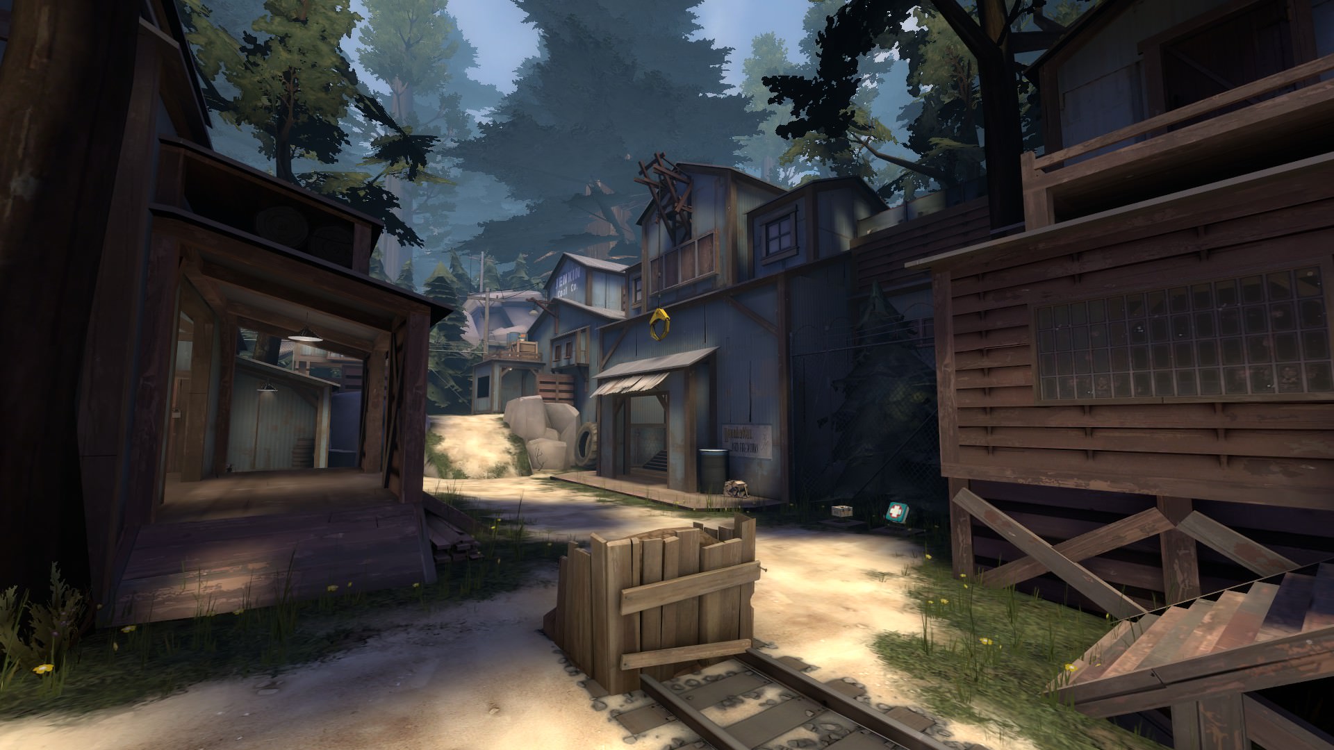
Other than that, I can't really see anything that you might want to change.
What's the map you're detailing?
- Jul 10, 2017
- 644
- 597
Yes... in the universe of TF2, time and growth is an enormous problem. If only maps didn't have to deal with this.It might become a problem if it grew any larger.
I suppose it kinda makes sense, but I'm just saying you don't have to change it.
Looks really really good! One of my favorite aesthetics in tf2Finishing up on an artpass!

marshmallie
L2: Junior Member
- Oct 4, 2014
- 51
- 155
- Jul 10, 2017
- 644
- 597
P
Prosciutto
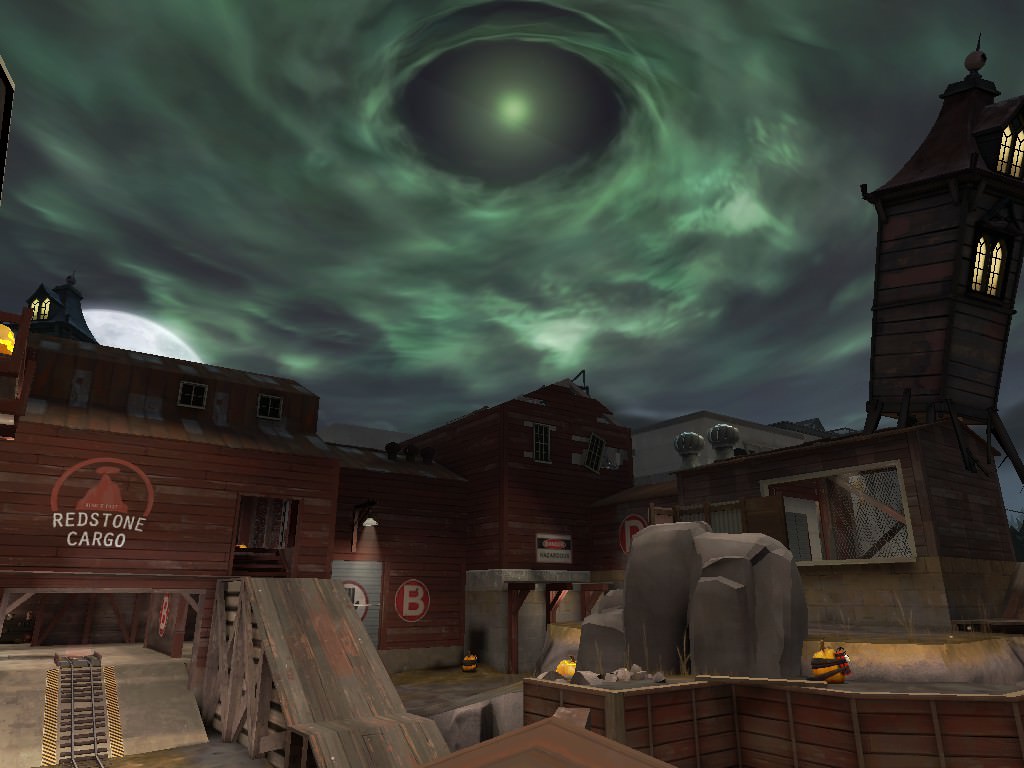
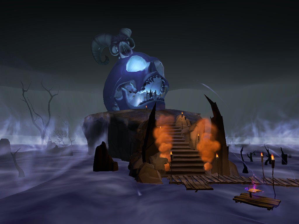
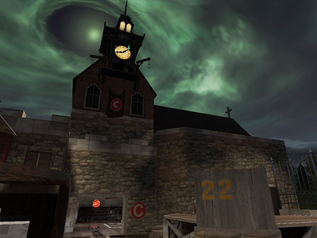
i want the map to be set in a haunted scottish castle or something like that@Kobolite Oh wow, that's actually starting to look really good! Tbh, I thought it was going to be one of those event maps where they just retexture some buildings and add pumpkins. Here it looks like you actually redesigned some components.
- Jul 10, 2017
- 644
- 597
The kinda inside spy tech area looks a bit weird. I don't think the computer walls really fit the position.Recently I've been making a fully-artpassed port of Blood Covenant from quake champions into TF2, and here's what I got so far

