WiP in WiP, post your screenshots!
- Thread starter Arhurt
- Start date
You are using an out of date browser. It may not display this or other websites correctly.
You should upgrade or use an alternative browser.
You should upgrade or use an alternative browser.
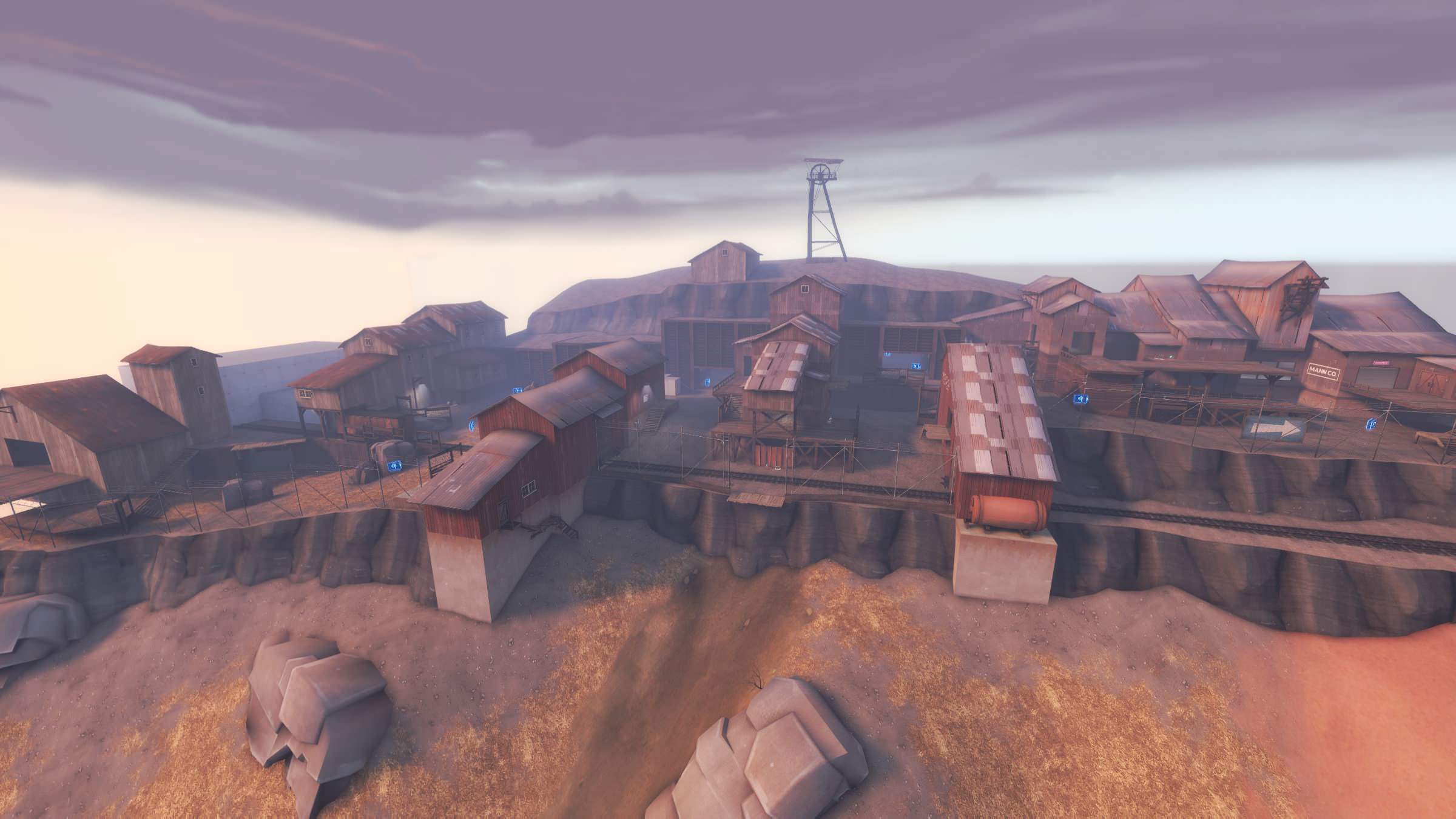
I really like how the center of the hill looks like a mudslide, with the texture stretching down the middle and the rock prop being tilted to the side. It really feels like there was some sort of outside force or presence there. Good job!
some hoto b11 wip shots,
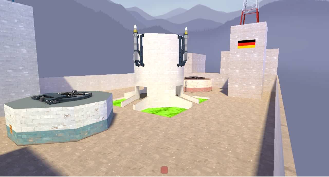
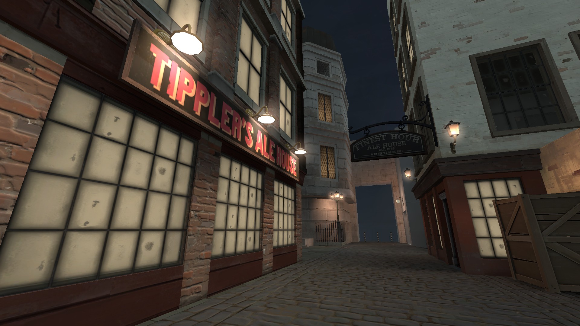
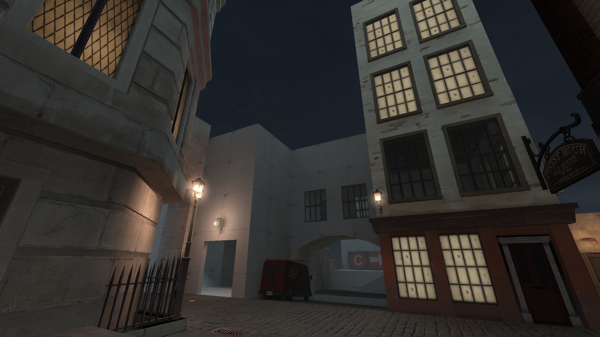
metals are now shinier than before, removed the poor team-colored-wall-textures and replaced with flags, experimenting with letters in the hud to show new players what capture point needs to be defended/attacked (it's not tf2 standard for 5cp maps, but as you know I don't mind experimenting with non-standard stuff)
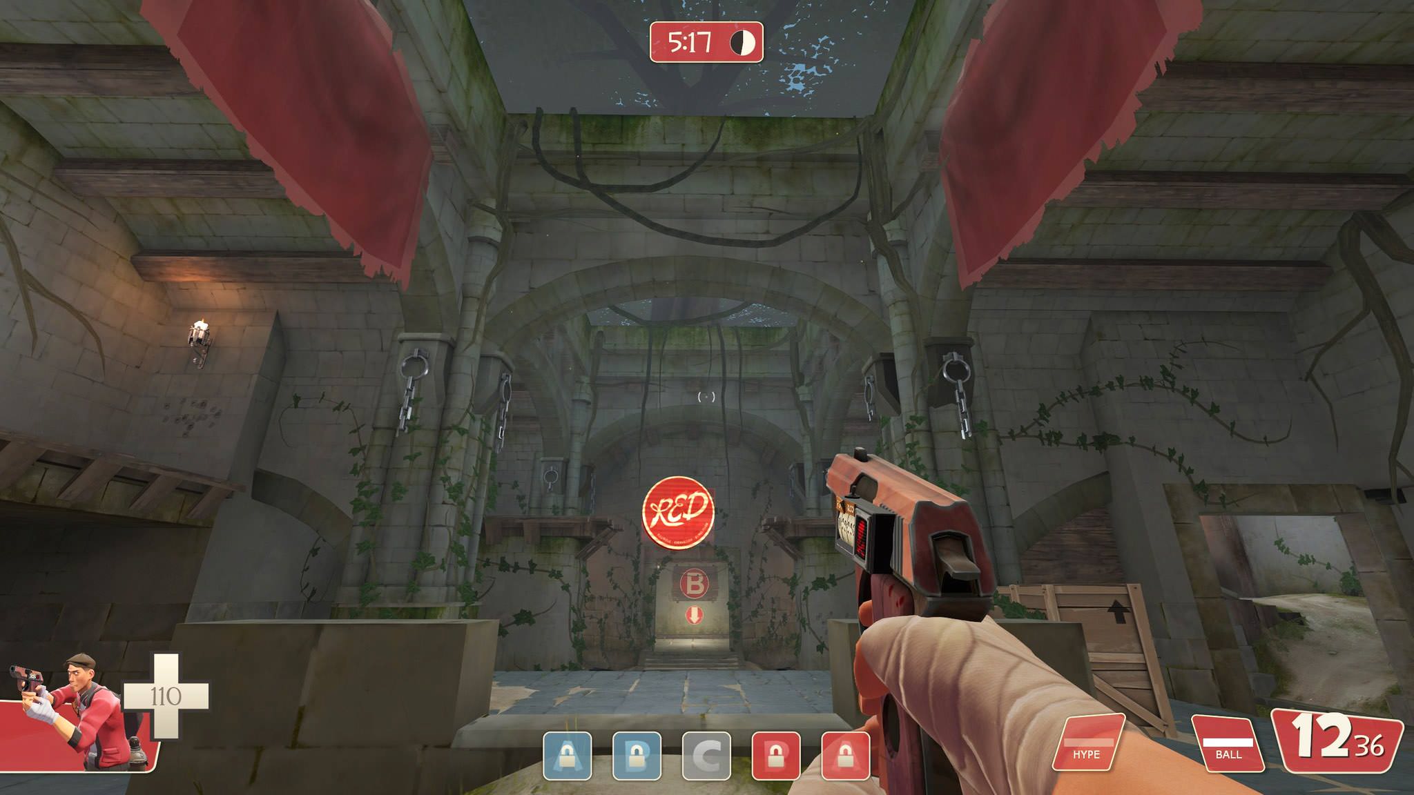
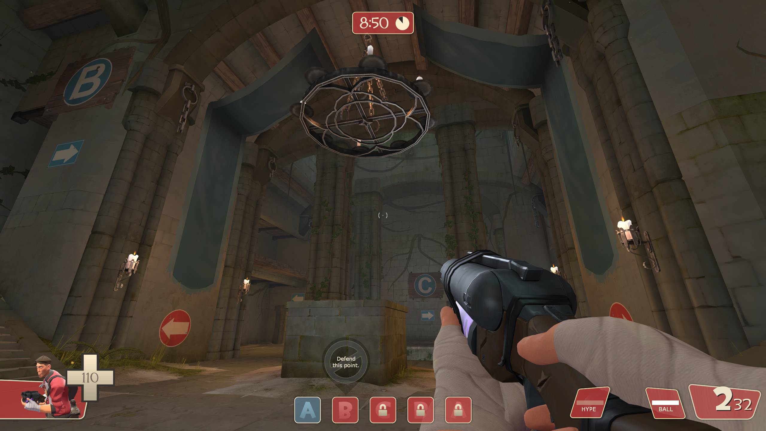
metals are now shinier than before, removed the poor team-colored-wall-textures and replaced with flags, experimenting with letters in the hud to show new players what capture point needs to be defended/attacked (it's not tf2 standard for 5cp maps, but as you know I don't mind experimenting with non-standard stuff)


Some Guy you know?
L1: Registered
- Jun 28, 2017
- 16
- 2
What strikes me is that there's almost no light and shadow. Like, if I unfocus my eyes, the stonework in the first picture is basically a solid-colored blob.some hoto b11 wip shots,
metals are now shinier than before, removed the poor team-colored-wall-textures and replaced with flags, experimenting with letters in the hud to show new players what capture point needs to be defended/attacked (it's not tf2 standard for 5cp maps, but as you know I don't mind experimenting with non-standard stuff)


----------------------------------------------------------------------------------------
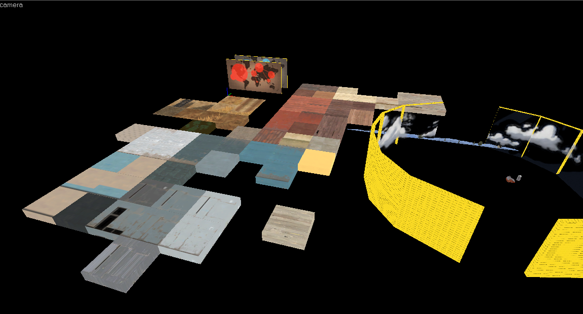
this is an map idea which i terribly drawn
P
Prosciutto
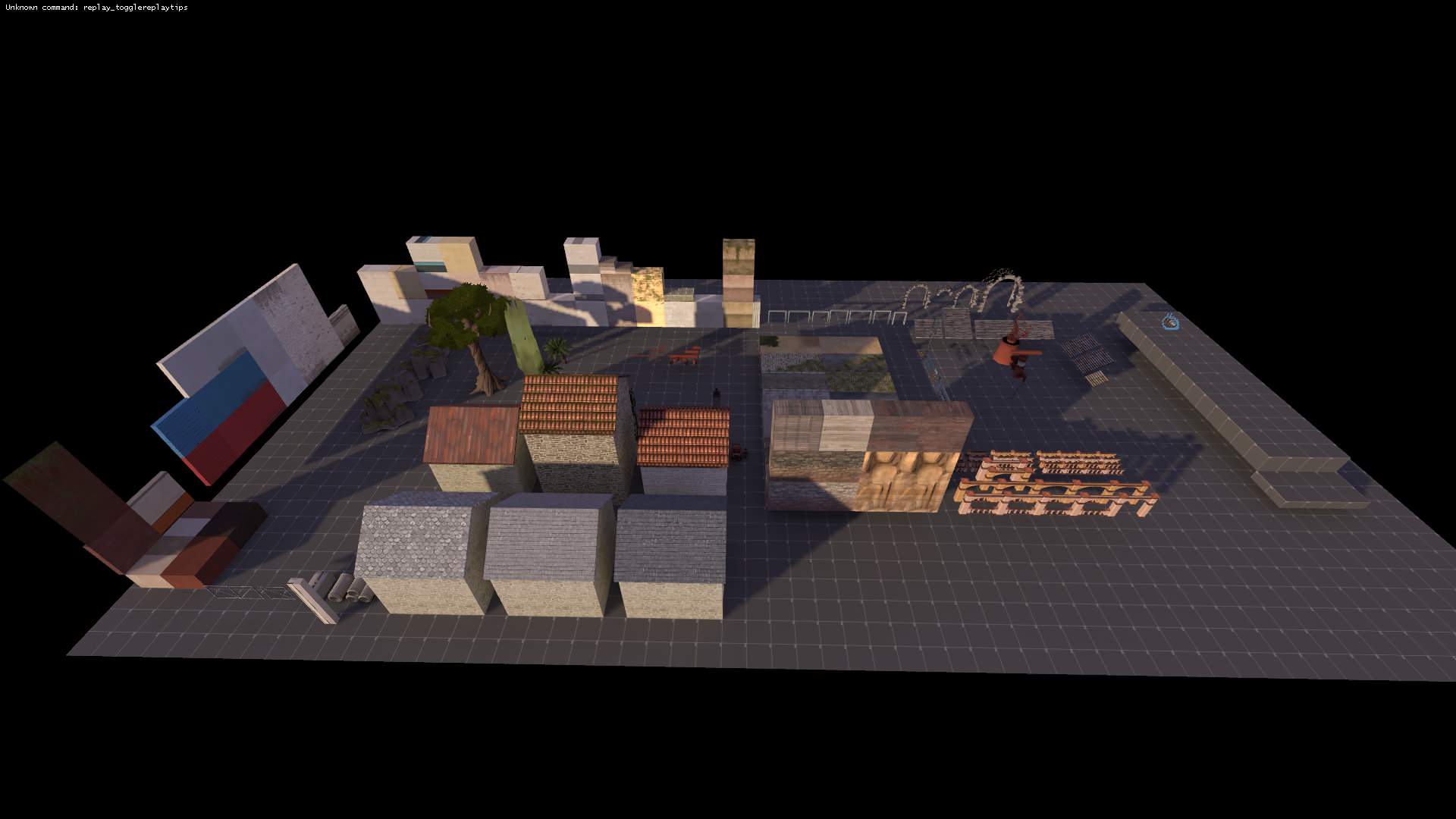
I'm a big fan of zoos. (72hr Jam prep)
Now I think I should do the same for my theme.
Now I think I should do the same for my theme.
Making a zoo is a phenomenal way to prep for a Jam. It's the only reason I was able to finish a map in the 7.2 Hour Contest...
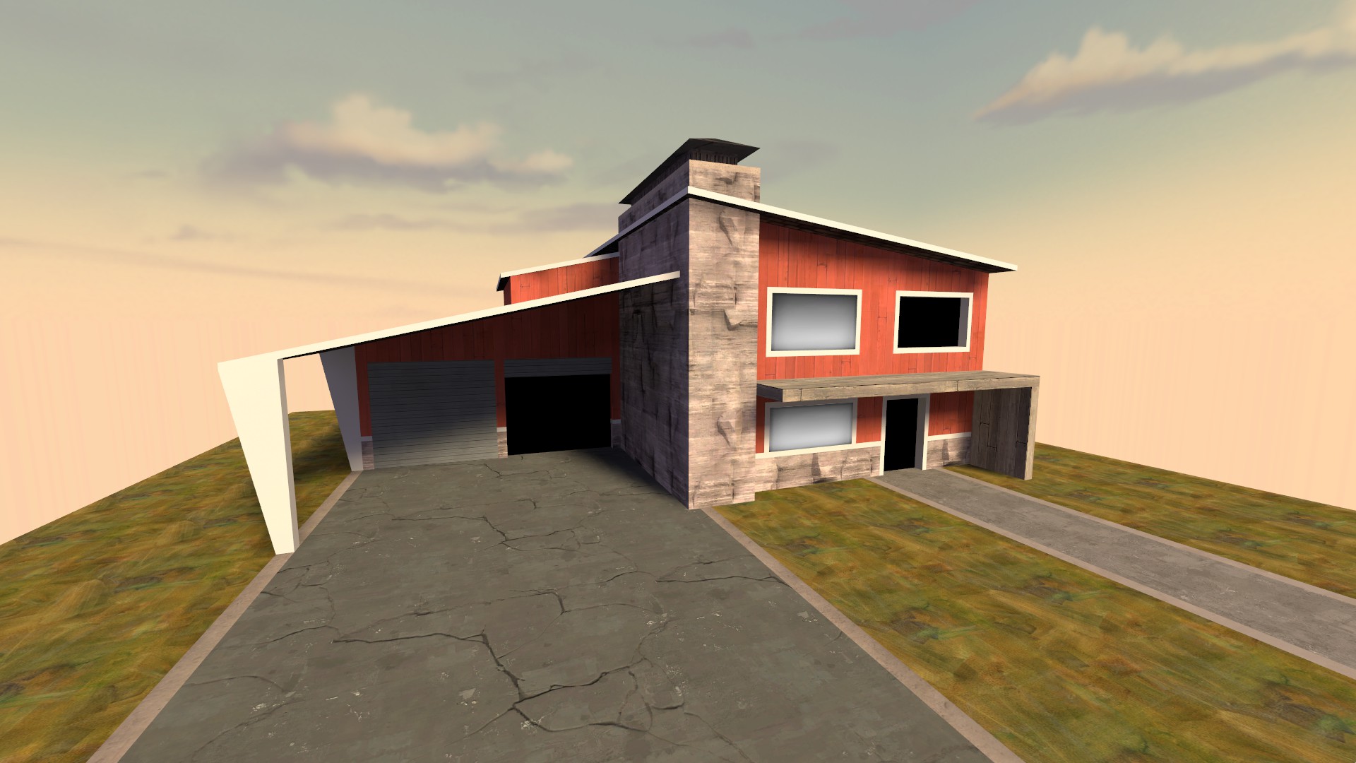
nuketown styleguide
it somehow fits and doesn't fit tf2 at the same time
i like it


