We must have different definitions of "cool", because to me it makes it look like an asset from a cartoon game accidentally got put in a TF2 map.It can look cool if you get the seam right on the edge of the brush.
WiP in WiP, post your screenshots!
- Thread starter Arhurt
- Start date
You are using an out of date browser. It may not display this or other websites correctly.
You should upgrade or use an alternative browser.
You should upgrade or use an alternative browser.
- May 21, 2009
- 2,039
- 1,484
We must have different definitions of "cool", because to me it makes it look like an asset from a cartoon game accidentally got put in a TF2 map.
>2014
>tf2
>not a cartoon game


The japanese for "greenhouse" is grinhausu so i'm thinking of using the japanese for "garden"
And then proceed to put chinese signs everywhere?
Shanghai
aa
- Jan 8, 2011
- 397
- 393


Ice Crystal
L2: Junior Member
- Feb 28, 2013
- 78
- 91
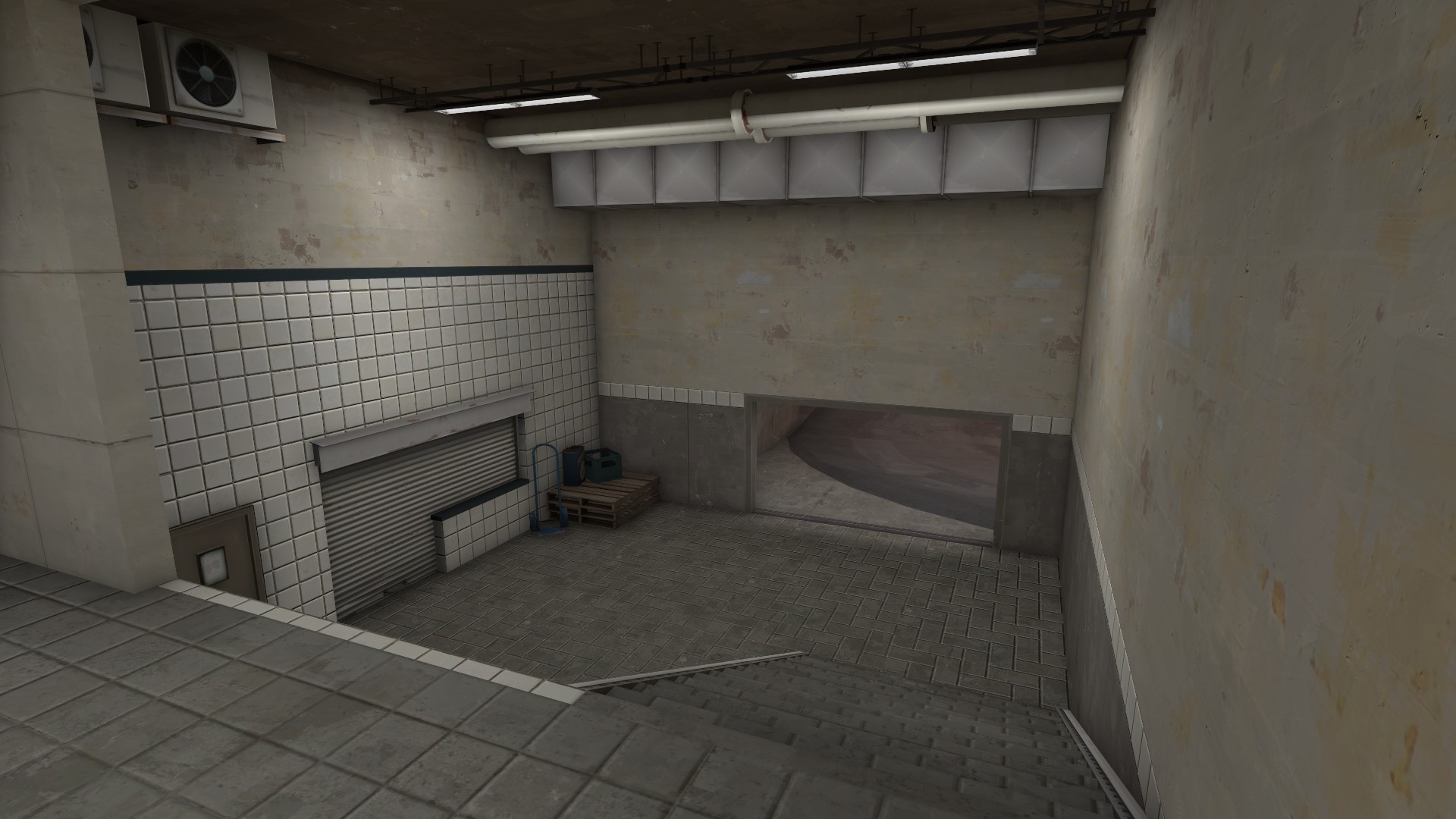
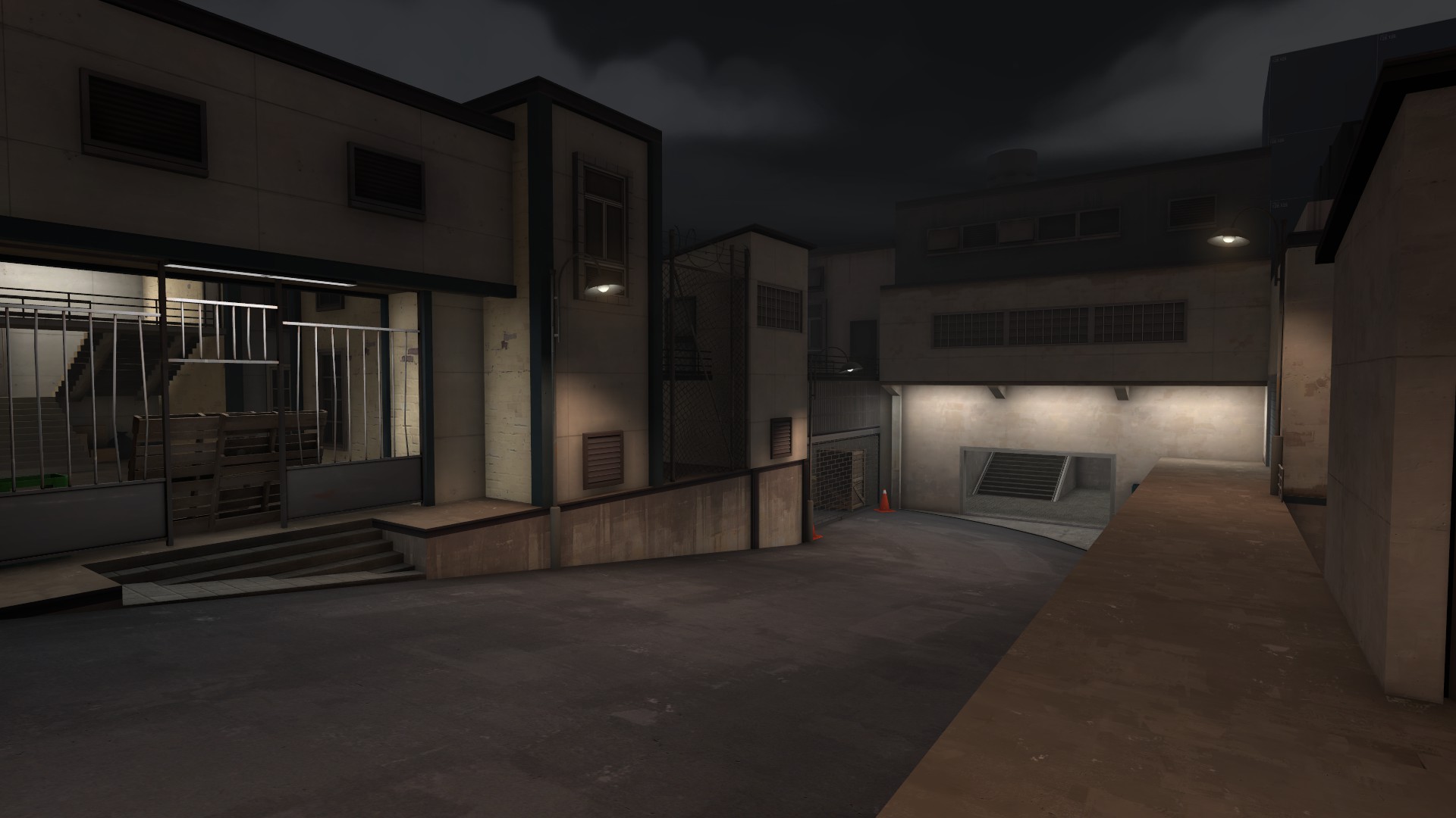
Looks really good, but I think it's really gloomy looking for TF2. That first screenshot is almost entirely shades of grey.
Hydro
Ice Crystal
L2: Junior Member
- Feb 28, 2013
- 78
- 91
Looks really good, but I think it's really gloomy looking for TF2. That first screenshot is almost entirely shades of grey.
Soho doesn't give you a lot of options so I'm trying to use warm lights. I'll punctuate it with signs and small colored lights later on.
Soho doesn't give you a lot of options so I'm trying to use warm lights. I'll punctuate it with signs and small colored lights later on.
You could try and use some of the "lit" window models and use lighting coming off the windows to give it some more warmth, and colors.
Shanghai
aa
- Jan 8, 2011
- 397
- 393

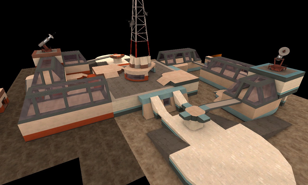
Making some more progress on Glassworks. Created some team colored glass and a new metal texture for it, so I'm getting all kinds of fancy.


- May 21, 2009
- 2,039
- 1,484
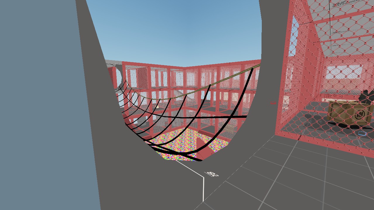
consider yourselves teased
the future of ball escort
be_ballpit
you have to escort the ball to the end
BUT WHICH ONE
Ice Crystal
L2: Junior Member
- Feb 28, 2013
- 78
- 91