WiP in WiP, post your screenshots!
- Thread starter Arhurt
- Start date
You are using an out of date browser. It may not display this or other websites correctly.
You should upgrade or use an alternative browser.
You should upgrade or use an alternative browser.
- Jul 31, 2011
- 872
- 1,021

- Jul 31, 2011
- 872
- 1,021


Fredrik
L6: Sharp Member
- Aug 15, 2009
- 376
- 219
- Jul 31, 2011
- 872
- 1,021
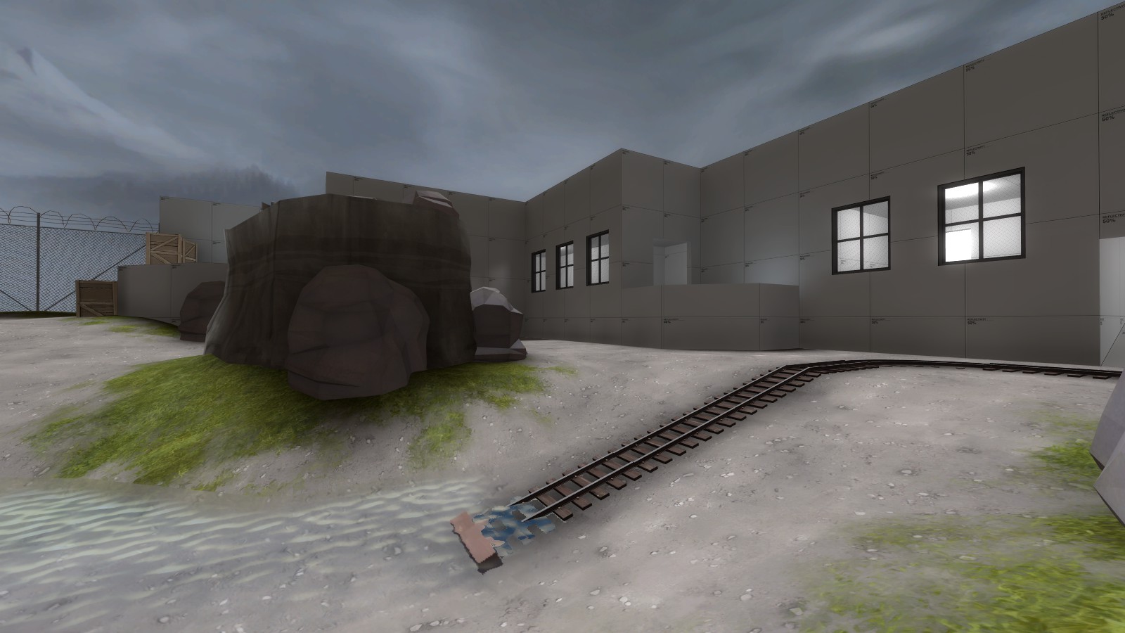
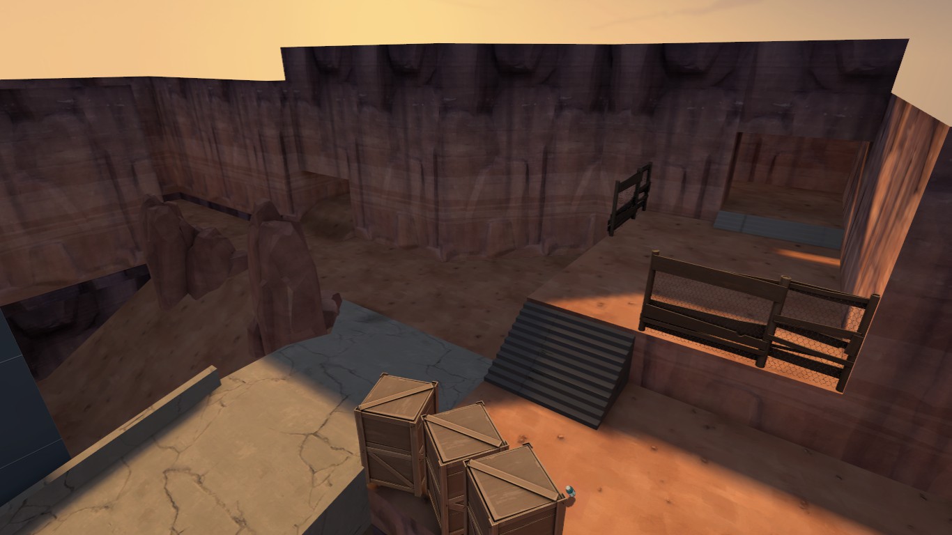
That's kinda not really how erosion works- anywhere but a really high erosion area, more dirt would be blown in my the wind than would come off the rock. Also, if that's the start place for a payload cart, it should probably be nearer the spawn.
Don't you criticize the random excuses I pull out of my ass to justify stylistic choices.
But about the track, duly noted.
Kill_the_Bug
aa
- Oct 6, 2008
- 1,969
- 451
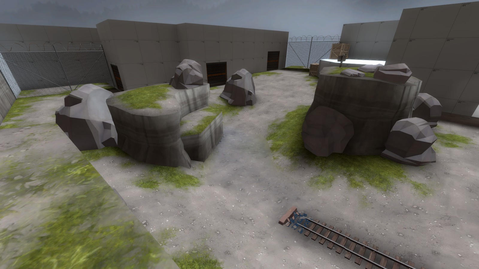
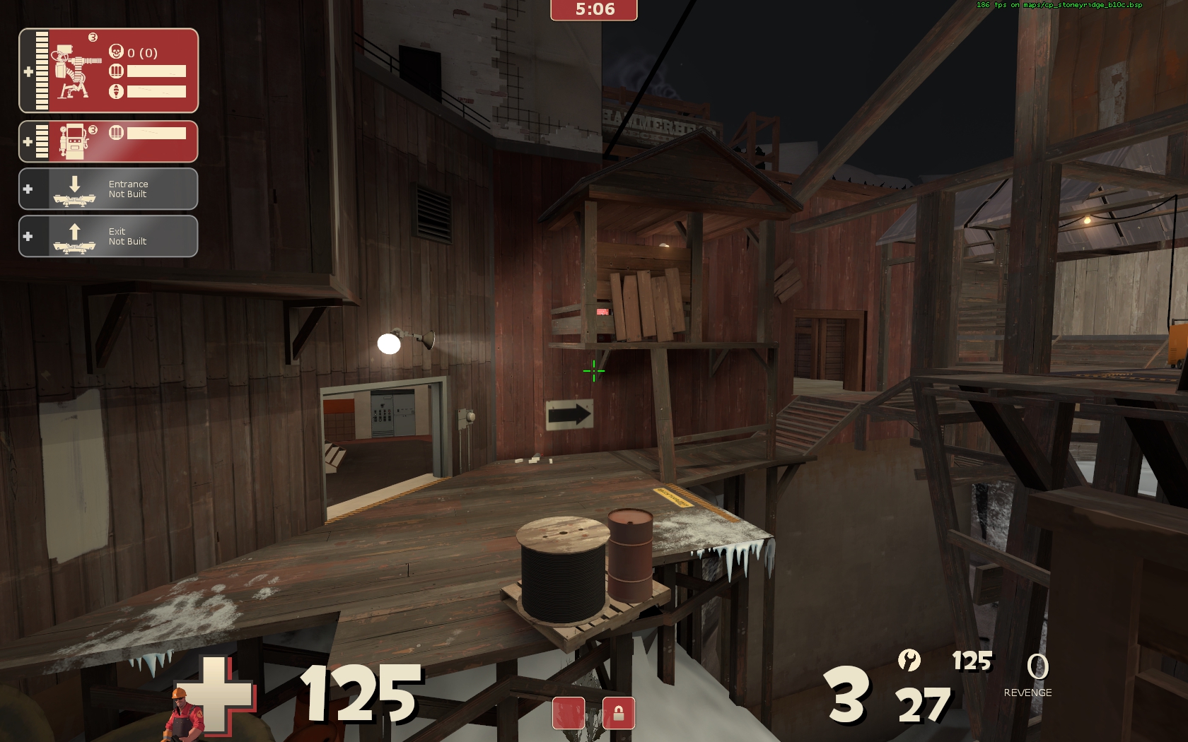
Stoneyridge
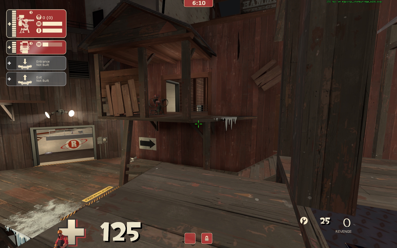
Looking really good Crash!
Sorry for delay in saying this - just got back from honeymmon.
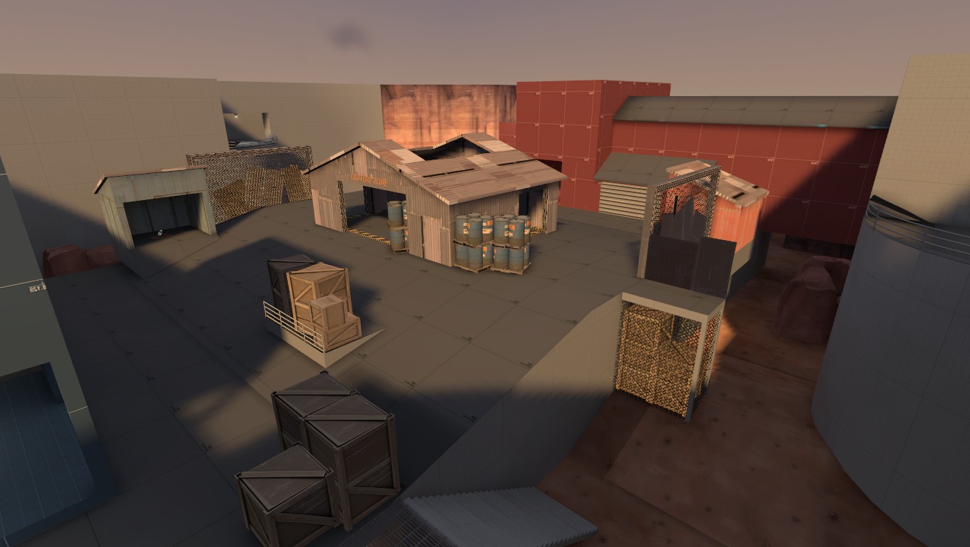
The chickenwire and boxes looks dumb. Otherwise, i rather like.
One thing that occured to me is that if you plan to make the "hill" natural and displaced, rather than sharp-cornered, it's probably better to do that sooner rather than later, to check it doesnt open up new sightlines when you round things off.
One thing that occured to me is that if you plan to make the "hill" natural and displaced, rather than sharp-cornered, it's probably better to do that sooner rather than later, to check it doesnt open up new sightlines when you round things off.
Verno
L2: Junior Member
- Jul 17, 2010
- 80
- 34
Actually pretty nice, you might want to break up the flat colour a little with some slightly smaller, subtle tonal variation and maybe a tiny weeny bit of noise too. Personally I don't think that typeface fits too well in the TF2 universe, it looks too postmodern. If you're going for something industrial then you're better off with a Geometric sans-serif like DIN or one of it's many variants.
I think its too late to change the font now (I created the text in a way where a font change is difficult) but I'll keep that in for the YLO (yellow) logo or if I decide to refresh the GRN logo significantly.
Thats an interesting idea, I tried going with a brighter yellow earlier and didn't like it, but a duller yellow similar to Red's might be better, like this maybeI actually think the color depth is fine, though it could use some complimentary colors like a creamy beige, similar to the circular red logo. I think you've done a good job keeping it simple, like early TF2.

- Jul 31, 2011
- 872
- 1,021
- Apr 29, 2008
- 1,068
- 709

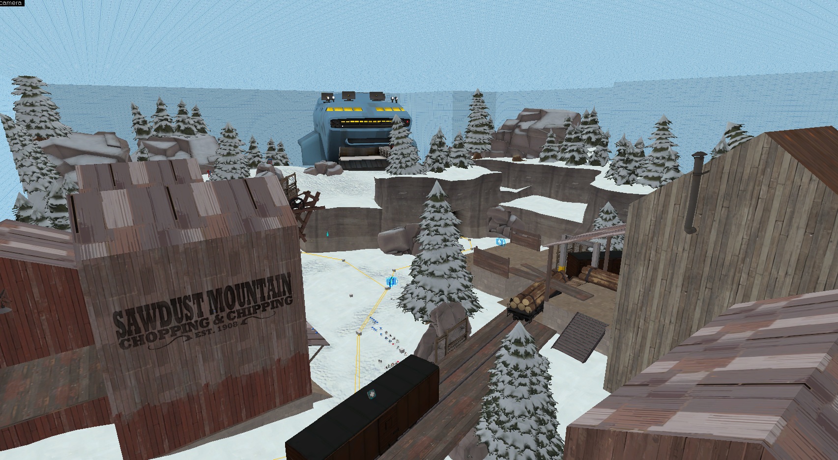
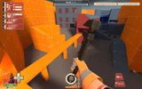
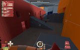
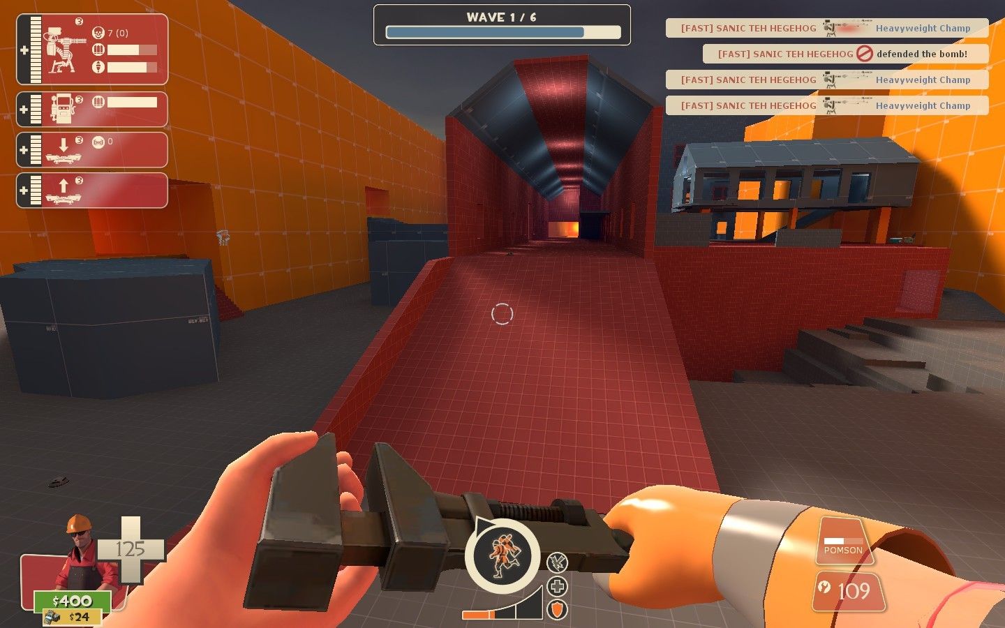
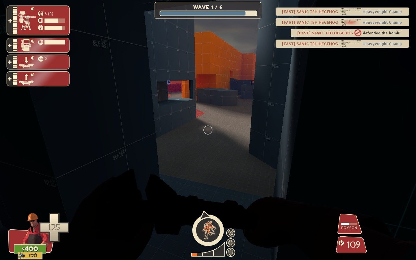
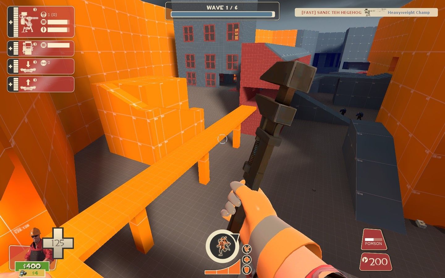
Working on a custom MvM map that's much larger than your average MvM arena. Currently in orange phase. Just about done with the general layout, though; just have one more lane to mold and then run a bunch of checks to ensure Sentry Busters and Giants can get through. Then the art passes will start.
(Click for larger images.)

Or if you're getting thumbnail'd, check these:
http://img.photobucket.com/albums/v488/DeanyKong/mvm_deadpit/2012-10-04_00012.jpg
http://img.photobucket.com/albums/v488/DeanyKong/mvm_deadpit/2012-10-04_00011.jpg
http://img.photobucket.com/albums/v488/DeanyKong/mvm_deadpit/2012-10-04_00009.jpg
http://img.photobucket.com/albums/v488/DeanyKong/mvm_deadpit/2012-10-04_00008.jpg
Last edited: