CP Winer a3
- Thread starter Bakscratch
- Start date
You are using an out of date browser. It may not display this or other websites correctly.
You should upgrade or use an alternative browser.
You should upgrade or use an alternative browser.
I wish i could  this.... or at least
  the posts...
Nice map, thought it was mispelt for cp_winner but aparently not
Nice map, thought it was mispelt for cp_winner but aparently not
Is this an actual contest entry?Map should be disqualified for purposeful misspelling of title.
Added doors to C, made the death water on last more noticeable, increased cap times, changed blu spawn by a
Read the rest of this update entry...
Read the rest of this update entry...
- Apr 9, 2008
- 1,706
- 1,491
Here are some initial thoughts. Overall, the map is messy and needs a lot of major work to simplify the routes and make the flow more typical for this kind of map.
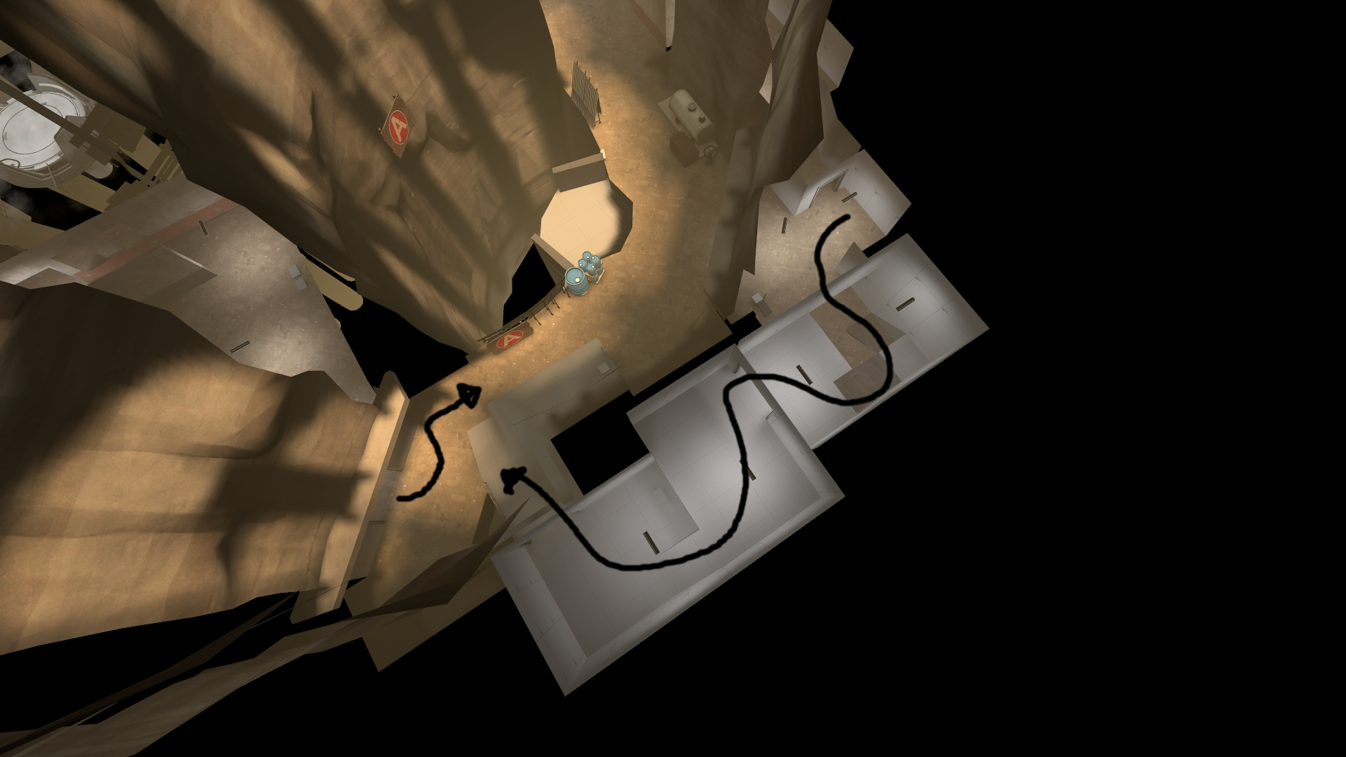
Blue Spawn to A
The area outside is complicated. Flatten it out and have one entrance to A (that splits into two to match the current routes) and a staircase down into the C corridor. (hard to draw, sorry!)
Blue Spawn to B
It's so tiny and cramped. The flow forces you to make several turns. I don't understand why the railing is there; it just gets in the way.
A
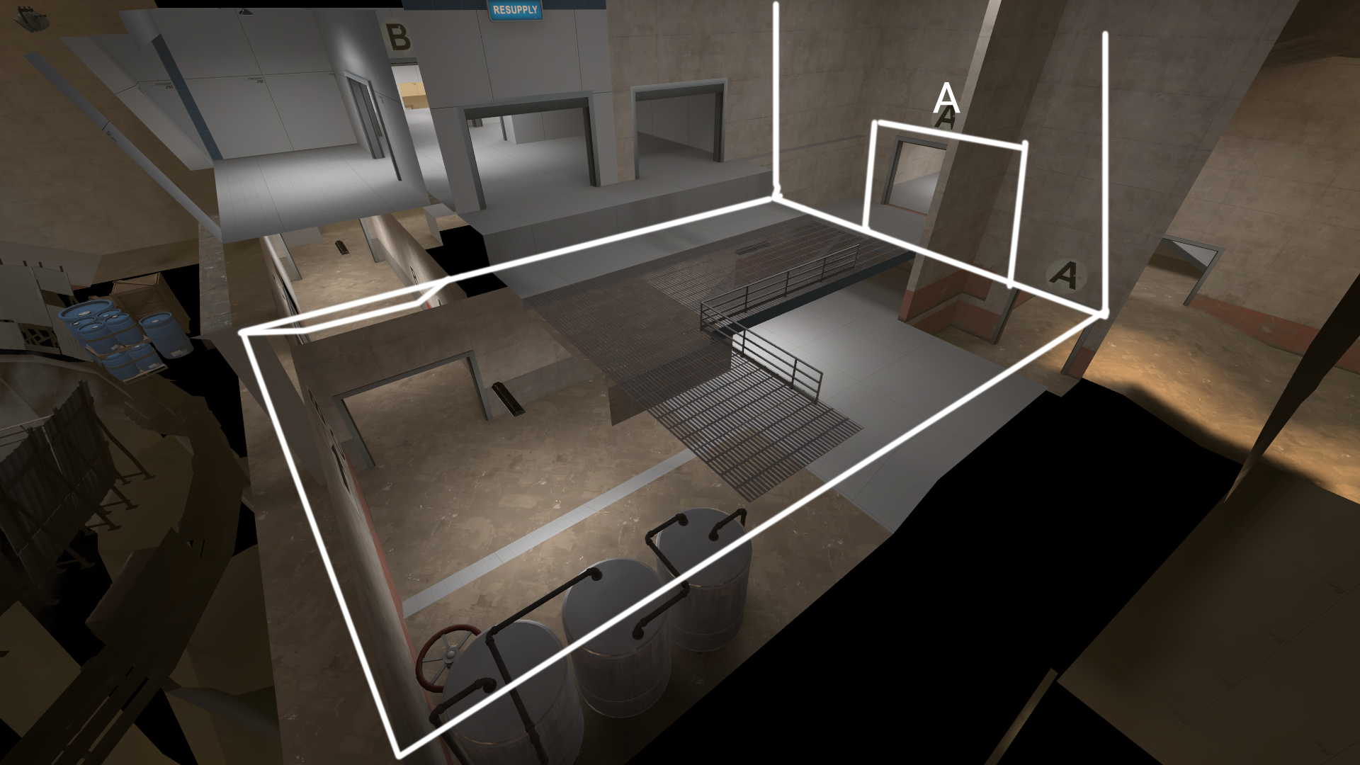
The defenders entrance to A isn't particularly inviting. It starts off wide then gets narrow REALLY quickly. Then there's the massive flanking route for Blu which means that moving forward as a defender easily puts you at risk of being flanked. Both of these mean that it's really hard to defend and that the Blu team can easily lock down your only entrance into the area.
B
The flow at B means that there's a great deal of deadspace that goes unused near the dam. There's no incentive for either team to go there as it exposes them to enemy players coming from either Blu spawn or C.
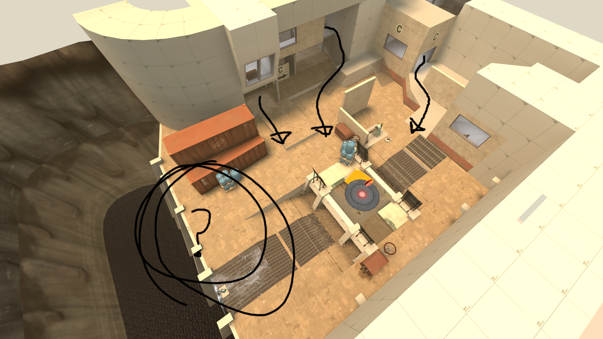
It also makes defending and attacking kinda awkward because there's no space that the Blu team predominately owns, and no space that the Red predominately owns. It just turns into a messy free for all with each team mashing into each other.
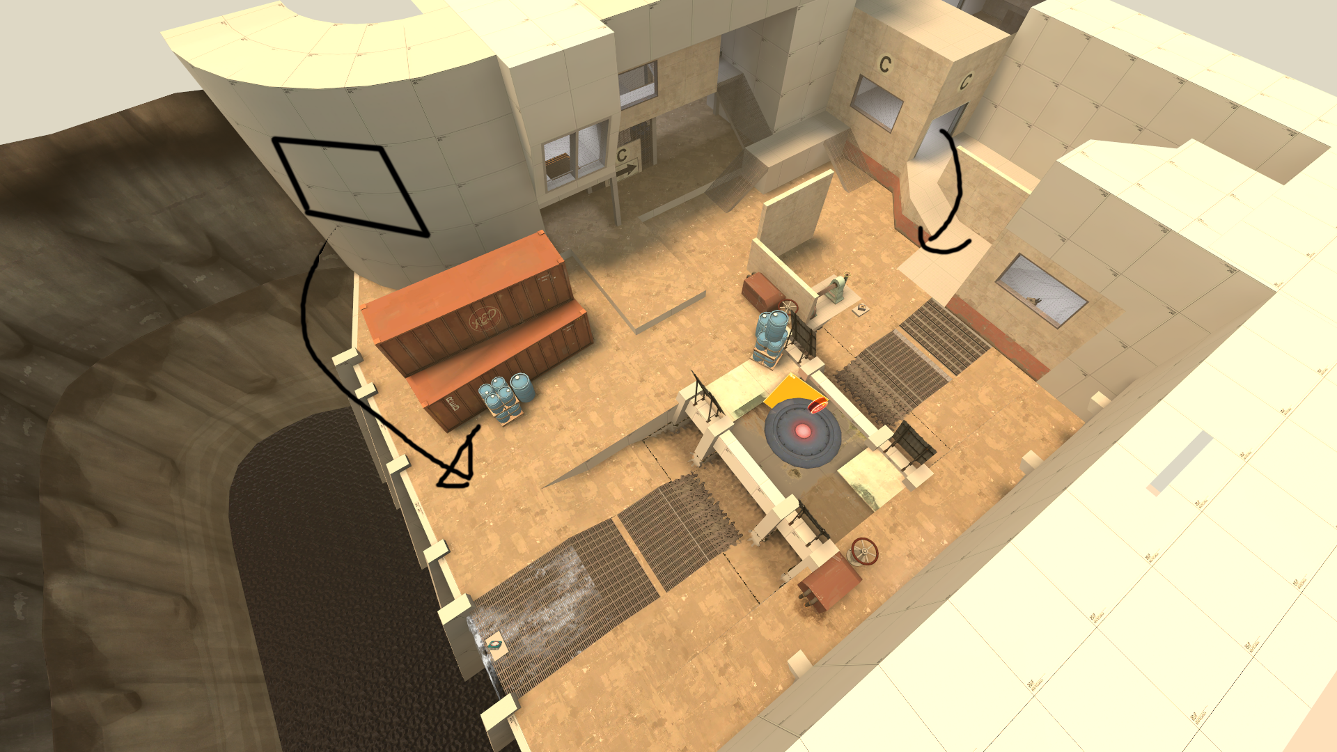
I'd suggest completely moving Blu's entrance so they enter from behind the containers or somewhere around that area. That way both teams are fighting across an area with a no man's land across the centre. You may need to rejig the whole layout of the area to make it flow nicely.
Misc
I think this map could benefit from a reworked Blu spawn that moves it further south and creates the typical routes where left leads to A and right leads to B without any need for the player to turn back on themselves.
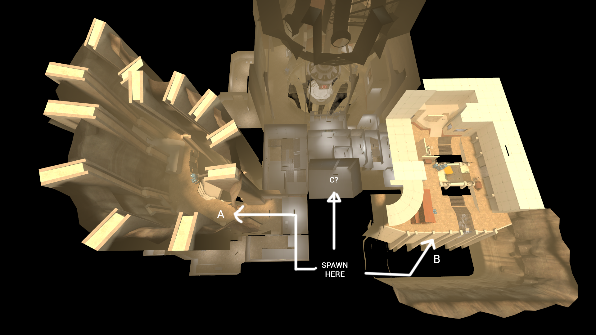
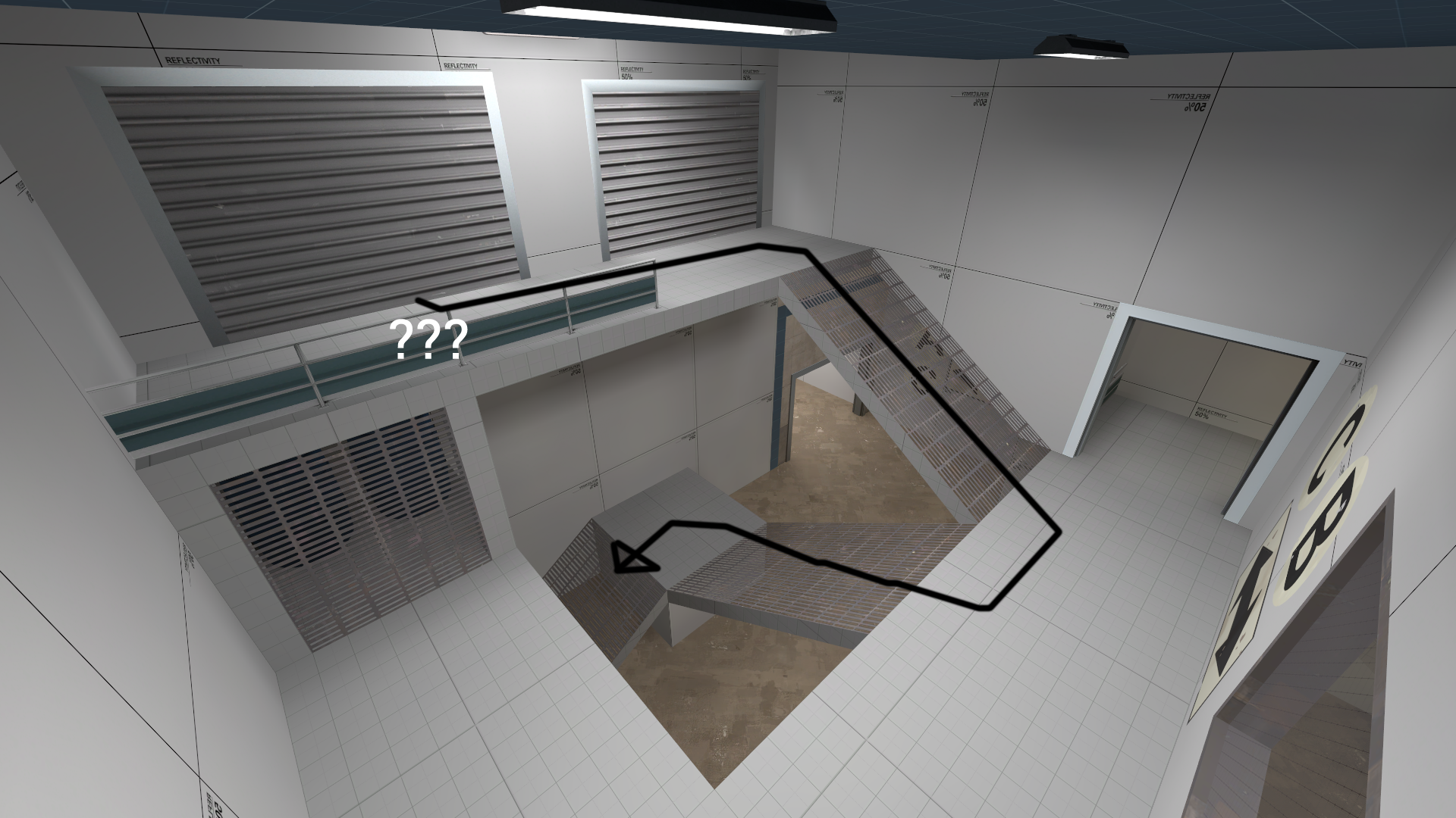
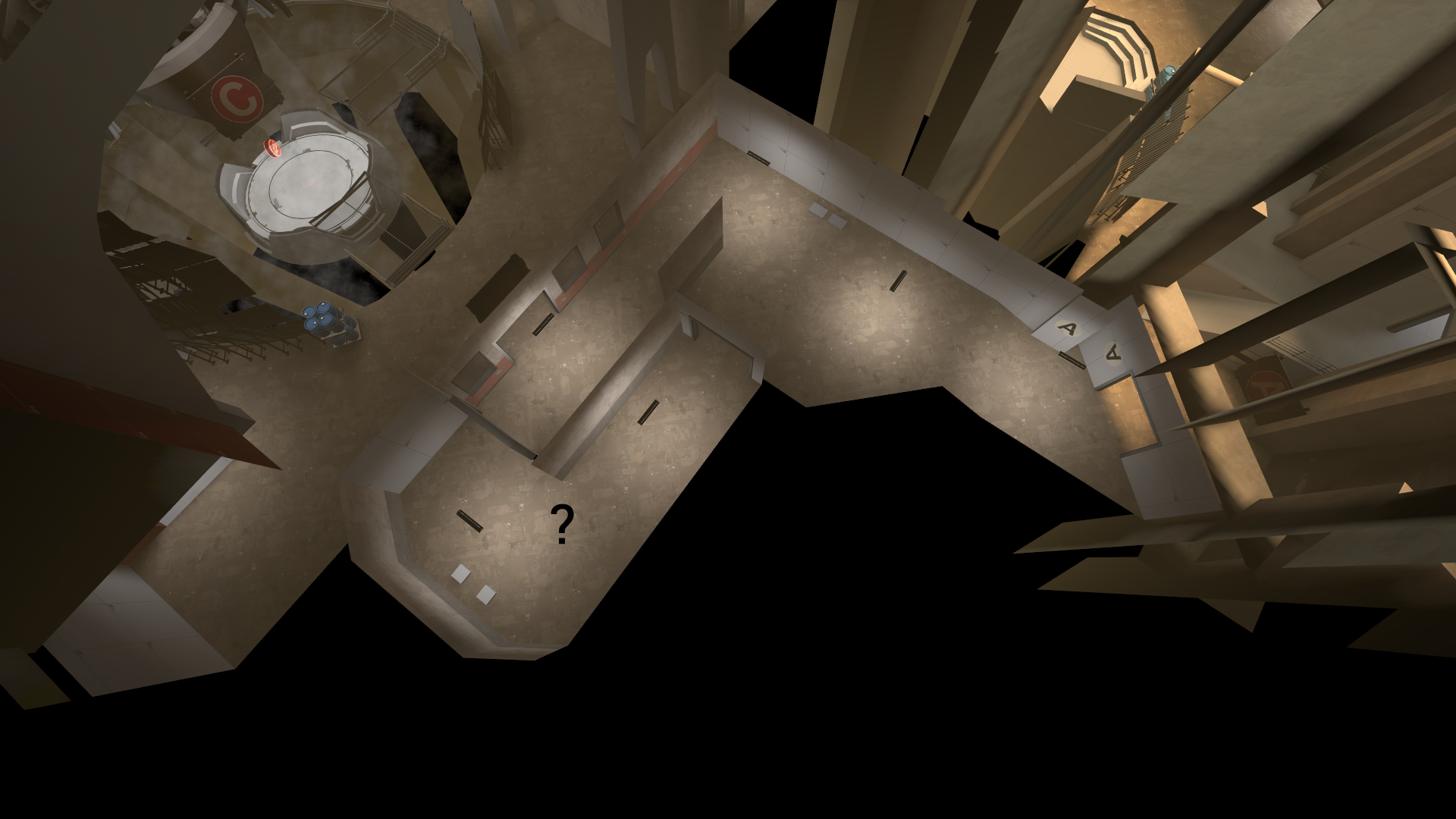
I don't understand why this route splits off into two only to merge again. It splits players up for no good reason. Just ditch the area marked with a question mark and keep it simple.
Blue Spawn to A
The area outside is complicated. Flatten it out and have one entrance to A (that splits into two to match the current routes) and a staircase down into the C corridor. (hard to draw, sorry!)
Blue Spawn to B
It's so tiny and cramped. The flow forces you to make several turns. I don't understand why the railing is there; it just gets in the way.
A
The defenders entrance to A isn't particularly inviting. It starts off wide then gets narrow REALLY quickly. Then there's the massive flanking route for Blu which means that moving forward as a defender easily puts you at risk of being flanked. Both of these mean that it's really hard to defend and that the Blu team can easily lock down your only entrance into the area.
B
The flow at B means that there's a great deal of deadspace that goes unused near the dam. There's no incentive for either team to go there as it exposes them to enemy players coming from either Blu spawn or C.
It also makes defending and attacking kinda awkward because there's no space that the Blu team predominately owns, and no space that the Red predominately owns. It just turns into a messy free for all with each team mashing into each other.
I'd suggest completely moving Blu's entrance so they enter from behind the containers or somewhere around that area. That way both teams are fighting across an area with a no man's land across the centre. You may need to rejig the whole layout of the area to make it flow nicely.
Misc
I think this map could benefit from a reworked Blu spawn that moves it further south and creates the typical routes where left leads to A and right leads to B without any need for the player to turn back on themselves.
I don't understand why this route splits off into two only to merge again. It splits players up for no good reason. Just ditch the area marked with a question mark and keep it simple.
Attachments
Here are some initial thoughts. Overall, the map is messy and needs a lot of major work to simplify the routes and make the flow more typical for this kind of map.
Thanks! I see what you mean how the "middle" of the map is basic trash. Ill probably end up re doing that entire part and make it more interesting.
B I'm a little confused on how B could be done better without completely re making it as its trash as well.


