Valve should have waited with Badwater Basin

Ida

deer
aa
Jan 6, 2008
2,289
1,372
For starters, look at this:

pl_badwater0001.jpg

pl_badwater0000.jpg


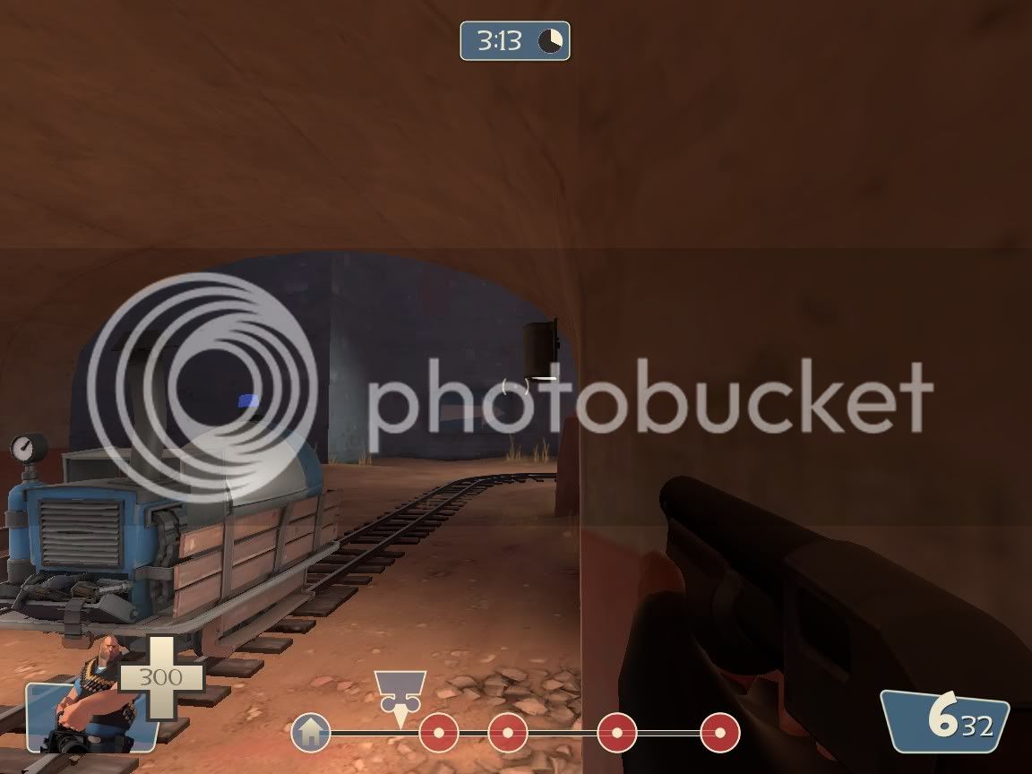
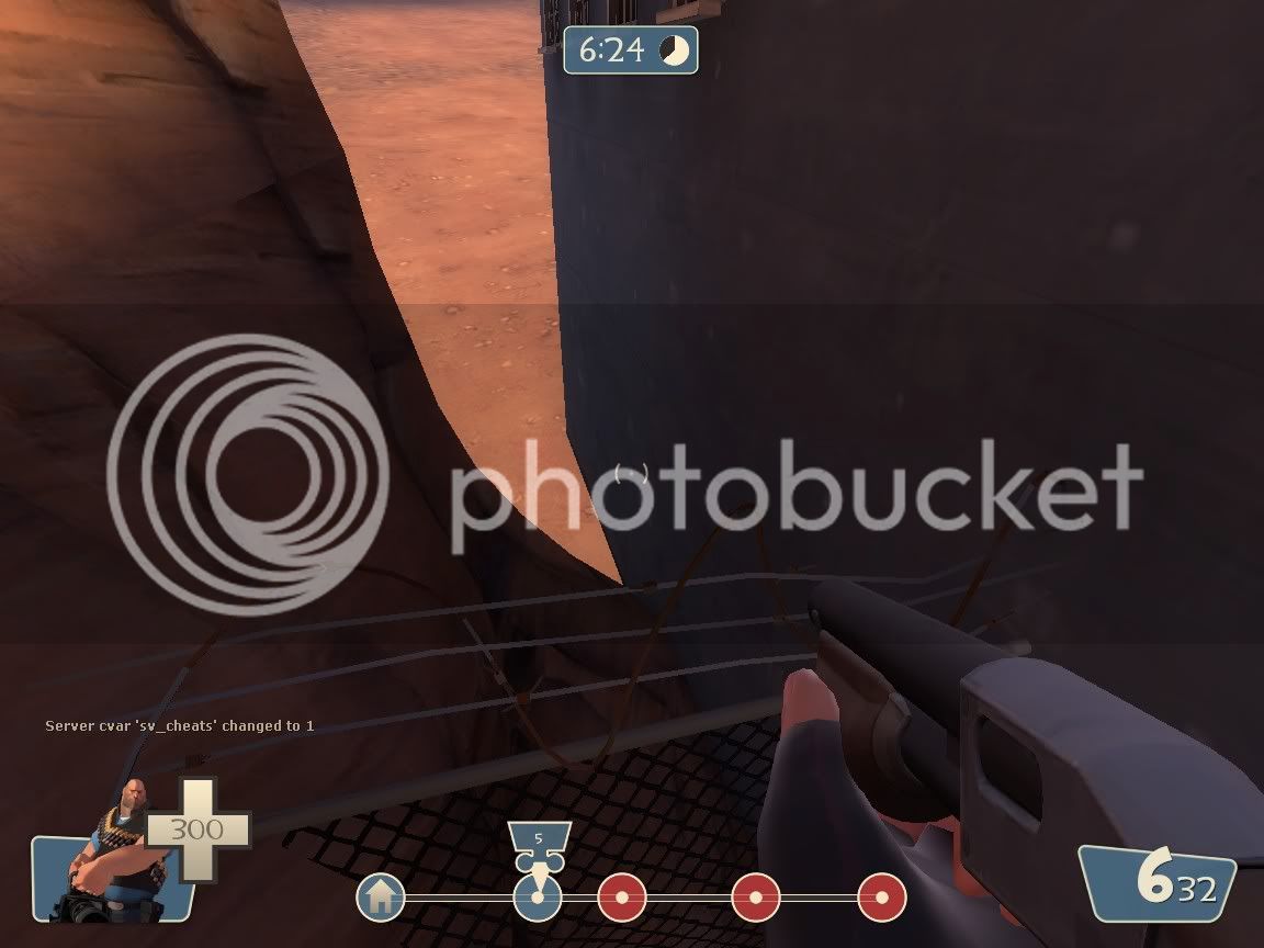
Alright, that last one is just a prop that's too far from the wall. No big deal. But look at the first one! I'm noclipping there (it's a private game :p), but you can actually stand on the fence.

The last pic puts the icing on the cake in the case of details. Quite simply, there is no detail to speak of in this map at all. It pains me to see Valve, the professional developer that's supposed to pwn us all in mapping, release such an unfinished map. Where are the details? WHERE? I see only buildings textured with single textures and maybe one or two props along the walls. Some displacements are badly sewn and some look completely wrong (outside of the BLU base, to the left). And skybox? Well, the tall mountains are pretty, but it's just blocked off by some trains and some tall buildings.

Valve's maps have always been known for eye candy, and for being very complete. This fails at both points. Sure, Valve have eye-candy related mistakes that should have been fixed in their other maps, but I was able to spot these by running through the map on my own once.

I think they should have waited for the next update to put some nice details and finishing touches into this map, since currently it really doesn't make me want to play at all.

PS. I don't hate Badwater Basin.
 

Snipergen

L13: Stunning Member
Nov 16, 2007
1,051
150
I've spotted alot of glitches too. The entire update feels a bit rushed.
 

Shaar

L3: Junior Member<BR>toboruin
Aug 7, 2008
231
206
I agree, We were having a full game match on there, 12 a side on a 24 player server, we just capped point three, then the server assumed we won and moved onto the next map.

also, another thing I've noticed, not a huge problem, but when you taunt with Natasha, Heavy's hand clips through the ammo belt on the gun, no biggy but still it brings the overall awesomeness down :/.

Natasha = sexyest sounding gun in the game. fact. I can't wait to use it when all the heavy players drop down.
 

Hawk

L7: Fancy Member
Dec 3, 2007
419
213
Oh, I imagined you said to them what you said in the post before, which might have been a bit rude. But it sounds like voicing concern is a bit more polite.

I don't find the map unacceptable. I enjoy it, and I'm happy to still be getting content for a game I purchased so long ago. You guys are probably right about all these mistakes and problems, but I don't think it's a very big deal.
 

Zwiffle

L6: Sharp Member
Jun 24, 2008
269
161
All of the valve maps have visual glitches. And honestly I think they're pretty easy to spot - many of them are simple things such as walls not meeting completely with door/window models. You can tell on other things as well, like on fastlane near the sides in the middle - the displacements aren't sewn together. Some models overlap each other. And so on and so on. It's not that big a deal imo. Although I haven't played this map for more than a couple hours, it feels pretty fine to me. I haven't had any problems with the map suddenly switching to a new map after the third cap (are you sure that an admin didn't switch over or something?)

So yeah, I kind of agree with Hawk.
 

Zwiffle

L6: Sharp Member
Jun 24, 2008
269
161
Well, they probably spent a lot of time developing the arena_lumberyard alpine look (which I am in love with, btw.) That's possibly why it's not as detailed as other maps. It is pretty plain compared to Steel (which I'm also in love with), but I don't think it's ugly or anything.
 

laghlagh

L6: Sharp Member
Jul 15, 2008
389
53
I also found this map plain.
 

Nineaxis

Quack Doctor
aa
May 19, 2008
1,767
2,820
The is underdetailed, however, it does play well. But it's also buggy with a ton of displacement misaligns in the first part, floating props, and I managed to get stuck in the cieling of that tunnel before the first cap.

Really, it feels too monotonous in terms of scenery after the first cap- it goes straight from an open area of natural landforms and colors to an endless stream of drab brick. And it's pretty easy to get disoriented inside the buildings in the middle section- they all have the same wall texture.

The map just lacks the feeling valve made it.
 

Dox

L8: Fancy Shmancy Member
Oct 26, 2007
588
62
Their mapping department was prolly running overtime on this patch... They can always run patches later.
 

R3dRuM

L6: Sharp Member
Feb 13, 2008
303
19
ok..
35v91eukah75ylg4wow6.jpg


0tmrs2dyt87pojb6fth3.jpg


j3rragbjmyrqjix2qjop.jpg


There is also TONS more of these demoman/soldier ledges in this map, usually anything extuding from the main part of the building, like pipes and beams are not playerclipped, good for lobbing nades. You can stand in alot of places on the displacement cliff at the start above the spawn. Fun.

Go valve!
 
Last edited:

crazychicken

L2: Junior Member
Feb 14, 2008
92
7
i agree that badwater is an awful looking map, plus the gameplay for the last cp is shit, its impossible to cap they made it so hard with the cart point being so close to the spawn and then putting a curve in the track, together with the harder to clear ledges etc for sentries i have never seen it completed.

getting trapped in the ceiling of the tunnel is apparently my fault for not verifying my gcf files. it is a poorly made map that deserves no more than 8/10
 

Half-Life_Maniac

L3: Member
Nov 30, 2007
122
89
Glad I'm not the only one. Right from the moment I first loaded it, I saw it was not up to the usual standard.

I haven't actually had a chance to play it online, so I can't say how well it actually plays. But it is a shame it looks how it does.
 

Altaco

L420: High Member
Jul 3, 2008
484
120
The explosion at the end doesn't even blow anything up, it just goes boom, no cinematic physics.
 

Ida

deer
aa
Jan 6, 2008
2,289
1,372
The explosion at the end doesn't even blow anything up, it just goes boom, no cinematic physics.

Yeah, I thought something was missing. I like the variation of the little "puff" of fire, but it does need more flying debris.
 

grazr

Old Man Mutant Ninja Turtle
aa
Mar 4, 2008
5,441
3,814
I saw 3 places where displacements were misalligned by smaller than 1 unit (an annoying mapping bug that ca only be helped by "destroying" and redoing the displacement). I also get stuck in doors that lead off the main route into the buildings. The last control point is terrible visually, the egdes of the map are ok and visuals are generally acceptable. But the area in which the final cp is is.. disgustingly plain. So much area with no detail, near impossible gameplay. I've played this map about 50 times and blu have won maybe 3.

Again, the area in which the last cp is housed is no less than disgusting. That random wooden ramp? I almost cried when i saw that. The random drop pit with no basis in reality (i mean purpose, not that it should be realistic). They could have made it seem like a loading port or something. I'm not sure what i'm supposed to think this place is.