Turbine redux
What am I doing? I think Grazr put it best: "Porting turbine to TF2 from 'fuck if i know that spytech is a sub theme'."
Turbine has been called many things, but the consensus seems to be that it's either the best CTF map in the game or the only good one, period... but only in terms of the layout. And looking back at some of the original Team Fortress maps that were adapted for this game (particularly Dustbowl and 2fort), it looks like they literally took the original map and just ran it through a very thorough artpass. So I thought, heck, Turbine is about as blocky and simplistic as a TFC map; it deserves the proper-TF2 treatment more than 2fort did!
The goal here is not just to re-detail the map but incorporate some layout improvements as necessary. I'm looking to Turbine Pro for some ideas, but I'm always looking for ideas and input. The goal, actually, is to eventually have a finished product I can pitch to Valve as an "update" in exchange for co-author credit.
EDIT - May 13, 2013
I've made a lot of changes since I first posted this, so I updated the screenshots at left. The text below is still from the first alpha; since then, I have rethemed the exteriors slightly, converted the air vents to a hallway and a series of catwalks, removed the out-of-bounds spytech hallway and turned it into an outdoor courtyard, and a few other minor changes here and there. See the changelog for full details.
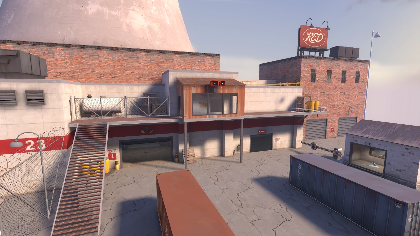
First order of business: Take it outside! No self-respecting map takes place all in one building! I've been wanting to see more purely-industrial themed maps à la Hydro, and a name like "Turbine" was just begging to be used that way. Tentatively I came up with the nuclear-power-plant angle, which I'm surprised hasn't been done yet.
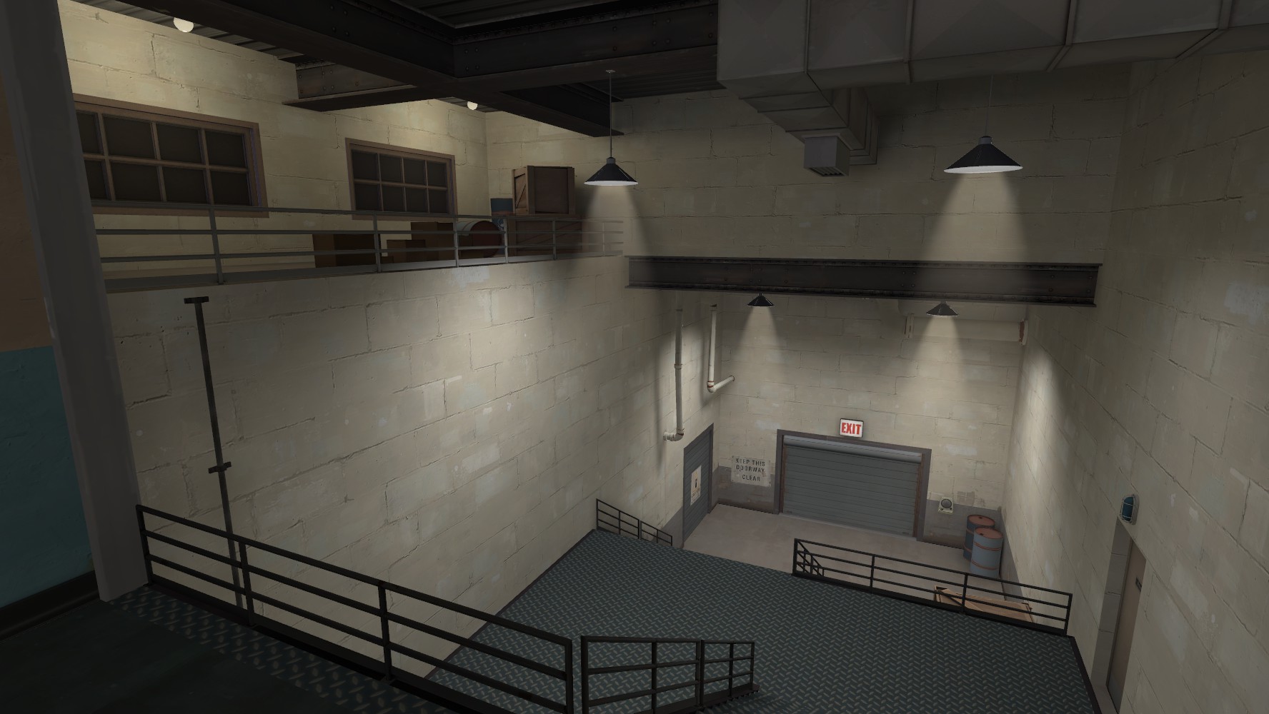
An early example of the scale of revisions to expect; I didn't care for the 1:2 stairs Flobster put everywhere, so I'm in the process of scaling back to 2:3 without sacrificing the feeling of bigness. In this case, I cribbed a little from the artpass map with some of Badwater's point-B flanking route thrown in.
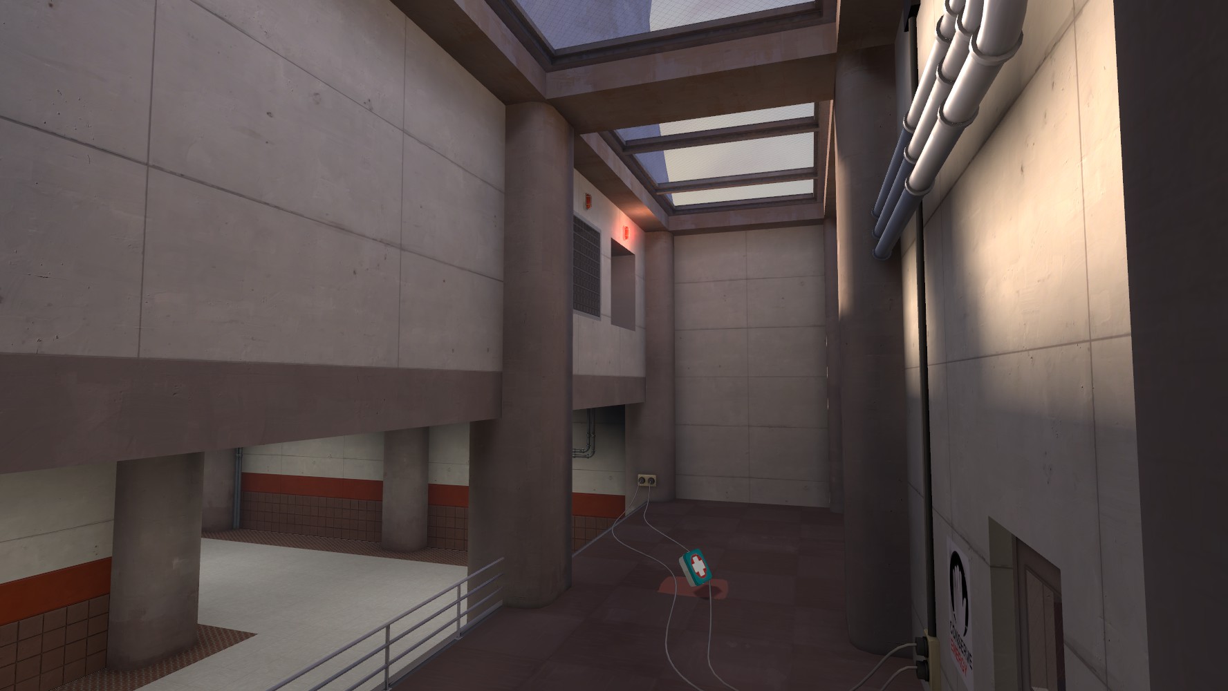
RED base's main hallway and platform. Note the added drop-down from the air vents; I figured this would provide an easy way to counter sentry camping on the platform without adding an alternate route into the building like Turbine Pro does. I love that the dual-plug prop fit perfectly here without any tweaking.
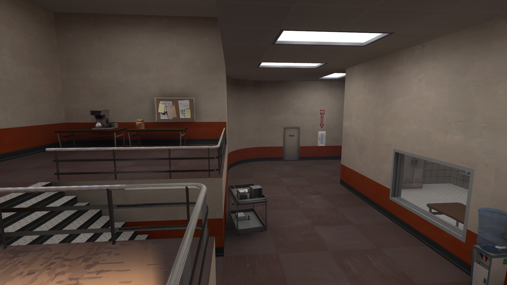
I'm sorry, you wanted spytech? Here's your precious spytech: Outside the field of play where you can't get to it! Muahahahaha! This is visible through the door in the above screenshot and a pair of double doors just to the right of that. Not pictured: Rexy's vending machine.
Sadly, I may have to throw all of this out because I had an alternate idea that involves a huge window pane and a fenced-in courtyard. I'd also like to raise the ceiling above the hallway and put in some Mountain Lab-style catwalks, but ironically the new air vents are blocking the way.
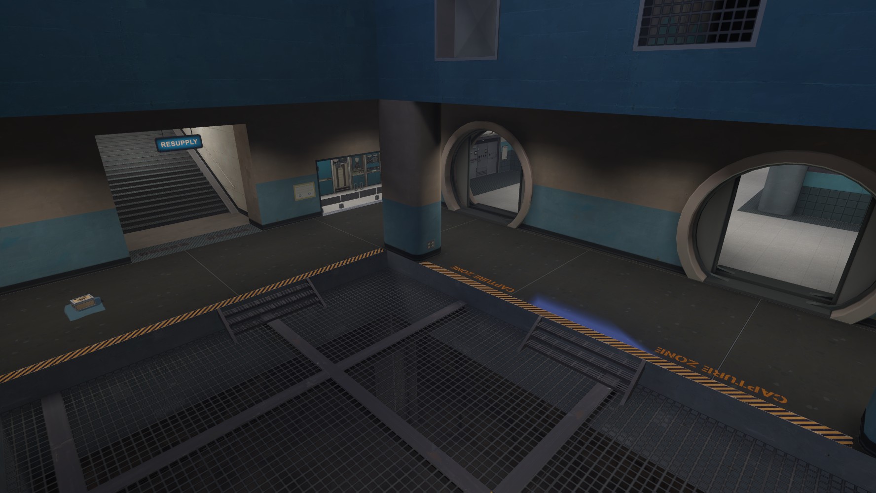
OK, technically there's spytech in here too. As you can see, I copied Turbine Pro's rejiggered dropdown as well as expanding the capture zone to the whole area because why not. Not pictured: a pair of spotlights shining directly onto the intel stand. Everything else is very up in the air; that stairwell is still 1:2 and will need to be retooled, and the secret underground bunker under the capture area was something I did totally on a whim and may toss completely.
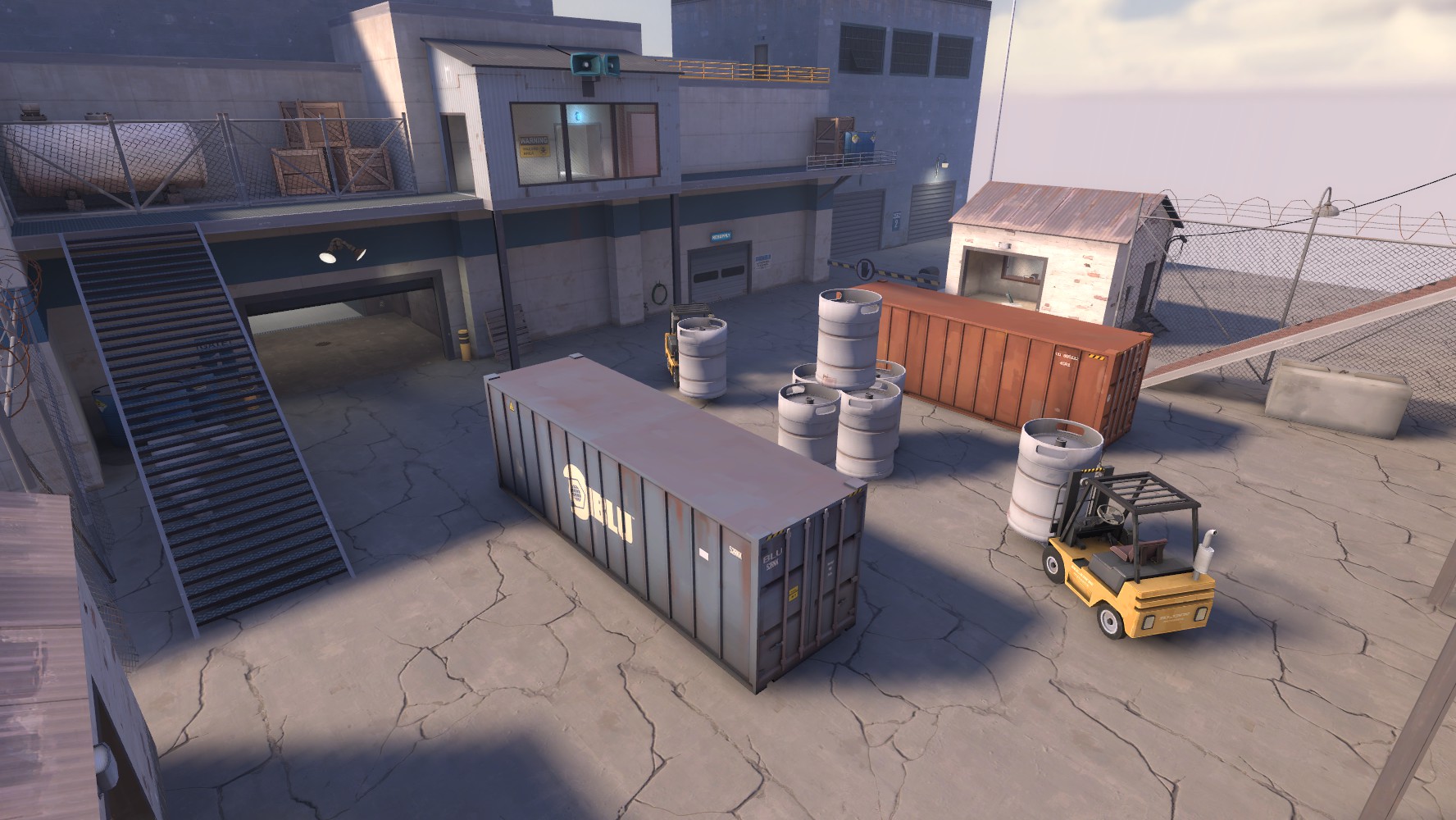
Mid as of today, from the other side. Since it's outside now, it took me some headscratching to figure out how to replace the eponymous turbines that block the sightline between the two main entrances. Rexy's forklift and a giant barrel in Hydro that I'd never noticed before provided the answer! Though I may remove the top barrel from the stack in the center; it seems ... off, to me.
What am I doing? I think Grazr put it best: "Porting turbine to TF2 from 'fuck if i know that spytech is a sub theme'."
Turbine has been called many things, but the consensus seems to be that it's either the best CTF map in the game or the only good one, period... but only in terms of the layout. And looking back at some of the original Team Fortress maps that were adapted for this game (particularly Dustbowl and 2fort), it looks like they literally took the original map and just ran it through a very thorough artpass. So I thought, heck, Turbine is about as blocky and simplistic as a TFC map; it deserves the proper-TF2 treatment more than 2fort did!
The goal here is not just to re-detail the map but incorporate some layout improvements as necessary. I'm looking to Turbine Pro for some ideas, but I'm always looking for ideas and input. The goal, actually, is to eventually have a finished product I can pitch to Valve as an "update" in exchange for co-author credit.
EDIT - May 13, 2013
I've made a lot of changes since I first posted this, so I updated the screenshots at left. The text below is still from the first alpha; since then, I have rethemed the exteriors slightly, converted the air vents to a hallway and a series of catwalks, removed the out-of-bounds spytech hallway and turned it into an outdoor courtyard, and a few other minor changes here and there. See the changelog for full details.

First order of business: Take it outside! No self-respecting map takes place all in one building! I've been wanting to see more purely-industrial themed maps à la Hydro, and a name like "Turbine" was just begging to be used that way. Tentatively I came up with the nuclear-power-plant angle, which I'm surprised hasn't been done yet.

An early example of the scale of revisions to expect; I didn't care for the 1:2 stairs Flobster put everywhere, so I'm in the process of scaling back to 2:3 without sacrificing the feeling of bigness. In this case, I cribbed a little from the artpass map with some of Badwater's point-B flanking route thrown in.

RED base's main hallway and platform. Note the added drop-down from the air vents; I figured this would provide an easy way to counter sentry camping on the platform without adding an alternate route into the building like Turbine Pro does. I love that the dual-plug prop fit perfectly here without any tweaking.

I'm sorry, you wanted spytech? Here's your precious spytech: Outside the field of play where you can't get to it! Muahahahaha! This is visible through the door in the above screenshot and a pair of double doors just to the right of that. Not pictured: Rexy's vending machine.
Sadly, I may have to throw all of this out because I had an alternate idea that involves a huge window pane and a fenced-in courtyard. I'd also like to raise the ceiling above the hallway and put in some Mountain Lab-style catwalks, but ironically the new air vents are blocking the way.

OK, technically there's spytech in here too. As you can see, I copied Turbine Pro's rejiggered dropdown as well as expanding the capture zone to the whole area because why not. Not pictured: a pair of spotlights shining directly onto the intel stand. Everything else is very up in the air; that stairwell is still 1:2 and will need to be retooled, and the secret underground bunker under the capture area was something I did totally on a whim and may toss completely.

Mid as of today, from the other side. Since it's outside now, it took me some headscratching to figure out how to replace the eponymous turbines that block the sightline between the two main entrances. Rexy's forklift and a giant barrel in Hydro that I'd never noticed before provided the answer! Though I may remove the top barrel from the stack in the center; it seems ... off, to me.
Last edited:


