Team Fortress 2 Update Released

tf2.com

L13: Stunning Member
Jun 16, 2010
1,186
712
An update to Team Fortress 2 has been released. The update will be applied automatically when you restart Team Fortress 2. The major changes include:
  • Fixed an issue with knives not animating correctly
  • Updated the localization files

Read on the TF2 Blog...
 

henke37

aa
Sep 23, 2011
2,075
515
Nope, nothing to see here, just a 28 mb localization file update. Definitly nothing strange going on here.
 

SnickerPuffs

(*single chuckle*)
aa
Apr 10, 2014
1,326
1,867
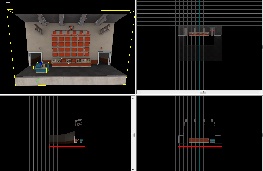
There was actually a model added in this update. Find it at models/vgui/round_end_score_wall_spytech.mdl

Console03 for scale

RYn6r9E.png
 

Shogun

L6: Sharp Member
Jan 31, 2014
260
221
That's pretty cool. If I had a guess, the 6 screens at the top of the wall will display either Steam profile pictures or class icons, and the rectangular screens below will display usernames. The rest of the screens could be anything really. Probably stats (kills, damage, healing, etc.) or favorite weapon during the match, stuff like that.
 

Bogdy

L4: Comfortable Member
Aug 13, 2014
187
208

Lain

lobotomy success story
aa
Jan 8, 2015
723
757
Well if so, they did say they where supporting publander so why is there only 6?
 

Pocket

Half a Lambert is better than one.
aa
Nov 14, 2009
4,701
2,583
Wouldn't be surprised if they plan to update the UI or something for the whole game.
I hope so. Among things that arguably need updated:
  • The original options menu is a relic of the days of low resolutions and multiple UI windows. The fact that Valve had to create a separate Advanced Options menu to hold all the gameplay customization stuff is proof positive that it needs an update.
  • Said Advanced Options menu is hard to find stuff in, not helped by being so small that less than a quarter of it can fit on the screen at once. Integrating all the options into a single fullscreen menu would let them reorganize it to be easier to navigate and fit two columns worth of checkboxes on the screen at a time.
  • The addition of unnecessary killstreak stats in the end-of-round popup makes it hard to aim during humiliation. I'm still not quite sure how this happened; maybe there's a minimum of visible screen space I need to have below the crosshair. Also it was poorly handled, stretching the border and messing up the aspect ratio of the rounded corners.
  • All the UI elements, including kill feed icons, should really just be vector based at this point in order to accommodate retina/HiDPI displays.
  • Why is Loadout a second tab on the Stats screen? That didn't even make sense back when they first added it.
  • Every menu that you access while playing (team, class, loadout, map info, etc) should allow you to quit out of it by pressing Esc. I forget which ones do and which ones don't, but it's annoying when I open one up by accident by pressing the wrong key and have to fiddle for the Exit/Cancel button.
Those of you who are into making custom HUDs: I know you can mod the main menu itself; can you also replace the options menus? I might be interested in looking into HUD modding if that's the case, to try to create a better one.
 

Vel0city

func_fish
aa
Dec 6, 2014
1,947
1,589
Lets not forget the idiotic small server browser window that, unlike the console window, doesn't remember its size nor position you last left it in before you closed the game.
 

Vel0city

func_fish
aa
Dec 6, 2014
1,947
1,589
And you know what the funniest bit is?

An update to the Steam client just rendered it unusable on OS X. Downloading a new version from the website itself is the only way to get that fixed.

Way to go Valve. Nice QC you have there.
 
Last edited:

Pocket

Half a Lambert is better than one.
aa
Nov 14, 2009
4,701
2,583
Do you have 10.6? Because I read that Valve officially dropped support for that this past week.
 

Jivvi

L1: Registered
Jun 28, 2015
22
31
Well if so, they did say they where supporting publander so why is there only 6?
I believe they started with 6s (and 4s?), and consulted high-level 6s players on balance, which was why everyone jumped on b4nny when the degreaser got nerfed. While I'd think that 9s would be better balanced with no bans, I hope that they iron out some class issues like spy's weakness and pyro's everything beforehand. I'd say that 6s is possibly a simpler task to experiment with, especially as they mostly seem to be getting the UI/etc laid down first.
 

Pocket

Half a Lambert is better than one.
aa
Nov 14, 2009
4,701
2,583
Other things that should be improved about the UI:
  • The auto-inspect that pops up in the kill cam should show the weapon that killed you, not what they're currently wielding. This also has never made sense.
  • Speaking of the inspect popup, some of the item descriptions seriously need to be improved. The fake weapon levels should be done away with, since they're confusing to new players, especially now that actual leveling up of (strange) weapons is a thing. Meanwhile, renamed weapons should use that space to show the name of their vanilla versions, so a renamed Force-a-Nature might say "(Force-a-Nature)" instead of "Level 10 Scattergun". And items that are part of a set have no reason to say so — let alone rattle off the whole list of what's in the set — now that set bonuses are gone. New players should not feel overwhelmed with information, especially information that's not important or useful.
  • And on that note, there are so many cosmetics that completely lack default descriptions now. Valve should hold another description contest for those.
  • When you are being healed, the popup saying who your medic is should give the default name of the medigun they're using, not the custom name. The whole point of putting that there was so you know what to expect if you get ubercharged. If it tells you the medigun is called "Dr. Alphys's Determination Dispenser", that's not information you can use. Same goes for the thing that tells spies what their disguise is wielding.
Did I miss anything?
 

Muddy

Muddy
aa
Sep 5, 2014
2,581
4,597
When you are being healed, the popup saying who your medic is should give the default name of the medigun they're using, not the custom name. The whole point of putting that there was so you know what to expect if you get ubercharged. If it tells you the medigun is called "Dr. Alphys's Determination Dispenser", that's not information you can use. Same goes for the thing that tells spies what their disguise is wielding.
I agree with you, despite how much I want people to know that they're being healed with Muddy's Beam of Love.

Tangentially related, but can Valve please fix that issue where if you're being revived in MvM while typing a message, it automatically closes the chat box and causes you to fire off several random binds and open a bunch of different windows and menus which you cAN'T CLOSE BECAUSE THE "YOU ARE BEING REVIVED" BOX IS PREVENTING YOU FROM DOING SO

*deep breath*
 

Izotope

Sourcerer
aa
May 13, 2013
698
764
When you are being healed, the popup saying who your medic is should give the default name of the medigun they're using, not the custom name. The whole point of putting that there was so you know what to expect if you get ubercharged. If it tells you the medigun is called "Dr. Alphys's Determination Dispenser", that's not information you can use. Same goes for the thing that tells spies what their disguise is wielding.

I agree with you 99%
But I think it should spell out the Medigun type and the name, and if the name doesn't fit, it will be dotted.
I just can't go without the giggles people give me in voice chat, when they read "Adolf Kritler".