Pier

PL Pier b23

  • This map is featured! Our best maps, all together in one place for your viewing pleasure.

Blade x64

Logical insanity
aa
Sep 3, 2009
252
639
Pier is a 5-point payload map set on an island. Features beach, town, and amusement park themes.

Blu has discovered that Red has purchased a shipment of fireworks for a show when the pier is completed. Taking advantage of the situation, Blu plans to escort a bomb cart to demolish a significant portion of the roller coaster using the fireworks to cover the inevitable explosion.

Credits:
Bullet Crops pack for the many maritime models and textures
Void for the adobe textures
Dr. Spud for ivy models
ABS for premade gametype
2f2f for playtesting
 
Last edited:

Yacan1

D I G I T A L I N F L U E N C E R
aa
Nov 7, 2010
411
793
Nice use of bulletcrops. I like the attention to detail, but I would get rid of sniper's camper, it seems a bit out of place considering it would be a model that everyone has seen already.
 

En Ex

L1: Still Registered
aa
Jun 30, 2010
47
17
You've done a lovely job detailing a very fun map. I'll be running B3 next map test session.
 
Sep 1, 2009
573
323
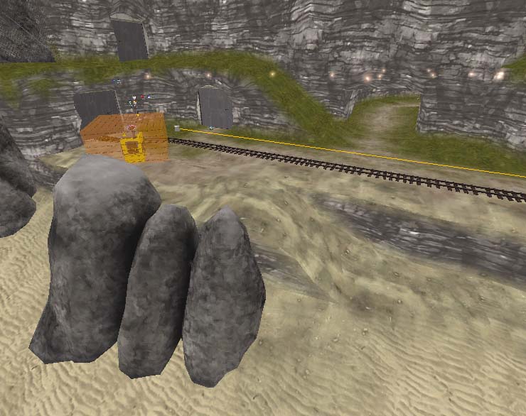
In the first screenhot those rocks along the side of the displacement ramp, aren't they hl2 rocks?
 

Tyker

L5: Dapper Member
Jun 1, 2009
232
142
This looks really good. The first screen though, like Godslayer said, looks more like a HL2 map than a TF2 map. Are those texture from the bulletcrops or have you made them custom?
 

IrishTaxIDriver

L6: Sharp Member
Sep 27, 2008
271
150
The metal fencing doesn't make an interesting level barrier to me in a wonderfully rich map like this, its bugging me (like the giant fence wall I pointed out a few days ago).

Otherwise its pretty fun. I think the point 2 area should get more direction though, where the cart spirals around the two buildings. Theres no real defined battle lines there, and most of the time you'll round a corner into a group of enemies.
 

Blade x64

Logical insanity
aa
Sep 3, 2009
252
639
Nice use of bulletcrops. I like the attention to detail, but I would get rid of sniper's camper, it seems a bit out of place considering it would be a model that everyone has seen already.

Do you mean it's out of place because most of the surroundings are custom?

In the first screenhot those rocks along the side of the displacement ramp, aren't they hl2 rocks?

The rocks and cliffside are from Bulletcrops. Could be the lighting making them seem like HL2.

The metal fencing doesn't make an interesting level barrier to me in a wonderfully rich map like this, its bugging me (like the giant fence wall I pointed out a few days ago).

Alright, I'll try to get a bit more creative with the barriers. Was the giant fence the one on the beach? I'm having trouble coming up with a realistic barrier for that part.

Otherwise its pretty fun. I think the point 2 area should get more direction though, where the cart spirals around the two buildings. Theres no real defined battle lines there, and most of the time you'll round a corner into a group of enemies.

I was trying to go for a more urban combat feel for the town section. Does it really feel that awkward?
 

honorum646

L6: Sharp Member
Oct 9, 2009
335
67
Do you mean it's out of place because most of the surroundings are custom?

I believe he means it doesn't fit in to the feel of the map because it breaks immersion. Everyone recognizes that as the Sniper's camper and putting it in a map instantly pulls the viewers mind out of your map and puts it into Meet the Sniper. It's the same reason people dislike using the Badlands' spire. People recognize it from something else and don't connect it to your map.

In my opinion, I would find a different vehicle to put in it's location, or remodel a new camper or something. Just so you don't break immersion.
 

Blade x64

Logical insanity
aa
Sep 3, 2009
252
639
Ah, that makes sense. Thanks for the explanation. Maritime has a vehicle I could use. I didn't want to use it until now because it was a little small.

Was the giant fence the one on the beach? I'm having trouble coming up with a realistic barrier for that part.

Nevermind, Barnblitz has a few wooden fences that work perfectly there.
 

grazr

Old Man Mutant Ninja Turtle
aa
Mar 4, 2008
5,441
3,814
The rocks have too much detail on them, they're very hl2-esque. The ground is also particularly detailed beyond what is necassery.

The building designs are very DoDS like as well, you should make either all of them taller so they fit the slightly warped "stylistic vs reality" TF2 style or at least some of them.

Make the roofs displacements as well, they're way too uniform.

I also don't recommend the use of the manor textures. They're overly obnoxious and don't necasserily fit the venitian theme you have going. Stick with stone or wood which is more appropriate. If you're having trouble for reference images check out the movies Transporter 2 or James Bond - Quantum of Solace.
 
Last edited:
Sep 1, 2009
573
323
I agree with frozen, as the bullet crop pack is great for small details eg a lighthouse , but that cliff texture only really works with 3dnj's artpass map due to the lighting and the style of his displacements.
 
Sep 1, 2009
573
323
examplecliff.jpg


Personally its just that green grass in my mind doesn't fit with sand and is kinda off putting , whereas martime's blendrocktosand would look much better and believe able.
 
Last edited:

Blade x64

Logical insanity
aa
Sep 3, 2009
252
639
Do the rock texture and coastal blend seem better now?

xHOaz.jpg


The building designs are very DoDS like as well, you should make either all of them taller so they fit the slightly warped "stylistic vs reality" TF2 style or at least some of them.

Make the roofs displacements as well, they're way too uniform.

I also don't recommend the use of the manor textures. They're overly obnoxious and don't necasserily fit the venitian theme you have going. Stick with stone or wood which is more appropriate. If you're having trouble for reference images check out the movies Transporter 2 or James Bond - Quantum of Solace.

I'll make the buildings along the road taller, but none of the others. The ones with large slanted roofs just don't feel right when they're four stories tall. I'm ashamed that I didn't think of making the roofs displacements, good idea. I'm sticking with the manor textures as swapping them out for others will only make this map feel less like TF2. That, and I like them myself.

I'll try out different cliff textures to see if one seems better suited for a coastal cliff.

For now, I just can't get rid of the camper. It's big enough to block the doorway and small enough that people can use it to jump on the balcony.
 
Sep 1, 2009
573
323
I like the improvements on the blending for the beach area :3
 

purequaternion

L3: Member
May 19, 2009
101
64
Oh I'm so glad someone is using those adobe textures. I got busy with teaching and never had a chance to work on the adobe map I was doing. I've felt guilty since.

Looks nice!
 

Blade x64

Logical insanity
aa
Sep 3, 2009
252
639
Updated to b4
-Various detail improvements
-Reduced spawn times for both teams on final point
-Disabled collisions for crane machinery
-Improved optimization

Oh I'm so glad someone is using those adobe textures. I got busy with teaching and never had a chance to work on the adobe map I was doing. I've felt guilty since.

Looks nice!

They were exactly what I needed. Thanks for requesting them!
 

Rexy

The Kwisatz Haderach
aa
Dec 22, 2008
1,798
2,533
Hey Blade,

I got a chance to play pier tonight for the first time and there were lots of aspects I liked! At the same time there were a lot of visual things I thought that if you changed/replaced it would tie this aspect of the map together very strongly.

I would like to suggest using more of the bullet crops items, seek out architectural references that are going to sell both the visual design of the assets and the seaside setting--the other side of this is avoid using the manor assets unless you're making a manor, or something similar. I want to believe I understand good usage of them, and I've seen examples of the assets being used in both good and not so good ways. I don't believe the assets should be used as universally as they are, although there are a few items I feel can be used in any setting, like the cardboard boxes, maybe even some door frames and doors. Overall, by replacing the manor assets with more appropriate items, I think you can eliminate the weakest visual aspect of the map and strengthen the rest in the process.

As far as gameplay, I'm afraid I haven't played enough of it to offer any thoughts on this topic.