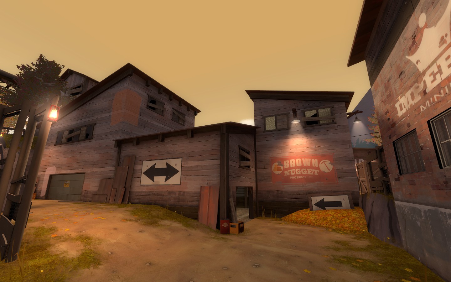
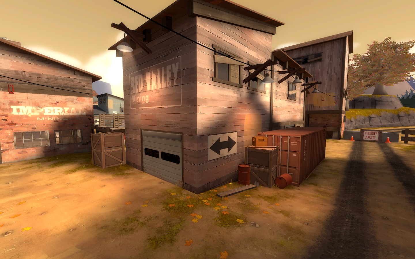
Maple Ridge

KotH Maple Ridge RC2

  • This map is featured! Our best maps, all together in one place for your viewing pleasure.

Berry

resident homo
aa
Dec 27, 2012
1,056
1,898
A6
- Renamed from Don't to Maple Ridge
- Properly clipped the pipebridges

- Rebuilt displacements around the control point
- Moved cap up another 32HU
- Heightened & clipped center shed
- Bulletblocked the buffer zone buildings
- Removed exploitable crate in buffer zones
- Fixed clipping error
- Changed the middle pipe to a rock chute
- Added platform supports beside latter-said chute as engineer spots
- Fixed small hole either side of map (not a leak)

Download
 
Last edited:

Lenny

L2: Junior Member
May 2, 2013
90
35
Don't

rename this map.
 

RubbishyUser

L7: Fancy Member
Feb 17, 2013
414
488
ar122627961917946.jpg


Blu team on the left, red team on the right. I will still be upset that this isn't called don't any more, but at least you've chosen a real area in British Columbia for me to look up puns around.
 

Berry

resident homo
aa
Dec 27, 2012
1,056
1,898
ar122627961917946.jpg


Blu team on the left, red team on the right. I will still be upset that this isn't called don't any more, but at least you've chosen a real area in British Columbia for me to look up puns around.

I had no idea it was a real place to be honest.

Let the puns continue!
 

Berry

resident homo
aa
Dec 27, 2012
1,056
1,898
A7
- Added a viaduct pro-esque route through the large cap building
- Support platforms at side of chute pointed straight up to cap (they were used mostly like that anyway)
- Extended see-through cover at control point
- Added a wooden platform either side of the control point to flank around the fence coverings

- Fixed displacement players got stuck on at BLU side
- Changed shed route doors to windowed doors
- Clipped rock chute at control point
- Replaced some wooden brush-based fences with other stuff
- Varied buffer zone buildings a tiny bit more than before

Download
 
Mar 23, 2010
1,872
1,696
this map is turning out really good. i would remove the current flank and instead return it to it's "nice holding area" glory (similar to viaduct cliff). then add a flank to make lower more useful area to be and you got yourself a map.

this is what I would do personally. It might be too easy to go past the point and remove focus from the point area but I think the way the routes to the point are positioned to the point, it would be neat and fun. dropdowns/crate jump route would be enough if it ends up too flanky.
 
Last edited:

Berry

resident homo
aa
Dec 27, 2012
1,056
1,898
A9

- Removed the abusable harvest trees
- Removed pumpkins you can get yourself stuck on
- Blocked off dropdown area, still "usable" for visibility purposes
- Slapped some colour on areas I'm comfortable with the gameplay of

Competitive-based changes:
- Completely rebuilt and revised everywhere but mid (rebuilt spawn and buffer essentially)
- Drastically lowered health/ammo in the map, specifically everywhere but the CP
- Hollowed the cap building, changed the shed to a small covered area leading inside it

- Heightened chute building so it doesn't look walkable

Download (.bz2)
 

Berry

resident homo
aa
Dec 27, 2012
1,056
1,898
B3
- Rendered with staticproppolys
- Expanded 3D skybox
- Removed unnecessary lighting origins
- Moved some tree models
- Added more leaf overlays
- Added more fences to the cliffs
- Slight changes to displacement on the cliffs and the ramps up to the capture area
- Increased detail to both spawn buildings
- Minor changes to skip/hint brushes
- Lighting tweaks
- Removed the grass at the base of the cliffs.

--Theo
 

EArkham

Necromancer
aa
Aug 14, 2009
1,625
2,773
You should update OP with the new detailing.

This is overall a pretty good and fun map. Decent distance to mid.

Not crazy about the direction you face when you spawn. Not a major issue, you can orient yourself pretty quickly, but it seems a tiny bit disconcerting at first.

The spawns are awfully spacious, feels empty.

Someone mentioned red spawning in blu's spawn at one point.

There's a crate near the second row of buildings that should be moved closer to the building corner. Little too strong for snipers otherwise (I'm sure the sniper using that spot during the test today will feedback it, since he mentioned it in game a few times).

Overall a good map, looking forward to seeing future tweaks and revisions.
 

ThrowingPie

L1: Registered
Apr 6, 2014
28
30
I enjoyed playing the map but a high sniper spot/ balcony might make the sniper better when defending. If you're team controls the CP then you can snipe from the point but other then that the sniper is slightly limited. ( just my two cents might not work if you try it)

Overall I enjoyed playing on the map and think it looks good.
 

evanonline

L420: High Member
Mar 15, 2009
485
273
I love the look of the map, and just running around and giving it a cursory glance I think the layout has some great potential.

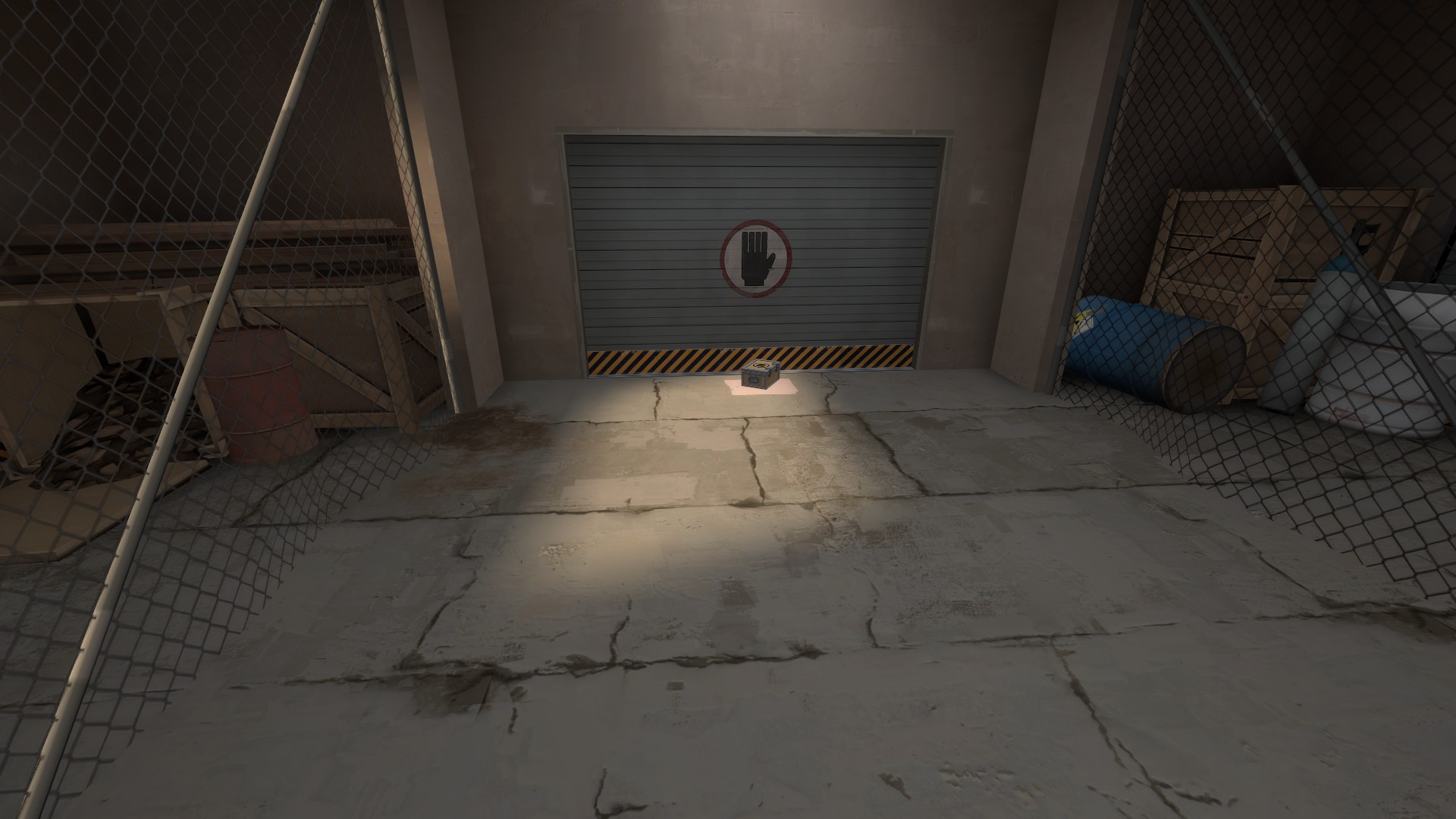
(Nerdy pet peeve: the garage doors on the front of the BLU base can't possibly go anywhere!!! They lead right into elevator shafts!!!!!!)
 

Freyja

aa
Jul 31, 2009
2,994
5,813
2014-07-21_00001.jpg


I'm sure you know of this one. You should edit the VMT to not produce detailsprites.

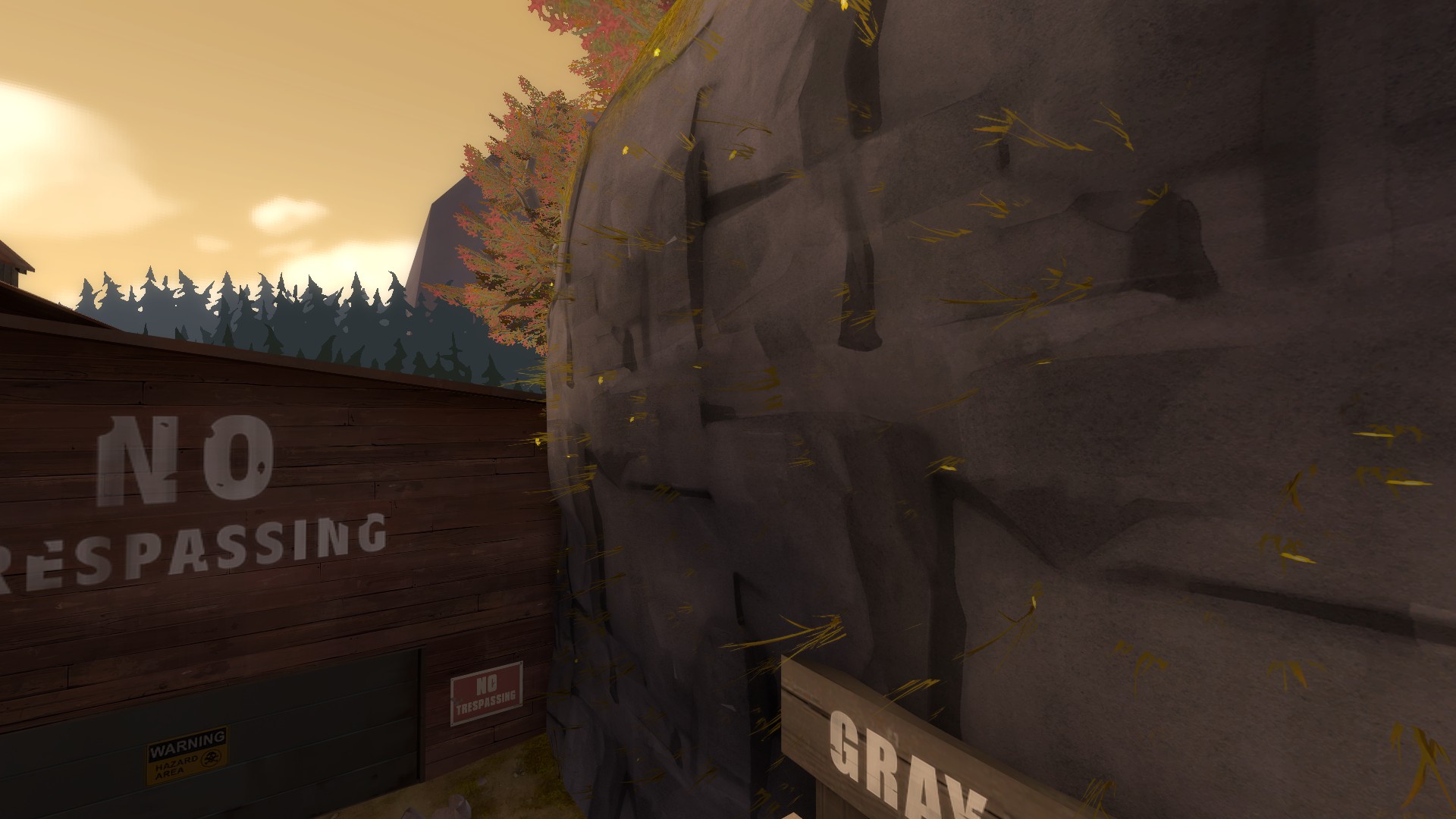
Additionally, I *hate* this rock texture. It's just so ugly, repeditive, noisy and ugly. It's your choice I guess but I think the winter (yukon) rockwall, although not tiling vertically, looks better 100% of the time.

2014-07-21_00002.jpg


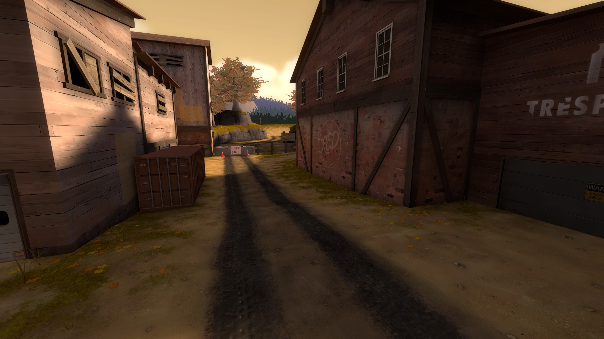
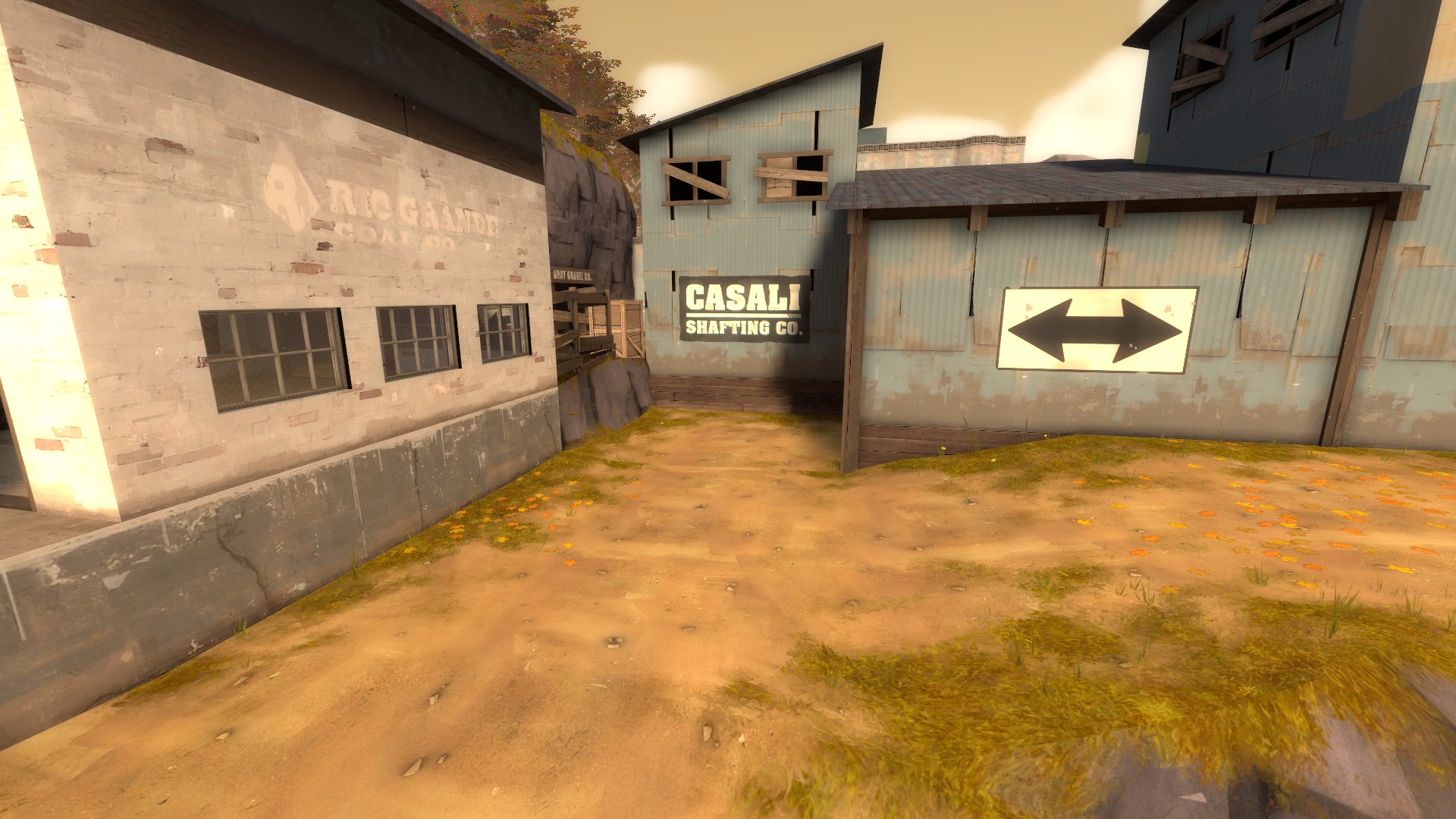
This area feels really empty. Some grass props, random barrels or crates in the corners, just general clutter against the walls would really help to make the area feel less empty and more lived in without changing the layout much if at all.

2014-07-21_00003.jpg


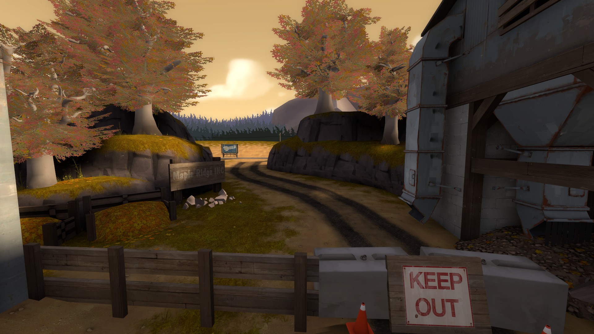
This out of bounds area is nice, but the cliffs, like Frozen said in the other thread, feel quite pillowy and unnatural. Making them flare out at the bottom (like actual cliffs do, unless they're eroded from below by water) would make them look nicer. Also I feel some more emphasis on the sign is probably important.

2014-07-21_00004.jpg


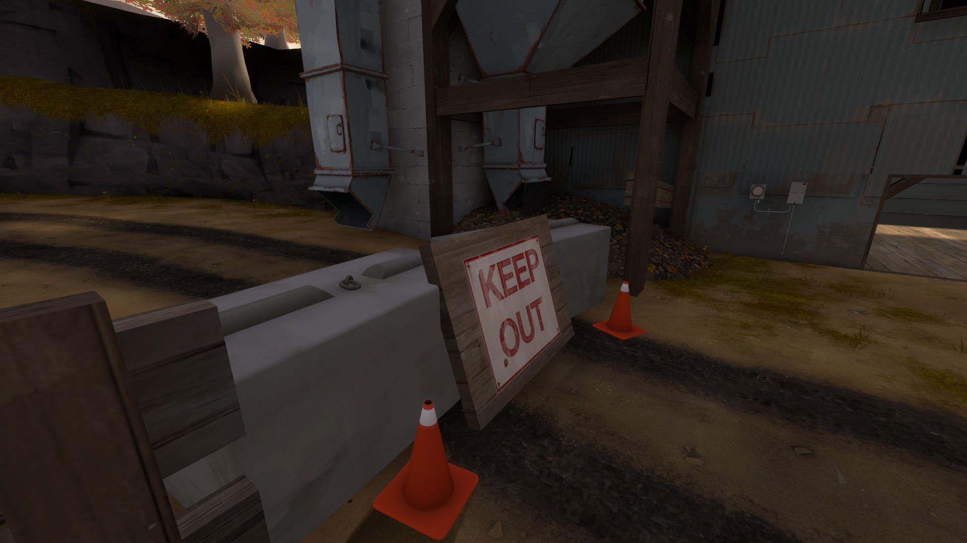
Sign colliding with props.

2014-07-21_00005.jpg

2014-07-21_00011.jpg


I feel this detailing so far suffers in the same way as to your otherwise outstanding detail 2SS entry. Your lighting is just really poor, it's empty and creates a very flat and lacklustre feeling to the map. The environment lighting is cool, but isn't enough alone.

Lighting your doors is a really easy way to improve this, and official maps do this everywhere. Take a look at the lighting specifically in something like this or this. You can see in both how the actual routes you can take are extremely visibly lit, drawing players towards them, and it really helps to break up the monotony of the lighting at the same time.

2014-07-21_00009.jpg


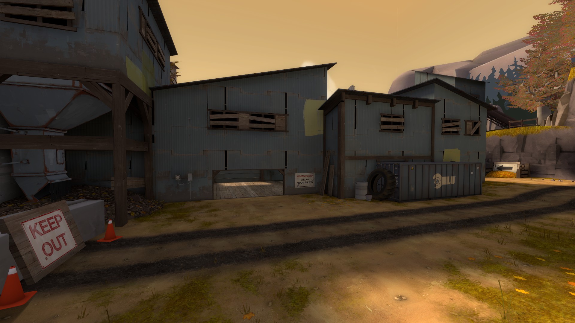
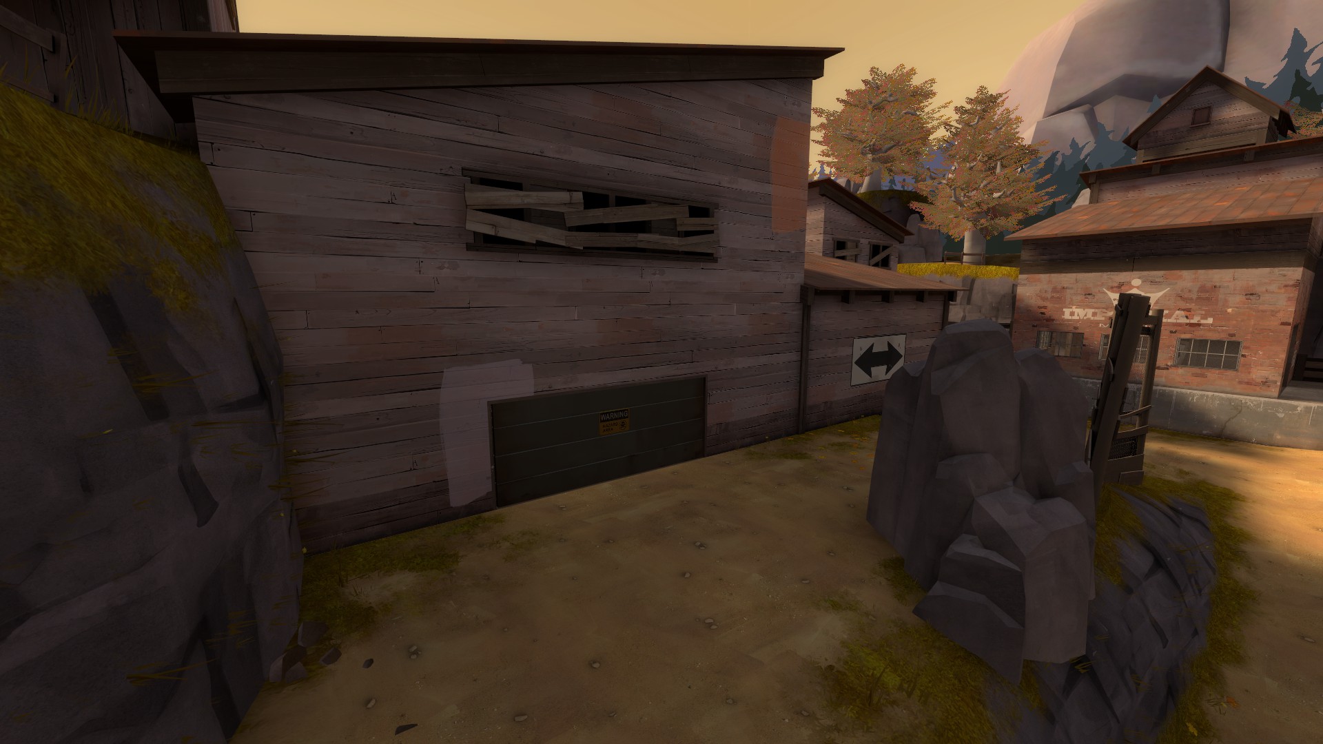
This is another place in maple ridge that could serve so much from just some highlighting. From this angle, I can't even tell there's a door there, it could simply be a dead end or area.

2014-07-21_00010.jpg


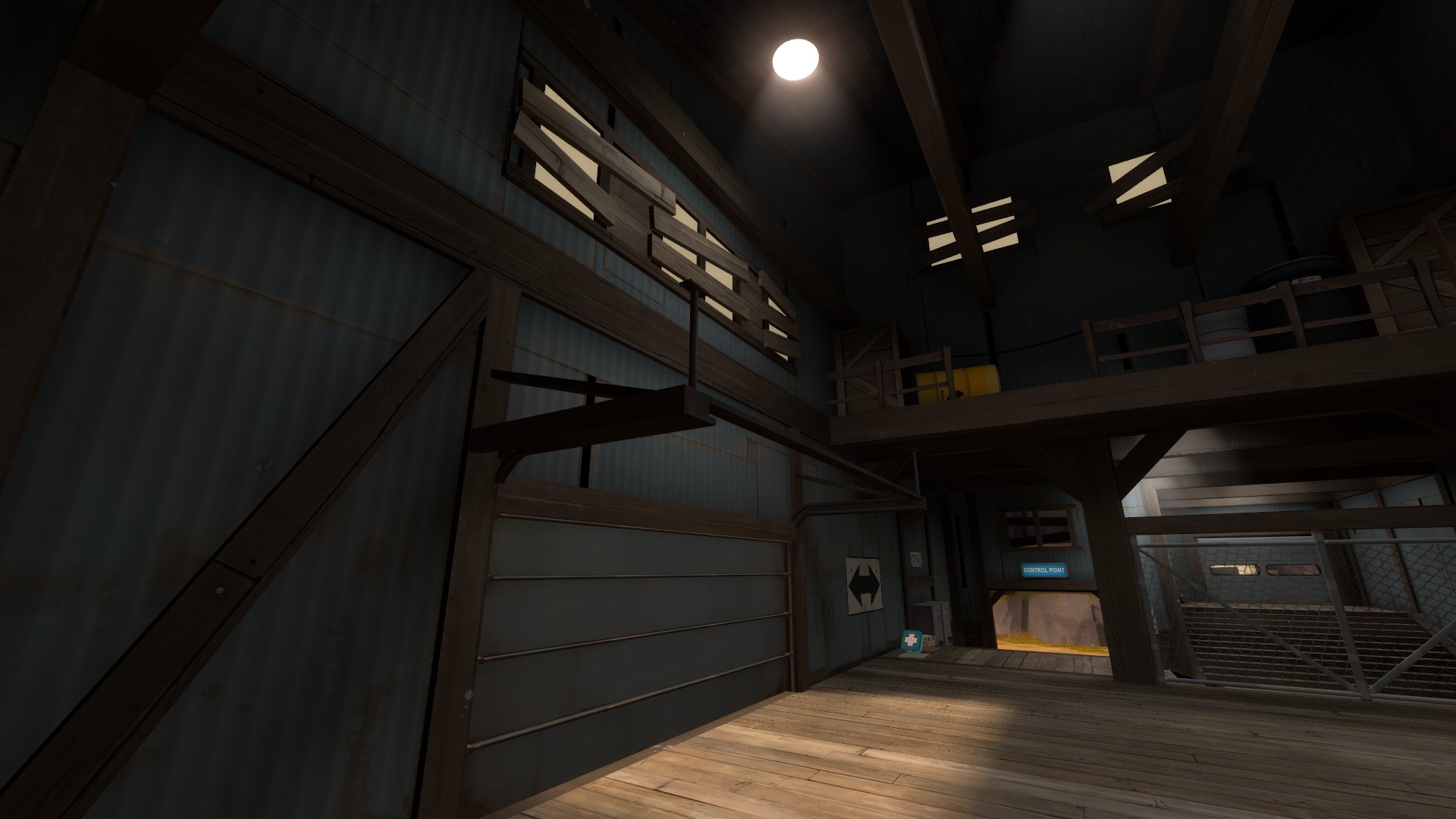
The lighting in this room feels weird. I walked in here and thought the lighting was odd, I had to actually search for the window it was coming from. While accurate, the rest of the lighting in the room neutralizes the natural lighting, so the skylight coming in actually feels super out of place and looks like it was cast from the light above.

2014-07-21_00006.jpg


Your door frame here is floating.

2014-07-21_00007.jpg


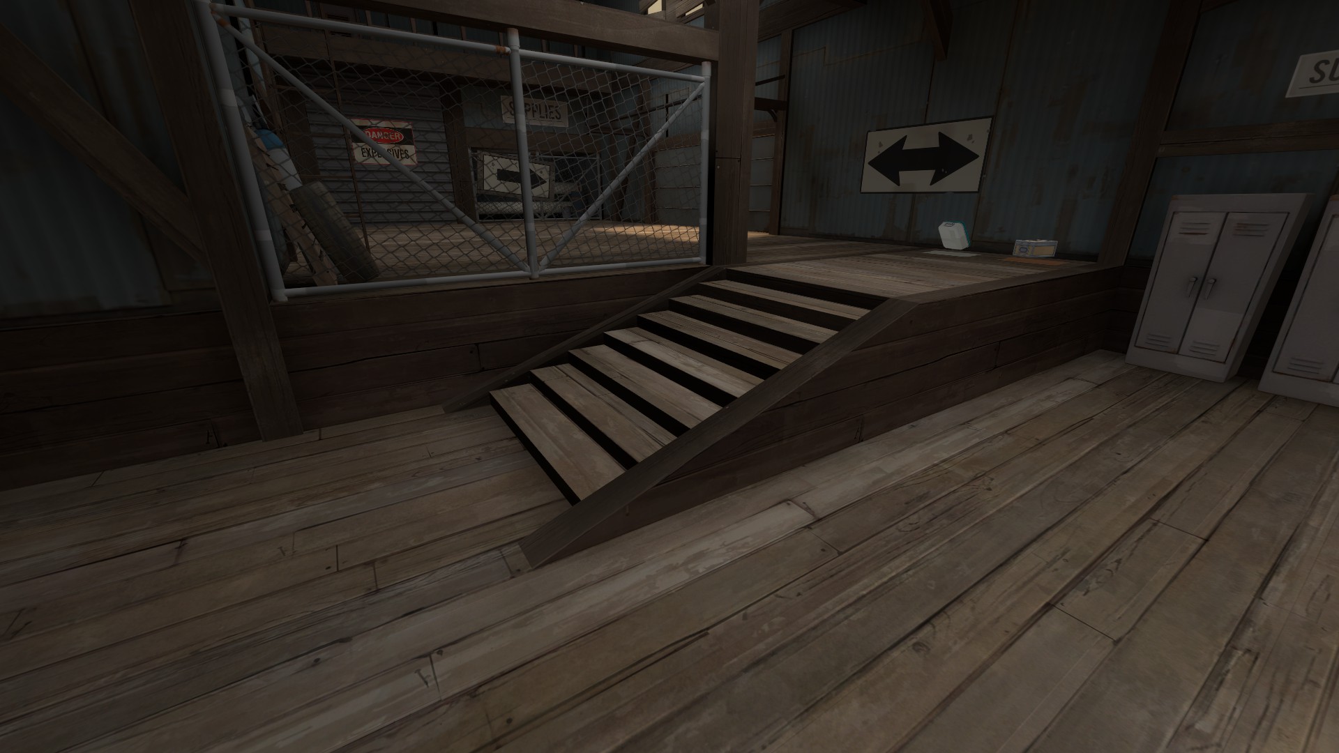
I don't like this style of stair, it feels way too long horizontally and as a result looks odd, I think stairs work best as 2:3 gradients.

2014-07-21_00008.jpg


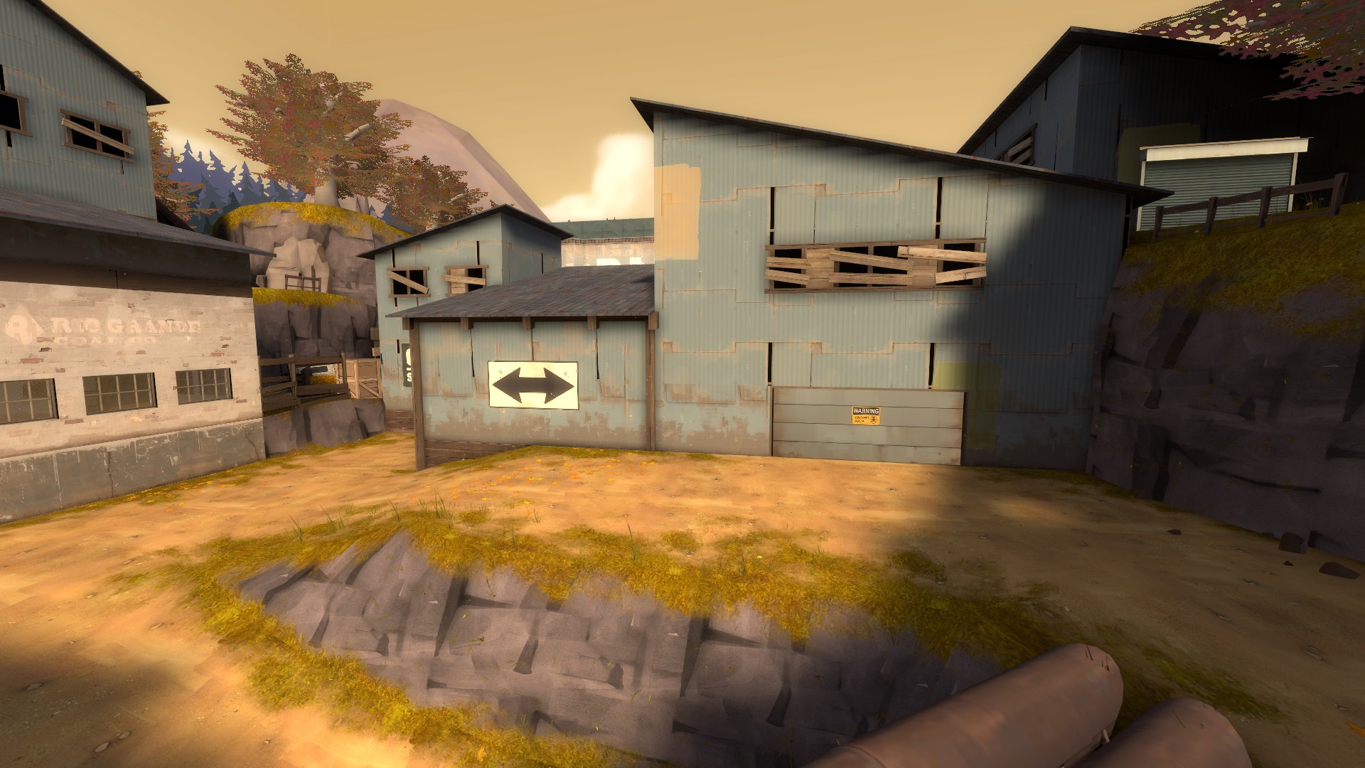
In the case of a place like this, where lighting variation does less to create interest because of the full daylight, you should use a lot more dense detailing around the routes instead. Flat walls aren't bad, but in this case it is because this wall acts as the façade for the blue part of the map, and it's incredibly drab, especially around the door. Here's an example of a rather boring (texture wise and architecturally), but makes up for it using clutter, lots of overlays and light fixtures to create more detail density, and thus more interest.
 

puxorb

L69: Emoticon
aa
Dec 15, 2013
531
798
One complaint that I have with the map is that those gameplay doors inside the spawn for the elevators, while very cool, are also quite confusing. I had a hard time trying to find the actual gameplay door surrounded by these.

I would recommend trying to recreate them out of brushwork with a metal grate as the inside part and metal/ibeam001 as the border/trim.
 

Pocket

Half a Lambert is better than one.
aa
Nov 14, 2009
4,694
2,579
Addendum on a couple of Aly's screenshots:

2014-07-21_00004.jpg


Sign colliding with props.
And it's a single flat surface made out of wooden slats that are inexplicably held together, just for the purposes of nailing a sign to it. Valve has made maps that use detail brushes just to attach signs to props too, but they're a lot subtler about it; they're usually gray sheet metal and the exact same size as the overlay.

2014-07-21_00006.jpg


Your door frame here is floating.
And it's clipping into the wood. Remember, those are tracks for the door to run on; they need to be exposed.