I'm sure you know of this one. You should edit the VMT to not produce detailsprites.
Additionally, I *hate* this rock texture. It's just so ugly, repeditive, noisy and ugly. It's your choice I guess but I think the winter (yukon) rockwall, although not tiling vertically, looks better 100% of the time.
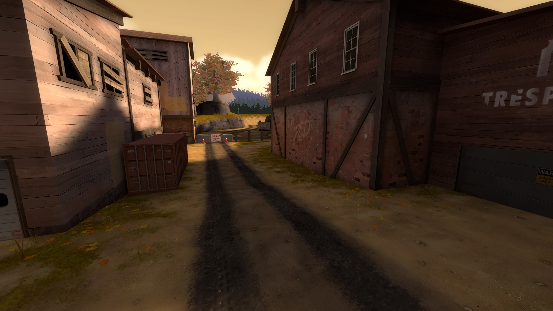
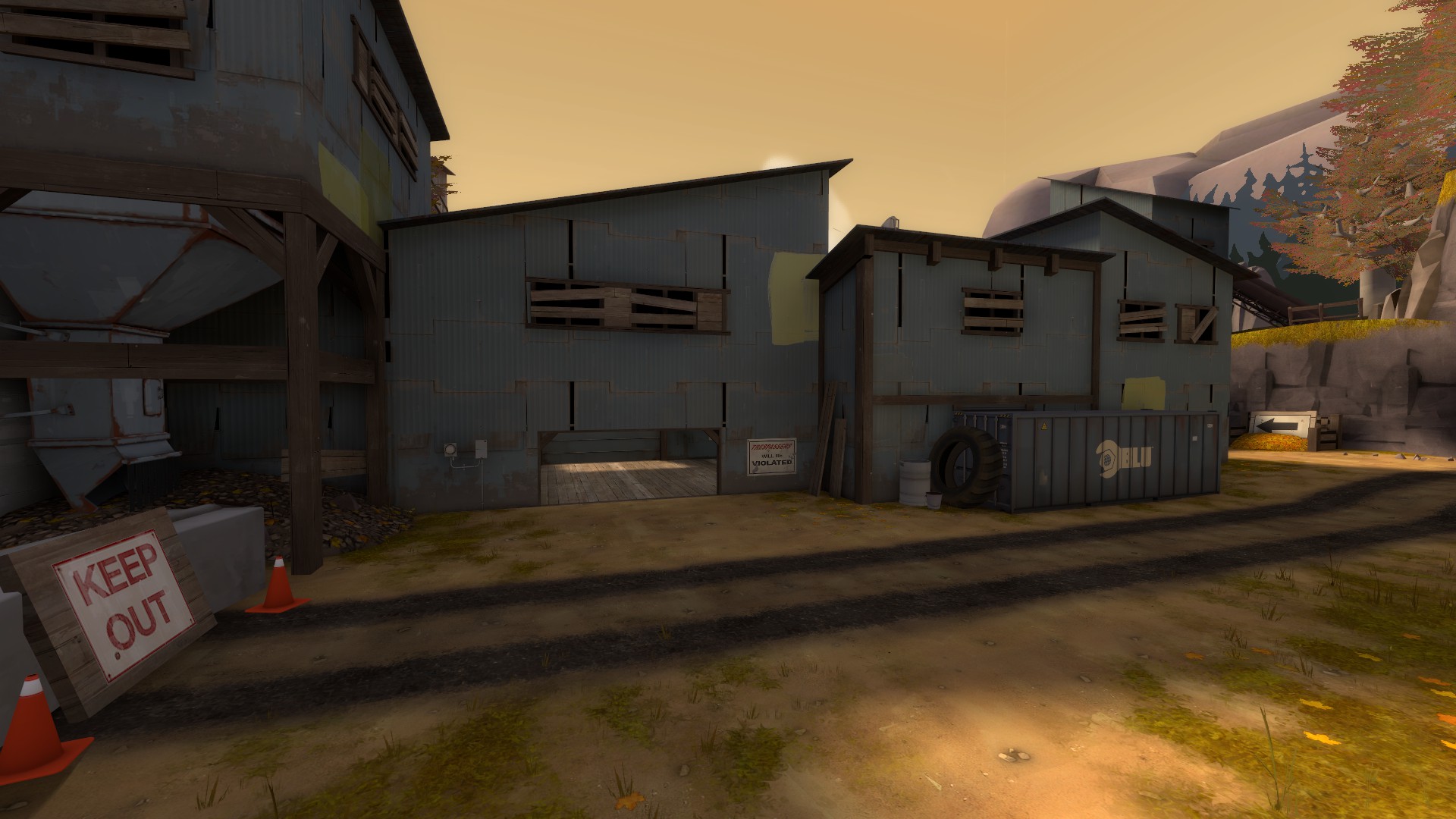
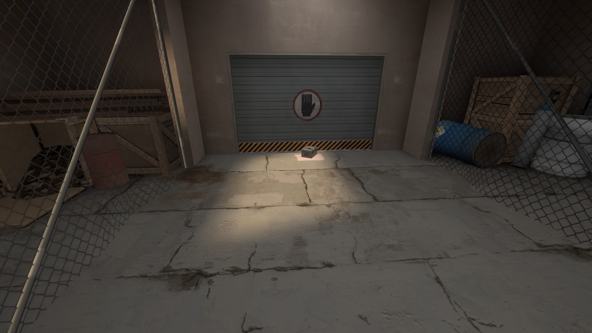
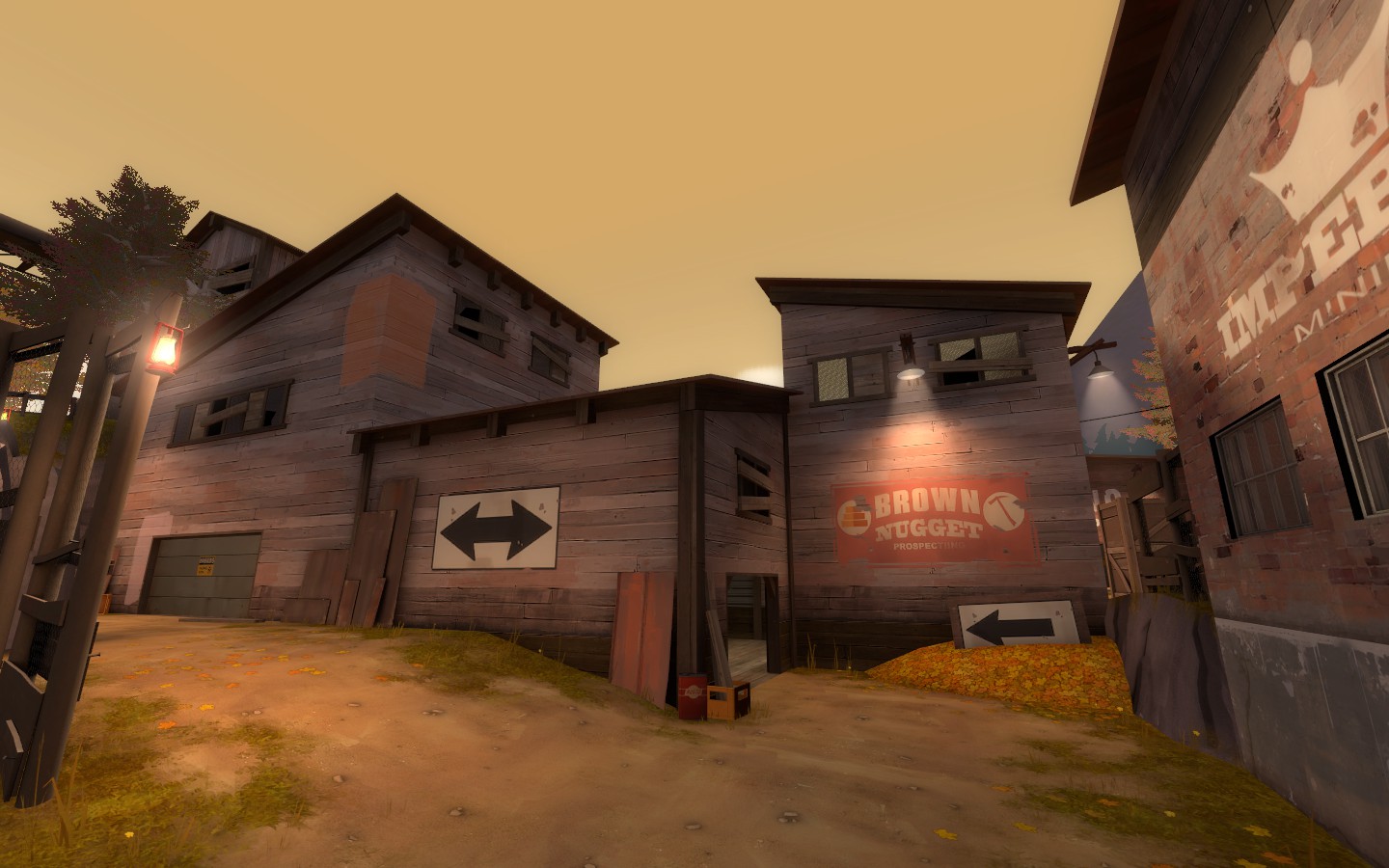
This area feels really empty. Some grass props, random barrels or crates in the corners, just general clutter against the walls would really help to make the area feel less empty and more lived in without changing the layout much if at all.
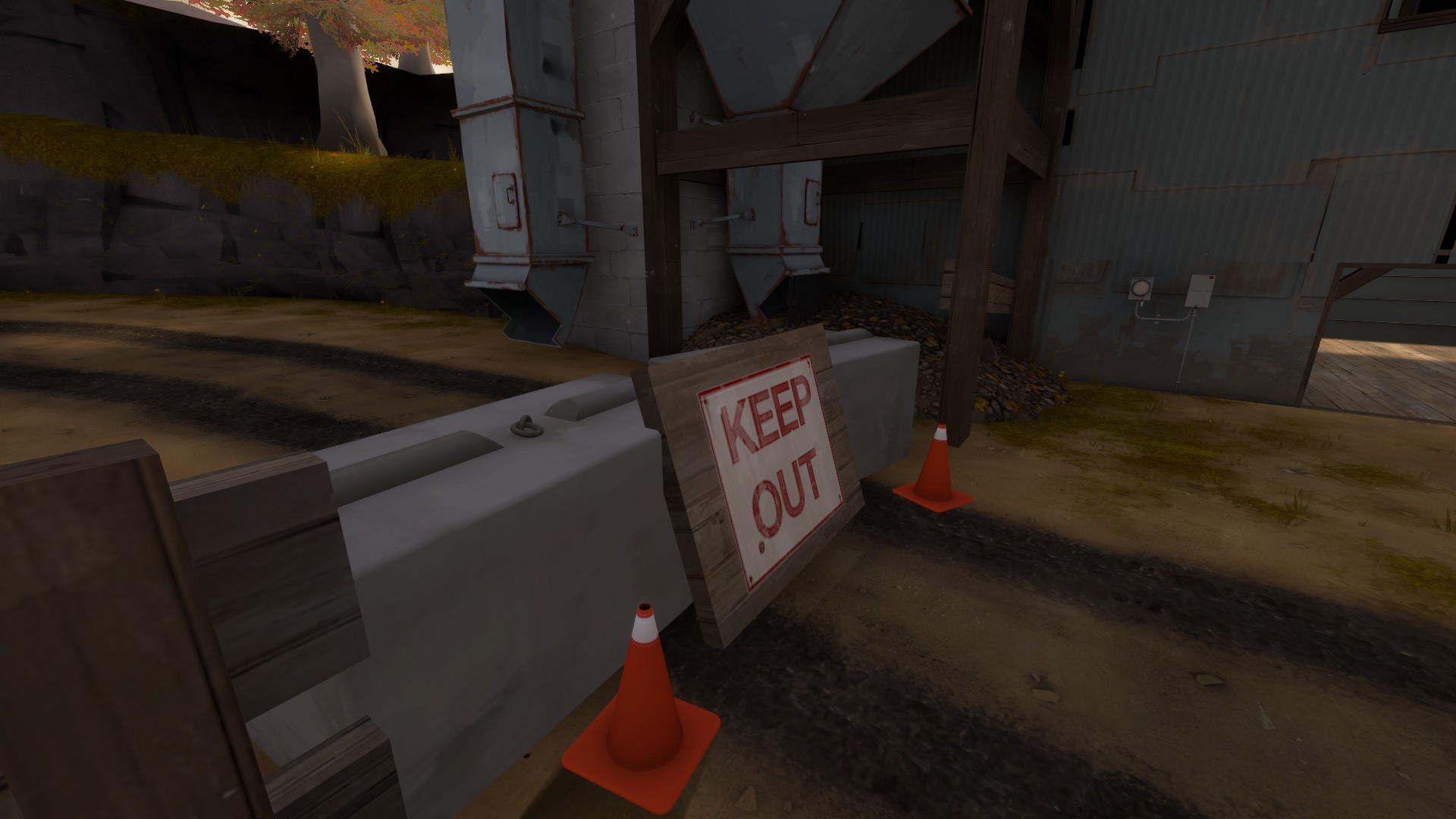
This out of bounds area is nice, but the cliffs, like Frozen said in the other thread, feel quite pillowy and unnatural. Making them flare out at the bottom (like actual cliffs do, unless they're eroded from below by water) would make them look nicer. Also I feel some more emphasis on the sign is probably important.
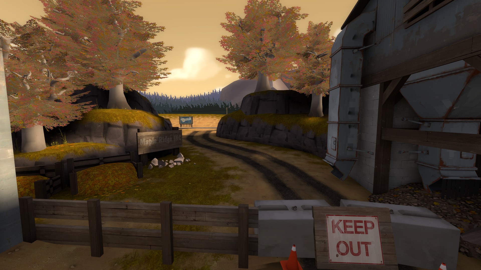
Sign colliding with props.
I feel this detailing so far suffers in the same way as to your otherwise outstanding detail 2SS entry. Your lighting is just really poor, it's empty and creates a very flat and lacklustre feeling to the map. The environment lighting is cool, but isn't enough alone.
Lighting your doors is a really easy way to improve this, and official maps do this everywhere. Take a look at the lighting specifically in something like
this or
this. You can see in both how the actual routes you can take are extremely visibly lit, drawing players towards them, and it really helps to break up the monotony of the lighting at the same time.
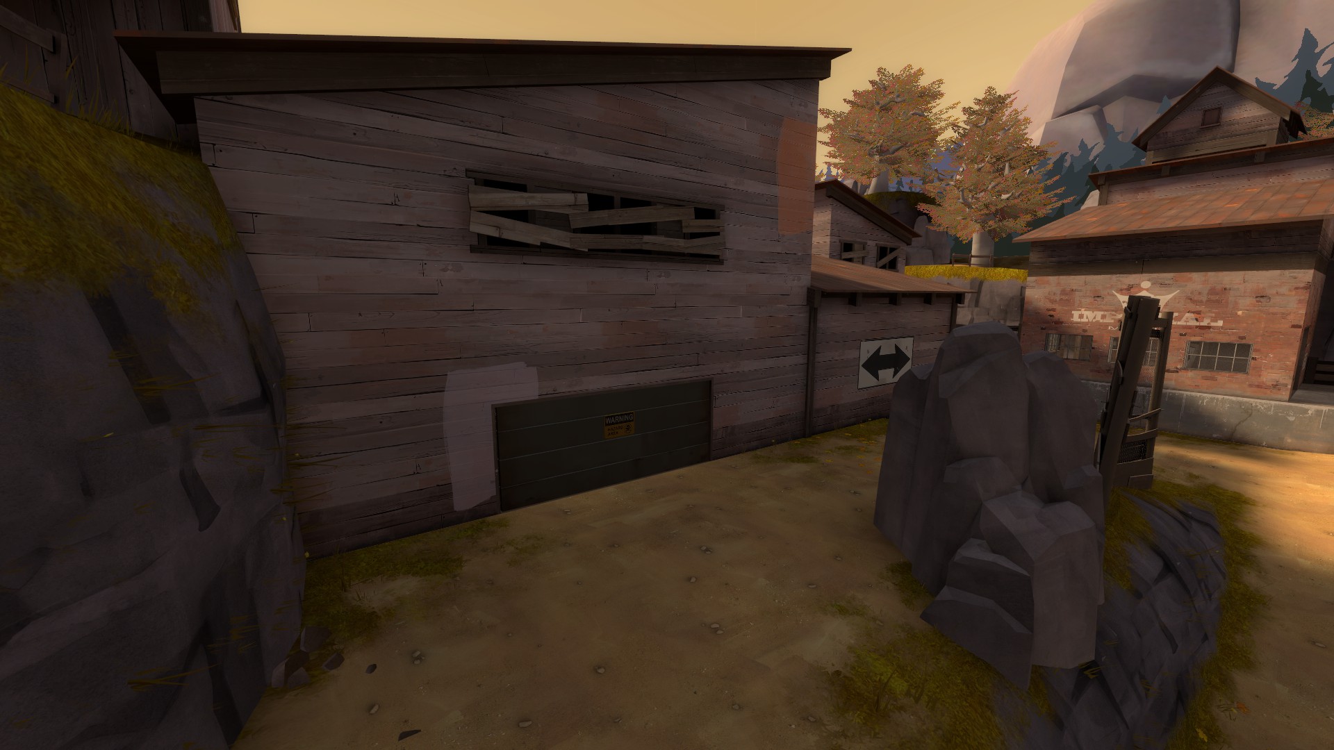
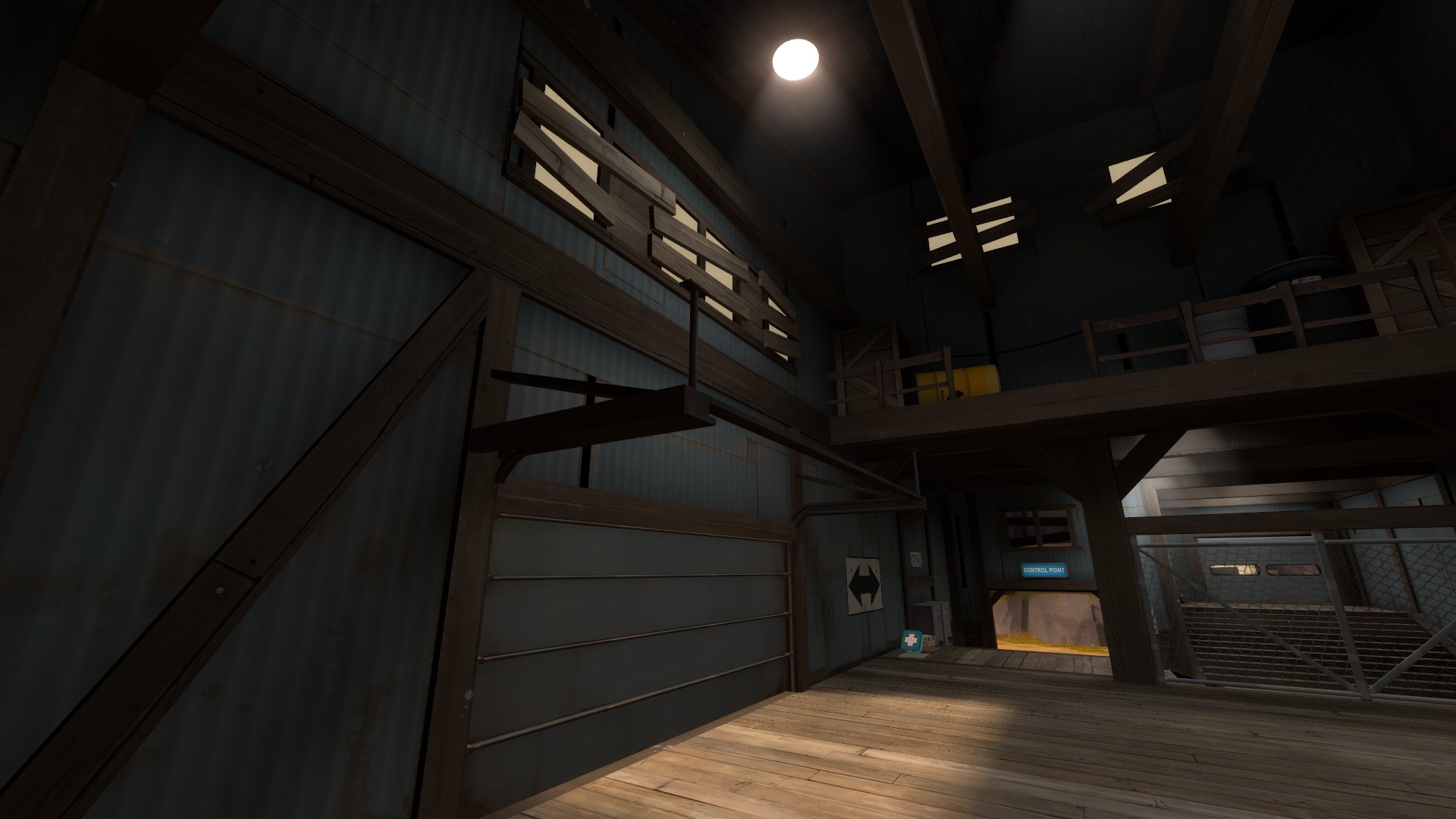
This is another place in maple ridge that could serve so much from just some highlighting. From this angle, I can't even tell there's a door there, it could simply be a dead end or area.
The lighting in this room feels weird. I walked in here and thought the lighting was odd, I had to actually search for the window it was coming from. While accurate, the rest of the lighting in the room neutralizes the natural lighting, so the skylight coming in actually feels super out of place and looks like it was cast from the light above.
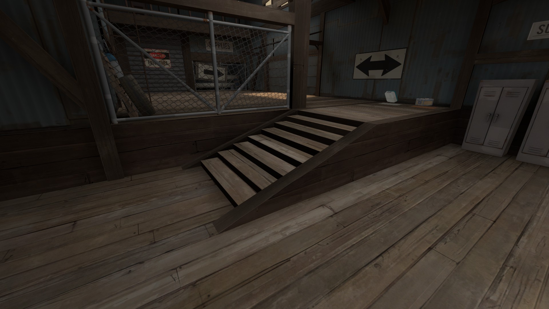
Your door frame here is floating.
I don't like this style of stair, it feels way too long horizontally and as a result looks odd, I think stairs work best as 2:3 gradients.
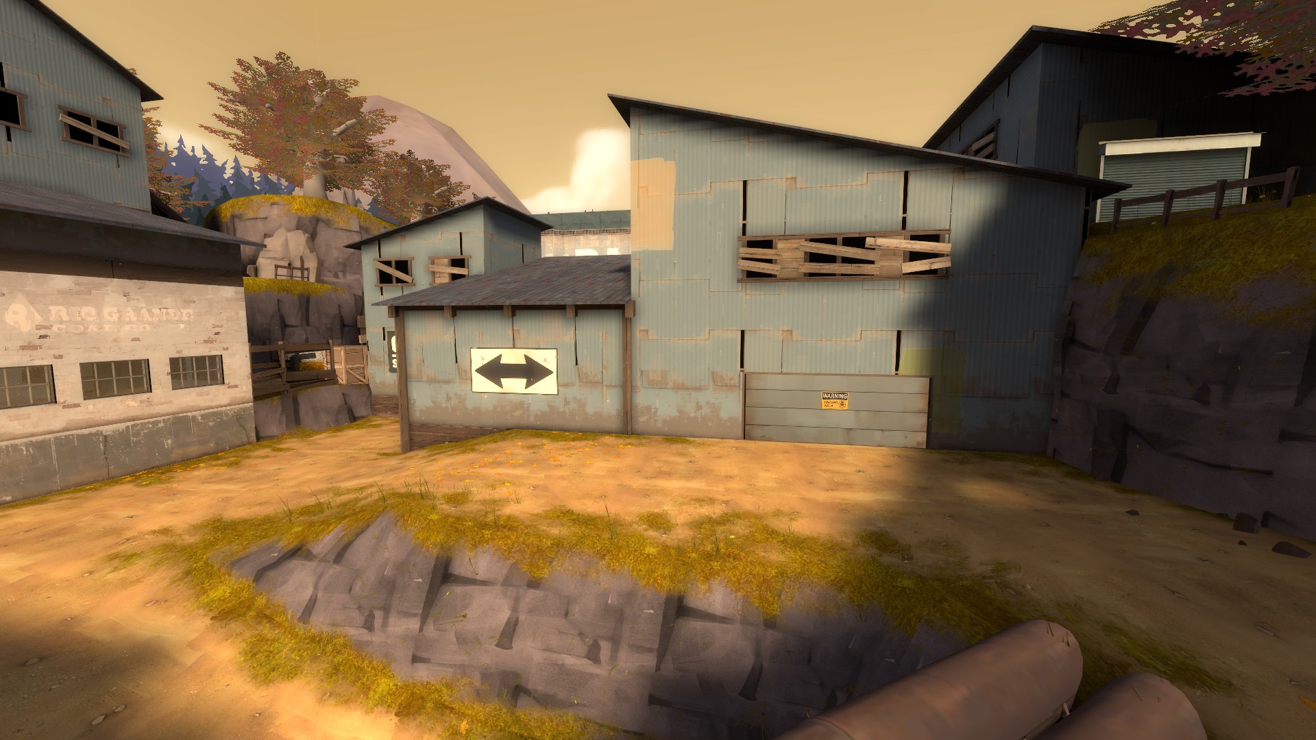
In the case of a place like this, where lighting variation does less to create interest because of the full daylight, you should use a lot more dense detailing around the routes instead. Flat walls aren't bad, but in this case it is because this wall acts as the façade for the blue part of the map, and it's incredibly drab, especially around the door.
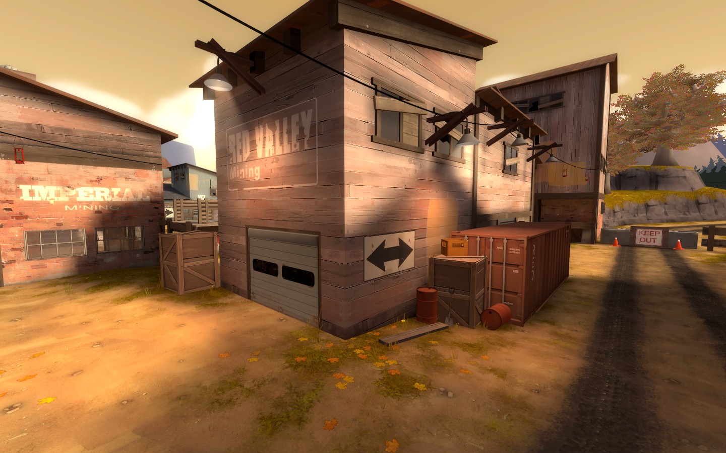
Here's an example of a rather boring (texture wise and architecturally), but makes up for it using clutter, lots of overlays and light fixtures to create more detail density, and thus more interest.