Alright, so, I can't give any gameplay feedback. I haven't played it... So I'll leave that for other people to argue, but I do have some lighting feedback, and some detail feedback that might get some of the people off your back.
Alright, lets start with the simple detailing thing:
This is creative, but no one in their right mind would make pipes like this, I suggest something more straighter. (More of the large white pipes perhaps?)
If I can't get back there, make it so I know that I can't (like put a cart or something there, something so I know that it is out of bounds)
Some shadow issues on these, i think putting a info_lighting in front of them, and having their lighting origin set to that would be best
Increase the texture scale on both of the water here. Your transition is pretty bad, making the scale will help a little, but you need something else down there to mask it a little (not hide perhaps, but just make it less obvious) --- ALSO, move the mist particles from the waterfall down, its too high up to be realistic.
Seam, small, but annoying.
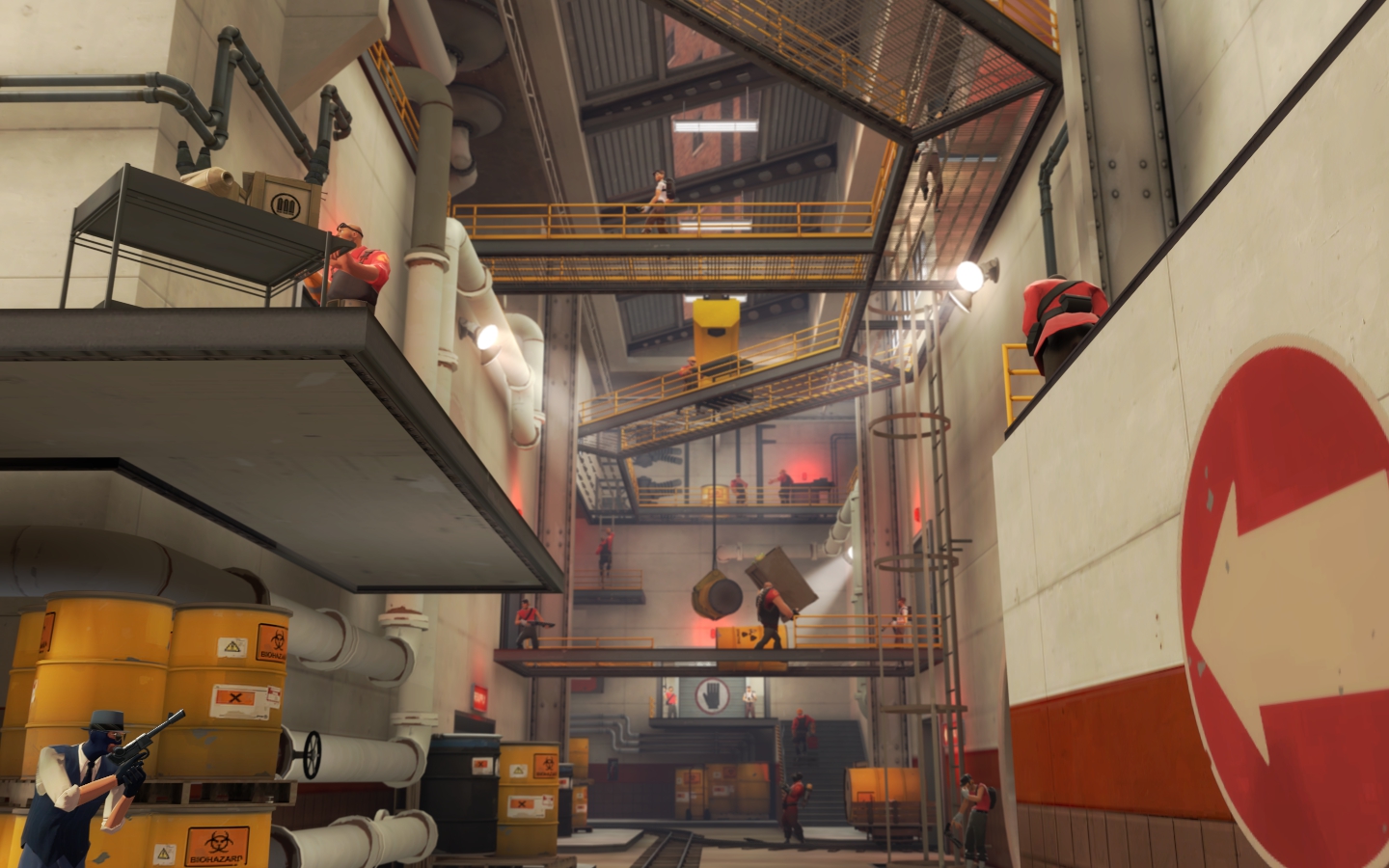
Make the barrels look more supported. Its kinda silly the way they are being carried right now.
Make these stairs, with a wooden ramp backing. These currently just look really ugly
Cute, I like it, but unnecessary detailing. Also, how did those get down there? Small cans/bottles make sense. Not full tanks
Also, the skybox behind Reds base looks crappy in my opinion. You should lower/move back the buildings that are there, and add something between them and Reds base to show a proper division between the detailing. Right now, it looks like the red buildings are right on top of the base (and that doesn't make sense!)
Alright, now for the lighting lesson (part 1):
I'm not an expert lighter, but I do know a bit more than some people (If you look at backlot, you can see why I needed to learn a bit about proper lighting...). The main point in lighting a map is lighting the places that people need to be/see as best as possible. The Out of bounds area's we don't care about right yet.
What I've noticed is that you have a lot of lights. and I mean, A LOT of lights. They all seem to be on too. Your map is around dusk, so the env_light angle is a bit low, you can use this to your advantage. For example:
In just this stretch, you have about TEN (10) lights that I can see, not counting the red lights (which, btw, tone down them, they are too wide on the lighting, or use sprites). This area could have a very nice shadow effect up towards the top. My suggestion is to turn off the upper lights, and use just the spots on the bottom. You should have enough light from the env_light and from the spots to have a properly lit path. This goes the same through that whole section.
Here there is the same issue:
You have TEN (10) light sources here in just this shot, not including the the ones under the walkways. You could do the same thing here, you don't need a lightbulb every 2 beams, you can get away with 3-4 beams. Also, the hanging cone lights are un-necessary if you have the spot lights, along with the windows.
**You might be able to get away with doing some silhouetting on the windows in the upper right (which is where you take a wide light_spot, make it the same color as env_light, make it a little less than the brightness of the env_light, and have it point in towards the map, it simulates natural light coming in through the windows**
Here some other places where your light density is too high:
This is in the building in front of blu spawn.
This is the small building in front of blu spawn. You have 5 lights. You can still properly light that area (and the detail on top) with 3, just by turning off/getting rid of the the light on the farthest left of the picture, and the farthest right of the picture.
You can do a similiar thing here:
Lighting lesson - part 2:
Now with lighting the playing area's, you also need to keep in mind the area's of interest. AKA: the capture points. So if you have spot lights shining anywhere, the first one's you place into the map, should be high lighting the points.
Here is one place where I think you can tone down the lighting density a bit, AND, highlight the point more. The goal is to blow up the rocket, isn't it? Then why are all the spotlights shining downwards and none towards the rocket? You can do this simpley but taking the existing spotlights, and just turn 2-3 of them so that they shine on the rocket (You don't need to add any more lights here).
Lighting in a map is as important as detail and gameplay, if provides and additional feel for the map and helps the player become more immersed in the environment. A thing I find helpful when dealing with lighting for maps is to take out all the lights in the map, and then run through it (assuming its not pitch black). Then, go through and only light up the places where people can walk AND are too dark to recgonize team colors. Nothing else. Once that is done, then you can start to add minimal lighting to the detail areas of the map.
I hope this helps. I was really impressed with the way the map looks.


")


