Mann Manor

CP Mann Manor Final release

Draco18s

L9: Fashionable Member
Sep 19, 2009
622
136
I will admit that I initially didn't feel that this map should have been a winner, but I've come to terms with that for several reasons, one of which is that it makes a great event map and because the props are the right feel for a map I've been working on. Tables, chairs, book cases, chandeliers, etc.

Congrats. :)
 
Jan 20, 2010
1,317
902
There are a couple spots that have been bothering me a lot.

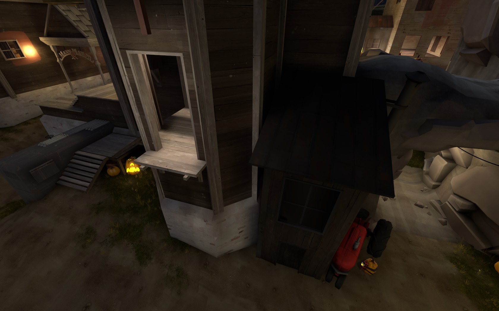
cp_manor_event0000.jpg


Jumping from the right ledge to the left ledge is much harder than it should be. That's meant, I believe, to be a easily used route.

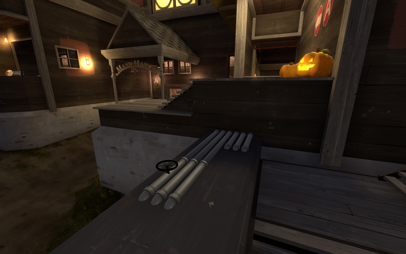
cp_manor_event0001.jpg


Many times jumping from the right ledge where the pipes are to the top left ledge, I get stuck where the wood sticks out. Nevermind that I have to crouch jump to get up there, but way too many times I run through that way and get my head stuck on that wood and fall down on top of the brick underneath it.
 

Pocket

Half a Lambert is better than one.
aa
Nov 14, 2009
4,701
2,583
Oh yeah, by the way, in that last screenshot, do those pipes have vertex lighting disabled or something? Because that middle section is awkwardly bright compared to the others.
 

Scotland Tom

L6: Sharp Member
Jan 19, 2008
332
64
Ditto to what Leminnes posted.

I've gotten more adept at making that awkward jump back and forth into that window, but it really never should've been an issue. I realize the artpass map was kind of designed that way but at this point I really think it'd make more sense if there were an opening in that wall between the roof and that little room.

And about that little jump from that ledge with the pipes... It either needs the hell clipped out of it or it needs to be re-tooled to make it more friendly for those who want to use it as a legitimate route to those upper ledges. Preferably both.

And to add to that list of annoyances I think it'd be nice if the fence around A went bye-bye. It can really get messy trying to move around down there when you're under fire trying to take the point or defend it.
 

Wilson

Boomer by Sleep
aa
May 4, 2010
1,388
1,227
Also, there is this really annoying gap between Mann manor sign support and the ledges, you have no idea how many times i have died, when i have fell into that gap. (Please clip it or do something else.)
 

grazr

Old Man Mutant Ninja Turtle
aa
Mar 4, 2008
5,441
3,814
And to add to that list of annoyances I think it'd be nice if the fence around A went bye-bye. It can really get messy trying to move around down there when you're under fire trying to take the point or defend it.

Seconded. I can't see what purpose the fence serves beyond getting in the way of otherwise fluid combat/movement.
 

Draco18s

L9: Fashionable Member
Sep 19, 2009
622
136
Seconded. I can't see what purpose the fence serves beyond getting in the way of otherwise fluid combat/movement.

Thirded. I've also tried to jump up on top of them to jump up onto the top ledge, but due to their width and the scout's speed it's almost impossible (and only serves to get me killed).

Also, there is this really annoying gap between Mann manor sign support and the ledges, you have no idea how many times i have died, when i have fell into that gap. (Please clip it or do something else.)

Seconded. There's only one way out and it requires jumping.
 

Pocket

Half a Lambert is better than one.
aa
Nov 14, 2009
4,701
2,583
Speaking of clipping issues and tractors, I keep getting caught on the roofs just above it, with no way to jump out. The only way to get unstuck is to slide awkwardly sideways and off onto the tractor below. If I'm lucky, I can do this without taking damage.
 

ExtraCheesyPie

L420: High Member
Jan 29, 2015
485
151
I will admit that I initially didn't feel that this map should have been a winner, but I've come to terms with that for several reasons, one of which is that it makes a great event map and because the props are the right feel for a map I've been working on. Tables, chairs, book cases, chandeliers, etc.

Congrats. :)

While the props are rather good, and the interior is excellent, the outside is rather lackluster and its more imbalanced/unpolished gameplaywise than mountainlab i feel. Since a spooky demon spawns on the map, i guess it's fine to be wonky.
 

radarhead

Basically? Kind of a Huge Mess
aa
Mar 6, 2013
1,044
627
While the props are rather good, and the interior is excellent, the outside is rather lackluster and its more imbalanced/unpolished gameplaywise than mountainlab i feel. Since a spooky demon spawns on the map, i guess it's fine to be wonky.

You're late to the party.