Mann Manor

CP Mann Manor Final release

YM

LVL100 YM
aa
Dec 5, 2007
7,158
6,079
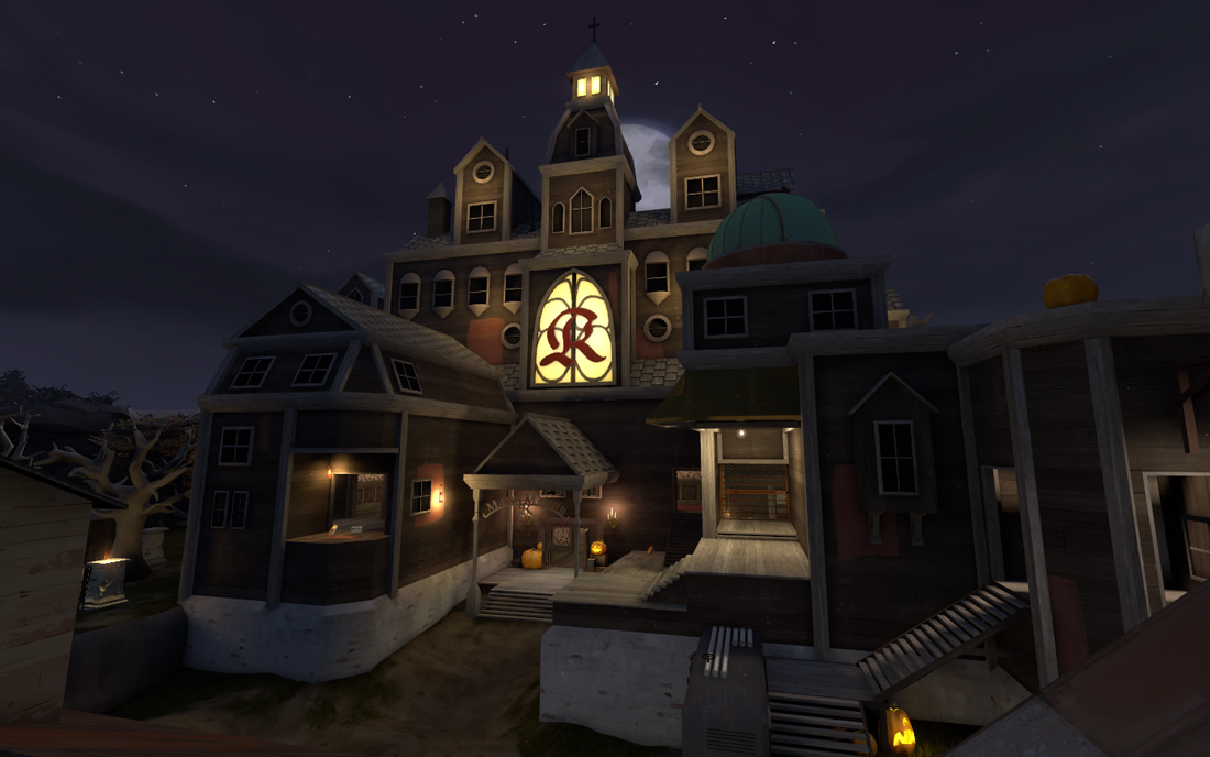
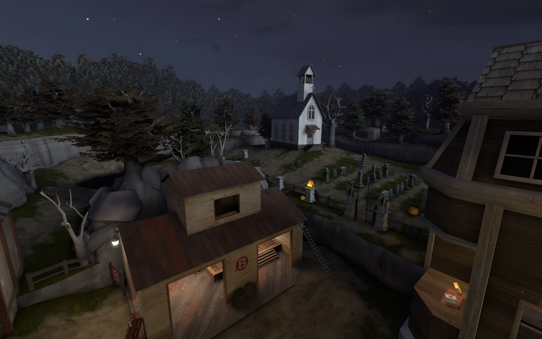
Well it looks like I forgot to run vvis, so that was a pretty wasted compile. I did take some screenshots, even if they aren't useful for any lighting fine tuning.

mansion_2d.jpg


church_2d.jpg


If you wan't 3D versions and a little bit more of an explanation of my compile failure, read my blawg

C is neaaaaring completion, not ready for any of you to see yet. Rexy is also working on one last exciting model too. Not long till completion, I can see the end!

JFYI for those too lazy to read the blog: The windows in the first shot, most of them have the same yellow light glow the middle one has, they just didn't get compiled.
 
Last edited:

grazr

Old Man Mutant Ninja Turtle
aa
Mar 4, 2008
5,441
3,814
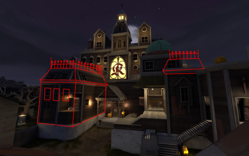
The graveyard is pretty slick but i don't much like the protruding section of the mansion with the slanted top area. The geometry looks too forced and bare. TF2 to me has always been about tall solid geomtry that is dominating, with solid angles, regardless of the fact of it being run down and falling apart or not.

mansion_2d.jpg
 
Last edited:

YM

LVL100 YM
aa
Dec 5, 2007
7,158
6,079
Grazr speak english. (or sober up?) I have no idea what you mean.

I do like the idea of the spiky fences on the roof though.
 

Goombac

L4: Comfortable Member
Mar 27, 2010
172
84
Although it looks great, the B building is a bit lackluster, especially compared to the outside of the mansion. Nothing big, though.
 
Last edited:

YM

LVL100 YM
aa
Dec 5, 2007
7,158
6,079
Although it looks great, the B building is a bit lackluster, especially compared to the outside of the mansion. Nothing big, though.

Yeah B has suffered the "I dunno really what to do here lul" syndrome and will be looked at again after C is done.

Currently taking a break from C to playerclip.
 

Okrag

Wall Staples
aa
Jun 10, 2009
1,029
655
Grazr means that he doesn't like how it shifts to the sort of slanted wall and then the roof. The picture is supposed to indicate he would prefer the wall leads right up to the roof.
 

Draco18s

L9: Fashionable Member
Sep 19, 2009
622
136
Yeah B has suffered the "I dunno really what to do here lul" syndrome and will be looked at again after C is done.

A lot of people have had that issue with at least one point.

My (even) bigger issue than B being a "lol WTF" is the 3D Skybox.
No really, I have NO IDEA what to put there. :|
 

grazr

Old Man Mutant Ninja Turtle
aa
Mar 4, 2008
5,441
3,814
You could make B a tomb?

what i mean is that TF2 buildings are tall and angular, almost monolithic in design. The mansion doesn't fit that design theory... atleast not that part. Considering gravelpit's CP's, dustbowls stage 1-3 building divide and the rocket, badwater's tower, hightowers tower, 2fort base fronts... it's all clean angular geometry.

Hydro and nucleus are the only maps that really break the mold. Though nucleus has always been an odd map for me that never really slotted neatly into the TF2 lore.

Whilst you have the style mostly down i don't think you've got the architecture right. It's almost like you were confused and unsure what to do with that part of the building and/or used no reference material.

Made me think of this local building... google link.
 
Last edited:

Scotland Tom

L6: Sharp Member
Jan 19, 2008
332
64
grazr is speaking in terms of TF2 aesthetics, but I think I can put it in slightly different terms:

Your giant Red building that houses all the stuff around C looks like it's supposed to be from the Victorian era, but those portions of the structure that jut out on either side of that main entrance don't at all look like they were constructed with a Victorian architectural style. grazr's red line drawing is a good start to getting those parts of the structure in-line with the style that's inferred by the rest of the building.

I also second grazr's suggestion to make B a tomb.

The overall theme looks darn sexy if you ask me. That graveyard especially is made of pure win. I'm quite anxious to see the finished product.
 

Penguin

Clinically Diagnosed with Small Mapper's Syndrome
aa
May 21, 2009
2,039
1,484
You should get some grass/rock blends for the cliff walls.
 

YM

LVL100 YM
aa
Dec 5, 2007
7,158
6,079
You should get some grass/rock blends for the cliff walls.

No. Every single damn time someone here decides their cliffs need a grass blend it has looked the ugliest fucking thing in their entire map of ugly.

Fuck that.
 

Simski

L2: Junior Member
May 17, 2010
57
11
The cliffs between B and the graveyard seem to start and end rather abruptly though.
I would agree with you about the grass blend, but I still hope you'd find a way to make them look more natural...
 

Tinker

aa
Oct 30, 2008
672
334
You could also go for B being the gravedigger's hut (remember Zelda?), filling it with shovels, coffins and stones while leaving the hut pretty much intact as it is. Could save some time if you're in need of some.