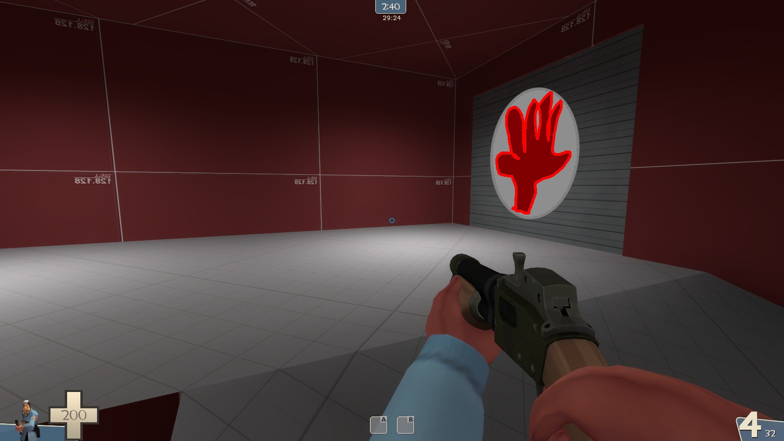
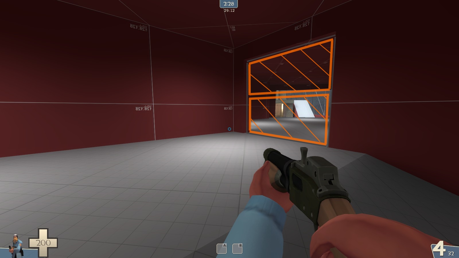
a2 revision notes for myself (as well as others, because I think public devlogs are a good thing)
overall:
-scaling is a bit too large. walk times to points are long, both from spawn and the "yards" of each point area
-opening gates between points on B's opening was a bad idea, just gives the winning team a bigger advantage
-multistage seems like the way to go, but that takes a long time for a map that's supposed to play quickly
-teleporting everyone back to spawn as soon as the point is capped seems bad, people like humiliation
-solution: provide an optional teleport directly back to spawn when the point is capped, accessible to both teams. also a fun and unique excuse for spytech
-the tiebreakers really just arent that fun. consider making this a proper 2cp domination where the winner of A gets an advantage over B (smells like steamroll!) or add a C point (seems like the better option)
-people went to go attack A during the setup time for B. Make it really obvious which way you're supposed to go - draw paths on the ground, signs that light up, idk. would be another fun excuse for spytech/dynamic elements of any kind, really
A:
-move platform directly into the cliffside so you dont have to cross a tiny bridge to get on it
-this also eliminates the area under the bridge, which is easily the worst part of the whole map. it's directly in the middle of the fighting area, but it effectively acts as a flank since nobody wants to be there, and theres already many other better routes onto the point that you would've had the option to take before you ended up in this shitty, shitty spot
-make the side flank onto the cliff not suck
-move cap level down to ground level (or bring ground up to cap level), being in that little trench area sucks
-there isnt really a good main fighting area, fighting is very divided or focused on the point (which isnt a great area to fight at the moment)
-maybe remove team-side cliffs, have spawns slope downward to point area?
B:
-same problem as A where there isnt a good main fighting area, you're either on the point (a scary place to be) or in mazy layout hell
-move point closer to middle rather than far out
-consider removing temple height advantage, or making it less significant
-porch exit sucks
-low area as a whole sucks, really
I probably wont get around to these changes for a while since I have a few other projects I need to work on in the next coming days, but I'm aiming to have a2 before next weekend. We'll see how that goes.


